File: 1596625800646.jpg (153.41 KB, 540x635, tumblr_pv4rk09bnK1v831lzo1_540…)
No. 102712
File: 1596641435200.jpg (21.21 KB, 500x500, 1512708433935.jpg)
I support this thread, and I'm not a bitch. So someone post their art so I can rate it genuinely instead of just shitting on it.
(I promise you, you are a nobody and no one is going to recognize your art)
No. 102714
File: 1596642681648.jpg (3.73 MB, 4608x3456, 20200802_191227.jpg)
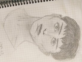
>>102712Hey anon! I'm the one who opened the thread.
Pic is my latest drawing, I started drawing ~2 months ago and before that i was a complete beginner.
I'm thinking of opening an instagram for drawing process but i dont wanna end up in the "bad/hideous art" thread here lol. So, what would you guys rate it out of 10?
(I know i should use better pencils/paper but i'm unemployed now due to covid so don't wanna buy non-essential stationary stuff)
No. 102720
>>102716Ah ok, still thank you. Guess it's too early to share for now. I just can't be sure if this was something that looks ugly or average.
My friend told me it was average. "Not something i'd look at twice but not in the bad art category" (her words). i couldn't be sure if she was just being nice though.
No. 102728
File: 1596651609781.jpeg (53.83 KB, 632x632, 1586844727675.jpeg)
so..is anyone posting their art soon?
No. 102746
>>102743Unfortunately idk anon. Its been on my phone for so long, guess it's a tumblr artist or something.
if you're on PC try putting it in google reverse image search.
No. 102747
File: 1596659207253.png (152.16 KB, 720x675, Screenshot_20200805-222500~2.p…)
>>102746I did. I put it through a website called "tineye" and just now through "labnol". God damn. Guess we will never know
No. 102824
File: 1596729367938.jpg (263.73 KB, 768x565, 20200806_105419.jpg)

Painted this a few months ago
No. 102833
File: 1596730511399.jpg (28.39 KB, 500x333, xetsojlp.jpg)
>>102824holy shit anon, this is gud. I love you
No. 102835
File: 1596732765362.png (312.24 KB, 1011x883, Capture10.PNG)
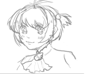
Did this as a birthday gift for a friend!
Does my art remind u guys of anything? Like an artist of some sort. Cuz my friend told me that my art looks nostalgic even though i didnt intended to kek
No. 102842
File: 1596734585756.jpeg (2.16 MB, 4032x3024, 03D96519-F1DA-4159-A835-2ED338…)
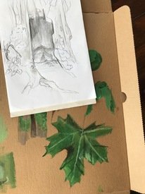
Trying to learn acrylics + to draw still life nature. Any critique is welcome!
No. 102845
>>10282410/10, amazing
>>102835I can’t think of anything in particular but it does give off an oldschool anime vibe, in a good way
No. 102854
>>102846She is! Its a little hard to get the hair right but I'm glad that u recognize her.
>>102845Thank u for ur kind words anon~
No. 102857
File: 1596737419100.jpg (619.73 KB, 1683x2110, 1089-F353-513-D-40-AF-A3-F4-CB…)
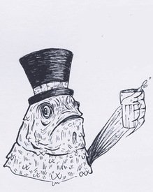
and old piece of mine of a fancy fish
No. 102890
File: 1596748326481.jpeg (2.56 MB, 2400x3800, 710CB994-279E-4178-806C-29CF9F…)
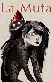
Here I go. I’m planning on releasing a small zine in the near future
No. 102896
>>102824This is a cool concept and a decent composition, but I think you need more variation in value. Try drawing a value study in charcoal or pencil before starting on the final piece so you remember to include darks and know where to put them. Generally you want your focal point to have the most contrast.
It looks like you're going for a Hieronymus Bosch thing here. Maybe do some studies of his artwork to practice.
No. 102897
File: 1596749175409.png (751.84 KB, 1501x1489, 2017vs20202.png)

i ain't afraid of no ghosts, and i love critique. left is from 2017 and right i did today. is this enough progress for 3 years?
No. 102900
>>102897Definitely not enough progress for 3 years, I'm sorry to say. Someone could reasonably progress like this within a few months if they have the right tutor/intruction.
I'll be honest, it seems like you follow a bunch of random tutorials to make your art "good" when what you really need is basic stuff first! I like your style, colors, etc. But what needs work are your shapes and poses.
No. 102912
File: 1596753913930.jpg (Spoiler Image,2.25 MB, 1436x1794, praise me punish me.jpg)

i got banned last time i outed myself as a horny gay scrote, but occasionally i like to draw homoerotic religious imagery (i went to private catholic school in the deep south for 10 years). it's only linework because i made cheap little risograph prints with it, but i've been considering adding flat colors and screenprinting it larger, maybe on shimmery fabric or with metallic ink or something. idk, i want it to look faggy but refined… curious as to what you guys think(horny gay scrote)
No. 102914
>>102897Idk how you've gone 3 years and still not learned how to draw a proper face shape. You went from obese, blobular jaw disease to putting fucking timothee chalamet's jawline on a tiny anime girl. It's truly baffling.
The body is also insanely stiff and awkward. It seems to me like you've spent all your time learning to draw Animu Eyes and nothing else. Either you have never spent time studying how to draw humans, or you have unfortunately hit your peak capabilities already. Some people just plateau at a certain point.
>>102824This is conceptually great anon, but I think adding more contrast would help it out a lot. Also, for landscapes like this, you'd be surprised how much good a little atmospheric perspective (things getting lighter as they recede into the distance) can do.
>>102857This is hilarious, I really like it. I think if I could say anything I would say you could maybe push the variation in line weight even more and it would have an even more pro look.
No. 102921
File: 1596755553165.jpg (Spoiler Image,4.44 MB, 2977x3963, D6500-B21-8-DC0-44-BA-AF33-F48…)

fancy fish anon here, with larvae lady. these are all old af, because now i'm freelancing animu art kek.
No. 102926
>>102890Love it! I could see this being a cover of a book or something
>>102921You got any more pictures? I love your art style
No. 102933
File: 1596766258624.jpg (272.98 KB, 1689x2048, 116370133_1053185391751244_759…)
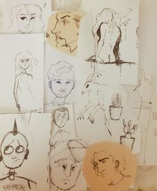
Does anyone have any tips for progressing past just perpetually doodling? My art skills have pretty much plateaued due to lack of confidence and being unsure about where to begin even though I'd like to do bigger/more serious pieces.
No. 102936
>>102912I love your artwork, horny gay scrote– this is the exact sort of thing I really like (both in terms of the style in subject matter.) If I came across this drawing on social media, I'd like/follow you.
Which brings me to the fact that LCF just isn't the place for you. Try Instagram or a different image board.
No. 102941
File: 1596769953604.jpg (2.09 MB, 3456x4608, 1596642681648~3.jpg)

>>102714It's hard to explain this without a visual, but I'm on mobile and pic related is the best I could do with my finger. There are a lot of proportion rules you can use when drawing a face straight-on.
The mistakes here are all really common for beginners. First, the eyes are too large and the nose is too small. The top half of the head is too short– unless someone is looking up or down, the bottom eyelid is always the exact center of a head without hair. Also, the distance from the fold of the top eyelid to the bottom edge of the nose is three eye-heights. The size of the eye basically determines everything else because it's a point of measurement.
You need to think of the mouth as a group of three-dimensional objects, not a single shape. The fact that it's a different color from the rest of the face is deceptive in that way. Don't let the color distract you; just pay attention to the volumes.
In terms of medium: don't use grid paper. Use large, plain paper (at least 20" tall) with a moderate "tooth" (texture). Textured paper "holds" material better. Your darks and mid-range values aren't dark enough, which is a common problem for people who begin using pencils. Use charcoal or chalk instead– they're much softer and you can make a dark mark much more easily.
No. 102956
File: 1596776661972.gif (462.46 KB, 577x774, lcb4after.gif)
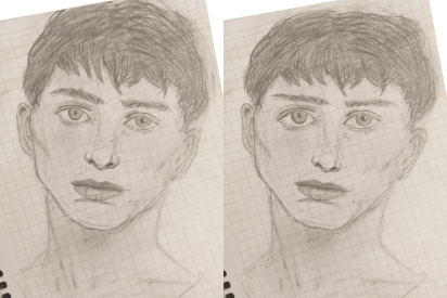
>>102941I take issue with your critique of the lips– it sounds like you're just parroting that common critique about 2D looking lips without actually looking at anon's drawing. The lips are one of the more properly done looking things anon did– they already have figured out that the top lip should be in shadow and seem to understand basic radial shading on the bottom lip.
>>102714that said, i gave him some plastic surgery.
Clip studio doesn't have liquify, only mesh transform, but i tried my best No. 102958
>>102897She looks cute! tho i recommend looking into some tutorials, your anatomy seems a bit stiff and wonky. The coloring is decent imo. I would also recommend working on lineart aswell, you should add weight to it and such. One anime artist i can recommend watching is SomeNormalArtist, he has a tutorial on how to put on line weight onto your art and many other things, focus on that please.
Just keep drawing and practicing, you will get there some day.
No. 102965
File: 1596785278017.jpeg (1.27 MB, 3149x4724, 5AA8C3A1-6D10-43BD-9A55-9BC465…)
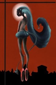
>>102898I-I have this but it’s way too amateurish imho
No. 102968
File: 1596789976165.png (1.34 MB, 1240x1539, instagramm.png)
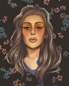
>>102700Got a request from smaller-following instagram drag queen.
I usually don't do requests but loved the colors and it was a chance to gain some extra followers, so why not.
No. 102974
>>102956woah you made my art go from beginner to professional so easily.
thanksfor both of your contributions. i swear i could tell that something was wrong with eyes but for some reason i never realized it was how big they are.
i'm thinking about using rulers and tracing (as a start, not always) since they proportions seem to be something everyone points out. is this a good idea to learn proportions or will it cause me to get dependent on rulers for understanding distance/proportion?
No. 102978
File: 1596809103609.jpg (328.58 KB, 1440x1982, IMG_20200807_190039_887-1-min.…)
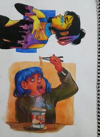
I stopped drawing for a good while, just picking it up again a month or so ago. These are a few years old from when I was 17, haven't drawn a finished artwork in years so I'm pretty sure my skill level is the same as shown here. I'd really like to improve how I draw faces, make them more dynamic and expressive, I usually draw them very stilted I feel.
No. 102979
File: 1596809170075.jpeg (359.73 KB, 1920x1080, 5361CC33-F57A-42E3-A951-C5D88B…)
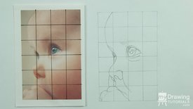
>>102974I’m not a pro at proportions but I find adding a grid helps me, it gives consistent reference points and I think it’s more helpful than tracing. Just make sure to draw the grid lightly in pencil or even secure it under your page if the paper is thin.
No. 103003
File: 1596818249403.png (Spoiler Image,26.25 KB, 226x290, lmao.PNG)

>tfw all i have to offer is thisI want to get into drawing lewd stuff, but I'm not sure if this disembodied wiener has me heading in the right direction or not.
>>102912Slap that shit on a shirt anon, I'd buy it asap.
No. 103007
>>103003It looks good anon! The only thing is it's very bent looking. I know some penises curve upward but it kind looks broken.
>>102978>>102968Geez we have so many talented artists in this thread.
No. 103011
File: 1596821132805.jpeg (119.22 KB, 1047x767, 5419F535-3C9B-4910-A940-36E346…)
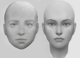
This is more of a recommendation than a request for critique since these are both pretty old, but I want to recommend a YouTube channel. The difference between these two drawings is 2 weeks. Yeah, 2 weeks. The secret sauce? Istebrak on YouTube, specifically her 14-day challenge critique videos. Binging those is like taking steroids for your art.
I think the reason her videos help so much is that she does not hold back and sugar coat her critiques like pretty much all other art critique youtubers. It can be jarring at first to see her tearing people apart, but, well, look at the difference between the left and right drawings. Her concept of “don’t value share!” enlightened me.
No. 103015
File: 1596822461384.png (81.95 KB, 287x295, 75266086_2443633742541231_2535…)
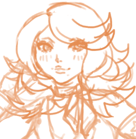
>>102858I'm sorry anon, I don't think I'm gonna finish this anytime soon cuz I'm still practicing on how to digitally paint. In the meantime, enjoy this piece that I just whipped up.
>>102906Noted! Thank u for ur critique anon!
No. 103017
File: 1596824464883.jpeg (2.62 MB, 4032x3024, 310A1021-9374-4C22-86B1-E681E6…)
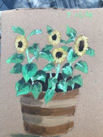
Acrylic painting part 2: electric boogaloo
No. 103021
File: 1596827272550.jpeg (14.83 KB, 225x225, images.jpeg)
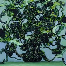
>>103017because of the colors it makes me think of pic related
No. 103035
File: 1596831281442.jpeg (152.89 KB, 749x960, DDF57704-28C5-42A3-B85B-D11EBE…)
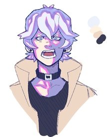
New to procreate so I’ve been trying to figure out a good way to digitally shade. I’ve also been slacking on studying anatomy (struggling with it more than usual) does anyone have any youtubers I can watch to help with that? If anyone has tips for drawing faster that be great too! I’ve been struggling a lot recently and it’s been annoying. I don’t get as much art finished as I used too…
No. 103097
File: 1596862168734.jpeg (Spoiler Image,3.21 MB, 3576x5371, E3D2A8B1-72FB-481D-B423-412BE6…)

Hello! I made this a week or so ago. I usually draw portraits and bust shots but I started drawing more background details. I’m not familiar with proper anatomy and i can’t unsee how long I drew her neck.
No. 103493
File: 1597111449471.png (11.16 MB, 4096x2823, Untitled446_20200811025642.png)
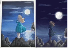
So I did these pieces a while back. While I am personally proud of them, I would like some feedback in order to improve. (If you're wondering why I did two of the same pieces, one of the things I like to do is to do a digital piece and then try and recreate it with watercolour or gouache or vice versa. )
No. 103498
>>103493These are beautiful anon! One issue I see is the fabric shading. When you paint fabric folds it's better to have variation in the shading instead of it being just one dark streak. Also, it's lineless, so it doesn't really make sense to have the hair so defined in the digital piece. It doesn't feel like it fits cause it's the only thing that's that detailed.
Either way I think these are really cute, the right looks like the cover of a childrens book, in a good way.
No. 103504
File: 1597117148772.jpeg (Spoiler Image,3.19 MB, 3722x5363, CBE62509-EDB5-49DC-A3F3-19712E…)

Okay so I think the arms here aren’t so bad compared to the long arms I had on the other post. It turned out a little muddy imo.
No. 103516
File: 1597129242025.png (140.44 KB, 640x1136, 1567EFEB-0C0D-406A-8164-0A0BA6…)
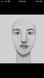
>>103011You inspired me to start this challenge.
No. 103521
File: 1597137623004.png (11.7 MB, 2336x3264, Untitled296.png)
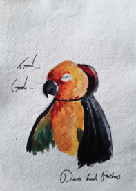
My first attempt ever at using gouache
No. 103547
File: 1597152789579.jpg (540.33 KB, 1926x1356, doodles.jpg)
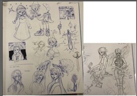
I swear I have more doodles and ideas than complete pieces lmaoo but hoping to make some finished pieces soontm
No. 103562
File: 1597157899772.jpg (Spoiler Image,4.61 MB, 4608x3456, 159715747521137950790747038574…)

>>102714Samefag, i know it's only been a week since i drew this but i made another portrait.
(I know hair sucks, havent watched any tutorials on that since im only focusing on faces for now).
I tried following the advice like making the eyes smaller, nose bigger etc. I'm trying to follow the general rules like the eye is 1/5th of the vertical line etc. but i also try to follow the reference photos. Somehow, my drawings gotten worse lol.
I know i shouldn't expect too much since i only studied like 2 hours this week but i didn't expect to regress this fast.
Sorry for blog-type entry. Just wanted to share it here.
No. 103563
File: 1597157999986.png (323.55 KB, 475x428, jenna marbles.png)
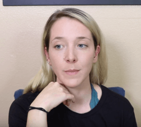
Original pic for reference. I know lots of anons don't like jenna here but she's way too pretty to not draw.
No. 103567
>>103547The ones on the left are cool. Slap a background and it would be so much better than it is as doodles.
Also the one hand you drew seems to lack… depth? Idk how to say it but it looks like there is no joint at the wrist, so the hand looks dough-ish (english is not my native language so sorry if this doesnt make sense).
I think they're nice anon. But you should improve from doodles to full drawings with backgrounds that tell a story so that it becomes more interesting.
No. 103591
>>103568Oh yeah the hand is super awkward, I really need to rely on references more. Thank you I appreciate the feedback a lot! I might scan some stuff I like and try playing around in digital
>>103568Thank you! I am not sure how detail oriented ı am actually because I get jittery whenever I try to focus on textures etc but this is nice to hear. I think I might go back to that and try that yeah! I struggle with composition a lot and I remember reading a post on thumbnailing and it was very similar to your description, I always draw rectangles to do thumbnails but end up getting distracted. The shapes tip is eye opening because I didnt see it from that angle, thank you!
No. 103633
File: 1597178507412.jpg (Spoiler Image,2.83 MB, 4608x2592, 20200807_130754.jpg)

can someone give me an honest rating of my junglebook drawing? been practicing traditional art for awhile, but i'm not sure if i suck or not. i hide my art from most people, so i get almost zero feedback. would really appreciate some advice
No. 103635
File: 1597178768443.jpeg (165.68 KB, 1024x841, ESrKaSKU4AEXEVa.jpeg)
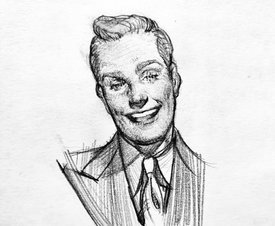
>>103633I love it! Personal preference, but maybe you could try adding more texture with hatching like pic related? I love this artist and her traditional stuff
No. 103641
File: 1597181102961.jpeg (Spoiler Image,265.09 KB, 1200x1500, Ee0fNwuUcAAGn69.jpeg)

>>103639Sartorial_E on twitter, go get your old hollywood dreamboats, anon
No. 103696
File: 1597212183768.jpg (Spoiler Image,2.3 MB, 4032x3024, image.jpg)

Ive started trying to learn how to draw after 10 years of not doing it. The pupills are too small so she looks creepy but other then that what else can I improve with?
No. 103698
>>103696The pupils are the right size, that's not your problem. Unfortunately this is a case where I don't even know where to start because you're basically not doing anything right. I know this is gonna hurt to read but I'm trying to be honest.
If I had to say one thing, it's that it's clear you are drawing with symbols, which is what everyone does as a kid, but you need to ditch that way of thinking if you want to make any progress. You need to think about the face and its features as 3D shapes, and then learn how to choose lines that best represent these shapes. Forget what you think a nose is and observe real ones. This is a hard process and it's a skill that all artists continuously develop throughout their lives. I guess you could start with tracing over some photos of real people, as a very basic way to start learning. This will help you stop using symbols.
No. 103722
File: 1597228661947.jpg (419.62 KB, 1000x1250, fun challenge one hour.jpg)
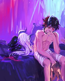
Drawn for a one hour drawing challenge with friends, we had to draw something including these prompts:
neon, woke up married, many horns, e-thot, vampire fangs
Trying to render something was probably a bad idea considering the time limit.
Also I never completed Istebrak's 14 day challenge but it kickstarted my understanding of rendering, so overall her videos were pretty helpful for me.
No. 103731
>>103722i like the idea but some things look messy, maybe because of the fact that you only had one hour.
like the guy's torso. left boob seems to be higher than the right one and there is a weird "dip" on his back.
the girl's body seems kinda emerged into the background? like there are parts where you can't tell where her body ends and the surroundings start.
overall, i don't have a good eye for art, but these are my criticisms. i like the piece though.
No. 103810
File: 1597265642959.png (Spoiler Image,2.69 MB, 1910x3002, Untitled336_20200525144232.png)

Recently just finished this
No. 104011
File: 1597370397004.jpeg (5.31 MB, 2337x3072, C67870AC-514E-4079-B651-730FEC…)
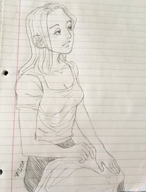
I don’t understand how to draw clothing folds and I’m starting to think I never will
No. 104019
File: 1597377022135.jpg (Spoiler Image,67.45 KB, 975x1390, bare-footed-woman-walking-on-t…)

>>1038101. Her foot's not going the right way. I can't find a ref pic, but if you stand like that yourself, you'll see the right foot would be pointing forward.
2. Her hair and skirt are being blown in two different directions.
3. If the brown part at the bottom is supposed to be the floor, it doesn't have much depth to show that.
4. Her left foot is too oval shaped. The way you've drawn it makes it look like she's actually standing on the tips of her toes when really shes standing on the pads of her toes, ya'know? Pic related for reference of how they should really look. Change to fit the type of shoes she's wearing obviously
5. Her hair is also a lot brighter where the light is shining than her skirt. The books in the background show that the amount of light is consistent from top to bottom, so the light on her skirt should be brighter.
I hope this wasn't to nitpicky, this drawing is really cute anon!
No. 104492
File: 1597512638610.jpg (278.18 KB, 736x736, 2020-08-15_154638.jpg)
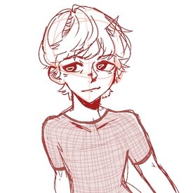
I don't know is there other thread for that but: where should i get clothes ideas from? I'm not creative, which sucks, because i have problem with OCs too
No. 104494
>>104492TBQH I actually get my fashion ideas from the quarterly lookbooks put out by labels and department stores. I have a couple from Barney's and Neiman Marcus on my shelf right now.
You can probably call and get on their mailing list. Ask for the studio services department if needed - they send these things to film & tv costumers a lot (which is where I got mine from).
No. 104504
>>104494>>104495Thank you so much anons! I'll look it up
Btw pic i posted is my sketch, so i have questions again. What is the method to achieve manga tier art? I'm not using loomis or anything at all; you can see circle and lines under "lineart" but i used it to draw hair and hair only. I'm literally drawing eyes and then i hoping face will do okay too- which isn't good method and never was. That's why I'm afraid i'll be stuck in the future. I can't learn and it's annoying. Is there hope for me, anons?
No. 104506
>>104504Idk why animefags think they can just start off at anime stylization and things will turn out fine. You still have to know the basics of real facial and body structure before you can properly stylize it. Your drawing looks like shit because you don’t know what the lines you’re drawing are based on. Learn loomis and do some figure studies and then when you actually get the basics, you can come back to anime.
Ever wonder why most good artists follow the “draw shitty anime in middle/high school -> drop it and learn realism for a couple years -> go back to extreme stylization only now have actual skill” pattern? There’s a reason for it.
No. 104515
>>104504Like the other anon unnecessarily angrily said, you should focus on learning foundations of things that will carry through no matter how you stylize your art.
Anatomy can be warped to create stylization, but that knowledge is needed in order to make a figure look structured and solid. Fabric folds and weight, lighting, composition, etc, will all affect your art no matter how you stylize it.
What helped me years in was actually just regularly taking figure drawing classes. Understanding how bodies move and work can help you create more dynamic poses, no matter how much you stylize or simplify your work. I would try doing gesture studies, or using posing/model software to start really getting anatomy basics down.
In terms of creativity… very few people are truly creative. Instead, it's a lot of absorbing materials and understanding how to repurpose them - "The art of originality is concealing your source." I'm fortunate enough to work in the industry, and just seeing how many beautiful pieces of concept art I've admired turned out to be photobashes composed of different images really changed my view and opened my eyes to how artists recycle ideas, objects, and concepts.
Plus, I'll 100% be real - a lot of artists have frankly shitty OCs.
No. 104641
File: 1597611480907.jpg (5.32 MB, 3072x3958, 20200817_033807.jpg)
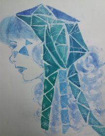
Trying sth else for a change…im getting back again after months and months of hiatus. Im not giving up, things will get better soon…Lets hope for the best.
No. 104646
>>104641I think you have a nice idea there anon, but you'll definitely want to study facial proportions and anatomy. Where the eye goes, what the side of the nose/chin area look like, that kind of thing. And on the triangles, if you're going for a geometric look, it'd be a good idea to use some kind of masking fluid or tape for sharper edges so it doesn't look messy.
Try not to abuse white gel pens. You may've been better off using white acrylic in some areas, because some of those gel pen lines look really scratchy and take away from your art overall.
No. 104679
File: 1597621435123.jpg (166.94 KB, 624x728, unknown.jpg)
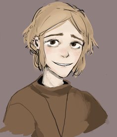
A boy I just doodled
No. 104697
File: 1597646209710.jpg (80.37 KB, 883x886, fgfgfgfgf.JPG)
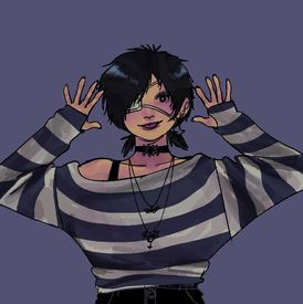
my artistic skills had been in a continues declining but here is a drawing of a picrew i made
No. 104705
So happy to see a thread like this, and anons actively posting! Hope it's gonna thrive.
>>104679The earthy colors are so nice! I like your style, do you have any finished work to show? I'm curious how it looks on the more polished stage.
>>104697Wish there were some stronger highlights so the skin, just one additional brighter color so it's more vibrant. The pose is really cool though!
No. 104820
File: 1597714815161.jpg (126.58 KB, 600x375, herrscher.jpg)
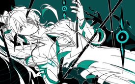
>>103731Yeah I didn't have time to fix everything, just kinda winged it as fast as I could.
Here's a little sketch I'm probably not going to do anything more with.
No. 104823
File: 1597718477739.png (Spoiler Image,591.85 KB, 500x667, qqqq.png)

No. 104824
>>104820I love your style
>>104823your anatomy is good, was this a sketch or a study?
No. 104846
File: 1597746144096.jpeg (736.61 KB, 1967x2980, 9BD50A2E-6606-4398-8B35-81C649…)
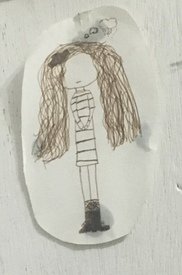
I used to draw this constantly when I was 12-14 lol, like all over my school notebooks and papers. Sometimes I’d give her longer socks or boots and put a hat on her. Notice how badly I did the ribbon in her hair lol. Regardless there was always a thought bubble turning into a storm cloud above her head. She was my own little moody dark gothic character I created, and I cut out this certain drawing and stuck it on my shelf, just for shits and giggles
No. 104855
File: 1597752620766.jpeg (204.74 KB, 1123x1123, FF57F34C-CC94-49C7-B520-200D1B…)
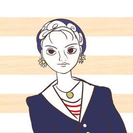
I love art but I barely draw anymore. I get discouraged cuz the stuff I wanna draw involves more realistic anatomy and my skills just aren’t there yet. I’m also not entirely comfortable with using a tablet, it feels slippery to me compared to pencil and paper.
Anyway this is a doodle I did in about 30 mins after trying to draw something more realistic for over an hour.
No. 104867
File: 1597759561469.jpg (2.58 MB, 3088x3088, 20200818_070507.jpg)
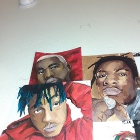
I figured this is a good way to cope with my depression, but I don't feel joy from acrylic painting.
No. 104868
>>104867Try oil painting maybe. I love oil painting, it's really soothing, acrylic paint may look similar but it's such a chore, it dries too quickly and it doesn't feel as nice on a brush but maybe that's just my thoughts. Your paintings are pretty nice
>>104855I also have daisy earrings!! But yeah if you want to draw something realistic you have to practice first by drawing something with a photo reference, don't get discouraged if you can't do it right away
>>104846 This is so cute, it reminds me of those notebooks with the little girl printed on the edge of the page
No. 104896
>>104873I use stretched canvas mostly, I think wood panels are even better because you can make very fine details without the canvas texture getting in the way. You could also get paper for oil painting, I don't know what it's called but they make these blocks of sturdy paper with a canvas texture.
I don't know what brand of paint to recommend because I use whatever. You can get a set of various paints but if you want to buy individual paints you need:
- titan white and zinc/zinc-titan white (zinc white is for mixing with other colors, titan white is for when you need a really opaque white color),
- a warm red and a cool red (there's lots of variations of their names, the warm red is usually called vermillion or cadmium red and is closer to orange, and the cool red is sometimes scarlet and is closer to purple),
- a nice yellow (honestly I hate that cool lemon yellow I can never find a use for it, it always needs a bit of red so I recommend a warmer color like cadmium yellow),
- dark brown,
- a cool blue and a greenish blue (you could use only a cool blue like almost a navy color, I can't remember some normal names but I remember my cool blue paint is called phtalocyanine blue and it's really nice, you could add some yellow to make it a greenish blue I guess but I think it's worth it to have a greenish blue paint too, like cerulean blue)
- black, you can make a nice natural black from brown and navy but sometimes you just need some true black
You can make whatever other color you need by mixing these. It might be better if you're not sure you'll like oil painting to buy a set of paints because individual paint tubes (the big ones) can get expensive. But it's definitely more worth it to buy individual paint tubes because in a set, some paints will just be used more often than others. I'm sorry if I wrote too much, and good luck with painting.
No. 105360
File: 1598022655897.png (267.02 KB, 672x641, 284781924.png)
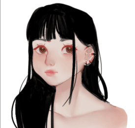
I am trying to develop my "painting" style, since my normal art is basic anime-ish.
I was wondering if anyone could give me an opinion in regards to this piece? Color wise, and any tips for blending and all of that in general.
(I wasn't aiming for a photorealistic style or anything btw)
Thanks in advance
No. 105366
File: 1598024556193.jpeg (758.07 KB, 2048x2048, 12B6BFF6-E2B6-4188-BA00-475B13…)
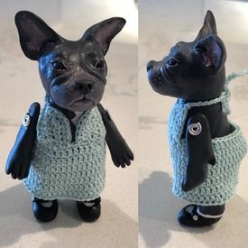
I started sculpting again this year and made my mum her little dog styled after a miniature bisque doll, but I'm part of zero art communities so getting critique is impossible. Is there a better method to painting fimo than baking the acrylic in the oven for an extra twenty minutes? I feel like it made it tacky and now I'm afraid to use acrylic sealant on it. Websites all have different advice and info but I didn't like their finished product appearance. One time I used oil and it stained the piece incredibly deeply and it never dried. Nothing removed the colour again, but I'm nervous to try certain things because the damn item itself is plastic. Any advice is so wanted.
Also yeah hindsight 20/20 I would have crocheted a hole in the dress for the tail since now it looks like she's shat herself, but I was on a tight deadline and finished the dress on the final day.
No. 105367
>>102704Oh, yes I just noticed i forgot that lol.
Any other thing you can tell me to improve? Thank you.
No. 105371
>>105366Sorry anon, I don't have any advice but I adore the dog figure! What breed is it?
Would love you to make a doll out of my pug. You should consider selling those on etsy once you figure out all the kinks!
I second the tail hole idea. It would be so cute to see her tail!
No. 106263
File: 1598751393288.png (1.29 MB, 720x1095, sketch.png)
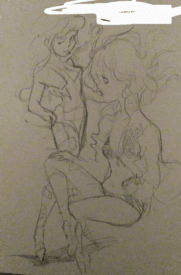
it's a light sketch but I've been recently trying digital art and it's very difficult to get into
traditional art just gives you a better experience than digital idk why
No. 106271
>>106263These are so pretty anon! The legs on the girl sitting down are out of proportion to the rest of her body (the legs are too small, and her left thigh and right calf are super skinny) but idk if you did that on purpose.
I think trad art gives more experience cause you basically have no short cuts, and it's harder and longer to do some things. Like blending for example.
No. 106291
File: 1598773732091.jpeg (1.94 MB, 2931x3642, 12BB780B-918F-4EF6-B2C2-270BE2…)
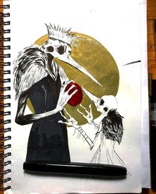
I did this yesterday
No. 106311
File: 1598807282630.png (814.79 KB, 1800x1300, test.png)
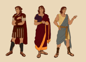
I've always wanted to do a webcomic of my own but I feel like my art is too stiff and unattractive to manage that, but I've been trying to work on consistency and character design to pursue it anyway.
No. 107371
File: 1599593159706.png (712.03 KB, 1070x559, Screenshot_2020-09-09-00-17-31…)
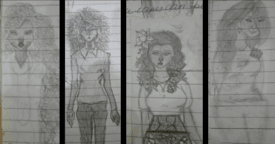
I think it would be pretty damn rude to drop my drawing here without offering feedback on others so I would critique their problems but I am in no position to give actual advice though
>>106311 It is stiff but still pretty good
>>106291 Cool atmosphere and design - rather stylized so there's no comment on the anatomy
>>106263 Legs are short but still really cool
>>105366 i have no idea what criticism to give but its so cute
No. 107526
>>107371I like the look of your art! It reminds me of detailed fashion art. I think it's good you used a few examples too. I love how you sketched different hair textures, hairlines and facial shapes, that really makes them stand out nicely. Your clothing choices are thoughtful too and I see how you've shown cloth volume through shape and some shading. Keep that up!
If I may suggest since we only have a sample size to work with; find a few photos of people in more poses you find interesting to try. It doesn't need to be wild or in a direction you aren't comfortable with yet, just more variation for you to have fun with and use. Doing a lighter undersketch should help structuring poses and positions. There's a ton of ways to visually break down the body, some work better or worse for people so experimenting is key. Off the top of my head is the 'bean' and 'circle and lines' techniques, might not be word for word on the last. The hands of the 2nd look good; it's a lot of work but keeping their hands out enhances the look a lot in most situations. So if you choose to use the above advice adding in some more hand practice would be great. Of the 4 I feel 2 and 3 have confident lines which help them stand out and (personally) feel more appealing.
On the note of standing out, I don't know what paper you usually use I really feel you should treat yourself with sketchbook paper. Experiment and find a texture you like. What you've shown, to me, shows even more potential. Having a clean page to draw on would help your work and details show through much more clearly. Thank you for sharing your art and giving others positive criticism.
No. 107702
File: 1599835882395.png (103.45 KB, 341x582, ohman.PNG)
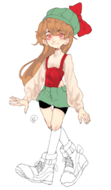
hello guys, i started drawing this yesterday and theres just something i hate about the shading but i can't pinpoint what it is? any advice? also struggling with hair shading.
No. 107705
>>106311 You should go for it anyway, these are really well drawn. You should try doing some croquis exercises to help you loosen up some of that stiffness.
>>107702Wow your style is really unique, she's super cute! As far as critique goes, you don't seem to have a consistent light source so your shading is kinda all over the place.
The colors you've picked for the shadows look muddy too. Try not to shade with a darker version of the base color, have some difference in hues as well. As a rule of thumb, if your light source is warm toned, your shadows should be cool toned and vice versa.
No. 107736
>>107702s'cute anon! if you're not already, try using more opposing colors for shading. for example on the cream colored turtleneck, add some blue/purple hues to the shading in order to create depth. same with red corset, try adding some green. the corset has the best shading imo.
keep in mind you are losing line when shading in this piece, especially in the hair and shirt. your linework is really delicate and thin (not a bad thing but it is easy to lose in coloring process). best way to keep thin linework as a focal point is to realllyyyy restrict value changes and color palette, or else you may have to thicken your lines in places where it disappears. just my thoughts, feel free to ignore lmaooo. you have a good style!
No. 107767
File: 1599899395780.jpg (347.43 KB, 1600x1200, vgirl.jpg)
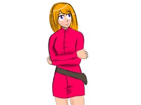
I'm still new to digital art, I'm using clip studio paint. Need some advice. Yes, I used a 3d model.
No. 107786

>>107767Something you should focus on is practicing your lines, main beginner mistake is to make multiple, messy lines like this. It's harder to get right with digital art as compared to traditional, but the same exercises will work just fine, for example the very first lessons of Draw A Box - simplified version of these is presented in the video I link here. Draw and delete the same line as many times as you will need, but don't draw it over another lines like here because it's only creating illusion of a defined shape, and will not help you learn.
3D models are okay tool to learn with but not when you trace - place the 3d model next to your canvas and try to replicate what you see, this is how you'll learn basic shape language and better anatomy. Tracing doesn't require any understanding so it's a shortcut that can really hurt your improvement when you're only starting out.
Overall the colors are really nice and don't get discouraged! You'll see the improvement very soon.
No. 107809
>>107786Thanks for the advice!
But yeah, even in traditional my hand is a little shaky, so inking always looks wrong. Also line art tends to be hard to do, so I need advice on that.
No. 107815
File: 1599946489351.png (195.78 KB, 477x589, ee oo ee oo.png)
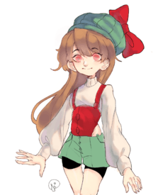
practiced some more… the blue tones really helped
No. 107868
>>107815Oh yeah, the cool shadows definitely broke the monotony.
Careful with the light source, it's unclear where the light source is because the hair, skin, clothes all are lit differently. You can use multiple light sources but it can complicate things since it'll impact forms in a more complex manner. Either way if it's gonna come from the right side then all parts of the render should support that.
No. 107891
File: 1600009128065.jpeg (4.74 MB, 3600x5318, D0618C05-B0E5-4C45-9CA1-D43A03…)
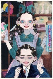
Hello! Do you guys have any advice on portraying transparency—in this case plastic? I just added white lines and I’m not very happy. I want to re-do it but I don’t know how to properly execute it.
No. 107892
File: 1600009931778.jpg (6.91 MB, 3600x5318, img.jpg)
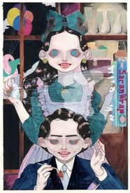
>>107891Maybe you could add some more shine like this. But I think it looks very good as you made it.
No. 107942
File: 1600073185576.jpg (74.68 KB, 637x847, PicsArt_09-13-10.47.46~2.jpg)
I do not care about any criticism because this is my son no matter what.
No. 107952
>>107944Fuck birds.
But yeah, anon, this is a good drawing of one.
No. 107989
File: 1600121161458.jpg (3.42 MB, 4160x3120, batstuff.jpg)
i did this a day or two ago using a variety of micron pens
No. 108043
>>108042I couldn't ignore this
**fear
No. 108124
>>107989I like your idea, but I think if there's something that might help it look better, it's to try and avoid tangents more (not a hard-and-fast rule, but here's a guide to spotting them):
https://www.google.com/amp/s/schweizercomics.tumblr.com/post/11966164633/the-schweizer-guide-to-spotting-tangents/ampAt a glance, the heel of the boot and her knee, as well as both elbows have some tangent action. It can get pretty visually confusing as to where one shape ends and the next thing begins, but having more overlap or more separation both help improve that issue.
No. 108149
File: 1600243902349.jpeg (45.78 KB, 800x754, USER_SCOPED_TEMP_DATA_orca-ima…)
I like to draw every now and then but I am in no way an artist
No. 108821
File: 1600888901473.png (453.52 KB, 2048x1537, Screenshot_20200923-142004.png)
I'm just now getting back into digital painting after trying briefly and getting discouraged. I usually draw more cartoony stuff. This is the first "painterly" piece I've made that I actually like… Any thoughts or feedback?
No. 108828
>>108821Hey anon, don't get discouraged, practice will pay off soon enough! I like your anatomy and shapes it has a lot of potential.
it feels a bit too blury, try using a different brush with more defined stokes to define some edges.
As for the values I recommend this proko video.
No. 109088
File: 1601138457153.png (556.1 KB, 1500x1900, Comparison.png)
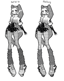
So I really didn't know where to put this because all I need is some advice on which one is better. I'm trying to go for a specific style with the screentoning but idk which one is better. Some advice would be nice I guess lol.
No. 109095
File: 1601141878215.jpg (441.04 KB, 1080x1834, IMG_20200926_193800.jpg)
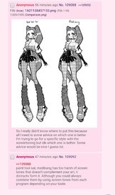
>>109088>>109092seconding this, at first I posted that medibang is better because pic related is what I saw on my phone. WHY DOES THIS EVEN HAPPEN
No. 109097
>>109088paint tool sai by a long shot, the screentone particles are smaller and create a fine and more pleasing texture. the one on the right isn't bad, but larger dot particles require less sophisticated character designs and bodies imo. the style on the right seems to work well with more 'chibi' style drawings, basically anything with less lines and detail.
don't have much advice, you seem to have a nice hold on anatomy (hands be a lil small tho) and shading, which adapts itself to your style. i really like that lighter part of the skirt near the hip, but it is basically the same texture and shade as the hair so i'm losing it in the overall composition. perhaps lightening it or moving the hair placement minutely can fix that. cute style anon!
No. 109310
>>109095when you unzoom and zoom on a "mesh" texture, it moves to bigger and smaller spots, try it !
in my mind its bc it's so fine that your computer has trouble making it even smaller while keeping the tiny tiles, but what do i know.
No. 109501
File: 1601436983792.png (9.15 KB, 300x300, art.png)
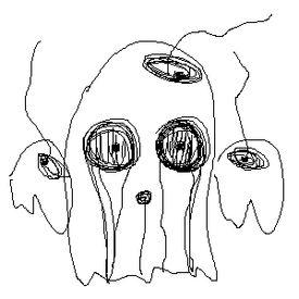
feed my ego
No. 109589
File: 1601504174121.png (730.89 KB, 1780x1780, lace.png)
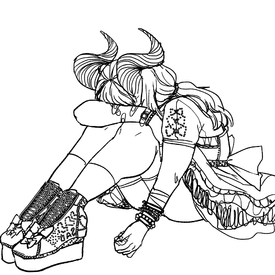
still pretty much a wip and needs more work including redoing the skirt and obviously colouring it, was planning to finish it today but didn't get to so i'll post here to get my dopamine release. and also criticism for stuff to fix when i do feel better and continue working on it.
No. 112896
File: 1603559896876.jpg (469.06 KB, 1120x1500, New Canvas.jpg)

Miu Iruma wip. I'm not sure what the other hand should be doing
No. 112936
File: 1603589020982.png (7.4 KB, 400x400, Untitled 10-24-2020 12-47-44.p…)

First try at pixel art.
No. 112946
File: 1603600942065.png (7.46 KB, 308x404, shaded.png)

>>112936I love the concept, you should add some shading like this so it's easier to "read" the shapes.
No. 113023
File: 1603736301012.jpg (196.93 KB, 1352x1761, rootroot.jpg)
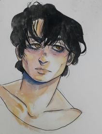
tried these koi watercolors i bought on my sketchbook. i'm not used to drawing men at all so i think i should start practicing that more.
No. 116080
File: 1606117235361.jpg (148.99 KB, 800x1200, redstone.jpg)
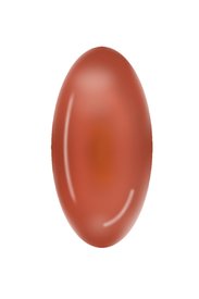
Same person from
>>107767Not a figure, but still keeping up with digital art. This was done with only a mouse.
No. 116082
File: 1606120202085.jpg (12.88 KB, 554x554, stone.jpg)
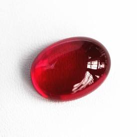
>>116080I think a few sharp, white highlights would really make this stone look more shiny. And some dark values, it is very mid-tone heavy currently.
>>115736Ah, yes kek. You're right, thank you. I really need to measure things out before winging it.
No. 116115
File: 1606150286604.png (954.82 KB, 700x701, 1606149036058.png)
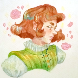
I just recently rediscovered watercolors and I'm in love
No. 116130
>>116115The style, the colors, the attitude! Someone marry me so I have a chance to wear a fancy doublet like this
Also anon do you mind sharing what brand you use? There's a sort of chalkiness to this that I really like.
No. 116269
File: 1606298804480.png (1020.99 KB, 774x932, hhhhhh s.PNG)
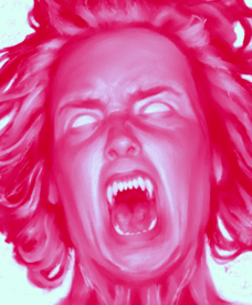
What expression does this look like to you guys? I'm trying to go for a combination of terror, pain, and viciousness; not sure if the emotion is displayed right, it kind of looks ridiculous to me after adjusting it so many times.
No. 117920
File: 1607635758253.jpg (964.46 KB, 1673x2439, 20201210_212842.jpg)
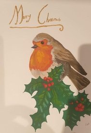
Not the best photo and it's been a while since I've painted a bird, but I think I've done ok
No. 118619
File: 1608125185516.jpeg (369.4 KB, 1412x1510, B1AF88B7-F3C3-4A45-B4DC-7281AB…)
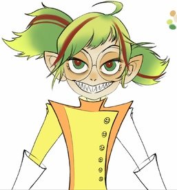
I want to hop on the vtuber train and I have been building my avatar, just for fun between work and study. People told me she looks like Gumi and now I’m a bit bumped
No. 119220
File: 1608632992812.png (822.48 KB, 1654x1500, thum.png)
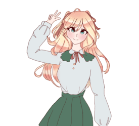
Does the anatomy look alright with this? I've only worked on the hair for the shading, and I'm going to revisit the hand lol
No. 119384
File: 1608801435370.jpg (222.48 KB, 981x1289, IMG_20201224_101209_272.JPG)
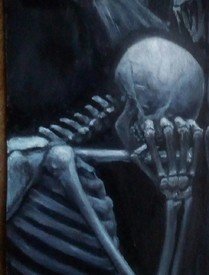
Does this skeleton look ok, I'm looking at photos online but it's hard to see if it looks weird because I don't know what a skeleton looks like off the top of my head. I think his finger and arm bones might be too thick and his shoulder too forward but I don't know really, what do you think?
No. 119398
File: 1608814491039.jpg (237.6 KB, 1920x1142, skeletonref.jpg)
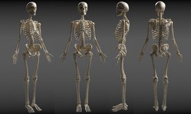
>>119220The shading and the colouring is okay, everything else isn't, the anatomy is broken and it's all over the place. I can redline it for you if you want.
>>119384I love the concept and the painting so much, the fingers and arm do look a little too thick and the forearm too thin, the spine drops are a little too long but overall it looks beautiful I wish I can have it on my wall.
No. 119399
File: 1608815504514.png (188.43 KB, 537x601, foranonily.png)
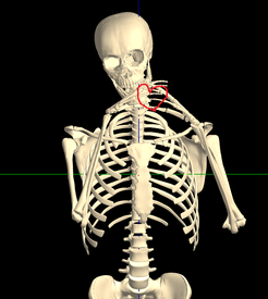
>>119384one more thing, there are many ways you can move around a 3d model of a sketelton to see how everything works, to find what I used here just look up "kineman movable 3d human skeleton model " the fingers aren't movable so I couldn't make a heart.
No. 119798
File: 1609279436159.jpeg (1.62 MB, 2838x3576, C927D863-F966-4085-9C4C-2450AB…)

she looks like a psychopath I think
No. 120694
File: 1609383459377.jpeg (Spoiler Image,7.35 MB, 3922x5776, C9E5F10D-579E-4693-A4D3-E9470D…)

Hey guys, do you have any tips and technique to draw or paint fur? The one on the teddy bear she’s holding looks clumpy I didn’t know what I was doing as usual.
No. 120811
>>120694I love your work! The way you've stylized the person but still shown you understand anatomy is really good. The colours are amazing.
For the fur, it just needs more variation in colour and light. The fur needs to be treated as multiple objects rather than one.
Try separating the furry object into smaller sections and group together fur that would act similarly. To do that, identify the "shape" of the fur (is it a round curl or a straight hair, which direction is it pointing in, etc) and the position (is it affected by anything touching it, where is it in relation to the light source, etc). Shade and colour each section as if it were its own object.
I'm probably not explaining this amazingly, but I hope you get what I'm saying! Check out Edwin Landseer - he almost exclusively drew animals and he sectioned the fur without adding too much detail and painting every strand.
No. 120822
>>120811>>120782Thank you!
And thanks for the artist recommendation as well! I’ll check out his animal paintings.
No. 121021
File: 1609683466801.png (50.25 KB, 394x554, uhh.PNG)
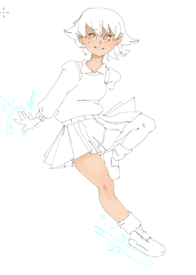
I'm just playing around with a different style but I'd love to know what you think!
No. 121039
>>121033Pure white tricks your eyes and once you add a backgroun everything will look different, even if you're not gonna add a background never use pure white but use a grey-ish yellow-ish white instead.
>>121037I said shading before laying the base for the whole drawing, you can't shade without a base otherwise you will be just painting, it's saves time and helps you keep your shading and lighting style consistent through the whole drawing.
No. 121045
File: 1609704772699.jpg (252.4 KB, 750x364, glam.jpg)
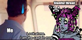
Has anyone else been possessed by their 12 yr old wannabe goth selves since browsing the glamfur thread…I wasn't skilled enough in 2003 to participate but now I'm fucking consumed. I'm not looking for a rating I just didn't want to post my goofy OC in the actual thread.
No. 121049
File: 1609708211565.png (593.52 KB, 1540x1920, 03.01.21.png)
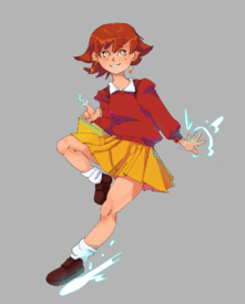
>>121022Thank you !
>>121026Yeaaah I know, but it started as a small doodle I didn't intend to finish. I did it the right way after your post though
>>121045 I love it ! It makes me want to draw glamfur too
No. 121051
File: 1609709707532.png (182.83 KB, 1080x1080, 01012021 cow.png)
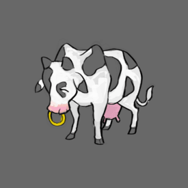
I've been having trouble painting/rendering things more realistically. I don't have a clue how digital art works
No. 121053
File: 1609710953842.png (1.35 MB, 660x878, polycyst.png)
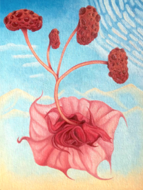
Does anyone know ways to get exposure online? I've been trying for years with no luck. I've tried Instagram so many times and I've never been able to get over 100 followers despite putting art hashtags and stuff like that. It's frustrating.
>>102824I'm the same artist as this one by the way.
No. 121066
>>121053People get exposure online with fanart and participating in trendy hashtags, that's an awful reality of it. Your aesthetic is so unique and alien, you could try applying it to these things I've mentioned above if you care about exposure above all else, but I feel like it would take away from it's uniqueness. If it's some kind of income you care for, your best bet would be IRL networking, looking for some opportunities to be featured in art exhibitions, getting interest of local buyers, because I'm sure these paintings could fit some alternative decor flats, or bars, or clubs… unfortunately, it's really hard when you actually bring something new and weird to the table as you do.
No. 121068
>>121053samefag, but additionally, when it comes to instagram numbers, try to insert yourself into a community of artist doing the same thing as you do; more in a direction of psychedelic theme in any medium, than just oil painters. Dedicate about 10 minutes daily to just go on a following spree, some percentage of these people will follow you back, then you can just unfollow them; of course many will do the same but ultimately the number will steadily rise which will slowly make your account looks better, at least from the numbers perspective. I think people actually rarely explore tags on instagram considering how messy they can be, so following people that like the same things as you do will be far more effective when it comes to finding these that enjoy what you do than just waiting idly for them to find you in the tags. Also, interact more; if you're just posting your things and waiting for engagement to happen, it will not. Comment on things you like, if you have twitter, post your art in replies (not retweet!) to people posting prompts like "unknown artists, share your portfolios!" and so on. Unfortunately building the following and keeping engagement is a work almost as time-consuming as creating art itself.
No. 121187
File: 1609874698134.jpg (270.49 KB, 1280x852, PSX_20201221_201416.jpg)
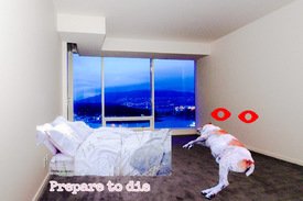
>>121053Anon I'm not even an artist and i broke 100 followers on tumblr doing shitty surreal edits like pic related. Just tag your things like weirdcore, oddcore and dereality because those tags/trends are really blowing up lately
No. 121192
>>121051If you want to render things more realistically, just find a photo for reference on details. Your cow is very cute, but its nose ring doesn't seem to be going through its nose or maybe I am retard
>>121053My friend made an art account for the two of us and she just obsessively follows all sorts of art accounts. We are following 3000 people now but also we are being followed by 1000 people. It's not all dedicated followers I guess and I think we should have let the followers come to us on their own but we have an audience now.
No. 121425
File: 1610096884036.png (270.31 KB, 514x503, completewithmsilyrics.png)
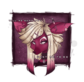
I for one welcome our new glamfur overlords…
No. 121475
>>121425This is absolutely wonderful! I'm one of the main contributors to the glamfur thread, your art is very true and authentic to the style. Great job, and feel free to post more.
>>121471I keep wanting to post mine (it's not nearly as good as that anon's, though) but freelance art is currently my only source of income and I'm also very conscious about my digital footprint and don't want to risk being recognized, lol. I hope any other farmers who've made glamfur art post theirs, though!
No. 121578
File: 1610241975383.png (30.93 KB, 400x500, relatable king.png)

the blue thing is a tramp stamp
No. 121739
File: 1610424415702.png (1.03 MB, 1500x2668, DB260049-36DA-4B6A-A469-7FF9A1…)
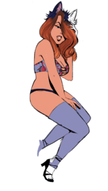
this is a work in progress but I did this in ibis paint
it’s so weird that I can sometimes make decent stuff and then the rest is awful is it because of my gaps of skill?
No. 121866
File: 1610551304290.jpg (1.31 MB, 989x1806, IMG_7794.jpg)
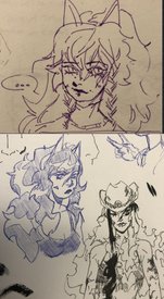
Chronic doodler so no complete pieces , perspective on the hat is so fucked idk how to fix my lack of sense of form (I know studies and practice but it feels like my brain is refusing to understand it). Not asking to be spoonfed obviously but if anyone had the same problem and got over it then tips are very welcome!
No. 121867
>>121578i love this anon
>>121866i really enjoy your style and (please don't take this the wrong way) don't think i'd enjoy it as much if it weren't for that sketchy pen look that it has.
No. 121871
File: 1610553193972.jpg (99.21 KB, 800x800, rappen-rotring-rapidograph-tec…)
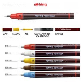
>>121866Reminds me a bit of the doodles I had in my sketchbook ages ago, style-wise!
In general, as basic as the advice can be, but you have to push yourself unfortunately. If you want to stick to traditional mediums, what can help is getting some new supplies that would motivate you more to spend time on your stuff. Something that helped me specifically was rapidograph, the way it works kinda forces you to go slower with your lines and be more precise as it's tip is super small and encourages to draw out all the tiny details you'd otherwise maybe not even think of; just because of that it's kinda harsh to rush with it which results in more polished and finished-looking drawings.
No. 121872
File: 1610553653847.jpeg (1.24 MB, 4096x4096, Koi fish.jpeg)
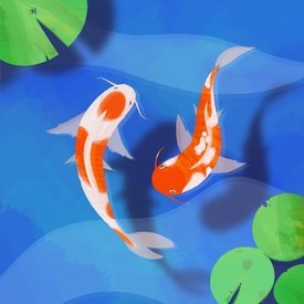
Getting back into it after a long time. Thanks for the feedback. :)
No. 121879
>>121867Aw thank you, also no I completely get it! I end up drawing very differently digitally and it is so unsatisfying because it does lose that sketchiness because I try to render and make it look more put together which ends up looking like ass. So I am still figuring out what I want to do digitally
>>121871Oh I am happy to hear! Sketchbook doodles are peak comf.
Also yeah I definitely should just sit my ass and push through it. I also never seen those pens, I've been using micron ones since the dawn of the times but I feel like the tip is too brittle. I dont know how similar they are but if I find them I will definitely give it a shot if they sell them here, thank you so much!
>>121872I think the fish turned out cute and I agree with anon above with the shadows and composition, I also really like the texturing on the lily pads
No. 124657
File: 1611971771021.jpg (6.95 MB, 4000x3000, MVIMG_20201230_212758.jpg)
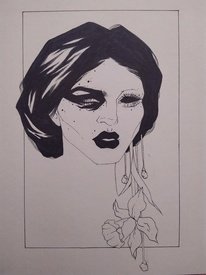
Something I did after a month long break from drawing
No. 125059
File: 1612141107518.jpg (900.05 KB, 1660x1660, img1612140538361.jpg)
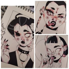
I'm the anon in
>>124657 , thank you all for the feedback! Recently I've been trying out a new art style, what do you guys think?
No. 125981
File: 1612453655075.jpg (294.47 KB, 3000x3508, sweater girl.jpg)
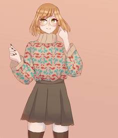
>>119539 >>119398
I did this a few days later and wanted to share it. It's still a little outdated compared to how I draw now.
No. 127195
File: 1613020973581.jpeg (591.65 KB, 3661x1550, download (1) (4).jpeg)

I've been doing some pieces on procreate and trying to find my style but I still struggle so much. All the art I love looks so cohesive, but I can't get mine like that where everything just melts together visually and looks so intentional I've been drawing everyday for hours just trying to practice and learn so I would love some specific critiques
No. 129177
File: 1614063921505.png (441.52 KB, 574x792, kgil.PNG)
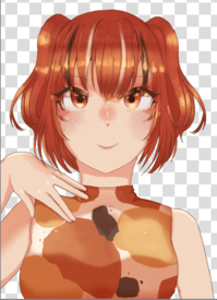
>>127207it's still a WIP but im drawing a koi girl haha
No. 129816
File: 1614432169903.jpeg (2.21 MB, 2893x4092, heartsoutfit1.jpeg)
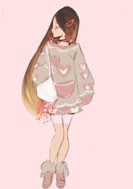
just a quick sketch with color but she looks like ariana grande lol
No. 130098
File: 1614577159173.png (1.09 MB, 1597x1580, aaaaaa.png)
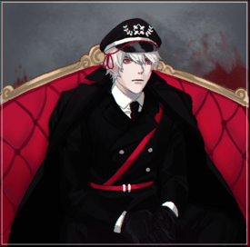
i mostly draw guys.. need to work on drawing girls :T(:T)
No. 130102
>>130101ah right now i'm gonna get a ban for it
sigh its happened to me twice already, god
No. 130276
File: 1614657281656.jpeg (1.13 MB, 1500x2668, 353895AD-2B0B-477A-A9A8-B87C65…)
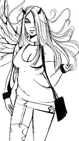
another stupid sketch
No. 130317
File: 1614681126426.png (313.74 KB, 562x1000, Untitled-3.png)
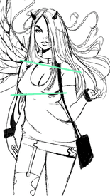
>>130276The face is super pretty, you have very marketable aesthetic going on. To add what other anon's said, be mindful of your angles, her shoulders are leaning down towards right side so boobs should follow a little bit, yet they're in a straight line; waist should be a bit lower too.
No. 130364
File: 1614706728788.jpeg (67.37 KB, 934x684, CDD8F5A1-2975-4E2B-9411-D07DFC…)
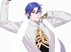
>>130137>>130156>>130199haha he’s not a nazi I just like coloring black clothes and have a preference for white hair! Here’s another piece I did
No. 130518
File: 1614779698256.jpeg (657.81 KB, 750x1334, 4DDA1FDB-2BD1-41BE-882B-9700F8…)
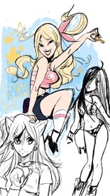
>>130289>>130317thanks anon for the advice
>>130276samefag but i sketched these a week or two ago
No. 130582
File: 1614804341837.png (80.77 KB, 526x713, 7d6a2bb7c7bf5c01084103fd7e488b…)
sorry if hard to see. I don't really do a lot of art anymore because of life woes. But I liked my little sketch I made this week and wanted to share.
No. 130925
File: 1614990577664.jpg (523.26 KB, 1120x1800, my art.jpg)
I'm a weeb
No. 131034
>>130925Is it supposed to be Kanae?
What's with the autism necklace.
No. 131904
File: 1615594049573.jpeg (1.01 MB, 1500x2668, 9F80FC65-E355-4F74-B5BE-0619B2…)
>>130276>>130518>>129816samefag, I just sketch this shit to past time kek
No. 131937
>>131904The left arm is a bit short but other than that, it's really cute! I love how you draw faces and your lineart.
I'd love to see lady gaga in the gucci polka dot dress in your style, she looked so gorgeous in that
No. 131976
File: 1615642945245.png (232.8 KB, 557x1003, kinky david.png)
I wish I wasn't too depressed to get out of bed on most days but I drew this as a joke for a friend. I wanna get back to seriously studying art eventually…
No. 132837
File: 1616177320177.jpeg (683.03 KB, 1500x2668, D8FBB217-C468-4E5A-B817-44FA48…)
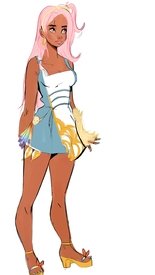
i really enjoy drawing on my phone even though the quality is still shit lol
No. 132849
File: 1616184744260.jpg (4.47 MB, 2669x4032, 20210318_164246.jpg)
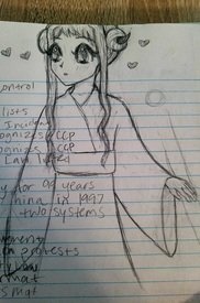
Sorry about the notes. Trying to draw Yashiro. I've been drawing for a few years but my hands are still so shaky, no matter what I do.
No. 132852
>>132837No offence, but her head looks like a squished in doll head; her right eye is placed wrong, but the colors are beautiful.
>>132849Try to draw a long line instead of lots of short ones; for me it's easiest if I draw lightly a few lines first and then draw the correct one a bit darker so I can erase all the other lines, because it's hard to draw a long line correctly from the first try
No. 132918
>>132872There's not much to say tho: it's literally flat colors randomly picked of the bunch.
But maybe I'm wrong, I want to listen to anons who called it beautiful because I may be missing something. This thread is like a pity party.
No. 132929
>>132861>>132918Study a bit instead of talking out of your ass, these colors objectively work together nicely. Blue and warm yellow are complementary, yellow and the dark orange-ish of the skin tone are analogous and again the latter still complements the blue. Light pink works well with the white section and also looks good with the blue and gives a nice summery vibe. The rainbow hints aren't too much either so it's fine.
And flatness is about style, not colors. Just say that they're not your taste.
No. 133242
File: 1616434921677.jpg (470 KB, 1748x2480, classic.jpg)
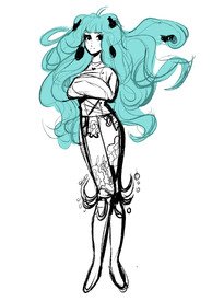
not good at art at all but this bitch looks so weird
No. 134612
File: 1617317401803.jpeg (3.35 MB, 4032x3024, 41BD36F5-6327-4D86-B027-D7052E…)
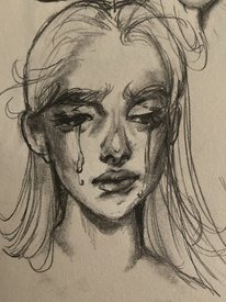
incoming drawfag post
No. 135242
File: 1617639855234.jpg (396.43 KB, 2400x2699, alizee.jpg)
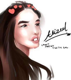
lmao I can't believe I attempted to make fanart for alizee the absolute autism
No. 136114
File: 1617957340070.png (328.92 KB, 415x834, Cap.PNG)
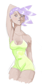
Mindless doodle
No. 136351
File: 1618016920041.png (139.29 KB, 472x671, CD69682E-3B4D-4F34-8066-143393…)
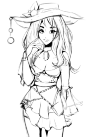
when you’ve been playing too much genshin impact lately holy shit
No. 136355
File: 1618018172984.png (283.85 KB, 900x900, untitled_1.png)
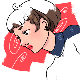
finally decided to contribute
>>136351cute, would be cool to see it in color!
No. 136518
File: 1618096089772.jpeg (2.11 MB, 4032x3024, 8A09D914-AE42-4CC6-B4D7-7539D1…)
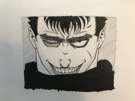
did some fan art the other day in an attempt to shake off some cobwebs. i haven’t inked anything in awhile and it felt good. i’m ready to get back to original art.
No. 137471
File: 1618463463402.jpeg (695.38 KB, 1536x2048, 073B05B0-DFD8-47BF-B804-DBECDE…)
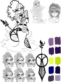
Character design for a friend
No. 137579
File: 1618516696441.png (3.01 MB, 1500x2668, 7811A26F-2087-47AB-A0D5-F16AB5…)
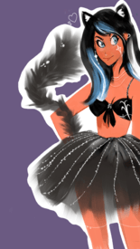
i’m so embarrassed of my art, I feel really afraid of posting it anywhere else but here
No. 137587
>>137579no need to be embarassed, nice job with the silhouette! If you didnt use pure grey but put a litte color tint to it, the color choice would be perfect!
>>137471this is so cool, especially that weapon, is it an arrow? or a staff? the shape is really interesting. I hope you're ok with feedback, because i just want to way it would be even cooler if you moved things around for a cleaner page composition! like maybe smaller color swatches to have a bit more space in the bottom half and moving the sketch and head on the top right a bit down to avoid empty space. But I take it's just a reference for a friend not a portfolio work ofc
No. 137676
File: 1618572949292.jpeg (850.28 KB, 1375x2048, 5F8BFE38-9294-43A7-B468-289FCD…)
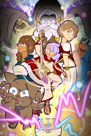
>>137587Aye thanks anon! It’s actually an electric Cello! It’s been a minute since I made a character sheet so I’ll definitely clean up the area! I’ll add the concept poster here too just cause it’s been such a fun project! I should start posting my art online more haha
No. 137680
>>137676Ohhhhh I see it now, I've seen some electric string instrumets have the most bizarre silhouettes so it totally makes sense, I could totally imagine such design exist in real life and it would be so cool!
The poster looks great too, nice clean colors, what kind of project is that, a comic? Looking at characters I imagine it could be an interesting RPG campaign with musician adventurers
No. 137776
File: 1618612981868.jpg (Spoiler Image,1.04 MB, 1920x2560, IMG_20210417_003155.jpg)

Everyone I love looking at your drawings, please don't stop posting them. Also please tell me is his torso too long and are his hands too small and if you can see the leg outline I drew with a pencil, should I move the leg there or leave it me? Thank you
>>137471I think she has a bit too much stuff on her, too many tiny details on accessories, they just distract when you have such nice shapes in the instrument and dress and shoulder things
No. 137785
File: 1618615119692.jpeg (Spoiler Image,208.16 KB, 1200x1719, 156A841A-FEB5-4D2C-98B6-38FB71…)

Spoilers for hentai, but I like to draw hentai when I’m bored, and I’ve been practicing a little bit more poses just because I love the human anatomy sooooo much! With toes though, what do you think I should do for the background girl? I also know the legs look a little funk but once it’s all shaded in it should be better haha. I literally suck at feet but I don’t think this piece is gonna go anywhere!
No. 137861
>>137783Thanks, I made it with oil paints and then with pencil over it. Thanks for mentioning angles, it gave me an idea
>>137785The bottom girl's shoulder looks really weird, like she pushed it forward as high as her jaw, if I were you I would make it a little smaller. About the toes, I think it's good how you made them like she curled them like in a fist (but like on a foot… sorry I don't know how to say it) but her feet overall are too small
>I literally suck at feetHaha
No. 137901
File: 1618670166231.png (5.14 MB, 5021x2367, Sukeban (sombra suave) (retoqu…)
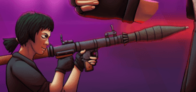
Character design I did. First time I made a full piece with a graphic tablet. This a cropped part from a character sheet(?) looking thing
The profile face looks a bit weird because I rarely do profiles and also I realised I didn't know how to make a strong shadow with the light coming from up (if you have any tips for that that's cool, I probaly should had tried looking up a reference)
No. 137907
File: 1618671747552.png (2.8 MB, 2511x1184, bazooka.png)
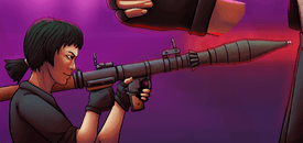
>>137901Hi sorry for butchering your painting in ms paint but from the side an eye looks like a triangle, also there will probably be no light on the lips and chin because the rest of the head casts a shadow over them. Also, the fingers look like gummy worms (no offense). I really like the colors you used and the pose.
No. 137909
File: 1618671987530.jpeg (1.73 MB, 3464x3464, 6AF7DBC4-B9E3-448D-9089-55100E…)
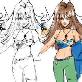
black and colored versions. something about this is really bugging me and I did this on my phone, any suggestions anons?
No. 137910
>>1379091) her shoulders are uneven (my shoulders are uneven too though)
2) I love her top
3) I don't think there's anything else wrong besides the shoulders, it's just that she's wearing her clothes so asymmetrically that makes it look suspicious I think
No. 137913
>>137907tbh I did go really lazy on her hand there
Thank you anon, your change on the cheek shadow was also helpful btw (made me realise I need to figure midtones better)
No. 137935
>>1379161) make sure the neck is horizontally and vertically in the center of the shoulders (assuming the person isn't pushing one shoulder up or something)
2) ????
3) Profit!!!
No. 137943
File: 1618689578804.jpeg (236.46 KB, 2048x2048, D9591A2B-FC70-4C9B-8A4A-CEF0E2…)
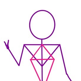
>>137916Because you all have been so incredibly helpful and cool I wanted to leave a little guide for you! When you draw your skeleton, add triangles to give dimension! I sketched a little guide if you needed a visual aide! It’s not the best, but as artists we all be learning everyday
Thank you guys again for being so cool. I really love the art boards here
No. 138723
File: 1619055854052.jpeg (1.06 MB, 1500x2668, DBD20E52-6D1C-4BFE-9AEB-D9809A…)
something I’ve been drawing on and off for a few days kek
No. 138754
>>137909Belly button and the line above it are too low down
>>138723The legs, among other things, are atrocious
No. 138760
>>138723The stylized drawing on the right is very cute! You're pretty good with lines. I personally really like the shape of the legs, though maybe the hand could be posed a little more naturally.
The drawing on the left has a few more issues, the hand and forearm look stiff and weird (does she only have four fingers?), the top of her head may be too big and uneven. Are they drawings of the same girl? The features look different, like the stylized version wouldn't "translate" to the semirealistic one in that way.
No. 139703
File: 1619583393289.jpg (190.06 KB, 1080x1920, FB_IMG_1619582648374.jpg)
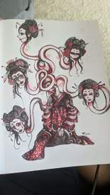
Ahhhh. I've posted this on my personal accounts but for some reason I'm way more nervous posting it here. Getting back into art after years of stagnancy,but really happy with where drawing again is taking me. Trying to focus less on worrying so much about anatomy/realism and going back to my surrealist/cartoon-y comfort zone since worrying about being too cartoon-y really sucked the enjoyment out of art for me, started this sketch in late 2020 and just finished it up last week.
I'm able to do clean line work but long ago one of my art teacher's told me my work looked more interesting when I layered my work and left the under sketching/sight lines/etc visible and I've come to really love the look it gives too.
I'm cool with any criticism, comments…whatever you wanna say about it to me. She started off as a oiran rokurokubi and as I added more and more she's become a bit of a hydra too.
No. 139705
File: 1619583822866.jpeg (102.47 KB, 1011x1920, received_1329723914091795.jpeg)
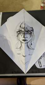
>>139703Same anon with another one of my pieces that started years ago and hasn't been finished. I plan on drawing her palms on the blank sides of the paper, and the backs of her hands/arms on the reverse side of the paper so that when it's folded it looks like she's covering her face then opens to reveal her face and palms.
No. 140898
File: 1620417116561.jpeg (3.5 MB, 3447x2922, 0E2FF293-CF4B-4049-85D6-128219…)
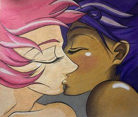
Can I get some critique, please? I’m trying to get back into doing fanart after hardly drawing anything other than the occasional doodle for the last 10 years. This is Utena and Anthy from the Revolutionary Girl Utena movie. I mostly used colored pencils. I’ve always struggled with drawing profiles, so this was definitely a challenge for me. I’m not wholly satisfied with the blush on Anthy’s cheek in particular, how could I make it look better?
No. 140984
>>139703>>139705Late reply, but I really love this kind of drawings done in pen! Especially the Geisha one is impressive. Love how you did all those necks! The other drawing is very cute, love the idea of her showing her face
>>140898The drawing is a good copy of that frame, but I think that the blush could be blended more into her skin. Don't ask me how to do that though. BTW, the shading is super impressive!
No. 140994
File: 1620488656381.gif (1005.26 KB, 500x227, 62e (1).gif)

>>140986Not OP but you made realize the drawing isn't an exact copy of that Utena screencap. It's very similar, so maybe the original is to blame for the hairline issue? IDK
No. 141001
File: 1620494771031.png (Spoiler Image,542.11 KB, 559x823, 1620282094376~2.png)

Totally embarrassed myself by posting this redraw in a cow thread. What do I need to do better? Obviously I'm not going to redraw cows' art anymore because it's arrogant and derailing, but I would still really like some advice on the technical aspects of the drawing.
Spoilered because I don't want people to see it on the front page again.
No. 141023
>>141014>art style is not an excuseFor your original work no, but if you want to copy someone's artwork, that's different IMHO. The whole point is for your picture to look as close to the original as possible (unless you are doing the one exercise in which you improve upon the original, but I guess this wasn't OP's intent)
>especially when original anime shot didn't include that broken shoulderValid take, I thought you were focusing on the faces and lips with your previous comment, and this part is fairly well copied
No. 141046
>>140984>>140986>>140994>>141000>>141004>>141014>>141023>>141043I'm
>>140898 and thank you so much for the feedback, I honestly appreciate it a lot. I definitely do want to take some figure drawing classes at some point. I mostly just redraw anime screenshots for now and I'm always torn between a desire to copy as close to the original as possible or to put my own spin on things. I just draw things for fun, I'm not attempting to be a professional artist or anything.
No. 141049
File: 1620535957041.png (583.3 KB, 1700x1788, image0.png)
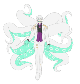
I'm looking for critique more design wise. I feel like something's kind of off? Or maybe too plain? Not sure where to place it…(the shoes have no laces because I tend to paint those in later)
If anyone has any suggestions lmk would appreciate it
No. 141342
File: 1620745314380.jpeg (3.55 MB, 2800x3850, 36C20B11-A1C1-4CA0-BC8D-91ABEC…)
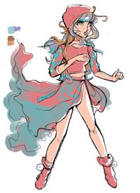
how do I make my lineart look a lot more smooth anons?
No. 141346
File: 1620747676259.jpg (21.65 KB, 297x239, unipig.jpg)
i drew this
No. 141366
File: 1620756669468.jpg (1.26 MB, 1988x1538, InkedIMG_20210511_0001-1_LI.jp…)
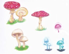
I'm getting into colored pencils for the first time and I love them! Any thoughts on my shroomies?
No. 148882
File: 1624018326965.jpeg (Spoiler Image,172.65 KB, 450x640, DA5E863C-7108-43F1-AD80-041133…)

Hey guys I’m trying to incorporate little gore on my art. I noticed that there’s no difference in the way I drew guts and brain so I’m wondering if you guys have any tips regarding that or anything else.
No. 148931
>>148929You can’t use emojis,
nonnie, It’s better if you delete this post before you get banned.
No. 149008
File: 1624073490170.png (36.64 KB, 383x677, Gelatina.png)
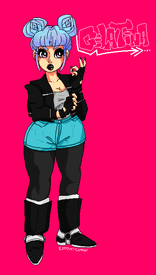
xenoverse has me perpetually in OC hell
No. 149263
File: 1624259556146.png (Spoiler Image,1.92 MB, 4800x6000, chrisredfieldwithaboobwindowow…)

>>149024thanks anon, i have also do non-pixel stuff which is also SIGNIFICANTLY newer and out of my comfort-zone (yes it is also fujoshi pandering lmao)
No. 149413
File: 1624373423087.png (2.03 MB, 1500x2668, 7EE558A2-2A16-4E25-A645-BBC12E…)
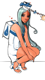
I love the way that this looks i’ve improved a lot
No. 149416
>>149413I love this,
nonnie!
No. 149424
File: 1624377785162.jpeg (126.14 KB, 750x1008, 0D6AF4A9-4D7B-43DF-BB1D-96BB25…)
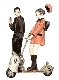
>>149414thanks anon i was really inspired by picrel artwork. he definitely doesn’t draw shoujo but i also like the way peach girl looks as well
>>149416thank you
No. 149764
File: 1624582328267.png (437.34 KB, 743x778, vamapple.png)
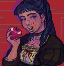
finished this for lolcow only
No. 149864
File: 1624631775377.png (2.59 MB, 1500x2668, 56680B5D-1371-4CD0-AE78-512265…)
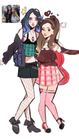
if you see this, you’ll get it
No. 149884
File: 1624640861466.jpg (527.18 KB, 2048x2048, image3A3462_chroma.jpg)
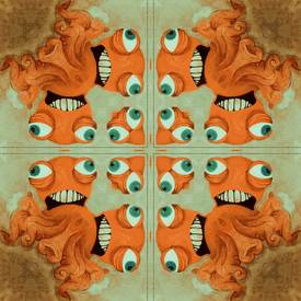
My art style is very different than what I typically see being discussed on lolcow so I'm very curious to know what ya'll think
No. 149912
>>149906You have no idea how much of a compliment that is to me! I'm only a hobbyist though, so I don't have an online portfolio and it would probably be a bad idea to post my social media on here.
>>149887>>149893Thank you so much!!
No. 149941
>>149912I wish I could so some kind of art trade with you, if you wanna talk my discord is
cockichi#9543 yes I'm risking the ban
No. 150077
File: 1624759678680.jpg (5.54 MB, 4800x6000, WIPleonkennedybutwithaboobwind…)
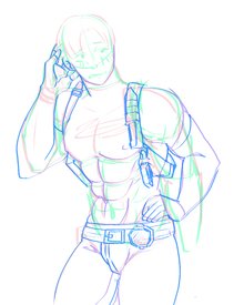
>>149294gotcha fam (it's a WIP)
No. 150082
File: 1624761813851.png (165.83 KB, 757x551, FireAlpaca_HTtE4xOqaI2.png)
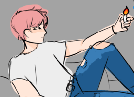
i havent drawn much lately but i saw this thread so.. its unfinished but at this rate it might as well be done
No. 150089
>>150082The face proportions aren't bad, and over as a preliminary sketch it's pretty good.
with some clean lineart and love this can turn out realy well.
No. 150100
File: 1624771684558.jpg (37.94 KB, 513x447, pxlart.JPG)
ive been trying out pixel art, do you think anyone would pay for something custom like this and if so how much?
No. 150148
>>150091there always has to be one bitch who thinks they are so clever
>>150082>>150093people are discouraging here because if you don’t produce the fucking The Last Supper in your first try or if you don’t draw things that are intended to be “finished products” then they assume you should quit and that you shouldn’t even try. the proportions aren’t that bad, but I think one of the real culprits here is that there is no line variation or difference of line weight and also it just needs a lot more detail and refinement because as you said it’s unfinished. stop responding to bait like that, they themselves probably can’t even draw and it’s LC, draw whatever the fuck you want and only share your art with people who will fairly critique you. they aren’t concerned about you wanting you to be “so much better” anon, just do more figure studies
No. 150157
>>150148yikes
nonny, you sound like you received a harsh critique on here once and haven’t recovered from the trauma lol. Anon themselves
>>150093 had a good attitude about it, so your sperging is excessive and embarrassing
> stop responding to bait like that, they themselves probably can’t even drawhow was that critique “bait”? It was all accurate criticisms, just couched in humor. Also nice cope at the end there kek
>it’s LC draw whatever the fuck you want and only share your art with people who will fairly critique youNonny it sounds like your definition of “fair critique” is 2 genuine criticisms peppered into a paragraph of ass kissing. People who genuinely care about getting better want you to cut the fluff and tell them what the issues are. And you’re right, draw whatever the fuck you want, there are no rules! But if you post it in the RATE MY ART thread, you’re going to receive criticism as a matter of course.
>>if you don’t produce the fucking The Last Supper in your first try then they assume you should quit and that you shouldn’t even tryanon it’s painful how much you’re projecting here. Nowhere in the critique was there anything telling the anon to “quit and not even try”. It was literally just points of critique. If just reading that secondhand gives you these feelings, perhaps seek a therapist or find a new hobby where people will coddle you more since you clearly can’t handle criticism.
No. 150166
>>150165kek anyways
>>150082drawing is heccin cute and adorable in a beginner kind of way! keep going anon!
No. 150179
>>150162>accusing anyone who says the word “yikes” of being a newfagyou’re either a self-conscious newfag yourself or too much of a stuckup oldfag to recognize that the word yikes is a better alternative to saying things like “sheesh” or “phew-wee” like a scandalized youth pastor
>>150175>bullying works, you knowKEK
No. 150190
File: 1624817506308.jpeg (75.69 KB, 750x922, 7E2FD16F-B392-437D-A5E1-AF2BED…)

>>150175>>150179>>150173>>150172I can just imagine what you people are like IRL
No. 150203
>>149864I'd say that from the waist up they both look very good, maybe be careful because one of ariana's eyes is too small compared to the other and her shoulder seems nonexistent (and her arm looks too skinny and undefined). The legs definitely need work, they're flat and look like they're facing the side because there's no perspective. The blue haired girl's left leg is bent backwards (I get what you were going for, but it's too much) and the other girl's don't properly connect to her waist but seem to be drifting right too much. You also may need to work on hands and feet.
>>150082Yeah, this needs work. Everything's too stiff and the limbs look too much like tubes instead of having the natural curves. There should be some kind of folds near the waist and armpits on the shirt. Is he leaning against something? Is his arm resting on the knee? It looks like there's not enough weight to anything. His neck and shoulder area go up too straight for that pose.
No. 150204
File: 1624823182825.png (310.25 KB, 1080x1920, Untitled27.png)
ANYWAY i also draw on my phone sometimes
No. 150207
>>150190Damn it’s twitter meme after twitter memes. Hang all newfags.
>>150204Cute vibrant colors and clean lines. Left leg is broken. It looks like it starts from the same place as the right leg and not from under left hip.
Stick the right arm elbow out more. Right now it looks like the right upper arm is tucked close to the body but the forearm is reaching across the torso toward the camera rather unnaturally.
No. 150747
File: 1625177834992.png (1.68 MB, 3386x3732, 8AA538EA-62CB-44F6-AA38-3C6DC1…)
I like drawing stuff like this, but I’ve always been too nervous to post online
I want her to look slightly dead/sick
No. 151034
File: 1625377590513.png (2.03 MB, 3040x3831, 75FD34A7-23CD-4266-8407-11B3C6…)
>>151028While I’m here, I wanted to drop the first drawing I did like this - it's a little harsh, which was fun because trying to draw everything nicely can get so boring and stressful. The face is definitely… gritty, but I think that’s why I like it
No. 151111
File: 1625428081680.png (98.07 KB, 500x700, sketch1551381535592.png)
more phone art, it's animal crossing oc
No. 151113
>>151034>>150747It's super cool but the faces look like you're holding back the strangeness, don't fear, make them explode with crazy
>>151111Wow very nice lines
No. 151122
>>151044>>151045Happy to hear it! Unfortunately I don't have an instagram yet, which is why I posted them here - but when I make one soon, I'll post these drawings so you can reverse image search them and find me
thankyouthankyouthankyou>>151113And I will definitely work on the crazy, lol
No. 151146
File: 1625446726830.jpeg (366.01 KB, 2360x1640, F1373CB1-0AC6-4411-930E-427CEC…)
This turned out not that good imo but I’m trying to get better at procreate
No. 151160
File: 1625452976626.jpeg (675.65 KB, 1500x2668, FC345093-60AE-4934-A65B-F88986…)

something I doodled a day ago because I had no internet, wasn’t made in may I was really bored lol
No. 151201
>>151197draw my oc kek
>>151196I know, she’s supposed to have fugly color combinations she’s not an appealing monster
No. 151287
>>102700>>151045>>150747>>151122Okay maybe I'm just dumb but I tried reverse image searching my own drawing and it doesn't show my instagram page, so here it is for anyone interested
instagram.com/goldchatte and thank you so much if you are
No. 151289
File: 1625526040557.png (1.48 MB, 1500x1500, received_1340771089448525.png)
I was playing with the symmetry tool, is it dumb??
No. 151403
File: 1625594147098.png (424.83 KB, 924x1294, my finger hurt.png)
>>102700a sketch i colored.
not related but i wanna get better at anatomy but i have no idea where to start. what are some good resources?
No. 151416
>>151403This is really cute anon!
As for anatomy, it depends on what you're looking to learn. For dynamic poses you definitely want to pause a video (scenes from an action movie for example and redraw frames from that rather than just using a still photo, which will end up being too stiff. As for just basic anatomy practice, there's plenty of books out there for that. I even used to use references from pictures in my high school bio textbook and it was honestly pretty helpful.
No. 151448
File: 1625633452597.png (2.78 MB, 1668x2224, D1F495F6-ACDD-45FB-89E3-EC39B9…)
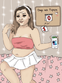
i like to draw shaynus i wish we had a cow fanart thread
No. 151536
File: 1625689902260.jpg (Spoiler Image,1.02 MB, 1591x2348, IMG_20210707_222511.jpg)

Hi anons sorry for terrible photo quality, do you think I should make the thing glow white or yellow? I think yellow doesn't fit somehow but with the white it looks so sterile. Maybe it would look nice completely red but red lights on everything else wouldn't look good. Also do you have any tips for painting waves because I don't know what I'm doing besides making tiny triangles
>>151448How did you make such a perfect likeness of her face, amazing
No. 151569
File: 1625720913704.jpg (1.06 MB, 1386x1096, akjfdslkfkf.jpg)
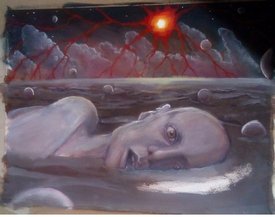
>>151536the clear answer here is it needs to be both. Make the yellow brighter by putting a bit of white in the middle, that will make it match the red vein thing it's in and give it some depth. The reason why your white version looks fucked is because going directly from white to red leaves dull pink in the middle. if you do a yellow light make sure to add in some yellow reflection tones in the water. This is what i'd do, picrel
No. 151600
File: 1625751130267.png (1.22 MB, 1500x2668, 0E41296F-324B-4217-ACBF-01B024…)
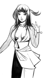
did this on my phone
No. 151603
>>151600Looks cute! Do you usually draw digitally or traditionally?
Some tips: maybe work on your anatomy a bit, it's just little details but the pinky on that hand looks broken and the collarbones (if those are collarbones?) should be higher up than that. Her stance is also a bit unbalanced and makes it look like she might topple over, changing the angle of the legs and/or having the hips line up with the shoulders a bit more would help.
No. 151607
>>151600This makes me a bit confused as her shoulders are positioned straight on but her body is left facing. The left boob can be turned left a lil as well as rn I assume her nipples are pointing in diff directions. Lots of potential overall anon.
>>151606If youtube videos aren't helpful, maybe try subbing to a digital artist who offers step by step guide of their pieces with the software you want to use.
No. 151657
>>151645lmao why did you get so
triggered by a mild complaint
bc I didn't asspat you for your art too?
No. 151908
File: 1625979998099.png (164.69 KB, 576x659, Capture.PNG)
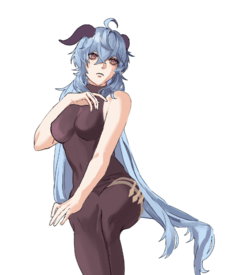
a commission ive been working on for a friend.. i dont draw girls all that much tbh
No. 151955
>>151936Oh thanks for the observation! Will work on the arms more
>>151921Thank you! Only recently did I start trying to work on how I shade hair
No. 151999
File: 1626070441495.png (552.58 KB, 1129x895, unknown.png)
hi anons! im trying to draw in a more painterly but anime style and this is obviously just a sketch but i have no idea how to paint at all since i usually draw cell-shade anime & trying to get out my comfort zone. does anyone know any youtubers that have good digital painting tutorials or something?
No. 152043
>>151999one thing ive learned is treating hair as sections. especially when it comes to anime type styles.
if you look at splash art for games like LoL, youll notice they render hair in big chunks as opoosed to tinier sections
No. 152100
File: 1626169596037.png (360.38 KB, 615x835, blah blah blah.png)
>>152092honestly my first post was kind of just experimenting and it was rushed so i didnt care about it so ur right about that part haha, also i didnt add a light source since i kind of just learned about lighting last night.(pic related is what i drew last night) im also working on a new drawing with this similar style so i'll post that when im done too! also thank you for the critiques, i tend to mess up facial anatomy even when im taking my time lol + add detail in too much area and leave other areas messy
No. 152103
File: 1626170358592.png (655.48 KB, 1022x930, received_945477445850675-2.png)
What do you think of my alien kitty nonnies? Be honest if you think something is wack about it
No. 152219
>>152100Hold on. You only just learned about lighting last night and yet you did that piece of art? Not only that, but, comparing both pics to each other, your brushwork became a lot cleaner, you're now painting eyebrows behind hair, your facial anatomy is suddenly way better (the ear, for example, isn't too low as it is on the first pic), and your colors aren't as muddy and streaky in the hair as they were before?
Post a screencap of this pic in whatever program you drew it in. Let's see the layers. I don't buy it for a second.
No. 152248
File: 1626246079125.png (446.17 KB, 1425x927, Screenshot 2021-07-14 015933.p…)
>>152219well if u want to see my layers then sure!
i also used a reference for this so the anatomy looks better lol + spent more time on it
>>152244woah you find me! impressive detective work anon. just dont look at my old art its a little embarassing LOL
No. 152249
File: 1626246668478.png (510.96 KB, 1283x827, benis.png)
>>152219>>152248heres the ref i used as well, also sorry for shitting up the thread so much!
No. 152277
File: 1626267990483.jpg (1.96 MB, 3000x4242, C__Data_Users_DefApps_AppData_…)
>>152248The light makes no sense, on her hair it is coming directly from above, on the sides of her hair it's coming from left and right, on her face it's coming from left and behind her, on her forehead there are two inexplicable lines of light, on her body there is no light and on her clothing light is coming from the left side. Pick a direction beforehand and stick to it. I find this image helpful, you might too. The cool and warm colors look very pretty together.
No. 152290
File: 1626277235819.png (3.55 MB, 3000x3000, bhjb2j.png)
>>102700nonnies im at a loss. I desperately want to get better at art but i can't seem to find my own mistakes, i guess my mental library lacks shit. Be as harsh as you want. Ignore the random % scribbles, this is just an alt of a drawing where i changed the background colour and shat on some light
No. 152350
File: 1626306668080.jpg (5.86 MB, 4096x4096, lc.jpg)
Hi, the first art style is my usual one but recently I am trying to do something a bit more anime because I am broke and have intentions of opening commissions or adopts.Anime seems to be more popular and idk what it is, but something seems a bit off to me.
Also, I don't have social media presence at all so I have no idea where to start either, any help/criticism is appreciated
No. 152351
>>152350anon i like anime myself but i have to be honest and say that your anime drawing such a downgrade from your normal style. like it’s cute and all but your normal style looks great, you obviously have a good understanding of lighting and it just looks so much more striking imo compared to the right one.
obviously do whatever you want but it sounds like you’re trying to change yourself for the sole purpose of appealing to a market, but you should realize that there is a good market for semi-realism as well.
if you want to make yourself seem more “marketable” you could start drawing fanart of popular characters from shows/animes/whatever, that helped me get seen personally.
No. 152362
File: 1626323738765.png (1.91 MB, 1500x2668, FE2C615C-81C5-4498-B296-499182…)
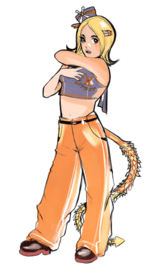
drew this dumb bitch a few weeks ago i don’t remember
No. 152387
>>152367yeah I know, but she still looks cute though so I don’t care
>>152372good
No. 153887
File: 1627469740519.png (1.76 MB, 3275x4096, received_569864753771545.png)
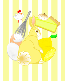
What do you guys think of this? There's something about it that bugs me, idk. I know you are you own worst critic but I'm so unsatisfied with this. Is it the composition? Is it the fact that it's a vector so it looks like…stiff or artificial?
No. 153897
>>153887I think it looks good, it reminds me of flash games about cooking! The shapes and lines are nice as well. I think the bunny is cute, its color and the meringue tail are cute ideas and make sense to me.
The chicken is a little confusing though, it's very cartoonish compared to everything else and just seems out of place. Its color is also very different from all other elements which makes it seem even more off. The colors in general are a little bad. They are too similar to each other and the background, it all melts together. The color of the lemon is way too saturated compared to the rest, especially its green leaf. Also personal preference, but I think going for a warmer yellow compared to the background might work or at least making sure that the background is clearly separated colorwise (either by changing it or outlining the different parts or putting any shape or decorative element between the background and the illustrations).
Your composition is fine, I don't think it's stiff or artificial at all. Right now everything is arranged in a square shape, maybe a circle would feel less stiff to you? Like moving the bunny down a little and leaving more space between things? Maybe even adding some decor like stars or such, but that might turn it kitschy and I don't think it's what you were really going for, it's just something to tie a composition and make a picture look less empty.
Sorry for the rambling, it's just what I noticed and would change personally, I'm not very good at giving helpful critiques kek
No. 153941
>>153903The line weight of the bunny was more to kind of separate from the background elements but I am for sure going to take that into consideration
>>153897Thank you for such a detailed response, this is actually really helpful!! I'm going to make some changes when I get the chance and maybe post a little update
>>153892Yeah you're right, it feels really flat, thank you for the advice!
>>153902U kno it bby
Thank you nonitas!
No. 154190
File: 1627626715976.jpeg (175.58 KB, 479x477, 44C582EF-8C56-481B-B085-AB8457…)
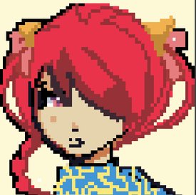
pixel art apps are always fun to use
No. 154255
File: 1627677014419.png (474.64 KB, 688x1182, wolfgang-new.png)
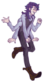
Sorry, I'm a filthy OC-let…
>>154190cute! what's the app?
No. 154303
File: 1627712210850.png (874.34 KB, 1162x1423, 6BD99F41-B5C0-4BC2-AE38-2215B0…)
Allow me to post a life drawing sketch
But more importantly… how should I use hashtags for posting art? I’m not on social media otherwise so I don’t know how to best utilize them. Pls help me
No. 154312
File: 1627721426169.jpg (668.46 KB, 2236x2868, CamScanner 08-25-2020 23.06.54…)
go rate me girlies
No. 154332
>>154303Tbh the upper body and lower body look like they come from pictures with pretty different perspectives and pose. I have trouble understanding whether she’s sitting or floating in thin air or even what angle is this from. How come you can draw feet like that but hands like that? Right leg is too high up on the torso and foreshortening is off so it looks like it’s growing out of her back. Left leg is fucking with my mind.
>>154312You have a pretty cool thing going. Her neck is long long and head too big. The face will not be at 3/4 from back view. Most people have trouble turning their head 90 degree into the shoulder. Part of the jawline would be behind or next to the shoulder at this point. Consider reducing hair details to make the character more readable.
>>154255Lovely OC. Your hand gestures are very nice. Clean lines and colors too. I don’t have anything to say except my personal preference would be spacing the sets of arms out more.
No. 155513
File: 1628650773181.jpg (176.98 KB, 833x1000, shindanmaker succubus doodle.j…)
A doodle based off a shindanmaker prompt (which included monster hands) where I tried hatching and drawing without sketching but couldn't really figure it out.
No. 155523
File: 1628657482661.jpeg (121.47 KB, 1080x1080, Euopb7xXEAQhe6k.jpeg)
>>155513wow, I hope your artistic vision goes beyond anime tiddy someday, I would normally scroll right past this subject matter but had to stop and look at this…your abilities are the foundation of something special.
No. 155524
>>155513Overall really good anon, love the details in the clothing, hair and horns. You could benefit from studying fabric folds a bit more because the right arm's sleeve looks a bit off since the arm is fully extended and there are folds where her elbow is.
The pose is kinda stiff & unnatural and I know she has monster hands but the way she is holding the staff is very awkward plus it looks as if she is wearing big gloves (reminds me of some chrono cross characters)
There are a lot of details and nice shading throughout except for the face and the staff, which look out of place to me. Composition wise, I think the picture is cut in a weird place, you could zoom in a bit more or zoom out, but cutting right at her fingers is not the best choice.
Lastly,her expression is confusing, why does she look so concerned?
Despite all of this, I think you are really good!
No. 155527
File: 1628661238066.png (5.01 MB, 1547x2147, boo.png)
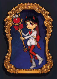
I'm still only at around 300 followers on instagram. I used to think my art was good but I've really internalized that whole numbers means how good you are/ what a marketing genius you are. I feel so lowly, slow and steady I guess.
No. 155530
File: 1628664854129.jpg (71.74 KB, 550x425, www.jpg)
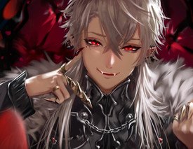
>>155519>>155523>>155524Usually I don't draw anime tiddy, this is the exception to the rule…
Thank you for the critique, I know there's a bunch of issues and most of them are because I didn't sketch it out / start drawing with a plan.
This is closer to my usual subject matter, but my style is all over the place.
>>155529Easiest way to get a feel for it is to copy other people's chibis, although it's hard to add shading to anime.
The direct lighting with unsaturated dark shadows also makes it feel a bit uncanny because the subject matter is supposed to be cute but the way it's presented doesn't match, although that could be on purpose.
It's mostly the face that makes it look weird as the other person said. Nendoroid mouths aren't as high and they have a slight nose.
Instagram doesn't mean much, don't worry about it. I abandoned my own account a year ago.
No. 155534
>>155532Awe thank you anon that was really sweet and kind of you to say. Definitely gave me a little pep in my step today.
>>155530Love the eyes
And thank you for the input as well. Ohh wow might be off topic and if you don't mind me asking how else are you working on exposure or do you not care? I would like to make this a career but everyday kind of seems like a farther and farther away dream.
No. 155603
>>155530I was going to say that skipping the sketching part sounds very challenging. You have a really nice style and your characters look intriguing anon!
>>155527I feel you, it is hard to promote your art on social media but don't worry, definitely doesn't mean your art is bad. You have to learn to separate those things because it will make you miserable and in some way kill your creativity (like you will try to just do things you think people want to see)
Selling and promoting yourself is another set of skills that you need to work on in order to get yourself known.
For insta, I think engaging with your audience will help a lot and maybe try different hashtags, do some challenges like "draw this in your style" or any others like that just to get you started.
Other options could be doing fanarts, joining groups/discords and even using other sites like Twitter,deviantart,artstation,fb and tik tok. I know amazing professional artists that don't really have social media presence at all besides their artstation and portfolio so don't beat yourself over it too hard.
Now, several anons pointed out that the rendering style doesn't go with the cuteness of the character but there might be a way of making it work if you draw the nose (even if it is a chibi) and maybe change the facial structure a bit.
Your work reminds me of the cute stuff of Svetlana Tigai (tsvetka.art) I think having a well shaded chibi can definitely work, just keep experimenting with the features because it shows that you have a really good grasp on colors and design. The frame looks so nice
No. 155990
File: 1629054876701.jpg (1.68 MB, 1691x2129, IMG_20210815_210449.jpg)
I got this bat for the scout in team fortress that when you miss you hit yourself, so I kept missing on purpose to hear him cry in pain (it's good) and it made me think and that thread of hurt people keeps getting posted in and I wanted to post there but I was afraid they would boo me for not understanding the spirit or being ugly so I post here
No. 156007
File: 1629066113376.jpg (682.5 KB, 1797x2336, IMG_20210816_002005_191.jpg)
>>155998Okay, sorry I was out of inspiration so it isn't as cute, maybe some other day. Also sorry I have a horrible camera and it's night
No. 156026
>>156007>>155990Básèd. Post more hurt bois when the inspiration calls
nonnie.
No. 156418
File: 1629258093662.png (443.93 KB, 495x594, Screenshot from 2021-08-14 15-…)
made this using coloured pencils.I'm still learning so any tips would be appreciated
No. 156422
File: 1629260042886.jpeg (709.41 KB, 2480x3508, FAB92F34-0257-4A8E-9973-F973AF…)
I deleted this but should I attempt to make this into a picrew or meiker.i?
>>156418nonny this looks good but why did you leave the watermark in there? you don’t want people harassing you
No. 156431
>>156422oh i didnt notice that
how do i remove it?
No. 156548
>>156422that looks pretty nice anon, just a couple suggestions.
The fingernails on the right (our right) arm make a tangent with the top of the purse, it makes it difficult to tell whether the purse is in front of the hand or behind it. You may want to make the fingernails overlap the bag, or bring the purse further away from the body so it's not touching anything.
The other arm and especially the hand is in a bit of an awkward position. If you repositioned it, like made the arm bent and her hand on her hip, it could flow better with the rest of the pose and would make more sense with her leaning stance. You may want to practice drawing hands when they're at rest beside the body, I've seen many people fall back on drawing a clenched fist when they don't know how to draw a relaxed hand.
The foot behind the front foot doesn't make much sense. It's hard to tell whether it's facing backwards or forwards. Remember the structure of the shoe, because it looks like all she's wearing on that foot is a sock. You probably could redo the whole back foot to make it better, and if you do, draw the
entire foot, regardless of what is covered by the front shoe. Then erase the unseen parts after.
I like the way you've drawn the face and the top, the image has a lot of potential.
No. 157181
File: 1629684661539.jpeg (1.5 MB, 2480x3508, CA22B8F1-07C6-4636-9531-C8A3B3…)
I can’t believe I was so fixated on making an inspired design of her this was fun as hell
No. 157182
>>157181That's very cute
nonny. Def better than the original.
No. 157279
File: 1629741428688.jpg (83.86 KB, 623x856, 20210823_205024.jpg)
Hey anons.
Glad to see my thread is still getting attention. I wanted to ask something to you all.
I took a loong break after the drawing below.
>>102714I know i somehow manage to regress (even tho i was pretty bad to start with). But can some of you give advice on how to use colored pencils? I will add another version of the same drawing. Tell me which one you prefer please ♡ thanks everyone. Sorry for the long post
No. 157280
File: 1629741556039.jpg (78.13 KB, 606x934, 20210823_205035.jpg)
Samefag. My camera quality kinda sucks. Sorry.
How do i use colored pencils woth more confidence? I either use them too lightly to the point that everything is extremely faded - or i color in the hand like a child, with harsh limes and no room for highlights
No. 157284
>>157279>>157280Hey anon! The first one is the better one because of the readability of the darker lineart.
For coloring with color pencils, you should have the fundamentals of coloring in general. Like lighting, values and such. I'd recommend Marco Bucci's videos and James Gurney's Color and Lighting book (also his videos)
You can also learn by watching other artists that heavily use it. I'd recommend this one, I really like her art style but of course you can look up some other artists that cater to your tastes better.
Good luck! I love coloring with pencils, it's very relaxing and forgiving.
No. 157285
>>157279Ouch that makes my hand hurt. Okay the fingers look a little weird. The middle finger especially, the second bone of the finger, starting from the fingertip, looks very short. Try posing your hand like this and taking a photo to see how it would look. Also if I were you, I would move the pinky finger so it doesn't overlap with the other finger, I think that would look less confusing. I don't know much about colored pencils, but you should try using more different colors and pressing lightly to make more new colors. For example putting pink and orange on most of the hand and brown where shadows would be, and red on some parts (when I look at my hand, my fingers and the wrinkles look more red than the rest), and maybe slightly erase parts which are the shiniest. I don't think you regressed from your last post, I think you did very well.
No. 157288
>>157285>>157284Thank you both. I didnt realize the finger overlapping was confusing but now that i look at it, it does look awkward.
Also thank you for coloring recommendations. I will watch the video.
No. 157290
File: 1629745943519.jpg (816.78 KB, 1584x2040, that freakin pyros a medic.jpg)
Hi, I made another beat up scout, but something is really messed up about his head shape I think, but I can't tell what, what do you think?
No. 157294
File: 1629747601902.jpg (1.25 MB, 1584x2424, IMG_20210823_203532.jpg)

>>157291Okay, I will; thank you very much. I just got an amazing idea, I'm gonna draw him in a pool full of candy! Here is one more
No. 157346
File: 1629779880451.png (481.44 KB, 416x565, Screenshot from 2021-08-24 10-…)
This was my first time drawing a realistic portrait. Can anyone give me tips on drawing hair?
No. 157364
File: 1629798260023.jpg (51.15 KB, 800x300, howtodrawhair.jpg)
>>157346Very cool. When drawing hair for me it is the easiest to imagine the hair as lots of clumps (like sims 4 hair), and then imagine how the light falls on those clumps, and then draw in hairs so it looks like hair. I think this image illustrates it well. Did you draw this with oil pastels? The colors are so wonderful
>>157358>>157295>>157352Thank you everyone, your responses make me so happy. I'm gonna draw more medic, I like to draw lots of shadows and his face looks great with lots of shadows. I'm just not sure if I should keep posting here even if I don't have questions about how to proceed with my drawing, but I don't know where else I would post - I would post in the "cuties with an ouchie" or whatever thread but what if not every drawing fits that thread. I know this is not my personal blog to post my drawings but I don't want to post my drawings on a blog, I want to share them with only my farmers. And isn't posting new original content more valuable to imageboards than reposting already seen content? Why do I feel like an attention whore then? I'm sorry about the blogpost; in conclusion I will post in the "cuties with an ouchie" thread in the future if applicable
No. 157372
>>157364Nah you're thinking about it too much. Your work is wanted so keep posting here anon. This thread is slow anyway, only nerds care about spamming in /m/.
I'll wk you if a bitch calls you an attention whore. Lc absolutely can use a lot more original content. It's easy enough to pick out the ones posting in bad faith.
No. 157377
File: 1629809572335.jpg (1.22 MB, 3696x3696, RDT_20190807_09342187810103621…)
Watercolor is really hard. I don't really feel like I'm doing so well with it, I think I'm too impatient to let layers dry in between or to build up color a layer at a time instead of just taking too much pigment from the pan. I feel like my work comes off looking sloppy, then I feel sad I ruined a drawing I liked.
No. 157446
File: 1629825002641.jpg (6.42 MB, 4096x7281, CollageMaker_20210825_02045320…)
Welp i know ive got a bunch to improve on, what do you suggest as the first step?
No. 157510
File: 1629858146477.png (1.01 MB, 1000x1214, lolcowmybeloved.png)
ah fuck it lets post
these are all fairly recent, im really bad at finishing pictures and tidying stuff up (none of these are really 'finished') and a lot of the time idc much about doing these things. my fundamentals are still bad but i love using colour a lot
No. 157625
File: 1629944380110.png (1.29 MB, 1242x2208, C9EB6176-1E28-47E7-AF16-9FA900…)
Hey, I got roasted on webtoon general a few months ago and I worked hard on improving.
I drew this oc on my phone in ibis paint.
No. 157633
>>157630>>157632I wouldnt say I was scarred.. I only put the pronouns to say she was a girl, idk everyone does it
And thanks I’ll take the anatomy advice!
I’m also 20 years old and saving up for an ipad
No. 157636
>>157635I just said I was 20..
do y’all need a birth certificate or something, I thought this was an anon board
No. 157640
File: 1629947388750.jpeg (3.07 MB, 4032x3024, BDB44D4E-2C13-4535-BF6B-F746CB…)
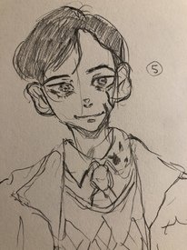
Drew Number 5 from The Umbrella Academy
No. 157663
>>157659Kek NTA but damn you bitches are mean. They're obviously a minor, calm down crankypants.
>>157625Cute drawing. I'd recommend you study anatomy more cause the arms and hips look a little wonky, but it's still cute. Try practicing drawing lines confidently and making your drawings more symmetrical.
No. 157667
>>157663Thank you for the actual advice anon. I’ll make sure to use it and work a bit harder.
Don’t know why everyone is being harsh only to me, it’s a bit discouraging. I used to draw when I was 15 but stopped for five years, obviously i’m gonna suck. I didn’t think my art was the most juvenile in this thread though. Anyways, thanks.
No. 157683
File: 1629972764554.jpeg (293.28 KB, 1421x1786, received_2494484897466115.jpeg)
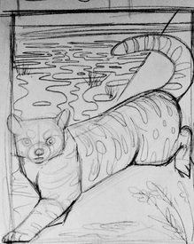
What do you guys think of this composition of this sketch? I want him to kind of like, fit into the frame, so his back paw will be against the right side and his front paw will be again the bottom left corner.
He's an Andean mountain cat, the shapes in the left background are bofedal wetlands and the diagonal cut on the right is going to be a mountain (cause like the name suggests he lives in the Andes). I feel like maybe his back leg looks kind of awkward and maybe when I paint the mountain I could have it resting on a foot hold? Or does this look okay the way it is?
No. 157688
File: 1629976721469.jpg (69.96 KB, 396x800, d0e58243bd02b1a1c206923c13951e…)

>>157683Why don't you pose him more like those chinese tiger paintings? Seeing that the framing is vertical rectangle. Right now he looks like he's being forced to fit the sides and it makes his torso rigid. Using the entire diagonal length of the space will give you room to articulate him more.
No. 157697
>>157640Cute very cute
>>157683Yeah it looks amazing but I think it would be perfect if his spine was curved, I hope you post again when you worked on it
No. 157844
File: 1630057955795.jpg (52.11 KB, 1080x804, tumblr_e870fc5c19d1e760d92cb55…)
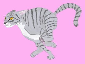
How is my cat?
No. 157870
File: 1630080679836.jpg (55.12 KB, 1080x804, 1630057955795.jpg)
>>157844>>157854Seconding this anon's recommendation. If you put it into black and white, you can see how poorly it reads. Make the background lighter or darker, and make the front paws darker than the back paws or vice versa. I think it has a good shape overall but it's hard to see that shape.
No. 157959
File: 1630169449714.jpg (1.36 MB, 2397x1806, IMG_20210828_173434.jpg)
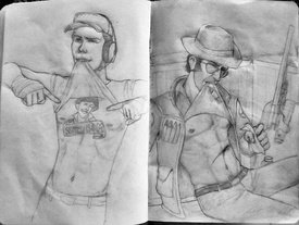
Hi, I wanted to draw scout lifting his shirt up to wrap bandages around himself. But then I remembered he has a tattoo and I didn't want to draw that anymore… So I drew sniper instead. Where do you find reference photos for poses for people? I like those deviantart accounts where they post stock photos but I can't always find what I need, so I imagine it but it looks awkward as you can see.
>>157844I agree with what the other anons have said but I wanted to add its head looks amazing. The shapes are so cool
No. 158056
>>158010You got it
>>158002Thank you I didn't think of pinterest! My mom browses pinterest for crafts ideas so that's all it is for in my head
No. 158863
File: 1630707627818.png (4.16 MB, 3000x3000, dot2.png)
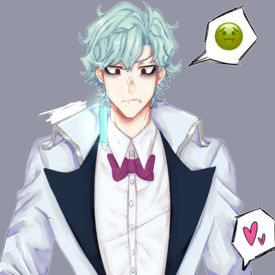
after a month i am back, judge this old man. Saged because i dont want this to be the reason the thread bumps
No. 158933
>>158932sorry, not native in english so I'm wondering what you mean. As I understand it, you mean to
not shade, let's say blue with another type of blue?
No. 159204
File: 1630943653711.png (751.13 KB, 1080x1080, board tan.png)
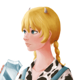
No. 159290
>>159206>>159209>>159210thanks for the feedback guys
>>159262paintovers and redlines would be useful imo
No. 159451
File: 1631082176416.png (794.44 KB, 779x759, usagi brush test.png)

Testing out some brushes since I got clip studio paint fairly recently, thoughts? I'm not sure about the eyelashes personally…
No. 159461
File: 1631086381575.gif (2.85 MB, 779x759, ezgif-3-e8571bfda069.gif)

>>159457Nta and this still very wonky because I made it with snow liquify on my phone, but I hope it helps to give you an idea.
The eyes are wonky - by that angle, the one you put higher (right eye) should be lower. That also makes the forehead look wonky.
It's missing a lot of cranial mass - the back has basically no head showing, so it kinda looks like she has microcephaly.
The neck is too thin and kinda wonky as well.
The war is too far back on her head and also kinda low, I couldn't correct that on my phone.
On that angle, the nose should be a bit more in front of the right eye, also couldn't correct that on my phone.
I also put her chin a bit more forward, as well as her cheeks, but brought her forehead a bit more inward since she's in an angle.
I do really like the colors though, nona, they look really nice. Maybe I'd just put a bit more of contrast in the highlights, but that's just me.
No. 159463
File: 1631088316329.png (574.87 KB, 779x759, 16310821764162.png)
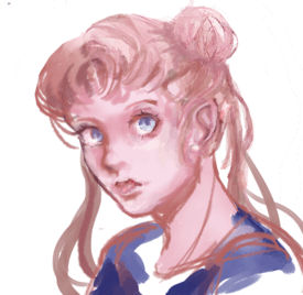
>>159457Not "redline," but here.
You need to focus on shape and form.
No. 159464
File: 1631088358902.gif (512.72 KB, 779x759, ezgif-3-d86fb7e0c9cd.gif)
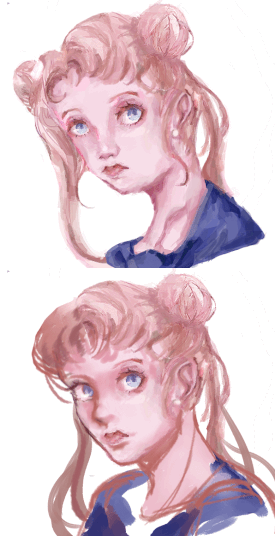
>>159463and a gif, for funsies
No. 159471
File: 1631093781118.png (372.98 KB, 489x694, aggie.io.july2.png)

ill never finish this so im posting it here
No. 159487
File: 1631106686778.jpg (256.67 KB, 1029x607, redline.jpg)
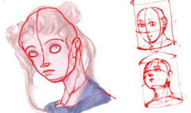
>>159457here, I made one so you see how off everything is. It looks to me that you weren’t sure about the structure and what angle the head should have. On the right there are two examples of perspectives I made. I really recommend you to plan your drawings like that, clip studio has loads of helpful assets too! Don’t be afraid to use them. You have a very pretty rendering style and color choice by the way!
No. 159757
File: 1631264604638.png (442.79 KB, 916x1120, flwoerelf.png)
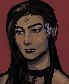
was drawing average scrote and I couldn't get the face right so I went off the rails and turned him into an elf.
No. 160029
File: 1631403686104.jpg (385.69 KB, 1000x1000, asuka.jpg)
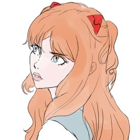
I feel like once I've done the bare minimum, I get bored and just rush it :/
No. 160054
File: 1631416860486.jpg (95.71 KB, 1000x732, 1612762325759.jpg)
And that's it, thanks for the feedback.
Apologies if you read the threads, I'm not that sane.
No. 160060
File: 1631417566404.jpg (672.94 KB, 2048x2048, 1612811022715.jpg)
I'm the Kanye West of /ic/
>>160056https://www.youtube.com/watch?v=GWtfOHBF1_wApologies, is to remember I posted it.
(USER HAS BEEN PUT OUT TO PASTURE) No. 160063
>>160061>>160062Why am I treated like this? Why am I insulted like this?
What have I done to deserve such insults, my posts! I must delete them.
IIIIILLLLLLLLLL BEEEEEEE YOUR ENIGMAAAAAAAAAAAAAAAAAA
No. 160088
File: 1631441430351.png (355.56 KB, 720x1058, Screenshot_2021-09-12-02-04-26…)
I was inspired by Tumblr to draw my husbando Sauron. I drew this is the memo app on my phone and its not very good lol but then again it's the memo app and I almost never draw. Anyway I always feel like my my faces look exactly the same and i can only draw them from one angle.
No. 160097
File: 1631445412924.png (534.02 KB, 695x857, lily.png)
started this a year and a half ago, but never got around to finishing it. i'm thinking of finishing it now, but first i wanna see what you guys think.
i have to fix the line weight on the umbrella and tweak the anatomy of the arms a bit, but does anything else stand out?
No. 160101
>>160088Now I want to draw him too, needs more beautiful elf husbandos. I think I saw your post about liking him, good taste and not too bad for someone who never draws. The face is a bit too long compared to the head but his eyes are very pretty!
>>160097The way your did the shading, to be consistent there should be a shadow from her arm on the dress. Consider that with line weight, thinner lines make something appear more far away than thicker lines, so maybe try around a bit with that. With everything having the same line weight it is a bit hard to have a focus point to look at and make out the distances, the part where her hand holds the umbrella looks a bit like it merges with the arm and shoulder behind because of this.
No. 160180
File: 1631486088085.jpg (1.6 MB, 1652x2284, Hmh.jpg)
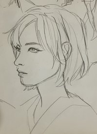
I resent myself for linking anime back in the day cuz now it feels like it permanently bled into my art and I want a more realistic style.
I'm trying to get back into drawing and want to get better at everything and finally be like those artist that I've been admiring for so long.
No. 160184
>>160097what is your light source? it looks like a coloring book filled out by a vary ambitious 6th grader, sorry. The hair seems like it's the same texture as the skin, all of the shadows are the same blurry, undefined mess, etc. I think you need to go back to basics on rendering bc the coloring on this is not working for me.
>>160180Her ear is a bit high, it should start where the nose ends and end between the eye and the eyebrow. Nice style though.
No. 160187
File: 1631490389992.png (1.44 MB, 2647x1102, smr12.png)
Hope it isn't too NSFW for the board
No. 160262
>>160213>>160233Thanks a lot!
>>160233I mostly have sketches and whatnot, not much very detailed stuff unfortunately.
>>160221Is it the tank ? I like mechanical things.
No. 160336
File: 1631584682655.jpg (104.62 KB, 1238x1751, 90134567.jpg)
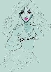
i've been very stuck does anyone have any good tips on rendering curly hair?
No. 160524
File: 1631722350350.png (837.22 KB, 1800x2250, leonkennedybutwithaboobwindow3…)
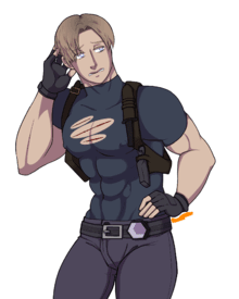
>>150077>>149294HAHAHA THIS TOOK FOREVER BECAUSE I'M IRREDEEMABLE GARBAGE :)
No. 160528
File: 1631723066282.jpg (11.78 KB, 300x250, kermit.jpg)

>>160524God I forgot I requested this (for me, not my friend btw)
And what is this suddenly in /m/? A sexy Leon with pert nipples?! THANK YOU
NONNIE!! ily
No. 160535
>>160527honestly that's why it took me so long, the shadows were making me big mad so i did the minimum i could get away with (what are light sources? i don't know her)
>>160528sorry it took forever aaaaa
No. 160608
>>160187BASTARD
SO YOU FOLLOWED ME HERE
WHEN I COMPLAINED ABOUT TALENT
TO BRAG ABOUT YOURS?
HAHAHAHAHAHHAAHAHAH
No. 160609
>>160180how long HAVE YOU BEEN DRAWING?
ARE YOU TALENTED?
THIS TALENT, IS IT GENETIC?
No. 160611
for 6 MONTHS I DREW AND DREW WITH PASSION, HARD WORK, EFFORT
FOR 6 MONTHS I DID THE TRAINING, THE GRINDING, THE FUNDAMENTALS, OVER 1000 PAGES
IN THOSE 6 MONTHS, NO VICTORIES WERE HAD
MY CONTEMPORARIES ON CERTAIN ART BOARD ON CERTAIN SITE, WERE, ARTISTICALLY BETTER THAN ME
I CHARTED THE PROGRESS RATES, TO A BASELINE LEVEL.
MY PROGRESS WAS BELOW AVERAGE, 0.9 BELOW AVERAGE.(USER HAS BEEN PUT OUT TO PASTURE)
No. 160615
>>160611Something about the way you're studying is flawed if you aren't improving.
>>160614Nta, but to me bro and man are slang and have been for so long they aren't even gendered for me anymore. It's funny to me and I like the casual tone of saying stuff like dude and man.
No. 160617
File: 1631763995574.jpg (987.97 KB, 3816x3078, Poodle.jpg)
Is there movement? Have I invoked movement?? Or is it as stiff as ever?
No. 160622
File: 1631767472180.png (90.56 KB, 850x483, 6705D0DF-9C5F-496D-896B-7E0CE9…)
>>160617nonners I’m sorry but this is so funny, I love it a lot it’s cute. i feel like there is nice movement in there, but i feel like you would really benefit from gesture drawing to make it feel more dynamic. find pictures of animals including dogs and make gesture lines like picrel to really get a feel of how they move, if realistic movement is important to you. regardless i love it it feels shitpost-y
No. 160633
>>160524You shouldn't ever say you're garbage and i like it
also leon is hot
No. 160635
File: 1631790982225.png (1.89 MB, 1387x2006, Mozart.png)
Is drawing cutesy versions of composers cringe?
>>160615Don't bother giving this guy any attention, anon. He's just an inflammatory schizo from /ic/.
>>160617Seconding what
>>160622 said. Love the watercolor/ink medium!
No. 161318
File: 1632285181682.png (435.87 KB, 1000x1557, 120C7DB8-401D-4DF9-9022-7DF971…)
I’m nervous posting because I don’t usually draw stuff like this, but I really wanted to try something new
And I wanted to capture a feeling of peace and reflection… and floating
No. 161321
>>161318The colors are cute, but my first advice is to study shapes and how the light affects them. You're doing some pillow shading right now and it looks pretty flat.
It's also a bit stiff for the floating feeling you're looking for, doing some quick gesture drawings everyday will help it to look more dynamic. And I mean quick-quick, like 15-30 secs on each drawing.
No. 161344
>>161318Good to see you back. This has a nice vision behind it anon. Use more line weight to make body parts pop out from each other and the subject from the background. It will communicate the transparency of her shirt better as well.
Personally I think the simplistic coloring has is charms, I could see this with some pop art touches like using thicker black lines and polka dots. Maybe experiment with coloring your lineart. Keep going!
No. 161405
>>161321>>161344Thanks anons. I definitely find it difficult to make lines that are neat, but still fluid and show motion. I will practice gestures drawing. The colors are my favorite part too, and probably where I spend most of my time playing around with combinations (when I should be focusing more on lines and shading lol)
Also I didn't think anyone would recognize me!
No. 161810
File: 1632605504999.png (1.03 MB, 1600x1600, a boy.png)
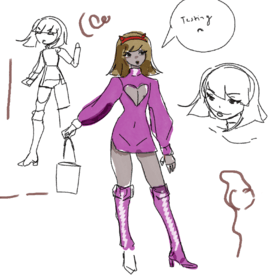
i haven't drawn in years but i'm going to try to spend the rest of the year doodling and improving as much as i can. i at least want to finally – finally – master hands by january, 2022.
anyway tell me what you all think of scribble.
and if you see me post this to /ic/ well, oops.
No. 161861
File: 1632649021397.jpg (672.17 KB, 834x1194, grey_cat.jpg)
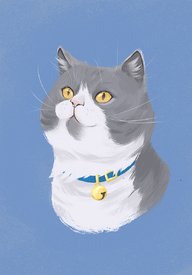
Anons, I know that everyone and their grandma does pet portaits these days so the niche is kind of saturated already, but do you think my art has the potential to generate some interest? I really enjoy drawing animals, so I figured why not try to make some extra cash out of it lol
No. 161862
File: 1632649751445.jpg (446.57 KB, 2320x2156, 20210926_014610-1.jpg)
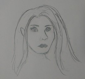
Does anyone know where I can learn to draw more realistic portraits, I especially need to improve on noses lol
No. 161877
>>161861saw this earlier, came back just to comment.
i love it anon, i really do. it almost reminds me of, and please don't take this the wrong way, the softness in children's books. your style seems like it can really be open to expressions too so if someone has, say, a super playful cat i think you could totally capture it.
No. 161882
>>161865Many thanks
nonny. I'm definitely going to work on improving my stylization as realism isn't really my thing. I'm hoping to eventually develop my own, recognizable style.
>>161877Thank you for your kind words, I'm actually really happy you're getting kids' illustration vibes from my style! I'm only beginning to take my drawing from a hobby to a way of making money but my number one goal in the future is illustrating children's books.
>>161879Thanks
nonny!
<3 No. 161883
File: 1632676726914.jpg (1.31 MB, 2268x3298, 20210925_185028.jpg)
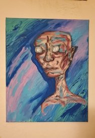
Something I did at a friends house maybe about a year ago. Just a lazy painting and I was drunk n high but it turned out alright I think
No. 161899
File: 1632683682451.jpg (1.51 MB, 3065x3016, 20170929_162620_(1).jpg)
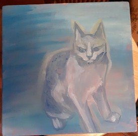
>>161883Yo is your painting interested in having my painting as a pet? I know he looks kind of pissy but I'm sure he's got a heart of gold or something
No. 161905
File: 1632686223219.jpg (2.09 MB, 2973x3041, 20210127_221931_(1)_(1).jpg)
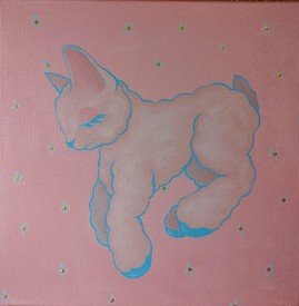
>>161904This was actually new for me! Usually I fixate on small details and end up over rendering a piece, even if I meant for it to be loose. I usually end up leaning toward realism when I'm trying to be more stylistic about it. I think I'm getting better though! The cat is from 2017, here is a cat-lamb thing I did a few months ago.
No. 162156
File: 1632847561976.jpeg (989.09 KB, 2480x2860, 8A27C410-D862-4042-91E6-0828D5…)
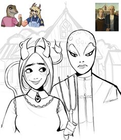
i got bored so i sketched board-tan and cc mascot
No. 162274
>>162229You’re right lmao I didn’t notice that, I’m definitely going to change that. Thanks
nonny!
No. 162416
File: 1632992279296.jpg (Spoiler Image,225.4 KB, 900x611, nude-female-reclining-1922-mar…)

>>162397I do, especially when they're drawn by women. There's nothing wrong with using nudity to express yourself emotionally or as a way of showing appreciation of female body and it's usually easy to tell from porn or fetish art. It also largely depends on your style and technique. As long as you avoid things like anime stylization and overly detailed boobs, butts and vaginas put up front and center I don't think anyone will accuse you of pandering to coomers.
Picrel is an example of a nude painting by a female artist that I really like.
No. 162444
File: 1633017974869.jpg (7.08 MB, 4624x2604, IMG_20210930_165849.jpg)
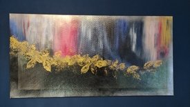
(lolcow.farm/info)
No. 162575
>>162574Fuck off, retard.
If you want feedback, your painting is trash, it’s distasteful, the kind of pictures you see at a bazaar which makes people wince and pity the poor idiot who spent their time and resources on making such a useless piece of shit.
Oh, nice you can use red, yellow and blue! Wow, impressive, how creative.
Get a job.
No. 162650
File: 1633137475057.jpg (149.88 KB, 822x818, abstract-glow.jpg)
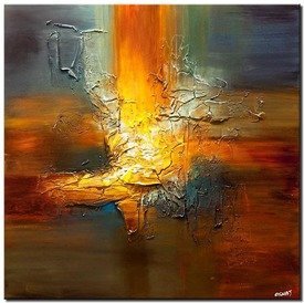
>>162444Since abstract art doesn't represent a literal subject, I think it's important to focus on the colors, shades, textures and overall physical 'paint' aspect. I enjoy abstract paintings based on how it catches my eye and leads it around, just like a typical painting with a subject. If there's nothing to catch the eye, it just becomes a flat blob to me
picrel is a painting that I thought was similar to yours, but more fleshed out in texture and lighting
No. 163295
File: 1633647708810.jpeg (1.24 MB, 2441x1418, 1D6B1A66-06B3-4B4B-AABC-B9BE45…)
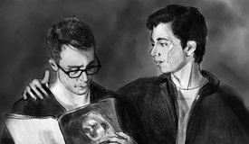
I am a hobby artist, transitioning from traditional to digital. I mostly do portraits, can’t do anything else really lol. I’m trying to simplify my work, learning not to draw every detail and to have more painterly approach. I also have trouble finishing anything.
here’s some quickish sketch, from screencap reference.
No. 163297
>>163295ooh thats really nice anon, i like it! digital can take some time to adjust to when youre used to traditional but this is pretty good.
some minor critiques: the hand on the left and also the glasses look a bit off, and i think the left figure's face could be… im not sure how to say it, more dynamic? if you used some bolder lines on his mouth and some other places i think itd convey a bit more character
No. 163408
File: 1633708955561.png (Spoiler Image,2.13 MB, 2500x2500, B930B2B6-58D4-484F-B897-6078DE…)

Hi anons, I'm no artist (like can't even draw stick figures) and I installed procreate, and followed a tutorial. I'm very shakey but I had so much fun. I don't have anyone to share it with, so I'm sharing it with you guys.
Thank you for allowing me to post here
No. 163410
>>163408Looks cute. Make us a phone bg or something with vibes like that.
>>163295Anon your skill level is beyond what this thread can offer. But sick work and keep posting if you like lol
No. 163756
File: 1633920305502.jpeg (711.04 KB, 2480x3508, DEE70616-BB7D-41F4-98DF-19F6A8…)
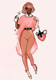
I think I got slightly better
No. 163769
>>163756It's really cute! The hand holding the bottle looks really fucked up though
>>163766I think that's a glove, anon lol. It's the same color as her socks
No. 163810
>>163766It’s a dumbass glove anon, kek
>>163769I know! I don’t know if you’re talking about the anatomy of the hand or the fact that I accidentally made the white outline on the same layer as the lineart.
>>163770Thanks anon
>>163788I used a 70s model as a reference, it was supposed to be a coke bottle but it turned out fucked up and I changed the entire outfit. Probably all of those things tbh
No. 163861
File: 1633989135324.png (208.48 KB, 457x652, Capture.PNG)
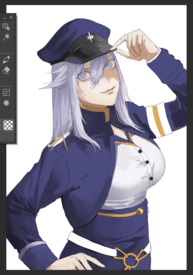
nonnas help!! her boobs look like balloons and im stuck on how to render
No. 163863
File: 1633991043419.jpg (96.73 KB, 1000x1333, jojo-blouse-crepe-satin-white-…)
>>163861You already started out with anime tits, of course they'd look like balloons kek. I think if you want to, you can keep it at that, it actually looks kinda good, it's appealing. The places where you put shadow colors make sense, if you smoothed it out it wouldn't look too out of place, people are used to that coomerish look anyway.
But a blouse like that would realistically stretch in somewhat of a straight line down to the skirt, not hug the boobs like that. In this image you can see the folds it would have a little easier since it's satin, but try collecting some more references while and even before drawing and look at them closely if you don't want things to end up like that. Your rendering and choice of color is really nice overall, I think you should try to improve your anatomy skills next, the hands look so sad.
No. 163867
File: 1633992018809.jpeg (91.67 KB, 457x652, 5544EF81-D040-4151-82AF-5F3A34…)
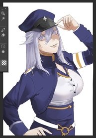
>>163861They start and end too high up her chest. Perhaps lower the neck line like this to make the illusion of more human boobies.
No. 165336
File: 1634676938207.jpeg (85.31 KB, 768x768, BAEB132F-6EB3-451C-890A-2AE74F…)
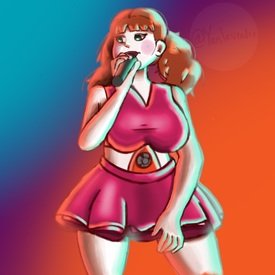
This is my first time posting, sorry if I did something wrong! This is my most recent digital “painting”. What do you think?
No. 165338
File: 1634677024617.jpeg (607.06 KB, 1001x1147, 87801F8A-6DA2-4E41-93A6-D72901…)
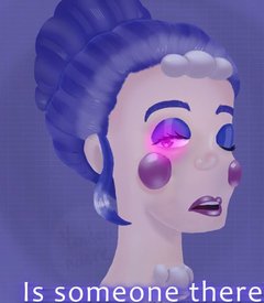
Here’s my first attempt for comparison
No. 169832
File: 1636843623913.jpeg (780.1 KB, 1748x2103, 5124DC77-7B49-425A-8FEE-57F07C…)
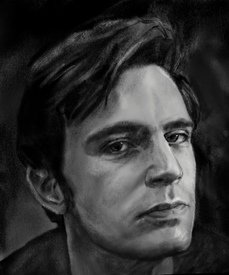
>>169102it was me (one of these), sorry nonna. it’s just that the more I stare at my creations the more I hate them. I am kinda self conscious about my ‘art" and that one i posted here i was particularly displeased with. so here’s something as an apology for you. i don’t hate it that much because it’s old ish
it’s suppose to be jack davenport in case it’s unrecognizable lol
No. 169836
>>169834thank you.
it’s the perks of being a perfectionist i guess. i only see mistakes, little things that could be improved, but often times when i try to make it better, it ends up worse
No. 169842
>>169832artist here! I think you did a great job. Great details on the nose, lips and jaw.
If you need any pointers: Eyes seem unbalanced (Left eye is way too low). Value and texture can be more refined (instead of heavily relying on grey, focus on the darkest and lightest parts of the photo you study from). Otherwise, great work! Looking forward to see what you draw next.
No. 170217
File: 1637130582635.png (256.46 KB, 719x857, Capture.PNG)
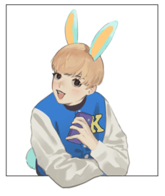
thoughts?
No. 170227
>>170219hes just a humanized version of an animal crossing character
>>170223funnily enough, i actually didnt reference anything for this so not sure if i should take that as a compliment or not
>>170224should have added more shadows there good point
No. 170296
>>170290It’s not referenced and I only follow my friends on twitter but nice try
And I’ll keep the actual advice in mind
No. 170415
File: 1637273137957.jpeg (792.63 KB, 1727x2048, 43843C00-0A97-4315-A37B-19AFF6…)
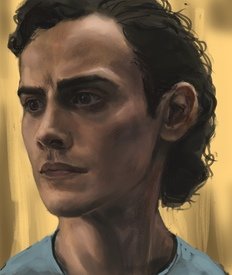
a wip portrait from a photo reference. i struggle to avoid getting caught in the details and also retaining likeness and values while painting in color. if anyone here have some advice on that, i’d infinitely grateful
No. 170438
File: 1637278904298.jpeg (253.63 KB, 1045x1125, 3113269A-6472-4213-966A-ACF3BA…)
>>170415You oughta revisit the scale of his shoulders, anon.
No. 170440
File: 1637279265550.jpeg (464.85 KB, 750x966, EA505C45-CB26-4BA3-A5FD-287F95…)
>>170439the reference image
No. 170444
>>170217he does unfortunately look kind of creepy but I think it's because his smile looks fake. when we smile genuinely our cheeks make our eyes squint from the bottom. arc and raise the bottom eyelid and it'll look like a more cute natural smile.
i really dont care for the random hard edges vs soft round brush line work some parts look really lazy like the phone.
No. 170451
File: 1637285289971.jpeg (764.3 KB, 1033x1024, 8596A41F-0206-42EE-B8A9-EE01AA…)
>>170415artist here. I saw the reference photo you attached, unfortunately the picture you chose happened to have bad lighting, in which I can see you were attempting to "lighten up" in your study - resulted in using artificial colors that don't blend in very well with the entire painting.
the part in picrel is where you did very well in distinguishing between local color for the skin, to the gradient lighting on top.
my suggestion for photo study next time is picking up professional photographs instead of screenshots/gifs from a tvshow. The way motion pictures can trick our eyes Alot and it's too early for you to replicate them at the time. Best of luck anon!
No. 170455
>>170296>I-it’s not referenced i SWEAR anon no offense but you might not be mature enough to use this thread. It’s obviously referenced judging by the difference in skill level and realisticness between the anime boy head and the body, as multiple anons have pointed out. It’s literally find to use reference when learning, everybody does it and should do it. Denying reference being used when it’s obvious makes you look autistic or underage.
>>170415The eyebrows aren’t aligned, one is much lower than the other. Look at the reference picture and you’ll see what I mean.
No. 170468
File: 1637293202928.png (1.62 MB, 3083x5920, pooptuber.png)
hello nonnas! i'm kind of designing my own vtuber and just wanted advice on some good designs? i'm not really a creative person, but i really want to make her look cute :). should i keep the demon horns or give her another design? sorry for the big file btw(:))
No. 170469
>>170468Depends on the content you’re making tbh, it’s better to create something related to what you’re trying to sell. So if you’re making videos of your avatar talking about video games with demons, the horns are a good idea and you can create a personality based on that. But if you will talk about cooking mama, you will have to make sure that the horns are not too distracting, unless you want your character to be some sort of hot anime girlfriend who acts like a mom or some cringe shit like that.
The thing is that you can just go to some random dress up game, click random, use that as your avatar, and nobody will bat an eye because all the viewers of Vtuber want is some quirky anime waifu who is a DeviantArt OC but animated.
And yeah, you can go to DeviantArt and look for OCs made by 13 years old, it’s basically what a tubers are, you could fit in.
No. 170492
>>170451Thank you so much for your reply!
The reference is definitely not the best, I can see my picture is too light, I was planning on darkening it, but maybe I just find a better photo lol and let this one be
I like to use references from screenshots and paint actors because I can see them from many angles and in motion, which is the closest to drawing live as I get.
No. 170572
File: 1637345127476.jpeg (143.46 KB, 608x1228, 8A35D4B7-598C-464C-B3B1-86503A…)
Thoughts?
No. 170641
>>170632Thanks it seems that everytime I post here my issue stems from the facial expressions/over all features
I’ll need to do some expression studies
No. 170644
>>170492AYRT. Gifs as replacement for live painting should be fine if you're studying expression/weight/motion from it. Uploaded online gifs are already reduced in quality, so when you pause a frame you'd see all the colors greyed out, and the details won't be as smooth when you watch a 8-frames loop.
I think you got good grasps on lighting already, so probably pick a better photo to study from next time!
>>170572A lot of surface/depth mistakes here.
Starting from the tie not resting on the girl's upper body (needs to be aligned with the buttons).
The shoulder is too narrow, the character's right arm does not extend well (either to the side - or to the back, the shirt's folds didn't enough indication which makes her right arm looking ruler-straight).
Hip and legs don't align, especially her right foot cannot be twisted to that direction, pay attention to her knee and work down to the foot which should be facing forward or to her left.
I had watched your timelapse, and I'd recommend drawing grids on your finished silhouette sketch to avoid the typical surface/depth mistake. Best of luck anon!
No. 170651
>>170469i'd just like to stream anything, like a multi-streamer! and i have been looking at plenty dA OC's actually but never thought abt doing the dress up game idea, i'd have to do that! thanks
>>170476i've just always wanted to have a cute anime girl persona since im not the prettiest person but i love to stream, its a little hard to get attention as a streamer if u have no cam. and yeah, i felt like the demon concept was basic and was going to add some type of animal ears but that felt even more basic.
>>170484>>170485haha i haven't heard of mmd since forever. i can kind of see it, any advice on how i can improve it though?
>>170494thank you very much! i'll end up taking the easy way out in the end if i ever finish this design thoughh. i plan on making the design first and then commissioning an artist and a rigger to make the model for me so she can come to life! drawing a vtuber is such a long process that i just dont have the patience for lol
No. 170659
File: 1637380476006.png (1.18 MB, 1080x848, catskulls_(1).png)
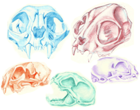
Some cat skull studies I did with watercolor pencils and white gouache. I admitted don't study very often and I feel really guilty about it. I have a lot of anxiety while drawing, my family used to shame me and compare me to others all the time and it's left lasting impact on me. Do any anons have tips for getting past the anxiety? What do you think of my skull studies?
No. 170664
>>170659These skulls are pretty nice! The purple one in the right can use a pit more darkening or outline near the back of the skull, just a note.
As for anxiety issue, your situation is quite specific I think? I'm doing arts professionally for ten years without formal education, I remembered being discouraged from my family in pursuing arts in college. My brother even said something like "you will never make it in the world as an artist", I just held onto my stubbornness and studied different major while self-taught myself arts through doing freelance.
I think being around with other artists will help boost your self-esteem a lot, find chill artist friends that give feedback and do art trade & collab with you, I'd even doodle in the postcards I sent to my online friends too - I was definitely looking forward to those.
Not sure if this will help, I do hope you can overcome your anxiety and find the people appreciate you and the arts you make.
No. 170731
File: 1637457817472.jpeg (926.56 KB, 2480x3508, A1D525C7-0310-4324-8363-4829B6…)
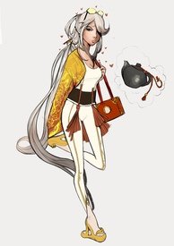
i drew ningguang because i was inspired by crazy ass clothing i saw in that shang abi video lol
No. 170855
File: 1637532834768.png (84.75 KB, 361x814, Capture.PNG)
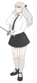
Ignoring stray lines/colors and the un even sword thing…
thoughts?
No. 170995
File: 1637612272563.png (68.11 KB, 528x454, fgh.PNG)
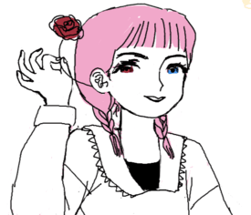
three years old ms paint sketch from the archives.
No. 171013
File: 1637620424257.gif (2.98 MB, 712x900, Beatrice kills the crab optimi…)
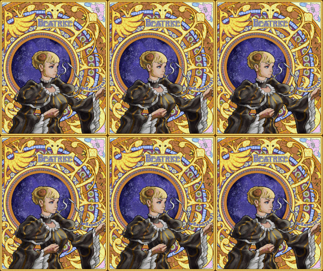
Something old(global rule #4)
No. 171019
>>170995Wow her eyes are so pretty
>>171013That's so cool, did you make the background with paths or how are those curves called? It's amazing, I only think it would be much better if the shadow on the woman was blue hued and not black.
No. 171020
>>171019hued shadows are a trend, i think
>>171013 looks amazing and has that classical feel to her.
No. 171137
File: 1637694161626.jpeg (706.7 KB, 3393x1520, 0EAC5D69-9351-4E3F-9AFC-A4569E…)
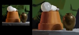
a color study i did, it’s from a ctrl+paint tutorial, where he explains what to look at when choosing the right color. i didn’t pay any attention to forms, shapes, proportions or details in this study, focusing on colors only. also i didn’t finish the drapery, it got a bit boring.
i often rely on color picking, in the beginning stages at least, and i’d like to get rid of that. i’d also like to learn to see colors properly and to simplify them in my work, as i often try to capture every shade and hue and then it gets messy very quickly
No. 171378
File: 1637839123626.png (1.67 MB, 1570x1438, Screenshot 2021-11-25 at 12.17…)
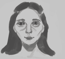
how/what do you feel when you look at this
No. 171379
>>171378is this a quick vent doodle anon?
I see tired wired but generally content. Like days I'd see myself in the mirror, weathered and aged, yet I have long accepted that I will be here forever.
No. 171388
>>171378solidarity.
uneasenies when staring into the eyes after a while, but not creeped out. her left eye is making a connection while the right is withdrawing into herself.
No. 171396
>>171379>is this a quick vent doodle anon?could be, honestly I'm not sure. but it is heavily "influenced" by my mood I guess
also, thanks to everyone who replied. I was feeling a bit conflicted
No. 171626
File: 1637980754179.jpeg (568.68 KB, 1813x1610, 433006F4-64B1-4742-8F64-FB365B…)
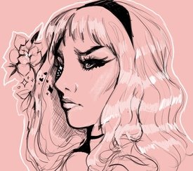
I wanna keep this thread alive it’s fun
No. 171951
File: 1638177232386.jpg (1.93 MB, 3464x3464, image2198382.jpg)
>>132849This was my drawing, I've tried to fix the shaky lines in my art since with the advice I received (thank you!) I feel like I can okay hair/faces, but the quality and creativity of the clothing is a disaster and I'm not sure how to fix it. When I try to reference accessories and clothing onto a drawing it looks like how you'd assume, like it was pasted on lol, so my drawings look very boring. The anatomy is lacking as well. How do I fix this? I feel like I'm stagnating.
No. 171963
>>171951imo you don't need to be creative right now, if you're trying to learn
one thing that helped me improve in general (anatomy, way of using references, etc) was first drawing 'off the top of my head' as well as I could without any guidance from references and THEN trying to do the same drawing but using references, or correcting my own drawing with them. this would ensure I wouldn't get too caught up in trying to make the 'perfect' drawing, thus losing my creative drive, but also that I would end up learning something
I don't know if this helped at all haha
No. 171990
>>171963That's really thoughtful! I'll give that a go, thank you so much!
>>171971I'm invoking my right to not speak without an attorney present (yes and I fucked up his nose so bad)
No. 172712
File: 1638641238467.png (1.05 MB, 1146x1496, Screenshot 2021-12-04 at 19.03…)
I sketched this but tbh I don't know how to go about rendering it, or if I should line it and cell shade it..
It's been a long time since I drew digitally so I'm having a bit of a crisis, any help?
No. 172751
File: 1638655786146.jpeg (973.23 KB, 1125x1441, 45EF6CF1-4780-40B8-B49D-129617…)
>>172745I think wacom intuos should be affordable, I still draw with my intuos 4 for professional works (despite my art friends keep making fun of it for being tiny). It costed like $70 back then, I'm not sure about current price, but any non-screen tablet should be good enough, I think wacom tends to push those affordable "for kids" model. Second-hand should be a viable option too.
As for art programs, GIMP and Fire Alpaca are free. I actually started out digital art on tegaki E back then (now currently te2.tewi), give it a try if you're planning to draw for fun and want some sort of small & chill community.
No. 172787
>>172745There's plenty of tutorials explaining how to pirate Paint Tool Sai and PhotoShop wich i've seen artist use very often. Krita and Fire Alpaca are free and both have animation tools (although fire Alpaca is way more basic)
For the tablet stuff i'd say you try to get a screenless tablet or a tiny one that you can find at an affordable price
Or You could buy some off-brand pad that comes with a pen and download medibang.
No. 175122
File: 1640179759736.jpeg (529.1 KB, 639x1051, B6C89381-9C6B-4727-A808-A507D3…)
I have some art i did. Its supposed to be one of those figure study compilations, with a little splash of colour
No. 175175
File: 1640203559326.jpeg (209.54 KB, 677x1205, 1B61C55F-C433-4E26-8701-816E95…)
I found more art. This was made for a friend. I asked him what screencap is his favourite and chose this one with a funny caption.
No. 175178
File: 1640204837073.jpeg (400.03 KB, 1011x1800, 93167246-F618-4F87-AD1D-22B9E1…)
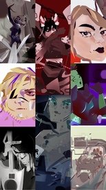
>>175177Hello, i made both art posts posted here recently. Thank you so much for the nice words. Have a collage of more recent art of mine, the style has gotten cleaner, honestly the kind of style I always wanted. Anyone have an opinion on this kind of style or have an opinion on artists who frequently use this kind of style?
No. 175577
File: 1640378921026.jpeg (2.39 MB, 4030x2409, 6DE5891C-621F-439C-A53E-A4CEDC…)
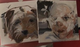
>>175198Thank you for nice feedback. Its true the middle column pieces dont have much contrast in them, i couldve used more lighter background color on the upper mid column piece to make the character stand out. Here are some of my traditional works, acrylic on canvas is my new obsession to work with. The picture is a bit dim, since it is nighttime here.
No. 175586
>>175577your traditional art is so good
nonnie! I especially enjoy the one on the right
No. 176875
File: 1641122309969.jpeg (353.86 KB, 1504x1163, 1089856B-71AE-49DA-990A-C96045…)
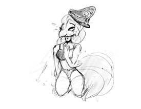
Heyyy do you guys think i have talent
No. 177911
File: 1641610385054.png (491.64 KB, 720x720, meem.png)
Hope all my fellow medic enthusiasts are doing great today.
sorry for bumping with tf2 shit>>176875Depends how long you've been drawing for. Maybe if this is your first drawing or something.
No. 177915
File: 1641611977476.jpg (21.23 KB, 564x486, 0e7dc7371bdbdea8084c96733f7145…)
>>177911LOVEE ITTTTTT!!!!!!! your art style is so cute
No. 177923
>>177911Not a TF2fag but I love your style and how you drew his face (those eyes hnngh)
You're really good
No. 178011
>>177911Oh my gosh oh my gosh oh my gosh lovely I love you
>>175577Wow very nice, I love it
No. 178037
File: 1641673659255.jpeg (688.04 KB, 1428x2889, F737DE86-2F01-4CD3-8D89-55E614…)
the only decent thing i’ve ever drawn tbh kek
No. 178184
>>178037She’s lovely anon! I love her eyes and body shape, your style is very nice!
>>177911Not a tf2 anon but this is great! I love how you color.
No. 178493
File: 1641802504075.jpeg (2 MB, 3024x3024, BFA2A53B-DAD4-47E7-A381-27A4AF…)
>>177911I love the medic bless your soul.
Here’s my sketch contribution as I never finish my shit (still)
No. 179384
File: 1642196143027.jpeg (340.98 KB, 1910x1558, 83C16AAE-15F8-4D96-A61B-B2CDDE…)
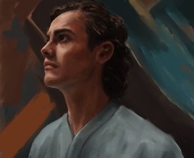
another try at the foundation guy. digital has so many advantages, the freedom of all of it, no fear of mistakes, but simultaneously i feel like it takes some of the fun away. i’m trying to retain the texture and the looseness while not loosing the likeness. the best thing so far is that I don’t have to clean all the mess, but i miss the smell of turpentine sometimes.
No. 179446
>>179384I don't like to deal with all the mess and prep traditional painting requires but i wholeheartedly agree there's just something about traditional process that is just more fun. Your painting looks good though! I think having more fun with digital will come with practice too.
Have you heard of heavypaint app? With the limitation it forces on you it can inspire you to be more creative and adventurous with digital medium, maybe it could be good for what you're looking for
No. 182753
File: 1643647958193.png (373.23 KB, 2048x2048, Untitled81_20220130200013.png)
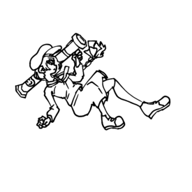
Anything I can do better?
No. 183355
File: 1643766895680.png (170.51 KB, 406x818, unknown.png)
I'm still working on the background so I hid the folder…
And now focusing on the full body of this dude: what are the thoughts of my fellow nonitas
No. 183389
>>183355colouring and renderings really nice. did you use a 3d model for reference? i ask bc it gives me the same kind of stiff vibe i get from other work using 3d model references.
overall it still looks great i just think a bit more fluidity especially in the leg area would improve it
No. 183412
File: 1643787470553.png (326.15 KB, 418x528, nose.png)
>>183355>>183389I agree, it's extremely stiff, which is a shame. I'd just take that sucker into liquify with a big brush and give him some nudges & repaint as needed.
Other than that, it seems like the face isn't placed correctly on the head. The head seems to be at near 3/4 view & tilted up, but the face is drawn as if it was straight-on. Try thinking about the face as 3d parts, not like an anime face sticker pasted on. Specifically, from this below angle, we'd see the underside of his nose & nostils, picrel
No. 183427
>>183381>>183389>>183412Thank you everyone for the advice
I’ll see if I can implement some changes into the piece itself
Really appreciate the feedback
No. 183700
File: 1643837948325.jpeg (1.74 MB, 2541x2199, 59E6ECF0-1A4A-446A-BBA4-6D9C19…)
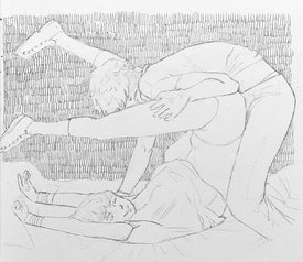
i’ve been considering making an art tumblr but i feel like doing strictly traditional is a major issue with posting art online. what do you nonettes say
No. 183744
>>183711i’m not particularly good at photo editing and that’s my issue. i wouldn’t even know where to start
>>183713yeah definitely. i’ve never posted art online before so i’ll have to get used to that. and thanks, i appreciate it
No. 183885
File: 1643891585442.jpg (760.19 KB, 1344x1590, lain.jpg)
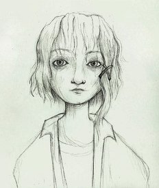
I'm trying to create art with more personality, is this an interesting approach or does it look stupid ?
No. 183930
File: 1643906460993.png (472.05 KB, 1434x1367, mike.png)

(repost because i posted the wrong version!) ive been wanting to post here for a while so take a sketch ill never finish!
No. 184046
File: 1643924173587.png (485.73 KB, 1193x1396, slimo.png)
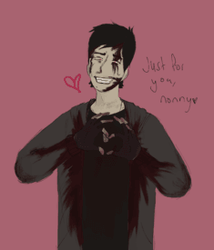
>>183955Just for you i did a quickie but finished bleeding boy <3
No. 184448
File: 1644040370105.png (139.06 KB, 435x452, Capture.PNG)
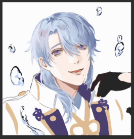
nonitas? what do you think i could change/adjust before i render his face/hair further
((I accept all criticism and dont take things to heart so dont be afraid!))
No. 184453
File: 1644043225821.gif (68.48 KB, 278x284, ezgif.com-gif-maker (5).gif)
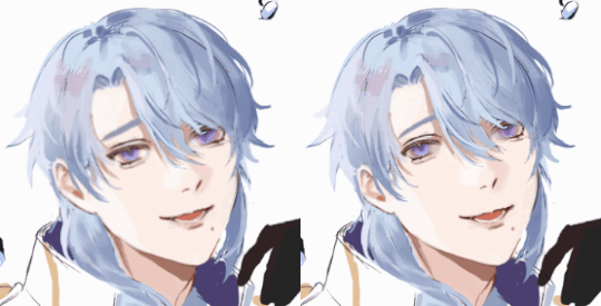
>>184448Anon… are you the same person who posted the wonky sailor moon drawing a while back? your issues with faces are similar. He looks like he's staring into the 5th dimension, has pink eye, orbital hypertelorism, and the smallest pair of ears ever observed on an adult man. Stop trying to render because you're not ready for that step yet. Learn how faces work first, or else the result is going to continue to be majorly uncanny and creepy. Picrel is a liquify fix, and I un-infected his eyes as a bonus.
No. 184688
File: 1644124350006.jpg (202.41 KB, 621x767, Untitled_Artwork 6.jpg)
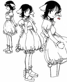
random oc based on a chobits cosplay i saw
No. 184831
File: 1644181077498.png (621.78 KB, 1436x1812, dude.png)
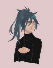
turns out i hate doing lineart so i tried doing more painterly-ish stuff. anyways it was late night and i didnt want to keep rendering the clothes kek
No. 184854
>>184835ty next time i'll actually do a decent sketch kek
>>184832thanks! maybe you can just do grayscale paintings first and then get into adding color? i've also seen ppl block out the lights and shadows first, then do lineart with a darker color, merge all the layers and then blend it with the rest if that makes sense
No. 184863
>>184853>recommendedi guess that's why its getting way more traction than usual. idk why it's always the sketch stuff that ends up in the algorithm
>>184803>>184816thank you!
No. 185717
File: 1644539244171.png (1.95 MB, 1321x1127, oranges.png)
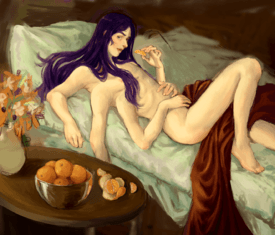
Drawing pretty monster-boys fuels me There's an older version of the same oc a couple months upthread, in case you're curious to see what the progression of autism does to a mf
No. 185723
>>185717Ayo you got
social media cuz damn
No. 185730
>>184831The eyes maybe need a little work but the colors are absolutely lovely!
>>185723Not really. At least not for this kinda stuff, but thanks anyway!
No. 185910
File: 1644611038041.jpeg (1.03 MB, 2480x3508, C553EB5B-556C-4B72-B5E4-CBFB79…)
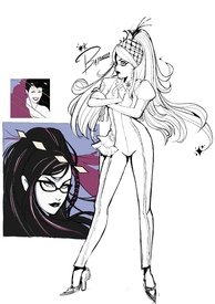
question should I carry the style of coloring on the left to the drawing on the right or color the drawing on the right differently?
No. 277961
File: 1677204590240.jpg (1.26 MB, 3000x3000, 20230223_210148.jpg)
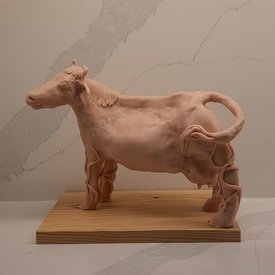
I don't know where else to post this, I hope bumping a year old thread is okay. I just wanted to share this sculpture I made for my class in college. She's based off an Irish myth, I added some bullshit like the little roots going up her legs. Spent about 10 hours on it in total. I figured maybe the nonnies here would like it! I will be firing and painting her tomorrow. This is my first attempt at sculpting in years, also my first proper sculpt with a wire frame underneath it and everything.