File: 1647228116682.jpg (139.34 KB, 1400x1050, EarwigEw.jpg)
No. 189172
File: 1647229433338.jpg (249.15 KB, 1000x600, NDR_PD104_Jun-Wu-Wei-Alexandra…)
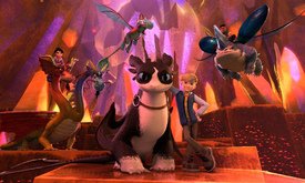
Inspired to make this thread today because I saw this, words cannot explain how uninspired and lazy this looks. This is apparently a reboot(?) sequel/continuation of How to Train your Dragon. It takes place in the 'modern' age where dragons are coming back to live with humans, even though they established in the last movie why that was a bad idea.
Idk what it is but the main dragon looks awful, I think it's supposed to be a descendent of Toothless and the white dragon, but the coloring makes it look freakish for some reason. The other dragons look even more out of place, all the awesome sharpness of the og designs is lost here. Everyone else looks like they were ripped from stock 3D character asset packs. It's a shame, HTTYD was one of DreamWork's best franchises too, but I won't let this spoil the other movies for me.
/Autism rant over
No. 189190
File: 1647238005669.png (356.13 KB, 810x305, dragons.png)

>>189172These exist in the same franchise now
No. 189242
>>189172aw i think the main dragon is cute, it looks like a cat?
but ive never enjoyed the style of HTTYD and always found it unpleasant to look at in general
No. 189639
File: 1647377017916.jpeg (101.08 KB, 1280x720, NPGYWWOFIFDRNA7NDZB3UBIA4M.jpe…)
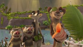
>>189242Maybe it's just me but I hate when new characters are added and they don't match the designs to fit in with the show.
The new Ice Age looks bad for movie quality and the new character looks like it's from a completely different franchise
No. 189640
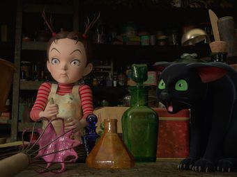
File: 1647377332370.jpeg (48.77 KB, 1200x629, earwig-and-the-witch-2.jpeg)
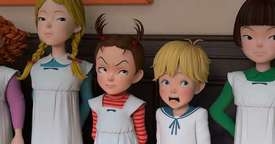
>>189168I'm actually okay with the character designs for Earwig, it's just that the animators never bothered to change the lighting at all for any of the scenes or have any interesting shots
No. 189649
File: 1647379228761.jpg (148.18 KB, 1095x617, Skullcrusher_the_Rumblehorn.jp…)
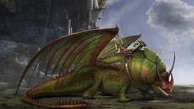
>>189644Ironically that's the one I have the least problem with, I could see it existing in the movies. HTTYD is always remembered for me for having more unique dragon designs, the new ones in this show just look too round and cutesy to be dragons from this franchise
No. 189652
File: 1647380281944.jpg (Spoiler Image,182.61 KB, 1920x1080, wtf is this.jpg)

Obligatory
No. 189794
File: 1647437718698.jpg (147.14 KB, 1000x1500, MV5BMTIwYmQyNjctNmJhYi00NDg0LW…)
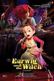
>>189640Earwing could have been a lot better if only they bothered to work with the lights and toned down the expressions a bit. The faces are even more exaggerated than 2d Ghilbi movies, I don't get why they went for more cartoony ones. Some shots and promotional images even look good (I think picrel is pretty acceptable), maybe they had a low budget?
No. 191736
File: 1648088132174.jpg (33.5 KB, 720x720, f.jpg)
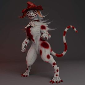
everything from this shit series is just unfiltered autism
No. 191746
File: 1648091070421.jpeg (37.58 KB, 845x1024, CFF4DC93-C4A5-4D64-B0CB-3555EC…)
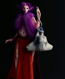
>>191738that was a cameo by the creator fennah. the whole thing is called "satellite city"
as folding ideas put it, it's just overdesigned horny furry steampunk garbage
No. 191748
File: 1648091204489.jpg (101.07 KB, 518x842, Untitled.jpg)
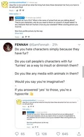
bonus funny sperg
No. 191749
>>191736>>191746The characters are overdesigned as hell and move like jello (though I do like the blind dragon one)
Also the creator is a pretentious dick about them. Deadwing dork has a good video about him
No. 201607
File: 1651104323061.jpg (65.56 KB, 850x850, BRS.jpg)
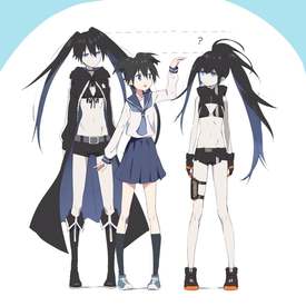
What the fuck is that stupid scarf thing she is wearing? Even though the bikini top was dumb, Black Rock Shooter's old design is appealing because it has cool biker vibes. Now they just went full coomer. She looks younger and she's wearing even less clothes.
No. 201618
>>201607Looks like they gave her an extreme cropped sleeveless jacket. Her original jacket is cooler because it gives off the impression of a cowl if she puts the hood up. She looks more unsure instead of stoic because of the younger look. Terrible choice. I hate the lack of clothing too. It looks jarring.
>>201617Waifu bait goals possibly? Younger girls don't have scars push narrative? Most likely a retarded reason.
No. 202355
>>189640The sad thing about Earwig is that I think the designs were interesting and the planning sketches and all that were pretty cool, but they translated it horrible into 3D. Everyone looks like they're made of playdoh and the shading was weird throughout the movie.
Sucks to say, but I don't think Miyazaki's kid really has a talent for animated movies. Earwig was fine, but he's not a gifted animator, and by that I mean that his work doesn't feel inspired and passionate.
No. 202599
File: 1651367382068.jpg (94.77 KB, 561x430, maxresdefault.jpg)
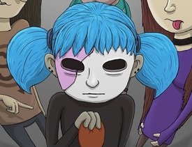
why are people obsessed with this character? is he supposed to look like an incel tranny?
No. 202668
>>191746>>191736This guy's genuinely fucked too. These creatures he made up (that just look like your regular dA sparkledog/furry abomination) have a society where the smartest is at the top and has the right to humiliate all the others by decapitating them, contorting the body and raping it. As you can see here
>>191746 the body the purple boa girl is holding is posed like one of Dahmer's
victims. He also makes the decapitated heads have an ahegao expression. He was a brony too.
It's funny because this guy used to go on and on about being better than Disney and shitting on the characters while having the audacity to say that his porny furries were better.
No. 202751
>>202699Nta but yeah basically. Apparently he was never a good father, his son was pressured to get into animation and he already had a huge pressure on him (being Miyazaki's son) and his father barely even helped him with his movies. He was made to direct Earthsea with little to no previous experience and then Hayao had the guts to go see it, walk out in the middle of it (rude fucker) and call it trash (no shit).
As for Earwig, if you know the context you'd know that it's impressive it even got made. It's based on an incomplete novel and in Japan is was actually meant to be some sort of TV special instead of a full movie (which explains why or ends so suddenly and the pace is a bit weird). It is also Ghibli's first try at a fully rendered CG movie so the weird textures and expressions can be excused (kinda) and the team was mostly made up of novices. You really can't expect the quality level of a regular Ghibli movie when you have a poorly experienced director with daddy issues, a brand new medium and not a lot of skilled animators. I did appreciate the soundtrack in Earwig though, I thought the rock-ish sound was a nice change from the usual Ghibli music.
No. 204340
File: 1651902342535.jpg (95.22 KB, 616x353, capsule_616x353.jpg)

Found this awful furry game on Steam. The face is nightmare fuel.
No. 204341
File: 1651902388865.jpg (238.42 KB, 1920x1080, 20210106190718_1.jpg)
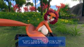
No. 204762
File: 1652084716639.jpg (39.56 KB, 600x450, 485159761-m.jpg)
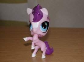
Bumping with some truly awful ones
No. 204763
File: 1652084741313.jpg (788.69 KB, 1080x2340, Screenshot_2022-05-08-18-35-20…)

No. 205083
>>204762It looks like it's wearing a mascot head on top of its own.
>>204763Meanwhile these look soulless as heck. All the color and life has been sucked out of them.
No. 205108
File: 1652206893850.png (754.36 KB, 1280x1280, tumblr_7cae623ad5739e8b267bd67…)

>>205083Funko pops are so ugly and soulless I could fill the whole thread with them. If you're going to get figure of your favorite character
why would you want one with a boring same face template and no personality of the character you like? Hideous
No. 205204
File: 1652234185364.jpg (204.28 KB, 1780x1257, 91jjvnlhkt431.jpg)
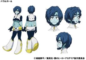
Retarded coomer design. Why is her underboob out and her shorts loose and undone?
No. 205220
File: 1652239540011.jpg (158.87 KB, 824x1081, 1652234185364.jpg)
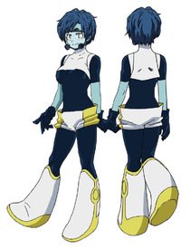
>>205204he is incapable of designing good outfits for his female characters. i like uravity and toga but the rest are so ugly.
and even this design could be cute or at least not offensively stupid-looking with minor changes.
No. 205250
File: 1652255018902.png (126.26 KB, 292x426, Ch_Simone_Rune_Factory_5.png)

Mayor/Doctor Simone from Rune Factory 5. She sticks out like a sore thumb.
No. 205257
File: 1652258522267.png (253.25 KB, 540x528, tumblr_3ed817bd9dfd1a956c16269…)
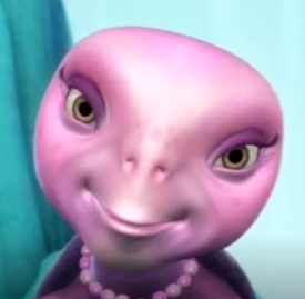
No. 205369
>>205199I don't know anything about this series, but what looks bad about this drawing to me is the lack of facial expressions and the bad gesture. It makes them look really boring. The designs per se are okay. I think the dark haired woman looks cute.
>>205220>he is incapable of designing good outfits for his female charactersDisagree. Some of my favorite Horikoshi designs are female characters. Uraraka, Toga, Jiro, Tsuyu and Mirko look amazing. But his bad designs really stand out because of how awful they are (Momo, Midnight, Tohru)
>>205258>she’s supposed to be a doctor, eh I’ll just throw a lab coat on herScientist characters in a nutshell. I've yet to see a female character who wears a lab coat that isn't wearing random shit under it
No. 205399
File: 1652316669185.gif (1.23 MB, 500x375, peak character design.gif)
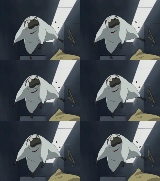
>>205199
Wtf are the eureka 7 verse that is not the original series, legit blocked out the sequel for how fucking awful it was and my friend told me the films are just as bad, like is anyone working on them that actually likes the series?
No. 208053
File: 1653134436337.jpg (102.44 KB, 557x880, 999-lotus-concept.jpg)
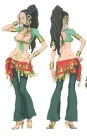
When I first saw her I thought "oh, just coomer waifu bait", but I was surprised to find out she's actually a very compelling character and her personality isn't coomer baity at all to me. She's in her 40s and is a single mother, of course some of the moid characters make fun of her for her age which I also dislike. I like her a lot, but her design is just…
No. 208163
File: 1653165287971.png (176.06 KB, 646x714, kobayashisan.png)

Most of the characters in this series are ugly, thanks to the annoying hair colors and hideous hentai proportions, but these two take the cake. Lucoa looks like a bad deviantart OC. Her breasts are too big, her clothes are boring, don't fit her personality and clash with her hair color. And what the fuck even is Ilulu, that thing leaves me speechless because of how hideous it looks.
No. 208175
File: 1653168085556.png (189.94 KB, 720x870, de405fd-f13071fc-3014-4ae8-b02…)
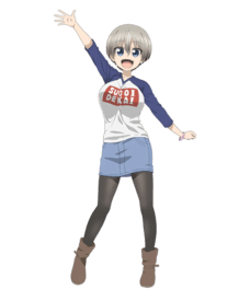
Everything about this design. Just awful
No. 208211
File: 1653184184629.jpg (181.8 KB, 984x984, 124-Horse-LPS-1.jpg)
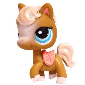
>>204762Jesus Christ, the horses were so cute in generation one (picrel), what the hell happened? Cute things are supposed to be round and squat, not pointy and skinny. That's character design 101.
No. 208720
File: 1653365577254.png (81.99 KB, 300x746, 441-4416855_elarainbow-six-sie…)
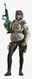
she looks like a fucking idiot
No. 208724
File: 1653367580827.jpg (110.74 KB, 688x1024, b50fc11be233bba555997e7d7b7a08…)
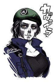
>>208720Why is she not wearing BDU pants as well? Also wtf is that gun decal or whatever? Looks like paintball gear. Does it make sense in game?
I don't play rainbow six but sometimes I get curious about it because I like some dude's design's and also Caveira's design.
No. 208728
>>208163gonna go in an autistic rant
every time i see this anime i just get so depress. At its best it's a series that explores the concept of adopted families and the affects a parent can have in a child's self esteem. At worst it's a dumb pedobait hiding in the guise of yuri.
The girl in the left makes me the most depressed. She's a dragon that gets summoned by a little boy. Aside from the obvious disgusting pedo undertones, there was one scene in the manga I really enjoyed. He goes in this witch tournament test thing and he gets bullied by the other kids and due to him being quiet in nature just takes it all. He gets scared in the trials and mess up every now and then. He was clearly struggling and there was the green haired girl cheering him on which gives him a little hope and for the first time in years actually passed the test. It's later futher revealed that the kid's dad doesn't really acknowledge his existence and that's why he's always trying to do things to impress him (like summoning the green haired girl) but he gets no recognition or appreciation what so ever. He has a mom but due her not being a witch, she can't really help nor does she really try.
He tells her that he appreciates the time she took in watching over him and supporting him in an area that his parents couldn't.
and i love that.
i wish that was more of that.
i wish this manga continued exploring that. but it doesn't and made an entire dragon mating scene instead.
No. 209032
>>208186kek thank you
>>208163I just realized that these designs remind me of those shitty Kisekae dolls with their dumbass cow-like legs and tiny feet. The one on the left in particular looks like they set her boob size to max.
No. 209037
>>208175not enough people talk about how awful her outfit is. It looks like a patchwork abomination of hideous 2010s trends
>the weird ugg boot things>paired with black tights>paired with a denim skirt>paired with a slogan long sleeve t-shirtI don't have the image on me rn, but there's this compilation image of women wearing black leggings, denim skirts and sandals. This looks exactly like that.
No. 210261
File: 1653947877489.jpg (340.91 KB, 1200x675, 5.jpg)
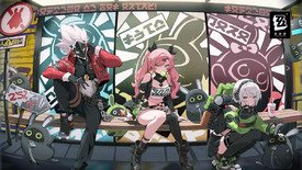
i think this is genshin impact but im not specifically calling them out (genshit fans shut the fuck up, pre-emptively) but i hate when you see… anything like this. a male character looking cool while the females are generic and have a ton of skin showing. male characters get to look badass while female characters are just there to be gazed at by straight men. hate it
No. 210278
File: 1653953629266.jpg (403.27 KB, 990x1201, pareil-11.jpg)
>>209037this one?
and yeah this outfit is hideously dated, but this character was made with scrotes in mind so they only care about the boobs
No. 211843
File: 1654396293246.png (109.29 KB, 194x498, Character_Barbara_Game.png)

I actually think this character is really cute. Or it could have been, if they didn't ruin it with their stupid strapless dress and detached sleeves obsession. The cleavage looks cheap and it doesn't fit the cute and innocent vibe she's going for at all. They took what could've been a perfectly cute design and ruined it, it makes me mad. Overall I still like her, but these two defects really bother me.
No. 211957
File: 1654445183697.jpeg (391.5 KB, 1202x1162, EVXkfLTUYAA2-Y7.jpeg)
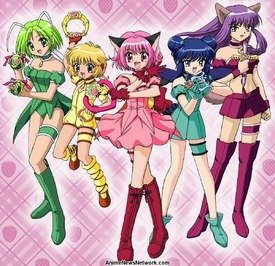
God, they're so ugly. The colors are an eyesore and the clothes look fetishistic. Pudding and Mint look better in this version than in the newer one, though.
No. 211977
File: 1654448751372.png (140.2 KB, 500x760, magireco.png)
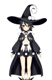
If I posted every ugly Magia Record character, this thread would reach it's limit
No. 212005
File: 1654454077284.png (677.05 KB, 658x978, TwinTurbo.png)
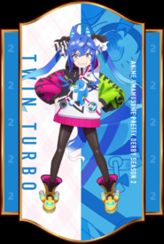
I like some of the designs from this series but this one hurts my eyes, she looks like the result of pressing 'randomize all' on a game's character creator
No. 212060
File: 1654464804334.jpg (568.41 KB, 800x1190, marmaduke-poster-2022.jpg)
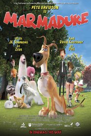
Looking through Netflix and glanced at this atrocious shit. Everybody look so stick thin like they could easily snap and what's up with that one lady with mommy thicc thighs but still looking sticc the waist up? Pretty sure they're trying to take the Addams Family approach but still looking pretty ugly.
No. 212064
>>212060In what way does this look like Marmaduke? This is atrocious.
>>212062Bootleg 2012 film look.
No. 212110
File: 1654479460108.png (85.46 KB, 1024x768, Card_30212_l.png)

>>211977Ew anon you weren't kidding.
No. 212159
File: 1654498314771.jpg (156.59 KB, 500x750, Kazumi5eng.jpg)

>>211977>>212013>>212016The artist was flat out a reformed lolicon, he said in the art notes he had a realization he was a creep halfway through the series and stopped drawing weird revealing outfits and even redesigned the main characters' outfits. Not defending this shit but at least a realization was made.
>>212101This is the most hilariously shitty art.
No. 212362
>>212159>>212159Holy shit when I saw the thumbnail I thought those were ridiculously massive saggy tits and not a skirt. My expectations for scrote art are already that low.
>a reformed lolicon, he said in the art notes he had a realization he was a creep halfway through the seriesI find that hard to believe, tbh, but at least he redesigned the outfits.
"Fun" fact, the original Madoka character designer is a woman but she's also a lolicon.
No. 213063
File: 1654795411651.jpeg (354.75 KB, 289x1156, 15CBF7BE-B847-4BDC-B450-2FF1DB…)

>>212060Why do they design women like this all the time
No. 213299
File: 1654891425044.png (167.14 KB, 396x912, Camille_Render.png)
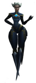
Her walking animation is also so goofy, i cant take her design seriously at all. But then again league has a lot of shitty female character designs
No. 213414
File: 1654944203749.jpg (113.13 KB, 1280x720, a12345.jpg)
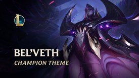
>>213299Don't forget its a f-ing GRANDMA, riot games are the biggest cowards to exist when it comes to character design. They made a new void champion after years just to turn it into a coomer 'mommy dom voice' bs. They could have made a monster like Rek'sai, but they want to make sure people jerk off to their champions so they'd make more skins.
No. 213469
File: 1654967898084.png (386.58 KB, 860x959, leblanc.png)
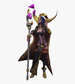
>>213299The splash art makes her looks cool, too bad they decided to give rcdart proportions.
Anyway, here's a little compilation of awful designed female champions. This one have the ugliest clothes. Men truly have no idea of what makes a woman sexy.
No. 213470
File: 1654967987024.png (261.56 KB, 900x955, janna.png)

>>213469Janna's design got updated in Wild Rift, but she still is boring and has a stupid Trolls hairstyle
No. 213471
File: 1654968040847.jpeg (93.58 KB, 1920x1080, zyra.jpeg)

>>213470Poison Ivy 2.0, but even uglier
No. 213474
File: 1654968183209.jpg (54.45 KB, 632x993, Katarina.jpg)
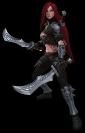
>>213472I don't think it's a good idea to let your long hair down and your stomach exposed while you're out there murdering people
No. 213476
File: 1654968403284.jpg (60.73 KB, 1280x720, evelynn.jpg)
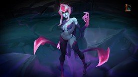
>>213474A demon who enjoys people's agony? Of course cumbrained men would turn this concept into a BDSM fetish. And the ugly Trolls hair is here again.
No. 213477
File: 1654968443031.png (1.86 MB, 750x650, kaisa.png)
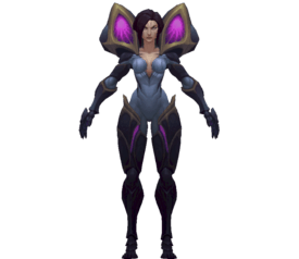
>>213414Never forget the Kai'sa shitshow. You'd expect her to look like Venom based on her character description.
No. 213501
>>213469>weird strappy swimsuit>pile of belts>skirt, but just on one leg>high-collar cape>blue hairWow, these things all go
so well together. You never would've guessed this was designed by a man!
No. 213928
File: 1655135207840.jpg (116.2 KB, 1269x660, tit anime reform.JPG)
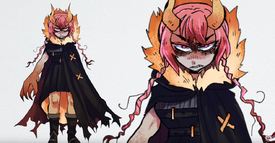
>>213927>>208163This was her version
Redesigning uggo characters etc thread would be fun btw, have we had one?
No. 213959
File: 1655142114710.png (398.23 KB, 446x610, EC235655-9F71-4E0D-A59C-4D01F1…)
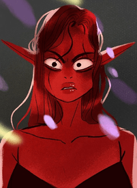
I would post every single Lore Olympus character on here if it were possible
No. 214010
File: 1655154267134.jpg (103.21 KB, 1200x829, EsYcFCpW8AM1hrM.jpg)
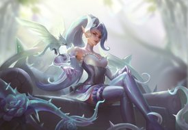
>>213469Leblanc probably has the worst possible iteration of a millenia-old witch possible. She's supposed to be a master manipulator, an illusion witch who trained under an undead evil overlord who's been running Noxus in the shadows for centuries, then she looks like THAT in-game. It's sad.
>>213471Zyra at least has pretty skins, but yeah her base design is just Poison Ivy.
No. 214100
File: 1655186643845.jpg (111.5 KB, 960x960, 3206569-img_5073 (1).jpg)
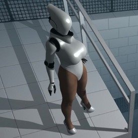
supremely dumb. supremely unsexy. scrotes have no idea how to design attractive female characters beyond "giant tits and ass"
No. 214125
File: 1655202237553.png (411.32 KB, 910x1032, aaaa.png)
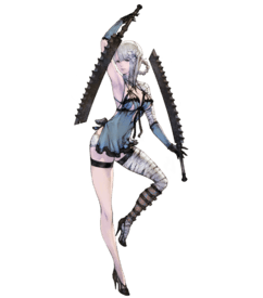
posted Kaine in one of the old threads and I'm gonna post her again.
No. 214133
File: 1655205740508.png (658.81 KB, 512x724, S114_Stage2.png)
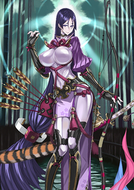
fgo raikou
no words
No. 214178
File: 1655212587172.jpeg (181.44 KB, 1262x2048, E3E912F3-0BA5-417F-9055-A7F06C…)
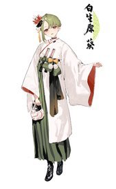
>>214139I think it’s shisantian. Coomer design is a given considering the game industry but sometimes he makes pretty good outfit designs like pic rel
No. 214216
File: 1655220488531.jpg (801.36 KB, 1280x1024, ivy-sc4-spec.jpg)

Ivy's design from Soul Calibur 4. Yeah I'm SC fan and this design of Ivy's was always one of my most least favorites ever. I understand that she's the sex symbol of the series and always wore provocative outfits but this look here was one of her absolute lowest and overall one of the tackiest outfits I've ever seen. I wouldn't even call it an "outfit" kek
Again, I understand she was a coomer design from the start but out of all the designs she's had, this one is the one I loathe the most. Which sucks because she's an interesting character in terms of the story for the series.
No. 214217
File: 1655220564334.jpg (1.11 MB, 2880x5120, ivy-sc5render.jpg)
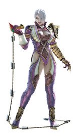
>>214216That said, I thought her Soul Calibur 5 look was easily her best. It's still coomer but it had a lot more nice intricate details going for it, I liked the incorporation of lace into it, makes it feel loosely sophisticated.
No. 214218
File: 1655220816088.png (736.46 KB, 923x1000, rachel-musou-orochi2-special-c…)
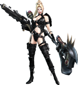
Rachel from Ninja Gaiden. Her design always annoyed tf outta me. Like Ivy, super coomer they weren't even trying to hide it. I guess the pattern is I hate overt stripper designs in action games because it's cheap and breaks the immersion for me and Rachel's is easily one of the biggest offenders of it. Even when I saw her design as a 14 year back when the first NG Xbox game came out, I thought it was gaudy.
No. 214219
File: 1655221078383.jpg (132.76 KB, 863x1280, kitana-mk9-2.jpg)
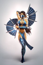
Kitana from MK9 specifically. Again, coomer design from the start (somewhat) but this one is easily my most least favorite look of hers while it's unsurprisingly the favorite of a lot of moids. The thing I hate the most about this design is that it just looks like it was thrown together in 5 2-3 minutes. There's no cohesion and just no style and her alternate costume in this game wasn't any better.
She got a major glow-up in MKX with an outfit that actually looked nice imo.
No. 214270
File: 1655230271139.jpg (87.16 KB, 536x727, Soul-Calibur-II-Game-Character…)
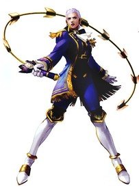
>>214217I love her alternate outfit from SoulCalibur 2
No. 214277
File: 1655232851689.jpg (203.8 KB, 512x512, ivyarts2.jpg)
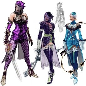
>>214270(Anon you replied to) I love that one too, that's one of her best alts! But I also liked her alternate from SoulCalibur 3, I thought that look was very pretty and fitting for Ivy's character perfectly, at least more so than any of her dominatrix themed outfits anyway.
Like I know coomers are gonna coom but I wish that they just ditched the dominatrix thing and followed suit with the alternate from SC3 and build from that.
No. 214279
File: 1655233255872.jpg (149.82 KB, 1280x1080, ivy-soulcalibur1-sc6-render-co…)
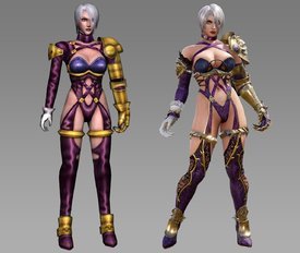
>>214270>>214277I think I'll add Ivy's SC6 look to tacky designs as well. The outfit is supposed to be a recreation of her look from the original SoulCalibur 1 on the Dreamcast (on the left) and while that look was already on the provocative side, at least it looked like it fit on her. Granted this was back when her breasts looked more or less proportionate before they made them huge but yeah, it looked okay-ish. But they went ultra coomer with the redesign making the chest piece not fit her bust and expose more of her abdomen. It's just a tacky design and it doesn't help that we didn't get any alternates this time around in the game neither.
No. 214299
File: 1655236989756.jpg (98.28 KB, 1024x768, leblanc_ff.jpg)
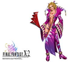
>>214216It's that kind of design that tries to hard to be sexy it ends up doing the opposite
No. 214379
File: 1655251454888.jpg (20.09 KB, 250x288, Ffx2-ladyluck.jpg)
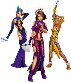
>>214299Posting designs from FFX2 is almost cheating
No. 214392
File: 1655253170847.jpeg (50.03 KB, 441x696, AACD4A0C-4909-492C-8C15-5DC188…)
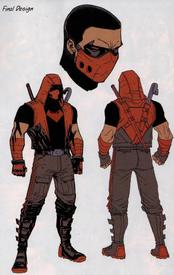
>>189168I hate this design, not sure if it’s because of the art style of short hair
No. 214393
File: 1655253202600.jpeg (131.41 KB, 642x537, 1C43ED20-2F50-40BB-9EDC-D4CC80…)
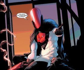
>>214392Lowest point for his character
No. 214564
File: 1655305553225.jpg (44.71 KB, 517x443, Ffx2-thief.jpg)

>>214299AHHH No Leblanc, I'm getting the flashbacks lol Very good choice anon, Leblanc had one of the worst outfits from all of Final Fantasy (that I can think of). Like how does that outfit even work? I don't think it's as awful as
>>214216 but it's still pretty gaudy. Like the only cute thing on that design is her hair and hair sticks.
>>214352Eugh… Never seen this character before but yep, tacky.
>>214379Oh yeah, FFX2 as fun as the concept was with the Sailor Moon-esq transformation sequences, a lot of the outfit designs were godawful.
>>214380I used to think his design was cool back then. Stupid stupid 15 year old me LOL This design looks mismatched and all over the place.
>>214393What even is this? Kek.
No. 214575
File: 1655306187734.png (209.32 KB, 403x690, sonya-mk9-white.png)
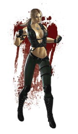
>>214558>I feel alot of the designs for women in MK9 were hideous due to how porny they were.You're absolutely right anon. ALL the female characters were dressed like pornstar meets strippers and it's kinda insulting lol. Sonya's is the closest to wearing something of an actual outfit. Like honestly all she needed was a matching black tank top worn under the vest and she'd be good to go.
But I guess Kitana's got to me the worst because she's supposed to be seen as a princess type of character and like, how does a look like that convey "princess"? to anyone? I swear this is why I hate a lot of moid who design with their dicks and not with their brains.
No. 214581
File: 1655306770640.jpg (134.48 KB, 563x1000, FFX_Lulu_Art.jpg)
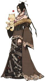
I've always had a like/dislike with Lulu's design. I like the whole gothic aesthetic when it comes to character design and there are elements of Lulu's design that I like ornate details on her dress and sleeves, the fur neckline, and the bodice but it's those fucking belts man, they really ruin what could've been a pretty cool look.
No. 214613
File: 1655309208868.jpeg (230.5 KB, 400x515, 73C82250-0E9C-48A0-8335-0315B2…)

>>214564Jason Todd/Red Hood from dc comics. It’s supposed to be homage to the joker’s own red hood costume but it looks fucking ugly.
No. 214617
File: 1655309330956.png (555.05 KB, 455x677, 22CD808E-4CFD-4E8F-9396-E3500C…)
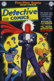
>>214613This is the inspiration.
No. 214625
>>214616>Nomura's obsession with beltsDon't forget the zippers. Belts and Zippers to the max all over in the Kingdom Hearts games.
I think he's learned to tone it down in recent years though.
No. 214880
File: 1655400875496.png (80.61 KB, 136x427, 193356.png)

>>214277I like this one too! Yeah I wish she had more elegant outfits, it suits her so much better
I didn't play the first game but this alternative outfit looks interesting too
No. 214882
File: 1655401218171.jpg (49.09 KB, 288x452, Sc2-taki2.jpg)
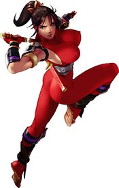
I think I already posted her in one of the old threads but this one makes me laugh everytime because it's so ridiculous, poor Taki
No. 214907
>>214880Oh I can't believe I forgot about that look from the first game. I really liked that one a lot as well and back in the day, I felt like it was a blueprint for this
>>214270 look.
Either way, both outfits rock and I agree, Ivy really did deserve more elegant outfits, it's why her SC6 look pisses me off so much because it was a step backwards into retarded coom territory which sucked because her SC5 look was a decent meshing of the two themes (Dominatrix meets Classy, by her "standards" anyway lol).
No. 214910
File: 1655408110397.jpg (40.41 KB, 240x452, taki-2p.jpg)
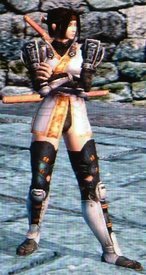
>>214882Taki is one of my favorite characters to play but I agree anon, most of her primary outfits are so fucking dumb. I'm just thankful that despite her stupid coomer suit, they didn't put her in dumb exploitative situations, at least that I remember anyway.
She at least did have some good alternates, her SC2 alternate was always my go-to. Still a bit coomer in design but I'd take it over the skin suit since it kinda looked cool when in motion.
No. 215083
File: 1655472911526.jpeg (260.95 KB, 1000x1250, D21E09E2-4E83-4F4E-B016-AD3AFF…)
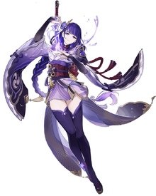
>>214174At least she has some armor and boots unlike the bitch from gayshit infact.
No. 215186
File: 1655498268923.jpeg (343.86 KB, 1208x1079, 8A609550-2063-445A-987F-8206E1…)
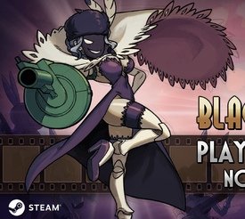
Never been a fan of skullgirls’ coomerbait designs but I’d admit they were fun. The new dlc character sucks though.
No. 215193
File: 1655499454073.jpg (Spoiler Image,98.95 KB, 470x900, __suzuhara_misae_mahou_shoujo_…)

>>214133Raita's art is so hideous, I can't believe that he's a professional artist.
No. 215205
File: 1655501811137.png (Spoiler Image,572.97 KB, 512x724, fgo.png)

>>215193Most of the FGO designers are fetishists, I believe he drew this FGO servant too (the anatomy is the same). I don't know how anyone can take this game seriously.
No. 215301
File: 1655520343440.jpg (14.87 KB, 288x288, HckyWoaV_400x400.jpg)
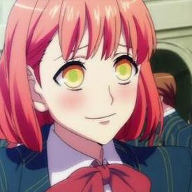
Haruka Nanami's eyes from Uta no Prince-sama.
Jesus Christ, look at them!
No. 215899
File: 1655769860434.jpg (96.07 KB, 1100x1100, dZjl31r.jpg)
No. 215962
File: 1655799354583.png (6.89 MB, 2250x2522, big band.png)

>>215186they fired alex ahad and hired a fangirl to imitate him (even to emulate his sketch lines left on final), and you can clearly see she's nowhere near as good, nor can digital imitate traditional pencil (ahad does pencil sketch, then ink brush lineart, then digital coloring)
picrel is Ahad's actual artwork for comparison
skullgirls is infested with the most insane drama than any other game ever did
No. 215972
File: 1655807172803.jpeg (275.66 KB, 600x911, C4494B89-5D8A-4B71-9D65-633284…)
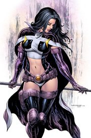
>>215951I agree the original will always triumph every other variation it’s too iconic and imo looks good.
I never liked huntress’ weird stomach window and booty shorts combo it’s so stupid.
No. 215977
File: 1655810732134.jpg (42.29 KB, 478x743, rngtsrgn.JPG)
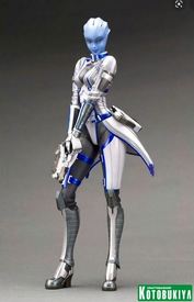
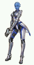
>>215899That fucking statue remind me of my least favourite Kotobukiya bishoujo statue: Liara T'Soni. Holy shit her face is awful. And these days that figure runs for 800 dollars..
I hate Liara's ME3 armor with burning passion too (the one the fugure has), I don't even know why. It's so UGLY
No. 216028
File: 1655831655325.jpg (31.6 KB, 600x450, Harley_Quinn.jpg)
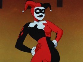
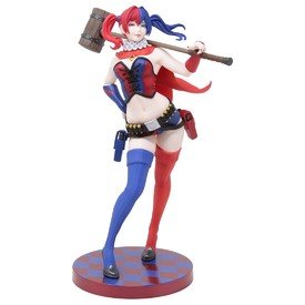
>>215899I feel crappy for this because I adore Harley in Batman TAS, she's one of my favorites in that cartoon but when they remade her design making her more "sexy" (I guess?), I thought she looked so dumb. Her OG design was much more iconic and unique.
No. 217936
File: 1656528856501.jpeg (45.08 KB, 400x300, D3850F8A-DFD9-4DB3-81D3-61989B…)

So ugly.
No. 218235
File: 1656640792750.jpg (95.69 KB, 671x756, 69f5e7b19a6d198531493cf83075d7…)
I'm finally reading Erased and I just can't with the main character's mom's pornified lips
No. 218263
>>215899>>215900It's like every version of Harley Quinn got worse.
>>216028Classic and iconic.
No. 218264
File: 1656650970716.png (187.56 KB, 401x560, tumblr_p69ty3eGRH1w1z40jo1_500…)

>>218235Reminds me of Peach Girl. Maybe her lips look weird because most manga artists don't draw defined lips that often? I respect your opinion tho, maybe "porny" is not the word I would use, but her face looks a little off.
No. 218265
>>218256So far I've been accused of being white, being a bitter and jealous weeb, all because I thought a character's lips look inflated. Next you're gonna tell me I'm a jealous thin lipped white weeb because I think a cow has too much lip filler kek. Imagine being this angry
>>218264Peach girl looked fine to me and it was the style for every character so it didn't really stand out
No. 218281
File: 1656660346580.jpg (15.75 KB, 236x441, d0956b5ba3b775be31ae56832b462b…)
>>218262They didn't, she is based on artwork by Shunya Yamashita (he has created redesigns for many characters, is Rei Ayanami, My Little Pony, the horror biishoujo series etc). Personally I think that the art is great (I really like his style), but the figure doesn't fully capture the face
No. 218287
File: 1656663795895.png (460.29 KB, 1276x385, 1656623422401.png)

Thoughts on the new Monkey Island? There's fan backlash over the art style, but tbf the games have changed quite often
https://www.youtube.com/watch?v=6BhE1r3JNpQ(learn2embed) No. 218621
File: 1656781557278.jpg (207.79 KB, 1920x1080, ekko.jpg)
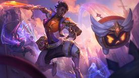
God, the new Star Guardians look so fucking ugly. Random champions that don't fit the magical girl genre, don't have chemistry as a group, uncreative uniforms and awful color schemes. Why the fuck are we even getting more random SG characters instead of the First Star and the first team, anyway?
No. 218624
File: 1656782024298.jpeg (Spoiler Image,339.06 KB, 2560x1440, FWWt_3DWYAAHLVP-scaled.jpeg)

>>218621As a Senna main, I actually think her design looks aight. Otherwise, I pretty much hate the SG line.
No. 218626
File: 1656782038250.png (1.51 MB, 1598x816, trannyliyah.png)
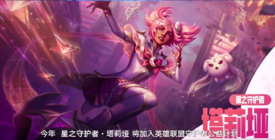
>>218621Taliyah looks like a cringe otaku TIM. And she looks hideous in pink.
No. 218630
>>218626I saw someone mentioned that Taliyah is a Troon and it's confirmed via story/voice lines or something. (twas an anon here who said so)
>>218628Same, I wish they'd honestly port them to PC.
No. 218635
>>218621>>218624>>218626They should have given them a new line.
Something like Goths.
No. 218800
File: 1656844515286.jpeg (Spoiler Image,253.36 KB, 2560x1440, CC509B83-1E14-4962-AE9A-BBE9DC…)

I heard a little homer simpson scream in my head when I saw this screenshot
No. 218868
>>218621The Ekko skin is awful and the blowback I've seen against it is huge. Ekko mains hate it, I hope it bombs.
>>218626Taliyah isn't allowed to have good skins besides her Esports one. They know this one's would have sold bad too, that's why they made her the year's charity skin to inflate the numbers.
No. 218917
File: 1656877970332.jpg (300.94 KB, 1143x746, motoko.jpg)
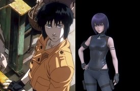
>>218889I won't forgive them for this downgrade
No. 219048
File: 1656913727668.png (750.5 KB, 1000x938, Velvet.png)

messy, ugly, stupid-looking outfit.
No. 219049
File: 1656914122876.jpg (103.19 KB, 500x600, etoz013.jpg)
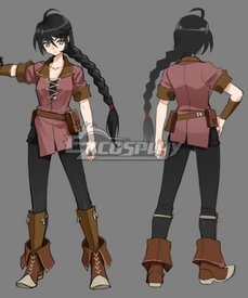
>>219048I like her as a character a lot so it's pretty annoying. I put her in her peasant costume immediately.
No. 219063
File: 1656920529572.jpg (370.91 KB, 1400x1800, Motoko.jpg)
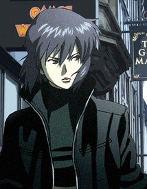
>>218917She looks so generic in the remake… Her 90s design and hell, even her look from the SAC & 2nd Gig design looked a lot more unique.
Don't get me wrong, her outfit in SAC was some straight coomer shit (the white leotard/thong look) but face and hair wise, she really stood out.
No. 219092
File: 1656932807991.jpg (226.69 KB, 841x475, Many-Looks-Major.jpg)

>>218917For me the 4th one here is prolly my least favorite. But I agree the downgrade sucks. Ilya's art is so bland and samey
No. 219326
File: 1657004269122.jpg (44.44 KB, 640x360, ETn-i75U0AAEKnB.jpg)
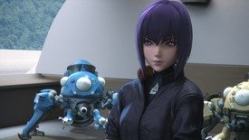
>>219092>4th one here is prolly my least favoriteAw I like the 4th one if you're talking about the 2004 design on the bottom left corner. I'm bias though because technically Stand Alone Complex/2nd Gig was my first exposure to Ghost in the Shell, I was too young when the 1995 movie came out to have known about it in the 90s and I didn't get into manga reading until about 2005. I do think the '95 movie is a striking look and I'm glad they weren't trying to make her look like a generic sex barbie unlike what's going on with Ilya's design. She looks so generic and lifeless. I mean I get she's not human but come on kek.
No. 219490
File: 1657069335509.png (359.73 KB, 700x1700, Baxter_by_PJ.png)
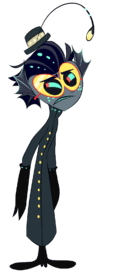
all the hazbin hotel characters look bad but… a male anglerfish with a lure? only females have that, is vivziepop fucking stupid?
No. 219597
>>219490I also can't help but roll my eyes whenever I see female peacock characters with colorful tails or lionesses with manes. Or even male calico cats, they do exist IRL but are disproportionately common in fiction.
On a vaguely related note boobs on non-mammal creatures are also quite jarring.
No. 219617
File: 1657107091751.jpg (149.39 KB, 1400x2100, 50891122.jpg)
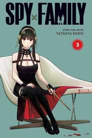
Don't know anything about this anime but from the moment I saw this design I HATED it. Not because its coomer like or whatever I just hate it I can't pinpoint why.
No. 222323
File: 1657963339863.png (789.49 KB, 752x1662, y6kfn18n4mp61.png)

Since a new episode of Dr. Stone came out recently
No. 222348
File: 1657980952083.png (714.47 KB, 970x916, hunter.png)
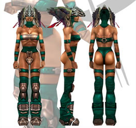
This old but something that always bothered me was Hunter's design in Quake III. All the other female characters were fully clothed and then there's Hunter going around blowing up people with a rocket launcher while dressed in a thong. It just feels odd because for the time the game had good female characters. The hardest bot to beat in the game was Major, a female commander from Quake II.
No. 222415
File: 1657999995004.png (8.75 MB, 4726x3145, drstone charactors.png)
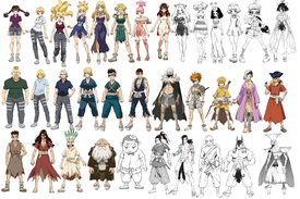
>>222323Made this collage and you can see the stark difference between the male and female characters. I only took the characters that had full body image.
No. 222416
File: 1658000245175.png (703.97 KB, 606x894, Charlotte_is_poisoned.png)
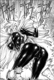
>>222415I had to see this and I'm making you suffer too. Her outfit from what I saw, is just a shiny unitard.
No. 222438
File: 1658006957915.jpg (101.57 KB, 1040x768, meet_the_characters_of_dead_en…)
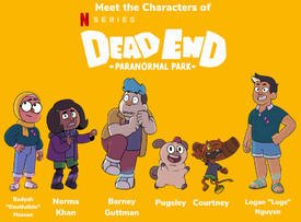
While the webcomic and pilot are its humble origins, can we just agree that CalArts was a mistake?
No. 222451
File: 1658011099586.jpg (12.81 KB, 334x343, Screenshot_20201031-082810_You…)

>>222446And now we know why people on social media, namely Twitter, Tumblr, etc. have been on a massive shillfest in order to get the show into having a second season.
No. 222454
>>222438I don't blame the school tbh, I blame the lazy students that don't use the tools that were given and the tips that they learnt from their professors to create something new and interesting.
Just because they learnt how to do a style doesn't mean they can't experiment, this isn't like during Da vinci's era in which if they didn't use the exact canons they wouldn't even get a glance from anyone.
It's clear that since Steven universe most people want something that doesn't have a bean mouth.
No. 222490
File: 1658021016560.jpg (309.53 KB, 1280x1707, 1280px-Efes_Müzesi,_2019_10.jp…)

>>222388It's said to resemble like the statue picrel but with the sheer dress it's just extra retarded especially given she's supposed to be an elite fighter not a priestess or something
No. 222692
File: 1658100388139.png (365.1 KB, 354x500, s-l500.png)
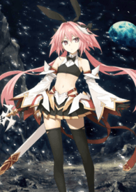
generic + memed to death + femboys are revolting
No. 222901
File: 1658158812791.jpg (186.57 KB, 800x1535, fisting.jpg)
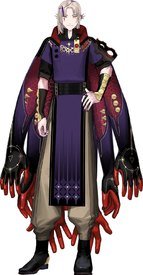
Worst design I've seen in a while (of course it's a V tuber)
No. 222917
>>218800God i hate
trigger shit so much honestly the biggest flag that something is pure garbage is depending how much it appeals to coomers
No. 222956
File: 1658173363823.jpg (28.36 KB, 480x631, 2fa6ec246ea5c63fd7c5368d60cb0e…)

I saw this and immediately thought on this thread.
No. 222991
File: 1658183060381.jpeg (1.24 MB, 3464x3464, EC4C0081-B698-44A4-BC21-B68EB1…)
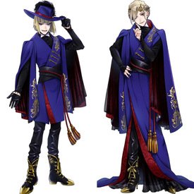
>>222901He looks like a mix of Rook Hunt and Vil Schoenheit. I seriously hate his clothes
No. 222996
File: 1658186475511.jpg (211.36 KB, 920x1024, Lucario.full.357006.jpg)
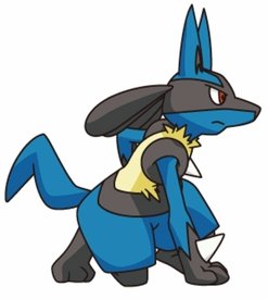
>>222956bleghhh this is part of why i hate lucario so much too
No. 223012
>>222996well, tbf it
is just a weird animal-shaped monster, not precisely an actual canid
No. 223019
File: 1658198765274.png (157.02 KB, 512x724, Sessyoin Kiara (Moon Cancer)_2…)
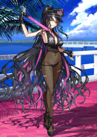
I feel like posting gacha characters is cheating at this point but this one got to me
No. 223067
File: 1658229112843.png (154.31 KB, 475x475, 890.png)
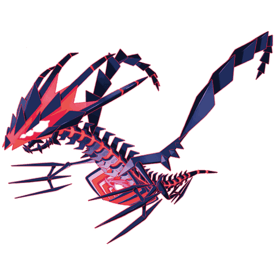
I hate a lot of pokemon designs from Gen 8 onward, but this might be the worst one yet. I know the ultra beast in gen 7 got a lot of hate for not looking like pokemon but at least they looked like a living breathing creature instead of a mess of shapes like this abomination. There's also a ton of other ones I hate like the trash can dragon, fat squirrel, vore bird, useless Regis, thicc Stonehenge, literal cum, and some more I don't even want to look up. Overall not liking the direction the designs are going in, hope that new designer leaves
No. 223118
File: 1658241147829.png (41.35 KB, 250x250, 890-e.png)

>>223067it looks even dumber in giga form
pokemon legendaries are pure garbage and have been for years. actually i didn't mind the wolf pair in swsh because their designs complemented each other way more than past "paired legendaries" for me. maybe because i could actually tell they were supposed to be a sword wolf and a shield wolf instead of some overdesigned confusing mess. beyond that, the power creep is insane. they have to keep making legendaries/pseudo-legendaries stronger and stronger to compete in the meta and it's absurd. soon we'll get a legendary with base 300 in every stat.
No. 223119
File: 1658241689906.jpg (91.11 KB, 1200x675, Featured-Pokemon-Scarlet-and-V…)
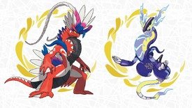
>>223118these are not as bad as that uggo but still… first weapons on dogs then tires on beasts? i personally think legendaries should feel separate from civilisation and mysterious this vibe just kills me
No. 223132
>>223067lol abstract red rayquaza
>vore birdwhat fucking pokemon is that? I don't keep up with shitty gens
>>223118this is so fucking abstract I would actually kinda like it if it were a sci-fi/horror movie and not Pokemon
No. 223142
File: 1658247295592.gif (904.06 KB, 400x422, tumblr_c51c289c1f290610c5c30d6…)
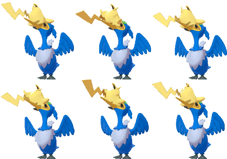
>>223132i think they were referring to cramorant? it picks up a fish, or sometimes a pikachu, to change its form. personally i found the pikachu eating animation pretty cute.
No. 223150
>>223142It’s weird to call this a “vore bird” when it’s based on a cormorant, which are birds that absolutely stuff themselves to the point they can’t fly if they get enough fish. It’s a cute and silly theme. Calling it “vore bird” makes me think they need to go outside and away from the computer for awhile.
>>223119I was ok with the red one until I saw the tire. Also someone said the purple one is shaped like a penis.
No. 223157
>>223134I think I meant Mega Rayquaza but tbh that red pokemon's overall shape is reminiscent of at least 5 other pokemon
>>223142>>223150I hate a lot of new Pokemon designs but Cramorant is one of the few I like. I never thought about vore when I looked at it but I can't blame anon for that being her first impression since the fandom is absolutely cancerous and pornsick, "vore" is no longer an obscure porn thing only few online circles know about and is now widely joked about, and GameFreak has a track record of pandering to furries, coomers and weirdos.
No. 223173
File: 1658252884266.jpg (87.47 KB, 376x470, Xiaolin_Showdown.jpg)
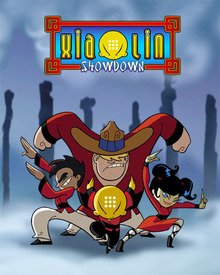
>>222438I fucking cannot stand this style, it's like the default for most cartoons on cartoon network these days and I miss the days of the late 90s and early 2000s where you saw so much more variety in cartoon styles. You'd have something like The Grim Adventures of Billy & Mandy to Xiaolin Showdown and Ed, Edd, N Eddy and Courage the Cowardly Dog. It's depressing that 15 years later and we're stuck with this garbage. It's like mainstream character design in terms of art style got so much lazier and it makes me grateful I grew up in the late 90s to early 2000s for animation.
No. 223175
File: 1658253166490.png (1.48 MB, 1359x2722, Naruto_Haku.png)

>>222692Femboy designs can be VERY hit or miss and most aren't very good. In fact when it comes to anime, most have terrible designs and the only one I actually like that comes to mind is Haku from Naruto. I think "femboy" designs work when there is actual cohesion and not trying to creating a look that over the top and so in your face.
No. 223233
>>223175>I think "femboy" designs work when there is actual cohesion and not trying to creating a look that over the top and so in your face.Femboy designs work when they're not coomer garbage.
>>223173Beanmouth style is so overused now because it's easier to animate and some popular cartoons in the early 10s used a similar style so it's what gets pushed in American animator schools to churn out mediocre animators who only know the bare minimum (sometimes not even that) and can only work with the style that's currently the industry standard. From what I've read, if you try to attend an animator's school in the USA, especially CalArts you'll realize that their goal is to get rid of artists' own unique personal style, because they don't want innovators, they want people who can copy the most generic, soulless and (most importantly) cheap artstyles because that's what works and so they can pay animators less, plus now there's more demand for CGI/3D animators so we are stuck with beanmouth style in mainstream American cartoons. Disney may have higher standards than other studios because well, they're fucking Disney and have a reputation to uphold (and profits to make from that reputation), so their cartoons can look decent despite having the same style (e.g. Gravity Falls, Star vs) but if you look at Cartoon Network 2D shows, you'll quickly realize that they have absolutely no quality control (e.g. Steven Universe, Craig of the Creek). They give no fucks, as long as it's easy to produce and gets popular enough to generate a profit, even better if it happens to become wildly popular.
No. 223248
>>223212Childrens cartoons are more aimed towards adults than anyone anyway. I'd argue even starting with Adventure Time era. Now cartoons are just self inserts of the creators, long continuing plotlines most children don't give a shit about, and agenda-pushing morals of the story.
Remember how cartoons used to be 15 min snippets, designed for children's short attention spans? And there was always a resolution in the end? There's barely any of that anymore. These cartoons are just a way for creators to sniff their own farts. They don't care about a child audience and it really shows.
No. 223954
>>223212>>223248AYBRT, you guys made great points and I agree. It really does seem like these days western cartoons are more preoccupied by having self-inserts with "deeper" story narratives then just you know, telling a story and having fun. I can't help but feel like Avatar The Last Airbender was the starting point though don't get me wrong, I fucking love that show and it doesn't feel like something that is a creator's self insert but what I mean is the drive for cartoons to have continuing plot-driven narratives.
And what we're seeing with this UGLY and frankly lazy looking animation style that is the CalArts style, the creators don't care about the visual creativity of the show and are more about unleashing their ego and sometimes agenda into their cartoons that like you said, kids won't give a shit about anyway.
Again I'm glad I got to grow up with cartoons like Hey Arnold, Ed Edd n Eddy, Courage the Cowardly Dog, Powerpuff Girls, Fairly Odd Parents, and so much more. Cartoons that didn't have deeper narratives and were just silly hijinks and episodic.
I don't hate narrative driven cartoons, like I said I loved ATLA but I just miss the variety in both the nature of the shows as well as art style and I can't wait for the CalArts style to die off and we see a return back to stylized cartoons in different art styles.
No. 224162
File: 1658622378314.png (76.3 KB, 577x474, rip.png)
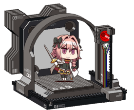
>>222692They belong into the shredder along with their coomer moid fans. Make a flat generic cutesy anime girl and call it a boy.
No. 224177
File: 1658630140163.jpg (66.25 KB, 896x504, rem.jpg)

I hate her stupid hairstyle so fucking much
No. 226196
File: 1659429359904.jpg (282.03 KB, 1080x1920, FZDFp7iXEAI2QtX.jpg)
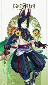
>>189168the more you look at it the worse it gets
No. 226205
File: 1659432497991.jpg (28.43 KB, 692x731, 77549954686cd66675393a5dfeea37…)
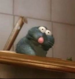
>>226196no offense to genshin husbando nonnies…
but most of them are mad ugly
No. 226224
File: 1659444714455.png (218.18 KB, 399x446, tumblr_2c1668b216900d3e0b68619…)
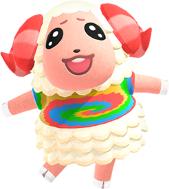
he looks like the concept of men who use vtubers as profile picture
No. 226242
File: 1659451875041.jpg (56.1 KB, 1200x675, evolvemilceryblogroll-15741256…)

>>223067>literal cumOmg are you talking about Milcery? Kek
nonnie, why did you put that in my brain, oh no. I fucking love Alcremie, don't taint her for me lmao she's perfect and I'm going to cry when she's inevitably not in S/V.
>>223119These motherfuckers are ugly, though, I worry about gen 9 designs. I already think the starters are all kind of ugly and generic, makes me sad.
No. 226435
File: 1659522610967.jpg (Spoiler Image,276.45 KB, 850x1204, __isabelle_tom_nook_and_dom_an…)

>>226224I hate his face so fucking much. For some reason he always reminded me of the weeby nice guys who whine about women and being single everytime they get rejected. It's like what they think they look like
No. 227249
File: 1659686241643.jpg (232.84 KB, 1920x1080, Mother_Demon_Spider_Anime.jpg)
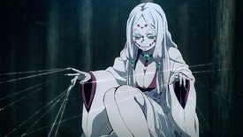
I finally got around to watching Demon Slayer after putting it off for years and I just finished the arc with the Spider Demon family and this character has stuck in my head for quite some time after. On the one hand I love her pale white color scheme but it's the big ass boobs that really bring her design down for me. I'm not saying that women being drawn with huge breasts is wrong or anything like that but there's just something lowkey coomer about the design that irks me. Especially with the added in context that she's supposed to be a child who took on the form of an older women to play the "mother" role which is kinda creepy. Like the concept is interesting but go for the coomer "milf" look?
At the very least I appreciate that they didn't really grossly objectify her by focusing on her breasts or having her get into ridiculous angles or positions just to perv on her.
No. 228250
File: 1659976349196.png (2.71 MB, 3268x3759, Testament_Guilty_Gear_Strive.p…)
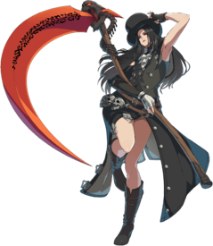
Massacred and yassified to a Hot Topic tranny. Such a shitty downgraded design.
No. 228290
File: 1659986573680.jpg (123.91 KB, 1280x720, Barold.jpg)
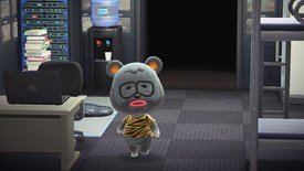
>>228264>Raymond is closer to those scrotes in all honestyWrong. Don't associate Raymond with those scrotes. I highly doubt they make themselves look prim and proper. In all Barold is the closest one.
No. 228558
>>228250I posted this in the transwash thread but yeah his new design is a mess. The only thing about the design that I like is the skirt, skull belt, and boots but the waistcoat and top hat is so fucking dumb and really make the outfit as a whole look tacky and mismatched, especially when in motion.
And then of course the "nonbinary" bullshit, fuck off.
No. 235131
File: 1661934670332.jpg (88.49 KB, 900x500, WendallWild.jpg)
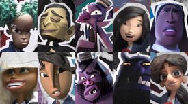
No. 235367
File: 1662010505492.png (60.06 KB, 267x499, 7BB6A616-CDAC-49DE-9753-CF37BA…)
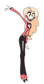
Cheap shot + apparently she’s already had a redesign but holy shit out of all the Bob’s designs hers always bothered me the most. All of them are so overdesigned but I felt like there was no effort put into Charlie at all. It always felt like she was missing key elements to her designs, like why is she wearing a formal bellhop outfit with a casual hairstyle? Why is half her hair curly and the other completely straight in the crazy low ponytail? I want to give her a hat so bad.
No. 235403
File: 1662029323505.jpg (26.57 KB, 400x400, FFPSiq9C_400x400.jpg)

The When They Cry franchise is dead and Ryukishi killed it (and ofc Umineko fans are creaming themselves on Twitter over this shit).
No. 235407
File: 1662031991376.jpeg (1.3 MB, 2000x2200, FMOZ4H4UUAIvayX.jpeg)
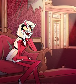
>>235367I very much preferred her pilot design tbh. She has a more friendly, cheerful and easy-going look that fits her personality and character way better than her redesign. Don't really like her eyes red all the time instead of those dark puppy dog ones. Her eyes are better off red when she's going in demon mode. For her pants, the black one contrasts well with her top rather than having it completely red. For her hair, it looks better with a single tie at the end making it look loose and flowy than having it tied twice which looked pretty stiff. Not really a fan of the redesigns except for Vaggie. They all just looked watered down and unnecessary.
No. 235440
File: 1662041319591.jpg (200.2 KB, 2048x1152, wendell-and-wild-3.jpg)
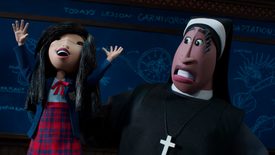
>>235131The asian girl is cute and I like the nun but man the rest look so unappealing.. I'm so bummed about the designs because I love Henry Sellick so much and I was excited to see him collaborate with Jordan Peele…
I hope the movie's good, maybe the designs will grow on me then
No. 235539
>>208163I know so many people (including women) that love the shit out of this series and praise it as the next coming of christ and I never understood why because to me it's nothing but a generic harem pandering anime, just with female MC, but this doesn't change the concept of the series or makes it any better or more interesting.
Think I dropped it when they introduced the loli since I was already fed up with the other characters before and couldn't stomach seeing them checking the next otaku harem fetish option. I haven't even seen (or don't remember) the first girl in your pic, I hate that design the most I think.
No. 235573
>>235542I feel you about Pi's awful design. It really didn't fit her… Unless all she cares is putting some ass in Yata's face kek.
Which .hack novels would you recommend? I need to play the old games. Tried long ago but could not get over combat feeling poor and floaty I guess.
If the character writing was more realistic in the first game series, I'm probably gonna love it. I have enjoyed GU so much, but wish that the plot didn't feel like cliche shonen at times.
No. 235589
File: 1662082833333.jpg (112.59 KB, 875x915, Genshin-Impact-Character-Tighn…)

I know genshit is low hanging feuit but they really hit a new low each update
No. 238818
File: 1663105131318.png (867.44 KB, 609x687, D50F3762-18B2-416E-8F45-4D0F81…)
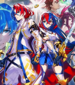
Dead thread but whatever.
Yes, these are the protagonists of the upcoming mainline FE title.
No. 238828
>>238818lmao I was
just about to post them myself
No. 238862
>>235131not gonna lie, some of those designs look like racist caricatures. I saw this video on TikTok about this movie saying it's gonna prove time burton wrong on
POC not working in his style but this shit looks fugly.
No. 238908
>>238818These look like bad OCs with some edgy backstory like 'they r desendints of marth BUT ALSO half demon do not steel"
In fact I wouldn't be surprised if they went with that explanation.
No. 239306
File: 1663197489654.jpeg (Spoiler Image,526.15 KB, 1170x896, E34BBEB6-3FBA-4AAD-91D0-1FF522…)

Soul Caliber was discussed last thread iirc but I haven’t seen anyone mention the atrocity that is Queen’s Blade. For anyone not familiar it’s basically the closest thing you can get to porn without actually being porn. No hardcore NSFW but spoilered since it’s disgusting nonetheless.
No. 239321
File: 1663199904967.jpg (490.09 KB, 2894x4093, IMG_20220907_143537.jpg)
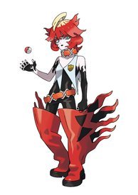
We could honestly fill a whole seperate thread with how stupid all the more modern pokemon designs are. Look at this retard in her retard boots. Why? Why are the new legendaries also a motorcycle? What actually happened to pokemon?
No. 239323
File: 1663200854378.png (1.11 MB, 750x1334, 6E0F21B6-5A62-45DD-87EF-953614…)
This might be a hot take and I don’t think it’s awful by any means but I just don’t think it fits in with the rest of the character designs in the manga…sorry yoru
No. 239348
File: 1663203949249.png (383.33 KB, 540x714, tumblr_343384ef9961207162b3a83…)
>>239321Wtf?
The 3D model isn't any better. How does she walk in those boots? How does her shirt stay up? Are those tattoos or some weird sleeves? The world may never know. Her face is cute though, if you just look at that.
No. 239352
File: 1663204279444.jpg (534.08 KB, 2481x3508, Pokemon_SV_Grusha_Key_Art.jpg)
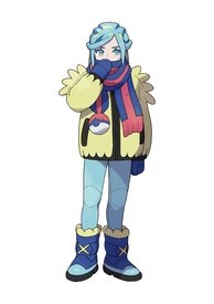
>>239348The ice type gym leader looks better. At least the outfit seems practical for the environment and comfy. It's a dude, but I can guarantee there will be a lot of people calling him trans/nonbinary/etc.
No. 239418
File: 1663217695141.jpeg (59.63 KB, 480x307, E05E846C-9EBF-4B52-AB08-9B782E…)
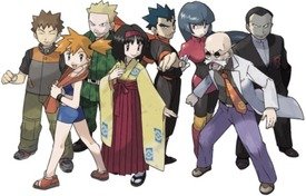
>>239416Remember when Pokémon characters didn’t look like they belonged in Yugioh?
No. 239433
File: 1663221896880.jpg (144.72 KB, 960x540, Yugioh Zexal.jpg)
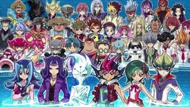
>>239416It feels like they're trying to go the Yu-Gi-Oh! approach with it and that's not a good thing at all…
No. 239441
File: 1663223408078.jpg (2.23 MB, 3200x5000, alisa-t6-wings.jpg)
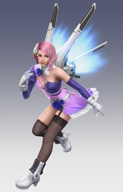
Not sure if there are any Tekken fans here but Alisa's design was one that I never really liked. It's just so mismatched and randomly thrown together in such an eyesore way. It doesn't help that I don't like characters like her, the whole anime waifu robot.
No. 239442
File: 1663223490530.png (849.84 KB, 600x1067, Tekken7-alisa-new-costume-alis…)
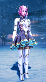
>>239441Her new outfit introduced in Tekken 7 was a lot better. A lot more pleasing to the eye even though I still don't personally care for her as a character as a whole.
No. 239489
>>239306The most disgusting thing here is the presence of the child. You just know he's there so moids can draw porn between them, because big mommy + shota is one of their most blatant fetishes.
Revolting.
No. 239496
>>239321I've love pokemon since gen 1, but I think the older gym leader /trainer designs are way uglier and boring. I honestly only think a few of the new ones are too over the top (like big boots mcgee over there), overall they're way better now.
I've never liked legendaries so I don't care about their designs, but the regular pokemon have gotten better. Every pink pokemon in gen 1 is a round blob and most of them look the same with minimal differences: jigglypuff, wigglytuff, chansey, clefairy, clefable and exeggcute. And the rock pokemon were literal rocks like geodude and onix.
No. 239503
File: 1663246215701.jpg (302.29 KB, 1022x1070, Untitled.jpg)
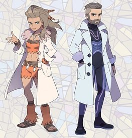
>>239416the professors look dumb af too. i am shocked by all the comments of "omg mommy/daddy!!!" the guy looks beyond boring and the woman is wearing a flintstones outfit under the lab coat. good lord they look terrible
No. 239582
File: 1663266425019.jpeg (492.61 KB, 1420x2000, F56A8AAA-0035-4291-8D87-4C74EB…)

>>239430All of them are coomerbait (some being lolicon which is disgusting) but not as grotesque as the one posted here. I personally like Sigui (the nun on the left) and wish she were part of a better franchise.
No. 239916
File: 1663347058125.jpeg (929.71 KB, 1170x1458, BCEEB5A1-5E89-46E2-9463-173723…)
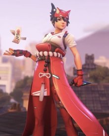
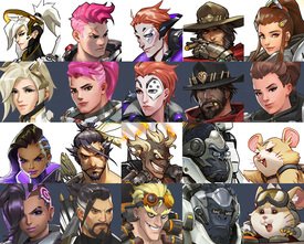
posting overwatch feels like cheating but wtf is this
No. 239918
File: 1663347509693.png (35.99 KB, 546x562, images.png)
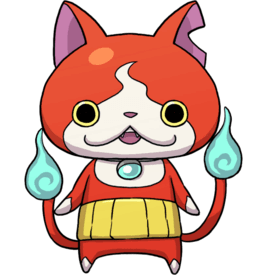
>>239916Fanart of this in human form?
No. 241355
File: 1663874172773.jpg (277.7 KB, 1000x1481, MV5BMTQ0MGI4NTgtZTlkNy00YTU5LT…)
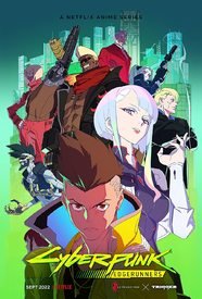
The desgins look like if you put in "anime cyberpunk epic" Dalle AI, its so generic
No. 242658
File: 1664226950246.png (923.43 KB, 750x581, AEC264FD-47B4-486C-87EB-AA08AE…)
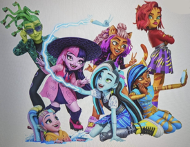
(dollsperg)
wut is this
No. 242678
>>212005Tbh I actually really like this design. It reminds me of over the top scene/emo shit people drew on deviantart
>>213471>uglierShe's sluttier but her color palette and overall theme is way better than any Poison Ivy I've seen.
>>214581I feel you nona. Her design is really cool from the waist up.
>>242658Every time I see the new Draculara design I hang my head in shame. She looks like the fat queer girls who dress colorful like this and then complain when people stare, kek
No. 242691
>>242658actually I'm really confused about this. I usually hate re-designs and reboots - Galaxy Girls still makes my soul ache - but the original MH designs seemed very soulless to me in a very bratz doll way. Here, the characters actually seem fun and more like they have some sort of inner life to them rather than just being copy-pastes of one another in different outfits and coloring.
They DO look more like Sims 4 characters though which is cringey.
No. 242704
File: 1664237333588.jpg (74.72 KB, 720x480, Monster-High-Frights-Camera-Ac…)
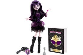
>>242693Yeah, like I said, Sims vibes, kek, it's almost uncanny and the more I look at it, the worse it gets.
Picrel is an example of an old doll I really love way more than any of those redesigns, but the general art, etc., never appealed to me so I'm torn.
No. 242785
File: 1664257318773.jpg (99.96 KB, 640x591, 4uiit4p6q9q91.jpg)
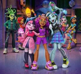
>>242658Nta but here's another pic
No. 242786
File: 1664257432906.jpg (34.53 KB, 320x638, 0xvdoygqb9q91.jpg)

>>242785Also bonus Ghoulia
No. 242839
>>242785I don't go here (was already too old for the original series) but isn't Clawdeen supposed to be more of a cool and bold type ? Why does she look like an early 2010s Tumblr nerd ?
Draculaura looks like a teenage tiktok zoomer girls but these girls are openly skinwalking her OG self so fair enough I guess.
I think Cleo is a bit like Jade from Bratz in the sense that if you remove her bangs it removes a lot of her charm and style. IIRC there was a doll with a long bob hairstyle, maybe they should have given her this if they didn't want her hair looking too much like Draculaura's. Lagoona's curls were cute too, not sure why they decided to olaplex her
No. 242934
File: 1664296104202.png (122.89 KB, 272x628, daxso2m-413eb051-fab1-4112-81b…)
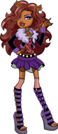
>>242785>>242839yeah clawdeen looks fucking horrible and she was one of my faves.
>>242786the legs are weird. her hair is so lame. the point of dolls is to dress them up in cool clothes and brush their hair, right???? god this reboot is dumb
No. 242984
File: 1664306611374.jpeg (59.22 KB, 766x400, images (7).jpeg)

>>242975
You mean these? They look pretty similar to me. I wonder how the people who repaint and customize dolls are feeling about the changes.
No. 242990
>>242984People used to whine about how they're conventionally attractive, but now they look even less monstrous and all of them have the same cutesy face
>>242987This looks so much better. Mattel needs to fire whoever is responsible for the dolls' clothes.
No. 244032
File: 1664650799234.jpeg (181.51 KB, 1260x605, A319053C-B197-47C5-BC4B-0B07B6…)

Mccree husbandofags I am sorry for your loss
No. 244051
File: 1664656789609.png (4.95 MB, 2151x2151, S355_Sprite_Stage3_webp.png)
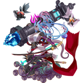
I know posting gacha shit is like cheating, but this is unironically one of the worst color schemes and over-designed official characters I have ever seen. There is another servant type for her which is just as bad but slightly different.
No. 244286
File: 1664735174761.jpeg (323.65 KB, 820x660, 3198A885-1328-4DD7-8B92-A3E091…)
>>244032How do you give the most minimal redesigns yet still end up looking worse
No. 244311
File: 1664740749281.png (781.87 KB, 860x1308, 587-5874831_new-genji-overwatc…)
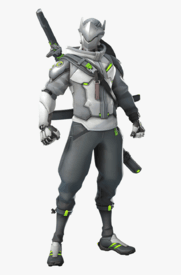
>>244286This art is shit and most of the redesigns are too. Genji looks like hes just in winter.
No. 244419
>>244384It's just a different concept artist
nonny that doesn't mean the final 3d renders will be in a completely different style
No. 244766
File: 1664895266532.jpg (38.8 KB, 334x679, 20221004_164836.jpg)
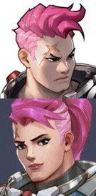
Fuck blizzard and this shitty game jfc
No. 244796
>>244766Wait are you saying in general? Or the new hairstyle? I actually quite liked this character existing because she went against the usual hyper feminine type women we get in video games so to see a woman character go against the stereotypes was so cool to see in my opinion.
>>244788>>244789Ah okay so it's the redesign. Yeah fuck that crap. Her old design is far superior because we got to see some bad ass bodybuilder woman who couldn't care less about looking feminine. So to see them do this to her is just awful.
No. 245003
File: 1664985647097.jpeg (127.06 KB, 892x965, E7EB05E6-04FC-4576-A9A5-1685E9…)
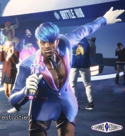
This is a character from the upcoming street fighter wtf
No. 245209
>>245007>>245004STAHP kek (but yes, it seems likely…)
All that aside, WTF kinda design is this? I know Street Fighter characters do look a bit out there but most of them still looked cohesive and conveying a theme. I can't tell what they're trying to say with a design like this…
No. 245323
File: 1665097417168.jpeg (1.19 MB, 1017x1937, 662F6554-1E16-4FD9-A373-AE7BCF…)

I don’t play this game but why does this character look like Vaush in 10 years
No. 245427
File: 1665143620801.png (486.29 KB, 652x503, 474236247436.png)
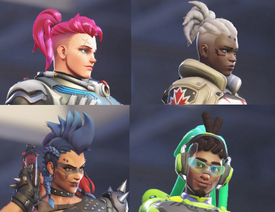
>>244286The new designers must really like shaved side/similar designs. I'm pretty sure Ashe also has an undercut, it's hard to see in a screenshot though.
No. 245588
File: 1665197772244.jpg (72.46 KB, 563x603, FegtfM2WQAIVNI2.jpg)
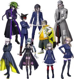
Teal braid girl looks okay but the rest…eeeesshhh….
No. 245591
>>245588source? looks like a danganronpa fangame or something.
also i feel like several danganronpa characters could be posted itt
No. 245648
>>245323That's the guy who pressured the femboy to troon out, people were making Redditor groomer jokes when the DlC got released lol.
>>245588I legit thought it was a bunch of Danganronpa donut steels using the canon characters as a base and gone through MSPaint, I could never take these games seriously because of the art direction.
No. 245720
File: 1665250387691.jpg (100.76 KB, 842x897, hell is real.jpg)
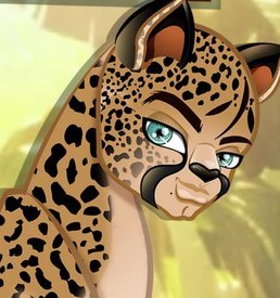
No. 247365
File: 1665763786941.jpeg (103.47 KB, 887x939, C5E7C626-D86A-412E-9AB3-C54E1A…)

No this is not a v-tuber. This is an actual character from the new Pokémon game.
No. 247376
File: 1665767345432.png (4.07 MB, 3000x3000, ACD0AB47-6199-44B4-9331-735A02…)
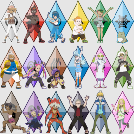
>>247365Pokémon is giving funny hair and outfits based on elements. How original. I’m tired of these new age Pokémon gym leaders. Pokémon sun and Moon had some of the best modern designs and yes I’ll die on that hill.
No. 247421
File: 1665775638092.jpeg (181.96 KB, 1200x2230, A29D1B1E-B32D-4CF7-88EC-16C07A…)
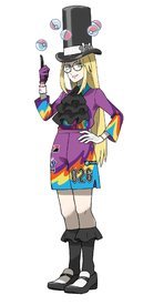
>>247371Please don’t remind me of this abomination
No. 247741
File: 1665868625729.jpg (147.57 KB, 900x506, 9-shield_61_a6.jpg)
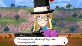
>>247421hes cute tbh. i dont usually like designs like this at all but i enjoyed him in game
No. 248947
File: 1666249676494.jpg (149.77 KB, 520x624, koko-tsuritama-31157908-520-62…)

I know she's some alien fish thing like Haru but when I first saw her, I thought she looked ridiculous compared to the other characters.
No. 248949
>>248942Uuh excuse you
These designs are perfections
No. 248958
>>248949Weak bait. Atrocious hair.
>>248951Minus the bikini top. Should get that covered up.
No. 249053
File: 1666272335994.png (91.56 KB, 250x382, Ryuki_Masters.png)
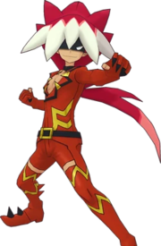
>>247421>>248942blocks your path
No. 250169
File: 1666626276517.jpeg (170.69 KB, 1169x1749, 6FACE8E2-BA55-4CEE-A232-68B25F…)
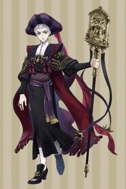
Not awful per say but if you know you know
No. 250483
File: 1666725223984.jpeg (1.28 MB, 1170x2477, 7FEBD8E9-EDF5-42A4-B2EB-69C854…)
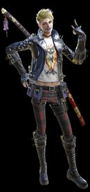
I’m excited for Bayo3’s gameplay but ugh
No. 250496
File: 1666727102011.jpg (143.13 KB, 1061x1500, FeSxtzyUYAEJJY0.jpg)
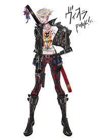
>>250494Based on how she acts in the trailers, since the game isn't available yet, she's a teenage girl who tries way too hard to look cool but has scenes where she's awkward and doing stupid shit so yeah, the design suits her for the reasons you stated. I disagree with the anon who posted her, the only thing I dislike is her lipstick color. Here's some official concept art.
No. 250506
File: 1666729393578.jpg (782.04 KB, 3000x1687, Han-Joon-Gi-Yakuza-7.jpg)
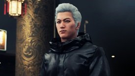
>>250504does that make Yakuza's Joon-gi Han Vergil post race reassignment surgery?
No. 250508
File: 1666729719124.jpg (180 KB, 515x1350, Ochiai-san-My-Divorced-Crybaby…)

No. 250516
File: 1666731947383.jpeg (52.46 KB, 542x655, C372CCAD-740C-4367-A600-CC1ED4…)
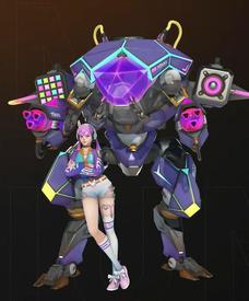
not sure if it’s awful or i just hate it. looks like an outfit a tranny would put together. or one of those e-thots like belle delphine.
No. 250532
File: 1666733997026.jpg (190.49 KB, 1919x1079, Screenshot_16.jpg)

I see the shitty overwatch designs and I raise you another hero shooter ripe with shitty design: Paladins. Look at this deranged fucking landwhale, who decided on these colors? Also what are these proportions, this looks like some shit straight from one of those twitter artists that draws everything brown and fat to get woke points. and yes, i know she's been in the game for a while now but nobody talks about this irrelevant game I am unapologetically autistic for and this has been bothering me for a while, dammit.
No. 250555
File: 1666737974631.jpg (177.78 KB, 1081x1080, sniffsniff.jpg)
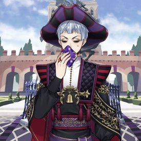
>>250549>>250169racist waifu ♥ he even does the thing in game
No. 250573
File: 1666744103750.png (144.41 KB, 860x1083, 510-5105811_hinata-transparent…)

>>245591 Hajime comes to mind first. What the fuck is his hair?
>>245616I wouldn't necessarily agree the style is ugly but it is kinda shitty, all their faces look the same tbh. i thought all the guys were girls at first too
No. 250588
File: 1666749603013.jpg (Spoiler Image,350.76 KB, 906x1280, 813eVqzEkTL._SL1280_.jpg)

>>250508Retarded ass boob pockets. Coomer moids can't draw clothed breasts for shit.
No. 250847
>>250483I'm personally mixed on the design to be honest. With the context provided with how she's supposed to be a teenage edgelord, the design makes sense but the thing I don't like is the T-Shirt and I feel like a cami tank top would look better but I admit to being bias with that because I personally don't like wearing t-shirts kek.
Overall I suppose she looks fine and they succeeded in making a character who doesn't ooze high fashion couture like Bayonetta and Jeanne which makes her stand out.
No. 250850
>>250532BIG WIDE….
Like WTF is going on here with the proportions…?
No. 250851
>>250594Yep, that scene was from this anime.
>>250588This is really the true lithmus test to see if a character with a bust is designed for coom bait or not.
No. 251135
File: 1666971520492.png (623.39 KB, 860x1580, 34-349718_moira-overwatch-funk…)
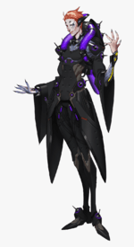
Moira's design from the original overwatch has always bothered me. How do you manage to simultaneously create the most overcomplicated yet most boring design of the whole cast? Seriously why is it almost all black? Sombra is also overdesigned as fuck but at least she has purple blue and pink accents to break up the monotony (albeit ugly af color choices and I don't get why people like her design.
Her OW2 design is one of the few better designs compared to the first game imo, gives off much more mad scientist vibes that reflect her lore better (even though overwatch lore is shallow af)
No. 252025
File: 1667303815239.png (549.51 KB, 963x1003, ugly.png)
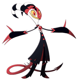
a lot of the cast is ugly but hes the main and such an eye sore.
No. 252090
File: 1667328257628.jpg (10.73 KB, 612x514, Irken_Empire_logo_by_FreeAd.jp…)
>>252025The fucking irken armada ripoff logo on his forehead like some kind of 2008 deviantart invader zim oc, I can't
No. 253060
File: 1667576841234.jpeg (760.39 KB, 1170x1668, 515D31E9-84F6-4801-972A-6F2534…)
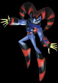
>>252025Looks like a blatant ripoff of this kek
No. 253861
File: 1667843550309.jpeg (40.52 KB, 400x600, 453D76AF-18A1-42B5-9124-91E714…)
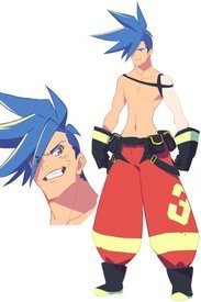
Studio trigger is a goldmine of bad character design but this one takes the cake.
No. 253974
>>252170She's obsessed with shipping him with that gay prince guy (Stolas?). I don't get it at all.
>>253861I always thought this design was super ugly but in an unappealing way. Boring Kamina rip-off
No. 254278
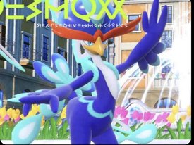
File: 1668107546445.jpeg (831.04 KB, 1090x815, 54C0FD2E-76AC-43C6-AF07-28D7C7…)
I’ve got a bad feeling about this
No. 254339
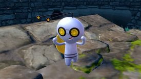
File: 1668124385521.png (249.89 KB, 1000x1000, Meowscarada.png)
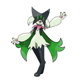
>>254278Why he got ass? So disappointed of these two as their final evolution. Meh designs but this is hitting real low compared to Cinderace and Inteleon.
A lot of the gen 9 Pokemon look uninspiring and nothing like Pokemon at all. I've seen some Fakemons and fanart that look way better than what's leaked.
No. 254383
File: 1668137338658.png (787.17 KB, 1200x675, gimmighoul.png)

I hope this isn't going too ham on the Pokemon designs, but just what is this? Gen 9 designs blow chunks and I hate them.
No. 254401
File: 1668144730831.jpg (444.56 KB, 1600x900, gimmighoul-pokemon-go.jpg)
>>254383I actually like this thing more in 2D oddly, it seems to have more personality and cuteness as a drawing than a 3D model. The model just has an odd flatness and textureless look to it. The worst part to me is the stupid sideways mouth, just removing the mouth all together would add some intrigue and mischievousness like an actual ghost type should have. I also hate that intentionally or unintentionally resembles the
reddit mascot
No. 254405
File: 1668145687203.jpg (209.94 KB, 1500x844, Bromojumbo-ScVi-Starter-Evos-2…)
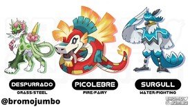
>>254383This one is lowkey cute. I agree with
>>254401 , They look so boring translated to 3d
>>254339>>254278These designs are such a disappointment. The fan artists did it better
No. 254407
File: 1668145977988.jpg (205.38 KB, 1913x1437, waaaaaaaaaa.jpg)
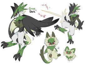
>>254339if they want to make it furry bait, at least make it look cool
No. 254426
File: 1668152507499.png (84.84 KB, 157x321, sage.png)
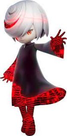
Sega robbed us of a canon Eggette and gave us this dull, uninspired edgy trash. Rei expies went out of style a decade ago, Sega.
No. 254536
File: 1668206412245.jpeg (470.24 KB, 1080x1350, D03D71D9-ADCC-422D-B686-9531C0…)
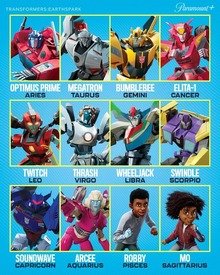
All of them are awful, but especially the human characters
Legit 2000s barbie movie tier in terms of terrible cgi designs
No. 255554
File: 1668631565110.jpeg (788.49 KB, 3100x1350, 6775EED8-9FA6-4B97-88D6-BC46FD…)

Image editor fucked up sorry.
I know some anons on here who would eat this shit (no pun intended) up
No. 255566
>>253861I love a lot of the designs from TTGL and KlK but didn't like anything from Promare. Even Leo looks like the generic white-hair bishi I already got tired of when I turned 18. Wouldn't call them outright bad too personally, not with that competition anime bring to the table every season.
>>254405Dammit this looks really good. Can't they do competitions and choose the artists with the most votes as the designers? Feel like PKMN designs look bad and uninspired for ages now save for a few exceptions per game.
No. 255567
>>254536tbh I really like Soundwave, Bumble Bee and Megatron. And Trash and Wheeljack are fine at least. Don't like the rest either and I hate the huge as hell heads the girls have.
Besides that I have to admit that I was actually positively surprised about that series, despite not being into that whole funny family stuff. But it was less annoying than TFP at least. I hated every single design in that show lol.
>>255554What the hell
No. 256115
File: 1668812651107.jpg (135.23 KB, 1120x630, cpthmpzclg.jpg)

Not sure if you can even call these things designs but I hate all chibi stuff that looks like funkopops in CGI. This includes mii or whatever those things are called, Animal Crossing or most handheld final fantasy games for example.
No. 256515
File: 1668966691206.jpeg (30.53 KB, 265x289, 24002A6E-8D4B-4FDD-B638-C7C623…)

I haven’t played a Pokémon game since I was in elementary school but wtf is this
No. 256531
>>256529do you also judge adults who are into disney or mlp or whatever
go back to twitter
No. 256552
File: 1668974817257.jpg (13.48 KB, 480x360, hqdefault.jpg)
>>256515i always see people shitting on new pokemon designs but this one has to be the absolute worst. Is it suppossed to be one of these things?
No. 256561
File: 1668976817568.jpeg (37.93 KB, 400x400, E15F4D2A-2555-45C0-80B3-F77C1B…)

Ryukishi is at it again
No. 256583
>>256549cool meme you took from another thread on /m/
"adults over 30 must cease having hobbies" is the most retarded zoomer mindset in existence
No. 256703
File: 1669022216101.jpg (29.55 KB, 393x309, 1644431400980.jpg)

>>256583Are you fucking lost? Yes, disney and mlp adults are also cringe as fuck. Now you can leave.
Imagine coming to shit character design thread to whiteknight your painfully reddit intrests. Come on, ask if I find funko poppers cringy as well.
No. 256706
>>256704Yes, it's exactly that and the thing from
>>256552, it's like they fused and became obese.
No. 256724
>>256716and you are STILL going on! Don't you have disney slop to slurp?
>the insecurity and projection reeksThat would be you. But alright, I won't make fun of your silly didney~ obsession anymore
nonnie,
No. 256748
File: 1669052703081.png (50.92 KB, 250x250, 939.png)

Generic mobile game monster
No. 256904
File: 1669082150425.png (170.74 KB, 600x341, Capsichum.png)

>>256748I like the idea of it; it reminds me of picrel but that design is so ugly.
No. 256915
>>256728she's not
t. another disney hater
No. 257137
File: 1669155454235.jpeg (293.26 KB, 1455x1305, CFA037A2-11FF-4962-8B11-B07376…)

How is this not a vtuber
No. 257217
>>256561My God it's been years and he's
still doing the "hands should look like cat paws" thing.
No. 257239
>>256709The fact that it's him with a voice changer pretending to be a loli only makes it more pathetic.
>>257217I don't know why he just doesn't let the colorist he pays do the sprites linework, he clearly has never been good at drawing.
No. 257370
File: 1669231230135.jpg (151.32 KB, 1200x675, FPhvLEZX0AM8i9C.jpg)
No. 257431
File: 1669249048244.jpg (64.76 KB, 414x730, Ramona.jpg)
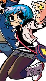
Prolly low hanging fruit but
No. 257479
File: 1669270024546.png (306.06 KB, 500x1109, 195-1956762_ramona-flowers-sco…)

>>257431as someone who really likes scott pilgrim (the comic) i agree ramona is horribly written. but i dont think she looks bad
No. 257481
File: 1669270766723.jpg (675.47 KB, 1337x1009, IMG_20221124_141708.jpg)
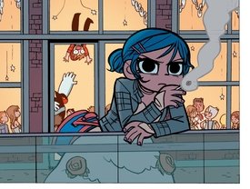
>>257479samefag but i guess it's just nostalgia but i always thought she looked cool
No. 257506
File: 1669277490807.jpg (360.83 KB, 624x392, envy (1).jpg)
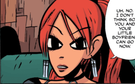
>>257505it truly is awful. like what is this.
No. 257533
File: 1669291871688.jpg (177.69 KB, 533x878, tirSC4art2.jpg)
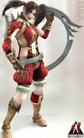
I like Tira but i hate the design she had here.
I get that it wasn't meant to make her look cute or nice, but i really can't look at it.
No. 257596
File: 1669312672245.jpg (948.22 KB, 2400x3300, Untitled.jpg)
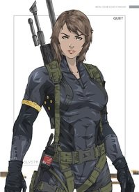
>>257557men dont understand how to make a woman look sexy i swear. the outfit redesigns of quiet are a great example of this. she looks like a fucking idiot with her ripped pantyhose and underwear and tied shirt, becoming hot when you put her in a form-fitting bodysuit or something.
No. 257657
File: 1669329407052.jpg (135.48 KB, 601x628, Tira2 (2).jpg)

>>257533I don't hate the concept art tbh I can see where they're were going with it, but the 3d models after Soulcalibur 3 look so bad
No. 257659
File: 1669329773692.png (1.05 MB, 894x884, Xianghua_3D_Model_Costume_2_SC…)

>>257657Like look at this shit. Why are her clothes so shiny and what happened to the colors?
No. 258736
File: 1669631868075.png (645.13 KB, 500x1092, Cainwatercolor.png)
rock that trash bag, boy
No. 258763
File: 1669641104001.png (184.91 KB, 212x744, darkdelusion.png)

just remembered that i saw this when i was looking at some old magazines online once
i have no idea of what is the setting of this game is, the whole costume doesn't make a lot of sense to me and just looks off but it's still pretty rare to see a female character wearing pants without any odd skin peeking cutouts
it would look fantasy proper if her stomach was covered, but i'm not sure how a cheerleader napoleon look is supposed work out
No. 259360
File: 1669790173568.png (1.4 MB, 1505x1292, soullessvssoul.png)
They took Kris' cute, functional design and made it disgusting coomer trash. I fucking hate Lyra so much, HGSS is the only Pokemon game I flat out refuse to play the girl character. I was a young teenager when HGSS came out and I felt this intense revulsion even then. I just knew they deleted Kris to appeal to coomers and it was the worst feeling.
No. 259371
>>259365Samefag but also the legs. Girly on the right actually looks like a poke trainer look at those legs! She is definantly ready to travel across the region.
The girl on the right is so waif and her clothes dont seem to show her preparedness for a tough journey just more like eye candy.
No. 259386
File: 1669800664722.jpg (148.97 KB, 850x997, __lyra_and_kris_pokemon_and_3_…)
>>259380>Everything I dislike is coomerishNeither of the designs are even remotely coomer unless you think shorts are coomer for some reason.
I honestly think both designs are very good in their own ways though, one reflecting 2000s tomboyish y2k fashion while the other reflecting 2010s girly Japanese fashion.
No. 259400
File: 1669803832864.png (2.11 MB, 3822x988, maincharacters.png)

>>259360Huge sperg incoming:
I love Kris so fucking much, probably my favorite female protagonist in Pokémon. However, even her design was distinctly "feminine" compared to Gold's: her body (how old were they in Gen 2? like 12? could blame it on Sugimori's style though), the fact that she's wearing shorter, skin-tight pants (why do girls have to wear that and boys get to wear wide, comfortable ones that don't show as much skin?), her pink Pokégear despite wearing red/yellow/white and having turquoise hair (basically pink is nowhere on her otherwise, plus the Pokégear was originally gray/black so they had to make a pink one because she's a girl), etc. But these are just massive nitpicks, I still love Kris despite being kind of disappointed by these little things since I first played Crystal. It's a shame that, instead of making the subsequent female protagonists look like this, like a cool female counterpart that's not much different from the boy protagonist, they have only been making them girlier and girlier and more distinct from the boys who always get to wear cool clothes and look cool (you know, like adventurers) in their official artwork. Not that I hate girly girls (I actually like Serena's default look a lot) but it's a problem when all of them are like that, and when half of their designs are so weak on top of that. But I guess you could also say that the boy protagonists are all samey and that's one redeeming quality of the girl protagonists.
I also love Hilda, even though she's clearly older and has a coomerish design but it's also rad, has a somewhat "American" feel to it and somehow manages to be more tomboyish than most of the other girls' so I'm kinda conflicted but w/e, maybe if she had longer shorts she'd be my fav. She's also one of the few female protags that get to wear a baseball cap, and one of the few protagonists overall with boots. May is one of my favorites too, and while her ORAS redesign is cute, it's still a downgrade from the original, and the art style doesn't help kek.
The one I hate the most so far has got to be Rosa, though. BW2 had some particularly atrocious designs for some reason. There seem to be
some improvements in recent female protag designs in recent years (LGPE, Masters, SV), though still nothing like Kris, or even May, but at least they're not as blatantly coomerish as some past designs.
Needless to say, I've hated Lyra's design since HGSS's new protagonist designs were revealed. I will never accept her as the Johto protagonist. """Ethan's""" design is also kinda shitty and inferior to the original Gold design but he at least resembles his original appearance. Lyra appears to have been designed from scratch.
You might find this article interesting:
http://www.rigelatin.net/staircase/pokemon-playercharacters.php (there's some enbie bullshit towards the end but otherwise it's a very fun article)
>>259385They really had no reason to replace her. I honestly think no one, not even waifufag scrotes, liked her design at first, save for a small percentage of fans. But also, most of the hate obviously comes from the fact that she's not Kris. For me, it's both that and that I hate her fashion sense.
No. 259404
File: 1669804757065.jpg (1.03 MB, 960x1272, vr3i7g8g9u191.jpg)
>>259387Honestly I think it just comes down to that they assumed kids would find Kris's design outdated, doesn't matter now though since both of them are used nowadays.
No. 259405
>>259400I forgot to mention how much I hate the zettai ryouiki shit seen in some of the girl protagonists. Leaf was already questionable with the miniskirt that rubbed me the wrong way even when I was a kid, because it doesn't look like something you'd wear going on an adventure, but I still loved Leaf because she had long brown hair like me.
But then Dawn happened. And it seems that's where the designes started to focus less on what's practical and more on displaying their girliness.
>>259403Yes, I mentioned that in my post, that the boys are more samey than the girls. But that's basically the only thing I like more about the girls' designs. And tbh the "boy = blue and girl = pink" standard affects both girl and boy designs negatively. Funnily enough I just noticed, that you can see that it was also in Gen 4 that this started to happen, from that point on the only boys that don't wear blue are redesigns of the older ones (Ethan and Brendan) and Victor (unless you count his jeans). Likewise, the only girls after Gen 4 that don't wear pink are Lyra, Gen 6 May and Selene.
No. 259408
File: 1669805450587.jpg (33.65 KB, 400x400, stop staring at me with them b…)
>>259407>That's such a weak reason to replace her, because they could've just redesigned herFair point, either way I like both designs and how neither of them get ignored nowadays.
>just like they did with Red, Leaf, Ethan, May and Brendan.Leaf never really got a redesign, she just got sort of mashed with the concept art of the gen 1 protag and made into Green. Honestly Leaf probably gets treated the worst of all the female protags considering that she doesn't even show up if you pick the female protagonist in games where Red shows up like HGSS and SM.
Nate probably gets it the second worst though since Rosa is the shill character, but that's probably for the best since his design is hot garbage and probably the worst protag design not counting scarlet and violet.
No. 259413
File: 1669806561929.jpg (13.35 KB, 220x330, ZHP_Polish_Scouting_Associatio…)
>>259400>her body (how old were they in Gen 2? like 12?I'm an underdeveloped womanlet and I looked like this at 12, and a bunch of female classmates lookes way curvier than that, no idea what you're trying to say here.
>the boys who always get to wear cool clothes and look coolOnly Red, Gold and the guy from BW1 gave me that impression, the rest look less cool and fashionable than their female counterpart. I actually like that they're distinct, you don't have to play as the girl just because you're a girl so being able to pick between two distinct choices in better imo. That's why I find the MC in SV bland as fuck. And if they wanted to make the school uniform in SV look like a scout uniform at least make it look more, idk, colorful or whatever. Anyway, in gen 6, 7 and 8 the issue you're talking about is solved thanks to the customization, even though the clothes in gen 7 are kinda shit compared to gen 6 and gen 8.
No. 259414
>>259408>Honestly Leaf probably gets treated the worst of all the female protags considering that she doesn't even show up if you pick the female protagonist in games where Red shows up like HGSS and SM. Yes, this is a crime, it hurt so much when I was younger because I thought she was so cool yet neither she or Kris were so much as officially acknowledged. Not including her in the story could be excused in Gen 3 since those were the very first Pokémon remakes and it's understandable that they'd avoid adding too much that wasn't there before, but then in other games, they treat Red as the posterboy of the franchise and Leaf as if she never existed. However, Green/Leaf does appear in LGPE, and in Masters (just like Kris) she gets to be in the spotlight, and is even included in the Kanto trio along with Red and Blue, which is awesome.
This is getting off-topic though so we better move this discussion to the Pokémon thread lol
No. 259417
File: 1669807072590.png (411.17 KB, 576x1257, Black_2_White_2_Nate.png)

>>259408Actually what's up with Rosa and Nate looking like they're wearing swimwear under their clothes and yet it never comes up and is never used in any way in the actual game? Nate looks like he's wearing some surfer outfit underneath and Rosa looks like she has a bikini top.
No. 259754
>>259436They aren't, but practically all the girls wear hot pants or miniskirts. Why? Because they're girls, somehow that means that they must show as much leg as possible, while the boys don't ever wear something as short as that.
Also, Gen 5 was when they started to make the human characters more appealing to the coomers so it wouldn't surprise me that Hilda was at least partially designed with that intention (plus the BW protagonists are older teens).
No. 259768
File: 1669901292802.jpg (106.01 KB, 501x497, 2aa93be73c.jpg)
not necessarily awful or even bad character design, just the mangaka has this tendency to depict asians as large muscualr blonde caucasians always and deriving contrived reasons to explain it, picrel is supposed to be Chinese
No. 259769
File: 1669901357040.jpg (231.11 KB, 694x1080, a3d2373773.jpg)
>>259768picrel is supposed to be Filipino
No. 259775
File: 1669902786360.jpg (160.16 KB, 938x1206, color code.jpg)
>>259400this article is upsetting. it's funny yes, but as a lifelong pokemon fan i am just sad.
thing is, i love most of the female protag designs. it just… sucks to see them next to the male protag and have it pointed out how much skin they're showing, how they don't get to have a backpack, how they must now wear "girly" colored clothing. bleh.
No. 260256
>>259754I get you anon. Shorts are fine but it's pretty obvious why they usually put the female protag in shorts. The only time we saw a male protag wearing shorts was B&W but he was also wearing leggings undeneath them, meanwhile the girls are always barelegged. Dawn's winter wear is especially dumb and should at least be wearing leggings (if they really didn't want to give her pants).
>>259966 is right that Scarlet & Violet did fix this which is nice even if the game is not exciting at all imo.
No. 260456
File: 1670122269214.jpeg (648.67 KB, 1862x2048, 99563983-A190-44B1-9257-C26754…)
I kinda feel bad for zoomers having to pretend to like these shit husbandos
No. 260537
File: 1670154652750.png (995.96 KB, 1376x828, CE382213-D368-442A-AED9-4DDC4D…)
The concept looks cute af what a shame
No. 260654
File: 1670184678458.jpg (78.94 KB, 1024x566, 1670049915777444m.jpg)

Mixed feelings about this. I guess I am getting kind of tired of people drawing a man and slapping titties on them? Muscular women usually look like leanbeefpatty or Monica granda, not like the one on the right, but I guess buff women rep is cool.
No. 260664
File: 1670186510117.jpg (Spoiler Image,69.05 KB, 736x919, 353ac1ff7059becaa94acebcfd9663…)

>>260654leanbeefpatty is unrealistic though? Most women wouldn't have that body type even if they got muscular. I lift and I look completely like the one on the right and Monica…ironically, they look similar so I don't know why you say otherwise.
No. 260687
>>260682Yeah my point is mainly that there's many, many differences between male and female anatomy that make it so that you can always tell, which is why troons never pass irl, and even tho a lot of female body builders are roided to hell and back, you can still tell they're women, and anyone calling them a "man" or "manly" is only doing so to insult them or to make a tasteless joke, not because that's what they actually believe. So what I'm trying to say is that I'm tired of artists just making a male body and slapping tits on it when everyone's always able to tell that's what they did, and it comes across as lazy and kind of insulting.
>>260681 is also right and I agree with
>>260656 that this was probably made by a salty moid.
No. 260689
File: 1670190226021.png (501.03 KB, 1920x1080, 9281F413-3536-44CA-9764-BC75F4…)
>>260537All modern Disney/Pixar movies have fucking ugly looking characters. It looks like the people on the Kroger grocery store ads. People shit on dreamworks for the characters all having the same smirk face but I’d take their designs over the same ball of clay and sphere nose human
No. 260702
File: 1670191852432.png (280.89 KB, 480x613, Screenshot_20221204-170900~2.p…)
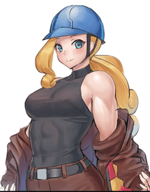
>>260695To be fair it makes sense for her to be in uniform, you rarely see female characters this covered. Fanart deffo does her more justice in the muscle department. Idk if this is a good example, but at least you can actually see her muscles now.
No. 260705
File: 1670192178838.jpg (50.12 KB, 333x532, 1669140739274.jpg)
>>260654Someone made a joke in the pokemon thread that it looks like those pics where a big hulking troon is next to a feminine black woman
No. 260718
File: 1670193888640.jpg (688.18 KB, 2000x1865, 20221204_233931.jpg)
More examples of women from Paldea. Why does woke pandering always result in the most shit designs ever… pokemon used to have cute designs, what happened?
No. 260724
>>260718The body types and ages are fine in concept but the graphics and designs are Metaverse tier soulless garbage with essentially zero art direction or vision. Pokemon exists only to promote new merchandise of the new pokemon that their loyal old cash cows and clueless little kids will buy so they get away with releasing an unfinished game that looks like it was put out by a Chinese knockoff mobile game studio, on purpose.
The 90s art was so sharp and edgy with interesting blocky shapes, colors, and recognizable style trends in the trainers’ fashions. Now it’s generic increasingly boring, roundified, thinktanked and consumer tested specifically to sell merch, like the Disney 3D round sameface style.
No. 260748
>>260728to be fair in real life men are much more likely to have luscious lashes–and yes, it's a thing, look it up. lashes defining "women" in animation has always been a conscious choice.
is this retarded? yes. am I right? yes.
No. 260750
File: 1670196448222.jpg (37.39 KB, 640x360, story-spoilers-poison-type-tea…)
>>260744Lmao I've literally never been on 4chan. I just think the designs are bad and happened to find an article of Japanese players talking about disliking the designs. Didn’t think nonas would defend the designs this much, I guess they really did hit the right designs for the target audience then. You can keep them, I'll go play games I find cuter.
No. 260751
File: 1670196630371.jpg (125.87 KB, 804x1200, Fh5KAHjWYAMwV1b.jpg)
>>260744Whatever man.
Glad someone brought up this dude, his resemblance to Charlie is so uncanny it makes me suspicious. Sometimes I wonder if game companies pander to YouTubers on purpose because they know that it'll create memes like picrel. You might ask how Asian game devs would know about him, but there was that incident where an anime moblie game from China used footage of him to promote their game. Sage for tinfoiling.
No. 260768
>>260718>woke panderingYou can't even say for sure they're making tranny chracters, they're just badly designed and the art style sucks so everybody looks even more shit. I agree with other anons that you sound like a scrote with your obsession with blaming "woke pandering" because the female characters aren't "cute" anymore, there's not a single canon tranny or even gay character in this game as far as I know. And if you think a couple of GNC female characters (the champion and that gym leader or whatever) are "woke" pandering, at least I welcome that kind of pandering because they didn't make them troons, just women with a masculine aesthetic (it's a shame that the champion's design is so horrible though).
Also I don't see what's wrong with the one on the lower right corner, it looks perfectly like a generic trainer from previous generations.
No. 260787
File: 1670200198001.png (227.42 KB, 314x768, Geeta.png)

>>260771That's funny because I think the champion looks weird as fuck in her 2D artwork, if she didn't have that wild-ass hair and the art didn't look like a tumblr artist with no concept of depth had drawn it, it would be perfect. This looks amateurish to me
>>260777>how the hell do the designs in SV look even remotely similar to the ones on the first gens?I said they're not as deliberately sexualized as in recent gens (which seems to be the main reason moids everywhere are complaining as they also criticize the few perfectly decent designs there are), not that the designs are similar or even as good as in the earlier gens.
No. 260810
File: 1670203492683.png (349.65 KB, 640x1280, Sword_Shield_Piers (1).png)

>>260801True, and I feel like that's why some characters like Piers look way better in fanart than in the actual game. Hey maybe the same artist designed both these characters, it would explain why they're both so skinny, the dumb hair and humongous eyes. I was so close to liking him but this guy looks malnourished in a cartoony way.
No. 260821
File: 1670204815690.jpg (484.52 KB, 1714x945, Untitled.jpg)
No. 260827
>>260821Aren't the Paldea ones in this pic fan redesigns?
Also who are all those in the second row to the left of Raihan? This looks like a /vp/ pic kek
>>260823Yeah I like a couple of designs from SwSh, thtey're not all bad but sadly most of them are weird, stupid or ugly in some way. Like beforer the humans look boring and plain most of the time but now they're going the opposite extreme
No. 260859
>>260821What they did wrong for the human characters for me in Gen 8/9 is they tried to put too
much uniqueness into each character's design. Pokemon is known for having character designs with crazy hair and outfits but I feel like it wad always kept to a minimum of a couple defining features per character until Gen 8.
Kabu, Bea, and Milo look the best to me from these because they kept relatively simple
I like Opal's design as well but she's the exception to the too-cluttered look for me simply because older people tend to dress like this kek with a concise color pallet in their outfits. If they
do have an exaggerated feature it's limited to
to one thing eg.) Milo's hat or Bea's hair & bow thing.
All the other characters are too visually busy with over exaggerated features (big hair, coats, shoes, belts, etc.) all in one. While these elements aren't a bad way to make a character stand out I think having too many at once can ruin the design, like with Piers for instance. I've also noticed the clothing the gym leaders wear in these games have so much patterning and colors going on that it clashes and distracts from the character alone (though in character design the character's outfit is just as much who the character is as their physical features)
Sorry to pokemon sperg again I just can't seem to jive with the newest gens looks at all, they either look like they are too simple (in the case of some of the pokemon) or have too much of a cluttered design (in the important npcs and legendaries)
No. 260865
>>260859>If they do have an exaggerated feature it's limited to to one thing eg.) Milo's hat
It had always surprised me how much people like Milo, I hate his cartoony face and short legs, he doesn't look like a Pokemon character at all because of it
No. 260925
File: 1670242829156.png (639.91 KB, 1024x574, ea752cb3359c2de07390d4f21b7126…)
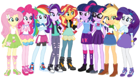
Maybe an easy target, but I despise the Equestria Girls designs.
> Same body for all of the girls which just happen to be stick limbs, of course
> Large inflated heads
> Clashing colors
> Bland and ugly clothing that just barely conveys their personalities
> Pretty much every girl has to have a skirt making them all look the exact same, again
As much as I despise a lot of parts of the MLP fandom, there were loads of better human designs made by the fans both before AND after the movie came out.
No. 260927
File: 1670244683308.jpg (523.37 KB, 952x1449, image-1.jpg)
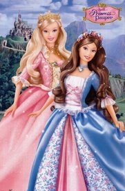
>>260925you can tell that Hasbro designed them as dolls first before giving them cartoon designs. I guess giving them all skirts was to give them some sort of coherence? Doll lines, specially the ones that has a movie tie-in, likes to have somewhat the same silhouette when it comes to clothing. Guess it makes it easier for the animators and doll manufactors.
I don't think picrel are bad designs I only added it to show an example of another dolline that does this No. 260949
File: 1670255028518.jpg (392 KB, 1600x975, EQ_Girls_Core_Allweb.jpg)
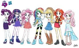
>>260925I hate EG designs too but the concept art looks better.
No. 262369
File: 1670630604871.jpeg (170.72 KB, 1080x1776, ADEFC638-502C-4E11-A988-E1C556…)
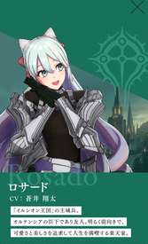
I hate all the femboyfag characters in FE but this has to be the worst contender
No. 262502
File: 1670677940327.png (80.67 KB, 200x465, Izuku_Midoriya_First_Hero_Cost…)
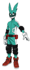
I HATE dekus hero costume so much
No. 262506
>>262505I dunno, I mean look at how we got here. America's always been better about this kinda stuff, even if not by much. People are being more open about how trans people disgust them, and being a
terf is way more popular in the UK. Ironically the more damage troons do the more people get pushed towards us, so I'm not saying it won't take a while, but it's deffo possible.
No. 262517
>>262502Everything in this show looks like shit, Japan seriously needs to stop trying to copy Western culture. All their fantasy and comic shit looks like ass.
>>262514 no need to apologize, anyone who didn't have the good sense to pull out after awakening deserves to be disappointed.
No. 263429
File: 1671008327023.jpg (33.73 KB, 220x549, sp thin.jpg)
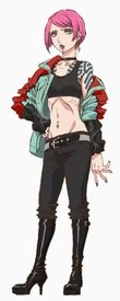
There's a random anorexic alt girl in Godzilla: SP and I don't know why. She's a pretty minor character and doesn't really even get enough time to be coombait. Really stood out to me because she's so insanely thin.
No. 263451
File: 1671015759441.png (1.7 MB, 1920x1080, Begone.png)

>>262369I'm so fucking tired of seeing these drawn girls labeled as boys everywhere. They all have the same personality of outgoing/cheery or fragile/embarrassed moeblobs. There's nothing male about them but just anime girls with no boobs and a Schrodinger's dick. They know that coomers and moids would eat this shit up and make bank out of it because it's a special flavor waifu and 4 da memez. This trend needs to stop since it's plaguing over to bishie, twink and young boy characters.
No. 263453
File: 1671017663100.gif (1.12 MB, 480x270, media.gif)
>>263195my friends where really into Bratz Babies when we where children but it always made me uncomfortable. Just seeing babies in make up, fashionable outfits and long hair felt wrong. Watching this as an adult it still makes me uncomfortable. It's just weird that a toy is trying to appeal to some manternal instict while also appealing to the girls who wants to be fashionistas. It's not even a power fantasy since the targeted audience isn't toddlers. I'm just sureprised that someone suggested "then we make a song where they sing "gotta look hotter than hot" and then the babies start swaying their hips to hit while putting on make up" and that got greenlit. idk this is weird babies don't look like this babies don't behave like this
No. 263463
File: 1671023371301.jpg (77.38 KB, 680x366, 90f346b6a026012e2d9745dedfe9b6…)
>>263462You've never seen boys wearing shorts and tank tops?
No. 263465
File: 1671024155839.png (403.58 KB, 642x383, Screenshot_20221214_081948.png)
I prefer when moids animate "pretty ladies" in videogames like this horrifying urchin haired woman instead of pornified boob goddesses.
No. 263736
File: 1671118862276.jpeg (32.53 KB, 601x733, 3D2D9D26-8234-4E81-953A-8A1C75…)
Why is this in FF14
No. 263751
File: 1671122531296.jpg (176.83 KB, 1280x720, maxresdefault.jpg)
These fuckers all look like they have Down's
No. 263753
>>263751i hate their eyebrows.
i know that animators often rely on eyebrows for expression but im never not annoyed everytime i see them slapped on an animated anthropomorphic character that otherwise shouldnt have them, it looks terrible
No. 263768
>>263751The top left one's eyes aren't even looking in the same direction…
>>263757As always little girls have to make space for the little moids because they're going to get offended if this colorful pony cartoon doesn't have a moid horse they can relate to. Why can't moids relate to female characters like girls have been doing with male characters for ages?
No. 263779
>>263761Agree, I loved the softer colors and more whimsical "tea-party"-esque nature of MLP g1-3. I get that each generation of children will be into different things and nothing can stay the same but that is precisely the reason why I can't understand why they're back to doing the bright ugly saturated colors like they were doing in g3.5 and the later half of g3. At least g4 had a nice color balance between softer colored ponies and more vibrant ponies. Not to mention, the ponies were much cuter in comparison to what they're doing with g5. The g5 gang blends together in my mind. And, like I said, they're butt ugly kek.
>>263768Because moids "relate" to female characters by unnecessarily sexualizing them (the entire shitshow that was the g4 fandom). I think the solution is to go back to what they did with g3 and make it as female-pony-only and as "female" as possible. So many failmale bronies I've met irl have said that g3 was the worst. I never even had to ask them why they thought that, it's pretty obvious it's because it only had female ponies and because it was for young girls and young girls
only.
No. 263963
File: 1671179413178.jpeg (32.43 KB, 348x388, Dreamfaces_1028.jpeg)
>>263751Oh my god I hate this. They all have the dreamworks eyebrows
No. 263972
File: 1671184999820.png (275.06 KB, 1136x1102, 606d1acd4f02ddba5dcd8dd2563835…)
>>263751I'm spergy as fuck but complaining is my hobby kek, I think everything about them is bad. The human faces give me uncanny valley and they're just not-horse enough that it makes them loose the appeal. Getting rid of the eyebrows would help combat it a tiny bit, but they should just redesign the entire head/face.
The color choices don't work together as a group in my opinion, the goal is to have them all be different enough that every kid can have their distinct favorite. But they picked similarish orange and yellow, and then similar pink and purple. And obviously it's subjective but in my eyes most of the shades they chose just clash and look bad, I especially don't like the magenta-pink on orange.
And sperging on, I hate the names too because they're again too similar. Pipp, Zipp and Hitch all have one syllable i- names that sound the same, and the other 2 have 2-syllable names ending in -y. That's bad naming, you want a mix of sounds and length to make them all distinct and easy to remember.
But still the worst crime is adding a male horse to the main crew. It's a girly show made for girls, let girls have their girl-focused shows without forcing in males. If boys like watching a girly show, they can most likely relate to the girl characters anyway which is something they usually don't have to learn to do because 99% of media panders to males.
No. 264386
File: 1671317841085.png (1.08 MB, 572x887, more wings.PNG)
Overdesigned as fuck.
No. 264388
File: 1671318389544.jpg (29.34 KB, 600x449, Revelations3_Blackarachnia_clo…)
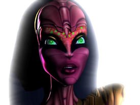
>>264386Also about 90% of the female designs could be in this thread
No. 264391
File: 1671319430998.jpg (79.92 KB, 640x640, 1wqynx2glh6a1.jpg)
Racing Miku 2023 design, what even is this outfit
No. 264400
File: 1671320975939.png (2.95 MB, 1500x2000, zdfnbd.png)
She's apparently meant to be both a skillful archer and a bodybuilder, and yet looks like girl no. 3947394 from one of those idol gacha games. I usually like Mika Pikazo's work but everything in Engage looks like a fucking Vtuber and I hate it.
No. 264402
File: 1671321425135.jpg (375.05 KB, 730x842, Racing-Miku-2021-Version_by-ne…)

>>264391I genuinely cannot see the "racing" concept in that design, it looks far more "marching band" to me. At least 2022 was very clear with the concept
No. 264474
File: 1671361427834.jpg (31.98 KB, 459x668, images.jpeg-10.jpg)
>>264391At first the designs were clearly sport related. But now it's more coomerish now . I think they're forgetting miku is 16
No. 264475
File: 1671361471214.jpg (29.75 KB, 491x624, images.jpeg-11.jpg)
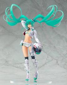
Just look at this redesign
No. 264584
File: 1671400715995.png (2.31 MB, 1885x847, mikapikazo.PNG)

>>264400>>264580i just googled this artist and i do like her art but just quickly looking at her art she really don't look like someone who is qualified to be a character designer. Her art is quite stylish but the characters aren't memorable. every engage design just confirms that the artist have no idea what she is doing when it comes to character design. It looks like she was overcompensating the designs to justify her title as a character designer
Making a good character design is an artform in itself and you aren't automatically good at it just because you can draw well
No. 264586
File: 1671400938999.png (2.84 MB, 1596x885, mikapikazo2.PNG)
>>264584same anon but this looks like an artist you would hire to do promotional work or posters. not one you would hire to do character designs. I wonder how the engage game devs felt like when they had to model the 3d models for the game
No. 264590
File: 1671401934255.png (739.58 KB, 1280x585, tumblr_oq5rniam7g1tb2c9jo7_r1_…)

>>264586That's a good question, now I wonder too. Awakening and Fates had Kozaki as a character designer and his designs look great in 3D (pic related), which was already proven by No More Heroes before Awakening. He was tasked to make the characters give off a different vibe compared to the previous games despite being already familiar with the GBA games and he succeeded. Hidari also redesigned the characters from Gaiden for FE Echoes and made them all more distinct and they look good in 3D in actual gameplay, and the cutscenes look like shit for separate reasons. 3H's character designer is Chinatsu Kurahana who is already famous for doing character designs AND in-game art for BL games, and her designs for Utapri look good in 3D in more recent music videos. The issue in 3H is that none of the in-game art is done by her, her designs were botched by the art director (the same incompetent guy who managed to make Rinkah hideous in the mobile game and gave us the toilet bowl armor in Awakening). They all have experience in video game character design. IS now has the money and reputation to hire other experienced and competent character designers and they went with a twitter influencer artist. I instantly recognized the artists for Awakening/Fates and for 3H just based on 3D cutscenes and not even on their actual art, yet the characters in Engage are random moeblobs. I don't get it. Engage seems to have more detailed models and better animations than 3H, but it doesn't matter if all the characters look like hot garbage in the first place.
No. 264605
File: 1671407492306.jpg (279.28 KB, 1570x2048, FV2EtLLacAAFuPc.jpg)
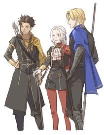
>>264590I love FE3H designs and i think the game deserved better in terms of character models and in game portrait art. I mean the entire game is pretty much unfinished in a lot of ways. Kurahana designed such a colour cast of characters and im still obsessed with all of them, 3 hopes designs also delivered. Its so disappointing to see engage throw all of that away for a vtuber artist when they could have made something even better than fe3h now that they have much more time and larger budget to work on the game.
No. 264620
>>264400Why is she blushing
Why does every female character have to be blushing by default
>>264584Seriously she looks like she can only design one or two types of characters. One girl with a plain hair color and another with two highly contrasting, highly saturated hair colors
No. 264626
>>264624I'm not very familiar with her, but even her original art looks better than those abominations in the new FE. She's just not fit for designing characters in a European-inspired medieval fantasy setting, much less one that has historically had a serious vibe like Fire Emblem.
Also the 3D models look worse than her art, what's with the chipmunk cheeks?
No. 264629
>>264626NTA but she's not good for designing anything that isn't overdesigned super modern harajuku/lolita/cutesy street/gyaru fashion with multicolored hair anime girls. it's why everyone says she's better off with vtubers, it's all she can design really. it became clear when she designed a character for fate grand order a couple years back and the end result looked like an abomination when compared to the rest of fgo's designs which is truly something else considering fgo's character design direction.
mika pikazo is just not a flexible artist. she can design one thing and one thing only. particularly what i hate the most is when in engage's cutscenes you look at the setting and the background and it all looks like normal medieval fantasy that could easily fit into any other FE game, but then one of those ugly ass characters step in and they look like they belong to an entirely different game. the characters literally don't match with the very background they step on to.
No. 264653
>>264474That’s her initial age. Miku’s age fluctuates based on the producer.
>>264475Coomerism aside I actually like this one.
No. 264844
>>264513Remember anon, its for kids. Little girls
and little boys watch that shit
No. 264914
File: 1671499987856.gif (1.9 MB, 498x371, my-little-pony-mlp.gif)
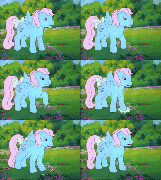
>>263972ugh, the face shape…. it's not like they ever looked like actual ponies but the more upturned the nose gets the less horse-like they become. their noses are round like a reptile's, that's not even a mammal note anymore. their smile is creepy, probably more due to the eyes than the mouth though.
No. 265163
File: 1672184082360.png (878.42 KB, 1500x1800, 0CF667DA-0B85-4F78-A675-4FA5F3…)

Isekai series have plenty of bad designs
No. 265650
File: 1672383365329.png (1.45 MB, 1332x1903, Kyojuro_anime.png)
>>265649>>265648For the LAST TIME
No. 265717
File: 1672416941541.jpg (24.61 KB, 463x662, images.jpeg-12.jpg)
But the most awful design in ds is michuru . Why the hell does she has a boob window?
No. 265750
File: 1672428889591.jpg (19.27 MB, 3700x3878, RDT_20221230_11161547252390251…)
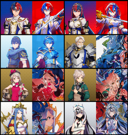
I know I'm beating a dead horse here with Fire Emblem Engage, but the 3D models are such poorly done interpretations of the 2D art. Their eyes and face shapes look so damn bizarre. The boring renders don't help because the lighting and costuming is bland and the posing looks so lifeless. They do look a lil better in motion at least from a review I saw. I'm not super impressed with the 2D art either. Maybe it's just not my taste. Is that their actual concept art or is it just promotional illustrations?
No. 265767
File: 1672439713940.png (119.66 KB, 475x475, 257.png)
>>265650What is it with Japan and fire chickens
No. 265809
>>265766finally someone who understands.
anime only looks good in 2d because it's in an uncanny level between realism and cartoony. putting them in a 3d space only exacerbates that problem
No. 265818
>>265717I'm so glad someone else pointed her out. I watched DS a few months ago and I found the show pretty "meh". Good animation but story wasn't that interesting to me but Michuru's design was easily of the worst designs in the show imo. The boob window was explained like
>>265788 mentioned but it doesn't make the design any less ridiculous.
No. 265820
File: 1672454088068.png (1.19 MB, 1336x1909, Tengen_anime.png)

>>265694Honestly the show was full of spastic behavior that was godawful. This guy was bad and so was the character Tengen (picrel). His constant use of saying "flashy", I groaned the whole time which sucks because I actually did like his design but his dialogue for the most part was awful.
No. 266853
File: 1672777718629.jpg (181.89 KB, 828x814, 1654246468121.jpg)
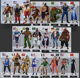
The leaked designs for the new street fighter roster, Ruy and Ken look good but everyone else looks like they belong to a completely different game series
No. 266947
File: 1672849728118.png (1.01 MB, 1200x897, D8DF4380-222B-40C2-AE2A-80883B…)
>>266929Naruto character designs are very iconic and are immediately recognizable. I’ve never read or seen the anime or manga but despite that I’m able to name and recognize most of the characters. If Naruto dressed like a classic ninja so in all black with face covered it wouldn’t be as well remembered.
No. 267019
File: 1672877235018.jpeg (39.53 KB, 710x400, 0x0.jpeg)
>>241355I hate the design of Rebecca, the green girl with red eyes (that the scrotes online were referring to as a 'loli')
No. 267028
File: 1672882777085.png (271.35 KB, 588x700, skulls.png)
>>259366late reply but thank god you could at least equip the XOF outfit for her
on the topic of bad mgs designs, the female skull unit soldiers in V looked so fucking stupid
No. 267031
>>267027nta but they definitely knew what they where doing with her. She has pigtails and an oversized hoodie which does make her look more childlike but she also walks around in a bikini so she is suppose to be sexy. Studio
Trigger where also insisting on having a loli on the show. There is a clip where on of the crew members in the American department says that Studio
Trigger told them "the loli must stay"
No. 267033
File: 1672886604344.jpg (122.92 KB, 1082x1353, FdB4VgHWIAIXRvS.jpg)
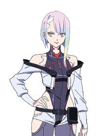
>>241355I liked this series, but the character designs did suck. I can't think of a single one that stood out to me. Lucy's was particularly annoying because the crotch area looks like it would be so uncomfortable and tight in real life. Rebecca's colors were nice but that was about it, and I feel like Dorio deserved a way nicer design. Kiwi's was just ugly despite being the only fully covered one.
I genuinely don't mind skimpy character designs (to an extent) but you can't tell me that in a world like Cyberpunk's, the characters would have such boring styles. The edgiest thing the female characters could think of is to have their titties out? I don't get it. 'least Falco was hot.
No. 267052
>>264629I unironically think her artstyle would be great if Nintendo and Atlus ever greenlit a sequel to Tokyo Mirage Sessions.
>>266853We finally get Cammy to wear pants in her default design, but at what cost…?
No. 267143
>>266874Kek they could have just taken all that extra material from her sleeves then.
How old is she canonically? The uniform makes me think it's high school which would be creepy for a tailor to do that to a teenage girl but this is anime, after all.
No. 267450
File: 1673093675929.jpg (529.16 KB, 3840x2160, 20230107_191134.jpg)
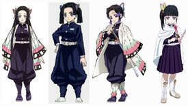
>>267143She's 19. She's just designed like that for fanservice as other major female characters in the corps have more sensible designs (picrel). What I hate the most about anime that the characters are somewhat okay or even good but the designs ate just coomerish or plain retarded.
No. 267452
File: 1673095369567.jpg (561.22 KB, 2000x1000, Housebroken.jpg)

Basically anything by Bento Box but these are especially horrendous
No. 267604
File: 1673159504163.bmp (519.15 KB, 365x485, helenadoa3.bmp)
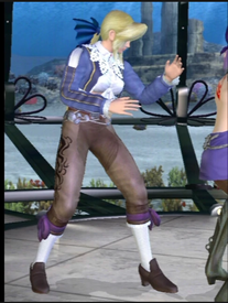
>>258763 It's from trapt/deception. It also appears in DOA 3 and Fatal Frame 2 for xbox. The game is like a puzzle strategy thing. You set up traps and use obstacles to avoid/kill enemies. It's pretty cute in motion.
No. 267667
File: 1673196039983.jpg (421.15 KB, 1052x1915, tdfdsfg.jpg)
>>267452God I hate Bento Box. They deserve to be ridiculed 24/7 and yet they're not.
No. 267989
File: 1673283229798.gif (1.36 MB, 498x280, avataro-sentai-donbrothers-don…)
Bumping because of porn.
Love the loser but his outfit with the feather cuff + shimmer material + shorts over pants are atrocious.
No. 268285
File: 1673377789501.jpg (861.34 KB, 3000x1685, strange world.jpg)
I definitely haven't seen this movie but if there's I know for sure about it, I really FUCKING hate this characters. Every single time I see a pic or screenshot from the movie, this character is always making this dumb fucking expression and I hate it so god damn much.
No. 268356
>>268285Their skins looks so rendered compared to their eyeballs ew it looks so uncanny to me. I always tought the whole "let's render every single freckle and blemish on the character's skin to flex muh realism" thing disney and pixar often do was a bit silly, but this one looks particularly off. They gave the mc a literal potato nose but then also gave it nasolabial folds lmao.
I just realised they also have creases around their eyes, and you can literally see the veins next to the big-nose-white-guy's eyes. I don't think it was a good idea to put so much extra detail around the eyes when they're so simple.
The lady on the back is slightly cute though. I feel like it could had been an alright design, but needed some more work No. 268489
File: 1673467703122.jpg (128.64 KB, 1200x628, demon-slayer-tengen-wives-suma…)

>>266858AYRT Unfortunately anon, the girls were correct. This character has 3 wives (picrel, yeah I know…) and they're personalities are as bland as their designs. The one on the left is the worst because the way she acts is like that of a little pre-teen girls, it was fucking disturbing.
And it was just awkward watching their "relationship", it felt so fucking weird and forced.
No. 268821
File: 1673638204305.png (2.42 MB, 2000x1080, 1671841159851.png)
>>268308>>268308I CANT TAKE THIS SHIT ANYMORE MAKE IT STOP
No. 268890
File: 1673668848772.jpg (219.64 KB, 1600x900, 20190115113333_1.jpg)

Low hanging fruit but
No. 268892
File: 1673670868093.png (1.13 MB, 1296x803, 5777712.png)
>>268821Every time I see a new character design with Bean Mouth, another little piece of me dies.
Also for some reason, the way Pixar has been drawing eyes lately makes everyone look like they're missing a chromosome. I never recall Dreamworks humans having this issue. It's a shame DW films have such fucking retarded subject matter, because I greatly prefer their art style to Pixar's.
Speaking of, did anyone else notice their weirdly-sexual camera pan over the fire character's ass and legs in the new trailer? Good to know Pixar's still being run by chauvinist pigs like it's always been.
No. 269132
File: 1673859538700.jpg (340.01 KB, 1519x770, 20230105032.jpg)

the animation of modaozushi/grandmaster of demonic cultivation has some of the ugliest character designs i've ever seen. what's particularly offensive is that they even gave this character (aqing) balloon tits even though it doesn't suit her at all. there's nothing remotely coomerish about her in the book, manhwa or live action and she's supposed to have more of a little sister role in the story
No. 270870
File: 1674254883939.jpeg (588.34 KB, 2048x2048, FY_aEHwX0AIQxpE.jpeg)
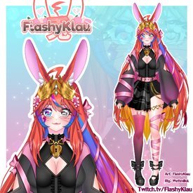
Somehow stumbled upon this
No. 270876
File: 1674256646028.jpeg (221.79 KB, 1000x600, B529133E-8EED-47DB-A74D-B7E562…)

>>270870>>270875All vtubers look like shit, you could fill up this thread with only vtubers
No. 270878
File: 1674258252511.jpg (63.72 KB, 499x500, hololive gam.jpg)

>>270876those are vshojo designs. I mentioned hololive specifically because while they're overdesigned, they're often made by professionals in the character design industry to fit a theme. vshojo hires random twitter artists, just like the indies do.
No. 270880
File: 1674259158123.jpeg (1.44 MB, 4096x2935, 113512C5-4644-4142-A32E-149A74…)
>>270878The only sightly interesting ones are the dog girl, though she still looks like a sped in an annoying way, and the girl that has the cap and the sped chew necklace.
No. 270885
File: 1674262441798.png (102.31 KB, 321x395, 951FCE2B-1D43-490B-AE7E-E7F589…)
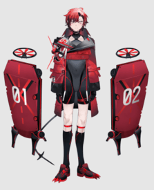
>>270882You know,
nonnie, professionally designed characters.
No. 271139
File: 1674389204446.jpg (96.93 KB, 960x695, MG_3913.jpg)
unironically so bad that its good
No. 272173
File: 1674981471711.png (1.52 MB, 1248x1766, 2E9165F4-9025-4D4A-A860-C8AD8B…)
She’s an idol and her name is UTA!!! WOOW HOW ORIGINAL AND UNIQUE HAHAHA
No. 273667
File: 1675633941170.jpg (25.27 KB, 600x600, st,small,507x507-pad,600x600,f…)
Very uninspired design
No. 274640
File: 1675956474907.jpg (423.76 KB, 3840x1080, tJD7eaW95Sx.jpg)

No. 275412
File: 1676234193158.jpg (242 KB, 1600x600, Untitled.jpg)

ugly pedoshit
No. 275670
File: 1676334815970.jpg (260.95 KB, 1000x600, WinXftr.jpg)
>>260925Equestria Girls has always reminded me of worse Winx Club. Same single body type for easier merchandise, but the earlier seasons at least of Winx really tried hard to give all the girls cute outfits and accessories without clashing.
No. 276733
File: 1676748349584.jpeg (239.01 KB, 1121x1172, EBDD7440-F1CC-45A7-AD77-E46B90…)
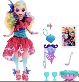
No. 276757
File: 1676752419444.png (367.58 KB, 742x251, Untitled.png)

>>275501never watched original trigun but i always really liked the designs. they had such a specific aesthetic. this is literal chad vs virgin shit.
No. 276889
File: 1676822552431.jpg (50.11 KB, 603x921, alfred-turner-1.jpg)
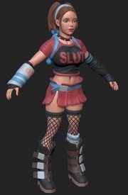
No. 276899
>>268489Part of me hated it but i think it was handled slightly better than i expected. Like yeah ninjas having to marry more than one woman to keep their bloodline is bizarre but it’s not far from a reality that existed (But what reality were female warrior fighting with their boobs out) Their rs wasn’t over sexualised so it didn’t make me feel weird but i was always on edge waiting for that anime “humour”.
I was mislead by the anime to read the manga. It was TERRIBLE, one if the worst i’ve read. The writing is just, below harry potter level of depth.
No. 276917
>>276899>realism but only for menhow about no.
no sluts in my animoo and mango!
No. 277107
File: 1676919694276.jpg (70.18 KB, 1024x476, FWvbAYqXEAAoTyK.jpg)

I could fill this entire thread with Steven Universe characters
No. 277131
File: 1676923336734.png (812.48 KB, 1293x626, 01.png)

>>277114OT, but from the comments
No. 277164
>>276757They made him into an Aiden wet dream, fucking hell
>>277142>Autistic coomer art>Stilted fetishy dialogueYes.
No. 277216
>>192303I laughed.
Thank you.
No. 277239
File: 1676977979650.png (7.43 KB, 196x257, smokeyquartz.png)
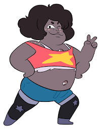
>>277114I like most of the base designs of the gems if I disregard the constant changes in proportions, I found them unique and fun and it was nice having a variation of female characters in a show. Not only that but you got these half-monster fusions of them, that were still visibly female. I hated all of the fusions with Steven and the main gems though, I just find them particularly ugly and disappointing.
But of course Rebecca Sugar had to retcon it into "they're not female, they're all NONBINARY like me because i'm so special and oppressed for thinking women suck and wanting to not be one". Like ok lady cool you want the one show with strong female characters to not be female at all. Thanks I hate it.
No. 277267
>>277114This! I hated everything with the whole thing about Rose was Pink Diamond shit was how the crew broke what little rules they made. Pink have a completely new color palette as Rose (they said some BS of they didn't want to "give away the twist" if they used Pink's palette for Rose); That bull Ian said about Rose Diamond's skin color was picked from the white parts of a Rose Quartz gem instead of just going for a pale peach color and a Rose Quartz gem is, somehow, the same as a Pink Diamond gem when flipped.
I also hated what they did to Garnet color palette later on; I really like her red and black palette from season 1 then they fucked it up by pushing the "Look at me, I'm made of love! I'm the fusion guru!" shit with Garnet by adding blue to her, that and how they barely changed her outfit as "just keep the bodysuit and add red and blue on it, ok done!" (god I really hate her final outfit with those ugly star glasses)
No. 280314
File: 1678055469332.jpeg (49.56 KB, 450x288, 157718B0-DAB3-45CB-B724-8E36E8…)
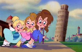
These are supposed to be "chipmunks"
No. 280315
>>280314So
that's what tiktok face reminds me of
No. 282423
File: 1678653596492.png (278.16 KB, 1248x1680, E7995F89-BC72-4033-8C89-88F9D1…)
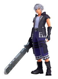
What a downgrade
No. 282454
File: 1678669771914.png (24.48 KB, 165x441, ysjasjcb.png)

No. 282496
>>282454this character design is the sole.reason why I won't call Kojima a genius. Onky a moron would approve of such a silly looking design
>>282463>The textures they used for her face are so fuglyI have always thought that there was something off about the character's face even though the real life model they used was pretty
No. 282536
File: 1678719606191.jpg (411.46 KB, 1756x1404, Fq_xjm4agAIefWf.jpg)
No. 282591
File: 1678738207008.png (45.96 KB, 310x653, Riku_KHII.png)
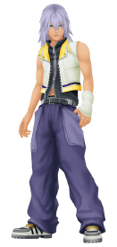
>>282423You're so right. His KH2 design was so much better
No. 283417
File: 1679064612127.png (195.69 KB, 350x674, inori_yuzuriha.png)
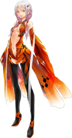
i've never watched Guilty Crown but remembering it was a mistake, even if it was popular back then, to me this design had the same effect of onions to vampires
No. 283435
File: 1679071217119.png (423.07 KB, 898x970, poemi.png)

>>283433damn… we have very specific vampires here, okay?
picrel feels like a retro vtuber
No. 283816
File: 1679167271352.jpg (49.78 KB, 642x500, tsvhdx9q0oj61.jpg)
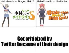
>>208163>>208175Scrotes and pickmes defended Ilulu's and Uzaki's designs saying that "petite women with large breasts exists!" or "women with this body type exists!" are pornsick and braindead in the head. When Uzaki blew up on Twitter, I remembered seeing pickmes do comparison pics of themselves to her when really these pickmes are just short women or have large breasts, not child-looking. Scrotes even drew smug breast envy fanart when people criticized their designs thinking that they're jealous or offended of their breasts size but really it's because they look like children with hentai balloon tits slapped on them. Ecchi anime are a mistake.
No. 283834
File: 1679171756006.jpg (38.57 KB, 395x641, 203885-annah__2_.jpg)
I love planescape torment, but I hate Annah's design.
No. 284151
File: 1679252107568.jpg (226.19 KB, 1000x1447, MV5BMDg5NTEwNzMtMDkyZi00OGYwLT…)

japan don't sexualize children challenge (impossible)
No. 284451
File: 1679373168000.png (135.54 KB, 580x233, gross.png)

not that i cared about this character before, but holy fucking gross. fucking hate "femboys".
No. 284489
File: 1679413748737.jpg (133.36 KB, 736x920, aea8a5a9b4e7133ce80355fd6a8732…)
>>284475Any male character short of a Dragon Ball fighter is a femboy under anon's logic.
No. 284726
>>284451They're both bishonen (pretty boys) they just made him more feminine in the remake. Calling him a femboy is an exaggeration.
>>284631>>284509I really don't like the word twink either because I associate it with gay coomer moids tbh
>>283816This pic is so fucking retarded, imagine trying to defend those designs and claim they only get criticism because Twitter can't stand big boobs (as if that were the problem and not everything else)
>>284636It's ironic that you say that because twink comes from male gay culture and originally meant a specific kind of very young gay man or older gay teenager. Meanwhile, even though femboy is used by coomers a lot these days, I remember a nonna posting about how in emo/scene culture or something adjacent to it, the term had already been in use to refer to a specific aesthetic of feminine guys who were most often straight or bi.
No. 285351
File: 1679698616730.jpg (517.67 KB, 1920x2560, 91gLNXRK-BL._RI_.jpg)
>>285302You can do magical girl parody without just sluttifying everyone.
No. 285368
File: 1679704402925.jpg (148.52 KB, 1422x1017, mkr.jpg)
>>285351Yes, and? It's only natural to make fun of magical girl slutiness in a parody anime since naked transformations have been a thing since forever.
No. 285416
File: 1679735139378.jpeg (38.09 KB, 419x746, FCC0E6CF-8D12-474D-A25C-D43AA3…)
Her design is so god awful i wouldn’t be surprised if she was posted in one of these threads already. It’s so distracting to play the game with her in it
No. 285462
File: 1679760790600.jpg (1.33 MB, 3620x3528, JVaqxwhmvhPro.jpg)
I could fill this entire thread with One Piece female characters.
No. 285468
File: 1679762329943.jpg (22.98 KB, 300x400, 0d0850fd25c0f62ee2e90526d13495…)
>>285416>>285459i find it disturbing that there seems to be more porn of the childish-looking form.
No. 285471
File: 1679762821114.jpeg (375.25 KB, 2048x1502, 61D3F706-194D-46E2-8114-79428A…)
>>238818>>247365I don’t get why Nintendo letting Mika Pikazo design characters for these IPs, her art is good on its own but it clashes when anything that isn’t also designed by her is next to it. She did the idol outfits for Hololive EN this year and the character she designed (Hakos Baelz) looks fine but characters with more simple designs look off.
No. 285477
File: 1679764542752.jpg (82.74 KB, 1112x1050, Untitled.jpg)
>>284475>>284500>>284509because this looks like a girl. any male character that looks like a girl is femboy coomer shit and i hate it.
No. 285498
File: 1679769583498.jpg (56.56 KB, 540x540, cb269098d83caa444a64d1cf72563a…)
>>285477Anon, that looks like any other anime little boy.
No. 285505
File: 1679770560396.jpg (147.44 KB, 1600x900, tsuritama_haru.jpg)
>>285477Why not just call it a softboy?
No. 285551
File: 1679779760266.jpg (1.23 MB, 2200x3262, Kurogane.no.Linebarrel.full.13…)

Kurogane no Linebarrel. Puke-inducing.
No. 285552
File: 1679779866852.jpg (770.12 KB, 2146x3187, 405838.jpg)
>>285551Side characters lok as bad.
No. 285600
File: 1679782569033.jpg (132.2 KB, 600x900, 106407-scryed-alteration-ii-qu…)
>>285567I don't have any issues with Hirai's designs in SEED and sCRYed. He really fucked up with Linebarrel though (and the show was shit in general).
No. 285707
>>285459ayrt i like her head design too, tbh the adult form is on par with other Zelda designs so i’m not too bothered by it but the fact that they made the childish version of her bottom heavy and basically built like a
(and i’m very sorry that i know this word and am using it) shortstack is so disturbing to me
No. 285715
File: 1679791791880.png (52.08 KB, 400x650, Rachael_Foley.png)
No. 285795
File: 1679844778729.png (178.62 KB, 1500x1061, Art of One Piece (Season 1) - …)
>>285462It physically pains me to see how they look now, Nami used to be cute
No. 286334
File: 1680039787669.png (71.37 KB, 529x804, D4_Archangel_Flonne.png)

>>275416Her Disgaea 4 look is more conservative since she's an angel again instead of a fallen angel
No. 287162
File: 1680478123824.jpeg (35.22 KB, 800x452, C0C654F6-DC53-4218-B024-4D2DC3…)
Most of the character designs in Naruto are bad but this one is just the worst, the shitty hair color and the fact that it just looks like they took a male hairstyle and made it longer.
No. 287166
File: 1680481203560.jpg (48.35 KB, 579x744, free-anime.jpg)

>>287162I think glasses are cute irl but they always look weird on anime characters I guess it's because their faces doesn't have much depth? Pic is rel but also tax. Can't believe they tried to sell this character as a bishounen when he is so goofy looking
most of the characters in free are goofy looking but that's because of the art style not because of the character designs No. 287167
File: 1680482197619.jpg (325.75 KB, 2560x1336, Rei.jpg)
>>287166>Can't believe they tried to sell this character as a bishounen when he is so goofy lookingThat's because he's already goofy as a character. Nerdy even and I think it's cute and silly.
No. 287312
File: 1680563299417.jpeg (212.36 KB, 2047x1151, EB6FCF62-AB98-4F25-A8AD-E63F11…)

You could fill a whole thread with Overwatch characters alone. Picrel is the new hero (who’s apparently “””pansexual”””). It’s funny when western game companies try to design attractive male characters but wind up with ugly faggots.
No. 287326
>>287317>soldier 76old
also gay
>mccreehairy
>reaperold and hairy
>genji wasn’t genji confirmed a tif by one of the devs?
No. 287364
>>287162the random retarded spiky hair on one side only pisses me off
>>287166I hate anything that isn't wire frame or rimless glasses on anime characters tbh
No. 289123
File: 1681310379924.jpg (173.21 KB, 1200x900, FsR4Z2sakAANk.jpg)
>they actually made this unironically
No. 292908
File: 1682752717702.png (19.99 KB, 1200x723, 9803300791094.png)

No. 292909
File: 1682752931291.jpg (37.3 KB, 1024x562, 6BCC15AF-2E98-4F7C-983B-.jpg)
No. 293780
File: 1683075091779.jpg (155.22 KB, 1305x1600, Glimmer.jpg)
>flat-chested fattie
Unlikely to happen and extremely unflattering body type. I could overlook her body shape if she had a cute hairstyle to outshine it, but the only thing the hair is managing to do is be as atrocious as the rest of the look. YT recommended me a clip of this show to me and I was surprised to find out this character is very sweet, because what her appearance actually tells me is that she's an insufferable NB who I need to keep distance of.
No. 293953
>>293780the fashion in the new shera show is so weird. I think the idea was to make the clothes practical so they modelled it after gym clothes but it just looks boring at best and weird at worse. it's a shame because I really like the idea of a princess oriented franchise where the characters aren't girly girls
as an extremely girly girl who had many tomboy friends growing up it was hard to watch cartoons with them because we could never agree on anything. I think something like the new shera would had appealled to everyone in my friend group but I doubt any child would like these outfits. Yes, we shouldn't have sexy outfits in a children's show but I think some people tend to forget that these cartoons are also power fantasies for children so sacrificing practicality in order to make a cool outfit is okay. I hate these skintight pseudo gym clothes
No. 293973
File: 1683136411585.jpg (69.6 KB, 755x1058, queen_glimmer_by_misakarin_ddz…)

>>293780Glimmer's Queen redesign looks a lot better. She's overweight but giving her obvious waist definition makes her not look like a purple blob.
The best main character design is Entrapta though, because she actually has some body definition.
No. 294530
File: 1683391066016.jpeg (54.82 KB, 750x919, IMG_3614.jpeg)

one of the worst cases of female animal design i've ever seen. i hate her long skinny neck, upturned rump, and i especially loathe her awful red lips so much, they freak me out.
No. 294532
>>222901The face is plain as fuck but I gotta admit I kinda like it. I like the colors a lot and the idea behind the design is pretty cool, it just could have been executed better. I think the main problem is that this is a Vtuber.
If Touhou had an all-male cast this design would be a final boss>>294530Holy kek. this cat looks like a dick
No. 294712
File: 1683471639027.jpg (314.5 KB, 1856x3300, C_kXxWnVwAAnd3D.jpg)
Look how they massacred my girl
>>294530Is there a reason for her to have such a long neck?
No. 294728
File: 1683478473425.jpeg (17.17 KB, 185x272, download (3).jpeg)
>>294712This trope of designing kid's characters in 3D with huge bug eyes disgust me, I can't even look at things like Boss baby or Cocomelon or whatever without the urge to kill. Fuckin spoilered
No. 294738
File: 1683480420842.jpg (133.02 KB, 800x600, 62ae01901ae87.jpg)
>>282536kek why is the background Street Fighter 3
No. 294820
File: 1683517415139.png (237.39 KB, 1200x358, garfield's mom.png)

>>294712>Is there a reason for her to have such a long neck?My guess is that it's to differentiate between the female and male cat characters? Picrel is Garfield's mom and she also suffers from giraffe neck. This is me just guessing since I don't know anything about Garfield.
No. 295147
File: 1683633616075.jpg (205.33 KB, 1080x1080, FvnxSoHXsAUh7Fr.jpg)
>Clone High revival designs
No. 295471
File: 1683739564085.png (72.32 KB, 840x982, 268-2680470_bismuth-by-airfly-…)
I understand making kids show colourful but holy hell I hate the palette and overall design
No. 295474
File: 1683740673835.jpg (95.19 KB, 800x800, mr7f1a398ud51.jpg)
>>295147the new designs all stand out like a sore thumb but Harriet's is the worst, what an eyesore!! jesus christ those mustard yellow socks. why.
>>295471this one especially is a shame bc of how beautiful and interesting bismuth looks, picrel. even back when i was a fan of this show i remember the premiere of this character and was like, grossed out at how ugly of a design this is, kek
No. 295475
File: 1683740992565.png (13.39 KB, 250x283, amethyst___steven_universe_vec…)
>>295471su went from a show about cute space lesbians to gendie heaven. didn't finish the show (i think i stopped years back while it was still airing, when peridot came to live with the gems? i vaguely recall nicki minaj voicing a character) but i've seen clips and images from later seasons. and they're all similar to what you've posted, totally tumblr-pandering
i mean yes, body types were diverse from the start, but they were never so blatantly unattractive. chubby characters were more "thick-boned" than outright fat like…
No. 295482
File: 1683742810638.png (572.97 KB, 1080x602, Screenshot_716635258.png)
How in the world does one someone make a lion resemble a hipster dude?
No. 295712
File: 1683818204028.jpg (311.66 KB, 1280x1280, 54404cf9b95df97e598cbc45a15755…)

>>295505Ewwwww wtf.
I still stand that the show had good potential but man did they drop the ball when after the human zoo episody thingy. I looked up some fusions after I stopped watching and >>295476… what. MF built like a lil' Debbie brownie. Was there some sort of arms race to see who could create the ugliest characters on that storyboard team?
No. 295769
File: 1683831659333.jpg (73.08 KB, 514x745, 8bbc20b63fd5a2f3b3c86c094178fa…)
>>214392I was about to post this. The doubled up masks, the short hair and the brown trousers, i wish dc would leave his design alone. The mouth design was something of nightmares.
>>214393This design reminds me of how out of character Jason was written during this period and dc couldn't decide who they wanted him to be.
No. 295771
File: 1683831937965.jpg (14.75 KB, 242x410, 9a0c204673f5ebc3b6d53f1c2dca1d…)
Sticking to dc, I absolutely detest over designed costumes, not just in western comics but in anime too, i can think of numerous examples that i loathe, but I will keep to Roy Harper. Another characters design that dc needs to stop messing with and keep sleek. I detest this design that was done for him in rebirth, i just wish dc would let this man win for once.
No. 295935
File: 1683917192500.jpg (87.02 KB, 1111x1111, Vex.jpg)
Like a Tunblr OC brought to life
No. 296197
File: 1684032899137.jpg (43.98 KB, 640x639, kenny-tran-as-logs-zach-barack…)
god i hate ALL the designs in this damn show. im all for "good representation" but GODDAMN you couldve made them look less like a gay tumblr user.
No. 296199
File: 1684034024120.png (155.7 KB, 1000x298, garf.png)

>>294820>TIL Garfield has a mom>and that he was born in the italian restraunt where she lives>which is why he loves lasagnaOT but holy shit? Garfield lore.
No. 296664
File: 1684192080189.jpg (184.15 KB, 864x1280, flounder.jpg)
