File: 1682013286101.png (1.18 MB, 1999x640, vomitemoji.png)

No. 291040
File: 1682016890411.jpeg (223.09 KB, 959x1178, 61EE7514-745F-42F1-A918-30345E…)
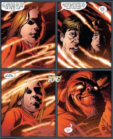
Most superhero comic art is pretty fucking ugly.
No. 291043
File: 1682017446070.jpg (72.88 KB, 1024x857, shape_language_by_kittykazoo_d…)
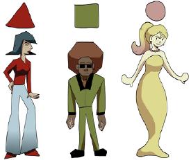
>>291041here is an example. its the way characters are formed by shape to give them distinction. usually in animation the designs like clothes, hair and face are simple so you use shape to distinguish them
No. 291044
File: 1682017515559.jpg (116.8 KB, 1409x854, Stefano_Camelli_Week1.jpg)
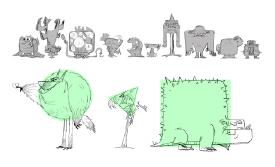
another example
No. 291053
File: 1682017899631.jpg (10.93 KB, 236x294, botox kun.jpg)
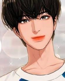
I hate the overblown filler filled lips on korean manwha.
No. 291054
File: 1682017923153.png (375.45 KB, 502x496, 3b3baca7f9b4364ca4b1a848519540…)
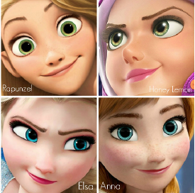
>>291039shape language character design that animation professors love
Yes! I hate it too, it's always so one the nose too. Unless you are making something for super small kid, you should never use it imo. It feels like I'm being baby talked when I see a character from adult animation being designed as "a square because he is strong and reliable". On the same note, I really don't like faces like picrel
No. 291057
>>291044Oooh this kind of thing
I think it works for stuff like fosters home for imaginary friends, but I don’t think the designs are super appealing
No. 291108
File: 1682028735065.jpg (587.43 KB, 2048x2048, pixar-elemental-movie.jpg)
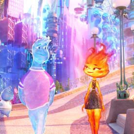
Ignoring the blandness of the designs themselves, the textures of these characters looks awful to me for some reason, the characters in Soul and inside out had a fuzziness to them I didn't mind but these look really uncanny & blurry to me it's hard to look at. Pixar has really dropped the ball on the ball when it comes to the way their movies look now I feel like this just the sake of a tech demo
No. 291137
File: 1682033428633.jpg (Spoiler Image,112.48 KB, 656x1000, what.jpg)

can i shit on specific artists? because sakimichan's art style is not only boring as hell but I have no clue who's paying her to continue making this shit.
No. 291138
File: 1682033531126.jpg (Spoiler Image,150.21 KB, 1000x667, huh.jpg)

>>291137it looks like ai art but a real human being spent hours drawing this.
No. 291156
File: 1682045505034.jpg (245.48 KB, 847x1166, 1681645207144.jpg)

This specific ultra deformed 90's anime art style is particularly ugly to me.
No. 291183
I know it's always controversial when people bring it up, but fucking Vivziepop and anyone that imitates her. The thing is, I can understand breaking some rules of character design to make something unique, art is subjective and sometimes to make something more appealing you have to think outside the box. But with Vivziepop, I feel like every single thing looks fucked up. There is no structure, everything looks like it was flat ironed and squished, outfits are bland and corny. All of the characters have the same long, eerie proportions and the few that don't look like any 13 year old's fursona from deviantart over a decade ago. I like exaggerated expressions but married with the lack of structure, everyone just looks sociopathic, and not in a cool way, in a "child making creepypasta fanart" way. I cannot fucking stand her art and yes I am jealous of how successful her work is, but I also feel bad for artists with actual honed skills who struggle to get their work off the ground (the art in Lackadaisy comic is god tier and it took how long to get one amateur pilot?) I hate artists who ignore fundamentals because their ego is all in their ~style~ and they refuse to put in the work to genuinely improve.
No. 291190
>>291108I hate it when the female characters have a wrist-thin waist and massive hips like the fire girl. There's something so coomery about it to me. Male characters rarely have sexualized features highlighted in the same way, the female ones are always conventionally pretty while only the males get to be funny goofs.
On the other hand, gender art trying to subverge beauty norms is always so freaking disgustingly ugly that I'd rather have the coomer art because at least it doesn't make my eyes bleed.
No. 291197
File: 1682068217985.jpg (152.38 KB, 1920x1080, MV5BNmFmMzUxMzMtMTk0MC00ZTZkLW…)
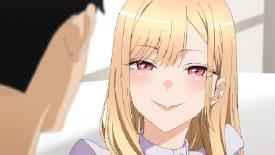
the lips are hideous
No. 291203
>>291053Me too!! I particularly hate that one style people (used to?) do where they put really strong highlights on the lips of every character to make it look like lip gloss, it looks gross to me.
I actually think a bit of detail on the lips can look good, but I fucking hate when they make every character look like bimbos.
>>291015I'm peeved by the opposite, which is when artists that exclusively draw women 95% of the time and have a very defined style
ie same face syndrome finally draw a guy and he's not drawn in the style at all. Samdoesarts is the obvious example but Ilya Kushinov also has that. The artist that made me most mad at this was msrbutterd, who has an extremely specific way of drawing girls' faces but the one time I saw her drawing a guy he was draw in a completely different way (and he was standing right next to a girl).
It's not even the same face that nags me, because I assume they do it on purpose for the style recognition, but it looks so jarring and low effort to just put a completely realistic guy right next to an anime blob.
No. 291217
File: 1682074548206.jpeg (83.08 KB, 1080x1080, ddg9krz-6420deb4-db88-4c85-a23…)
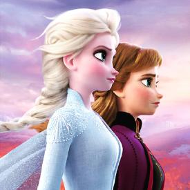
>>291054god I hate Elsa and Anna's profiles, there's just something in them so vomit-inducing to me, they don't look like people they just straight up look like bugs, and their mother is their identical twin too! I hate their giant ass heads, eyes, the way that their nose bridges don't exist and the nose itself is some weird ass stub in the lower part of the face, their almost non-existent chins. I really don't understand how frozen got to be so popular with such disgusting art style
and of course all the male characters in it look more or less like stylised humans and not fucking praying mantis. sorry for sperg out.
No. 291221
File: 1682076305125.jpg (297.22 KB, 1600x1200, 100_6551.JPG)
>>291217My first thought was dogs
No. 291224
File: 1682076673789.jpg (1.05 MB, 4096x5461, sexual dimorphism.jpg)
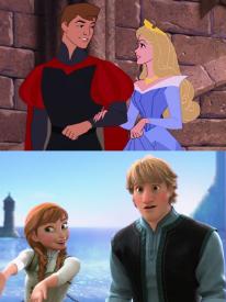
>>291222sa example of how the sexual dimorphism became more exaggerated
No. 291237
File: 1682083223985.png (26.56 KB, 652x406, Screenshot_49.png)
>>291236I'm not surprised. his shit reeks of porn sickness
No. 291248
File: 1682089544793.jpg (64.77 KB, 900x900, bf35ccf67b88f1184bb68afcc8dc99…)

>>291217>>291221It like if you pushed a finger against the bridge of their noses they would completely cave in. They inbred their art style so much, Disney women need to be intubated for breathing problems kek
No. 291265
File: 1682095949088.jpeg (93.1 KB, 1280x720, 33392C34-30EA-48C6-9087-320FEB…)
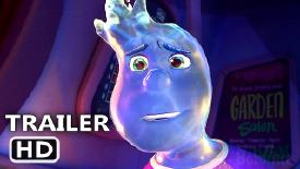
>>291108Kek this is absolutely ghastly even the Twitter toilet parody looks better than this
No. 291393
File: 1682156856602.jpg (181.33 KB, 1024x768, 1024-by-768-477328-20070426040…)
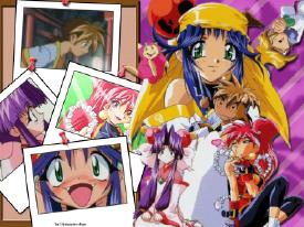
>>291315This is a harem anime, not shoujo.
No. 291428
File: 1682183180643.jpeg (26.93 KB, 600x600, 96AFEC2D-E6EC-4E47-80EC-51F0F1…)
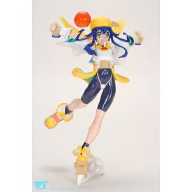
>>291393I will always love saber marionette, it’s such a silly story, and the style isn’t that bad, it’s just super deformed. It’s charming, I also love Lime’s sped outfit, when I was a kid I used to think she was the girl version of a super hero like Superman, wearing her underwear outside of her pants.
No. 291443
File: 1682189212023.jpg (404.67 KB, 1346x2048, FkuDhGlVQAElXsb.jpg)

mgong520. i actually love her style it's just that her fat ocs really disgust me
No. 291471
File: 1682196213720.jpg (393.36 KB, 1123x1665, 403112.jpg)

>>291428That yellow bandana is iconic.
No. 291539
File: 1682223661012.jpeg (164.4 KB, 828x1182, 50A82282-D5C1-4A30-9975-2A9DFA…)
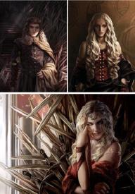
picrel is from an artist that has illustrated a lot of ASoIaF stuff and i can't stand it. not bad art per se but it's just tacky and soulless. too bland and generic and everyone has a face like an instagrammer slathered in makeup
No. 291561
File: 1682230259566.png (291.6 KB, 852x458, 1681464469230.png)

an art-style that somehow posses the worst aspects of 2d and 3d animation.
No. 291619
>>291465>ffs why would you make a fatass OC.bc she has a fat fetish, obviously? That's not her only fat OC, she also made a fat woman OC.
>>291616Thank you for being brave enough to say that outside the shameful fetish thread kek, same. I didn't see any genitals on that guy in her alt account but that's disappointing if true. I also didn't see any pedo shit. But if she actually draws that kind of gross stuff it would explain why looking at all the pics of him with the little girl on both her accounts felt like walking on a minefield.
No. 291627
>>291616>I love some fat guys if they actually look prettyThat's the thing though, fat guys are never pretty. Fat men shouldn't even exist, they're meant to be fit because they gain muscle more easily. I'm sorry you have this nasty fetish nona. And she has a "fat" woman oc but of course she doesn't draw her like an actual fat woman, just a woman with huge tits and ass and a skinny neck.
>>291448I didn't see, was the picture actual pedo shit? I was already suspicious because she seems to draw the toddler together with the fat man and half-naked normal men but idk.
No. 291656
File: 1682270068031.gif (189.37 KB, 220x274, bgc-bad.gif)

>>291616>I love some fat guys ew…
No. 291710
File: 1682289897305.jpg (193.8 KB, 1440x1440, 272973484_135422132295731_4771…)
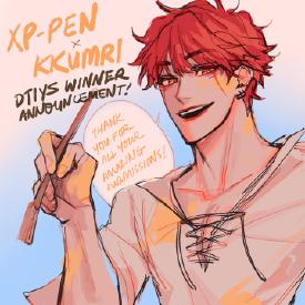
I wouldn't dislike her art so much if it didn't look almost exactly the same as it did in 2017. its not as bad in this pic but the wide-ass mouths with bright red lips she always draws piss me off and I've seen 14 year olds with a better eye for rendering + anatomy than her.
sorry for being a salty bitch, I just don't understand how this type of art can garner over 200k followers and 50k likes per post lol
No. 291711
File: 1682290406457.png (185.93 KB, 849x892, Untitled.png)
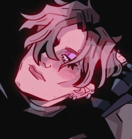
anyone who draws a male character like this, unless the character is a jojo, is a ftm
No. 291728
File: 1682300116043.jpeg (63.74 KB, 1010x672, FB8CB937-93BA-44A0-A33C-F259F4…)
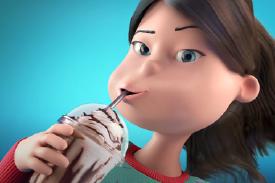
>>291561This is exactly what I wanted to post ITT. Something about the characters’ features in Turning Red and the other new Pixar animated movies with the 3D beanmouths are so grotesque to me. It’s the same feeling I got when I watched that godawful GrubHub commercial
No. 291747
>>291728These new CG Kroger ads are worse than the Grubhub ones to me. Vomit inducing.
>>291711Don’t tell me that’s supposed to be Leon…
No. 291793
File: 1682324284876.png (273.01 KB, 1136x1102, 606d1acd4f02ddba5dcd8dd2563835…)

I can't stand the new mlp style, the ponies look like humanoid dogs
No. 291801
>>291793Agreed. Also there's too much orange, lavender, and teal, so the ponies aren't as varied visually as they were in previous generations. The two lavender ones look more like sisters than the actual sisters do, it's weird.
That said, I do really love the hooves and feathering around them. In g1, the Big Brother ponies had it and I thought it was cute.
No. 291819
>>291265cant believe this is real, looks like ps2 water rendering without any of the charm
>>291393ngl i kind of like this artstyle, brings me back to a simplier time. ill take this over flat, featureless contemporary moeshit any day
>>291561weirds me out so much how you can see her individual eyebrow hairs and little moles and shit but her ear is just completely featureless and flat…
>>291793the colourscheme is dogshit too
No. 291885
File: 1682384755385.png (46.55 KB, 409x897, deiedmn-eb5d04d1-1fc4-42fb-b25…)

>>291183I always felt like the designs in hazbin were too cluttered, imo. It makes it hard to tell what the cartoon wants your eyes to be on. Also I never realized that picrel was a spider.
No. 291932
File: 1682405107619.jpg (965.21 KB, 2400x2400, 2400x2400sr.jpg)
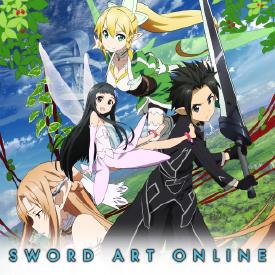
>single-handly ruins anime artstyle forever
SAO is the worst shit that ever happened to anime. It's the calarts of anime and i doubt we will ever recover from its consequences. Even the most detailed modern anime still has that SAO influence of no shadows, barely any highlights, everyone having the same face, generic as fuck designs, ''grounded'' animation stripped of any personality, overly saturated colors, everyone looking like a background character. Ugly as shit.
No. 291941
File: 1682405479482.jpg (33.73 KB, 645x363, 1679916986425609.jpg)
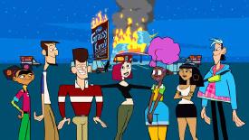
Oh and lastly the new Clone High reboot artstyle. Dunno why they had to ''round'' the characters and make them so bright, it's a fucking adult show let the characters have some fucking edge in their design.
No. 291967
File: 1682410860715.jpg (123.36 KB, 1920x1080, maxresdefault-1039811.jpg)

>>291932>It's the calarts of animeBased. Seeing this style unironically
triggers me, all the girls who are supposed to be adults or late teens look like they're 12 but with big tits, everyone has that ugly dumpy sameface, flat as fuck features and forgettable designs. In Japan liking Sword Art Online gets you branded as a retard with no taste yet studios still keep pushing out dog shit series adapting its style and aesthetics because it's so cheap and easy. Picrel it's literally the same face copypasted on both a male and female character.
No. 291987
File: 1682412191759.jpg (304.45 KB, 1072x1251, recordoflodoss.jpg)
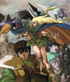
>>291974pic rel is gorgeous and it annoys me that fantasy anime went from dnd/frazetta/dark fantasy inspired to shit like sao
No. 291998
File: 1682413212450.jpg (115.75 KB, 800x800, Hisone_main_sitook.jpg)
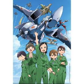
>>291974Dragon Pilot is super cute! Sadly it has a weird rep because the dragon/airplanes eat their pilot and vomit them out to work…weird ass concept…but the characters are so cute
No. 291999
File: 1682413349561.jpg (129.57 KB, 640x905, cc0fb1fe7e6b2cbc479b1834a67712…)

>>291992yeah thats a matter of subjective taste. I personally hate the colorful jrpg artstyle that most isekais and fantasy anime have and it saddens me that there are only 2 good fantasy anime, Loddos and Slayers.
No. 292004
File: 1682414696824.jpg (61.58 KB, 511x512, fc73c2911c432506fd19a90de31327…)

coomer anime south park esque looking ugly loli shit
No. 292059
File: 1682441206282.jpeg (288.65 KB, 2160x1207, 58AFD4F1-6309-4109-86A0-CD4BAA…)
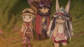
>>292004Reminded me of Made in Abyss.
No. 292063
>>291967I used to love anime style as a teenager but now I fucking hate it so much. I will only watch an anime if the style is very good (with shading, good animation and all that shit) or experimental, otherwise I don't bother with that trash. How can coomers even jack off to this cardboard retarded-looking thing?
>>292004Notice how the boy toddlers don't have that hentai pimple blush. You can tell it's a fetish because they only put it on the little girls.
No. 292075
File: 1682446690650.png (617.56 KB, 1471x1543, shitra.png)
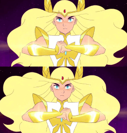
I hate the she-ra style so fucking much. The artstyle is jarring but it also feels so unpolished despite everyone hyping it up as the best thing ever in animation since Shrek 2. The art are so amateurish, they cannot even bother to flip the fucking canvas to check WHY their art looks so wonky. You know, an art tip that even a 14yo drawing fnaf yaoi fanart can understand.
No. 292079
File: 1682448487591.png (1.06 MB, 1600x900, She-Ra-Jan-2023-Show-Image.png)
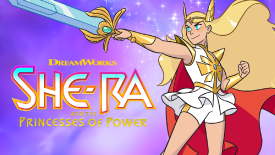
>>292063>Notice how the boy toddlers don't have that hentai pimple blush. You can tell it's a fetish because they only put it on the little girls.I just checked the image again and wtf you're right. Even the girls far away that you can barely see have it but none of the boys eeeew
>>292075This is more about character design but I always tought her short + open skirt thing combo looked so bad. There are so many choices that would had looked better:
>don't have the skirt thing>skirt thing but with longer pants>actual normal closed skirt but with short shorts underneat (not noticeable in most scenes) so you can have her jump around without worriying about panty shotsThe flowiness of the cloth has some visual interest to it but the shorts combo is just fugly
No. 292166
File: 1682468985086.png (4.12 MB, 1080x2952, animation_style.png)
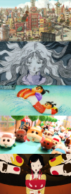
>>291974>all anime looks the same to mesorry for being annoying but this comment hurts so much as an animation lover kek, there is tons of beautiful and interesting animes out there (picrel is just some of my favs art direction)
>what's a good anime art style?Hard question but anything that actually serves the director's intentions, which is very different from what most anime is today ( fast and easy style that serves the economic interest of huge studios ). Japanese animation is varied but you have to dig a tiny bit, most of the great stuff are in short films unfortunately!
>>292004I hate this so much
No. 292173
>>292063>>292047>>292045Another thing they do is give little girl characters the personality of an adult which is also shown in their facial expressions or the clothes they wear. And one thing I really despise that can also be seen in older characters with generic coomer designs, for example
>>291967 is the huge gap between the mouth and the tiny dot of a nose they have. The nose is way too high and the mouth is way too low. They look like retarded little goblins or something but with the blush and everything else going on, it's supposed to be "sexy". Fucking disgusting
No. 292221
>>292218Kek thanks
nonnie, I will check those!
No. 292373
File: 1682538039938.jpg (426.87 KB, 1320x1826, wp-content-2.jpg)
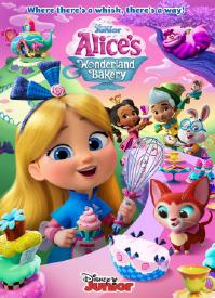
I have never seen this cartoon but the way they made the mouths on this poster irks me. It's the worse version of the dreamworks smirk. The characters pout and don't-pout at the same time it's weird to look at
No. 292390
File: 1682541561001.png (382.2 KB, 1080x1512, Screenshot_20230426-133309.png)

So many examples I could post here from Webtoon, a lot of uncanny looking poses cobbled together from traced models and pasted on SketchUp backgrounds. There must be tons of fiverr artists cranking out gradient tool backgrounds with tons of sparkles and effects, another artists does the bubbles and text, and another artist colors the flats as fast as possible.
This is from "My Mobster Boyfriend" , I hate how lifeless all the poses are and the lack of stylized proportion other than huge butts/bulges/boobs.
No. 292394
File: 1682542137864.jpg (54.76 KB, 600x722, 10gxkt5.jpg)

>>292373Looks like pic rel.
No. 292399
File: 1682543711475.png (1.51 MB, 1231x1034, 1673377121312.png)

>these are all different cartoons
No. 292412
File: 1682548631152.jpg (309.67 KB, 2028x1141, bigmouth.jpg)
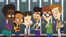
>>292399Pretty much the adult cartoon art style but Big Mouth is no doubt ugly as sin. Rick and Morty and Inside Job gets a pass since their animations are pretty fluid and have some better character designs.
No. 292414
File: 1682548978397.jpg (106.25 KB, 600x913, FgWK5LtaYAASHVQ.jpg)
I don't even know what to call this style. Genderblobcore? There's a specific style that late 20s/early 30s TIFs with edgy fetishes all seem to use.
No. 292419
>>292414I know what you mean. Genderblobcore is good.
Like "Tumblrcore" or "Depressed Art Student".
No. 292422
>>292399I call it Matt Groening Syndrome
>>292414it gives me the creeps. However I have seen some other artists do the spiky lashes thing and I love it, I don't know why. Does seem to be a signifier of looking at too much fetish art though, like you can just tell…. If I ever see a children's picture book in this style my eyes are gonna pop out of my head.
No. 292429
>>292422I think it kinda worked in the Simpsons because the eyes actually matched the rest of their bodies in how cartoony they were. But in these shitty adult cartoons they have much more realistic bodies or body proportions compared to The Simpsons.
I actually think the culprit here is Family Guy for badly imitating that art style first.
No. 292504
File: 1682598372507.jpg (34.83 KB, 640x480, 1582424526801.jpg)

>>292310watch hidamari sketch its made by a woman and has crazy shaft direction and SAKUGA
No. 292506
File: 1682598565701.png (11.33 KB, 200x248, 200px-Poochie.png)
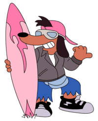
>>292367>>292393all of the new designs in the clone high reboot are just poochie. At first i though it was a self aware parody but then the trailer dropped and all of the new charas acted like tiktok zoomers.
No. 292513
File: 1682602049351.jpg (99.7 KB, 720x1280, 9607ac4d5335275ea69634badd2d3a…)

>>292079>skirt thing but with longer pantsFunnily enough she gets a powered-up form at some point that's pants with a butt-cape and it's still a little janky, but it's so much better looking than the bike shorts.
No. 292561
File: 1682622327490.png (184.44 KB, 421x350, Illustration5.png)
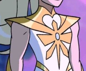
>>292513i wonder if these designers give it more than a micro second of though when designing clothes. These are the same people that complain about boob armor being goofy(it is) but then give their characters whatever the fuck this shit is, what is it? why are the shoulder plates connected to the chest? that's miles more annoying to walk on than boob armor. I cannot imagine trying to turn that shitty design into a cosplay. it looks so uncomfortable. Also the leg things, is it supposed to be boots? then why are the pants inside the boots? the original shera design made more sense.
No. 292603
File: 1682634573837.png (Spoiler Image,502.05 KB, 1215x1500, ew.png)

western twitter porn artist. They always draw the characters so fucking glossy and shiny and the proportions are beyond fucked up, they make anime girls look normal in comparison. This guy and gloss are specially disgusting.
No. 292626
File: 1682646744700.jpg (4.69 KB, 307x164, fewrwr.jpg)
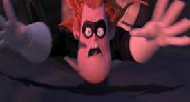
>>292513what if that assflap gets caught on something
No. 292707
File: 1682679452827.jpg (38.08 KB, 592x518, 1682342395415831.jpg)
when zoomers try to make an ARG or creepy pasta about something they didnt grow up with so it just ends up sticking out like a sore thumb as something fake and gay. This and the gay puppet fake lost media shit come to mind. I am so fucking tired of seeing this shit on my youtube feed.
No. 292712
File: 1682682774117.jpg (967.58 KB, 1200x10128, MTXX_PT20230428_135004329.jpg)

Another webtoon post but for some reason Maybe Meant To Be makes me feel an ick when I read it. It's in some way coomer but I can't put a finger on how. It's a romance manga that's obviously mostly meant for women going by the story but the way that artist draws the girl smug and blushing all the time reminds me of Shadman. Even though the story is for women the artstyle is for coomers somehow, but not in an obvious way. Maybe it's just me. Also making the guy super jacked but ugly as fuck is not exactly an equal fanservice they probably think they're giving us.
No. 292715
File: 1682684676223.jpg (61.31 KB, 728x455, anime-monogatari-series-mayoi-…)
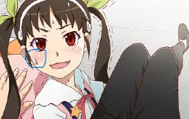
>>292063I used to feel insane being the only person who noticed that weird pimple blush on anime characters. Its like no one talks about how ugly the generic anime artstyle is. I wish people talked about it half as much as calarts sometimes.
No. 292726
>>292712thats my problem with most webtoons. The female characters looks very coom baity even if the story is targeted women. I once read a webtoon bl that spend a lot of time showing a naked woman which defeats the purpose of a bl.
Also all the male characters in webtoons are ugly no exception. They always have disgusting thick necks and board shoulders. It doesn't help that most webtoons also use a really bland flat colouring. Everything about webtoons looks so soulless I can't wait til it becomes a dead trend and people move on to something new
No. 292748
File: 1682695470201.jpg (Spoiler Image,348.93 KB, 1600x1035, 1682665790700006.jpg)

john k. He ruined western animation forever with his ugly as shit artstyle.
No. 292788
File: 1682702086686.jpg (125.09 KB, 1280x720, maxresdefault.jpg)
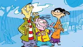
Simply gross.
No. 292804
>>292788His other cartoons are really, really gross, so it shows in EEnE. I like it, though
>>292715Fucking amen to that. I hate the way most anime looks, mostly anime aimed at moids (so most of it). People think it looks good because they're so used to seeing it everywhere. It's shilled as attractive. When you think about it, the huge, highly detailed bug eyes and unnaturally clear, neotenous faces paired with those realistic bodies, not to mention all the retarded little details like the pimple-blush… It ends up looking really creepy and inhuman.
No. 292830
>>292809To be fair, he probably does hate women.
>>292623It would be cool to have more animated adaptations of comics, especially for older audiences, but many marvel fans would be less inclined to see it because of animation's association with children (ironic considering that the 'live action' movies are 90% cgi). I dislike a lot of things about anime, but I do wish that comics animated adaptations were more common. I'm at least happy that the internet has allowed for artists and animators to show their works to the world.
Also, any recs?
No. 292831
>>292748i love john k's art style and wish he wasn't a horrible
abusive groomer
No. 292847
File: 1682726658691.jpeg (Spoiler Image,58.95 KB, 377x470, 0FAD048D-8E14-411E-960E-60A881…)

>>292809Jesus Christ this man’s art is disgusting. And this isn’t even the racist shit he did.
No. 292885
File: 1682742659691.jpg (Spoiler Image,105.8 KB, 723x458, Untitled.jpg)

>>292847this is his worst imo
backstory is a bunch of mental patients rape and force a nurse into slave labor and beat her face into a hole for fucking
yeah i hope he dies a horrible slow death
No. 292901
File: 1682751943479.png (81.14 KB, 621x342, rey45.png)

You fail at imitating the anime style and make the characters look disturbing in the process. Awful.
No. 292947
File: 1682769265308.png (1.74 MB, 2000x594, PPG OG.png)

>>292901>fail at imitating the anime stylesilence filthy weeb, dont speak unless you know what you are talking about. PPG wasnt imitating anime, it was based off old hannah barbera cartoons.
No. 292958
>>292901wrong
>>292947thank you nonna for this
No. 292980
>>292959Yep, still mad.
Whatever have you expected from a thread named
>Art Styles You Hate?
Give me a break. Fragile like a snowflake.
No. 293148
File: 1682813398740.png (3.79 MB, 2450x1750, alldifferentartistsbtw.png)

I'm so glad the "lofi aesthetic cozy sticker shop" style isn't trendy anymore. It's like Alegria for zoomers.
No. 293157
>>293148I like it, but that's because I avoid places where this is popular so it's still fresh for me. I might be able to make a quick buck selling stickers like these here kek
>>293155I like Teen Titans and I love the designs but I agree, it just feels like a cheap imitation. It doesn't have the amount of detail actual anime had at the time. It's extremely American (well in the case of Totally Spies it was French). The visual anime gags are especially cringeworthy now that I'm older too.
No. 293161
File: 1682817611517.jpeg (331.17 KB, 2048x2048, 50C1125D-4554-450D-8089-2F2031…)

Theres an illustrator group im in and this person has been posting these creepy ass samefaced creatures for months, something about the shiny eyes and weirdly lit skin makes me want to claw my eyes out
No. 293191
>>292847Crumb is literally the most overrated scrote on earth. All of my male professors in college shilled him
so hard. I straight up told one of them at one point that the only reason men his age like the guy is because his art is the first time they saw boobs and they're blinded by nostalgia. Art Spiegelman was the best artist in the comix movement, because he actually had shit to say– real commentary about the art industry, society, trauma, etc. That's why Maus is a modern classic, while everything Crumb's done has aged like milk.
Pisses me off that Crumb's daughter has a nepobaby career, too. Her shithead father doesn't even deserve a career, let alone someone whose only credential is being unfortunate enough to share half of his DNA. Wife's a creepy handmaiden, too. Whole damn family is a waste of oxygen.
No. 293253
File: 1682856513936.png (493.95 KB, 445x576, fghjk.png)
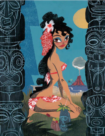
>>293212nta, just went to look at it because I was curious, you are right but also for some reasons it looks so much better and less pornish in her style, I can't explain it.
No. 293265
>>293253it's because she is a woman so her art is less malegaze. Besides, John K is a literal pedophile so it'd make sense his art of girls is so disgustingly pornographic.
Degenerate moids love to take women's art styles and make highly sexualized copies of them. Moe/lolicon style literally comes from shoujo style, an art style developed mostly by women, and targeted at girls. Pedo moids took that, Ghibli's and Tezuka's art styles, all very cute and relatively innocent art, and turned it sexual, and that's what you're seeing now in 90% of all anime these days, with all those underage high school anime girls that are everywhere.
Sorry to sperg so much about it but I truly hate moeshit and all moid coomer art. You can really tell a lot from just a male artist's style.
No. 293272
>>293253Ayrt,
>>293265 is right it’s just a porn-y distortion of her style but it took him a while to get there. Their stuff in the 80s is nearly indistinguishable from one another, he rode her coattails so fucking hard.
If you like Lynne’s stuff you might also want to check out her late husband Chris Reccardi’s work, his girls are also stylized and “sexy” without being Spumco-gross. John was also influenced by his art and supposedly pushed him down a flight of stairs when he found out he was with Lynne, lol. Im so embarrassed to admit I ever looked up to JK but his blog was so formative to me when I was learning how to draw as a teen.
No. 293305
File: 1682878963013.jpeg (32.76 KB, 354x500, IMG_4236.jpeg)
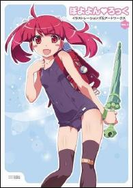
>>292715God damn words cannot express how much I hate this type of art style. I partially blame Aiko Watanabe, the coomest of the coomer lolicon artists. He is responsible for the horrid designs of the new Higurashi and many more ugly anime girls
No. 293316
File: 1682881165508.jpg (70.42 KB, 787x579, Untitled.jpg)
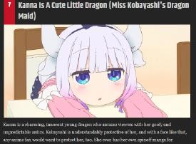
>>293265>>293271same here anons. i am genuinely baffled when people are like "OMG SOOOO CUTE" to some anime girl like it's a kitten or a puppy. they aren't cute at all to me, they're obnoxious and honestly skeeve me out the moment i see them bc i assume there are lots of men jerking off to them
No. 293381
File: 1682896087548.png (304.96 KB, 1366x768, 1_HFxPVApXIFz18zBexp__fg.png)

>>293316Made in abyss is by far the worst offender imo. I don't really hate any type of art but something about this grossed me out so deeply the first time I looked at it, that I absolutely 100% KNEW for a fact that the guy who made it was a massive creep before I even got into the plot. I don't feel like saving any examples of the abundant pedoshit from that show / manga to my device to post here but trust me, they are incredibly easy to find.
I'm not sure what exactly makes these particular moeblobs so sinister but I know of multiple people who've had the exact same reaction as me.
No. 293391
>>293381>but something about this grossed me out so deeply the first time I looked at it, that I absolutely 100% KNEW for a fact that the guy who made it was a massive creep before I even got into the plotIt's funny how so many people have this feeling that something is off about moe art when they're first exposed to it, yet we're all told we're crazy for bringing it up in weeb communities.
I remember when I used to browse /vp/ seeing a thread about some female(?) Japanese artist that those moids worship because she "perfected cutelewd art". She drew a lot of pokegirl art in a very cute but also very sexualized way. Like "teehee I'm so cute and small and innocent uwu fuck me daddy/oniichan". That "cutelewd" shit is exactly what moeshit is about.
No. 293395
File: 1682900534599.jpg (343.21 KB, 2654x1726, bratz.jpg)

Their faces are so fucking ugly
No. 293407
>>293316>”with a face like that”It’s a fucking circle with two glossy anime eyes and a dot for a mouth
I don’t get the appeal either anon. This shit isn’t cute, it’s creepy as fuck
No. 293413
File: 1682906493484.png (66.13 KB, 681x720, 1608230407039.png)

>>293305Still not over that his K1 looks like a girl.
No. 293458
File: 1682933496733.png (474.3 KB, 862x557, 69154f_e818279beaf54b029157ae5…)
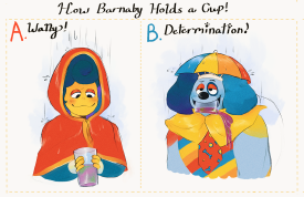
>>292707I hate that puppet creepypasta too. Fucking hate the faggot puppet. The art IS pretty cute and captures the muppet style. But I'm pretty sure the artist is a TIF and draws the characters stimming kek. Zoomers and horror Youtubers that are starved for something good think a couple spooky pngs and a frog singing audio is groundbreaking horror. Honestly no different than older 2010's creepypastas that were shit but had characters kids wanted to draw. Amazing how the internet never changes.
No. 293481
>>293458people started drawing porn of that damn puppet day one
supposedly it made the creator have a mental breakdown
after seeing the shit it became i am a little glad it seemed to kill their interest in continuing
No. 293505
>>292707I just got this recommended to me on youtube and the videos are almost hilariously bad lmao. Actually giggled when I got hit with the first traumacore jumpscare kek.
>fakeI definitely thought that too. The point is that it's supposed to pretend to be a classic flash game, why would you give it such an extreme "2022 mspaint nicotine anime girl" artstyle? World's least immersive ARG
Also, the traumacore/weirdcore stuff felt really cheap because there
were creepy flash games and it would had been way more interesting if she had taken some influence from that instead.
>something they didnt grow up withI don't think it's that, because zoomers did grow up with flash games. I think it's more a "muh personal style" and not wanting to do artstyle studies thing
and honestly I think this particular artist might just still be a bit bad at drawing and not have the art skills for what she was triying to do No. 293508
File: 1682952686440.png (7.3 KB, 984x123, nonnysdream.png)

>>293505What if someone made an ARG creepypasta based on this
No. 293521
File: 1682957215385.png (1.17 MB, 1380x826, dsfsdf.png)
>>293505i refuse to believe the author is over 18 years old, the artstyle reeks of 14yo to me.
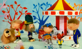
> I think it's more a "muh personal style" and not wanting to do artstyle studies thingi agree with this. The fake puppet show always gets praised for ''capturing the 60s style'' but i feel people only say that because, like the author, their only knowledge of 60s culture is Austin Powers or other 2000's+ media slightly inspired by it. It looks too cluttered and tumbler-esque to be something from the 60s, which had a very limited budget, alongside the limited technology of the time. Pic rel is a puppet show from the 60s/70s. I feel like designs like these could be spookier, because they look more innocent. But internet artists cannot make anything they dont want to fuck, so she had to draw the gay puppet as a tumblr sexy man.
No. 293666
File: 1683037585629.jpg (463.77 KB, 3195x2400, 20230502_072310-COLLAGE.jpg)
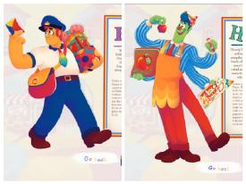
I looked up the puppet arg thing (called Welcome Home). I also hate this art style, it's the Tumblr/Twitter version of "my dream school is CalArts." It's so obviously modern and I can't imagine anyone being fooled that this is a "lost nostalgic show." Rainbow puke everywhere.
No. 293756
>>293666People say the blue haired main puppet looks like it was designed on purpose to be a tumblr sexyman but the mailman to me has way more "tumblr husbandu" vibes. He looks like he was designed by somebody that draws those baloon titted himbo memes.
>>293682Lmao what's the source for that? Did the artist make some lame drawing of it holding a troon flag?
It's actually funny how obsessed gendies are with slapping flags on everything under the sun lmao
No. 293763
File: 1683067710640.jpg (197.29 KB, 1400x1120, FapmMahUIAA6TsK.jpg)
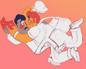
>>293666Damn, I'm supposed to be believe this is some totally creepy lost puppet show from the 70s when the artist draws stuff like this? The fuck is this crap.
No. 293781
File: 1683075327689.jpg (412.19 KB, 1653x2047, what.jpg)

>>293502so my info might be wrong, idk what's even happening here
https://twitter.com/z0rrico/status/1645840035256893440?s=20maybe the twittard was lying if
>>293763 this ugly shit exists
No. 293783
File: 1683075392047.png (10.86 KB, 513x233, Untitled.png)
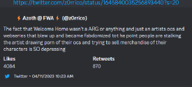
>>293781old cap before tweet was deleted
No. 293787
File: 1683076987812.png (23.71 KB, 308x301, 1681078482101.png)
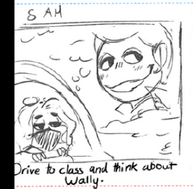
>>293502She got mad because people were drawing porn of her husbando basically.
No. 293826
File: 1683082691831.jpg (98.27 KB, 540x561, 20230502_215804.jpg)

>>291974 I'm not someone who is big into anime, I pretty much only like old shit. Even then I dont watch it frequently. I don't have much recommendations but I seriously loved how mononoke looked when I first saw it. I personally think the ugliness of the characters is so refreshing to see and gives the anime a "charm" so to speak. It's a supernatural anime though so don't expect anything light hearted.
The ghost ship arc is my favorite arc just bc the ship is so over the top and flashy.
No. 293914
>>293792>merchIdk I kind of get why she’d be salty that fans are profiting off of her work before she is but the ridiculous pearl clutching zoomers freaking out about muppet porn are fucking embarrassing especially when as others have said these character designs give such TIF coomer vibes. Wouldn’t be shocked if the creator has a whole stash of her own porn of them.
>>293805Please link if you find it again, sounds hilarious
No. 294749
File: 1683485135849.jpg (1.76 MB, 3149x4443, 442412.jpg)

>>293305The Deen designs were perfection to me. Why did they have to hire somebody else to redo them?
No. 294947
File: 1683560014619.jpg (180.32 KB, 1080x1346, tumblr_2def57be11bc3c2a3b0935b…)
I hate cartoony styles where people are drawn with realistic proportions. This stuff looks traced (though it probably wasn't).
No. 295786
>>295254Just fat hate. A lot of anons sperg on multiple boards about hating men who are fat because they find it disgusting.
I guess they could also be disgusted by a male oc having a vagina, but it is primarily disgust for fat people.
No. 296130
File: 1684020691462.png (680.12 KB, 1198x630, little-mermaid-flounder.png)
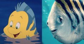
Not exactly an art style but… why. They took away all his charm. I don't love him I want to kill and eat him.
No. 296227
File: 1684048154768.png (1.79 MB, 2048x1152, higurashi-mei-night-pool-kazuh…)

>>293413Yeah Keiichi looks horrible in Akio Watanabe's art style. He looks like a douchebag.
No. 296232
>>295786fat moids ARE disgusting
>>296130this is so depressing, it’s the lion king remake all over again
No. 296256
File: 1684055614468.jpeg (270.64 KB, 1600x1131, 59BFDFBD-2986-4A88-9423-951962…)
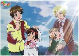
hetalia old art style is so fugly. their skin legit looks like boiled shrimp and its so shiny and hideous. i have no idea what they were thinking when animating. also baby americas face in this image kekekek
No. 296269
File: 1684056309150.png (795.03 KB, 877x629, komugi.png)
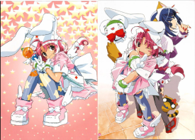
>>293305I've always wondered, is aiko a woman or a moid? aiko is typically a name for women but there are exceptions of course. Some of the design have a cute and nice attention to detail (which moids lack considerably) also the pen name "poyoyon rock" is a little ambiguous.
No. 296312
File: 1684072007314.jpeg (77.35 KB, 591x901, FvCnzJ0WcAEOiil.jpeg)
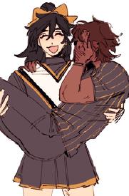
it's a pet peeve of mine and nit-picky for sure, but i am so fucking tired of seeing cat mouths on characters that are portrayed as mischievous or morally ambiguous. just draw a normal mouth! god!
No. 296346
File: 1684083763167.jpg (136.01 KB, 1280x720, 230427162710-01-disney-little-…)
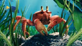
>>296130At least the design for Sebastian is slightly better. I think the attempt at a smile works better here. Still looks uncanny kek
No. 296443
File: 1684112438799.jpg (144.98 KB, 960x1070, 1681926657833086.jpg)
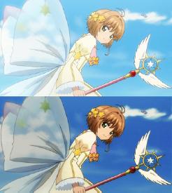
modern anime looks so glossy and over-saturated.
No. 296444
File: 1684112489510.jpg (653.33 KB, 3456x2291, 1681223735598.jpg)
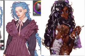
this guy's faces….why
No. 296461
File: 1684118532685.jpg (33.48 KB, 1024x589, pain.jpg)
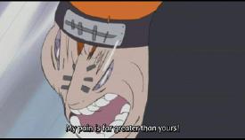
the "webgen" style sucks. it always features paper-thin lines and tryhard animation. if you ever wondered what was up with that one Naruto vs. Pain episode, you can blame webgen.
other examples include Bocchi the Rock, every Shingo Yamashita opening (the guy responsible for picrel), and that pedo Onimai show.
No. 296513
File: 1684149853814.png (943.62 KB, 580x882, himaruya-hidekazu-illustration…)
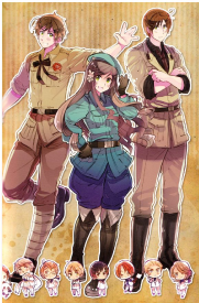
>>296256I think it's because the fact that Himaruya had very weird art style, since the start. He got better later, but demage was done. But all the girls who later tried to imitate the anime style… We finally escaped the hell.
No. 296618
File: 1684170617320.jpeg (56.28 KB, 400x570, 083354D3-28CE-4627-B87D-0F8CFA…)

>>296513I actually like Hima’s art (the colors are pretty) but the older stuff from the deen anime looks pretty damn hideous.
No. 296641
File: 1684180377531.png (212.87 KB, 1200x675, fate-stay-night-saber.png)
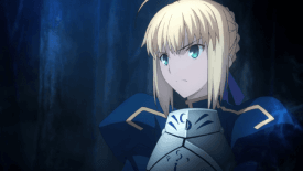
>>296443I've tought about this too for a big while
nonny. Your example is really great because you can really tell the values just mesh into each other
also kek at handle of the wand (not even the whole wand) being the focal point because it's so mush more saturated that everything else in the image lmao did the scene actually call for that or did they really make it super saturated on accident?I also specifically hate the look a lot of modern anime has where the post production effects are way too noticeable. It makes it look extremely synthetic to me.
Never seen it, but something about the fate series anime looks particularly bad to me (maybe it's the gradients in the eyes but I'm not sure)
No. 297325
File: 1684508995347.png (201.91 KB, 895x597, sharknosedfucker.PNG)
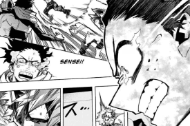
This motherfucking manga's style. Not only does it attract a bunch of autistic genderspecials and manchildren, it also looks hideous to me. Something about the detailed and muscular bodies together with the super quare and overly stylized anime faces is jarring. The exaggerated expressions make every character look insufferable too. Even in this image, the fucker has a pointy ass holeless nose, huuge eyes but the gums and teeth are detailed? Usually his body is also detailed and muscular which is also kinda weird because this is a kid.
No. 297380
File: 1684524055857.jpg (28.76 KB, 250x394, Primer_atuendo_casual_de_Juno_…)
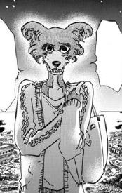
The anatomy (particularly the facial anatomy) in Beastars infuriates me in a way that can't be described using words.
No. 297414
File: 1684530084513.jpeg (67.39 KB, 602x394, 37223613-25A3-4FE4-943C-236D7F…)
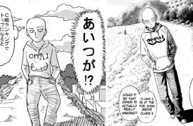
>>297413>I thought mangakas had to be good at drawingNo.
No. 297457
File: 1684557320846.jpg (34.55 KB, 395x395, 163838949_187351826486398_1295…)

Modern moe anime art styles aggravate me
No. 297463
>>297457I fucking hate the anime muzzle so much.
It's even worse when you remember that these characters are supposed to be sexually appealing. What the fuck.
No. 297465
File: 1684560670034.jpeg (236.96 KB, 791x1200, 8E267F45-E586-4599-BB66-76D38E…)
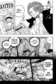
>>297461Exactly because of that you can just notice how you don’t need to be some artistic savant to make a manga. It may be in a webcomic format but it’s still a manga.
As long as someone likes the story, it doesn’t matter if the art is shit.
No. 297471
File: 1684566025064.png (32.3 KB, 334x465, Comparison-of-wolf-body-size-t…)
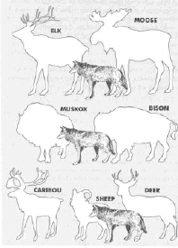
>>297380I like to believe that the characters in Beastars are just humans in furry suits. Fucking Zootopia seemed to have a better grasp on animal biology, At the end of the day, the carnivore vs. herbivore divide is the main focus even though it doesn't really make sense. For example, there are plenty of small carnivores who scavenge, and some herbivores are actually massive and aggressive, like deer compared to wolves
No. 297490
File: 1684571022533.jpg (76.65 KB, 500x383, zoobortion.jpg)
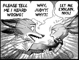
>>297380Whenever I see a Beastars scan I think it's the Zootopia abortion comic.
No. 297492
File: 1684571800669.png (408.34 KB, 816x730, Kemono.png)

>>297471>>297476The series isn't meant to be realistic regarding each animal's real life counterpart, The animals in Beastars are Kemono, humanoid animal-headed fantasy creatures that originated from Japanese puppet theater and have now become popular elements in manga and anime. They were traditionally used to tell cautionary tales, and in this series, suspension of disbelief is vital to fully enjoy the story. The narrative doesn't got to great lengths to explain the rules of its world, instead of relying on familiar cliches rather than science.
Most people don't know deer can be quite large, rabbits have claws, and alpacas can defend themselves from wild dogs with powerful kicks. While these facts may be interesting, they are not relevant to the story being told in Beastars.
No. 297759
File: 1684683627688.jpeg (277.8 KB, 1167x2063, 2B90301E-B005-4F8F-A008-524DC9…)

They aren’t satisfied until the pretty boys are as uggo as they are. Also these "inclusive" styles often end up coming back around and feeling racist
No. 297761
File: 1684684369029.jpg (94.74 KB, 742x1590, asunnydisposish.jpg)

>>297759basically picrel.
No. 297778
File: 1684689179357.jpg (95.63 KB, 536x800, utamaro004_main_new.jpg)
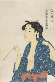
>>297761til that picrel is a racist caricature
No. 298916
File: 1685166410999.jpeg (56.9 KB, 410x612, images.jpeg)

>>297761While the artist is right about the yellow skintone (no one has that in real life unless their sick lmao), they need to realize that small eyes like above are actually real and can be seen on people, hell look at old Japanese paintings and the way they depicted their eyes.
Not sure if the artist is a clueless "ally" or just a self-hating Asian. To say that depicting eye shapes like those are somehow "racist" is like saying that people naturally born with them are somehow "defected" and should be fixed immediately. This type of thinking is literally what's fueling the double-eyelid surgery craze in East Asia tbh.
It's
not that small eyes are racist–were these features exaggerated to mock Asians (particularly East Asians) in the past? Yes. But to say that small, slanty, "ugly" eyes shouldn't be depicted at
all is just plain retarded. If anything, they should just be depicted well,
normally.
No. 298926
File: 1685172098450.jpg (371.9 KB, 1915x1084, B5E0E611-2EF8-4952-979A-52C2BC…)

>>297380Give her a break, her dad is the author of Baki
No. 298927
>>298916I have yellow aka olive undertone skin and know a lot of people who naturally have it, though I think it's mostly common in middle east instead of east Asia.
>>297761That's literally so weird. There are asian people with the first eyeshape, imagine having those eyes and seeing this comic, kek. This feels like a white artist who found out he's %3 Korean via those gen tests trying to be woke. Doesn't most asian art pieces also feature a wide variety of eyeshapes?
No. 298974
>>297759check the dates the bishie art is newer than the uggo art
also i can't stand the stumble in the uggo art what an odd detail to draw>>297782Yeah it can look racist when you make the eyes super upturned but there isn't anything racist about drawing small or narrow eyes. The eyes on
>>297778 aren't as upturned and they have a different shape instead of just being two lines with pupils in them.
But the artist is still wrong though saying that everything else than disney bug eyes is racist is super fucked up
>>298916>It's not that small eyes are racist–were these features exaggerated to mock Asians (particularly East Asians) in the past? Yes. But to say that small, slanty, "ugly" eyes shouldn't be depicted at all is just plain retarded. If anything, they should just be depicted well, normallythe racist caricatures in the past is probably why so many has a strong kneejerk reaction to any art that features smaller eyes
No. 298985
File: 1685194070771.png (55.57 KB, 598x508, Screenshot.png)
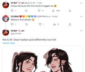
>>298974NTA but the ugly art is the newer one. Bishie is a reply on the original post because someone asked to see the original.
(Person who asked said that they prefer the old version btw kek)
No. 299130
>>297759I feel that she was triying to evolve out of generic animu style but she doesn't know how to make characters cute in a realistic style.
Their hair is crazy, though. Did she not realise that adding so many loose chunks of hair makes them look disheveled as heck? Someone give these guys a hairbrush.
No. 299365
File: 1685333090614.png (1.04 MB, 975x1510, Screenshot_20230528-183155~2.p…)

I don't like this same face e-thotification of Sailor Moon and other female characters. Even if it's drawn by women it's just so sexualized and basic, dark lipstick, heavy eyelashes, and porny poses.
No. 299366
File: 1685332998370.png (1.2 MB, 1080x1543, Screenshot_20230528-183155.png)
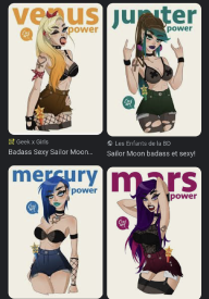
I don't like this same face e-thotification of Sailor Moon and other female characters. Even if it's drawn by women it's just so sexualized and basic, dark lipstick, heavy eyelashes, and porny poses.
No. 299367
File: 1685332932109.png (1.2 MB, 1080x1543, Screenshot_20230528-183155.png)

I don't like this same face e-thotification of Sailor Moon and other female characters. Even if it's drawn by women it's just so sexualized and basic, dark lipstick, heavy eyelashes, and porny poses.
No. 299436
File: 1685378415360.jpg (192.26 KB, 549x1440, IMG_20230529_193557.jpg)
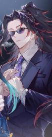
Hot take as fuck but I'm sick of these pretty boys that all look the same regardless of fandom. I know all anime art looks similar but these faces specifically have been getting on my nerves
I don't remember it being this bad until kpop/webtoons fans appeared and started drawing every single fave like this, even on women.
No. 299437
File: 1685379083598.jpg (100.75 KB, 900x1003, E8q4ushVIAE9eKO.jpg)
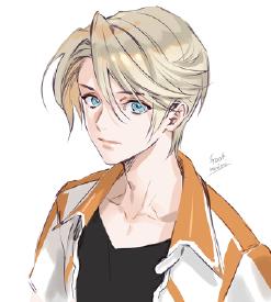
>>299436holy shit same. It's impossible to find good male artists. They all either draw dorito faced alien boys or go the other way to draw ugly tumblresque shit like
>>297759your example specially bothers me because of how detailed everything is compared to the face. pic rel looks much better even though its still a dorito faced anime boy.
No. 299457
>>299437My queen Foo, she always draws the cutest/hottest boys.
I did come across few good artists on Twitter/pixiv but the styles like
>>299436 are drowning them to the point it flows results and stopped recommending the good styles because these are easier to make jfc
No. 299469
File: 1685393375087.png (338.3 KB, 1836x832, Screenshot 2023-05-29 163612.p…)
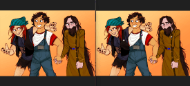
dae like to edit out gender from people's art. i don't even have to like the art. sometimes i just feel like detrannyfying shit
No. 299481
>>299436Fucking finally, someone (else) said it.
I really wanted beautiful art of beautiful anime men to thrive about 8 years ago. But then it degenerated into the male equivalent of ultra deformed moe uguu anime girls with no nose and overly "clean" faces that creep me the fuck out when they're attached to a hyperrendered body. Especially when the heat is tiny like in your pic (kek just look at that neck. It can also be the opposite with a pencil neck that looks like it'll break)
Did bishonen artists forget how to draw a head or something? Why are we going back to dorito-shaped jaws?
No. 299501
File: 1685408341915.jpg (174.19 KB, 1080x1658, cro9s8hoplf71.jpg)
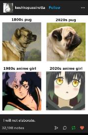
>>297463Why the female characters never given noses? Im not saying they need giant snozzers or whatever, but the lack of a nose even from the front makes them look uncanny. It looks even worse from the side. The little blonde girl is the worst one here. Seriously the difference between the artstyles of new and old anime reminds me of pugs.
No. 299527
File: 1685413583258.jpeg (92.71 KB, 1319x600, FBB0A7E8-2133-4F10-B3C7-DAFC16…)
This announcement reminded me of the irrationally strong loathing of everything about this art style I had when the show aired kek
No. 299588
>>299527I like it.
>>299580There was a lot of joking about 'moe police' when they show aired.
No. 299632
>>299501No nose/small nose is similar to children's feature
Men watch these animes the most
Do the math
No. 299672
>>299501modern anime girls being pugs is a hilarious thought
It's not just anime though, ALL cartoons have gotten simpler and more featureless. The nose is the most redundant feature for facial expressions so it had to go first
No. 299690
File: 1685537717023.jpg (458.68 KB, 1155x2306, F4Vpgk5rx61.jpg)
Whatever this is.
No. 302292
File: 1686772689741.jpg (1.27 MB, 540x15153, 685047e6310b87c7905ef09c060a16…)

This image summarizes a lot of my feelings about the way how modern anime women and modern anime in general are drawn. Too much oversaturization and bright colors, samey faces.
>>297414Idk, I actually like ones art style. I think hes genuinely a good artist
No. 302308
>>302292Oh, this is the post where someone added a screenshot of Golden Boy and claimed its female character designs were made for women. What a joke.
>>302303Anime has been filled with pedo character designs since the 70s/80s, the only difference between then and now is that anime is mainstream in the west. Other anon is right that the post is misleading and cherry-picked.
No. 302352
>>302300Judging by one of the most recent anime in that screenshot being SAO, I'd say it's because that post was made about 10+ years ago.
Even then they were right about anime deteriorating
>>302303>>302308Not OP but even though those kinds of coomer designs already existed then, they became more and more blatant, fetishistic and openly degen, and most importantly, more common in anime as the decades passed. Now, even most adult female characters resemble children, when at least in the 80s they looked somewhat mature.
Anime wasn't perfect back then by any means, but it's definitely much worse now.
No. 302353
File: 1686797438653.png (3.15 MB, 3220x2916, art styles.png)
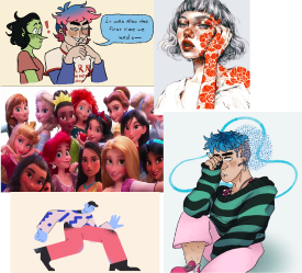
I realize everyone's said this already but:
-Person of gender/fujo shit.
-Generic pretty girl Instagram artist with overly inflated lips, upturned nose, and angel skull.
-The artstyle that every modern 3D movie does for women, especially Disney films now. Just extremely tired.
-Low hanging fruit special mention is corporate memphis homunculus people of course kek
No. 302375
>>302370I'm not discounting that as the case, but I also think it's important to remember that the main consumers of disney princesses are little girls who usually get more attatched to characters that look younger as well. Having been a nanny, a tutor, and having a baby niece, Elsa is like crack for girls aged 1-6.
Is it weird, creepy, and overall an insult to art for disney executives to keep pushing out same-face baby looking women and overwriting their old princess designs with it? Absolutely yes. Is it extremely effective in getting literal babies to pay attention to their content and make their parents keep buying new merch, tickets, and disney+ subscriptions? Absolutely yes.
No. 302377
>>302370its most noticeable when u look at snow white or sleeping beauty to a lesser extent because u can see how much more stylized and childlike the new design is compared to the more fully-grown look in their original movies.
this shit had already started ages ago tho. compare the look of the original ariel to sleeping beauty, im pretty sure both characters are explicitly 16 but you would never guess that if they appeared in the same film
No. 302400
File: 1686826629566.jpg (932.29 KB, 2880x2880, 20230615_175734.jpg)
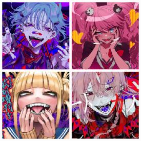
Not an art style but I really hate when they do this expression. Not only it looks edgy in a tacky way it also look super porn-y
No. 302438
File: 1686848950592.jpg (79.31 KB, 425x596, DMetNwZVAAAz0KJ.jpg)

I'm going to get stoned.
No. 302514
File: 1686873104292.png (907.89 KB, 600x759, inconvenient_man.png)

>>302456bishie artists are dime a dozen, let her draw her ratboys. It's a nice change of peace to see men be pathetic and abused
No. 302523
>>302521I'm not a bishie connoisseur but I've definetly seen some
abusive yume art on the fujo imageboard. It tends to be mixed with the bl tho
No. 302529
File: 1686877004018.jpg (116.63 KB, 823x1000, 20230615_193814.jpg)
>>302521BL not count? The women who want to see men raped and abused are always fujos to some degree. Even the ones that draw m/f, such as hiero0301 who dropped it early on to draw BL torture porn instead. It's so common in fujo works that abuse and rape are prevalent in many of babby's first BL mangos. Femdom is forced unless you create a world where all your women are massive furry werewolf creatures and all your men are helpless virgin damsels. This kind of content is generally frowned upon by yumes.
No. 302531
File: 1686877298194.jpg (1.2 MB, 770x897, 20230615_200038.jpg)
>>302529Samefag to highlight SAC's
based obsession with virginity
No. 302539
>>302521>>302523>>302529Can we please not start this infight in
another thread? Some fujos like this stuff, others don't, let's leave it at that.
No. 302566
File: 1686892731386.jpg (32.87 KB, 338x450, globalvillagecoffeehouse.jpg)
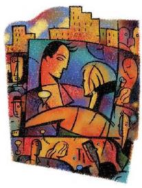
>>302355people are already nostalgic for it, well the precursor of it. but i think what makes me nostalgic for this is the places you would find these sorts of drawings. remember seeing this sort of clipart in libraries and cafes. the colors feel like a old dream you suddenly remember having.
No. 302674
>>302592I see how the way she shades and colors skin in that style could be off-putting but honestly that's what I like about it. It contributes to the atmosphere of her sick world.
>>302640I too like that older style, I wonder if Alegria being so soulless is caused by it being digital art, or if there are other big differences. When you look at Alegria style you'll notice it's much more simple and empty than this
>>302566 despite both having abstract looking human cartoons
No. 302694
>>302355Yes, in 2043 on future Twitter corporate memphis parodies will be the big meme for at least 2 hours.
OT derail but I say 2 hours because compared to even a couple years ago the lifespan of memes has significantly shortened. Everyone is always online and everyone wants to go viral and corporations want to seem like real people that memes just get chewed up and spat out in a matter of days. I can’t believe i’m missing the era where a cat meme could last for years without everyone getting sick of it.
No. 302699
File: 1686972424971.jpg (794.11 KB, 1832x2480, a.jpg)
seeing stupid fangs like this makes me instantly annoyed
No. 302701
File: 1686972484900.jpg (77.73 KB, 800x600, torean_encounter_by_jennadelle…)

I wouldn't say I hate Jennadelle's art (old and new one), but you can see how many people she has influenced and some of them are either ripoff or copycats.
No. 302714
File: 1686977951126.jpg (24.93 KB, 512x431, _forwho__.jpg)

>>302701>jennadelleholy GOD you took me back
No. 302800
File: 1687020291015.jpg (54.43 KB, 1079x610, Miguel_fangs.jpg)
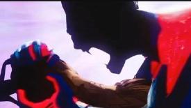
>>302699>>302794It's not an artstyle though, he literally has those fangs, its part of his design. Shouldn't it be posted in the bad character design thread if you hate vampire fangs?
No. 302802
File: 1687021938786.jpeg (125.17 KB, 1125x1663, DEF1F8FF-FC3A-41E2-92CE-77DC27…)

>>302699Those are the fangs he has though. As a vampirefag I get it though, some interpretations of fangs just look too silly for my tastes.
No. 302803
File: 1687022170534.jpg (519.19 KB, 2048x1666, ok.jpg)

>>302800>>302802idk capeshit but yeah it looks like the typical twitter user cartoony fangs thing i see all the time
No. 302806
File: 1687022910946.png (89.45 KB, 548x976, comm_d_zetallis-onifix-2.png)

>>302714I have tons of art of her and it inspires me quite a lot! But the copycats/redraw artists are too notorious. Granted, she's not an original artist but it seems she opened a door for these kind of art.
>>302802I have learned something funny about vampire teeth: Technically vampire bats have their fangs like Nosferatu, but in a human they don't look like a menace. So since we are both predators and prey, we need seeing fangs like the other vampires to feel "fear" they can hurt us since they resembles more a predator. TMYK.
No. 302809
>>302805there is definitely an art style where you can tell a genderspecial did it, like
>>292414 , unnecessary fangs just happen to show up often in it. if the character canonically has fangs then whatever but it's just one of those things, like pronounced bottom eyelashes on male characters, that signals an aiden probably drew it.
No. 302855
File: 1687042286535.png (61.78 KB, 1280x898, tumblr_4643edd8d1e012f6e063789…)

That specific weeb wannabe-4channer r9k art style like picrel, it's so cheesy and the artists that make them are insufferable.
No. 302858
File: 1687042984491.jpg (906.69 KB, 2550x3300, CloneWarsPoster.jpg)
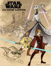
I really don't like Genndy Tartakovsky's art style, I thought the Clone Wars cartoon was a parody just because of it, it never suited Star Wars imo.
No. 302886
File: 1687061278412.png (4.61 MB, 1350x1800, Art-of-Kaneoya-Sachiko-189.png)

>>302531>>302438I think I understand where she's coming from: it's a desire to physically dominate a male body and be the active partner without conforming to any male fantasy like female domination or a mommy kink. I don't necessarily like it but I get it
No. 302905
>>302899>It's usual fujoismNTA but no, fujoism and the dynamics in Sachiko's art are both a form of female gaze where a male is in a submissive position. Fujoism is not the default, it's the most popular way women objectify men, but definitely not the default way. The dog in that pic is female as signaled by the bow it's wearing, I think all the dominant characters in all Kaneoya's art are female.
And also what that anon said makes more sense than what you're saying about "pseudo-females". In yaoi there are two males but one usually looks and is treated a bit like a woman due to having the submissive role (it varies of course, I don't believe ukes are as feminine as that anon says so don't cry about it). In Kaneoya's art, there is unmistakably one female and one male, and the usual roles are clearly inverted, it's a more explicit subversion than in yaoi.
>>302855I can't stand this kind of art either, it's part of why I can't browse the /img/ board on cc
No. 302906
File: 1687072502388.jpg (3.35 KB, 100x102, 415101509.jpg)

>>302905You misunderstood every word of my post
No. 302919
What does Sachiko's art have to do with fujoism if it's f/m? Please don't tell me some of you are so braindead tradtards you think that anything but sumbissive uwu feminine woman x big burly dominant masculine man is fujoism. And anon
>>302886 is right btw.
No. 302931
>>302923>the unchanged male formThe male is still pretty feminine though? Smaller built, no muscles, pretty face features, submissive role and sexualized positions/contexts (I hate associating femininity with submissiveness and sexyness but they're traditionally associated so sorry about that).
>>302892Aand I hate how you're calling men with feminine qualities or submissive men "pseudo-females" or "pseudo-males". It's like any man that's not a big roided muscle ape is automatically assuming a woman's role.
No. 302958
>>302946Nta but why encourage posting images like that, further derailing the thread? If it's that serious, go find them yourself, look to the fujo thread even.
>The overly feminine yaoi bottoms from older works can be seen as the target for a female reader to project onto/self insert'Older works' and tifs aren't usual like that anon claims. "Pseudo-male" anon is obsessed with painting fujoism as a tranny fetish thing and refusing to see the similarities much of it, particularly of modern BL, bears with this theme in Sachiko's art likely explaining the popularity it gained with female trannies (and fujos) another anon pointed out despite them usually not caring for heterosexual content. Her men fit anon's criteria for "pseudo-males": submissive and weak even if visibly male, objectified even if not exactly conventionally sexy, an unrealistic air of innocence that makes their female creator obvious, yet the key difference here seems to be the sex in the dominant position. Unless a female is involved, anon will perceive any man in a submissive position as a pseudo-male.
It's a potential indicator of autism. It's okay to like it more as well as to not like m/m, your taste is your own, but the comparison still stands.
No. 302963
>>302940No one cares if you think that though. Take it to the fujocoomer thread if you want to sperg about your hate for bishie men (or pseudo-males).
Actually I wonder how that anon views same sex relationships now. Are butch lesbians pseudo-females or pseudo-males? Are faggots pseudo-females too, since in real life they feminize themselves as much as possible?
No. 302966
>>302958Not the "pseudo-female" sperg, but you don't know if the reason she calls ukes that is just because they're weak and in a position of submissiveness (if you actually read her posts you'll see there are more reasons than that). You're just assuming that's why, and that's why you keep linking Kaneoya's art with fujoism when her art is literally femdom, not about making men gay for each other which is what being a fujo is about. Kaneoya's work is for women who like cute men being dominated without women being objectified, it appeals to some fujos but that doesn't mean every person who likes it is one.
>Unless a female is involved, anon will perceive any man in a submissive position as a *pseudo-femaleWell, yeah, because in yaoi there are two men, they're the same sex but still one of them has to take the role of "woman" (since a lot of yaoi is made by straight women so it's not a portrayal of realistic gay male relationships). And it's even more obvious when the bottom is not just physically weaker, younger, feminine and smaller, but also has personality traits that are stereotypically feminine, or even takes on traditionally feminine roles like cooking and cleaning, not to mention ABO shit that is full of metaphors giving ukes the social role women have irl. I don't agree with her generalizations of yaoi saying all ukes are like that (it's a rare thing these days and even back then, there weren't that many housewife type ukes) but I can see where she's coming from. Now, is she obsessed with this to an annoying degree and blowing things out of proportion? Yes, she is. Now please stop bringing attention to her and defending yaoi so much when there's no need, you could've just ignored her from the beginning you know, instead of replying to her and complaining later that other people agree with her.
>>302960>And it's not like she creates her art with the intention of subverting yaoi or somethingNo, but she's obviously trying to subvert heterosexual dynamics. In yaoi, men are being objectified from a female perspective, but actual women are usually taken out of the equation entirely, while this artist includes them and explicitly gives them power over a man. I think that's the only comparison to be drawn between these two genres.
>It feels like the commentary is only relevant if someone suggests BL as an alternative to SachikoFunnily enough I bet a lot of women felt relieved to find that art like this existed after forcing themselves to consume yaoi.
No. 302974
>>302966>defending yaoi so muchI don't think anyone here is defending yaoi? Some people are just pointing out that her sperging is annoying and autistic.
Also you're saying that yaoi men are pseudo-males because they're weak and take on traditionally feminine roles, but then Sachiko's males aren't even if they're also weaker (women have power over them so it's subverted) and if you knew her art you'd see that they often act and look feminine as well (also not all of her art is femdom, plenty of her illustrations feature the males only and I guess that's why a lot of fujos like it). So I guess males are pseudo-males only if there's another male involved kek.
>it's not a portrayal of realistic gay male relationships)This is derailing but maybe they're not realistic in terms of depth (men aren't as romantic as women) and looks but as for roles? I don't think you've met real gay men and couples kek.
No. 302978
File: 1687107851859.jpg (41.99 KB, 736x552, 62de59126d9e5b2a72f7ab306ba08d…)
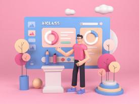
That Memphis shit but 3D
No. 302989
>>302982Nitpick but
>Cis menYou can just say men, we know this isn't about TiFs
No. 303002
unironically do think more women should practice celibacy irl (why would you fuck someone who watches porn, has 100% fapped to porn that resembled you, probably doesn't wash his hands when he finishes pissing, probably thinks casual misogynistic jokes are hilarious, will call you a slur if you piss him off, and a hundred other things males do on the regular) but i don't care about what people do with fiction. it is not real.
>>302982>cis men>pseudo-maleyou are completely retarded
(derailing) No. 303016
>>303009I meant in fiction too, retard. If a woman writes about lesbians and one of them is more masculine, is she a "pseudo-male"? Since the women in Sachiko's art are big, furry and strong are they meant to be men in all but pronouns? Are gnc women characters in media pseudo-males? After all they often don't take on the feminine role to act and look feminine, so they must be men with female pronouns.
The real reason the males act "feminine" in yaoi and other female-made media is because they're men written by women, so they project their experiences and thoughts onto them, but they're still meant to be males (except they're generally prettier by women's standards). This "pseudo-male" and "pseudo-female" shit reeks of tranny and it sounds like you're unable to see a relationship without looking at it through traditional heterosexual roles and self-inserter lenses.
>>303010>You enjoying a beautiful "feminine" man in fiction is literally the same as pedophiles calling a child an adult to justify themselvesKek you've made this retarded argument before. Again, there's the fujocoomer thread in /ot/ for your schizo tranny "pseudo-female" theories.
No. 303043
>>303027kek
>>302974First off it's "pseudo-females", second, this
>Also you're saying that yaoi men are pseudo-males because they're weak and take on traditionally feminine rolesis not my argument, I'm just explaining the sperg's point even if I don't agree with it 100%. This is why I meant by "defending yaoi", why would you focus on that little part and ignore everything else I said? It's like you need to argue against any analysis or comment people make of it even if it's in passing like in her first post. This happened because you couldn't damn ignore the sperg and just want to argue with her. Like you said, take it to the fujocoomer thread.
No. 303050
>>303043Nta, I was the one you accused of doing that hours ago. I quit replying because I don't agree with you, the sperg, or your interpretation of the sperg and don't care anymore, plus the anon you're replying to is saying the jist what I would've if I did. You're talking to multiple people.
And the sperg used the term "pseudo-males" specifically, take that stupid technicality debate up with them.
No. 303053
Can the anti-fujo spergs just get banned already at this point?
>>302872Same. I always got "groomed in discord" vibes from these girls.
No. 303057
>>303043Nta but disagreeing with your criticism of something isn't necessarily the same as defending it. They might just disagree with your particular angle.
You dislike seme/uke because of some weird, social justice pedantry that requires hyper-analyzing women's sexualities. I dislike it because it's a boring, overdone trope that makes the characters feel wooden. I can criticize you for being overly neurotic about meaningless anime bullshit while also agreeing that the thing you're criticizing sucks.
No. 303058
File: 1687143460894.jpg (1.48 MB, 2160x3840, 20230619_095625.jpg)

I can't understand the appeal of these
>Bland character designs you can barely tell apart and make you wonder if it's all just spin-off from each other but drawn by a different artists
>Ridiculous, overcomplicated clothes to compensate the blandness and as a clumsy attempt to give an air of "luxury." Everything is vaguely 18th–20th century Europe lumped together.
>Abuse of assets, texture, and everything that can oversaturate the cover because more is better. Everything have to look sparkly and shiny with luminosity layer overworking. My eyes can barely follow everything.
>Underneath those elements the cover are super boring, just two people or more sitting or standing together
No. 303060
File: 1687146275422.jpg (1.91 MB, 5380x3027, methode_times_prod_web_bin_375…)
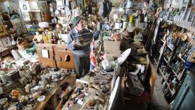
>>303058I hate this art style. It's busy and cluttered and combined with the thin lineart, it has an "icky" vibe. It's like looking at a hoard but it's the cartoon version.
No. 303066
File: 1687149096410.jpg (109.54 KB, 640x640, jesus christt.jpg)
>>303058I tried getting into these, but, god i can't stand the art style. It's to the point that despite being a pretty huge yumefag I can't fathom being attracted to the male leads (who always look like either picrel OR picrel with blond hair and blue eyes). Never have I ever been more aware that they're just lines on paper. Not to mention the stories themselves are pretty bland and repetitive as well.
weirdly enough jp stuff works for me No. 303068
File: 1687154512641.png (420.57 KB, 735x407, E5l09DrWYAEbQda.png)

An 8 in 1! These are avatars for a tranny loving Youtuber.
No. 303069
File: 1687154743710.png (205.96 KB, 652x990, Suzuka.Sakuya.full.2831512.png)

This character in Magia Record. She looks like a blow up doll.
No. 303075
File: 1687157840295.jpeg (181.21 KB, 2048x1676, 655BB513-AC4D-4876-999D-F95953…)
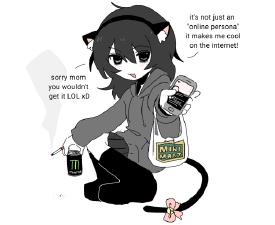
i hate yukiko snail and all her clones so much. it's the same "haha look at miku smoking weed egirl so funni" every time someone draws shit like this. she doesn't really draw things like this anymore and she's pandering to coomers now but i can't stand her clones either
i swear these artists are all a hivemind
No. 303107
File: 1687175524680.jpg (105.43 KB, 640x930, Arnold_Schwarzenegger_1974.jpg)
>>303012i get it lesbians all must have a certain hivemind my sweet "recently peaked former TRA" polilez retard
>>303016>so they project their experiences and thoughts onto them, but they're still meant to be maleexactly, these are painfully heterosexual stories that even if the characters are "meant to be" males they practically are females.
>Kek you've made this retarded argument before. Again, there's the fujocoomer thread in /ot/ for your schizo tranny "pseudo-female" theories.i've personally never posted this before you schizo paranoid. perhaps many people can come to the same conclusion.
also just you actually realize what i am saying, my point wasn't "yaoi = pedophilia" but it was "drawing a thing that looks exactly like X and then saying it is Y is ridiculous and people understand that for example in situations where characters that look like literal children are said to be adults. people who realize this acting as if this train of thought doesn't make any sense when you say that a character that is drawn and acts the stereotypical role of a woman is practically a woman is ridiculous. you are being wilfully obtuse"
like do you idiots actually know what i am talking about?
>>303021 and "we just enjoy pretty men in fiction", that isn't the point you idiots. the point isn't women liking pretty boys. the point isn't that it isn't allowed for women to like pretty boys. the point is, that even if it markets itself as gay media with gay characters, many yaoi stories are not actually that, they are basically heterosexual stories for heterosexual people, the characters practically act as heterosexual couples. that is the point. not that you can't enjoy it or whatever, you are so hysterical about your tastes and any slight criticism towards it that you blow out of propotion what people are actually saying and act as if i have personally murdered your favorite yaoi artist or whatever.
never, ever have i said you are wrong for liking things you retarded dumbasses.
also
>If a woman writes about lesbians and one of them is more masculine, is she a "pseudo-male"?actually yeah in many instances i have thought that so called ""butch lesbian" characters basically look like men, they are just males with she-pronouns. and i'm not talking about likt character having a short hair and wearing pants, i am talking about characters being literally drawn like pic related and the artist saying that they are butch lesbians uwu. especially when characters who look like this are being paired with small dainty girls it's obviously painfully heterosexual. genuinely not exaggerating here, if you find a character that looks like this hot you are not a dyke. die mad about it.
No. 303108
File: 1687175836782.jpg (451.79 KB, 1498x2048, Fu-_wqAaMAIxZTM.jpg)
>>303075>she's pandering to coomers nowCan confirm, I knew a coomer scrote who used to send her art to me all the time. Her art is just coomer art thinly veiled as ironic meme art. Used to be kind of cute and endearing, but the charm wore off pretty quickly.
No. 303114
>>303107>that a character that is drawn and acts the stereotypical role of a woman is practically a woman is ridiculousYeah, they act stereotypically female by wipping out their dicks and fucking each other in the ass and bust their prostates, as women often tend to do.
Also what's your point? Women liking pretty men are actually lesbians? Women reading yaoi are actually reading het romance? Why should we care?
No. 303118
File: 1687181860907.png (295.35 KB, 1500x1350, D-7LxKAXoAEw3Z3.png)

>>303116>>303114Nta but you need to relax. It's obvious that you just haven't seen any yaoi where the bottom is very feminized, like in Rouge (can't think of anything else off the top of my head) or the way mookie draws Kenma.
>>303115Also nta but anons love to shit on uretnik for example for supposedly drawing butches too masculine but those conversations are just as braindead because it always ends with saying that butches have to still look feminine in some way to essentially count as women. They always say that the shoulders are too broad and muscles and jaws too big, but if there's a visible chest in the image it's suddenly fine.
No. 303132
>>303058>Abuse of assets and texture.Jesus I hate that I get that this webtoons are on a tight schedule for episode releases… but shit they don't even bother making it
subtle.
No. 303157
File: 1687193529686.jpg (25.49 KB, 636x502, hljashd.jpg)

>>303110>>303156fujoshit are homophobes, who would have thought! kek
>>303115>>303114how do you like my drawing of an eagle honnies
(infighting) No. 303164
>>303157am I supposed to be ashamed? you can't even experience it since you're only faking.
>>303159>hysterical>hateboner against fujos and pretty boys>lesbo grooming attempts…is this the tranny? it's the tranny isn't it
(infighting) No. 303190
File: 1687195590627.jpg (164.63 KB, 1280x720, tumblr_static_love_live-group-…)

back on topic plz
can't be the only one who finds the love live style disgusting
No. 303205
>>303164>lesbo grooming attemptsdo tell me dear homophobe, what the fuck are you talking about?
also, hateboner for pretty boys? WHERE? where have i ever said that pretty boys or liking them is wrong, you HYSTERICAL schizo? like i said, some of you fujos are so HYSTERICAL and defensive about your tastes that even midlest commentary about it makes you think i am the evil lesbo dyke coming and stealing it away from you when i never said anything about liking it being wrong.
do you understand? do you understand the words you are reading? do you understand that saying that "some yaoi couples basically work as heterosexual couples" doesn't mean "liking yaoi is wrong, liking pretty boys is wrong, you must turn into lesbian"
do you understand how words work? do you smoke meth? what is wrong with you?
(infighting) No. 303211
>>303157>Samefagging to make it look like fujos hate lesbians and vice versaOh my god, stop trying to add fake stakes to your retarded argument. The only place I have
ever seen lesbians and (non-TiF) fujoshis fight is here. Most fujos and lesbians don't give a fuck about each other. It's never been about bigotry, it's about shaming each over retarded cartoons. People are sick to fucking death of endless fujoshi discourse, give it a damn rest already you turbo-autist.
No. 303219
>>303211>Samefagging to make it look like fujos hate lesbians and vice versaoh shut the fuck up, just accept that some of your brethen are homophobic and petty assholes who will resort to that if you dare to say anything about their favorite cartoons.
and you can call me the turbo-autist but just reminding you all that from my pov this thread went like this:
>someone says some male characters in yaoi stories are basically like pseudo-females>me: "i agree">anons: have instant paranoid fixations of me being a tranny, some legendary fujohater anon, discriminator of pretty boys and pretty boy lovers, a man, whatever>me: i do not hate pretty boys nor no i say you shouldn't like it, i am just saying some yaoi couples act like heterosexual couples>nonnies: throw tantrums and have instant paranoid fixations of me being a tranny, some legendary fujohater anon, discriminator of pretty boys and pretty boy lovers, a man, a 5D infight chess player creating discord between lesbians and fujos, a man, etc>>303217me: yeah i think some so called female characters are basically male characters now that you ask
you: SEETHING, SEETHING!
you all are taking this shit way more seriously than i am
No. 303245
File: 1687199261126.jpeg (39.04 KB, 500x300, 0774304B-3A24-472B-B525-D6B169…)
I’m sorry, I just can’t get into shojo stuff like this cause of the style. My friend gave me the first volume of this manga a birthday present when I was like 13 but like I just can’t find guys in this style to be handsome and the girl just looks weird to me. The dorito chins and face style are just not for me. I’m sorry Crystal.
No. 303464
File: 1687262154033.png (1.31 MB, 1320x743, 1920_x_1080_1_.png)

i hate the western anime look, specially this shit
>>302805yeah that's fucking autistic as shit. Hating things just because they are associated with someone you dislike is newfag/twitterfag behaviour. Its sad how many times ''its liked by tifs/tims'' is thrown around here like a gotcha. I once got called a tif for saying i liked breaking bad.
No. 303740
File: 1687358915342.jpg (213.4 KB, 1200x675, 40285220bd7ba44265b5848a529f92…)

Very offputting.
No. 303766
File: 1687364883684.png (309.43 KB, 512x512, dd46xml-8db0874f-4b05-4aeb-8cf…)

I hate Adachi's sameface. It's worse that Hiraiface - at least Hirai gives them different hair colours.
No. 303767
File: 1687365009403.jpg (20.58 KB, 225x350, 29708l.jpg)
>>303766Also that uncanny valley effect every adaptation has to fix.
No. 303828
File: 1687376071612.jpeg (113.15 KB, 828x920, F22CFFA2-F378-4DA3-8419-8151F3…)

I posted about this in the bad comic thread but fuck has his art style deteriorated from an already not-good style
No. 303831
File: 1687376314822.png (153.11 KB, 540x735, unicorn warriors eternal.PNG)

>>302858Have you seen his latest show? The animation really unsettles me. It's inspired by 20th century art style but moves in a modern way so it's just uncanny
No. 303848
>>303831Wait, I just watched a clip from that show and it's not what I assumed at first so forgive me for the unrelated rant about tweening that I posted kek.
The way the camera moves and the timing in the animations is kind of unfitting, yeah. It feels like it's taking itself waaay too seriously what with the (I guess you could call it) immature art style that looks too goofy to be this serious and edgy.
No. 303971
File: 1687414829718.png (60.12 KB, 640x855, IMG_0859.png)
Whatever this ugly tumblr comic style is. The mouths are so gross with the fakeboi fangs and that stupid anime shit where they have a chunk cut out of the lip.
No. 304010
>>303971I’m so tired of the “haha they’re dead” jokes. I get it, dumb rich people spent the money to do this but it’s still a shame that lives are being lost.
Could you even imagine if someone said this about a trans person dying during elective surgery? They’d be up in arms.
No. 304052
File: 1687445167008.jpeg (97.94 KB, 960x960, 3472076B-8391-426C-9396-294B46…)

I recognize the skill in this “silhouette and shape heavy art style” but it just looks the corporate version of visdev industry. Bleh.
No. 304094
>>304010The limbless torsos are so "baby's first comic" and I hate it when artists completely remove the space between the mouth and the nose ugh
This is very ot but tumblr has been going on such a LARPy ass edgelord tirade with the submarine thing these days. Their self important speeches about how it is essential for the revolution for them to make weird villainous declarations about how they should die as painfully as possible and nobody is allowed to say they're weird for it are so petty.
This reminds me of that shoplifting artist from twitter that got bullied for making comics where the punchline was that she(? don't recall if it was a troon or not) was jaded and nasty.
No. 304099
>>304098you know whats more annoying and worthy of ridicule? infighting with a 4 day old post
>You have more in common with a 4channer than a normal womanthis applies to every lolcow user btw
No. 304306
File: 1687544882818.jpg (183.59 KB, 1422x800, BfrKzwDwVQnzPZP-1600x900-noPad…)

This kind of blobs with no defined facial features other than eyebrows, eyes and mouth. It's even worse when it's porn, everyone who gets off to this shit should be locked in an asylum.
No. 304374
>>303971Why did so many artists start drawing glued-on looking shape noses like five years ago? It reminds me of a Sesame Street puppet.
>>304306This looks like it's from 00s Newgrounds
No. 304586
File: 1687666674287.jpg (102.92 KB, 900x1600, 5a7a11fbf0281b835975ba1e061e61…)
>>304306>>304306The circle tool head style reminds me of that ybf guy from that one visual novel. I think his name is Peter
No. 304589
File: 1687667014850.png (341.19 KB, 1280x690, tumblr_9af624508f755cce1feab77…)
>>304586Speaking of art styles you hate, I hate the way the people are drawn in this game in general.
No. 304606
File: 1687677372132.jpg (206.97 KB, 1077x579, 75864754.jpg)
I hate these kitchy tiktok youtube short spray paint planet and stencil generic moon with trees and black silhouette paintings and the similar stuff so much
No. 304934
File: 1687819372005.jpeg (94.26 KB, 828x1027, 0DB21E19-1985-4D88-B224-DE074B…)
I’m honestly shocked that she’s still making comics when they all look like this and have looked like this for nearly a decade now. None of them are funny, none are “cute”.
No. 304939
>>304934these dime-a-dozen "omg me
n my nigel are sooo quirky and funny and unique but also #relatable" comics are super popular with normos. so i guess there's no point in putting much effort in them since they get clicks anyway
No. 305055
File: 1687865919663.jpg (286.48 KB, 1080x1080, this_shit.jpg)
>>305053I actually wasn't referring to that one because I don't even consider that one to be an attempt at being wholesome with how bad it is kek. His just comes off as bragging about how great he is. Most of the ones I think of are super cutesy-wootsey and made by women like picrel
No. 305215
File: 1687932171999.jpg (77.84 KB, 850x478, cicada.jpg)
I hate this type of coloring where the characters have white spots all over them. It makes them looks greazy and nasty.
No. 305228
>>305053The couple that has kids and does a bunch of gross fart/shit/piss joke comics?
>>305055Was going to post this same one, I hate this fucking style. They’re both dumpy af irl
No. 305822
>>305727yeah, i get what the
nonny is trying to say but that choice of image is pretty bad kek those are just particle effects
No. 305938
File: 1688221816746.jpg (133.51 KB, 735x743, 38d7f65298de051d1bf017e1f024a8…)
Whatever this is
No. 306058
File: 1688239723970.jpeg (Spoiler Image,155.62 KB, 828x806, IMG_1578.jpeg)

twee instagram mental health art like in picrel
No. 307206
File: 1688766703341.jpg (109.71 KB, 630x630, Girl-Gang-Sailor-Moon.jpg)
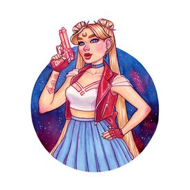
>>299365God yes, I absolutely loathe this trend of "modernizing" Sailor Moon wearing uglyass edgy clothes. Most of this art done by people who aren't even fans of the story, and don't know the girl's personalities and just see Usagi as an icon to project onto, like Miku has become.
The best thing about Sailor Moon was how they would defeat evil with things like kindness and love. And then these lame artists draw the girls holding bats and weapons and being nlogs
No. 307318
File: 1688815668565.png (Spoiler Image,2.39 MB, 1874x1545, tttr5L.png)

Gay moid furries are the most annoying breed of faggot and their art always has the worst proportions. They're everyfuckingwhere in art circles too so that only makes things worse
No. 307525
File: 1688905088203.jpeg (Spoiler Image,386 KB, 2048x2048, 89A64FAD-0D36-4E60-8EE1-DE6180…)

This lip biting expression that western artists seem to think is peak Hotness and Pleasure
No. 307604
File: 1688947615266.jpg (112.81 KB, 1024x768, sm4-1.jpg)

>>307206>But my women power!Then seek for a female character that do use weapons!
>>307280> I roll my eyes whenever they portray “modern” Usagi as fat.If they even knew the anime, Usagi's nightmare is being fat and is a gag. She even was pissed off at Luna for drawing her fat. I still remember those "draw in my style" Sailor Moon and Usagi was tiny and fat.
No. 307622
File: 1688955961411.png (172.74 KB, 428x388, 000181828281.PNG)
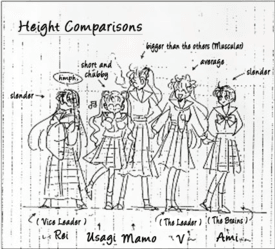
>>307280>>307604I think the artists took this sketch and ran with it. Even when Naoko never bothered making her fat at any point kek
No. 307624
File: 1688956717193.jpg (86.55 KB, 1030x641, Esh3gNhVcAAHuSh.jpg)
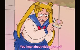
>>307622I wouldn't blame her.
No. 307642
File: 1688962253776.jpg (70.5 KB, 420x560, Untitled.jpg)

>>307626most likely. "chubby" in japan in the 90s would just be "not rail-thin"
No. 307650
File: 1688967517228.jpeg (474.47 KB, 1443x1348, 4CFF9E43-D8B6-41F4-848F-1446E4…)
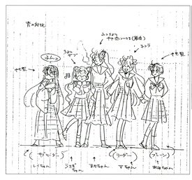
>>307622I looked up the original and it’s literally "a teeny bit fat"
No. 307780
>>303831I liked the style of Samurai Jack and fucking loved Primal but this show was such a disappointment. The story and interactions are a whole own can of worms but I hated the artstyle too. The characters had whole different artstyles and it didn't work. I also think that feMC in particular is ugly as hell. I loved her old self though but we barely saw her.
That aside I literally cannot watch most cartoons and anime for how ugly they are. The look is one of the main reasons for why I am not touching a show and I hate moe blobs, flat colors, filter shit, cartoon characters with frog eyes and spaghetti legs and ugly abstract shit like I genuinely believe that Adventure Time is a good series, but I couldn't stomach it for how it looked.
No. 307809
File: 1689029692294.png (1.95 MB, 748x939, sailor stinky.PNG)
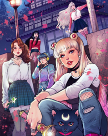
>>299365>>307206Shit like this has negatively influenced anime obsessed males. This is the type of shit that a tranny would put on the back of his "battle vest" kek.
I hate any crossover/re-imaging of popular characters. I remember a girl won first place at a cosplay contest for her crossover of princess serenity/zelda cosplay and couldn't believe it. I think their efforts of being imaginative is incredibly lazy.
No. 308056
File: 1689133463494.png (477.43 KB, 660x608, edgy moon.PNG)
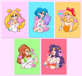
>>307809This is been a trend for the longest time and it's so tired. I used to be a fan of this artist's edgy sailor moon series, even though she's got major same face problems, but it got old real fast
No. 308890
File: 1689606637964.png (494.03 KB, 1080x964, Screenshot_20230717-170450.png)
It's not offensively bad or anything, but it's sad to see a dynamic and charming artstyle devovle into stiff glossy kpop trash.
Thought that maybe the two pics got mixed up, but no, the one on the right is more recent.
No. 308996
>>308891They're all over My Adventures With Superman Tweets (which is already a cursed fandom) acting like they have PTSD from Voltron any time they see Mir reuse a Voltron design (which is often).
>>308986And as someone who actually liked VLD, warts and all, I hate it. I hate that anyone who engaged in that fandom is associated with these crybullies. I just stayed in my corner, damn it.
No. 309027
File: 1689666208016.jpg (1.21 MB, 623x9825, klancercancer.jpg)

>>309000This is just from one thread. A couple are positive, some just observe or criticize Mir, and some act like typical histrionic Klancers. They are perpetually stuck in 2018.
It really is just Zarkon though, I agree.
No. 309035
>>308986they contributed a lot to the current moralfagging shipping climate but they're not the ones that actually started it. apparently it was the spn fandom with wincest that brought this drama and other early 2010s shows that had "
toxic" ships
No. 309055
>>309044don't call it moralfaggotry then, that's what TIFs and TIMs call it.
>>309040maybe, but two males can't have a baby together.
No. 309075
File: 1689687158817.jpg (57.29 KB, 750x932, f029c9ab2224a585ce77362be55b0f…)

>>309070nta but Klance shippers were very "insistent" about their ship, more so then even regular fujos. One infamous example was there was a group tour for Voltron fans in the studio and where one of the attendants essentially took photos that were meant for future episodes and attempted to blackmail the studio. she threatened to leak these photos unless Klance became canon. The intensity and willful delusion of klance shippers led to arguments with seemingly the entire internet, as well as real-life harassment of the voice actors and creators. The backlash against them resulted in the first major anti-fujo backlash online, and this pattern has been repeated with other fujo ships since then.
No. 309082
>>309075>>309071I need to explain a bit better what the harassment was about. So when voltron first aired both klance and sheith got popular at the same time, but klancers (who were mostly TIFs and bihets btw) felt threatened because shiro's va shipped sheith and it seemed like the show was going to push that ship more. So they started moralfagging with arguments why sheith couldn't happen and why other fans should be against it "sheith are brothers so it's incest", "sheith have an age-gap so it's pedo", "keith is a minor", "shiro is the space dad you can't ship him with his son". Basically if you shipped sheith you were a horrible human being and a moral failure. Every voice actor who showed any hint of support was called a pedo, a yaoi freak, an incest lover or a fetishizer fujoshi. Bex who is pidge va is a jewish lesbian and they claimed she fetishizes gays for liking sheith kek. It got so bad to the point you couldn't even post sheith fanart in your own fandom bubble without being attacked by klancers. A weird thing about klance and its fans in general is that it revolves solely around lance. They behave more like husbandofags who would do anything to defend lance's honour and they would shit on keith all the time, which made no sense to me cause if you hate keith so much then why are you shipping him with lance?? I think keith was just the "safe" option and they liked the red-blue aesthetic too much to drop it, and deep down even if they hailed lance as their "bi king" they didn't want to see him with a girl. That's why it's hard to call them actual fujos because like 80% of them were just extremely jealous and possesive lance husbandofags and keith was the character they projected on.
The irony is that the anti-fujo backlash was started by them, thinking that they are punishing the bad "straight white women" who love
problematic ships but in the end people turned against klance and lance lol.
No. 309155
>>309070Unfortunately, VLD came out at the height of social justice on Tumblr. You have two generically "pretty" boys like Lance andKeith, doing the whole red/blue rivalry thing, and it was like cartnip to the most braindead of fujos. The other big ship was Shiro and Keith. Now in canon, there is an age gap between Shiro and Keith. At the beginning of the series, Shiro is 25 or so and Keith is 17 or maybe 18 at most. Through space fuckery, Keith is 21 by the end of the show, while the other characters only age maybe a year. Also, Keith is orphaned when his father dies in the series as a pre-teen, so he is "raised" by Shiro. In canon, he mentions Shiro is like a brother to him multiple times.
This is where the "social justice" angle comes into. One guy (Keith) being shipped with two different guys made Klancers butthurt, and they began to use social justice talking points to shit on Sheith (a ship that I don't like either, and I also find many of its fans annoying, but nowhere near Klance tier). They'd prattle on about how one ship had a dark skinned guy and a light skin guy, which is better than two light skin dudes. But, the most prominent one, by far, is the "age gap" discourse and the "imcest" discourse. If you want to sit there and argue those points, I won't stop you,but the most important part is Klancers were doing this very blatantly because they didn't like the popularity of the other ship. The "social justice" angle, like they usually are, was fake as fuck.
>>309075Oh boy, this again. I was there for the whole shows run, active in the fandom, saw all the "discourse" and your facts are wrong. I don't know if you got it from some clickbait story, or from /co/tards who hate VLD and like regurgitating shit or what, but I'll break this down.
A fan who ran a Tumblr page had gone to Korea, and was granted a tour of Studio Mir. From what I remember, I don't think she even had a shipping preference. While touring the studio, she took pics, possibly with the studios permission. She posted these pics online basically with a positive intent "This is Mirs studio, isn't it neat?" What she didn't realize (or so claims, but I'll give her the benefit of the doubt here) is that it had season three spoiler material scattered on various desks, along side character sheets from other projects (Lego Elves). Among the leaks, were some Galra character designs, namely Lotor and his female generals, some ships designs, layouts, etc. This spread like wildfire and got reposted on TUmblr and Twitter. When Mir realized, they asked for the materials to be taken down. The OP photographer released a post on her Tumblr saying so as well, deleting her postings, and surprisingly, the overwhelming majority of fans complied and deleted it off their social medias.
Except for this one entitled 14 year old Klance fan with very few followers, who directly posted under Mir's thread saying 'I won't do it until you make Klance canon". Even in this annoying fandom, people were quick to jump on this retard, and they deleted their literal who account. Too late though for drama whores and clickbait articles, who took it and blew it all up.
>>309082This, however, actually does correctly hit on a lot of the shit the VAs faced. Also, more drama not Klance related, but Bex began trooning while working on this show. You can literally see her begin to lose her mind in interviews.
Also, a few She-Ra employees were outed as Klancers. One even got a Lance drawing from Joaquim Dos Santos (the co-showrunner) himself, and then later would get so salty about th show, she like Tweets talking about how Lauren Montgomerys (the other co-showrunner) wrists should be broken (its always the women they go after).
Klancefags "abandoned" VLD for She-Ra after season six, and got their wisk with Catradora, a ship that had two girls raised together in an orphanage as sisters. le ironic Palpatine face.
No. 309161
File: 1689714004564.jpg (29.12 KB, 512x331, fa5c60d995b36749771382ee458c63…)

>>309070I'd add onto what everyone else already explained that Klance vs. Sheith was also kind of a generational clash between fujos. "Old fujos" (maybe 25< back then) had spent their teens shipping guys in mecha anime (or other genres) knowing they'd never get a canonical gay ending and were pretty grateful for any gay-teasing from the showrunners, and also didn't care much for the squickier implications of Sheith, 'cause well… fujos. While as others said most of the "baby fujos" were either on their first blue-red ship or just straight up gayden husbandofags who were obsessed with Lance "winning", and somehow thought that their social media presence would literally influence how the show ended. So the two "groups" had no chance of settling their differences since their online behaviour was completely different, Sheithfags never got what the moralfagging and demands for canon gay stuff was about while Klancefags were scared they got "gay baited".
No. 309162
File: 1689714401033.jpg (610.91 KB, 1395x2480, D4STjNNWkAAlxa_.jpg)

>>309161>and somehow thought that their social media presence would literally influence how the show ended.I still see, to this day, the occasional "release the real season eight, with Klance" on the official Voltron social media. Combined with the usual "omg this show is giving me PTSD flashbacks", "y'all did Allura dirty", "y'all queerbaited" and "Lotor did nothing wrong" posts.
So glad I mostly stuck to the villain side of the fandom.
No. 309182
>>293434Old post I know, but I'm not sure about Crumb, I think he's more into adult women, but I can absolutely see art being his outlet to stop him from harassing women. He likes piggyback rides. He manages to be the least fucked up of his brothers, which isn't saying much. The Crumb documentary from the 90s focuses on him and his family, and his eldest brother, Charles was the one who got Robert into art. Charles was always fixated with drawing comic strips with young boys in them, and in the documentary he talks about taking medication "to kill his urges". As per Wikipedia: "As Charles entered adulthood, he began showing signs of mental illness. He later said that he had "homosexual pedophiliac tendencies". According to his own testimony, Charles Crumb never succumbed to his urges, and remained determined not to." Charles necked himself in the early 90s. The youngest brother, Maxon, also does art, in a more abstract way. He has a history of sexually assaulting women in public, in department stores, things like that. He openly talked about it in the documentary.
An entire family of moid perverts.
No. 309219
File: 1689751374193.png (1.34 MB, 723x1042, 1662688939950.png)

>>309182This was the panel I was referring to. I'm not sure what's up with him writing this because like you said, it always seemed like he was most interested in adult women. Could just be him raging about censorship and giving a really poor example. Out of curiosity, I looked up what Maxon is up to these days and I'm surprised he hasn't kicked the bucket considering his odd habits and decrepit living conditions.
No. 309237
File: 1689764999649.png (358.69 KB, 731x567, asdfghjklkjhgfdsa.png)
>>309084It's funny how kaeluc is technically the 1:1 successor of klance in terms of the characters' appearances and the ship dynamic itself and yet kaeluc also has all the exact issues that klancers used to persecute sheith shippers for like 'pseudo-incest' (whatever the hell that means kek)
No. 309329
>>309219This is Chris Chan telling Megan he'd rape her if he didn't draw himself fingering her level shit. Or, even better, this is the Berserk guy drawing that page justifying lolicon in Japan, saying it prevents men from raping women. I saw that recently while reading though a couple of anime threads here. So glad i never bothered with his shitty rape anime/manga that moids love so much.
>>309237Same with Catradora, which Klancers love.
>>309317Absolutely based and correct.
No. 309366
File: 1689790187945.jpg (1.16 MB, 2598x3464, 9q92z2n6tsf81.jpg)

Speaking of Genshin, I hate this new gacha art style so much. Everything is too shiny and their faces have no defining characteristics outside of color palette differences. This post could double in the bad character design thread too, but I think it's the art style they're going for that's selling every single character short. They all look rail thin and have the same sharp eye, sharp chin, no lip face. Every male character's bodytype is the same no matter how hard the fans examine the models. There are no micro-pixels of differences between their ass sizes, there is no difference between their "boob" sizes, and there is no difference between any of their heights. They all are generic modern day anime ikemen. And Baizhu is fucking ugly.
>>309237The only difference in modern shipping vs. older shipping is that people back then genuinely believed their pairing had a chance of making it. No one nowadays believes kaeluc would happen (at least if they were smart lol), but they just hope for scenes or hints to feed into the shipping part of their brain. I think arguing over pairings that won't ever be confirmed is really dumb.
No. 309399
>>309370ayrt I completely get it. I tapped out after Kazuha was announced but I still get fanart on my Twitter timeline all the time. It's a bad case of fanart catfishing me into thinking I should get back into the game, but then I see their actual models and, you know.
>>309381True. If anything at all, it's pretty consistent in it's art style and quality of art that they post for events. I think the art style just isn't eye catching nor unique so I get sick of seeing people rave about how hot character x or y is when it just looks like typical fantasy anime to me. I'm personally biased to the art style of Granblue for a gacha game, and I think FEH sometimes looked okay, but I get why someone would stick with easily consumable generic mobage style.
No. 309498
File: 1689821607052.jpg (690.02 KB, 1422x1478, FbBvMS9VsAEKTRc.jpg)
Regular Bara art is already shit but the Fujo/TIF bara art somehow fundamentally even worse.
No. 309505
File: 1689823334326.png (1.71 MB, 1680x1350, ugly.png)
>>309498mastectomy scars on bodies ftms can't attain aside, this is way better than real bara. your example lacks the grotesque pornification of these disgusting fat ass characters and it doesn't have what I can only describe as the human character equivalent of furry sameface bara is known for, possibly because barafags and furfags have that massive overlap. women are fundamentally better artists than men.
No. 309506
File: 1689823502623.png (1.61 MB, 3040x2153, ugly2.png)
>>309505samefag, seriously what is up with barafags and this stupid fucking bear from yokai watch face
No. 309520
File: 1689829575701.jpg (64.94 KB, 910x986, E8XbEyFWUAMkPip.jpg)
>>309505>>309515both are awful, just in different ways.
No. 309626
File: 1689871575739.jpg (165.86 KB, 750x1624, n5Z9IGTIxgD9wu6iDUY51683321831…)
>>309366Your post reminded me of how much I have grown to hate Korean manhwa art styles. Even if I come across a decent story (which is rare enough), but pretty much all Korean manhwas employ the same cheap art style that prioritizes the "attractiveness" of the characters but also trying to make it as quickly as possible, and it ends up being the art style equivalent of fast food - samey faces, samey bodies, and an emphasis on expensive branded clothing.
No. 310342
File: 1690185759375.jpg (188.82 KB, 1200x675, adventuretime5.jpg)
Always hated this show's artsyle, especially the noodle arms and the retarded mouths, it makes it looks incredibly obnoxious.
No. 310518
File: 1690256136220.jpg (Spoiler Image,154.91 KB, 1124x1377, cktru1pd7gg81.jpg)

>>310342Before seeing this cartoon, the art style did threw me off at first and thought it looked bland, simple and very different from the usual cartoons I've seen but after getting into it, it was pretty charming, unique and quirky. They can pull off some funny exaggerated facial expressions and grotesque moments. At least it doesn't involve with the bean shape face.
>incredibly obnoxiousThat because Adventure Time was around the "LOLZ so randum! xD" time.
>>310512>The color scheme makes it look like something for toddlers.It's a frickin cartoon aimed at little kids and teenagers.
No. 311667
File: 1690707914970.jpg (290.69 KB, 900x1110, F1bVk1vBMl5Ba.jpg)

No. 311898
File: 1690786856647.jpeg (66.29 KB, 700x629, dc7jLKEzi.jpeg)
>>311667Ugh… big anime eyes?
No. 312879
File: 1691187868327.jpeg (152.01 KB, 600x900, C719D6C4-A5A0-4B5D-A944-B8F43B…)

I hate coomermoid character designs so much
No. 312893
>>310342hate how it looks still or frame by frame, but find it toally bearable if not nice in motion.
>>310512cant watch it on tvs because of the colourcheme kek, have to watch it on shitty streaming sites on my laptop with the warmth turned way up and then it actually looks nice imo. also it is for straight up middle schoolers, or at least s1-6~ certainly were. started getting a weird tone shift around s5-6 but i liked the new direction.
ot but really very unsure about how the fionna and cake spin off will be handled, even the distant lands stuff was 90% boring and tired to me and the trailer/synopsis that has been released does not sound super promising. seems like theyve got specifically stunted millenial/zoomer adults in mind as target audience
No. 313059
File: 1691281572075.jpg (236.26 KB, 1200x675, Ruby-Gillman-Friend-Group.jpg)

This artstyle is just so ugly to me. I am usually fine with beanmouth, but it just looks so horrible here.
No. 313141
File: 1691329678400.jpg (523.48 KB, 3000x2284, F2thzTsWUAI6OwO.jpg)
>>313059Western cartoons now all have these hideous character designs. I just can't understand how audience can like them. As a kid I hated ugly toons.
No. 313336
File: 1691430573881.jpg (416.34 KB, 1920x1080, Rugrats-rugrats-42942651-1920-…)
>>313308How could this become popular?
No. 313355
File: 1691439421744.jpg (262.36 KB, 1600x900, gallery-1452526731-81705-2.jpg)
>>313336The Rugrats are pretty hideous but they don't got shit on Ginger's ugly level.
No. 313361
>>313336>Rugrats was the most popular cartoon when I was a kid, and I refused to watch it because it was so fucking ugly.I did this with a lot of cartoons as well, and we didn't even have youtube or streaming options back then. I'd just go play with my toys instead of watching something ugly lmfao sometimes the art style would be mostly fine but it had too many "gross" jokes like fart jokes, eating their own snot, "realistic" gross body shots (like hairy dirty feet) and so on and that was enough for me to never want to see those shows ever again.
Even as a parent I wouldn't want to buy toys of an ugly cartoon for my kids, everyone else in the house has to look at that thing too.
No. 313362
>>313360samefagging from
>>313361 but I also hate the squeaky clean 3D look of modern cartoons I've seen, but I think those were literal toddler shows so I'll give them a pass
No. 313405
>>313363Off-topic but Marceline/Princess Bubblegum were the best couple. Nothing like Pearl's
toxic relationships (I love Pearl, she deserved better) or the trainwreck that was Catadora. Korra/Asami were ok, but felt way too rushed, I didn't buy their romance at all.
No. 313417
File: 1691460325883.jpg (514.76 KB, 1264x914, Untitled.jpg)
not a particular style really but if i see a male artist who draws nothing but generic pretty female characters all i can think is "what a fucking faggot"
does that even make sense?
No. 313480
>>313363I used to love AT initially, but it started to feel "off" for a while. The final straw for me was the episode centred around Finn literally curing his depression by kissing/making out with as many princesses as possible. He had a flower arm at this point and a female bee who was attracted to the flower helped him get girls as a wingman. Even though the usual expression is "birds and bees" it was clearly hinted at an allegory for sex with the bee and flower, and the first princess was literally named after an std, "crab princess" like ewww
I just read the episode summary just to check I didn't misunderstand it, and it said the bee literally calls herself a "virgin queen bee" as well what the heck
No. 313511
File: 1691490838356.png (266.19 KB, 661x825, ideal.PNG)
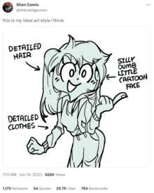
>>292707Kek I thought that was Shen's current art for a moment
No. 313555
File: 1691512027312.jpg (148.41 KB, 1280x720, 154526756855.jpg)
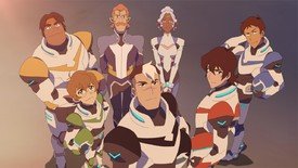
Styles that try to mimic anime but fail at it. If I didn't know better, I could be fooled into thinking that Teen Titans or The Boodocks are Japanese series. But shows like Voltron or She-ra are so obviously Western, there's something off-putting about these shows styles.
No. 313563
File: 1691514566613.jpg (54.4 KB, 500x375, MV5BMzA0NTY2OTkxM15BMl5BanBnXk…)
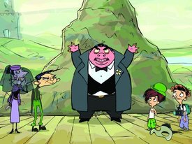
>>313336>>313355oh god, there's so many ugly kids' cartoons, I never got the appeal when I was a kid. I particularly hated this one, Jacob Two-two
No. 313654
File: 1691559601586.jpg (304.99 KB, 1614x1913, Untitled.jpg)
>fat blocky nose
>teeth that look like one big chunk of enamel
>pronounced bottom eyelashes
>tongue unnecessarily stuck out
signs i know the artist is a TIF who grew up reblogging yaoi on tumblr
No. 313662
File: 1691563954051.jpg (291.72 KB, 1860x2048, 20230809_015302.jpg)
>>313654The artist is just some argentinian girl with a sad dilf fetish who also draws hetshit. I think her stuff is pretty cool.
No. 313744
File: 1691603332480.jpg (44.72 KB, 563x434, dbda6720b3ded2eab8c85b29716b98…)

idk what this is but i hate it
No. 313813
File: 1691638637783.png (6.21 MB, 2937x1441, sy.PNG)

>>313759Yeah, this is nauseatingly repetitive and generic
No. 314116
File: 1691766198946.jpg (404.63 KB, 1600x2500, FuhCBpvWcAAcLbx.jpg)
Whatever this is called and is plaguing modern book covers.
No. 314126
File: 1691771770946.png (842.64 KB, 1079x1695, Screenshot_20230811-092317.png)
>>313685Different anom here, Breezy made me lose faith in Adventure Time so much that I stopped watching for almost a year and then later went back to catch up. It was an episode entirely directed, written, storyboarded, and approved by men.
For anyone who wasn't aware this is an episode about a BEE sexually assaulting Finn and his "flower" while Finn keeps making out with every princess including LSP and is extremely sexual/hormonal and depressed.
Reading the episode synopsis is sickening
https://adventuretime.fandom.com/wiki/Breezy No. 314180
File: 1691793669270.png (137.28 KB, 495x510, -kawaii-food-3-32643023-495-51…)

>>310342I wouldn't call it "ugly" but the art style must've took inspiration from kawaii objects, food, etc. which is alright
No. 315322
File: 1692206614485.jpg (269.01 KB, 1280x623, FuaJDh8X0AEOCd5.jpg)
>>314116how did book covers get so bad in the first place?
No. 315787
File: 1692371854304.png (846.71 KB, 1080x1050, 1692367003156.png)
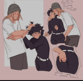
this type of style, i dont know how to describe it but i despise it. Specially the porn, it's so unappealing
No. 316688
>>316683I guess male is a slur yeah
And fetishist
And TiF
You’re a retard btw
No. 316747
>>316683>>no sageThere is no need to sage on /m/ - it's not against the rules, newfag.
>no imageLike 95% of posts in this thread?
>>316683>just a string of slurs like they’re 14 and posting on /b/Welcome to chans and fuck off for good. Maybe Twitter is a better place for you. Seriously, fuck off.
No. 316904
File: 1692776640028.png (7.23 KB, 578x30, 461677811.png)

>>314126Wonder when it'll come out that this guy is a sex pest
No. 317332
File: 1692903576969.jpg (1.53 MB, 3000x3700, ugly fucking zoomer style.jpg)
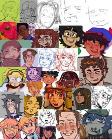
Holy shit, this hideous fucking artstyle. I hate it so much. All these terminally online aidens have adopted this exact style, it's like a disgusting mix of south park and higurashi. I hate the ugly square mouths / squiggly blush / line noses. It's like a venn diagram of each of these elements usually. I dub it the Twitter zoomer style.
No. 317376
File: 1692915591620.png (23.69 KB, 150x113, cm.png)

>>317368nta but south park characters expressions are inspired by emoticons and this style is trying to emulate y2k anime internet nostalgia so there is also a emoticon-ness to this style specially the way mouth are drawn. Lots of south park fans draws like that too
No. 317377
File: 1692915798881.jpg (125.58 KB, 1138x693, ZUaxL1pSpbVgz.jpg)
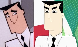
man what do modern cartoons have against pointy edges on characters
No. 317399
>>316904you're telling me that moid was sexually assaulted by a bee
What a world we live in
No. 317416
File: 1692934959982.png (159.2 KB, 500x326, Zhg9gaI.png)
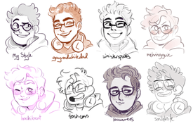
>>317332its so true, I also want to add the style that imitates that of daria and clone high or any other cartoon from 2000
It reminds me of this image and the "tumblr style" from a few years ago, really all these gendy artists are so lazy that they imitate each other
No. 317419
File: 1692935691344.png (644.89 KB, 1049x582, Screenshot 2023-08-24 205718.p…)
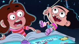
this fucking shit
No. 317478
File: 1692948752217.jpg (52.76 KB, 350x300, denver_the_last_dinosaur.jpg)

>>317424>denver the last dinosaurThanks reminding me of that show. I hardly remember it, but I liked dinosaurs as a kid.
No. 317534
>>317332That's a really big pool to lump together. Tbh these seem a lot more diverse than you take it. In fact, some here can actually work if more detail was put in.
Again I also don't see the South Park influence. This does scream 2000 "learning how to draw anime" but not SP.
No. 317608
>>317530yeah she's a chicano, but pretty much all hispanics just see chicanos as gringos anyways.
>>317558kek, i used to have a massive crush on him and the glasses guy when i was a kid. It might have also activated my fujo neurons.
No. 317944
File: 1693080053168.png (24.36 KB, 764x427, HAR12_BoneStructure.png)
>>317377>man what do modern cartoons have against pointy edges on charactersIt's because of the way we animate low budget show. You mostly use pupet style animation in ToonBoom nowadays to create shows. It's much easier to animate the joints when they are round with this technic! This style of animation is the reason why most modern shows look extremely stiff with super similar character design (like this
>>311667) as well as very limited camera movement!
No. 318014
File: 1693120565398.png (432.74 KB, 1087x266, 5855434347722702.png)

>>317534nonna, can you read? All of these could fit into a pretty strict venn diagram, everything at LEAST shares two major similarities. Retarded square/line nose, Epic face 2000s anime disjointed mouth and squiggle blush. I'm sorry you draw in this fugly style and feel like you have to defend it.
No. 318160
File: 1693193599593.jpg (136.92 KB, 540x650, tumblr_fa96931afcd121aa68aeaef…)

>>317332I call it, "TiFs who never learned to draw mouths and who tried (and failed) to stop drawing in anime style."
>>318024That's exactly what I was about to say. I'm more incensed by the lack of line weight variation than by weirdly rounded everything is.
No. 318165
File: 1693195886155.jpg (269.76 KB, 675x940, FwHEHRyXsAEfGSP~2.jpg)
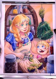
Idk what category this style falls into, but it's so off-putting. When an artist draws giant anime eyes, but a bulbous "realistic" nose, and the roundness of the limbs resembles western cartoons. It's like they internalized the notion that "real artists" don't draw anime, and to make it not-anime you must add in non-anime features, so the stylization is just this horrible mish-mash. This seems to be a millennial art style, don't see zoomers ever draw like this.
No. 318166
>>318165Not every instance of giant eyes is anime
nonnie. Disney has been doing for a long time.
No. 318172
File: 1693199393419.jpg (252.48 KB, 432x432, 57def80825c4cdeb030f3ccd_20160…)

>>318165Is this by Nattosoup/Becca Hillburn? I was just thinking about her yesterday
No. 318179
File: 1693209070705.png (835.29 KB, 1121x700, capture.png)

>>318176looked her up and she's still uploading and posting frequently, you almost have to admire her persistence.
No. 318267
>>318165this is just
>>317332 but with more skill
>>318166the eyes are clearly more influenced by anime than Disney.
No. 318556
File: 1693400847879.jpeg (544.04 KB, 1280x1810, tumblr_mujct37cFK1r88lcmo2_128…)

i despise this style
No. 319072
File: 1693645348932.jpg (26.93 KB, 460x469, FB_IMG_1693268705668.jpg)
My sister sent me this and it reminded me of some of the discussions in this thread
No. 319129
File: 1693669968484.jpg (184.32 KB, 1280x1280, 6df702a830bebc2f6587d0d7e230b0…)
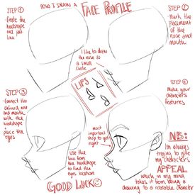
>>319072I hate the Disney female profile, why are the lips attached to the nose and jutting out so much, the jaw looks gigantic. The girls who work at Disney or copy Disney style all draw profiles exactly like this.
No. 319143
File: 1693677805309.jpeg (342.04 KB, 1200x900, 1A71F7C1-A4D0-4BC5-8693-02149C…)

Can’t stand how ugly the designs of these ducks are. I feel like character designers think that if a movie is a comedy the animals can’t be cute, they have to be these hideous CGI monstrosities with emoji faces. Animals can be cute AND funny. Older animators understood this. Tom and Jerry, Tweety Bird, a lot of Disney characters are cute and can still pull of slapstick comedy. When I was a kid there were so many comedy movies, like Madagascar, I refused to watch because they made the animals look so ugly. Norm of the north is another infamously ugly CGI animal. So repulsive to me. I think kids would like cute animals in their comedy movies.
No. 319397
File: 1693784162263.jpg (66.23 KB, 1280x600, MV5BMTFlMDE2MmQtYWIwNS00YjQzLT…)
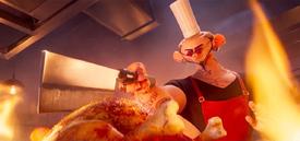
>>319143>When I was a kid there were so many comedy movies, like MadagascarAnd yet Madagascar was a huge hit. Just because you vomit at the sight of a goofy cartoon lion it doesn't mean all children hate it. It also doesn't mean it's psychological torture, grow up. Plus those older animations often got goofy instead of cute, you just think it was cute because that's your personal preference.
Though I agree that the ducks in your pic are shitty, but that's just because of the fucktarded eyes and eyebrows that every single 3D animated cartoon goes for these days, it's obnoxious as fuck.
You wanna talk about truly ugly designs? Check out this uncanny valley-ass fucker from the same movie. When are animation studios going to learn that this kind of design NEVER works in 3D, especially if they have realistic rendering? Now THIS is traumatizing.
No. 319400
File: 1693785403143.jpg (492.43 KB, 875x276, mallards.jpg)

>>319147Yep, as if it wasn't enough to give both the parents and the children the male and female colors, they have to add the tiny nose/mouth and mascara bullshit in there somehow. It's even stupider because technically, juveniles (like the 'teen son' I'm assuming) do not look like miniature male adults, which is something that the character designers could've learned from 5 minutes of googling, pic related.
I don't think children would've gotten confused about the sex of the smaller ducks upon watching the movie if the ducks were designed a bit more accurately, they probably would've learned something new instead. Finding Nemo taught us a lot of stuff about sea life, pretty sure Illumination could get away with not having retarded gendered designs for once.
No. 319479
File: 1693809357705.jpg (329.11 KB, 1641x1730, 6.jpg)

theres something lazy about these bratzdoll adjacent styles
No. 319535
File: 1693842201652.png (1.29 MB, 720x1252, Screenshot_20230904-114046-278…)
>>319492>>319511She'd be a lot more successful if she stopped drawing ugly humans and her ugly self-insert OC and stuck to flowers and nature instead, which she's not terrible at. Her adhd/autism doesn't allow her to let go though, no different from the dozens of autistic artists online drawing their hyperfixations for years with zero improvement.
No. 319624
File: 1693850599983.jpg (110.5 KB, 600x826, Baylee-Jae - Hobbyist, Filmogr…)

>>319535I did not recognize that as Becca's art for some reason, I completely thought it was Bailey Jae
No. 319638
File: 1693855249072.png (1.76 MB, 1398x1052, kinga.png)
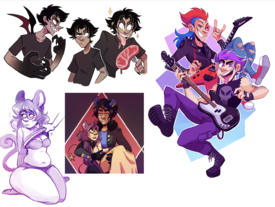
Not sure if anyone recognizes this artist but she used to be pretty popular on tumblr and youtube (she made that awful 'butter lover' animated short with her gayboi pokemon gijinka ocs) and her art style has always irked the fuck out of me.
No. 319839
File: 1693930687344.jpg (87.67 KB, 800x800, Bay08_800x.jpg)
>>319834tbf Baylee Jae realized and mostly dropped the human art in favor of cottagecore animals and non human motifs which has been working better for her.
I think they both have a problem many 80s babies have (and some early 90s like Baylee) which is not being able to let go of this "Japanimation" style, 80s/90s boomer anime mixed with their own art western artstyle like it was popular to do back then (Becca's noses remind me of the fat guy from Megas XLR).
Artists in Japan are encouraged, for better or for worse, to update their style every decade to the current trends. You will not find much work if you're still drawing like you live in the Heisei era (which is how you get the artist from Slayers using AI to generate generic moeblob 2020s anime shit). Most older western artists are in comparison stubborn and unwilling to adapt their style to reflect current trends like BJ did. Holly Brown also comes to mind with this eternal pseudo manga style.
No. 320030
File: 1694033343028.png (1.05 MB, 720x1172, Screenshot_20230906-164813-156…)
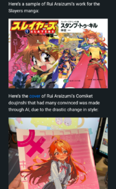
>>319896He didn't use AI, but what a downgrade. Proof that you don't need to conform to modern trends if you have an established fanbase that loves your style.
No. 320032
File: 1694034621256.jpg (44.07 KB, 612x612, 7180fb8b9c8a708db23f2b3b775fb6…)
>>320030Nta, but Jesus Christ. I hate when artfags sperg about "soul" but how on earth did this guy manage to drain all the personality of his style this badly? The SAO-fication of animanga really destroyed all creativity.
No. 320103
File: 1694088067058.jpg (1.76 MB, 2894x4093, ENQjxCBU0AAnBw6.jpg)

>>320072>>320058>>320032People are quick to accuse other of AI use, but tracing has been a thing since forever. Anybody with a bit of talent can pull it off, especially when you trace from a super-generic style that's everywhere.
No. 320223
>>319991Maybe unrelated but the people accusing him of using AI and then faking the video showing off all of his progress layers don't realize how retarded that sounds.
Not even actual AI users that try and pass it off as their own would ever put that much effort into faking a timelapse or layers. At the MOST they fake a sketch and then call it a day.
No. 327113
File: 1697311874330.png (717.09 KB, 1024x576, b13a8a0394dbd5a1f9a22ef35751ce…)
Why is this getting a series?why must everything look like a cheap Vivziepop copy?
No. 327382
File: 1697408040143.jpeg (171.33 KB, 640x640, b2290f6f_f095_458d_86fd_e396a4…)
South Park art style but more uglier
No. 327873
File: 1697574740358.png (3.42 MB, 2048x2048, 1697574485325.png)

>>319129>>319130Yeah, the Disney forehead/lips/eyelash profile proportions have also merged with Steven Universe lips/ baddie lip filler lips. Does this character feel somehow racist to anyone else? I'm too afraid to ask anyone I know or else I will be called racist but this looks almost minstrel (American minstrel shows in case someone doesn't know the phrase).
No. 327881
File: 1697576684897.jpg (1.27 MB, 1242x1334, IMG_7462-2.jpg)

>>327873>>327877>high effort full color WebtoonIt looks likes she been abusing botox because her facial expression does not change one bit. Along with the fact that her lips looks like it's permenantly stuck in a pursed way like a duck and I doubt that they'll ever draw her very expressively as her lips are stuck as it seems like she has lumps underneath her upper lips as her teeth will
always show thanks to lip fillers
No. 329392
File: 1698025620673.jpg (784.25 KB, 2048x3138, c656ac6a470f869aef348519506cfd…)
I don't read comics anymore but I need to mention this:Scott J Campbell or similar to his art style.I think it's quite funny how he only knows how to draw one female face and body while he draws diverse male bodies & faces.his art style has aged terribly same with Rob Liefeld.
No. 329398
File: 1698027818257.png (2.52 MB, 1115x1409, WallyLoveYou.png)
>>293458I'll never understand anyone who would be attracted to this ugly retarded looking Cheeto puff,I'm guessing it's an autism thing.
No. 329498
File: 1698071343215.jpg (77.62 KB, 800x1075, CaptainAmericaRobLiefeld.jpg)

>>329392Had to google rob's art to see what bad about it, and I don't blame you for hating it.
No. 329502
File: 1698073778857.png (259.56 KB, 330x806, Banner1lowrez.png)
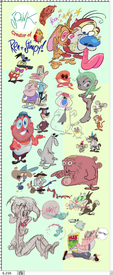
I hate Jon Kricfalusi's art style so much it was hard just searching it up to post it in this thread without getting disgusted, i don't get how it got as popular as it did his art is trash and so is he.
No. 329516
File: 1698078176973.jpeg (2.1 MB, 1290x2451, D8735803-8B77-4EDD-8B7F-15E797…)
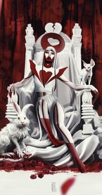
>>329514Laura Rubin (La___aura on IG) is one and she just does same-face women from the bust up. And 80% of the person is covered in solid black with a white background. She attempted a full body image (picrel) and it’s clear she’s never taken an art class or studied anatomy. I stg the woman just traces and uses brushes to carry her career around.
No. 329533
File: 1698080398292.jpeg (224.59 KB, 640x650, IMG_8995.jpeg)

>>291015Artists like 04119_snail make me feel unreasonablely furious
No. 329570
>>329398I tried to see night mind's video to see if i actually like this arg but I kept closing the video after 15 mins the cringe is unbearable.
The art is good I guess but it's the obvious gender driven style bothers me
No. 329578
File: 1698089908729.png (1.05 MB, 1296x773, 327598325.png)
>>329502He was only ever successful because a soulless corporation (Nickelodeon) had him on a leash babysitting him and his work. When he was given creative freedom with Comedy Central, he ruined his own fucking series and was clueless to what made it successful in the first place.
Picrel is a popular animator/artist I hate follow for his ugly art and who takes strong inspiration from John's style- Especially when drawing female characters as a pair of inflated tits and ass. Only coomers enjoy this stylization and I wouldn't be surprised if years later he is exposed for something degenerate like John either.
No. 329580
File: 1698090739482.jpg (241.43 KB, 1079x1144, Screenshot_20231023_154922_You…)
>>291233>>291237And this artist apparently bought into the meme of feeling bad for males because of the "muh compliment" pity party. So on top of being a coomer, he's one of
those.
No. 330143
File: 1698249749017.jpg (572.73 KB, 1920x2443, ttoja-.jpg)
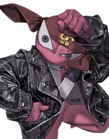
I despise this shit over rendered style
No. 330697
File: 1698458132699.jpeg (Spoiler Image,431.82 KB, 1434x2048, F9dGsCmboAA9GGS.jpeg)

I'm actually sick of this guy, khyleri. His style looks so, I don't know, greasy would be the word? The characters look made of wax and the faces don't feel natural. Even before knowing what messed up joke there's hidden on each picture, his cutesy anime girl drawings look disgusting, it never gives off any innocent vibe because of that Sakimichan-like wooden gloss texture. Pic related actually made me quite mad, it almost gives passive agressive vibes against the cute nun drawings. His art style just repulses me like none other and his themes make it worse, I guess that's all I'm trying to say.
No. 330775
File: 1698497760551.jpg (Spoiler Image,586.82 KB, 1200x840, 1698479325259.jpg)

Took this from the dumbass thread on /ot/. This art style is somehow more lazy and lower quality than average animu shit. It's so ugly too.
No. 330823
>>330697Holy shit this, I hate his oily ass style. Makes literally everything look coomy and sleazy, absolutely disgusting vibe.
>>330775I dunno nona, imo it's cute if a bit too simple. A lot of artists draw baras looking fucking retarded for some reason, but they don't look too bad here. Could use some shading, though.
No. 330996
File: 1698541804555.png (5.46 MB, 2899x2000, westernscroteshit.png)
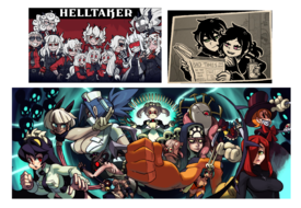
This western scroteshit style that's definitely inspired by ecchi harem anime. It just comes off as annoying and replusive from the bedroom eyes and defined tits of the female characters. This is the kind of art style that the artist might have sexualized family friendly cartoon girls like Jenny and Frankie.
No. 331020
File: 1698548919755.png (1.06 MB, 1600x321, The_consequences_of_porn_addic…)

I like to remind you all that moids jack off to this shit unironically. And since I had to suffer seeing this, then you should all too.
No. 331106
>>330697The jokes are really reaching now too, I’m saying this as an edgelord. They sometimes don’t even have anything to do with the character or world they live in. It’s just le edgy joke but POPULAR ANIME CHARACTER!?
And he abuses warm blending modes too. Everything looks like it’s at sunset because overlay/add glow/hard light makes colors cohesive easily. It’s a cheap trick.
No. 331559
>>331553How Sword Art Online's aesthetic has overstayed its welcomed in the anime industry,
>>291932 explains it better.
No. 333212
File: 1699235970157.jpeg (Spoiler Image,1.32 MB, 3024x4032, C4C4B670-3CAC-42C2-B650-F3FABC…)

This figure exemplifies everything I loath in moid anime coomer art
No. 333225
File: 1699237043656.jpg (231.3 KB, 1920x1038, rise-of-the-teenage-mutant-nin…)
Never was a fan of the animation style,they look more like retarded frogs than turtles, especially Raphael & Donatello.the countless of over exaggerated expressions they made were irksome I know the 3D show had them too but it was charming there but in Rise it's trying way too hard to be funny.
No. 333354
File: 1699266572616.jpg (110.82 KB, 850x478, __lee_gyee_drawn_by_itto_menta…)
>>330775Looks like a meme that Mentaiko Itto drew? His usual art isn't that simplified but even then you can still see how good his anatomy is. I don't even like bara but I legit think his erotic comics are some of the best out there kek
No. 334013
File: 1699432114843.jpg (551.14 KB, 2048x1370, 1699431516318.jpg)
All bara artists melt together. It has to be some form of giga gay autism because i cannot imagine not getting tired of seeing the same fucking tanned, muscle guy with a buzzcut over, and over, and over again.
No. 334603
File: 1699636758953.jpg (232.43 KB, 1280x1567, tumblr_c9df09ced86bfc074535c70…)
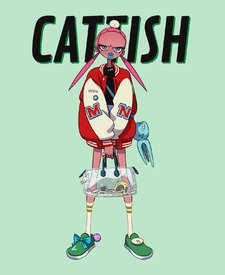
I fucking hate the prolapsed anus lips some artists draw on some characters. I blame steven universe for this
No. 335955
File: 1700111997223.jpg (1.2 MB, 2080x2210, genshin.jpg)

never understood the appeal of this kind of art style.
Super saturated colors, shit ton of effects and use of pre-made assets to overcompensate the messy lines + weak attempt to stylize.
No. 336702
File: 1700337755022.jpg (79.23 KB, 375x644, harley_quinn_by_gashi_gashi_df…)

I'll get a lot of hate for this but I hate this try hard stylized "Quirky" anime style lots of greasy coomers have on Newgrounds and on Twitter nowadays,It all started with Gashi Gashi I guess.another example is Scott Malin
No. 336704
File: 1700337969350.jpg (124.42 KB, 1122x1120, ERBJoymUEAAlfWe.jpg)

>>334603The way Steven Universe animators drew lips is unironically a reason why I dropped out of watching the show kek
No. 336789
File: 1700364665049.png (Spoiler Image,5.77 MB, 2910x1714, degenerates.png)

>>336702I'll admit that some of Gashi-gashi's art is pretty neat except for all the coomshit and sexualized girls. Pretty much like
>>330996 with the western-looking art style inspired by anime and hentai/ecchi shit. Also adding Speedoru, Gerph and Diives.
No. 336806
File: 1700369905963.jpg (406.69 KB, 1122x1120, edit.jpg)
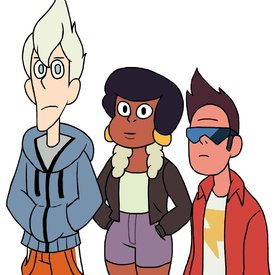
>>336704My edit. I had to fix her nose because it made her look like the Paul Frank monkey.
No. 336809
File: 1700372185408.jpg (154.78 KB, 1080x1086, Ee1vsGgXYAQuuME.jpg)
This art style is really hideous to me. Anti-sjw comics with the same ugliness as SJW art
No. 336842
File: 1700387120233.png (1.34 MB, 2160x1620, f7dd751ac36d221075320d52412523…)
>>336702gashi gashi is good because he actual draws non coom shit once in a while, and he's actually skilled. His clones are absolute cancer, they dont have a single redeeming quality to them.
No. 336899
>>336810The anon from
>>336815 is right but it also feel like fetish art because that artist is genuinely really gross about women. He often does the standart conservative/coomer moid shtick of drawing sexy women in sexualized poses and with fucked up anatomy to le epic own the
triggered SJWs, but on top of that he'll flat out draw himself sexually harraring liberal women as a joke
No. 337039
File: 1700449844702.jpg (418.61 KB, 2167x1806, fullsizephoto164381.jpg)
>>319143You made me remember "Leafie, A Hen into the Wild" and how everybody were laughing about the "bishie ducks"
and they ended crying over the ending.
No. 337173
File: 1700506320347.jpg (37.25 KB, 678x367, Leafie,_a_Hen_Into_the_Wild-01…)
>>337039Kek I love this nona. It's interesting that they made the main character just look like a strange chicken compared to the supposed to be handsome male ducks, I think western designers would've done the opposite
No. 337260
File: 1700540489261.jpg (307.04 KB, 1302x807, F_FoGuiWUAAw7Ne.jpg)

>>337163>>337163you'd be surprised how much twitter loves this style
No. 337281
File: 1700545754210.jpeg (1004.9 KB, 1538x2048, F_ZPJuUWEAAHk40.jpeg)

The linework and shading is pretty cool but jfc the actual style itself is grotesque.
No. 337349
File: 1700575924325.jpg (27.76 KB, 1280x720, maxresdefault.jpg)
>>337281pointless overstylization ruins so many good pieces. this would be great otherwise
No. 337424
File: 1700609914269.jpg (696.91 KB, 1080x1352, Imveryretroguyz.jpg)

I hate people that try so hard to imitate the "80's anime artstyle" but instead their stuff ends up looking like a shitty copy instead. Also most of them are coomers for some reason.
For example, this guy (picrel) is kind of popular in the hispanic community. He seriously draws like this and then makes videos teaching anatomy and correcting other people's drawings.
No. 337471
File: 1700628056393.png (35.9 KB, 800x800, 51537a1636517898b68615f1653348…)

I found this webcomic and if the pages aren't annoying enough to show one frame, the ms paint-Homestuck style doesn't help neither.
No. 337472
File: 1700628187587.png (317.09 KB, 445x629, eafie a hen.png)
>>337340she even doesn't have a "curvy" design and by the end of the movie she end looking quite sick and tired. She had a good character design.
No. 337525
>>337471I keep up with that comic. The most recent chapter depicts the two edgelord tim characters in their teenaged years before trooning. Danny (Vikki, the true crime youtuber) is shown looking at gore and one of them is a picture of a dead woman in fishnets and the next fucking panel is him wearing fishnets and posing in the same exact way. Danny works at a morgue and shows his troon friend a dead body to which he says “it’s just like liveleak” and then they smoke weed in a cemetery and all the comments are praising the creator for writing transgirlhood so well.
All the characters are depicted so realistically in just how they use being trans as escapism or for the fetish, if it wasn’t obvious from the art style I would assume the author isn’t pro-trans but it’s a tif so she is. The other farms comes up in it once but I don’t remember if lc ever did and i’m almost offended, Milo would have many threads here.
No. 337533
File: 1700655207272.jpg (61.02 KB, 640x480, eef12838cb3fe541db8b2c5b785346…)
>>337525>all the comments are praising the creator for writing transgirlhood so wellWhat a self own
No. 337542
File: 1700663082418.png (23.89 KB, 800x800, 51537a1687390680b68615f3113630…)

>>337471her inability to draw hands is what irritates me the most (before anyone tries to blame this on muh style, they're not fucked in consistent ways from panel to panel). Just look at your own hands and copy what you see, jesus christ
No. 337550
File: 1700666296935.png (43.58 KB, 880x1200, F93vbS4XQAA6Rbj.png)

>>337542Even in fanarts she looks like she's avoiding human anatomy for… reasons?
No. 337553
File: 1700666356306.jpeg (212.76 KB, 1668x1443, F99PNABaEAAeYyG.jpeg)

>>337550Sameanon: That's a commission. Picrel is a fanart.
No. 337577
File: 1700679738721.jpg (603.44 KB, 1152x2048, 155573156_3602490809879877_778…)
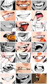
>>337566I'm guessing anons just say that when the drawing is bad, though the furry/vore version is usually covered in copious amounts of saliva. But draw what you want, no one is going to accuse artists like Yuto Sano of degen pandering
No. 337609
>>337577i think those have more to do with how japanese people find it cute, and it translates to their art
i personally love these fangs, slightly crooked teeth, for me it's the same as adding moles to a face, the subtle imperfections make it unique and charming
No. 337776
File: 1700769243243.jpg (168.82 KB, 1172x2048, F_PCPpea4AAsz7L.jpg)
Anytime webtoons try attempt to have a "sexy" art-style, how do people even tolerate this shit?
No. 338030
File: 1700876799601.jpg (70.37 KB, 686x386, hq720.jpg)
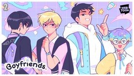
>>337776That's like the Korean Webtoon art style.
And since we are talking about Webtoons:
No. 338623
File: 1701191920462.jpeg (887.45 KB, 2860x2896, B60E3B91-215D-4556-BEFA-77C50E…)
ziggyzagz art has everything i hate (except for pedo/moid coom shit, that takes my #1 spot). The overexpressive tryhard faces piss me off for some reason. I love expressive and emotional styles but not this kind of shit. it reminds me of similar person-of-gender art styles with obsessions over smug toothy smiles and dreamworks eyebrows, just marginally better drawn. Plus the emphasis on sharp teeth and fangs. Maybe it’s because I’m lesbian and she mostly draws men in a thinly veiled horny way. Hate it!
No. 338626
>>338623>>338625I see where you're coming from, personally it took me a lot to be into western cartoon art in general but honestly even if it's not my kind of thing i think that it would look more tolerable in animation? As long as it has some moments where the characters have more relaxed/blank expressions.
I didn't check her out.
No. 338627
>>338623Nah you're onto something. I'm bi and I find this the wrong/bad kind of horny, and the man is ugly. He looks like a serial killer who enjoys torturing his
victims before killing them because he's a sociopath.
No. 338628
File: 1701193482405.jpg (59.79 KB, 600x337, Omori_11-30-20.jpg)

Idk if this is controversial and I can't put my finger on why I don't like it but I find this art style so unappealing that it's keeping me from playing this game/watching a playthrough of it. I'm seeing it everywhere too now so that just makes my hatred for it grow even more
No. 338634
>>338632Reading comprehension. Anon is saying that she hates pedo/moid coom shit
more than the art style she posted.
No. 338643
>>338632Sorry.
>>338634 Has it correct. I hate pedo/moid coom shit more than the style I posted. I mean Ziggyzagz stuff is ugly but harmless
>>338626Yeah, maybe I’d hate this less if it was in motion. But I still hate the overall “sexy western bara” type designs too
>>338627Thank you for your endorsement kek. He really does look like he’s overly evil. I think she draws him as some sort of ‘bad boy but is actually a friendly himbo’ character which makes me dislike him even more
>>338628I’ve always disliked this too. I liked the game but always rolled my eyes when shots like this came up. On the other spectrum, this is too unexpressive and flat. I also just fucking hate that closed-eye smiling expression they always draw in anime. I think I’m just getting older and jaded because I’d prefer some degree of realism in stylized art: as in, not Real Real, but at least an effort to imitate or stylized real expressions people make.
No. 342655
File: 1702702801523.jpg (27.55 KB, 500x281, MV5BMWQ5MzliZDctNDdhMi00ZTUyLT…)
I hate this wannabe 'quirky' stylized,annoying art style with extremely annoying characters.the animation doesn't impress me and can be hard to look at sometimes.I couldn't watch a single episode without one of girls acting painfully hyperactive and childish.what bothered me the most is that they barely act like highschoolers and more like first graders.If this reboot wasn't created by Lauren, people would be shitting on it like they did with the original G1.
No. 342658
File: 1702704418353.jpg (97.94 KB, 1440x1080, Wormy_Butterfly_Close.jpg)
>>342655They will never be Wormy.
No. 342684
File: 1702724880492.jpeg (291.69 KB, 1211x1500, IMG_6272.jpeg)
I suppose it can’t really count because I love love LOVE her super creative designs and rendering…but hate hate hate how they all have to have an anime boy head. So juvenile. Still one of my favorite artists though.
No. 342686
File: 1702725432570.jpeg (352.49 KB, 1448x2048, IMG_6271.jpeg)

>>342684I do really hate this OC though he is so boring and ugly and anime headed
No. 342857
File: 1702762130490.jpg (15.77 KB, 300x247, 89efb648ef96cab6aa2949b8db61a8…)
>>342831It honestly puts a smile on my face so hear someone else share the same sentiment I thought I was the only one.
No. 346234
File: 1704230103448.png (1.26 MB, 1600x1600, UZYVhL.png)
I wouldn't necessarily put it as 'hate' but I dislike the art style of this new rhythm game, Scratchin' Melodii. I understand it's trying to emulate the art of Rhythm Heaven, but it just doesn't feel… right to me? Like it feels like a cheap knock-off of Rhythm Heaven in a way that feels artificial. I understand this sounds autistic but yeah.
No. 346247
>>346234my first thought was that it looks like PopnMusic but now i definitely see the Rhythm Heaven and Parappa influence.
I don't dislike it but the more I look at it the less I like it. I think you're right that it feels artificial. All the above mentioned games have a great art styles
I think rhythm heaven is the least stylish one out of those three but it can be charming at times Parappa and PopnMusic had cute pop art which looked modern at the time. Parappa also had some whimsical designs. I have never heard of this game but it looks like they hired a random artist and told them to emulate Rhythm Heavens art style instead of hiring an artist that already was specialized in drawing pop art.
Also it looks like the child(?) DJ and the two people in the background where drawn by two different artists
No. 346313
File: 1704273721423.jpg (160.41 KB, 1280x720, maxresdefault.jpg)
>>346247>>346255ayrt, I agree that it's not bad art per se, it just feels a bit soulless to me, yet somehow too tryhard. Like this frame is clearly trying to be 'haha look she's making an over-exaggerated uwu anime meme face' kind of thing. Yet somehow it lacks personality to me.
It feels like all the aforementioned rhythm games have their own unique identity, and this is just trying to pick up bits and pieces of those without finding its own identity.
(sorry I don't know art well but I really like rhythm games)
No. 346329
>>346313her hand is broken
>this frame is clearly trying to be 'haha look she's making an over-exaggerated uwu anime meme face' kind of thingafree. that face looks like a forced meme
No. 346924
File: 1704574378213.jpg (161.81 KB, 600x900, phuyuzqww9ru8ea3hvje9w2rr3m.jp…)

I've never been irrationally irritated by an anime art style until I saw BNHA I absolutely hate the over the top, exaggerated retarded faces they make especially Bakugos and Himikos.its not funny it's just dumb as hell.
No. 346927
>>346924Its like a moeshit style but applied to shonen. Ultimate soyfacing.
I also hate Demon Slayer.
No. 347018
File: 1704605106223.png (9.24 MB, 3600x3713, ca53f7cb77c194736ebdbd282deeef…)

>>292707okay i meant to reply to this post months ago when i first found about lacey but now i finally decided to do it lol
its like whoever made it didnt even try to make it credible. actual flash games for girls were bright and glossy, and lacey just looks so post pandemic tiktok brainrot zoomer that it just fails. the color choices are so bad too, why would childrens games about cooking and dressing up look so dull? i cant take it seriously when the art looks so amateur and its trying to pass itself as a game that totes existed in 2007. i hate blue hair girl's head position.
also if it really was a creepy game from back then the jumpscares would be heavily edited images from japanese horror movies and screamers, not this abstract traumacore bullshit that is also so 2020s.
No. 347064
File: 1704628630887.png (141.88 KB, 824x824, bendy-and-the-ink-machine.png)
>>347018The ggg.com mascots where so cute i hope whoever designed them was paid alot for it… anyway incoming sperg, but flash games and commercial art targeted girls like those topmodel drawing books, looked very glossy and bright. They also used big shoujo eyes. The only dress up games I remember that used those simple "sketchy" eyes where the ones made by teenagers experimenting with flash on DA. The fashion in the arg looks off too. Fashion in the 10's, where dressup game sites had become common, focused on layers and accessories. I feel like even dress up games from the late 00s
like the old roiworld games? I think they where from that time did that too? The point of dressup games and commercial art in that era, was to emulate the look of tween stars and models so you wouldn't use "homely" fashion like the arg game does. If we compare the art to the ggg mascots, the most "homely" dresssd is the quirky one in the middle and even she has accessories like sparkling earings, a beady belt and she has a very cute drawn face. Every girly franchise in that time also had a girl who dressed like Sharpay Evans because 10 year old girls back in the 10s thought that was the height of fashion. The arg game is lacking that.
I'm not familiar with dressup games in the 90s and early 00s but weren't they usually stuff like Kisekae Set system? Did they even have dedicated websites to dressup games back then?
I dislike most "let's emulate an art style from another time" art style because rarely the artist knows what they are doing. I think that's why something like Cuphead got popular because the creators grew up with old Fleischer cartoons and they referenced a lot of rubberhose characters when designing Cuphead. I know Bendy and Cuphead comparisons are cliché but some Bendy characters seem so modern. I can't put my finger on it but something about picrel bothers me
I think it's her hairstyle Also picrel character's lore is apparently that she was targeted towards girls? But she is referenced from Betty Boop? at least Bendy doesn't try to be an authentic 30s it just takes inspiration. I still think the bendy style is ugly tho
No. 347222
File: 1704696952759.jpg (Spoiler Image,467.44 KB, 2000x1535, GDJ_QsBasAAvFFb.jpg)

This coomer over rendered style is so bad. I didn't post on the bad fetish thread because I know someone out there will say this isn't as bad as the rest of the thread, maybe some even find this hot, but this has everything I hate in porn art. The exaggerated features, fucked up anatomy, weird glowy wet skin. It surprises me every hand on this has 5 fingers, because this has AI tier rendering and anatomy non-sense. I specially hate when they draw male pecs as boobs and when the nipples look 10x the normal size. I don't care if it's a man or a woman drawn in this style, they all look like repulsive alien slugs.
No. 347291
>>347288>>347271This is obviously a moid. You can tell because of his obsession with huge dicks and balls. His profiles say he's male.
Imo I haven't seen that many women who do pec-tits, but when they do it's only with characters who already had big pecs and it's drawn in a much less obscene way. If it's super obscene and gross, 9 out of 10 times it's a moid.
No. 350050
File: 1705770136299.png (1.14 MB, 1280x2454, pg11.png)
ran into this webcomic site "gorly.scumsuck.com" while setting up my neocities and the eye sear was too painful not to share. this shit is some of the ugliest slop ive ever seen, to the point where i was initially wondering if the author had to be actually male because the art just stinks of the average AGP MTF artist. judging by some of the content it is a woman tho, just a mentally stunted one? she is both unfunny and simultaneously tries way too hard, the content and her style are repugnant tbh. some of the comics are benign but most of them are just full dick-brainrot masking as self awareness. her whole brand is that shes a ~lesbian fujoshi~ playing out the typical shtick of bisexual women being so dick-obsessed they refuse to make the distinction between being a lesbian and being a bisexual woman in a lesbian relationship, and by proxy making every lesbian look like she just needs the right dicking or secretly faps to cock.
i fear the eldritch john K abortions of ugliness that is her "serious" art if she truly does draw teh yaoiz all day like she says.
No. 350051
File: 1705770226322.png (343.28 KB, 1280x1978, pg31.png)

this one is one of her "better" comics at least in terms of coherence and content, im not going to pearl clutch over some women saying they like sexy drawings of women even if theyre drawn by men or anything, but fuck the art is so ugly it takes me a minute to even figure out what the fuck im looking at
No. 350052
File: 1705770292115.png (Spoiler Image,472.76 KB, 1280x758, pg10.png)

>>350050>>350051last post, i could comment on how she draws her gf(??) but i dont want another dosage of arsenic straight to my retinas by looking at this shit. this is one of the ugliest fucking art styles ive ever seen. spoilered for fujos fucking
No. 350060
File: 1705771863588.png (352.31 KB, 1280x960, everyone-hates-harriet-bgsm.pn…)
>>350052>>350059i do not think that's her gf, i think it's an oc or something… and here is how she draws women
No. 350063
File: 1705772248823.jpeg (539.32 KB, 1000x1294, spy-affectio.jpeg)
>>350052"gf" looks like how she draws Spy
No. 350376
>>350063I feel like I've seen this person's NSFW art in the bad art thread or a FTM thread. The thumbnail in
>>350051 looks very similar to the artwork I saw except it was with Spy from TF2.
No. 350569
File: 1705903835804.jpg (651.83 KB, 1200x1600, tumblr_4190af43f8779bf1f1f3636…)
>>338628I actually like the art style for how cute and simple it looks especially with the colors and traditional hand-drawn lines/strokes. I might use this term wrong but it's pretty aesthetic. More of an opinion, I like how it goes well with the real life images that's somtimes shown in the game or in artworks which looks nice, not overcomplicated to the eyes and make some moments jarring. The art style is one of the reasons why I'm interested in this game along with it being a pixel rpg inspired by Yume Nikki and the Mother games.
No. 354397
File: 1707346752834.jpg (288.33 KB, 1000x563, gravity-falls.jpg)
I liked the art style as a kid but now I realized how fucking ugly and bland it is.so many art styles to choose from and they went with this?it's budget was literally over a million dollars.no wonder so many people watch anime instead.
No. 354398
File: 1707346918517.jpg (330.26 KB, 500x2125, e27.jpg)

>>354397The concept art is 10x better I don't care if the art style is too Tumblr we could have had this instead of some lazy,ugly bean mouth Simpsons clones.
No. 354799
File: 1707536511179.jpeg (125.02 KB, 640x640, ab67616d0000b27396b7062b58ca1a…)
Overrated and extremely hideous plus seeing the gross Worthkids art style makes me irrationally irritated yeah I know that's retarded but I really hate the art style doesn't help that the creator is a smelly manchild with a punchable face.he can't animate good.
No. 360006
File: 1709522781137.jpg (245.66 KB, 1080x1792, f180888c19a842589cfc6178d247e1…)
This webtoon style of art that's clearly inspired by kpop boys. I'm not an artist so I don't have the vocabulary to describe it but it's like… uncanny?
I feel like if you look at any one thing (the colors, the anatomy, the clothes) it seems good enough. But all together, it creates this feeling that it's trying too hard to be beautiful.
Sorry if that doesn't make sense. Maybe someone who's an artist can explain it better than me.
No. 360013
File: 1709526061257.jpg (59.04 KB, 736x662, 7c41a78e5b1eab6fb04f1d2bcbf8a3…)
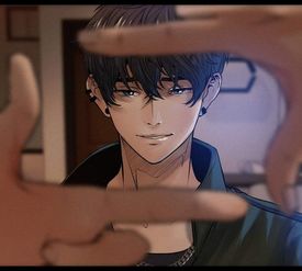
>>360008I think I'm just also over the aesthetic of kpop boys with shaved off jaws, over the top street fashion, and lips with gradient shading. It's too common in webtoons, even among western artists.
No. 360016
File: 1709526250846.jpg (55.91 KB, 400x600, 59590759.jpg)

>>360013Samefag but damn, this artist only knows how to draw 1 male character and 1 female character. Believe it or not, but this is a different male character from a different series.
No. 360038
File: 1709534182345.png (390.4 KB, 800x530, lHpb5D2.png)
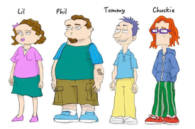
>>318557>>318585late reply, but one of the creators of the show got so mad at seeing perfect 20 something fan-art of adult Rugrats/AGU characters that he drew this "canon" version of what they'd be like.
>The Rugrats did not all grow up to be fashion models or self-confident hipsters,” Molinsky declares. “Especially not Chuckie.” No. 360722
File: 1709843978199.jpeg (56.16 KB, 465x659, newgroundscore.jpeg)

I don't really know if there's a name for this… but there's this specific art style that just reeks of male hands the first time you see it.
It's kind of combination of anime and toony proportions—giant heads, women have the same face, big boobs and ass.. males are absolutely nondescript. Gerph, Aaron Diaz, speedo and the Helltaker creator is what comes to my mind. Their sense of humor is really scrotey too it annoys the fuck out of me.
No. 360749
File: 1709859191522.jpg (139.2 KB, 1000x688, d74d2dc0bb964703a0c1aa380b5ef9…)

>>360722Interestingly someone complained about this further up thread
>>330996It's just the edgy western coomer style kek. Both the art and humor seem heavily inspired from Newgrounds and old "western anime" porn artists like shadman and picrel
No. 360752
File: 1709862589061.jpeg (669.96 KB, 2048x2048, C0542A1D-B88D-4269-AE10-CE1FD1…)

the fact this guy tries to present this as just stylized art and doesn't even acknowledge his disgusting plastic surgery fetish, the way he draws female bodies is even worse. i feel like a lot of modis with ~cartoony~ art styles are exactly the same.
No. 360758
File: 1709867881425.jpg (Spoiler Image,647.22 KB, 1200x849, 98322176_p0_master1200.jpg)

>>347222>>347291Moid or not, the exaggerated perspective makes me wonder what did he tried to draw here. I know Louis is showing his ass, but…
No. 361175
>>327873I'm African American. Honestly, I have a few issues with this
1. is the lip placement… I can't stand the fucking slack-jawwed, lips-almost-falling-off-the-face expression that a lot of "artist" draw black characters with. It's doesn't look good, and screams that they are too mediocre to learn how to draw bigger lips proportionately on a face.
And 2., idk if there is something about this characters bg that explains this, but her hairline looks terrible. It should start from the top of the forehead, angle on the temple and create sideburns infornt of the ear. She looks like she had her edges yanked out! Who thought this looked good?
No. 362352
>>360758Holy fucking eldritch horror. His body doesn't make sense. why can we see the iliac crest/hip bone? His asshole looks like the Eye of Sauron. The completely blank face really sells it too
>>360006I refuse to read webtoons because of this, even if the stories are good. I can't stand the blank, expressionless faces with at most, a smug shit eating smile.
No. 363331
>>303066Honestly what you posted is still diverse by manhwa standards, most of them look like the one in bottom middle, black hair and red eyes with those stupid parted bangs and comically jacked body.
>>313417I think the art looks good but I despise how trend chasing moids are. Drawing copypasted gacha girls they don't even know instead of like, any actual characters they're attached to? So fucking pathetic.
No. 363337
File: 1710698602285.png (7.04 MB, 1554x2298, gotouge.png)
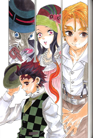
>>346927>>346953I think the original manga is far superior in style to the anime adaptation.
The trailer they made for the manga is so much more stylish too.
https://youtu.be/UP1VEX8K1yA No. 373863
File: 1714085784409.jpg (364.25 KB, 572x713, 1410855086.jpg)

All his shit is extremely cluttered and hard to look at,that Maya series was ugly as hell and looked difficult to animate.just because it has more details doesn't mean it's better.
No. 390929
File: 1717969235993.png (744.3 KB, 1024x576, rfQj5sN.png)

No. 393227
File: 1718657933478.jpg (103.56 KB, 564x825, why does he look like that.jpg)

Don't think this is an unpopular opinion. I like jjk but some panels look like chikkenscratch
>>346924I find some panels and standalone artwork of horikoshi's fine, but I hate the artstyle for the anime. It sucks that mhashit was basically everywhere for a period of time.
No. 393276
>>291561I hate this so much. It gives me fight-or-flight.
>B-b-but it's based off of the Ghibli styleToo bad it looks like shit.
No. 395592
File: 1719423782281.jpg (Spoiler Image,1.36 MB, 2400x3000, itneverends.jpg)

Disney but make it pinup porn. I hate the Buzzfeed-ified crossovers of genres that blur porn and children's media. People on FB commenting they are pinup girls! Not porn! This is OK, and even artistic, and not derivative 2010s Deviantart slock.
No. 396748
>>362337I know I'm replying to this late but I recently found this artist who does that traditional style mentioned but better than the one you linked, but of course they had to make it for some coomer furry shit. I was surprised to find out they were one of the animators for Gemanimate since the scene they animated for that was actually pretty cute:
https://youtu.be/QUkREF24Sak?si=m9d5m2MAmcWN0G8Q.
No. 397336
File: 1720002338723.jpeg (102.9 KB, 730x393, IMG_3363.jpeg)

I hate this yassified weed dependent white girl style.(racebaiting)
No. 401757
File: 1721029894095.jpg (468.65 KB, 1638x2048, GSXix2KWcAAQZL-.jpg)

No. 401770
File: 1721035524953.webp (59.7 KB, 1280x720, bocchi.webp)

Good anime, soulless and creepy chara designs
No. 402437
File: 1721182266591.png (153.91 KB, 313x342, r5rf8hs57648gfd5.png)

>>401770Why are their noses making a 90-degree angle? They look like pugs. I guess this means they would snore a lot.
No. 402486
File: 1721197139996.jpg (45.8 KB, 827x465, Nige-Jouzu-no-Wakagimi-02-77.j…)

>>401760That's unfortunate, I quite liked Elusive Samurai's art style and direction, but maybe it's a bit too much.
No. 402916
File: 1721295229557.jpg (542.95 KB, 3117x3200, 2641309.jpg)

Cringe pony stuff incoming, but this art style is one of the worst. I really can't put my finger on it overall, but the sharp teeth are gross looking in these characters. I've seen a lot of artists in the community have this art style, idk if they're coping it from the artist from pic related, but it screams Hazbin Hotel mlp with TIF.
No. 403214
File: 1721356890712.jpg (102.55 KB, 1920x1080, l8oyJ41lyINyhZ0cWzLIGTMyKO4.jp…)

>>397336Nice Ricardio fanart
No. 403393
File: 1721396237774.png (314.13 KB, 540x478, Screenshot 2024-07-19 063512.p…)

i will simply never understand the appeal of doing this to the south park cast
No. 404279
>>403393The difference between how Japanese fujos draw them and how tif fujos draw them is so night and day too
Spoiler for generic shota
No. 404280
File: 1721682067605.jpg (Spoiler Image,171.29 KB, 480x640, 639c48536b6dbf9697cb26d96d0848…)

>>404279Dropped my pic lol
No. 409905
File: 1723612637416.png (1.3 MB, 875x962, instagram artists.PNG)

Unsure whether to put this here or awful character design. But I hate that Instagram artists that only know one female body type and face type try to redesign characters. They're so fucking boring. I dunno whether I hate purposefully hideous TiF art or watered down generic pretty IG art more
No. 409955
File: 1723634300548.png (1.3 MB, 841x1048, instagram stitch.PNG)

>>409933You're right but there is no effort put into this design. Didn't even bother keeping the constrained pupils, because every female character needs to have big doe eyes. Her hair isn't even messy, could have made it a frizzy mess while still maintaining cuteness. And her expression looks like she just smelled a fart instead of being on the verge of an anxiety attack.
This could have been cute, expressive, and true to the design, while still maintaining beauty, but it's just bland and sovlless.
Here's another pic by this artist to drive it home.
No. 410129
File: 1723673928790.jpg (63.78 KB, 739x415, images(144).jpg)

Nowadays even the pink blood (which I thought was a cool concept a few years back) now makes me angry.
No. 414208
File: 1724860517492.jpg (1.01 MB, 1948x2264, heartstrings.jpg)

I read it for the lesbians but looking at it actually pains me a bit kek, I’m just really bored of these type of soft generic western animesque styles. And when these kinds of artists do a character design or facial expression outside their softgirl/softboy comfort zone, it looks really jarring and amateurish
No. 416557
File: 1726746492261.png (4.96 KB, 505x590, rro.png)

>>414208I'm glad to see a western lesbian comic with no tranny shit (fingers crossed) but yeah the art style can be awkward.
Ro's head in sideview is what bothers me the most, why does she look like that?
No. 417791
File: 1727102204576.png (228.18 KB, 1192x741, 1710536428208.png)

No. 417804
File: 1727109083728.jpg (158 KB, 768x1024, F1MNLu4XoAIrBCG.jpg)

>>417791>who was the patient zero of this styleit could have stemmed from happyholidays98 (more known as cyber3ngel)
No. 417806
File: 1727109166693.jpg (261.84 KB, 1534x2048, FngfAp7WIBs4jES.jpg)

>>417804wait here's a better example with the swirly blush
No. 417867
>>417809 >>417791
I swear everyone who has that art style end up being the biggest drama queens and are either always canceling eachother over the twitter fujo ship of the week or pitch a fit whenever their orbiters make an oc that looks slightly similar to theirs.
No. 419307
>>417793The artist has never drawn anything before Danganronpa (at least as a career, no prior experience and didn't seriously pursue it), he was a sculptor by trade, and he was a fan of only very realistic styles. He and Kodaka bonded over their love for The Silver Case and Flower, Sun, and Rain. That's why the art style looks kind of odd and there are some parts that don't really mesh or make sense, like the spin-offs having very realistic old men for no reason. It's funny that it's considered generic nowadays since it's still very distinct like it or not.
The first game in particular was a very low budget game made by a small team. it was initially supposed to be a 3D game, but their propositions got canned, while models got made. If you look at the sprites carefully, they're actually 3D… Only faces are hand-drawn. You can notice by how everything else has blurrier lines. The other games have hand-drawn sprites, but most likely they used similar technique and first made 3D models then drew over them after posing.
No. 420477
File: 1727997806497.png (41.35 KB, 560x315, 1D274907422036-today-simpsons-…)

Fuckin hate this shit and the bad impact it had on adult animation art styles.no wonder every adult cartoon looks like ass it's because of the Shitsons.
No. 443664
File: 1735453126631.jpg (395.86 KB, 718x3840, 1000003111.jpg)

This look like the same elf "blow up doll but make her qU1rky!" character copy and pasted over and over again