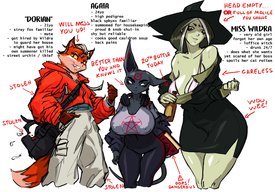
File: 1685626646061.jpg (168.41 KB, 1500x500, FxcXIAALVfsVA.jpg)
No. 299904
Post the worst of the worst character designs you can find. From the uncannily realistic to terrible reboots to oversexualized. It doesn't matter if it's from movies, TV, video games, comics, just has to be awful.
Previous threads
>>>/m/124171>>>/m/189168 No. 302285
File: 1686766759482.png (320.61 KB, 567x525, Angel_Lilo_Stitch.png)
No. 302294
File: 1686773081013.png (99.2 KB, 666x630, jessica sherawat.png)
Someone already posted Rachel Foley but can we talk about jessica who decided to wear high heels in her wetsuit?
No. 302346
File: 1686795164230.png (34.63 KB, 1080x651, Screenshot_20230614-190531.png)
>>302287That was really fake? I can't believe I even thought it was real. I had to dig up the original post and even this person said she made it kek
https://thepageofhopes.tumblr.com/post/126945060592/theoneandonlystraycat-sweet-poni-edgebug/amp No. 302498
File: 1686864973829.png (218.41 KB, 1280x1920, why.png)
>>302294dang, an anon beat me to it, but I've still got to. I'm not even angry that she has her boobs out during some mutant/zombie stuff—it's how the hell can she see with her hair like that? No wonder she got got, she didn't see it coming.
No. 303192
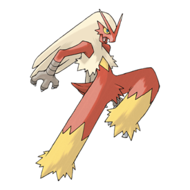
File: 1687195700850.jpg (423.34 KB, 1685x1200, Fxv1f6NXA_mBTe.jpg)
Every Pokemon Generation past 4
No. 303292
File: 1687204055975.png (70.72 KB, 950x475, FKV2uE6aV_A31b.png)
>>303291I dare you to defend this.
No. 303322
>>303192There are some good designs up to gen 7 or even 8. However the amount of bad designs increases with the gen number.
Gen 5 had a bunch of good ones. Gen 6 had too few new Pokemon to leave an impression but it had a mix of good and bad. Gen 7 is where it truly went to shit even though a few designs were still good. One of the few designs I liked from gen 8 was Corviknight.
The problem, I think, is that more and more people started to design pokemon, same with the human characters, so the franchise started to stray from the characteristic style it had for the first few generations.
Also, it's not like all of the pokemon starting from gen 5 are automatically bad and all of the designs before that were perfect, that's such a genwunner take. A lot of Gen 1 pokemon in particular are so fucking boring to me and don't seem to make sense, like they were designed in a hurry. But generally, yeah, the first 4 generations had better pokemon that actually looked like pokemon and quality started to decline after that.
No. 303659
File: 1687313350097.jpg (90.3 KB, 1080x1133, xgr65fxc44g61.jpg)
These two are white blood cells. Why does the female one have huge knockers out even though the male one is normally dressed? It doesn't make sense since this version of Cells at Work! she's in takes place in a much darker and edgier theme where hell breaks lose. How am I suppose to take this seriously when her tits are out making herself more vulnerable to enemies and foes? Are the audience supposed to feel worried and aroused at the same time? It's unnecessary, retarded and cringe just like Highschool of the Dead. I like the idea of surviving in an apocalypse or in a world being swallowed by danger and disaster but designing the girls to look sexy with skin out and to appeal horny moids just ruins it and breaks the seriousness and immersion of the theme.
No. 303669
File: 1687316688802.gif (1.3 MB, 480x360, lies.gif)
>>302346Right, because people
always tell the truth on Tumblr.com.
No. 303736
File: 1687357519427.jpg (1.66 MB, 5000x3404, Gens.jpg)
Accidentally posted the wrong image.
>>303292I was talking about Snom specifically not that disgusting thing! Anyway I decided to go over all the Pokemon from the Gens after Gen 5 and see how many of them I actually like. I've marked the ones I think are good designs/that I like personally. Just for fun.
No. 304269
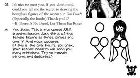
File: 1687530400440.png (36.89 KB, 685x402, IMG_6.png)

>>299904From the Western Animation Thread, tick how many of characters in the thread pic fulfil these requirements.
No. 304496
File: 1687628931857.jpg (140.32 KB, 1079x1677, Dog bee lady.jpg)
What is she even supposed to be
No. 304513
File: 1687635403975.jpg (45.84 KB, 800x418, miscreation.jpg)
>>304496It looks like a creature from miscreation
No. 304760
File: 1687756989175.png (35.45 KB, 475x475, 097.png)

God tier pokémon design right here
No. 304761
File: 1687757198589.png (641.17 KB, 868x764, fucking puke.png)

So tired of retarded anime designs like this. Cut your fucking hair goddamn
No. 304953
File: 1687824623329.jpg (204.63 KB, 1200x2305, Untitled.jpg)
this design has always been weird, stupid and coomer. i cannot believe the amount of women who went full pick-me to defend it because they like the game's creator.
No. 304980
File: 1687831501678.jpeg (920.13 KB, 3024x2418, IMG_1952.jpeg)
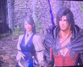
Anyone else bothered by the women in the new Final Fantasy? The concept art looks good but somehow gets lost in translation to 3D because of weird-looking proportions (I think tiny heads/necks too long?) and extremely mousey faces. Meanwhile the men all look great. Jill’s unnecessarily low ponytail behind her ears and gray hair make her look extra mouse-like.
No. 304981
File: 1687831586033.png (541.94 KB, 2560x1440, IMG_1950.png)

>>304980Better view of her face
No. 304994
File: 1687837222012.jpg (40.04 KB, 600x337, Dissidia-FF-NT-PV_12-14-17.jpg)
>>304980I like Jill, but I agree there's something a bit weird about her and Benedikta's faces. It might be the long, thin noses and pointy chins? Benedikta particularly looks like a yassified Dissidia Zidane to me.
No. 305057
>>304980>>304981I think both of their eyes are too small and squinty?
I find the super low ponytail cute tho, makes me think of Applejack and Tifa
No. 305086
File: 1687885692373.gif (9.28 MB, 540x540, tumblr_53bfd233e177eac66e17edd…)
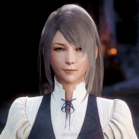
>>304980Their mouths are so weird
No. 305107
>>305086I hate the modern FF 3D style so much. All the girls' faces look very similar (seriously, if you swap the hair they'd some of then look identical to each other) and they're uncanny when they move. Everything is so smooth and you can tell they refuse to give them proper expressions because they fear their usual japanese-looking pretty girl face will appear ugly. Look at these
>>305088>>305086 their faces don't move beside the tiny mouths. The men are slightly better but they often look uncanny too with the expressions and realistic face + anime eyes combo.
No. 305189
File: 1687919223851.png (122.5 KB, 1055x949, ECFD78C4-7590-4FF0-BCC7-6C7730…)
Kabaneri of the Iron Fortress is excellent, I’m enjoying the fuck out of it, but MC’s design is so ugly. He’s very green in comparison to all the other characters, his one lens glasses look stupid af, his hair style is ugly, his clothes are ugly, and why does he have all those marks on his body that the other MC (also a kabaneri) doesn’t have? Can’t wait for this dude to get a hair cut or different fit or something. The purple pants ain’t it.
No. 305224
File: 1687935268604.jpg (27.74 KB, 400x379, realmario.jpg)
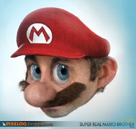
>>305107It's the end result of modern FF trying to pander to both Japanese and Western tastes at the same time.
No. 305258
File: 1687955697474.jpg (26.21 KB, 680x1176, Untitled.jpg)

>>305210i agree it looks fine except for the legs. it's especially awkward comparing her to 92 who is completely chaste in comparison. i've seen people say the boy "appeals to female fantasy just as much". fucking how? he looks like a 10 year old in his school uniform
No. 305406
>>305403>where they want to appeal to men while also trying to get a female audience without threatening the male fantasy.Exactly what I was going to say kek. If they had made the male android appear the same age as 2B and a bishonen/biseinen, male players would've felt threatened and cucked by him. Making him a shota also helps attract pornsick moids who are into straight shota (usually for self-insert purposes) or "femboys".
It's kinda fucked up that their way to attract female players is making the male character look like an underage teenager instead of a young adult man, just because they don't want to make moids uncomfortable.
No. 305460
File: 1688045504231.png (561.19 KB, 900x900, quality designs.png)

You know your characters designs have gotten "better" over the years when important features like eyes and arms blend into other bodyparts
No. 305601
>>305460>>305477>please leave tinkaton out of thisI second this, tinkaton is cute and fun!
While I find the other 2 quite ugly I don't think the things anon complained about are right in this case. Gholdengo is made of solid gold, the eyes are just rings etched into the gold. And Palafin is a superhero wearing a mask/swimming goggles, they both make thematic sense to me. As for arms blending in with body parts… that's been a pokemon thing since gen 1, just look at like mankey or poliwrath so I don't see what the issue is there? But I can't stress enough that gen 9 designs are not at all my taste and is possibly the ugliest region we've ever had overall. But that's just because they deliberately give each region its own "style", I for one adore pretty much every gen 7 pokemon but I've heard others say it's the worst region and them loving these new gen 9 pokemon.
No. 305651
>>305601>>305477Idk guys I find Tinkaton stupid too. I mean, it's cute, but it just doesn't look like a Pokemon. The huge-ass hammer makes it look more like a character from some anime rather than a species of cute critters, if that makes sense.
Same with the stupid superhero fish. You would never imagine those in the wild.
No. 306200
>>304953I feel the same way as
>>305331 I actually like her design as well but I also acknowledge that it is total coombait material and I cringe when I see moids make fanart of her and go to town coomifying even more.
I do agree that it would look miles better if the skirt was a full skirt.
No. 306555
File: 1688452098981.png (168.35 KB, 251x581, Milim.png)

Wtf is this design
No. 306581
File: 1688468167462.png (564.39 KB, 719x1278, kawaii_desu_uwu.png)

An amalgamation of every coomer anime trope known to man. Surprise surprise, it's a vtuber.
No. 306809
File: 1688594916677.png (219.7 KB, 454x985, 3350fb019c57776940b81bd8374d3e…)

trash tier design
No. 306820
File: 1688599386267.jpeg (63.75 KB, 540x411, IMG_2230.jpeg)
>>306809Literally leftover shit from the beta that no one could be bothered to put any effort into writing back in.
Originally she was going to be a more active despair character meant to contrast with Komaeda (encouraging people to not do anything aside from lay around in despair, while Komaeda encouraged people to kill for hope), but that got scrapped so she was just left with literally no personality aside from 'lol meat'.
Sucks because her original design and concept were really cool and I would have wanted to see the ideological debates she and Komaeda got into.
No. 306831
File: 1688606984733.png (23.74 KB, 512x512, CHEESTRINGS-MR-STRINGS-NEW-REN…)

>>305460The one in the middle is just a fucking string cheese
No. 306838
File: 1688611642177.jpg (414.25 KB, 820x1760, 611-6113961_this-article-cover…)

>>306816>>306810The whole thing about her having a coomery design bothers me because it doesn't even fit her personality and it's such missed potential. She's supposed to be a gymnast but nothing about this design screams athletic. They could have even made her sexy with a skintight gymnast outfit but they had to go for this generic, shitty take on a gyaru (I think junko's design from the same franchise is a very shitty take on japanese street fashion). But at least it fits Junko's personality, it doesn't even fit Akane. Picrel - I think Tenko from the third game really suffers from the same problem as Akane, her design is far too girly (yet also somewhat unappealing to coomers, she doesn't seem to have many fans) and doesn't fit her martial arts talent at all or reflect her personality very well. I am a danganronpa fan but gosh some of the designs in this franchise are hot garbage and I could totally sperg for paragraphs but I wont.
No. 306870
File: 1688630637184.jpg (336.14 KB, 1220x813, E52X2B_388936122_677912872-122…)

general book thread ! CP !
No. 306888
>>306838tenkos design is annoying bc the character designers would rather die than let a female character wear anything other than a skirt, even when it doesn't fit their character. tenko hates men & is an athlete but they still give her a short skirt…
ill use toko from dr1 as a direct contrast & example of a character whose outfit (long skirt) actually reflects their personality. tenko had potential to be great imo, but her design doesn't do her justice
No. 306946
File: 1688668039234.jpg (149.53 KB, 1919x1079, glow-production-glow-productio…)
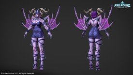
I posted some hero shooter characters in the last thread but god they haven't gotten any better. OW2 designs are still garbage and the most recent champion in paladins looks like picrel. I know probably no one else cares about these games anymore but I cant stand the shit-tier coomerbait designs when this game used to actually make good designs, including sexy ones! I mean this character is supposed to be the queen of demons or whatever she just looks like some generic monster bitch with the most ridiculous proportions and an outfit boring as sin. You can tell this was made for weird moid fetishes (peep the fucking FEET) . Also just one more cherry on top of the cake she's supposed to be black but imo the design does nothing to actually match that, like her skin looks way too light. Its just more lazy, ugly coomershit and hero shooters are honestly just filled with garbage designs now, not even just coomerbait ones.
No. 306947
File: 1688668246896.jpg (457.39 KB, 4096x1271, Fp6eI7pWIBEtKCe.jpg)
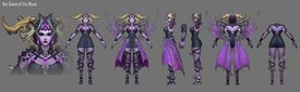
>>306946samefag but i completely foregot to mention how ridiculous and unbalanced the horns and wings look too, it's just way too much detail in one place while the rest of the design is boring as hell, picrel is concept art where she has this cape thing and even though using the wings as a cape is kinda silly it already looks so much more balanced than the design we got
No. 307024
>>306820God forbid Danganronpa let their female villains be insane in a way that's actually intriguing. I've also seen a couple people mention that Angie would have been a much better rival for V3 instead of the annoying shit known as Kokichi and they're absolutely right.
I swear this is one of the many reasons why I only engage with a select few fangames at this point. I absolutely love the concept of DanganRonpa but the execution really is just awful.
No. 308747
>>306809Looks fine to me.
>>306555Loli-bait. Would look okay on an older character.
>>305189I like his design, it has that 80s feel.
No. 309766
File: 1689929477075.jpg (94.38 KB, 500x558, anime-same-faces.jpg)
whatever this is called?
No. 309796
File: 1689943529848.png (739.19 KB, 1000x563, girl.png)
Not like there were any good designs in this garbage shounen, but the way the giant girl's face was drawn pissed me off, how many extra chromosomes does she have?
No. 309797
File: 1689944130343.jpg (137.16 KB, 1280x720, maxresdefault.jpg)
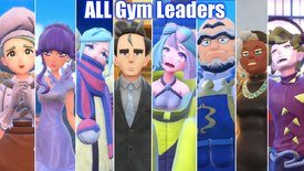
The gym leaders (most characters really) of the last pokemon game. I despise almost every human AND pokemon design in those games, they're all so weirdly "meh". I can't even hate them with a passion because they just bore me too much for me to care
No. 309801
File: 1689944734109.jpg (63.46 KB, 850x541, __rika_and_larry_pokemon_and_2…)
>>309797they're all horrible except larry and brassius tbh
No. 309804
File: 1689946026184.png (9.34 MB, 2676x2867, better.png)
>>306838>>306820>>306809The original designs are much better, the original concept of Distrust in general seemed a lot better than the final tween product. Another game that got this treatment was Bioshock which had an actually horror-themed concept before it got candy assed into a sellable product with cartoonishly bobble headed characters. Danganronpa is a major disappointment in that it had a lot of horror/mystery potential.
No. 309820
File: 1689953610123.jpg (193.2 KB, 500x219, 1259681562192252.jpg)
>>309797All have been crap since the end of Gen-4
No. 309951
File: 1690005768513.png (316.44 KB, 600x431, IMG_0093.png)
>>309796I really liked Suzuki's previous work, Kongo Bancho. Tried to get into 7sins because of that, but man… Everything from the art to the story felt degraded in quality for marketability. Not like Kongo Bancho was some masterpiece, but at least it had character. It knew it was stupid and had fun being stupid.
No. 311748
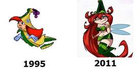
File: 1690738484832.png (101.07 KB, 259x426, IMG_0865.png)

I come back to Neopets and found this abomination made from the jump start days. Every official art of her is incredibly static and she stands out like a sore thumb because the art style isn’t consistent.
No. 311776
File: 1690744088071.png (78.31 KB, 297x388, IMG_0866.png)
>>311759Yeah she’s from the not China/Japan region called Shenkuu. Not only is her design botched but so is her story. I want to redesign her to match the original Neopets style.
No. 311778
File: 1690744489029.png (560.69 KB, 800x501, tumblr_p03g9syKi01uysqzko1_128…)

>>311776Someone apparently did a pass that actually makes her work with the other fairies kek
No. 311790
File: 1690745969918.jpg (2.4 MB, 1970x1400, Danganronpa.full.1581183.jpg)

>>310165Yeah, I love them.
No. 311812
File: 1690751403752.jpg (273.99 KB, 847x1000, d.jpg)

>>311776kek she looks so retarded why did they draw her like that
>>311778i love this redesign, it actually fits. the wings reminiscent of sakura blossoms are a great idea
No. 318654
File: 1693460697771.png (745.13 KB, 603x1076, Screenshot.png)
Modern Pixar
No. 318660
>>311748Aww, I like Kaia's design. I agree with
>>311778 that the problem is the style, not the actual design itself.
No. 318787
File: 1693505687123.png (474.86 KB, 320x1086, 320px-Olivia_portrait3_webp.pn…)

It's not bad on its own but she's supposed to be a woman in the 1940s
No. 320182
File: 1694121744612.png (381.35 KB, 898x898, ewewew.png)
Hate this ugly ass hipster design. So far I'm really disliking the way they modernized Ooo and made it look like something from 2016. You can sense that time period in the writing too, it feels very mid 2010s in the worst way. The original designs were simple yet unique, not all of them were in my taste but they were very cohesive and timeless in a way. This already looks dated.
No. 320184
File: 1694122106738.jpg (127.33 KB, 698x1000, 91Gb2OXw04L._AC_UF894,1000_QL8…)
>>320182I think it's fine? Obviously you can't beat the original, but I thought Finn's new design was alright. It reminds me of Errol Flynn.
No. 320195
File: 1694125253052.png (3.14 MB, 1000x1662, 82bb74b06d59f7cae9c69d6f942364…)
>>320182How does he look like a hipster? To me, he looks like a more casual version of a Dungeons and Dragons character, which I guess it's the style the show is going for. Agreeing with
>>320184 No. 327109
File: 1697310834722.png (51.37 KB, 414x670, Vivi_Transparent.png)

Basic as hell design ripping off Velmas
No. 327111
File: 1697311132192.png (843.47 KB, 946x2044, Mega_Man_X_DiVE_Hunter_Program…)

Bad in every possible way
No. 331529
File: 1698711799170.jpg (276.52 KB, 1280x720, 1686586199078.jpg)

The amount of information and colors in their designs hurt my eyes. Also, I hate the wannabe chibi style that makes characters look like dwarves.
No. 333183
File: 1699231606478.png (314.38 KB, 494x744, Clawroline_(KatFL).png)
Why is Nintendo making so much shitty ugly fur bait lately?this looks like some coomers fursona.
No. 333192
File: 1699231821026.png (122.27 KB, 475x475, 908.png)

Ugly coomer,furry bait
The designers at Pokemon are not even trying anymore.
No. 333195
File: 1699232230299.png (407.75 KB, 800x600, Stella_profile.png)

Obligatory
No. 333319
>>333183>>333192Based, I agree. Anyone who likes this shit is a furfag.
Besides, Meowscarada's design makes no sense to me. So it's a bipedal cat that's wearing a mask like at a carnival for what reason exactly? And this ties in with the Grass-type theme how? such a bad design in every way, and it's clearly pandering to coomers so it's even worse.
>>332056>giant bulbous noses>bean mouthsnta but only two of them have it
And even if you hate these art styles (which might just look similar to you because all of them go for cartoony and hyperrealism at the same time, and all are in 3D with the same realistic lighting) they're still more distinct from one another than generic Frozen style. I really think the problem is the aforementioned similarities in lighting and wanting to make certain details as realistic as possible while going for the opposite when it comes to the body and face, which is what they do with Disney Frozen style also. Every single one of them would look miles better if they were 2D and Disney/Pixar/every fucking animation studio these days stopped trying this horrible realism and stylization mashup that clearly makes every design look like generic, uncanny valley trash
>>333195This character made me feel kinda weird in a bad way as a child and I didn't know why. Fuck moid writers and character designers inserting their pornsickness in children's media.
No. 334139
File: 1699477177868.jpeg (142.39 KB, 750x1050, wagYhtC.jpeg)
I hate seeing this coomers art.
No. 334161
>>334139>woman has hobby>guuuys this girl is totes a tomboy right ? I'm not a fag for having a hobby that women have sometimes right ?I'm so done with the tomboy gf meme. And I'm even more tired of the "farm girl has big titties because cows haha" trope.
>>333319I love Meowscarada in a childish sperg way just because it's a cat magician, but I'm starting to realize I'm bound to experience the same fate as the kids who really liked Gardevoir. I hate knowing that whatever fanart I make will be seen with coomer eyes.
No. 334227
File: 1699495953868.jpeg (293.61 KB, 1280x1728, 5FDCCF40-DD04-49B4-B2B7-FF8608…)
Everything in this shit horrible coomer game. Korean moids, not even once
No. 334238
File: 1699498732962.jpeg (1023.25 KB, 2949x3008, FgaXABtVQAAw5cD.jpeg)

Why is most indie animation so ugly now?first Vivziepop now this???I remember when indie animation had really simple styles (ex homestar runner,eddsworld)
No. 334319
File: 1699544431741.jpg (79.19 KB, 1000x698, earthworm jim.jpg)
>>334238I think a lot of indie animators are trying to imitate cartoons they liked as children. Obviously the older shows are inspired by even older cartoons and other media, but it used to feel more like things had a wider range of inspirations that all came together to form something unique.
No. 334419
File: 1699580196813.jpg (90.26 KB, 1400x700, anxiety-in-inside-out-2.jpg)
Pixar has been failing repeatedly in character design lately.
No. 334732
File: 1699674230446.jpg (97.34 KB, 981x517, Untitled.jpg)

>>334729
it feels like common design sense to not put a tuft of fur on the pubic area to not draw attention to it, and yet
No. 334733
File: 1699674240588.png (119.66 KB, 475x475, 257.png)
Badly designed Pokemon in my opinion, unnecessarily humanoid with it's awkward looking body and face looks more like a Sasquatch than a bird monster also the fur tuft on it's crotch is just unnecessary.
No. 334749
>>334738My unpopular opinion is that I don't get why people give objectmons such a hard time, sure it's kinda weird for a creature to be literally a candle or an ice cream but they did a good job of designing around the concept? The designs are distinct enough to be recognizable as not just some object, without being overdesigned. Plus gen 5 had an urban theme so it makes sense to have industrialized artificial creatures. Doesn't Garbodor's pokedex say he developed out of nasty polluted conditions that humans created or something, he may be a pile of trash but he's a cool pile of trash
And also we had stuff like voltorb since gen 1. I have nothing against voltorb btw I think he's funny but I'm just saying there have always been "lazy" uninspired designs in every gen
No. 334837
File: 1699700759118.jpg (17.71 KB, 194x259, skinny kfc.jpg)
>>334733I like it a lot but I'm biased, it's my favorite gen 3 starter. It's based on pic related so I get why it's bipedal with long legs. It's funny because orgs like PETA complain that Pokemon games glorify the urban fantasy equivalent of dog fighting, everyone says they're wrong because it's more like some shonen manga martial art but with cute monsters, and then the devs give us a pokemon that's specifically based on rooster fights where people place bets over which animal will die or whatever it's called in English. The gen 4 fire starter is a good choice for a fire/fighting type since its last evolution is really just Sun Wukong, I have no clue wtf they were thinking with the fire type starter in gen 5.
No. 335026
File: 1699747140760.jpg (139.93 KB, 1000x1363, MV5BMjhiNTZhNGEtYTRhNS00NGZlLW…)

I find the show good, a shame it has that disgusting bad adult cartoon style à la Family Guy. Misleading and turns away potential viewers who expect it to be retarded like Paradise PD or Big Mouth
No. 335030
File: 1699749307761.jpeg (124.26 KB, 1000x1500, CE52D069-5AE8-4598-9812-4FD561…)

>>335027nta, it’s the super stiffness of the characters plus the fact that every aspect of it looks like stereotypical mouth-drooly adult cartoon. The cast is stereotypical, the poses are stereotypical, the expressions are stereotypical, even the name and background are stereotypical. It’s enough of a putoff that even with an endorsement I’d never want to watch it after seeing that poster.
No. 335063
File: 1699757559874.jpg (134.71 KB, 1280x720, maxresdefault (31).jpg)

Coomerbait ft. same face syndrome
No. 335065
File: 1699758266829.jpg (25.45 KB, 600x315, Q8XvTnzd1aHa1g-ZBQ_riRC8ATBEPw…)
>>335063What the heck happened?
No. 335202
File: 1699824083699.png (2.49 MB, 2046x2031, Redesigns.png)
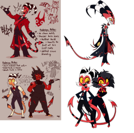
Found these redesigns of the Helluva Boss cast and it really put into perspective how ugly these characters look. I mean the artist didn't even change the designs too much but even just drawing them in a different style makes them look 100x better in my opinion. Its not as bad with Moxxie and Millie as it is with Blitzo in the original but I like the redesigns more they have more personality. They're also easier to look at because of the variety of colors. Millie is cute and Moxxie is an absolute malewife as God intended. Blitzo looks twisted and conniving even without the weird proportions and the bulkier build makes it more believable that a bunch of people fucked him/want to fuck him in the cartoon
No. 335218
File: 1699829928181.jpg (12.12 KB, 278x283, 68747470733a2f2f73332e616d617a…)

>>334733what did you say about my
husbando bitch?
No. 336999
File: 1700438557505.jpg (59.23 KB, 616x353, capsule_616x353.jpg)
i guess it's not "awful" but i fucking hate the appearance of every character in this game, it's like some faggy victorian-aesthetic yaoi anime but with a "realistic" filter, everything looks too clean and smooth and "pretty" and the main character people are thirsting after looks 12, it's gross
No. 337046
File: 1700451431147.png (200.69 KB, 338x518, Yurishia_Farandole_Anime.png)
Atrocious
No. 337048
File: 1700451654541.png (251.43 KB, 488x938, Raphtalia_Anime_Profile.png)
Overrated trash
No. 337218
File: 1700524898570.png (648.16 KB, 1862x2417, 61848578_i5DntCDsF.png)
>>334732kittydog didn't listen to that advice, and put neon gradients in her character's vagina.
No. 337620
File: 1700691083338.png (313.05 KB, 415x830, Pinocchio_(2022)_-_Jiminy_Cric…)

Disney made Jiminy Cricket look like a green polished turd rather than a cricket also the rest of the dreadful designs are uncanny valley especially Pinocchio
No. 337621
File: 1700691213070.jpg (331.22 KB, 1535x1537, Profile_-_Pinocchio_2022.jpg)
>>337620The animated version looks more alive than whatever this is
No. 337634
File: 1700697984307.jpg (774.31 KB, 5200x6500, Josie_CG.jpg)
The designs in recent Tekken games have been absolute shit (Looking at Paul and Nina) Never liked Josie at all but her design is absolutely atrocious.what is that footwear?the piss yellow,the unnecessary accessories.awful character too.
No. 337640
File: 1700699489878.jpg (106.31 KB, 707x869, Josie_CG_1.jpg)
>>337634Why does her hand looks like this
No. 337809
File: 1700774461394.png (183.51 KB, 246x499, NinaT8_Render.png)

>>337634>NinaI hate this outfit so much, I don't remember which trailer showed her alt with cat ears but that ones bad too
No. 337813
File: 1700777187954.png (2.83 MB, 1829x3000, Voyd_Incredibles_2.png)
I'm honestly glad we're not going see this character again.her design was atrocious and looks more like a rejected Fornite skin than some Pixar superhero.why is her hair color almost the same blue color her suit has?the bright green clashing,the stupid logo,the ridiculous hair.the sequel was a huge downgrade anyway.
No. 337814
>>337809They could have just given her some black sleek catsuit instead of whatever that is
>Ankle bracelets>Out of place sunglasses>Mismatched gloves >Over the top dress with fringe>Leather that doesn't match Did they fire the old designers at Tekken??what the heck happened here?
No. 337817
File: 1700778061173.png (756.51 KB, 834x1158, Caine_Render.png)
I know everyone on LC is tired of TADC but his design is so distracting and hard to look at.Some of GreaseWorx's designs don't translate well in 3D at all,some things should just stay in 2D.
No. 337845
File: 1700790838195.png (646.96 KB, 1280x1920, tumblr_pbmy71GdF81qbs4u5o2_r1_…)
>>337813i wonder if they made her look like a tranny on purpose
No. 337852
File: 1700796178489.png (964.08 KB, 894x894, Lyric_the_Last_Ancient.png)
Lame,forgettable,bad Sonic villain no one remembers with an equally terrible appearance.
No. 337854
File: 1700796678208.jpg (131.99 KB, 1206x1206, sonique.jpg)
Iconic in a bad way lol
Hilariously terrible yet hideously grotesque at the same time.
No. 337871
File: 1700806920873.jpg (176.26 KB, 1920x799, ugly-sonic-1653040758070.jpg)
>>337854And somehow Disney decides to bring it back in that shitty Chip N' Dale movie with so much emphasis on his disgusting teeth. It hurts seeing anything Sonic-related as lame and cringe nowadays.
No. 337906
File: 1700828487401.jpg (1.15 MB, 4096x2865, F9w6LugXAAAb730.jpg)
No. 338056
File: 1700886068369.png (335.64 KB, 677x953, Screenshot_20231124-221908~3.p…)
I couldn't find a model sheet for this thing but it's butt ugly,it's from a short film called Clicker.its supposed to be some anthropomorphic boom box?looks like some French fry to me instead.the designs of the background characters were so much better.
No. 338263
File: 1701007594181.png (232.64 KB, 347x1011, IMG_0535.png)

Medukaverse got a lot of bad apples
No. 338277
File: 1701016251365.jpeg (11.97 KB, 224x224, 0FE1BFAF-8552-412F-AFB7-B18A0B…)

>>338263Kek why does she have an ashtray in her hair? Is she an ashtray gijinka?
No. 338326
File: 1701038127808.png (249.02 KB, 652x990, IMG_0538.png)
>>338277She’s supposed to be a cinephile and friends with the main 5 but got lost in the timelines. Or some shit. It’s very Mary sue and her design is so jarring it does not follow the design rules of the main 5.
No. 338346
File: 1701043607133.jpg (97.99 KB, 1280x720, maxresdefault.jpg)

Pixar is dead
No. 338351
File: 1701044151243.jpeg (798.26 KB, 956x1615, IMG_2504.jpeg)
>>337634>>337809We have to talk about Elena from street fighter if we’re talking about fighting games because what is this. And she’s supposed to be a princess.
No. 338363
File: 1701050559218.jpg (112.95 KB, 735x535, 542a3703e78d06e6a16226217fe37c…)
>>338351The way she's animated in 3rd strike always bothered me. It's really uncanny compared to the other characters and it looks like she's rotoscoped. It's a shame her design is terrible because I love that she's very tall and from Kenya. If only they would've given her nicer clothing, an edgy take on picrel would've been really interesting but imo Japan really fumbles character designs when it comes to different ethnicities.
No. 338416
>>303192The grass monkey's evolutions, Scorbunny, the water starter's last evolution, the baby squirrel, the iron raven, the red ladybug, the plant with the big white fluff on it's head, the corgy and its evolution, the poison-electric guitarist frog, the baby octopus, the KISS furry, the coral ghost, the snow larva, the snow moth and the two legendaries are aight
No. 339049
File: 1701382484983.jpg (780.03 KB, 1920x818, strange-magic_mbd040_f1001_wip…)
Hate this ugly, boring movie
It ripped off Epic as well,glad it was a box office bomb because the whole movie was horrible to look at.
No. 339051
File: 1701383117030.jpg (100.54 KB, 679x478, breadwinners.jpg)
The fact that they're ducks makes it a lot worse…I always thought they were frogs?why green tho?
No. 339059
File: 1701387866140.png (493.98 KB, 499x922, Android_21.png)

I use to be a DB fan but when I first saw her I knew she would be a bad addition.honestly she's shitty bland waifubait made to sell merch.looks like some teenager's Deviantart OC.the vore stuff in the game doesn't help either.she looks way out of place as well
No. 339216
File: 1701466746653.jpg (224.4 KB, 1437x954, wp-content-2.jpg)
>>339051>why green tho?they are suppose to be mallards but because of the stylization their is no way to make their bodies brown and white without making it look too jarring. if i have to say anything positive im glad they didn't make them white ducks since every cartoon duck is white but this artsyle just sucks and they dont even look like ducks
No. 339684
File: 1701656817478.jpg (15.44 KB, 300x222, 300px-Meikuumon.jpg)
Nothing redeeming or appealing about this Digimon along with it's evolutions
No. 339852
File: 1701738062081.png (277.09 KB, 530x452, news4vip_1493782220_304.png)
Apparently she's from a slice of life anime about mahjong, with some "yuri" flavour.
Can't really comment on the anime since i would never watch it but she looks so dumb, she isn't even curvy anywhere other than her breasts and the way they draw her shirt is so stupid it's like they couldn't decide if it would stick to her body or create a boob curtain. (which is not unpopular for pornrotted moids anyway)
No. 339853
File: 1701738860980.jpg (116.61 KB, 850x977, ef8e18f153264db7fa82395c7532b0…)

>>339852This is one of the worst takes of sexualized anime 15 year old girl, i'm sure there are worse examples but at that point they must be those things with ecchi scenes on every frame.
I don't even know if it's worse than Ilulu, i'm not defending that design but this is not supposed to be a 10000 year old loli and the way they held back from giving her thick thighs and skindentation despite everything these characters usually have creeps me out more.
These abominations should really stay locked in r18 content instead of something that wants to pass as slice of life anime.
No. 339881
File: 1701743824900.jpeg (706.04 KB, 1625x1396, 433AD7E4-CFDB-440F-8981-DA3511…)

Mikio Ikemoto was Misashi Kishimoto’s assistant on Naruto and is now the artist for its sequel Boruto. I didn’t pay any attention to it until I saw his female character designs. Even as 12 year olds he drew the girl ninjas like little prostitutes. I hate to even type that but it’s blatant. Adult female ninja characters are all in heels and he added cyborgs to the ninja world who are extra coomery.
No. 339882
File: 1701744622559.jpeg (538.41 KB, 1817x1080, F1DDEF0D-D772-4A70-99D9-346B91…)
>>339881He has a thing for heels and legs kek.
No. 339889
File: 1701748695430.jpeg (666.6 KB, 1728x1268, 35A18B30-15E2-4BCD-865E-45535C…)
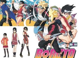
>>339881>>339886Sasuke and Sakura’s daughter is his wifu imo because he draws her in the skimpiest clothes out of all of them. At the risk of sounding like a narutard, she’s a female uchiha she’d make an interesting character he didn’t have to sexualize her so much. Kishimoto must be a coomer too or something for letting him do this to child characters. I think fans complained about her second outfit so in another time skip she has some kind of shorts under her long top instead of the gross mini dress and baby heels. Like wtf is the cover on the right? It’s like an upskirt shot thinly veiled as an action pose.
No. 339890
File: 1701749394946.png (121.88 KB, 250x495, Tumblr_inline_pc1nm6xCBo1qbjpi…)
>>339881related, i always found this disturbing
No. 339921
File: 1701760025604.jpeg (366.62 KB, 1266x628, 8299D17C-31AF-4FFF-A530-822F37…)
>>339915Yes, they’re supposed to be 12 then 15. I’m grossed out I didn’t know this man existed and was doing this. He gives all the girls pouty baby faces I hate it.
No. 339937
File: 1701762090692.png (335.59 KB, 688x372, 970da81fcf3db6a.png)

>>339881>>339921Lolicon-tier usage of bigger heads to make their bodies look even smaller
>>339890This is surely weird but i've seen worse from him, maybe this looked less exaggerated during the 80's or whenever he drew this?
Also i think being autistic is a requirement to believe that red would look good with those colors kek
No. 339944
File: 1701763991053.jpeg (477.11 KB, 1142x2304, 178E1C05-6709-4AA1-9C0D-52B7C6…)
>>339929>>339937I hate him so much for this giant chubby baby head thing.
No. 339945
File: 1701764037772.png (1.02 MB, 1725x2475, BEASTARS v18 (2022) (Digital) …)
Not "awful" but Kyuu's design was weird to me since none of the other furries had big boobs. She's not even a sexualized character, aside from a scene.
No. 339955
>>339940That’s really interesting. I’ll have to go watch and see.
>>339945This manga went to shit so bad. Tragic.
No. 340001
File: 1701789931424.png (2.29 MB, 1600x1230, AQbdAYF.png)
No. 342281
File: 1702582009189.png (3.38 MB, 1973x1638, sEEtsim.png)
No. 342294
File: 1702586674396.png (238.54 KB, 485x666, Screenshot_190.png)
uma musume has some cute designs but this one is so ugly
No. 342296
File: 1702586888651.png (1.05 MB, 911x991, dragon-maid-ilulu.png)
No. 342298
File: 1702587509718.png (929.91 KB, 595x671, censor.png)
>>342296one of the worst coomer bait anime designs, her boobs look like tumors and the panties are just the cherry on top. genuinely looked better in the chinese censored version where they made her boobs smaller
No. 342347
>>342281>>342289I know it's made by that same tranny who made The Amazing Digital Circus that everyone won't shut up and coom over though I think that one is more decent and better designed than Murder Drones. I tried watching this but it's so cringe and edgy like it's made by a 12 old year boy after watching dubbed scrote anime and inspired by NieR:Automata. Like wtf robots with puberty?
Left to right:
>looks decent at first but gives off latex and midriff fetish >twintails looks like Marie Rose from Dead or Alive which is a fighting game with coomshit female characters>the middle one is the worst and coomerish design out of all with the thigh highs and nothing covering her down there. Probably inspired by 2B porn>can't tell if the rebellious-looking teenager is wearing a skirt or just a jacket while wearing nothing underneath down there but wearing chokers is pretty fetishized. Moids love and coom to goth girls.>cute boy is definitely inspired by 9S and looks like Chat Noir No. 342399
File: 1702621653489.jpg (162.42 KB, 1200x675, F93uU3nWsAAif4Y.jpg)

Just got an ad for this on Xitter. The more you look at it the worse it gets
No. 342612
>>342281Gross
Why do they even have hair?makes them look more jarring.this shit gets praised for it's strong female characters which I find very laughable,classic coomshit.must be a pain in the ass to animate
No. 342636
File: 1702696301199.jpg (50.12 KB, 500x500, artworks-gMgpueeMaI2gXHrQ-HRXu…)
Terrifying,there is no way any child would actually love watching anything with this horrid abomination on screen.
No. 343063
File: 1702844954592.png (3.85 MB, 2200x3500, Toy_Chica.png)
>>340003speaking of, have this old cringe
No. 343089
File: 1702855707284.jpg (248.39 KB, 1920x1440, 9story-Monster-By-Mistake-001.…)
>>342402Here's some legit ugly design nona. Monster by Mistake on Cartoon Network.
No. 343227
File: 1702917146602.jpg (122.65 KB, 640x898, 100654_front.jpg)
15 years later (!) and I have no idea what the death note guy was thinking with most of these designs.
>Grant gets a retarded backstory where he's butthurt over Trevor and Sypha getting married. That and giving him into a Voldo-esque mummy design
>Action figure design Death
Lol, this game was a fucking mess.
No. 343242
File: 1702919920504.jpeg (409.5 KB, 1280x1024, Alucard_1280_1024.jpeg)
>>343227Kek glad I'm not the only one who can't stand Obata's bullshit. What he did to my boy Alucard is unforgivable. I mean, imagine settling with picrel as your final design of one the most iconic and beloved characters of the franchise. Imagine thinking this is even remotely passable.
The fucking gall.
No. 343289
File: 1702926721724.jpg (63.64 KB, 563x762, alucard-1.jpg)
>>343242They all looked so bad. Nothing can compare to Kojima.
No. 343484
File: 1702982365738.jpg (173.05 KB, 1920x1080, jerry_and_his_bros.jpg)
>>343089i love seeing shit design like this that is JUST ugly kek
my contribution is an old swedish cartoon called the three friends and Jerry, this show was somehow popular back when i was a kid
No. 345490
File: 1703846995513.jpg (103.64 KB, 942x522, jmv0Di9.jpg)
Not a single complete piece of clothing. Funny that twitter was bending over backwards defending this game's designs earlier this week.
No. 345494
File: 1703849165049.png (221.1 KB, 280x412, Untitled.png)
>>342636>>343073I babysat a kid during the summer and it's one of the cartoons he loved. He's also probably austistic but he is too young to be diagnosed. Funny thing is this cartoon wasn't even the worse he was watching.
>>343510yes….
and talking about the thicc mouse..
No. 345527
File: 1703863361208.jpg (176.28 KB, 1024x1436, latest-958968972.jpg)
>>343227I know I'm late but I will forever hate Obata for what he did to Maria.
No. 345687
File: 1703909851974.jpg (76.45 KB, 800x450, CRYMACHINA_20231007153659.jpg)

I wanted to try this game out because the music was nice, but the designs are horrific. Other than the MC, this character in particular's I hate. She's 2x taller than everyone else, dresses like a goth gf egirl, and has the cursed round glasses to boot. It's a yuri centric game too so I just imagine her as the character every tranny self inserts as
No. 346023
File: 1704127768120.png (430.33 KB, 687x577, EW.png)
Visual clutter and ugliness: the character design. 99% of the artist's designs are like this btw(namefag)
No. 346130
File: 1704166541200.jpeg (661.42 KB, 4096x1638, FOQLYq5X0AEccni.jpeg)
From an indie cartoon
Looks like some ugly Furaffinity adoptable that would be sold for $600.Why do a lot of indie animation creators hate simplifying designs?
No. 346795
File: 1704501864210.jpg (60.3 KB, 366x566, ed240a3280dcf596f88b312501205f…)

A lot of Supergirls old outfits were hilariously and ridiculously bad.
No. 346796
File: 1704502047716.jpg (1.53 MB, 1080x1080, share-tw.jpg)
Self-explanatory but who approved of this???I can never get into Pokemon because of genuinely hideous garbage like this.
No. 346832
File: 1704512965550.png (548.94 KB, 2957x2957, Raging_Bolt.png)
>>346796The dragons are ok since they're designed to be like motorcycles but this gen has far uglier and uninspiring mons
No. 346858
>>346796SWSH was the nail in the coffin for me for a number of reasons, but one of those reasons was the confirmation that GF was going to stick with the retarded direction they were going with Pokémon designs, especially for the legendaries. When the SV trailers dropped, I knew my judgement was correct. Even SWSH had some completely new Pokémon designs I liked, but almost all of the ones I like in SV are derivative of older Pokémon
and a couple of the Treasure of Ruin Pokémon.
No. 347536
File: 1704837225741.jpg (493.67 KB, 1284x856, Lightyear.jpg)
He looks out of place compared with the other humans in the movie his chin looks like one single massive testicle.
No. 347554
File: 1704846860648.jpg (16.17 KB, 318x159, images (18).jpg)
i don't know what they call it but i am tired of seeing pictures of characters with wide mouths agape showing fangs with smug expressions. Its a plague, maybe this trash anime is what originated it or maybe is something that comes from furry art. but its gross, i hate it, i want to punch people who draw every character like that.
Hero academia has some of the most ugly face expressions in anime history, i don't get the appeal
No. 349030
File: 1705398358674.jpg (168.71 KB, 800x722, Rmiku2023_01.jpg)
Miku's thighs are disgustingly coomerish here and if a character has a lip fang then the artist or creator is a degenerate since lip fangs are mostly seen in annoying moe characters like Astolfo.
No. 349040
File: 1705403143702.jpeg (104.58 KB, 826x818, GDw9qhEW4AADU5R.jpeg)

Probably shooting fish in a barrel, but I saw this One Piece image and the anatomy is killing me.
No. 349748
File: 1705671065126.jpg (128.43 KB, 1080x1080, c45.jpg)
No. 349815
File: 1705687244340.gif (2.57 MB, 500x407, 0501ba63625e66a50e17d4e462264c…)
>>349040Female characters in One Piece always make me think of this line from Who Framed Roger Rabbit. Even when I want to like them, it's hard to get past the ridiculous anatomy. How do all the women in this universe have J-cup titties? Oda has even given them canonical measurements that are like barbie-scaled-to-human-size measurements (Robin is supposed to be B100-W60-H90). I mean wtf.
No. 349991
File: 1705735478893.jpg (1.44 MB, 4096x2302, InCollage_20240120_142118174.j…)

This is exactly why we need to gatekeep magical girls (and anything related). Not only moids now are turning it into their loli yuri coomer angst torture porn fap material, they also come up with the most atrocious designs imaginable.
No. 350001
>>349991This is egregious holy shit
Dare I say worse than Strike Witches
No. 350039
File: 1705763436134.jpg (Spoiler Image,51.33 KB, 641x800, MED-DVD2-55483_01.jpg)
>>349991What's worse is that the special edition bluray for the first few eps comes with a cast-off figure of the left girl (who is 14, far right is 9). From the screenshots of the anime and some pages of the manga I've seen, it's pure ecchi shit with loads of clothing damage, tentacles, implied rape and so on…
I've seen people rave about this anime, because some stations are airing it uncensored, with nipples, as if that's stunning and brave of them.
No. 350111
File: 1705787261650.png (312.77 KB, 755x1040, Charlie_Morningstar.png)
Charlie's recent design is the lamest,most disappointing design I've ever seen for a female protagonist.she's literally the princess of hell yet how would I know from her basic ass look alone?Viv could have at least given her a crown or some other royal elements.why is she red now?why is her shirt not tucked in?why is her shirt and shoes the same color as her skin?her hairstyle clashes with the suit so badly.I don't know why Viv didn't turn her into some goat girl since Viv herself is a furry.
No. 350124
File: 1705789928351.png (384.27 KB, 1285x1997, Lucifer_ashley_boys.png)

>>350111I'm gonna sound a turbo autist here again but Lucifer, who's supposed to be the ruler of hell,has the same problem too especially with his suit literally being the same color as his skin.why didn't they make his suit another color instead?also he looks way too identical to Charlie making them look like siblings rather than daughter and father
No. 350264
File: 1705808075480.png (855.52 KB, 886x1869, Character_Furina_Game_(Pneuma)…)

mihoyoslop is rife with awful, soulless, tacky and over-designed characters but i am especially sick of seeing this creature and her mint toothpaste hair. hate the ugly mihoyo baubles all over the outfit, hate the stupid hat, i hate the silhouette, there's just nothing good about it. yelen is even worse, what the fuck is she even wearing
No. 350277
File: 1705812069885.jpg (Spoiler Image,173.24 KB, 800x450, 1218141522604a0e825a7440011.jp…)
Sorry i know i'm beating a very dead horse and this is more of a costume matter than character but i'll never forget how uncomfy this costume was.
I know it's dumbass coom content but who would want to see a wool swimsuit, in a tropical setting even.
No. 350291
File: 1705815872617.png (426.3 KB, 1208x485, arcade place.png)
No. 350295
File: 1705819756238.png (1.73 MB, 1080x1920, ezgif-3-eb1db27158.png)
>>350285the non-coomer designs are also very bad…..most of the dudes are hideous and messy (in appearance) too; i will never understand this game's popularity when all of its characters look like the weeb version of vivziepop sparkledogs, they can't be that interesting writing-wise.
No. 350300
>>350293overly-designed to compensate for generic sameface
>>350295pretty much all genshinfags are children or mentally children
No. 350316
File: 1705832859004.jpg (261.2 KB, 1080x1920, 1000010377.jpg)
ngl tighnari easily has one of the worst designs in the entire game. theres just way too much going on here
No. 350320
File: 1705837245301.jpg (107.56 KB, 1280x720, vi.jpg)

>>350277I have seen many women instagram wear knit bikini tops and there are several tutorials youtube that shows you how to make one.
I even saw some websites selling them when I was bathing suit shopping last summer. I genuinely don't get this trend. I can imagine that people only wear knit bikinis for a photoshot and then they take them off but they look stupid. Bikinis already look silly to begin with but at least you can swim in them but why make them out of wool? it makes useless
No. 350339
File: 1705848898515.png (1.26 MB, 1084x900, bravelydefaultchars-2053266514…)
>>304980>>304981>>305086both their faces look like they tried to translate bravely default's art style straight into 3D without recognizing how wonky it looks in 3D
No. 350340
File: 1705849485599.png (1.79 MB, 1092x663, 51ACrhD.png)
No. 350432
File: 1705867992768.png (1.27 MB, 885x1920, Overblot_Riddle_Fullbody.png)
twisted wonderland is full of ugly outfits too. at least i can look at this guy and tell what he's supposed to be but it's still super cluttered
>>350316when you need your character to be unique but you can't actually draw and you refuse to pick up a 'how to design' book
No. 350444
File: 1705870370748.png (312.51 KB, 1000x630, Shadow_Chie.png)
>>350438>postcool, it still looks like shit to me. the "mental state" thing isn't good reasoning either imo, like smt's full of good designs wrt to frayed minds like picrel. (some good cluttered looks too – like carmen's persona.)
i love ridde's bustle, the heels, and the ink gloves, but the rest of it is just a mess. and he's literally wearing three different shades of black…
No. 350451
File: 1705871536983.jpg (89.66 KB, 1000x449, Tumblr_l_212692197805060.jpg)
>>350444persona is full of overdesigned messes with pegs for feet because soejima hates drawing them and little corelation to either the characters plights or the mythological figures they're supposed to represent, I don't think it's much better. kaneko, the iconic smt designer, never designed any of the p3+ personas and soejima never designed a single smt demon. soejima's shitty designs are partially to blame for how far smt designs have fallen over the years since persona blew up, kaneko left, and doi took over, but that's a story for a different day.
>he's literally wearing three different shades of black…two of those are a different color called grey. all the black is there because he's covered in ink. it's an ink motif. you're free to not like it but it isn't a terrible design.
No. 350463
>>350456nta and never played twisted wonderland but that design IS bad. beyond too much going on, it doesn't look particularly regal, and i'm assuming that's supposed to be the red queen?
>tiny crown implying some sort of restraint when the red queen is notably megalomaniacal>glowing eye?>female choker on a dude (gross)>ripped sleeves just make it look like a t-shirt >a corset? or a vest? with two belts diagonally below the ribs? what are they securing?>the half-painted flowers are okay but, yes, we get it>cards look like shit, add nothing to the design but clutter. did he glue them all together>weird skirt that doesn't seem to connect to anything>ugly clashing of colors that could have been done more intentionally asymmetrical rather than perfectly split in half like soi like the pants and boots i guess
>>350444this looks stupid too
No. 350468
File: 1705875290397.png (1.03 MB, 1200x1372, Inanna_(SMTIVA_Art).png)
>>350456mkay, no need to get so upest. now, allow me to post some of nuSMT's greatest hits.
No. 350472
File: 1705875720382.jpg (15.72 KB, 406x419, prototype-caine-from-the-conce…)

>>337817>>337844Funny enough,his concept design was actually tolerable and was actually better I don't know why Greaseworx ruined and complicated his design tho.what an irritating look he has now,his voice doesn't help either.
No. 350477
File: 1705876368010.jpg (318.24 KB, 3840x2160, Artemis1_Demons_SMTV1.jpg)
>>350468Sometimes I enjoy re-reading that longass blogpost about why modern SMT designs are shit.
I particularly hate this one from V because I know the source material for the reference, Saint Seiya, and it makes no sense for a goddess to wear what basically is the armor of a Bronze Saint (Athena's armor in Saint Seiya is basically a full golden plate).
It's just shitty otaku bait in more than one way and does no justice to a famous goddess like Artemis whose simbols go beyond "lol moon and bow lmao".
Egyptian gods having a flat disc on top of their head is also incredibly cringe.
No. 350485
File: 1705877773069.png (1.63 MB, 1137x1920, ezgif-1-8154b208d5.png)
>>3504681.) i agree that everything you've posted is bad but
2.) i'm not even an smt fan kek, i just casually enjoy (some of) the designs because they're interesting to look at
3.) the twisted shota is still fugly
>>350463i like chokers on dudes but yeah i agree with everything else. riddle's inkblot seems ai generated to me. so thoughtless, shit's just thrown everywhere to be somewhere. the others aren't any better, see picrel
No. 350486
>>350484nta but
>this is that femboy obsessed schizo from 4chan againopinion discarded x2
No. 350488
>>350486i don't think that's her, but trapschizo
has been at it for years…
No. 350491
File: 1705878477218.png (1.33 MB, 980x1226, img_mv_sp.png)
They're all terrible.
No. 350492
>>350485>>350432>>350444You're really awful at selling people on why you think the design is objectively bad. You should just say you personally don't like it and move on instead of criticizing it for "different shades of
black," intentional clutter relevant to the character's mental breakdown happening in the story, and an ink drip "seeming ai generated" somehow kek with the notorious femboy sperg as your only backup.
No. 350507
File: 1705881038890.png (963.01 KB, 1200x675, 0__zFjjfiL9xoyLUjP.png)
>>347554Nagatoro looks punchable as fuck to me, but maybe that's the intention?
Never seen this anime and never will but I hate this character. And what's wrong with her eyebrows?
No. 350519
File: 1705886021994.png (1.11 MB, 688x2048, Screenshot_20240121-201524.png)
>>350507She is so much better when doing judo. IDK why the artists is still fucking around with the bullying girl with mouthfang schtick. That ship sailed years ago.
No. 350524
File: 1705887052371.jpg (355.61 KB, 1280x794, precure_mega_all_stars_by_prin…)
>>349991Relating to magical girl, every single precure design is godawful.
No. 350527
>>350525>It's tranny baitIt's really not, it's just a show for little girls.
Still doesn't excuse the designs being hideous.
No. 350529
>>350524Idk if it's because I grew up watching anime in the 2000s, but none of these designs are particularly offensive to me?
Like, as an adult, I wouldn't choose to cosplay or draw them or anything. But it seems pretty standard for magical girl anime geared toward children.
Ultrabright colors, frilly skirts, big hair, and tons of accessories seem to be mainstays of the genre to me tbh.
No. 350530
>>350528I found them really ugly way before I knew about Jill.
>>350529I've seen mahou shoujo for kids that have nice designs (I'm not a fan but Sakura sticks out to me as the main example), the precure ones are just highlighters on acid to me.
No. 350533
File: 1705888656508.png (6.83 MB, 3819x2060, dfr61jq-9bd006a0-3f27-4b82-b85…)
>>350524I don't watch them, but I thought pic related was kinda cute. I'm a sucker for a nice cape though.
No. 350535
>>350524It's not for you kek, and it really depends on the season. It's like how a lot of Kamen Rider looks retarded to most adults but it looks that way because it's what kids think is hype enough to dish outcash for.
>>350525It's for little girls. Really not sure where you're getting this idea from. Maybe you're confusing it with the Pretty Rhythm series, which is completely unrelated and actually does have trans characters while also being for kids?
No. 350537
>>350535>It's not for you kekAnd? Neither are coom designs for moids but those take up the majority of this thread (not that they shouldn't since they suck granted).
>>350536I hate the current 'magical girl feminism' retardation. They're just shitty superhero shows made to sell the current sale's quarter's plastic until they get thrown into a dumpster.
It's about as empowering as something like he man is for boys.
No. 350540
>>350537Ngl, this feels a bit nitpicky to me. Having colorful child characters with sparkly poofy skirts who beat up bad guys is not equivalent to having hypersexual child characters in tiny school uniforms throw themselves at a male protagonist.
Regardless, I'm curious to see what you think of as an appropriate and meaningful form of media for children to watch, or what it would theoretically look like.
No. 350543
>>350540>Ngl, this feels a bit nitpicky to me. Having colorful child characters with sparkly poofy skirts who beat up bad guys is not equivalent to having hypersexual child characters in tiny school uniforms throw themselves at a male protagonist.I don't think 'it's for kids' makes saying it looks ugly a nitpick. Plenty of other characters from children's franchises have been posted here on top of that.
>I'm curious to see what you think of as an appropriate and meaningful form of media for children to watchI'm fine with kids watching stuff like precure (it's made for them after all) I just roll my eyes into the back of my head every time someone tries to claim it's somehow 'empowering or feminist'. I like stupid shit on occasion as much as the next person but I don't claim it's high art.
No. 350548
File: 1705893221030.jpg (134.01 KB, 975x728, 8d37acf0fd6f46af56be73a9cf99d1…)
>>350483Nah, it's a reference to Saint Seiya because Saint Seiya is based around greek mythology, so Doi's brainlet idea is to have a greek goddess reference it blatantly by badly copying Pegasus Seiya, a bronze saint (the lowest rank of "knight" in Athena's army in the Saint Seiya universe) whose story and armor have nothing to do with Artemis. You could make a stretch and say that Seiya inherits the golden Sagittarius Armor, but it's not the armor that inspired Artemis' anyway. It's clearly his puny Pegasus bronze armor. A goddess like Artemis would never lower herself to the ranks of a common knight.
No. 350558
File: 1705900591976.png (168.05 KB, 230x525, Hibiki.png)

>>350545There are a few instances of gender woowoo but Hibiki is explicitly trans
No. 350563
File: 1705902361047.jpg (34.12 KB, 480x270, unnamed.jpg)

>>350558Wait seriously? It's been years and I never watched all the episodes but I thought Hibiki directly said she was a woman. I remember all the characters thinking she was a boy but then she casually reveals she's female and from then on is just the standard 'princely girl' archetype. That really sucks if they changed that, she was one of my favorite characters
No. 350581
>>350537You're right, I don't think girls should get to enjoy seeing girls like them shoot vaporizing beams from their eyes and create high-impact craters in the ground with their incredible kicks… It's all feminist trash…
I'm gonna be honest, you just sound retarded interpreting my statement that way. If you'd ever watched the shit you're ragging on you'd know I'm just talking about how fun and exciting the shit Precure doles out is to watch. IDK why you're so pissed that something is tangibly more action-packed than other media for young girls.
No. 350596
File: 1705916267042.jpg (137.93 KB, 808x596, kinprisss07-57.jpg)

>>350558Also Leona West was "trooned" in The King Of Prism series when in Pripara him is just a GNC boy.
No. 350597
File: 1705916703201.jpg (173.82 KB, 680x1000, 11.jpg)

This Shit Counts?
No. 350603
File: 1705917973964.png (343.83 KB, 750x1024, IMG_0603.png)
>>350596That's not Leona, that's one of Leo Saionji's older twin sisters. The twins are based on Leona and his sister Dorothy, but they're not actually related to him. He's still just a GNC boy, much the same as Leo Saionji is a GNC boy. It's just a throwback.
No. 350604
File: 1705918263608.png (690.37 KB, 660x1211, IMG_0604.png)
>>350432Eh, in this case it makes sense in the context of what it represents. That being said, I do think Idia's overblot is just ugly.
No. 350730
File: 1705982101517.jpg (328.07 KB, 1280x1030, duck with tits.jpg)
No. 350731
File: 1705982269721.jpg (92.74 KB, 1200x829, GELODhDWkAAZSBb.jpg)
Since people are playing the new Pokemon ripoff with guns, it's got a lot of copycats and straight up Pokemon fusions. Picrel is by far the worst and most degenerate.
>basically pink Salazzle but hornier
>retarded heart shaped coochie
>heart shaped boob fur?
>NO. #069
>entry states that it rapes Pal monsters and humans, basically furry/coomer pandering
No. 350742
File: 1705991984640.png (25.98 KB, 180x68, Untitled.png)

>>350731holy shit it is literally just pink salazzle
No. 350747
>>350731Let's be honest. This is definitely what Salazzle's designer would have wanted.
I'm not defending Palworld designs. But for Salazzle in particular we have to be real with ourselves.
No. 350754
>>350731they didn't just steal the designs they even stole the actual game models from pokemon, someone is about to get sued kek
I can't imagine being so shit at designing even when stealing from one of the most popular franchises everything you make still looks like shit
No. 350990
File: 1706125625019.png (254.75 KB, 510x427, ROB-LightFury-Transparent.png)
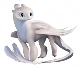
Ugly,lazily made abomination, literally reminds me of bird poop.I find it funny when some HTTYD fans spergout whenever you say anything remotely negative about Light Fury
No. 351036
File: 1706143396427.jpeg (278.91 KB, 1210x726, IMG_2200.jpeg)

>>350731kek you weren't kidding the designs are straight up lifted from pokemon wholesale. like picrel is just mega latios with extra steps
>>351013honestly as a pokemon autist, the concept of pokemon with guns sounds really fun. it's the plagiarism that's an issue
No. 351042
File: 1706146967169.png (788.32 KB, 1080x1739, Screenshot_X.png)
>>351032they've been livid over it, gamefreak bootlicking in overdrive. one autist made a (now deleted) thread that went viral comparing all the designs and some were really hilarious reaches. I'm sure you can imagine what reddit's reaction has been.
this one is just a reply to the aforementioned thread but my favorite about it is how they're both ugly. I don't care about the plagiarism at all as long as the game's fun tbh.
No. 351063
File: 1706160751553.png (191.77 KB, 480x902, Sniper_Mask_29.png)

everytime i see him i want to burn the screen and that's saying something since i love snipers, masked men and suits too.
the fedora and dream-esque face design kills me, i know it's not the worst but i despise this so much.
No. 351165
File: 1706187565396.png (3.33 MB, 1240x2008, IMG_3463.png)
every single character in not only this game but across the whole franchise. and not just the characters but also the design of everything else in all of the games. just zero appeal whatsoever
No. 351344
File: 1706255176728.jpeg (256.42 KB, 1170x1942, IMG_0412.jpeg)
all of the designs from this are bad but she makes me want to alog she looks like an rcdart drawing.
No. 351491
File: 1706306766154.jpeg (11.97 KB, 300x277, Kerry.jpeg)
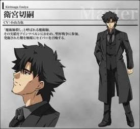
Some might disagree but I always found Kiritsugu's design to be so cringe. The black trenchcoat-cigar smoking-stubble having trinity feels so tryhard—literally baby's first 2edgy4me OC vibe.
No. 351503
File: 1706309518938.jpg (41.85 KB, 512x451, gungod.jpg)
>>351491I believe the dead eyes and brooding attitude are what make him feel so tryhard, he always felt like emo Spike Spiegel to me.
His design itself is most likely taken from Gun God, the main character from one of Nasu's previous works (even their love interests look similar), and Gun God is most likely based on Kaji from Evangelion which was Nasu's biggest inspiration back then.
Sage for type moon autism.
No. 351739
File: 1706409327512.png (329.29 KB, 541x403, DeathWolfPussInBoots.png)
He looks like some emo 10 year olds edgy furry OC from Deviantart,the long snout looks so stupid too.he wasn't scary at all just terribly try hard.
No. 351740
File: 1706410473786.jpeg (760.03 KB, 1600x1200, IMG_7283.jpeg)
Those goggly eyes staring into my soul disgust me. Every facial feature being crammed into a perfect rectangle is disgusting, why do they have no necks? Why do the legs just stick out from nowhere? The Simpson-like side mouth, the nose so up high when cute dog snouts have nose+lips close together… they way they run around like wind up toys made up in hell. I can’t for the life of me understand why anyone finds those cute. I like that the main characters are females, that’s it. Such an eye-sore.
No. 351756
File: 1706422826487.jpeg (120.58 KB, 651x1000, IMG_6852.jpeg)

just everything
No. 351851
File: 1706476970113.png (433.23 KB, 1014x1058, Saint_Peter.png)
This is supposed to be Saint Peter BTW why does Viv love white twinks so much?
No. 351965
>>351739iterally why wasnt he a ram with a skull head. would have been so much more swag
>>351740i agreed with this until i watched them in motion, idk how but it works for me
No. 352053
File: 1706560681298.jpeg (62.77 KB, 720x900, GBfa3GcaYAAJxpZ.jpeg)

>>350111>>350113I don't see why she couldn't have had some goat features especially horns since she is supposed to be a demon princess after all.Vivziepop is just shit at character design.no wonder Charlie gets redesigned a lot,wasted potential.
No. 352615
File: 1706791447477.jpg (239.33 KB, 965x1292, GEiujGNXEAA9_PU.jpg)
No. 352796
File: 1706838200662.jpg (52 KB, 408x540, Polar.jpg)
Imagining having a virtual singer that's lame and basic and also super unoriginal and forgettable. absolutely soulless in every way.
No. 353522
>>352615How hard is it to give Harley pants?
>>351852You arent wrong. it's so cringe
No. 353563
File: 1707089446950.png (931.4 KB, 820x1198, 1000014552.png)
I hate the characters in Splatoon, they look like speds and have that incredibly obnoxious family friendly Nintendo games design.
No. 353582
File: 1707094084284.png (116.34 KB, 550x545, Untitled.png)
>>353563i thought all these designs were adorable when i first saw them, but then of course, moids happened and made everything associated with them smell like rancid cum.
also some of the designs give weird vibes.
No. 353584
File: 1707094431155.png (2.79 MB, 5079x1455, bf013f9204ac97dcc1c15632b4700b…)

Boring,overrated,ugly shitty cookie cutter trash.they literally all have the same faces and bodies barely any nuance.I honestly don't know which ones are worse this or Hazbin.I found it hilarious how much people especially smelly man children praised these designs for being either unique or good.
No. 353586
File: 1707095767354.jpg (191.77 KB, 1280x720, maxresdefault.jpg)

>>353584Samefag, incoming sperging I could shit on these designs all day it's just so pathetically lazy and boring the creator didn't bother making them stand out just some basic anime girls slapped with horns and tails nothing really screams demonic from them.Helltaker designs make Hazbin designs look amazing in comparison.
No. 353608
>>353587dev is supposedly color blind but that doesn't stop the art from being shit
>>353584the moids hazbin really
No. 353700
File: 1707132881874.gif (502.66 KB, 500x384, 1691011416201.gif)

>>353522Her original look was iconic, nothing else compares.
No. 353944
File: 1707196586264.png (640.97 KB, 273x600, Valkyrie_DD2.png)
No. 353986
File: 1707221978493.jpg (113.72 KB, 1280x720, maxresdefault (2).jpg)
These things used to creep the shit out of me as a child
No. 353989
File: 1707222964641.png (121.82 KB, 300x301, 12.png)
I hate this cartoon. It was ugly and gross
No. 354003
File: 1707229216460.jpg (160.04 KB, 954x953, ds.jpg)
I think the design for Higgs in Death Stranding 2 is so ugly. I hate the really bulky armor with the codpiece thing and the hair and makeup. The makeup would have worked on a character that is actually hot, he’s not. The only part I like is the intestines viewable through the armor.
>>353944It’d still be a shit lolibait design but they could have at least made the leg armor metal match the gold buckles kek.
No. 354013
File: 1707231615573.jpg (22.5 KB, 889x580, brandon-lee-the-crow.jpg)
>>354003>>354006The design pays homage to The Crow
No. 354014
>>354003This nona
>>354013 is right, but his design being an homage doesn't change the fact that it's hideous. As for the chunky android armor, I think it may be Kojima's niche fetish. It showed up in Metal Gear Rising, too, and that was released a decade ago. He's clearly been attached to the concept for awhile.
>>354006It
triggers insufferable Redditor moids when people say that he looks like the Joker, so you should keep doing that.
No. 354020
File: 1707233559868.png (210.6 KB, 972x333, HUKGm00.png)
No. 354069
File: 1707241060612.jpeg (169.93 KB, 1191x751, 887AE19A-43A3-48EC-ADDB-6A52E8…)
Thank god this shit finally never happened
No. 354095
File: 1707249122748.png (531.27 KB, 494x838, 1707248040720.png)
this looks like something a teen boy would find cool. considering that's the target audience for this franchise, i'm not too surprised kek. very ugly and boring design though
No. 354104
File: 1707251045445.png (158.06 KB, 360x535, Zero_Suit_Samus.png)
>>354095>>354099She's actually iconic but zero suit Samus belongs itt
No. 354109
File: 1707252781218.jpeg (58.3 KB, 750x399, A21BD7D1-ED2F-4DF3-9E4A-65A456…)

>>354104Shit tastes, her shoes are blasphemously ugly
No. 354155
File: 1707263121434.gif (403.61 KB, 500x200, D360CFE1-E9FD-45FB-9618-AAC0B6…)
>>354069Wtf I thought the project didn't come to achievement but in fact it did, I can’t believe Tezuka production validate this bullshit. I'm angry like Chris Chan during the Sonic Boom incident now, who’s I’m gonna pepper spray huh ?
No. 354162
>>354016You're right, my bad. The design of his armor just reminded me of Sundowner and Jetstream Sam.
>>354041 this, on the other hand, isn't true. MGR was released in 2013, and Kojima left Konami shortly after the release of MGSV in 2015.
>>354104I'm not fully opposed to ZS Samus wearing a gymnast-inspired outfit, but her retarded sci-fi Bayonetta heels in Ultimate don't match that concept at all. I also hate how much her colors clash.
No. 354180
File: 1707268211877.jpg (196 KB, 1080x1440, 232158065.jpg)

He man from that 3D Netflix cartoon I know the show is highly stylized but he's built like SpongeBob his tiny head doesn't help at all he looks soo bad in motion
No. 354207
File: 1707274923496.png (523.66 KB, 460x1064, Rebecca_Anime_Concept_Art.png)
She's 16
No. 354208
File: 1707275010557.gif (1.15 MB, 492x319, giphy.gif)
>>354207This gif of her tho lmao
No. 354978
File: 1707607549038.png (2.28 MB, 1480x1679, Sf6-lily.png)
Her whole look is a mess especially the hair and shorts shorts her face is also uncanny valley.
No. 354981
File: 1707609376824.jpg (112.4 KB, 594x900, F2Y-NMVXoAAD8uF.jpg)
>>354208I've been a lifelong weeb but never got into one piece and still don't understand why everyone likes it. It's hideous
No. 354996
File: 1707612076806.jpg (55.39 KB, 1000x563, MV5BOTIzYjlkM2QtZjk1Yy00YWVjLW…)

>>354981Extremely hideous
No. 355099
File: 1707662355452.png (4 MB, 2372x1867, shame.PNG)
>>354981I've never seen OP and I think the pretimeskip designs are better. Nami used to have a really cute outfit and wasn't shaped like a badly shooped insta baddie.
No. 355100
File: 1707662544153.png (4.74 MB, 1274x1899, cahncept.PNG)
>>355099Even more tragic when you find people posting her concept art.
No. 355126
File: 1707671844407.png (186.99 KB, 398x400, Screenshot 2024-02-11 171856.p…)
>>355100Sanji also used to look hotter than the ugly perverted french mutt he is now
No. 355147
File: 1707676603263.jpg (53.98 KB, 738x412, EreIm2yXUAIIbO4.jpg)
>>355129moid author doesn't care
No. 355365
File: 1707744766186.jpeg (227.1 KB, 945x2048, coomer gotta coom.jpeg)
kek it's hilarious how this game designs are so shitty even by coom standars. Such generic boring designs. That ugly npc kpoop girl will never be 2B/bayonetta levels of recognizable coom waifu.
No. 355372
>>355365I actually enjoy coom outfits unless they are plain stupid because it's something i can't see irl and i'm bi but god since i've seen crumbs of this game years ago i was baffled.
She looks so boring, like a random ponytail girl created in
honey select to make gross monster bestiality porn kek.
I guess that i can appreciate that she looks like a human and doesn't suffer from vtuber special eyes/multi-colored hair.
No. 355405
File: 1707759076412.png (1.07 MB, 2048x1074, xBtEtdE.png)
No. 355473
File: 1707781642101.jpg (280.52 KB, 1004x1069, 20240212_194821.jpg)

her old character design was just an oversized sweater and nothing else, i think she went too far in the other direction with this eyesore. Also no wonder the old one had overly long sleeves she can not draw arms to save her life
No. 355652
File: 1707832232464.png (92 KB, 566x518, Efjnv5jWoAMIkvb.png)

>>355473I'm surprised to see her featured here but I agree with you anon, her old design was a bit better because of how simple it was. I'm bias though since I think oversized sweaters will always look cute but her redesign just has so much going on with it. Seems she was trying to make her look more like an IDOL character but it just doesn't really "hit".
No. 356433
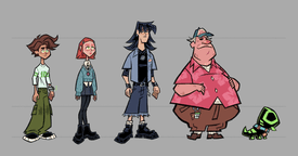
File: 1708050164539.jpg (130.14 KB, 1280x720, maxresdefault.jpg)
Overrated,ugly and they all look like they belong in different shows especially Pomni and Zooble.Nothing about their designs tell me that they're in a circus except for Kaufmo he's the only one designed well.
No. 356441
File: 1708052276473.jpeg (70.29 KB, 645x475, IMG_6928.jpeg)

some of you guys have 0 taste, whenever I see anyone praising these abominations, I gag. Your nostalgia goggles are working overtime.
No. 356600
File: 1708099501005.jpg (194.96 KB, 1024x640, sirenix.jpg)
>>356568I agree about enchantix, but sirenix being much better? It's all overdesigned, ugly, copy-pasted garbage. Maybe even the worst designs in the show.
No. 356622
File: 1708111103041.png (1.44 MB, 667x933, Cap.png)
No. 356629
File: 1708114443041.jpg (669.49 KB, 1046x1450, Winx.jpg)
>>356600i've always liked bloomix the most
No. 356635
File: 1708119649531.png (2.13 MB, 1280x960, IMG_1133.png)
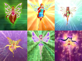
>>356600I feel like a lot of winx transformations of the girls lose their individuality. They’ll never top enchantix and they know it too. I like it because they actually look like faeries.
No. 356659
File: 1708126090429.png (1.09 MB, 907x1845, Raggie (1).png)

>>356433So ugly and uninspired. The worst for me is the ragdoll character, I fucking hate the way her feet and hair look especially, it's so lazy. And the main character of course looks disgusting
No. 356715
File: 1708153355851.png (486.35 KB, 720x480, E_0wV25VEAI9g8p.png)
>>356659Cheap,shitty rip-off of Molly Coddle.it isn't inspiration it's blatantly copying the design in such a lazy way sorry for the sperging but it's true I agree with you.
No. 356810
File: 1708201819892.jpg (203.78 KB, 607x861, 942558_465951466816788_1783589…)

No. 356860
File: 1708212345391.png (Spoiler Image,3.01 MB, 6000x2250, Zone-tan.png)
Edgy cringe coomer OC. Probably smells like rancid cum and glue scented lube mixed with pungent Bath and Bodyworks perfume to mask the stench.
No. 356936
File: 1708259811182.png (373.38 KB, 398x1066, latest.png)
never been interested in the games so i do not know, can final fantasy nonnas tell me what the appeal of tifa is outside of her cute face and sex appeal? (the main 2 things i've seen people talk about regarding her online for years upon years) i've always found her outfit so damn stupid
No. 356950
File: 1708268641515.jpg (472.8 KB, 3190x3115, vomit.jpg)
>>299904I guess who approved this garbage.
No. 357911
File: 1708655731399.jpg (46.1 KB, 800x1237, Despicableme2-lucywilde-kriste…)
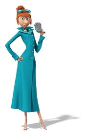
Her design is not that bad but it's extremely boring and forgettable I mean she's the wife of Gru.the high heels have to go tho
No. 358106
File: 1708732832857.jpg (160.06 KB, 1200x800, justice_league_box_aspect_rati…)
Not just awful but visually grotesque and hideous I guess his first design wasn't bad enough
No. 358281
File: 1708821612323.jpg (76.02 KB, 1200x900, palworld-lovander.jpg)
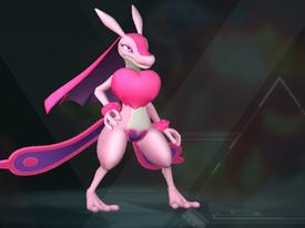
Worse than Salazzle,it looks like some shitty scalie OC from a furry porn site.
No. 358425
File: 1708891427130.png (611.18 KB, 545x960, F8iMG9l.png)
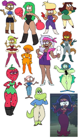
I hate Ian Jones-Quartey.
No. 358787
>>358425I followed someone who openly hated on this show's designs while it aired and she got a bunch of shit for it because "who cares" "it's stylized" "it's just a cartoon" "a woman designed these though" I wanna say I hope she feels vindicated but honestly I still don't think this show got enough hate.
Lost some respect for an artist I admired (it was a tif anyway) because she also defended the hideous designs with "well a woman designed them sooo" I hate cartoonfags so much lol. The moids on the crew (including Ian) were typical coomers who got off to (art of) sexualized teenage girls in thongs but of course fans will never see them as creeps or see the correlation between creepy tastes and coomer designs.
No. 358900
File: 1709074577750.jpg (199.19 KB, 1000x703, 6501192e41794.jpg)
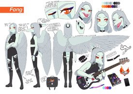
It's not that awful compared to the rest of the designs here but she looks nothing like a dinosaur (pterodactyl)and more like a dolphin.why does she have her wings in the back rather than having the wings on her arms???what a weird design choice yeah I know I'm gonna get hate for this
No. 358914
File: 1709079453109.png (1.7 MB, 2118x1300, Fang_Pass2.png)
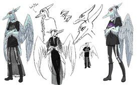
>>358900Her beta design is 10x better than what we got,she actually looks like a dinosaur in this one.they made her too humanoid in her final design .
No. 358916
File: 1709079802460.jpg (2.17 MB, 2608x1952, Amazonas-Flussdelfin_Orinoko3.…)
>>358903>>358912I always thought she was one of those long snout crocodiles,a Gharial or a River Dolphin guess I was wrong.
No. 358927
File: 1709084724628.jpg (174.93 KB, 1240x1754, D2maZEgXgAAIBkn.jpg)
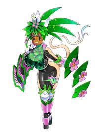
Horrible and hideously grotesque in every aspect.
No. 359104
File: 1709154539817.png (271.68 KB, 1417x315, Steven_Universe.png)
>>358425Shit like this makes me appreciate Steven Universe even when people bash on this show.
No. 359107
>>358921More like brainrot and twt does. I hate the they/them bullshit so much.
>>359104Still so hideous
No. 359113
File: 1709157281527.jpeg (72.66 KB, 686x386, IMG_1229.jpeg)
>>356936I hate the godawful swimsuits the girls wear in the new FF game. The ruffles on tifa’s top annoy me so much.
No. 359114
>>359113Aerith's swimsuit doesn't look that bad,
it's kinda cute tbh, but god wtf is going on with Tifa's? It's like they wanted it to be coombait, but added too much of everything.
No. 359118
File: 1709158305589.jpg (103.05 KB, 800x450, 800px-SO_Promo_screenshot_20.j…)
I've always been neutral on Splatoon itself even in spite of the always coomerish fanbase but the outfits in the dlc lean into it way too hard. Too much emphasis on the lower half of the female character where it's obviously intentional on an otherwise childlike body, it just feels gross
No. 359135
File: 1709164636880.jpg (637.44 KB, 1875x1561, D_y9sT8UIAESG_f.jpg_large.jpg)
>>358425They had more body diversity than most cartoons imo
No. 359143
File: 1709165376734.png (343.32 KB, 525x653, Agent_8.png)
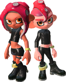
>>359118>>359120The male is absurdly cheeked up too, I was surprised but not in a good way despite enjoying the DLC so far.
I would be fine with this outfit otherwise, it's another spin on the octarian army aesthetic and Agent 8 (picrel), which is a little sexualized and edgy anyway, but there was no emphasis to asscheeks in their previous game…
No. 359152
File: 1709167303628.jpg (522.73 KB, 3464x3464, duyijca7ch1a1.jpg)

>>359143The reason for that is because the characters aged, meaning Splatoon 2 Agent 8 is a teen and cheeked up DLC Agent 8 is the adult version. Picrel shows the difference between your character in Splatoon 2 and 3 (inklings are even smaller and stockier in Splatoon 1).
I get your point and I agree, DLC Agent 8 is too sexualized; this isn't to justify the change in her character model, it's just to give it some explanation and context. I too wish they would've not exagerated her ass as much
No. 359154
File: 1709167497843.jpg (74.71 KB, 443x377, Tumblr_l_642594648497300.jpg)
Sorry for samefagging but since we're talking about the Splatoon 3 DLC: Acht looks amazing and I love her design… until the glasses are off. Jfc
No. 359158
>>359154I like her goofy ass face, but I understand why you wouldn't enjoy it and its gap moe.
Off-topic, but what's up with her gender? Is she the japanese equivalent of a themlet in the original?
>>359156I don't find them very hot, but I think the octolings being a little sexier adds to their cool appeal.
No. 360589
File: 1709776933113.png (2.33 MB, 1920x2457, Julia-chang-tekken7-artwork.pn…)
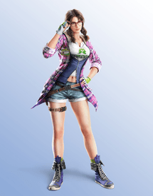
Awful just awful I cannot even understand why they made her look like a teenager what's that thing on her waist??a jacket?? nothing on her outfit goes together and everything clashes instead.
No. 360615
File: 1709792230154.jpg (726.87 KB, 1637x1752, 1000006392.jpg)
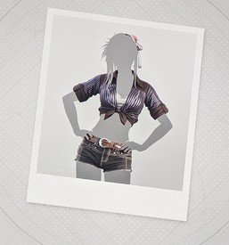
>>359113The alternative outfit for Tifa is somehow even uglier. Sleeves and DENIM? For the beach?
No. 360627
File: 1709797969362.png (380.01 KB, 385x967, DFFNT_Tifa_Lockhart_Costume_02…)
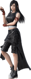
>>358347Her advent children outfit was better, although I never liked the shoes
No. 361012
File: 1709953120662.png (1.32 MB, 1280x1599, zhen__kung_fu_panda____transpa…)
Another boring,uninspired,shitty fox furbait that looks nothing like a Kung Fu Panda character.
No. 361016
File: 1709953535066.jpg (624.19 KB, 676x704, Chameleon2.jpg)
What an ugly,cluttered villain design.even her name "The Chameleon" is lame as hell I think she's so supposed to be more stylized than the others?but all those unnecessary details look like shit and is jarring to look at.no wonder she was hard as hell to animate.
No. 361022
File: 1709954081142.jpg (93.3 KB, 500x664, tumblr_inline_mfw18dboTF1rund2…)

>>360589she got that disney channel drip
No. 361260
File: 1710049800657.png (5.44 MB, 3681x4523, Kasumi_Yoshizawa_(Violet).png)
Coom design. Also isn't her character and personality as of a Mary Sue?
No. 361263
File: 1710050599031.png (701.57 KB, 2048x1888, P5S_Ann.png)

>>361260Her too. Both are high schoolers btw. Funny how this dominatrix design pretty much defeats the whole purpose of her struggle against the pedo teacher who's all into her.
No. 361303
>>361300>Kasumi was so badly integrated into the gameI thought Marie was worse. At least they made Kasumi a student in the same school so she had a much better pretext to be in new cutscenes before the new arc starts, even if I still can't bring myself to give a fuck about her.
I liked that her backstory made her look like such a selfish, retarded asshole that it was hard for me to even notice I was supposed to root for her kek. Marie was pure cancer, they didn't even try to hide her Mary Sue status. Atlus does that with most of their new editions, it's not just Persona. SMT5 Vengeance has a new girl who's from another school and she may or may not be a saint just like Tao. SMT3 Nocturne added Dante, who's replaced by Raidou and Gotou in other versions. DeSu2 on the 3DS added a new girl who suspiciously looks like Yamato but I haven't played that one until the end so I can't tell you if she's as bad as Marie and Kasumi. Catherine Fullbody added Rin, a new love interest
who's actually a guy and while I find that case way less worse than the others it still adds a few cutscenes before Rin's new routes and some people did say that it ruins the pacing of the story a bit, etc.
No. 361318
>>361294Kek I also can't stand her. I can handle Ann's design because at least her character isn't bad personality-wise (I love how optimistic and how she's a good friend in the game) but fucking Kasumi oh my god. Why did they make her design like a genderbent version of Joker? Everyone has their unique thing but she has to have the copy of the protagonist. She has her own (long ass) scene in the prologue that makes her look like a badass while every other time in the game she's a pathetic selfish loser, and you know what it would be fine if she was and if that was addressed in the game, but no everyone kisses her ass and is fine with what she does and how she behaves
so she starts off as the mary sue, then you discover she's a loser who's skinwalking her dead sister, then you find out her biggest wish isn't to bring her dead sister back to life (despite her sperging about how important she was for her) but to become her, then she goes through her character arc where she supposedly understands that she's okay being herself, then she goes back to looking and behaving exactly like her dead sister again and a perfect girl uwu kek what?. Then the scene where she's introduced as your school mate she does a dramatic tryhard gymnast move and everyone is wooed (don't even get me started at her animated scene during the school festival thing). THEN on top of it they try to push her as this rival/equal figure to Joker together with fucking Akechi who actually has the whole game and a lot of reasons to be his actual rival, because he has plot relevance and is his actual rival, like he's the antagonist for more than half of the game while she appears here and there to do her mary sue things and shares only a palace/dungeon with the main team. You could also write her off completely and the story wouldn't suffer from it because the character that's actually important for the third semester is Maruki who was added in well imo.
No. 361323
>>361318>Then the scene where she's introduced as your school mate she does a dramatic tryhard gymnast move and everyone is wooed (don't even get me started at her animated scene during the school festival thing). Oh my GOD
nonnie I had completely forgotten about that school festival scene, it's unreal how much it made me cringe. For the first half I thought they were setting her up to be a villainous yandere because she was so suspiciously perfect and only appeared to meet the protagonist but no, that's just how her character was supposed to be and you were meant to adore her for it. It's archetypal Mary Sue writing even down to her flaws being "she's too perfect and everyone is jealous of her" and "she's kind of shy and clumsy
because her own clumsiness got mixed up with her dead sister's gymnast skills and absolutely not because they were trying to make her soooo adorkable". Like I can't believe they even added that ridiculous "she has godlike metabolism so she can eat all the food she wants yet stay thin and petite tee hee" thing too, it's as if they wanted to deliberately piss players off. The payoff was worth diddlysquat because as you said
she goes back to just skinwalking Kasumi anyway but basically "being an improved version of her" so what the fuck was even the point of her entire arc?
>THEN on top of it they try to push her as this rival/equal figure to Joker together with fucking Akechi who actually has the whole game and a lot of reasons to be his actual rivalRemember when she appeared in Metaverse and immediately upstaged Akechi (who had been an assassin in his Loki form for YEARS before the Phantom thieves even existed) in combat despite apparently being a complete newbie to fighting? I honestly can't understand what they were going for with her and I can't get over the collective brain damage in the P5 community celebrating her as the best girl. I wanted to be mean to her all the time but all the given dialogue choices were just flattering her kek.
No. 361585
File: 1710118250252.jpg (117.87 KB, 1920x1080, MV5BNDExYTFlNjctYTZiZi00YjZlLT…)
The knight guy is okay I guess but the rest are awfully bad why did Dreamworks approve of this?
No. 361593
File: 1710119402584.png (2.73 MB, 2191x2800, Reina.png)
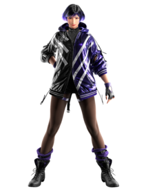
She looks like she came out of Twitch.I will always hate the lazy,uninspired e-girl look a lot of game designers are giving to female fighters.we really didn't need an Asuka clone also her color pallete is rather bland.
No. 361728
File: 1710170801669.png (165.19 KB, 260x562, 260px-Jessica_Albert.png)
Started playing Dragon Quest 8 and something about Jessica sets off my fight response. Something about the color scheme the context for the outfit change ("Fuck you Mom I'm rebelling") and her tits just being out. She's supposed to be 17.
No. 361900
File: 1710213000932.jpg (52.7 KB, 478x641, 1000007410.jpg)
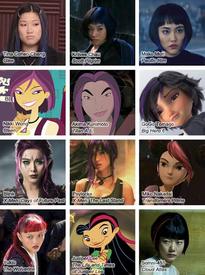
>>361593Reminds me of this trope with asian female characters having short hair and colored strips
No. 362615
File: 1710449385963.jpg (25.72 KB, 600x337, Übel.600.4100023.jpg)
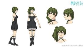
Her design is so e-girl coded to me and I can't stand it. Naturally moids are obsessed
No. 362723
File: 1710470353566.jpg (28.95 KB, 480x360, chop_socky_chooks.jpg)

I have always thought their designs were horrible and looked nothing like chickens.it aged like shit too.
No. 362783
File: 1710494121430.png (93.59 KB, 400x163, JQXAWDp.png)
No. 363705
File: 1710807346305.png (13.24 KB, 169x275, 1710807151743.png)

All FNF designs are bad but this one's really ugly and it's just another stupid donut steel Mary Sue designed by a coomer.
No. 363706
File: 1710807537483.jpg (1.04 MB, 2000x2906, MV5BOTMxMTkzMTk5Nl5BMl5BanBnXk…)
What were they even thinking?the entire cartoon was a mistake.I fixed a typo but yeah who approved of this?this was a kids cartoon
No. 363866
>>306820This design got partially reused for UDG Komaeda kek.
>>309937DR1 was supposed to be turned fully 3D at some point, I imagine that's why they redesigned it to look less detailed, since it was a PSP game. Komatsuzaki wrote in artbook about adding details to Naegi's hoodie from behind because the player would see it, which was never a thing in actual game, and you can see from DR1 sprites that they just posed 3D models and added hand-drawn details. TCRF had some screenshots with posed 3D models left over that they used for CGs.
>>309797I actually like the idea of Grusha (him actually being rude jock despite the design) but his clothes are pretty ugly kek. I mostly like seeing him from specific artists that draw him more handsome.
No. 364341
File: 1710989736252.jpeg (159.57 KB, 865x1355, 5B133086-434C-4757-804F-016CB6…)

the big lips and weird face, the ugly green hair with that awful white headband, giving her a huge ass despite the fact she's supposed to be skinny and awkward looking. what the hell are those shoes? strive continues to disappoint.
No. 364467
File: 1711047569692.png (620.93 KB, 709x960, Ggxxs_cs_ab (1).png)

>>364341Thank GOD I'm not the only who's pissed about ABA's new design. It's so bafflingly ugly. Her old design in picrel was so cool to me, she was always my favorite gg girl when I was younger because she was so grungy and awkward. I feel like every returning character in strive has just been redesigned to appeal to normie porn artists on twitter.
No. 364669
File: 1711126352302.png (672.11 KB, 600x810, zPqZyBm.png)

No. 366192
File: 1711653936890.jpg (78.08 KB, 957x546, original ocs donut steel.jpg)
No. 366552
File: 1711813714526.jpg (452.77 KB, 1803x1150, fcf506e541159d2430b48c00832114…)

Such an original OC concept
No. 366630
File: 1711841628783.jpg (94.27 KB, 616x353, capsule_616x353.jpg)
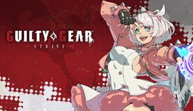
>>364694The moid that currently does the art has never seen a pair of breasts in his life
No. 366637
File: 1711843519501.png (5.04 MB, 2090x2258, Zhen.png)
This movie sucked anyway but seeing her concept art makes me sad because she looked so cool! She actually looked like a thug and not shitty furry bait, also the final design doesn't even seem to belong in kung fu panda
No. 366640
>>366637idc about kung fu panda but that concept art is amazing
>>366630is he gay? these arent even sexy in a "big perky boobs" way bc they look so unnatural
No. 366650
File: 1711849597257.png (379.97 KB, 927x940, MissCircleStanding.png)
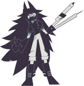
This is so painfully try hard and ugly just like the rest of the shitty designs.
No. 367252
File: 1712084504788.webp (82.56 KB, 474x913, IMG_0610.webp)
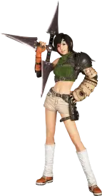
I hate this clusterfuck of a design.
No. 367259
>>367252What the fuck is going on below the knee? Kek
The more I look at the entire character the more jarring and odd it looks. Why does the fanny pack have to wrap around the bare thigh? My leg hurts just looking at that and it makes no sense, that strap is completely useless. What's with that weird headband thing that just disappears into her head? I can't tell what vibe/time period/character type they're going for at all. I usually like a mix of techs and time periods (think steampunk) but this misses the mark for me.. Those damn shoes with that single-armed fat armor (??) and that weird ass giant sharingan motherfucker. Offputting as hell.
No. 367261
>>367259>What's with that weird headband thing that just disappears into her head?It's just behind her bangs, it's some stereotypical ninja headband. Same shit with the big shuriken she's carrying.
>What the fuck is going on below the knee? KekSocks like this were trendy in the 90s with teenage girls in Japan and FF7 is a 90s JRPG.
No. 367298
File: 1712098445253.png (2.89 MB, 1626x2510, Alisa_29.png)
>>361593I guess that she would have looked ok only in the concept art, she looks so boring and i agree, she looks like a Twitch gijinka but i'm surprised no one mentioned what they've done to Alisa? This hurts my eyes.
No. 367299
>>367260Fair and I've never played FF7 but the design just looks so bad it enrages me. It's so damn asymmetrical too, like if she wasn't in that pose with the weapon on her left shoulder it would be so right-heavy and awkward looking.
>>367261I can assume what they're supposed to be and what inspired them, but that doesn't make it not ugly af. Just my opinion of course. I like plenty of other FF and Kingdom Hearts campy designs
No. 367313
File: 1712100982920.png (395.45 KB, 640x750, seith_goddess_of_hope_slide.pn…)
My friend sperged about Fire Emblem and i still can't forget the awful design of the characters in this part, she showed me some of the cutscenes too and they were all so coomerbait and made no sense. I know it would be even more coomery but maybe if this character didn't have that weird ugly grey skintight suit under those clothes it would look better.
No. 367317
File: 1712102070856.png (746.85 KB, 514x1188, IMG_5141.png)
>>367313It makes me kind of bummed that Fire Emblem became so ridiculous looking, I liked it as a kid because the designs were so grounded besides the anime hair colors and short skirts. I wonder if shit like the Fate franchise is to blame for popularizing gachas and waifushit and having tons of guest artists making character designs. These don't even look like they're from the same franchise.
No. 368501
File: 1712444627691.webp (81.07 KB, 1000x791, IMG_2116.webp)
>literal embodiment of lust
>looks like shit
he has 0 sex appeal. why, vivzie?
No. 368540
File: 1712451727897.png (1.27 MB, 880x1000, image_2024-04-07_110037408.png)
>>368501To be fair actual Asmodeus is supposed to be ugly as shit but the stupid rooster theme his character is supposed to have doesn't work and looks terrible. This design should have be scrapped
No. 369246
File: 1712663276558.jpg (Spoiler Image,70.49 KB, 596x1181, dqb79vinha3b1.jpg)
Cammy's old outfit has always look so disgusting and coomery. She's not wearing any underwear either. How the fuck do you even fight while constantly having a wedgie between your ass and avoid slipping your coochie out even by "accident" down there? She has a serious demeanor but not with that retarded outfit; going out fighting with your skin that exposed to vulnerability and unashamed for how porny it looks. Bringing this hideous shit back is a fucking mistake and deserved to get to canceled. God I hate moid coomers so much.
No. 369407
>>369350Eh i just don't like how she looks like Android 18 with a casual boring outfit, i know this one is even more simple but the new one has such very boring colors and clothes that i've seen around any kind of character, i'd prefer the silly green leotard with red beret, it's more unique.
Also i really don't like the haircut, i think that it's cool that she can look badass with super long twinbraids instead of looking like Anne of the green gables so it weirded me out when they made her look so generic.
No. 369417
File: 1712702546462.jpg (254.04 KB, 801x1285, Cammysf6.jpg)
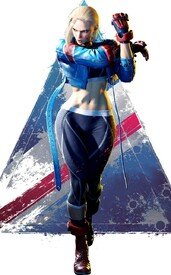
>>369246>>369394They gave her a redesign in the new game that you might like more. Though as
>>369407 points out, it's less unique than the old one.
No. 369430
File: 1712710839633.webp (179.87 KB, 900x1060, 0611a0da-11f7-4fa5-b41b-5eb9f7…)
No. 370032
File: 1712966081250.png (251.61 KB, 1200x923, 1200px-PMTTYD_Flurrie_and_Hear…)

She kinda looks like Ludwig which is weird.
No. 370848
File: 1713168088424.png (101.86 KB, 340x476, 1000002352.png)

No. 371337
File: 1713292822767.jpg (270.57 KB, 1228x1282, GIJFN7-aEAEOSOh.jpg)
No. 371424
File: 1713320345061.jpeg (1.09 MB, 4096x3322, FNMoP7uUUAE9_YH.jpeg)
Jeff The Killer but for retarded,fat gendies.
No. 371425
File: 1713320510781.png (52.19 KB, 300x475, Peter_(YB).png)

The least they could do is give him some hair
No. 371454
File: 1713342634724.png (3.17 MB, 1826x2733, MM_Happy_Mask_Salesman_Artwork…)
>>359158No, the japanese dub made her a tomboy who uses boku, every other translation has her as female, but of course amerifags had to be quirky and made her a themlet
>>364467>every returning character in strive has just been redesigned to appeal to normie porn artists on twitter.That and gendies. I miss the edge of 2000s designs. New ones are bland.
>>371424Couldn't have said it better. I feel like even husbando-bait characters have to be ugly to an extent because modern gendie fangirls are insecure as fuck
No. 371847
File: 1713478361497.jpeg (195.72 KB, 2048x1151, IMG_3058.jpeg)
She is suppose to be a handsome girl, but she has this retarded coom face you see in hentai. Nothing about this ugly overly inbred pug face design is handsome. An absolute disgrace to all handsome women.
No. 371878
File: 1713491910201.png (369.09 KB, 1080x1710, 1000019107.png)

>>371425I get it, he looks slightly less retarded with a nose and some generic hairstyle. What is the point of the game anyways? I've read that he's a yandere, but is he? I don't get how anyone can look at this character and fall in love unironically.
No. 371881
>>371878Thank you
nonny,he actually looks attractive now.major improvement.
No. 372151
File: 1713572175949.png (1.03 MB, 860x1313, Sly.png)
Fuck it I'm going say this but Rogue's costume sucks ass.I don't care how iconic it is the yellow and green is so ugly It reminds me of vomit and the colors are horribly flashy and clash.they couldn't have chosen another color scheme for her?it's so damn hideous,her boots as well.
No. 372245
File: 1713597016352.jpg (183.7 KB, 632x960, 9032635-power-girl-2-1-50-vari…)
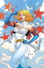
>>372151i could go on and on about ugly-ass "iconic" superhero outfits
No. 372507
File: 1713689423765.jpg (1.37 MB, 1200x1586, bugtopia webtoon.jpg)
I could put any webtoon original here but something about looking at any of these characters pisses me off lmao
No. 372539
File: 1713697935986.png (1.8 MB, 1200x1465, AssassinShutenDoujiStage1.png)
No. 372554
File: 1713706580920.png (703.62 KB, 563x1000, a trillion belts.png)
>>367267Nah I'd argue ff7 has the least cluster-fuck designs compared to the other series. Don't get me started on the spin-offs.
>>367313Along with the coomershit, the worst thing about gatchashit designs are how cluttered they are with details. I think there's a culture of artists who are fucking some dick measuring contest on how much details and trinkets they can shove on a character and brag about how much shit they have to animate.
It extends with vtuber shit as well
>>363671 No. 372618
>>350264Agree on Yelan, never liked her design, but dissing on Furina? That's my pretty princegirl, get out of here. Look at her cute curls. I love her so much. Might be bias though because I love almost every design from Fontaine.
Actually, can you take a look at focalors and tell me what you think of her design? (Furina but with long hair and a dress)
No. 372769
>>372617IIRC the legend is supposedly that she's based off Aoi Yuuki, but she obviously isn't an average Japanese adult lol and she has normal proportions, not this creepy featureless toddler body.
>>371847>However, she has recently been struggling with the gap between her ideal image and physical development.Of course. Certified scrote shit.
No. 373318
File: 1713919652884.webp (44.69 KB, 640x426, 668EDACF-FF8B-448E-9074-E58744…)

this is supposed to be six different characters.
No. 373576
File: 1713989989257.jpg (16.4 KB, 275x512, 372595-32f40.jpg)
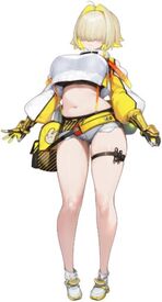
I keep getting this dumbass ad where she shakes her tits and I'm getting sick of looking at this awful design
No. 374179
File: 1714186521018.jpg (33.38 KB, 480x360, hqdefault.jpg)

Obviously belongs here,very repulsive also uncanny valley in a way too.
No. 374393
File: 1714251322628.webp (596.46 KB, 1200x3688, V.webp)

I hate his everything tbh. Design,his urizen for being in the game and gameplay.
>inb4 he looks like Adam Driver
yeah he's ugly too
No. 374397
File: 1714252456341.jpg (1.23 MB, 2048x1879, 20240427_155250.jpg)

character design isn't even that bad, I'm just irked that this is suppose to be a guy. I'm a trapfag and all but I'm into them when they're still phenotypically male and have masculine traits/or are bishounens. this is literally just woman with he/him
No. 374417
>>374395yeah newfags were
>>374397I hate the hiked-to-your-waist underwear design
No. 374462
File: 1714273523654.png (78.71 KB, 660x760, Niffty_Main_Series_Render_.png)

Its funny to me that a lot of people say her design is good or not bad compared to the rest of the Hazbin cast but I strongly disagree.if she's supposed to resemble a bug (or an alien as I heard )where are her bug features?she has Charlie's same white skin and pink cheeks which is not only lazy character design but boring.why does her eye have gradient colors?it looks horrible.why is her hair the same color as her dress?? she's awfully ugly and badly designed too it's that no one wants to admit it because Nifty is their favorite.shes also a ripoff of an obscure demon girl called Saffi from Jimmy Two Shoes.I forgot to add that her eyelash placements literally make no sense.
No. 374599
File: 1714326676359.jpg (93.52 KB, 800x800, alita-battle-angel-epk-ABA_179…)

Literally, who thought this was a good idea???
No. 374673
File: 1714342848916.jpg (132.27 KB, 2048x946, Tumblr_l_48548017361906.jpg)

I'm sorry if he's a brand new Tumblr sexy man but he's a total eyesore.he has way too much of everything,shit looks extremely hard to animate I think the reason why Shred Force never got picked up is because the rest of the budget went to animating this unsightly thing.there are cool ways to make an anthro guitar but this isn't one of them.
No. 374694
File: 1714345730031.jpg (179.13 KB, 714x725, vol 1 chap 5 p 29.jpg)

>>374599as a fan of the manga it is really fucking bad. it doesn't make sense. her eyes aren't abnormally large for an anime girl. its so sad, they could have made a good movie.
No. 374965
File: 1714430907194.png (309.47 KB, 300x878, roboco-san_pr-img_06.png)

No. 375026
>>375010>>372507Yeah, I swear to god I remember this artist being some weird he/him lesbian girl who would also go hard on the Steven Universe critical tag or whatever back in the 2010s lol. I swear I've seen her bugmen before, and she was legitimately unhinged and got into slapfights on tumblr a lot.
I even remember her telling people to watch Word Girl (lmfao) instead of Steven Universe at some point, unironically. It was bizarre.
No. 375217
File: 1714535441473.png (207.62 KB, 358x422, Jojo.png)

>>371878Someone baldify him please.
>>375026Oh, angry birds porn ackee?
No. 375579
File: 1714619666767.jpg (96.99 KB, 1400x1494, 616Laop8uoL.jpg)

Horrendous,even their names are bad.they look so out of place in the movie.
No. 375585
File: 1714622969807.png (165.45 KB, 1280x1504, Rebecca_Edgerunners.png)

Overrated garbage design,very hideous as well.
No. 375591
File: 1714624400945.jpg (75.53 KB, 768x1024, rdzf2mq6bw881.jpg)

>>375579It's weird that they're clearly evoking Betty Spaghetti here, but that they apparently didn't get the rights? I'd be fine with Trolls and Betty Spaghettis being different "races" in the same universe, but they should just get permission to do it instead of filing the serial numbers off like this. I'm sure they could make bank off of Betty Spaghetti tie-ins. It's tacky, I wish I knew what happened behind the scenes here.
No. 375609
File: 1714628629934.jpg (Spoiler Image,270.69 KB, 1920x1080, 1000395176.jpg)
>>374965I don't mind this design considering what she started with, I think they managed to make her look less naked while keeping her character traits. Her first design is horrendous and was posted in this thread before iirc
Speaking of, the first hispanic corpo gen debuted and it looks like this. Posting the full image because I don't want to earn a ban, that's how bad it is kek. Why is that character the only one dressed like a hooker? The only loli characters that go mainstream are the ones with default cute designs like the Touhou girls, La+, Gura, Kanna from Dragon Maid. No one that isn't a pedo coomer wants to be caught dead looking at a picture of a character that looks like this by default. I've seen lolicon anime official designs look less disgusting
No. 375716
File: 1714635446239.png (Spoiler Image,1.67 MB, 1920x2589, Aya_(Anime).png)
>>375609What the fuck kek. Reminds me how baffled I was when this character got introduced late in Kemono Jihen. The manga has female artist too.
No. 375944
File: 1714679691219.jpg (56.72 KB, 640x480, sddefault.jpg)

The original 2D cartoon already looked bad enough but now in 3d?eugh gross and extremely ugly.some things should just remain in 2d.no wonder most kids today watch anime.
No. 376417
File: 1714796679280.jpg (355.29 KB, 934x1211, Miss_Lady_in_Tango_Tangle.jpg)

Modern SpongeBob has always been ugly but why did they make some shitty,ugly fapbait?they knew what they were doing,barely even looks like a SpongeBob character.gosh they should let the show die already.do kids even watch SpongeBob anymore?
No. 376444
File: 1714806206541.png (253.32 KB, 535x281, 075330536085798809d8c9cebb030e…)

>>376434>>376417new spongebob is quite literally a big "fuck you" to stephen hillenburg and all the heart and soul he put into his series. it makes me sick to see it.
No. 376723
File: 1714920969059.jpg (64.62 KB, 720x575, 1618397249950.jpg)

No. 376744
File: 1714925535298.jpg (179.72 KB, 677x1200, hasumi_gym.jpg)

>>375585god agreed, so glad I don't have to see her ugly ass on the timeline anymore. I wonder why scrotes even liked her so much
>>375609what the fuck. also you're right, people act like liking gura's design or whatever is the same as liking this shit when this is what's truly unsalvageable and impossible to like as just a cute girl design
>>376723lmao
pic rel my contribution, her boobs look retarded
No. 376751
File: 1714927514521.png (2.31 MB, 1575x2000, tekken8-lars-render.png)

>>367298Tekken 8 is so over-designed it's awful. At times it gets in the way of gameplay, espcially the traditional outfit for Reina. Sure, you can dress them up in other outfits, but more than half of the customisation options look like ass.
>>373318Honestly I think their faces do look different, but comparing the differences between the women and men, the variety is laughable.
Also I will never forgive them for removing Asuka's neck.
No. 376966
File: 1714995706056.jpg (39.94 KB, 414x743, 940eb674a99a8d10f7d732840228c3…)

Most of Nikke designs are coomer heavy and overall shit. Every time I see this particular character, she pisses me off and her whole personality is a "dom". Yet she looks and sounds like a 8 yr old child.
No. 376986
File: 1715004191186.jpg (56.64 KB, 637x358, download.jpg)

>>376858The wings make no sense too yeah, they're like wings every character from that particular school in the game has for some reason, they never explain it. The boobs are what bothered me the most about the design though, they literally look bigger than her head and the proportions make no sense (why are her waist and legs so small in comparison). Pic rel is a cg in game and makes it look even worse
>>376966Yeah I haven't seen a single cute nikke design, they all look either incredibly generic or like only coomers would enjoy them. Usually with gacha there's still at least a few cute designs here and there even if they have a lot of coomslop. The proportions on that character look retarded, moids love to make female characters with massive legs but somehow keep the rest of them skinny and tiny, the outfit just looks uncomfortable and strange too. One thing I've noticed with men in general is when they make designs they literally don't take how realistic or comfortable it would be for the character into account whatsoever, they just care about the coom.
No. 377337
File: 1715126911877.jpg (9.16 KB, 169x299, images.jpg)

>>377016>>377096Some of the designs look cute and more passable, but a lot of them are terrible coombait. I hate the retarded cunny memes for the loli characters too and it's got one of the worst fanbases I've ever seen, period. Pic rel is another horrible one
No. 382216
File: 1715778001483.png (1.56 MB, 1920x1080, DtWfwGA.png)

No. 382427
File: 1715804600358.jpg (182.15 KB, 816x1146, Profile_-_Embarrassment.jpg)

Movie isn't even out yet and I already hate this fucking ugly,lazily designed thing.
No. 382486
>>382469there's even foreskin… curse you
nonny I can't unsee it now
No. 382487
>>382427This guy is the final boss is shitty big-nosed softboy faggot pixar male characters.
>>382482That's adorable on your part, it's the complete opposite, they hoped he died ASAP so they could squeeze the brand for all it's worth, it's the single most successful thing they've ever made, they're never letting go.
No. 382824
File: 1715919817792.png (706.42 KB, 944x1172, image_2024-05-16_212309761.png)

i geniunely kind of like zestyjesus' tf2 youtube videos but i can't stand the look of his god awful fetish oc jumpscaring me in his videos. i have no idea how this guy actually gets girls.
he has a weird muscle girl fetish and his retarded waifu is asuaka from eva but he has to make a totally new oc to somehow make liking a 14 year old anime girl "morally acceptable." i have no idea what he was on saying she's in tf2 attire.(i do not recommend looking through his twitter likes)
No. 382837
File: 1715922500209.png (1.68 MB, 1500x2100, image_2024-05-16_220626910.png)

>>382824samefag, that chibi didn't emphasize how awfully its designed
No. 382864
>>377337Scrotes over at kiwifarms were so defensive about this retarded design like:
"what, you think every teenage girl is flat chested?"
"teenage girls would totally dress like that if given the chance!"
I hate coomer scrotes so much
No. 383569
File: 1716052634833.jpeg (57.41 KB, 400x225, Magical_girl_squad_assembly.jp…)

Magical Girl Spec Ops has the worst magical girl outfit designs by far. At least the main heroines in Gushing Over Magical Girls' outfits are color coordinated and actually compliment each other. Not a single good outfit here, and when together, they look like a pile of vomit.
No. 384615
File: 1716235246908.webp (46.22 KB, 572x924, 883C38DA-5400-4121-9350-E0B7D9…)

his hair is sooo stupid and ugly. the rest of him looks great it’s that ugly fucking hair
No. 384720
File: 1716250821545.jpg (83.9 KB, 1000x1250, samantha_3.jpg)

>uncannily realistic
She looks AI generated lmao also the Dorito chin.very retarded of Samsung to make her only to not ever feature her ever again I guess because of the Internet's strong reaction to her.
No. 384875
File: 1716281362743.png (966.84 KB, 956x1026, Kalk.png)

No. 384880
File: 1716281853832.webp (137.45 KB, 910x1865, Character_Lyney_Game.webp)

hes ugly
No. 384913
File: 1716286562047.webp (368.49 KB, 1080x2160, CB8F7836-B888-4056-A40E-6A68E0…)

>>384881she is a cat girl with her underwear showing and a boob window who is implied to be a
victim of sex trafficking, he is not more sexualized than her, plus magicians assistant has always been a huge fetish among males. be real, but i would say he is close to being equally sexualized as her.
No. 385556
File: 1716413241632.jpg (578.41 KB, 1365x2048, FzvtYjHacAAf9CN.jpg)

I saw yesterday a repainted monster high that looked extremely retarded only to discover that is from a Melanie Martinez song and that this is an actual character design kek
seriously what the fuck is this. Not a single photo of this looks good
No. 386701
File: 1716752881469.webp (19.38 KB, 222x500, IMG_3818.webp)

so bad, it’s all I remember from the dlc
No. 387170
File: 1716871959657.jpg (107.29 KB, 1920x1080, MV5BZjQ3ZjUzOTgtNzk1Mi00NjVjLT…)

No. 387463
File: 1716973741697.png (1.18 MB, 1986x2474, ransa.png)

He's an okayish husbando but his design is so hideous.
>Chose the most annoying shade of blue
>The full body suit with its white outlines look ridiculous
>His hairstyle is retarded
>Eye searing red spear doesn't do anything good to contrast the blue motif.
I hate it so much.
No. 387556
File: 1717008241486.png (292.17 KB, 654x610, modal_17.png)

>>387463Here is the superior Lancer.
No. 387824
File: 1717100197700.jpg (15.07 KB, 437x414, 273562938_1622590188101007_562…)

More like a character design trope, but I hate the weird bent knee things so many anime girls have. I do not get the appeal.
No. 388837
File: 1717452911832.jpg (307.86 KB, 1920x1080, Fnc5W2DWQAEVG8v.jpg_large.jpg)

These Jeff The Killer wannabes are so unoriginal,bland and ugly.yawn
No. 388838
File: 1717453007165.jpg (136.58 KB, 1200x675, FpDXB3sXwAI7heH.jpg)

>>388837YNBS
You'll never be Slenderman
So tryhard
No. 388935
File: 1717492453499.jpg (76.3 KB, 750x750, Beelstarmon.jpg)

How the fuck is this even a Digimon and since when did they make coomshit designs? And here I thought Digimon is family friendly about a bunch kids with digital monsters that can turn cool and badass not some porny waifu
No. 388938
File: 1717494086029.webp (24.46 KB, 320x320, Angewomon_b.webp)

>>388935They always had coomy designs. The one you posted is more detailed and extreme but I'll never forget angewomon, she was my favourite when I was in kindergarten kek
No. 388940
File: 1717496810751.jpg (103.8 KB, 640x640, Sakuyamon.jpg)

>>388938I never minded digimon looking like sexy women like Angewomon in
>>388935 or this art of Kaguyamon (picrel), but it does bother me how after they knew their original audience grew up they started drawing them hornier and hornier like this Beelstarmon with underboob and less cartoony proportions.
It's blatant when you compare old style art of women digis like Lady Devimon, Rosemon, Kaguyamon to new style ones.
Just look at Kaguyamon's gallery in her wikimon page, it's especially jarring to see these differences in how she's drawn:
https://wikimon.net/SakuyamonIf you only saw her ass out cards with boob armor (which her original design doesn't have) you'd think she's some kind of horny japanese spirit instead of a fighting kitsune priestess.
No. 388944
>>388905Kek wasn't that debunked though?
>>388940I actually love this design. She's in a cool armor, she reminds me of Samus.
No. 388947
File: 1717498609352.png (394.43 KB, 598x427, S.png)

>>388940They also hired a pin-up/ecchi artist (Yasuda) for the past few games, and while I like his art despite the coomery, it shows the direction they're going to. Considering they called it "Pokemon for graduates", for better or worse it seems they're aiming for the coom adults as well now.
No. 388953
File: 1717499882441.jpg (168.36 KB, 650x907, Renamon_evolution_deck_sleeve.…)

>>388947That's depressing. Like I said I don't mind coomer digimon but I do mind if they're drawn like they're out of some hentai game and I hate when they change their personalities to horny servants.
>>388944Yeah, she is very cool and I always liked her design when it's drawn normally. Some women digimon aren't coomery and she's one of them.
No. 389107
File: 1717560502614.png (1008.65 KB, 1100x618, mervamon xros wars.png)

>>388953I honestly think a lot of the "girl in bikini"mons are cute, but I remembered seeing Mervamon back when Xros Wars was airing in Japan and feeling straight up disgusted. She's the absolute worst tittymon in my eyes, her design isn't even visually appealing and she's literally a worse redesign of a better looking coomer digimon, Minervamon
No. 391115
File: 1718021945947.jpg (21.29 KB, 1092x1031, GIawPU1WAAAL4eP.jpg)

No. 391116
>>391115I remember seeing culture warrior scrotes who get mad over no visible cleavage get
triggered over this image because not even fictional women can exist unless they’re coom for moids I guess
No. 391117
>>387463Holy shit taste, he is pure sexo
>>387556And so is he
No. 391166
>>382864lmfao reminds me of when i discussed this design with a guy and he said it's just "her personality" that makes her dress that way or whatever, as if it's not the creators who made that up in the first place. they love doing that with female characters in general like oh it's her choice that she did that when they're literally fictional and created by men most of the time. and when they're created by women, their cope will be "it was made by a woman! so it's okay!!" as if pickme, misogynistic women don't exist. imagine if women made men that dressed like this, it'd just be called out for being a woman's coom fantasy or whatever yet if men do it it's totally fine. it's not even attractive either
>>384875disgusting. i wish lolicons didn't exist, i hate how some designs (not this one, obviously) are actually cute but get corrupted or are made with them in mind to begin with and then i have to feel bad for liking cute things as if it's not normal for me to think a small child looks cute or something. i genuinely hate how it's always a lolicon thing no matter how innocuous the design is, so ones like this where it's like so blatantly sexual at least i'll never like at all or the lolicons can keep them
>>391115every time. this reminded me of what happened to bocchi from bocchi the rock, she didn't necessarily have canonically small breasts but since she wears baggy clothes all the moids started drawing her with big tits. same for characters like fern from frieren who does canonically have big boobs but they massively exaggerated the size of them in fanarts. it looks like shit and i don't get moids because i like boobs and i never find this shit attractive
No. 391282
>>388935beelzemon what happened to you kek
(I know they're separate mons but also I hate whenever the 'female version' of an originally male design looks more like a horny cosplay than an actual character design, so lame)
No. 391307
File: 1718073385886.jpg (Spoiler Image,161.52 KB, 1280x720, disgusting.jpg)
>>391115Said this in another thread, but it's disgusting when moids do this to Gardevoir and Lopunny even though they never have tits in the first place and to point of drawing them as pornified Pokemon ocs. Also Hex Maniac too because of that one time she was selling moomoo milk in XY. Anything involving with milk = massive tits. Moids are fucking retarded.
No. 391308
File: 1718074100743.jpeg (279.35 KB, 850x1111, IMG_4833.jpeg)

I despise tomboy characters like picrels left
No. 391311
File: 1718074734484.png (30.05 KB, 425x278, Screenshot_2024-06-10-23-00-45…)

No. 395321
File: 1719346515624.jpg (68.79 KB, 640x360, marnie.jpg)

Whoever approved of this outfit for Marnie is a raging lolicon. Where's that cool leather jacket she wore throughout the game? Absolute downgrade and coombait design.
No. 395501
File: 1719399366363.jpg (194.96 KB, 1300x956, rear-view-of-three-japanese-fe…)

>>391314It seems slightly more common in Japan to have what's called "bow legs" like picrel and it's seen as a cute feature for some reason so it's even in a lot of anime art too. Though I've seen women here with bow legs too so idk if it's actually that more common, I think it's just more obvious on skinnier people and people where I live are way bigger compared to japan kek
No. 395967
File: 1719529238888.jpg (196.42 KB, 1224x1632, 2a96e51da381bfd020c8562a3f0423…)

This ugly try hard garbage for retarded Tik Tok teenagers.
No. 395970
File: 1719530031194.webp (120.43 KB, 1876x2880, IMG_5773.webp)

>>395321I never played this game but Asada Nemui drew an older version of her
No. 395985
File: 1719534503169.jpg (331.07 KB, 859x1000, tumblr_pweca3OnjQ1qge8nto1_128…)

>>395967"I'm not like other artists, I've got a pretty edgy, fucked-up style"
No. 396063
File: 1719560423568.png (279.21 KB, 270x1198, 270px-Scarlet_Violet_Amarys.pn…)

>>395321Speaking of pokemon, i hate Amarys design. I get what they were going for and I want to like her, but I just find her an insufferably boring emotionless autist stereotype with retarded shoes. She also has a crush on Kieran despite there being literally 0 chemistry between the two, they'd make the worst fucking couple ever.
No. 396197
File: 1719614145325.png (418.7 KB, 600x1084, IMG_2505.png)

No. 396209
File: 1719619565150.mp4 (2.19 MB, 720x1280, 6103800-d650eb2931ac61333d4354…)

This woman really thought that this diet 2B/Swordmaiden wasn't going to attract a lot of chicken chokers.
Artist is Ashmatics in case anyone is wondering
No. 396260
File: 1719642956027.jpeg (24.33 KB, 716x485, 14a.jpeg)

>>396209Oh, she's the one that made the "I forgot you were a man" comic. I feel kind of bad for her.
No. 396312
File: 1719672158220.jpeg (101.77 KB, 1284x1300, GGOSAOyXcAALCeb.jpeg)

>>396209i genuinely wonder why they think "cvnty" high femme bimbo tier shit isn't meant for men.
>a woman looking hot just to look hot>serving cvnt in a "girlboss" way i mean who is she looking hot for. what's the point of "looking hot" if not to attract attention. it's like this mario meme going around, this is meant to appeal to men. women just identify with it and perform it. i guess that's alright but be honest about it
(learn2integrate) No. 396450
>>396428Yeah, I saw some of her tik toks and somehow I get the feeling she might actually be a bit naturally prudish and intune with basic peak male-ish notions, but because so many memes and trends are based on sexualizing women
plus popular lib feminism putting sex positivity on a pedestal, her zoomzoom brain just falls right into them.
For example, vidrel deactivated the comments so idk if she got any unpleasant reaction, but here she says she was trying to hide her body
which reminds me of when I was a teen and was scared of gross moids staring at my body and would do the same, so she could be a similar case yet makes this video where the whole punchline is her bringing attention to her "voluptuous dumptruck ass".
Even on the original video, it strikes me as odd that she feels so uncomfortable about coomer comments, yet is fine with drawing herself sloppy smooching a hypothetical respectful viewer on the same video. I know that it's because the coomers are gross moids vs her drawing le funny scribbles, but I don't know how you can have such a poor sense of cause (make coom content) and effect (get coom comments).
No. 398764
File: 1720389097046.jpg (120.59 KB, 1296x730, Final-Barney-First-Look-H-2023…)

No. 398766
File: 1720389401527.jpg (1.12 MB, 4096x2572, e8jh9xdjqhy71.jpg)

When you try to copy South Park but it looks 10x uglier & soulless.
No. 399282
File: 1720515976436.jpg (40.24 KB, 600x315, aoI8a8br9WGlMb8CaI2jZrCBhzz3oQ…)

Still can't get over how Soul Eater is downgraded and moefied especially Maka. Their original art style was way cooler and unique.
No. 399430
File: 1720552737147.jpeg (162.39 KB, 1400x700, 44326270-11FF-4A69-9A1F-4857E5…)

>>399282no soul or eater (this is not eating)
No. 399566
>>399282>>399430More like the soul of this series was eaten and left as a soulless husk of modern moeblob slop and of course moid coomshit fanservice.
>>399348Soul Eater, Not!, more like NOT Soul Eater.
No. 399885
File: 1720632927076.png (175.53 KB, 504x287, 1615229763021.png)

No. 399888
File: 1720633420404.jpg (142.72 KB, 1023x640, 3383666917_301b216ce5_b.jpg)

>>399566Soul Eater was always that.
No. 400047
File: 1720652610418.jpg (62.48 KB, 543x292, 1720515976436.jpg)

>>399282I tried "desmoeshitfied" her design.
No. 400142
>>399888Unpopular opinion but I hate SouL Eater's art style. Hate the droopy eyes, circle nose, and fetal alcohol syndrome face.
That said the moeshit is a crime.
No. 403344
File: 1721385114834.jpg (418.03 KB, 2048x2048, junos-abilities-kit-voice-actr…)

wtf is this shit
No. 403357
File: 1721388935964.png (103.66 KB, 435x603, Wattson_Banner.png)

>>403350Their game is flopping hard so they've gone back to the classic strategy to boost player counts and sales: add a cute girl. The character designs have been going downhill for years imo, I could sperg for paragraphs about how shitty they are.
She looks like a merge between Dva and Tracer with uglier colors and all the clunky over design of newer OW heroes. The color scheme and clothes remind me of Wattson from Apex (picrel) but with none of the charm, she will definitely have the generic cutesy moe personality to appeal to coomer fans and ultimately be forgotten like all the new heroes for the past 3 years
No. 403403
File: 1721397083938.png (263.08 KB, 667x1128, DBD_Website_Ch31_Character_Pag…)

I find DBD's original survivor designs to be largely hit or miss, inconsistent in general, but holy SHIT this one is atrocious. She has the face of a woman in her late 20s and the styling sensibilities of a troon. Coincidentally her backstory also lesbian-baits her being paired up with another wonkily designed character who's beloved by all sorts of annoying people. Just screams tranny bait all round, I don't know.
No. 403404
File: 1721397129220.png (1.13 MB, 1280x1707, dbd___sable_ward___default__xp…)

>>403403Samefag, the full outfit is so bad
No. 403437
File: 1721403112480.png (1.27 MB, 1062x746, xpiiizi.png)

does this count?
No. 403481
File: 1721408711115.jpg (107.53 KB, 600x409, old_v_new.600x0-is.jpg)

>>403437Could say the same for picrel. The original covers are way cuter and in character but of course they just have to make it "cooler" or "badass" by looking more angry.
No. 404399
>>399282>>399566>Soul Eater, Not!, more like NOT Soul Eater.That was unironically the point, Ohkubo started it at around halfway point of the original series and the style was different on purpose, moe-fied because it featured moeblobs as protagonists. It mostly served as a prequel and an infodump. It went on hiatus once the final arc of the original series started and then finished a year after the original.
Anime being made so much later on much lower budget was just a very weird decision, since it serves no purpose without the original itself being remade.
No. 405081
File: 1721935151181.png (75.65 KB, 1080x260, dr9jzqob6ij71.png)

Whatever this ugly shit is,it's an NSFW mod for The binding of Isaac.
No. 405867
File: 1722223387968.jpeg (195.7 KB, 2048x630, FjJXtCRXwAAVBWd.jpeg)
I can't believe this extremely generic Tumblr trash actually got funded.
No. 405872
File: 1722227098694.jpg (212.35 KB, 828x1026, 2b1301f800869ddb19d0404bdf6883…)
>>405086The original Soul Eater? It has a really iconic art style, though. It's the manga equivalent that 2000s alt style anons tend to like, in the same vein as glamfur or Jhonen Vasquez.
No. 405896
File: 1722238053618.jpeg (202.11 KB, 2048x658, Fx3gRl6X0AE0uFq.jpeg)
>>405867Their choices are interesting for sure
>>405884I'm getting the feeling he's already either a creator's favorite or someones self insert. There are so many posts including him on their twitter and they also made a v-tuber of him for some reason
No. 405944
File: 1722256462744.jpg (22.51 KB, 500x358, 5f556d6b6c19cf3f.jpg)

>>405896>lesbian with a trannyof course
No. 405984
File: 1722278414402.png (713.56 KB, 566x800, hearts-of-titan-poster-4-baby2…)
>>405871No,worse,it's going to be an animated web series.
No. 405994
>>405867From left to right,
> generic streamlined robot (that purple sparkledog's armour?)> humanized Helluva Boss character> Keith from Voltron> Rejected ValiDate tranny> Pidge from Voltron but Tumblrized> Harley Quinn cosplaying Roxanne Wolf> Ripoff of the lead Hex Girl for obvious and boring goth/Latina fetishism> Actually cute design> Rejected ValiDate tranny 2> Coran from Voltron but younger + shavedThis cast will
definitely be remembered for years to come and totally won't fade into irrelevancy after a week kek. I'm sad that the one cute character will definitely be paired with an uggo.
Ngl it is legitimately funny how blatant some of these character's "inspirations" are, the Coran one has the exact same colour scheme and face markings No. 405995
>>405994Speaking of the purple sparkledog in
>>405896 it looks exactly like the "Galra Keith" edits people used to make, right down to the mullet hairstyle and shape of the bangs kek
No. 406896
File: 1722637252520.png (641.69 KB, 1407x912, the-book-of-yog-v0-n64nxsz4bs3…)
No. 407842
File: 1722995669915.jpg (73.89 KB, 640x768, lets-gooooooooo-art-by-minus8-…)
The humanized toppings (Topping Gals) by that gross worthless pedo Minus8.Pizza Tower was already shit but seeing this was adding more fuel to the fire
No. 408356
File: 1723153828192.jpg (124.67 KB, 1080x1034, michaelmynd.jpg)

I don't even have it in me to explain
No. 408433
File: 1723174508569.jpeg (17.46 KB, 478x360, Bernaaaaard.jpeg)
>>408356He should've just killed picrel and skinwalked his (cuter) face and body.
No. 408473
>>408356Bob Odenkirk
>>408433John Greene
No. 408475
File: 1723183392848.jpeg (40.79 KB, 640x337, IMG_6758.jpeg)

>>408473you win the thread
No. 408486
File: 1723185607554.jpeg (14.34 KB, 733x418, images - 2024-08-09T163602.898…)
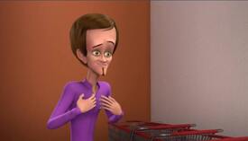
>>408469Yes, unfortunately. Its from a episode of the new TV show where Megamind has to disguise himself.
>>408433God, I wish. Original Bernard was such a knobhead too, I don't think anyone would notice.
No. 408544
File: 1723216418622.jpg (11.75 KB, 145x348, emilie.jpg)
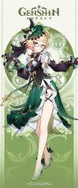
she deserves to be here
No. 408925
File: 1723346391538.jpeg (187.53 KB, 872x1080, IMG_1839.jpeg)
Alpha and Omega is bad in general, but who thought it was a good idea for a goose to have male pattern baldness?
No. 409205
File: 1723425432890.png (937.84 KB, 2751x6334, Vox_render.png)

Ugly as shit especially the stupid, irritating faces he makes.the mismatched lineart color of the other eye is incredibly unnecessary.awful color palette and he looks more of a computer than a TV.
No. 409218
File: 1723426538630.jpg (20.76 KB, 181x272, tumblr_inline_pcpmejDScQ1snugq…)

Should we establish that posting Vivziepop characters is low-hanging fruit?
No. 409236
File: 1723432456468.jpg (185.57 KB, 500x690, 1957-mens-suits-dacron-500.jpg)
>>409205Also tacking on to the computer thing. He's from the 1950's apparently? None of his design conveys that AT ALL. Like maybe the attenae do, but that's such a small detail compared to the rest of the design. He's a flatscreen not an old school boob tube, wears a tight three piece suit in hot topic colors when picrel was the more common cut of the 50's. Like I get his whole thing is updating himself and his company with the times, but it's weird that nothing of his era remains in his design. I know going after Vizzie's work is too eas but god is Vox especially confusing.
No. 409280
File: 1723452528826.png (2.11 MB, 2048x1450, 1h8rVRU.png)
No. 409356
File: 1723477828715.jpg (95.5 KB, 1024x576, 1000006515.jpg)
>>359113Ironically Tifa's swimsuit seems to get rid of her curves kek
>>408925Speaking of Alpha and Omega, look how they modelled the wolf pups kek
No. 409357
File: 1723477939191.jpg (76.97 KB, 1200x675, 1000006516.jpg)
>>409356They fully look like inbred corgis when paired next to the adult
furbait wolves.
No. 409818
File: 1723593273864.jpg (42.58 KB, 1200x600, Untitled-design-14-2.jpg)
Micheal Bay was a mistake
No. 409827
File: 1723595994223.jpeg (111.52 KB, 1074x1074, IMG_2848.jpeg)
isn’t the entire point of elves in fantasy that they were supposed to be inhumanly beautiful
No. 410494
File: 1723765269033.jpeg (184.17 KB, 783x922, IMG_4687.jpeg)
Wtf are these tumours on her chest
No. 410521
File: 1723774572255.png (Spoiler Image,6.23 MB, 1807x2048, wada.png)
>>410501Probably.
>>410513Nah Wada Arco is just like that, she's one of the main writer's nepo friends and can do pretty much whatever.
No. 410523
File: 1723775175738.webp (446.62 KB, 512x724, S244_Stage2.webp)
>>410513Have you seen the rest of her work? She's really horny for these small women with monster boobs. Her male characters are all modest on the other hand.
She also drew this ugly mishmash of clothes.
No. 411324
File: 1724052350757.png (217.16 KB, 254x648, 1000009502.png)
She looks like an annoying special needs kid who eats nose booger
No. 411856
>>411324My sister saw one or two episodes of this, and I saw some of it with her (we made fun of it together). The thing I hate the most is her fur texture, it looks so freaking ugly and makes her skin look like wood. I think it would had look way better if they toned down the texture and actually sculpted in a few hair tuffs (Torelei's mother had subtler hair texture and it looked less ugly). Also, her brother has zoomer brocolli hair kek.
Another thing I found really lame on the series is that now most of the main cast has generic elemental laser powers they shoot from their hands now.
The whole thing feels way more baby-ish now.
No. 411879
>>411856>Another thing I found really lame on the series is that now most of the main cast has generic elemental laser powers they shoot from their hands now.The whole thing feels way more baby-ish now.
I was actually considering watching the animated series just to see what the hell people on reddit were talking about but this horrible. If they didn't make the dolls and characters various body shapes, this shit would be absolutely flopping in sales. If they all had the same body like g1 & 2 it would have not gotten much further than two main doll releases and maybe a few more budget releases but it would have seriously undersold. Everything about the franchise at this point in time is so painfully brightly saturated frumpy mid 2000's disney channel core.
No. 411937
File: 1724200993923.jpg (822.92 KB, 1100x3251, 1723761209227.jpg)
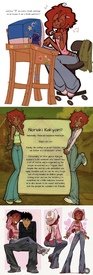
No. 411962
>>411937It’s a shame since her art is so cute, imagine if she never did the whole OC projection thing
Also funny how the most PC people of today claim to love old school internet culture
No. 412007
File: 1724227135038.png (8.56 KB, 181x278, 8C2FEE1E-7D3A-4E4E-B26D-1A7AB5…)
this thing scares me
No. 412041
File: 1724246744448.gif (42.92 KB, 600x178, ga890505.gif)
>>412027it is official lmao
No. 412043
>>412007At first I thought she was supposed to be a sphinx cat but apparently in
>>412041 she just has pink fur kek
No. 413215
File: 1724548730600.png (1.48 MB, 1509x1085, concord.png)
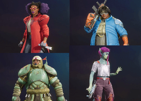
So I just discovered there's a new AAA hero shooter from Sony and every single character design in it is the most cancerous woke shit you can imagine. It looks like a parody kek.
No. 413219
File: 1724550782606.png (748.76 KB, 1400x700, buffy-animated-series-women-in…)
>>413215why can't we have black characters who are cool and hot?
No. 413256
File: 1724565591374.png (167.87 KB, 1024x682, 697.png)
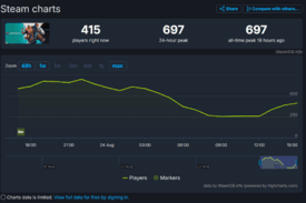
>>413215They spent 100 million to make that.
No. 413287
File: 1724584570279.jpg (228.88 KB, 1280x720, maxresdefault-3.jpg)
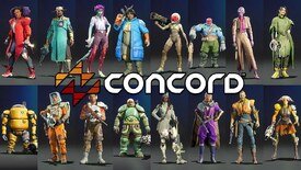
>>413215Disagreeing with the woke part because I don't see it but these designs are genuinely so bad. The truth is that gamers of any gender want to play attractive characters that can fulfill some kind of power or sexual fantasy. It's like big studios are just making games to make them while expecting that
someone will buy their slop
No. 413297
File: 1724593500075.png (292.8 KB, 646x485, tf2_202.png)
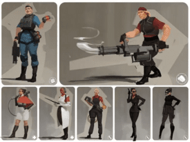
>>413287from what i see it seems like the "we need to represent everyone" meaning of woke. in contrast to tf2, where only design was considered. the resuls is theres only one black man, and no women.
No. 413298
File: 1724593705024.jpg (752.71 KB, 1475x2587, kuso.jpg)
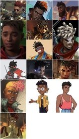
>>409827>that cutClose enough, another one for the compilation
No. 413299
>>413297I’m starting to think the mere presence of a black woman in games is enough to
trigger the woke response, regardless of the quality of the game
No. 413315
File: 1724599168394.png (726.63 KB, 500x670, 580a5c631b0000522bef8960.png)
>>413298Is this the new Asian hair streak kek
No. 413320
File: 1724599691244.jpeg (166.06 KB, 1284x700, GVnR9qZWUAA4JcW.jpeg)
>>413301I thought anons screenshot was about dustborn which came out only three days earlier and was talked about as the "Wokest Game Ever" kek their character designs are similar 3d slop
No. 413321
File: 1724599800406.png (2.44 MB, 2500x1505, Dustborn_crew.png)
>>413320These designs aren't much better
No. 413473
File: 1724645051675.webp (11.18 KB, 250x295, Sunglasses_Vendor.webp)
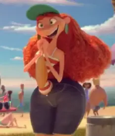
I know stylization is a thing but this is grotesque.
No. 413478
File: 1724648946382.jpg (401.63 KB, 743x1072, 1000539395.jpg)
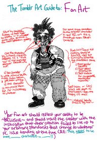
>>413287I don't know why people are mad at this, I understood what she meant. It's not because there are black people in the game but because the designs all have to be unconventional and unattractive.
I wouldn't say these are woke as much as the character here is though
>>413321 the vitiligo, the giant schnoz, the septum piercing,
the schoolboy clothes, the glasses… kek it looks like this picture
No. 413548
File: 1724671736174.jpg (1.44 MB, 1262x1494, titan.jpg)
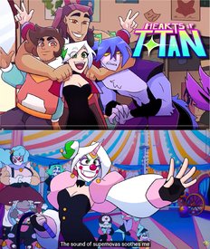
>>405867>>405984>despite it all, they still remembered to have le obligatory manic pixie dyed hair coomerbaitVery boring looking cast lmao, also not sure why but something about the beginning sequence reminds me of undertale.
https://www.youtube.com/watch?v=iDVXryC7ZlA>>405994 Spot-on with the Harley Quinn thing by the way
No. 413658
File: 1724700763062.png (451.97 KB, 1248x1812, DrMystery22r.png)
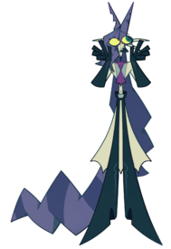
This shit is so ugly,I even saw a plushie of this abomination on Makeship.com.this thing is supposed to be a anthropomorphic long hair cat.
No. 413791
File: 1724730750781.jpeg (96.79 KB, 1280x830, GKug7xBW8AATu1G.jpeg)
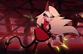
Full demon form my ass,they just made her 10x more redder and uglier.lazily slapped some generic horns,tail with some stupid heart and some red eyes trying so hard to be menacing.I don't understand why she couldn't become a demon monster or something I'm pretty sure she can since she's literally the princess of hell.Dont get me started on Lucifer's "demon" form,it's basically the same but worse with extra shit slapped on him.
No. 414173
File: 1724852544849.png (1.23 MB, 1536x2048, wElUF1E.png)
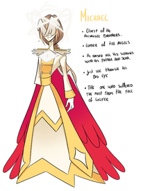
No. 414346
File: 1724884646883.jpg (112.94 KB, 697x496, tumblr_7b2c6448f6aac47ca2fbc0e…)
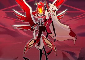
>>413791Samefag,I forgot to add this;why the fuck is she wearing a mini dress and thigh highs instead of armor???this hurts to look at dear goodness what were they thinking?it's so try hard only a 12 year old would this is badass or good.
No. 414398
File: 1724899961937.png (1.43 MB, 2000x1436, helltaker beezlebub.png)

Her monster form actually looks pretty cool and then she becomes another retarded looking waifu clone
No. 414818
File: 1726106799710.webp (885.49 KB, 1200x723, Wondla-Posters.jpeg)

There's an obscure sci-fi kids series by the guy who helped write the Spiderwick Chronicles (Tony Diterlizzi) called Wondla. The author clearly illustrates the covers and lots of pictures inside the books so it's pretty clear what the main character looks like.
I stumbled across a 3D animated series based on the books that started airing this year. I was happily surprised…until I saw what they did to the MC. Who even is that. They also changed a detailed and steampunk-y robot mom character (bottom of book cover) into…a generic porcelain doll thing. I don't get it nonnas.
No. 414832
File: 1726109163631.png (2.87 MB, 4194x2160, 1086903_skuddbutt_meru-the-suc…)
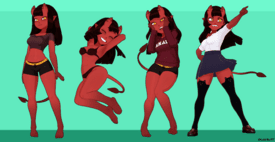
Supposed to be a succubus but she doesn't even have wings it's just another boring,shitty,generic red devil anime girl.also the 3D show was created by a pedo coomer (he makes porn animations of young Gwen from Ben 10)
No. 415094
File: 1726182035767.jpg (317.22 KB, 1500x989, tumblr_367340ce1e99732dda36c64…)
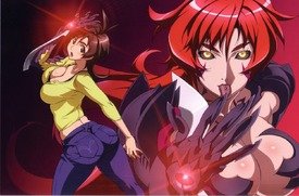
I'm honestly glad no one remembers this trash
No. 415102
File: 1726182794442.jpg (86.36 KB, 671x680, Meru_the_Succubus.jpg)
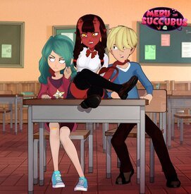
>>415097It's a real show unfortunately,has 5 episodes.
No. 415103
File: 1726183378375.png (23.35 KB, 596x295, skuddmeruepisodes.PNG)

>>414832>>414861>>415097Iirc Skuddbutt (the animator) was making all these porn animations as a sort of demo reel to pitch around for a limited series but surprise surprise, no one wants to make a cartoon based on porn. And I'm pretty sure Meru the Succubus is the OC of a different artist MeruNyaa that Skudd decided to latch onto as his own
>>415102It's 1 movie split up into 5 episodes but nothing officially produced by a studio. Can't find it right now but his tweet about being genuinely sad he wasted time for a (porn) project that's never gonna get picked up as a show was funny
No. 415129
File: 1726190018531.jpg (131.39 KB, 1020x574, a-minecraft-movie-trailer-1.jp…)
Someone please put it out of it's misery for Pete's sake
No. 415160
File: 1726197091259.jpeg (653.63 KB, 2096x1127, IMG_5319.jpeg)
>>415129THIS CANT HAPPEN! THEY WOULD TURN INTO ZOMBIE PIGLINS!
Really though, I wish they would have made a legitimately realistic Minecraft movie. Because most things in Minecraft are normal, the characters wouldn't really notice that they had stumbled into another dimension until night fell. Maybe they see a pink sheep and think it's a little weird. But then they realize that they're trapped somewhere dangerous, ultimately having to defeat the Ender Dragon to return home etc. Instead we got four retards in Willy Wonka's factory, with Jack Black having wandered onto the set from his living room.
No. 415382
File: 1726289145263.png (134.45 KB, 281x600, whatsherface.png)

>>395970That Battle Frontier Brain was way fucking cooler
No. 416032
File: 1726555004440.jpg (265.5 KB, 1920x648, 1708289387456.jpg)
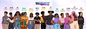
No. 416075
>>416048Not just men, wokies love to make
poc, especially black people, look ugly as fuck in the name of "redefining beauty". They think if they draw a conventionally attractive black person they're gonna have to have "white" features because they don't know what black features look good
No. 416324
>>416032It feels like these types of western dating games that are playing diversity bingo are a dime in a dozen but I can never tell if they're successful enough? Like idk what the dating game's story and settings tend to be like
they're so ugly I kinda go ugh and move on, because all the focus on how the characters look but they still manage to be so bland you can rarely tell anything about the characters themselves. And with a huge cast like that I find it hard to really give each of them an unique and compelling story. Do people actually play these games? At least many enough to be lucrative to make them?
No. 416350
File: 1726681062704.png (176.13 KB, 752x233, coomshit.png)
>>410521Old but this image is going around on twitter with all the coomers calling it a "peak design" and I thought of this thread. As usual men be like coomshit= peak without caring about if it's actually good or not. Cut out the rest of the image since it's nsfw.
>>416324I've honestly never seen anyone play them, not even people into visual novels
No. 416354
>>416330I love it when they go so woke they end up racist, they really are so blind to their own quest for diversity they don't see how offensive the result is. There are so many of these types of lineups out there and it's always the non-white characters that end up with all kinds of sexualities with both physical and mental disabilities on top of it, while the white ones perhaps gets queer tagged onto them if the artist is feeling a bit extra that day kek or they do it like
>>416351 said and turn them into stereotypes because they are so afraid of white-washing the characters
No. 416360
File: 1726685172767.jpg (402.54 KB, 2326x652, art direction.jpg)
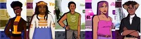
>>416032Reminder that the characters used to be uglier kek
No. 416410
File: 1726708931414.png (955.45 KB, 828x1032, Narlene_and_Nobby_adult.png)
Way too humanoid even for SpongeBob standards to the point that they look out of place and badly designed.both of them look like they came from Chowder or something.
No. 416432
File: 1726712812952.jpg (173.21 KB, 1280x720, maxresdefault (1).jpg)
I still can't believe this was made by the same creators as Phineas & Ferb.its just so soulless and generic,her design is painfully bland and forgettable.
No. 416804
File: 1726805528107.jpg (219.29 KB, 1792x1182, liveactionstitch.jpg)
No. 416813
File: 1726806649886.gif (1.28 MB, 165x294, panko-cat.gif)

>>416804I'm sorry but he looks very cuddly. Would pet.
No. 417690
File: 1727069695399.png (477.93 KB, 800x800, a6b8898ebe8f596c53dd7ff4a5d1e0…)
No. 417863
File: 1727129264523.jpg (333.14 KB, 845x1039, DM3_Minions_.jpg)
I'm surprised to not ever see these heinous creatures posted here.
No. 417902
>>417884She's probably Afro-French but they didn't feel like specifying for whatever reason (even though I assume French Black people would be more likely to know their country of ethnic origin). I'm curious what country the creator of that character is from for her to represent her ethnicity like that.
This happens often when people try to show off how ethnically diverse their set of OCs is, but this lineup is particularly messy in terms of mixing ethnicities with nationalities with which country flags they use to represent them.
>>416432Milo Murphy and Hamster and Gretel are visually baffling to me because they kinda have the same style as PnF, but for some reason all of their characters are designed in a way that was only used for random background characters and celebrity cameos in PnF
except Gretel herself doesn't even look like that, she flat out looks like she came out of a stock image siteDid some grouchy Disney suit start breathing down the creator's neck and decide that he wasn't allowed to draw characters with weird face shapes anymore or what?
No. 417903
File: 1727139315933.jpg (121.26 KB, 1280x720, maxresdefault (1).jpg)
I never understood why Nintendo gave them skimpy clothing to play soccer.definitely a bad design.The crop top & booty shorts were so unnecessary.
No. 417913
File: 1727141002261.jpg (276.97 KB, 784x1145, 4yhgs4lpeq0c1.jpg)
I cannot stand Dandadan or its sense of humor. The worst part is that the art is actually fine in everything but character design because the mangaka only knows how to draw 1 face in the main cast.
No. 417917
File: 1727142017567.jpg (60.74 KB, 779x897, d0fb1164030eef6c862db73eb391b6…)
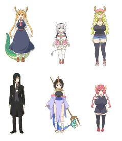
Repulsive
No. 417936
File: 1727147009523.png (56.47 KB, 205x499, Seiko%27s_full_appearance.png)
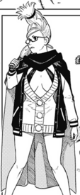
>>417927Fafnir is love, the rest of it can be shitcanned.
>>417924It gets better, this is MC's grandmother.
No. 417937
File: 1727147077961.png (82.91 KB, 537x254, we5oumsgx4m71 (1).png)
>>417936(by better I mean worse, sarcasm doesn't translate well)
No. 418160
File: 1727214471344.png (306.29 KB, 420x733, KEKMAO.png)
>>417917AHAHHAHAHHAHAHAHAH WHAT THE FUCK
I've seen this retarded design a million times and it still makes me laugh, it's SO FUCKING BAD
No. 419152
File: 1727563116622.jpg (208.96 KB, 1298x736, nogame.jpg)
Everyone in this is ugly with ugly clothes and the general look of the anime is an eyesore. It's also one of those isekaied into a game world but the game world in question makes any mobile cash grab rpg or gacha look like high art.
No. 420190
File: 1727918189879.png (1.78 MB, 1476x2404, prier.png)