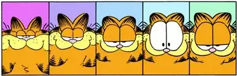
File: 1743008002226.webp (11.83 KB, 350x113, rsz_2003_06_15.webp)
No. 475053
Post and discuss examples of art from artists or media changing over time. Possible discussion topics include analyzing how the art has changed, linear art progression, if you prefer the old or new art, progression stagnating, how to evolve your own art, etc.
Artist salt:
>>>/ot/2458042Bad art thread:
>>>/m/460862Art styles you hate:
>>>/m/472261Awful character design:
>>>/m/462640 No. 475054
File: 1743008275476.jpg (42.74 KB, 640x480, fatpikachu.jpg)
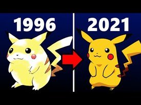
I think fat Pikachu was cuter
No. 475055
File: 1743008388922.jpg (37.78 KB, 533x327, tumblr_87d330a174b4215b7b88f2c…)
can't discuss art regression without rcdart or puppychan
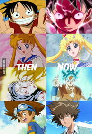
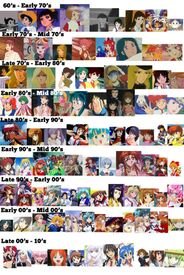
No. 475143
File: 1743020124887.jpg (542.86 KB, 3072x2171, nzja15g15sq61.jpg)
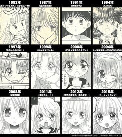
anime style evolution
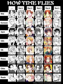
No. 475148
File: 1743020740032.jpg (716.59 KB, 1462x3421, 1742588611603.jpg)
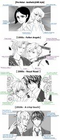
Bl manga artstyle evolution
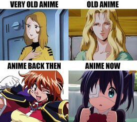
No. 475153
>>47514380s and 90s is objectively the best
>>4751482010s is the best
No. 475181
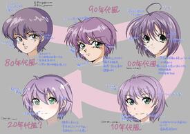
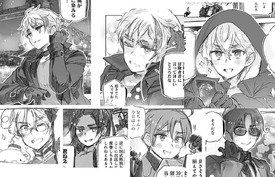
File: 1743024767420.jpeg (143.54 KB, 605x680, CBLy_aOUgAAd3Pt.jpeg)
An example of an shoujo manga artist's art evolution, Yabuuchi Yuu.
Check out Mahochuu! btw, it's very cutehttps://x.com/Utopia_SM/status/581794474306744320 No. 475185
>>47514390s is the ugliest to me, it makes me understand why all those "learn to draw manga" books looked so shit, that was just the style at the time kek
I prefer the newer ones, though the 80s one is cute too.
No. 475288
File: 1743045108336.gif (6.9 MB, 854x480, Tumblr_l_6305001520245735.gif)
>>47514390s and 00s will always be dear to me.
No. 475469
File: 1743089581653.webp (91.41 KB, 1000x550, Image_2022-06-02_120907435.png)
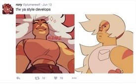
No. 475476
File: 1743090738770.jpg (124.14 KB, 1080x779, 1705872291811198.jpg)
I didnt know it was possible for coomslop to become even more soulless, but alas
No. 475477
File: 1743090802346.jpg (157.85 KB, 1200x1200, 1706491769707.jpg)
No. 475478
File: 1743090865251.png (1.81 MB, 2400x1244, 1682446256618265.png)
No. 475508
File: 1743092429926.jpg (Spoiler Image,540.41 KB, 2880x2880, Khyle.jpg)

So soulless
No. 475515
File: 1743093408807.jpg (397.87 KB, 1270x1280, 1000011274.jpg)
>>475148I miss 60-70s manga art so much. I hope artists try to revive the style like popular 80s inspired artists and Ganbare Nakamura-kun for example
No. 475548
File: 1743097745229.webp (106.09 KB, 800x395, cnjbo7qdwrrxdb03ciqf.webp)
No. 475549
File: 1743097773745.webp (242.42 KB, 636x357, 1483549891277781314.webp)
No. 475555
File: 1743098057773.jpg (55.39 KB, 636x856, bd3dabfa313b9715a36fcfb8aa5780…)
No. 475556
File: 1743098091431.jpg (140.25 KB, 1084x610, animetimeskip1.jpg)
No. 475557
File: 1743098122732.jpg (90.38 KB, 460x668, avnLLe5_460s.jpg)
No. 475559
File: 1743098212305.jpg (73.19 KB, 600x533, e112b9f90908ac704e6eaafee9e380…)
No. 475564
File: 1743098392515.webp (104.25 KB, 1200x1200, w3k15rgizyf91.webp)
begging them to bring back color and shadows
No. 475565
File: 1743098450818.webp (131.81 KB, 1080x761, which-art-style-is-your-favori…)
No. 475573
File: 1743099174308.jpg (141.06 KB, 1400x700, 6.jpg)

>>475560Western cartoons are also suffering from pedofication (of female characters)
No. 475574
File: 1743099205444.jpg (180.5 KB, 700x1046, 91f57a4ee23e48fb152e8d2628b1c4…)
No. 475581
File: 1743099665929.jpg (143.29 KB, 667x1000, s-l1200.jpg)
No. 475585
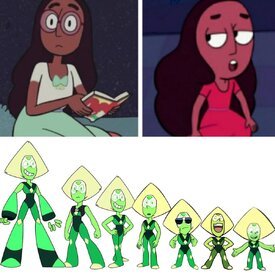
>>475477Peridot was so beautiful and threatening when she was first introduced, she paralleled Yellow Diamond. I loved her height and aesthetic of her limb enhancers, as well as the representation of people who need tools with handicaps (She's a gen2, smaller from lack of minerals, like an infant born with disability from lack of nutrients in the womb). I loved how competent and knowledgeable she was at her job, that it gave her center. Her worldview is based on that. She's very by-the-rules. She was an exceptional representation of autism…. and then they nerfed her. I get that adapting to a new world, without enhancements can be a great learning point and challenge to develop her character, but she just hit a point where she devolved from versatile, to infantile. She became a negative stereotype for someone on the spectrum AND the worst part is she's basically an "ugly to beautiful" or "nerd to prep" trope. They beat her autistic traits out of her. Steven told her that her inate, rule abiding, literal interpreting, intellegent self was bad. She needs to throw out all of her healthy coping mechanisms and risk the equivalent of sensory meltdowns on the regular to be like his carebear self and make OTHER PEOPLE comfortable. Her eroding physical appearance goes with it.
No. 475690
File: 1743111490225.jpg (541.63 KB, 1000x1335, tumblr_m8hzcfYGbj1r4931ho1_128…)
No. 475742
File: 1743117368093.jpg (73.07 KB, 600x433, 66.jpg)
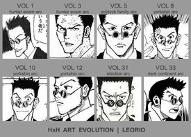
Togashi can't decide how to draw his own characters. He emerges from each hiatus with a different style kek
No. 475769
File: 1743122240844.jpg (97.77 KB, 1280x823, recent hetalia.jpg)
>>475690>>475694I seriously dislike the wobbly eyes and mouths Himaruya does now. Looks silly.
No. 475794
File: 1743125565297.png (617.45 KB, 816x1679, Sleeping_Dead.png)
No. 475843
>>475690This pic is so old lol
My favorites are 4 and 5 but I also have a soft spot for 1.
>>475769What the fuck is this? Damn.
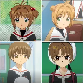
>>475549I'm assuming this is KyoAni? It also depends on the animation director for each series.
No. 475856
File: 1743139942089.jpg (786.95 KB, 1728x3728, VoGzymCrWM-ajwPFduMB18ZPbk1dI0…)
No. 475860
File: 1743140462974.jpeg (2.23 MB, 1920x2160, IMG_1142.jpeg)
>>475859I'm not an artfag, so can someone explain to me why digital animation has to look inferior?
No. 475866
File: 1743143284235.jpeg (402.18 KB, 1536x2048, GgoXSr6WcAAxrt2.jpeg)
>>475573everything must be Elsa
No. 475868
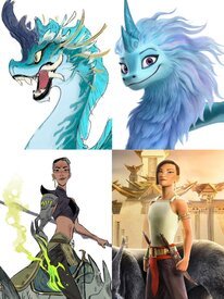
File: 1743144409601.jpeg (107.35 KB, 2048x693, IMG_7169.jpeg)

>>475866That dragon makes me so sad. It could've been so beautiful. Picrel for redesign someone did, it makes it really obvious how Elsafied she was.
No. 475869
File: 1743144645281.jpeg (223.58 KB, 842x820, 1723546791554.jpeg)
No. 475884
File: 1743147421169.jpg (162.13 KB, 710x900, 4a61400f5836c83b40be0692ffb3b8…)
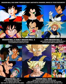
I love the earlier animation style so much, it was so charming and I liked that they weren't afraid to go off model a bit during action scenes (for example the hair could behave like actual hair and change shape with movement). Late Z style is edgier but the colors, textures and animation quality was still nice, same for GT even if it changed a bit again (I'm a fan on the colors though, they work so well with the setting). Then for super it just turned into literal slop. You'd think with digital you would be able to have better animation and colors but it's the opposite.
No. 475889
File: 1743149025133.jpeg (94.98 KB, 885x432, Summer vs Winter.jpeg)

>>475852>>475858>>475859>>475860>>475861Washed out colors and a more distinguished color palette.
A red is a real red, the colors are more saturated in old anime its like somebody turned the saturation up by 500%.
You could also call it the Summer vs Winter aesthetic.
Like in Summer, everything in older Anime seems to "pop" more and everything in shadows seems too be dark.
While modern Anime looks more like a snowy day where everything is covered in snow.
You can observe a reverse of this in
>>475858 where the cockpit liquid is much darker in the new one, overpowering every color in the scene, while in the original its much more gentle on the colors.
No. 475965
File: 1743166458309.png (948.09 KB, 960x720, vlcsnap-2022-01-04-00h25m28s99…)
>>475937>You guys I miss the look of old cel animation so much.Me too. I was just looking through my LoGH screenshots folder and thinking about this. The digitally(?) re-animated shots they added in re-releases are extremely jarring. Visually, it's like you're watching two different things. In some cases, the original shots were better, I even downloaded the original versions just to see the differences. Hell, even when Japanese animators fucked up back then, it still looked better and kinda charming compared to digital. Animation fuckups may have looked funny and ugly before, but it's straight up soulless now.
>I know there was that one cuphead show a while back but I've heard it's trash and I don't think it does that good of a job anyways.I remember watching an episode once, and it was obvious that they were using modern digital tweening techniques. Not only that, but the characters have a very "modern" feel to them in their expressions and movement, even the camera movements make it obvious that it's not a classic cartoon. The art style is too heavily influenced by current era cartoons as well, and it seems that some Cuphead fans actually noticed this and didn't like how different from the game the characters looked. The lines are too clean. I could go on and on.
I don't know a lot about animation so forgive me if I'm using these terms wrong, but the timing/spacing of the characters' movements also failed to capture the feel of classic cartoons.
Though, to be fair, it looks like they tried really hard to mimic old cartoons, by using tweening as little as possible and adding a lot of effects to emulate animation cel textures.
One thing people often forget is that the camera, color process, etc. had a huge (and I mean HUGE) impact on the final result. Many photographers and videographers try to achieve a film look as well and regularly look for methods to replicate it; this isn't unique to animation.
>>475931AYRT, my favorite was Z, but I like the other old styles too. And to be honest, when I was little I couldn't get into GT (doesn't help that it's not canon, or is it? It's confusing). But there's something about the art style that makes it look so polished and almost cinematic, it's undeniably pleasant to look at. Gives me OVA/film vibes. It also had warmer or darker colors, which adds to the nostalgia.
No. 475967
File: 1743167270476.webp (35.51 KB, 1200x675, IMG_2379.webp)
>>475937The Day the Earth Blew Up did a really good job, maybe there were some noticeable doesn't-quite-know-how-this-worked moments when trying to mimic older cartoons, but the characters and movement looked pretty great anyway. It was a really good time seeing it in theaters too.
No. 475974
File: 1743168737890.jpg (1.6 MB, 1959x1086, little nuns.jpg)
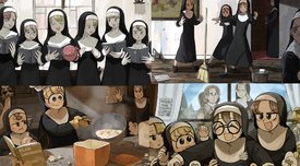
the art stagnation in little nuns is pretty sad but its to be expected when you churn out finished pieces on a bi-daily schedule
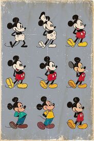
No. 476004
File: 1743175318068.jpeg (1.86 MB, 1433x2157, 2lwm4n3agb9c1.jpeg)
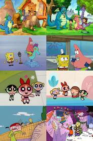
cel vs digital with western cartoons switching in the late 90s and early 00's. Dragon Tales art kind of slaps.
No. 476007
File: 1743175620352.webp (40.74 KB, 700x529, do-you-like-the-cel-animation-…)
>>476004It's hard to get this feeling with digital
No. 476023
File: 1743177921489.jpg (396.34 KB, 2560x1642, elusivesamurai.jpg)
>>475904I think the issue is the colors being so washed out, not so much what her face looks like
>>475917That's definitely a thing but there are still some that don't do it. I thought the colors in Elusive Samurai were good for example and that's a recent anime.
No. 476231
>>476004I'll be honest, I don't mind digital in super stylized, cartoony cartoons for children like these that much. When I was a kid I preferred the colors in the digital seasons of PPG and Dexter's Lab.
But for adult animation like The Simpsons, I definitely prefer the traditional look.
>>476010I wish I knew how to get one of those. How expensive?
No. 476244
>>476236I checked some online prices myself and it ranged from some 1500 yen to 50000 yen depending on the pose and character.
Though I realized that I wouldn't be looking for anime cels but rough sketches, key frames and character model sheets since the anime I'm thinking of is digital.
No. 477179
File: 1743428794451.webp (921.39 KB, 1745x2358, Dororo.webp)
>>475869I just wish she still used full saturation.
>>475861SADAMOTO HOW COULD YOU
>>475859What was even the point of using the filter here? To show that the train was being gassed?
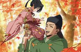
>>475515I like the 80's style, but 60's style manga just wouldn't translate well into anime. Can you imagine the new Dororo adaptation with the original manga chara designs?
No. 477994
File: 1743631341377.png (3.06 MB, 2560x1280, ccassandraspring.png)
Left is from 2016, right is from 5 hours ago. This is so sad, she's turning into Adam Ellis.
No. 478002
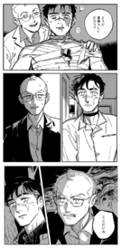
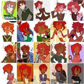
File: 1743632610129.jpeg (572.11 KB, 2048x2048, 1743563049268.jpeg)
No. 478032
>>478002I was hoping someone would post a compilation of brujoari's Kakyoin-Kate transformation, thanks.
The first two Kaks are actually kind of cute.
No. 478935
File: 1743803238045.jpg (532.9 KB, 2352x1297, wide.jpg)
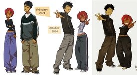
Her art looks like she’s been gradually squeezing and stretching it
>>478002>>478084She still has the schnoz, Brujoari posted big nose kate and small nose kate side-by-side as a joke and the person who made the compilation added the latter by mistake
No. 479675
File: 1743986092444.jpg (262.95 KB, 1053x942, imgonline-com-ua-twotoone-jOIT…)
Watching Aria right now and I can't believe what they did to some of the character designs in the later special episodes/movie. Who the fuck approved of this?