File: 1646506409179.jpg (440.27 KB, 828x1601, 1645974888322.jpg)

No. 187243
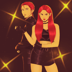
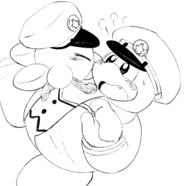
File: 1646508807528.png (63.9 KB, 257x275, 1645817661864.png)
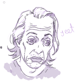
Whoever drew this ily
No. 187247
File: 1646509329514.png (411.62 KB, 2048x2048, Untitled91_20220305150738.png)
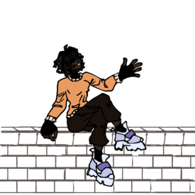
I'm trying to figure out how to do the lineart but pls rate the sketch before it's too late
No. 187268
>>187257Sorry
nonnie…
>>187261Yea I'm usually on there (until my patience with 4channers runs out lol)
>>187263Thank you sm!
>Do you take commissions?Not officially(haven't set up a commission sheet or paypal business acc or anything hghh), but I do a few here and there for fun.
pretty sure this is against the rules but my email is there in case you're interested anyways No. 187291
>>187255>cringe assIt's certainly embarrassing cuz it's porn, but I wouldn't call it bad art.
They're both very cute and your style is nice. But you only posted pencil sketches. Don't you have a tablet?
No. 187295
>>187279I'm just embracing it tbh. I love drawing goofy looking tumblr-people and shit
>>187291I do have a tablet and usually do a lot of digital painting. These were more just spontaneous sketches
to quell my inner fujo No. 187310
File: 1646536195983.png (514.32 KB, 6047x8598, sprigatito.png)
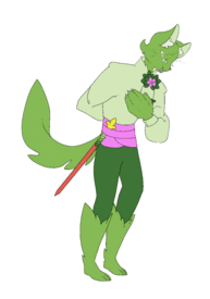
here's some degenerate furry art i made of sprigatito's inevitable 2 legged form
No. 187313
>>187310Aww this is cute!
I would advice muting colours that are as saturated as that violet so they’re not that ms paint-like, since they’re a bit jarring.
I absolutely looooove the big cute fluffy paw, and the detail on the furred face! Super cool! However I also feel it kinda clashes with how rushed and plain the tail looks in comparison, especially since it’s such a big subject in the piece. If you put the amount of care you put in the paw and fluffy cheeks towards the tail as well, it’s gonna look even more amazing.
Finally, completely up to your taste, but a blank background can make it feel pretty boring, poor kitty just floating there in infinite blank space. But just even a square or triangle of solid color for the background could make your art stand out more.
No. 187315
File: 1646538286392.jpg (76.3 KB, 1024x538, spanish shawl.jpg)
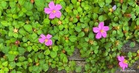
>>187313yeah, i had a hard time trying to make it not super detailed (like canon pokemon), but this was the end result lmao
also the the pink i just nabbed from the plant spanish shawl, but i definately could've put more demension (?) in the colors
No. 187394
>>187310Too cute
and too anthro to be a Pokemon, I also love your idea here
>>187315 No. 188539
File: 1646941524834.png (276.16 KB, 700x1000, STACY STRONK.png)
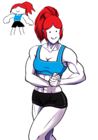
>>187310i posted this in the oc drawing thread, but i would like some feedback for the muscles and stuff. i used a model reference, so i'm hoping it still looks nice with my artstyle™
No. 188858
File: 1647044905706.jpeg (473.4 KB, 1147x1248, 085BF85D-26CC-4AB7-96E5-D08C40…)
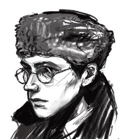
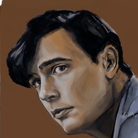
i’m glad that this thread is back, so here’s my shitty contribution. just a random sketch portrait, reference was a screenshot from a film. the weird thing on his head is some kind of a furry hat, i always struggle to do hair or fur lol
No. 189187
File: 1647236715393.jpg (241 KB, 1144x785, 1647234571782.jpg)
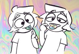
>>187255Excellent taste, love some old fashion gays
No. 190546
File: 1647675378918.jpg (Spoiler Image,1.13 MB, 700x1000, Inkedmonster bf_LI.jpg)

>>188539spoilered because it's "sexy"(?)
No. 190683
>>190549lmao you're right, why havent i noticed how bad it was before ffff
as for the horns, i was going for a chipped growth effect. whould it look better if the lineart was thinner? or should i just scrap the horn texter and make them smooth?
No. 190767
>>190546HELLO
>demon>shibari>pretty boy>tiddy12/10
No. 191484
File: 1648000244413.png (1.73 MB, 1511x2236, angle.png)

I've been dipping my toes into a painterly style, it's a bit fun actually!
No. 191485
File: 1648000469647.png (972.13 KB, 1670x1131, birfdayborb.png)
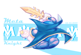
>>191484Another one I did in this style. I find working with blues and purples fun.
No. 191507
File: 1648008431164.png (2.34 MB, 1683x1889, portrait.png)

>>191504Thanks nona, it means a lot!!! I love using bright saturated colors and I love using "traditional" digital brushes even more!
No. 191514
>>191484>>191485>>191507I love kirby too
nonnie!!!!! Your art is fantastic!!!!!!1
No. 191556
>>191509Thank you! That's one of the other reasons I like Kirby, it's full of very bright and varied colors to play around with! like instead of using bright pink for Kirby's skin I can use a pale reddish orange and soft orange which gives off a more summery "vibe". I did not know who Marco is, his face scares me but I like his art so thank you!
>>191514Oh nice, it's rare that I get to meet others into Kirby outside of twitter!
which is both a curse and a blessing Are you excited for FL? Who are your favorite characters?
No. 194833
File: 1649128159819.jpg (Spoiler Image,1.14 MB, 700x1000, Inkedmonster bf_LI.jpg)

>>190546hey nonnas, thought you guys would wanna see updated/fixed demonboy tiddies
No. 194836
File: 1649128426740.png (516.32 KB, 900x1400, WIP FOUL TARNISHED.png)

>>194833also, i'm working on my elden ring husband, so here's the WIP
No. 195069
>>194833He's fantastic and I also love how you gave him such a winning smile. Don't always want to see a sub anxious or in pain, sometimes it's nice when they're just happy to be here kek
>>194836Love your style
and subject matter. The design of the staff(?) is really beautiful. Wish I could see more of your work without you having to out yourself but thanks for sharing!
No. 195078
File: 1649203366466.png (87.98 KB, 500x500, blushblush.png)
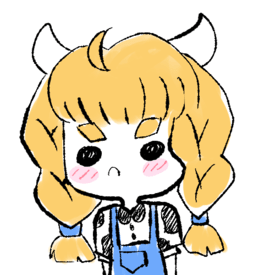
>>195069that's probably the nicest thing any stranger on the internet has ever said to me, thank you
nonnie No. 196304
>>188858I love it
nonnie! what was the movie ?
>>196291This is an amazing style, how did you create the pattern on the sleeves
No. 196384
File: 1649615119043.jpg (1.98 MB, 900x1400, FOUL TARNISHED.jpg)
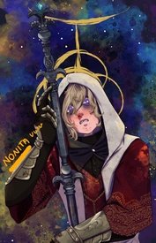
>>196291HE IS . . . COMPLETE
No. 196511
File: 1649645973866.png (1 MB, 1460x1328, fnasplace.png)

I got around to making some art again! The Space Ranger ability is so so fun, it's super cool looking too. Very surprised it wasn't found in the Invasion of the House of Horrors stage.
No. 196512
File: 1649646053262.png (1.28 MB, 816x2464, clumsydee.png)

>>196511I also re-vamped a MSPaint doodle I did, Waddle Dees are way too clumsy.
No. 196513
File: 1649646134426.png (216.05 KB, 1056x803, galactaclothes.png)
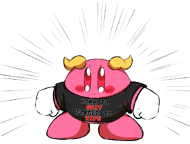
>>196512and finally, a simple doodle based off of a God-like phrase.
No. 196750
File: 1649715434019.png (10.46 MB, 1976x1846, waifu1.png)

>>196384this is beautiful i love the details
>>196511your kirbies are so cute anon
this is the first time i've ever tried to do something painterly and the first time i've touched my tablet in months. she's based off a waifulabs creation lmao. one day i'll make something that isn't a pretty, emotionless bust
No. 197153
File: 1649893557343.jpeg (2.21 MB, 4032x3024, D6E4ADCF-8B83-41FF-AE71-B74261…)
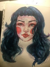
Super quick self portrait (5 min. for the sketch, maybe 15 for the coloring). I stopped drawing for a year or so (still did it occasionally, but not much) and have been getting back into it the past few months. I think I added too much purple on the skin, I wish I left more white showing so the cartoony blush didn’t look so out of place but oh well. The hair has some purple in it too but it doesn’t show up on camera very well. I think in the future I will try less shading and make it more solid colors, using my sketching pen to do most of the shading (red ballpoint). Also the Kuretake Gansai Tambi watercolors are the best, I got a starter set and purchased some indivual colors to add and it’s the perfect set now! Especially the teal color (no. 57) is so good, smooth and pigmented.
No. 197158
File: 1649894973223.jpeg (2.5 MB, 4032x3024, E1AA7DB0-0E0E-4D07-B2B6-DD38B8…)
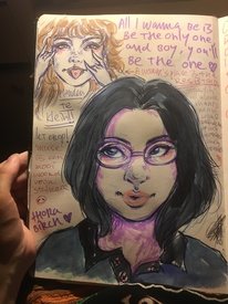
>>197154Thanks nonna, that means a lot ♥ I don’t do finished pieces really so here’s a page from my sketchbook!
No. 197159
File: 1649895082877.jpeg (2.16 MB, 4032x3024, 8126CEE6-368A-4A5B-8F70-DE951D…)
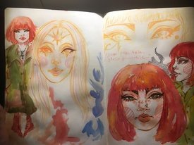
>>197154My phone camera is a bit shit, also lol at the feet on the far left. I’m trying to do more character design but I never really learned anatomy well. I’ll continue drawing though, only way to get better!
No. 197449
>>197408This is so sweet, thank you nonna ♥ I'm 19 now and have been using sketchbooks since I was about 12. I used to do a lot of finished pieces and used my sketchbooks mostly for concepts so I'm not sure. I have a ton of old ones and I don't even know where they are lol (I think I gave them to my mom?). I pretty much completely stopped doing 'finished' pieces about a year ago and just used my sketchbook for colorful things, regular sketches, studies, figure drawings, thoughts, inspiring lyrics, writing, and whatever else. Ever since I've gotten into the habit of drawing every day again, I think I've gone through 2 other ones and have this one half finished (my sketchbooks I use have 50 pages and I use both sides of the paper). Thank you so much for the compliment by the way, I graduated high school a year ago and my art teachers hated me because I have quite a messy style and they saw it as laziness/low effort work, I didn't have the guts at the time to tell them I felt it made my work more lively and it made me enjoy the proces a lot more than my old approach which was sketch, ink and color. It made me stop enjoying art for a while because I just associated it with people telling me it wasn't good enough, low effort, this and that. I don't really care anymore though, if these people really knew how to make art they wouldn't be teaching it. I don't do art for others anyway, it's just a hobby I really enjoy, something I use to get my emotions out sometimes and that's fine imo.
No. 198230
File: 1650241867317.png (3.78 MB, 2224x2037, eastercardfinal1.png)

Happy Easter nonnies!
No. 200246
File: 1650855816442.png (298.2 KB, 645x927, goodjob.png)
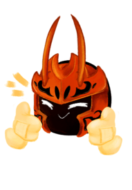
>>198230Going to post some more stuff! Here's a cute Morpho Knight.
No. 200247
File: 1650855853284.png (1.07 MB, 1417x1248, dudeweedlmao.png)

>>200246Something I drew for 4/20, it's Kirby with the Leaf Ability.
No. 200248
File: 1650855932177.png (2.21 MB, 2187x2416, rkgk2.png)

>>200247Some doodles! One of them featuring one of my favorite ships, MetaSusie.
No. 200249
File: 1650856024794.png (332.17 KB, 1111x959, paintingthiswillbeapainintheas…)
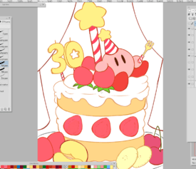
>>200248And I'll end my posts with a work in progress. I plan to go simple but colorful with this one.
>>198271Thank you! Drawing the main gang is always a joy!
No. 207344
File: 1652901818750.png (Spoiler Image,79.27 KB, 589x551, cake.png)

Did I give him too much cake? Any weird anatomy you can see?
No. 207384
>>207367I am afraid of posting my art here and people recognizing my style (I've posted art a couple of times although not in this thread), or recognizing my taste, but I would never post anything here that I've posted elsewhere.
Still, I would say do it anyways (post art for critique, not something you've posted elsewhere, I mean). If you have practically no audience on your social media/art accounts, it's extremely unlikely that anyone will care about cancelling you or something, or if someone recognizes you here, I doubt she'll make a big deal out of it.
And btw I've heard that some artists have posted or promoted their art here. I know one of them, but it seems that nothing bad happened to her.
No. 207444
File: 1652919186105.png (372.57 KB, 690x1600, leafgreen nuzlocke 02.png)
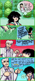
>>207367i could be wrong, but i believe the etiquette is that if you recognize someone's art outside of lolcow is that you don't call them out (don't quote me on this tho lmao). being active on an anonymous forum doesn't mean you're thoughts and views are the same as everyone else's on said forum (does that make sense?) so unless you've said some INSANE shit and it's traced back to you (example: creepshowart), i dont see why you'd be called out for being on lolcow or whatever.
and if someone who's lurking calls you out on it - wtf were THEY doing on lolcow?
/rant end
ANYWAY here's a random page from a nuzlocke comic i've been working on, maybe you guys will see it offsite lmao
No. 207467
File: 1652925481500.png (456.57 KB, 739x1049, Taranzaisfuckingpissed.png)
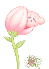
Going to post some art again.
>>207346>>207345Thank you Nonas, I'm glad you like it!
>>207348Who's your favorite Kirby character and or ship?
>>207367Yeah, I post the art I post here on twitter all the time. Not particularly scared, as I've accidentally sperged out about
KirDedede during the time /ot/ shit itself so I've long since lost any shame. If someone were to call me out, I'd just say "So? Piss off.". Anyone with enough ambition or tism can trace anything you say or do online, so when I type something online I make sure to mean it.
No. 207469
File: 1652925558592.png (714.17 KB, 1915x1371, leolol.png)
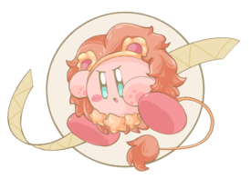
>>207467Kirby recently made a promotion featuring a bunch of Kirbys in various horoscope themed costumes.
No. 207470
File: 1652925647886.png (2.86 MB, 1734x2842, queenrippleandherpet.png)

>>207469Queen Ripple is cute but I think 02 is cuter.
No. 207472
File: 1652925798039.png (99.88 KB, 399x361, kirbysummer.png)
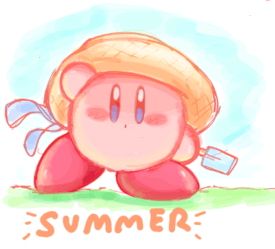
>>207470A doodle I did in a paint-chat.
No. 207474
File: 1652925972694.png (98.81 KB, 1277x1111, MARXPAINTING.png)

>>207472Marx, he's okay but I got some brushes and I wanted to paint him.
No. 207477
File: 1652926602426.png (8.9 MB, 1763x2711, CAKE CAKE.png)
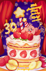
>>207474And to finally end my art train, the finished card.
No. 207478
File: 1652926938953.png (127.44 KB, 2500x3000, 78348234457_7e7r78er78_hgduys7…)
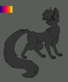
never had a furry/warriorcats phase as a kid so I wanted to make my own character, I'm not going to finish it, but I liked the base and colours I picked
No. 207512
>>207507>no ships>but all my faves are in Kirby 64.Just from this alone I can tell you're amazing. Kirby Super Star is my favorite by K64 is a close second just from it's OST. I consider you a friend
nonnie.
>>207509Yeah, I figured as such.
I sincerely apologize. No. 207526
>>207344No it's nice, however the other guy's broken
>>207478Cool, my best friend used to draw just like this
>>207444I love it, I love everything but my favorite part is the panel with the grass, it's so cool
No. 207531
File: 1652956881069.jpg (36.02 KB, 305x735, rthbsrthnb.JPG)

Probably neva eva gonna finish this bc I have no patience with drawing these days. It's my Skyrim Altmer player character power fantasy lady. Is it too coomerish? I know the anatomy is a bit wonky. My works always have a weird aura of uncanny valley with the anatomy mistakes, maybe because I make them too "polished" so the mistakes show up more than in a more painterly/sketchy style.
No. 207537
>>207534BUT I LIKE THUNDER THIGHS
Ok, I'll take it it's a bit too coomerish then lmao? Also I was actually proud of those hands, now you come here to crush my dreams! No it's fine, thanks for your input nonna, I appreciate it
No. 207539
>>207531I actually like how you drew her thighs even if they’re obviously stylized to be larger and wider i think even from this I can tell you have a good grasp on anatomy to be able to stylize it like this, the other anon was unnecessarily rude imo, the hand by her head could use some work but the one by her belly is very well drawn and nice, I also like how you drew the little bits off boob coming off the side and how the gloves squish her arms, nice work
nonnie!
>>207477I always enjoy seeing your kirby art, so beautiful!
>>207478This is actually very cute! I agree the neck is a bit off but if it’s your first time drawing more furry characters it’s incredibly impressive tbh and I think the eye is very cute and pretty!
No. 207556
File: 1652967824765.jpeg (272.27 KB, 1601x959, 68D9C3A7-1991-409C-8B8D-64B440…)
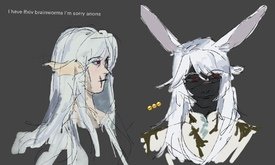
Im here to be obnoxious with my ocs, absolutely cannot stop drawing them.
Also I absolutely adore all the kirbies, made my day
No. 207959
>>207556give me more ffxiv content OR ELSE–
i will cry
No. 208111
File: 1653153720917.jpeg (546.38 KB, 1225x1012, E385AB17-1111-4309-BDF3-012CBA…)
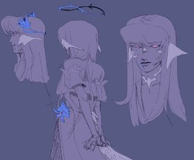
>>207959I’m a total ffxiv sperg (extremely salty I had to stop playing right before adventurer plates came out thought rip), so I’ll gladly waterboard you anon
No. 208249
File: 1653191208934.jpg (36.23 KB, 846x585, FKznt2TXMAEj5wl.jpg)

>>207367I have posted my drawings in many places and have been ignored so many times that I no longer care if someone recognizes me.
No. 208264
File: 1653193496679.jpg (256.16 KB, 1200x901, illust_60981175_20220521_22112…)

>>208250
I use a lot of references mainly from pixiv (sometimes I practice drawing the references I find and from pictures with real people), and I also look at drawings that resemble the pose I want to draw to get an idea of how to draw it "right".
No. 208431
>>208390as a ~PROFFESIONAL~ artist my advice is
bullshit everything.
my REAL advice is to pick your anime hair color and then pick a lighter color that looks really pretty with it to use as a highlight. maybe experiment with overlay. go nuts. it's anime. (when my wrist stops hurting, i'll come back to this with some examples)
No. 208444
File: 1653257322120.jpg (27.58 KB, 596x607, FB_IMG_1652806253837.jpg)

>>208282<3
This has been a terrible year for my drawings, I can't finish things. I hope to encourage myself to publish the best of 2021
No. 208449
File: 1653259351161.png (1.31 MB, 1500x1500, standalone.png)
still working on this but wanted to share the progress with you nonnies <3(emoticons/ emojis aren't allowed)
No. 208471
File: 1653267902059.png (2.39 MB, 1919x1988, ringmastermeta2.png)

Quickie fanart I made of the Kirby Horoscope Collection, specifically of the Leo rubber keychain.
No. 208478
>>208473sometimes people can have a better grasp of broader anatomy but be worse at detailing or vice versa. i do think OP's pic could be traced but it could also be a newcomer who over-focused in one area but neglected others
>>208449if it isn't tracing: there's an uneven distribution of realism here that looks uncanny. the shading on the clothing is good but clashes with the hair, which looks much stiffer. the generally realistic proportions really clash with the cartoony look of the facial features. blending realism w/ stylization has to be done with a deeper sense of anatomy or the elements just look like they're conflicting with each other
if it is traced: that's fine to practice anatomical proportions but don't post it without clarification that it's practice or you will get reamed kek
No. 208484
>>208470>>208466I don't really care for ♥ although I was surprised to see it in colour when I started to browse lc on moblie since I'm more of a pcfag. Whenever I see a farmer do an emoticon for a heart without the hashtag I get reminded on the fact a lot of the newfags don't bother to read /rules/ or /meta/ and just post video links or just write about what happened without properly embedding or simply posting caps since this is an
imageboard
>>208471 Keep up the good work! It's fun to see how passionate you are about the Kirby franchise. While Metaknight's right leg is a bit wonky compared to his left, awkwardly grasped staff and his top hat would look a bit better if it tipped down more as he is looking downwards to Kirby other then that I can see the improvements along with you trying to have the characters a bit more dynamic then usual which always a good thing to see.
No. 208489
File: 1653272159282.png (240.84 KB, 715x725, metafeet.png)
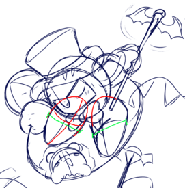
>>208484Thank you nona! I am extraordinarily passionate about the Kirby franchise so I want to get better and improve. Yeah, admittedly, compared to my other works this is one I'm a little less proud of. Throughout drawing it I several times thought, "I should scrap this". I was trying to have Meta Knight do a cool pose that's fitting to the whole magician thing he had going on. You're right, his right foot is just kinda dangling off at the heel and I think putting it into the foreground (in-front of his body) would've made it look better perspective wise. I also feel the left foot is a little wonky too since the front of the foot is facing the viewer directly so it looks like the foot as a whole is melded to Meta Knight's back rather than the heel
and due to the size not being smaller (along with his hand too) it lacks perspective in a way maybe and angling it upwards would help? I see what you mean by the way he's grasping his staff, I'm still struggling with drawing gloved hands rather than just hands with fingers, working with mass blobs as hands is a little difficult. I'm tempted to buy large winter gloves and use those as references. Thanks, with Kirby characters it's a bit hard to do dynamic poses since you have so little to work with depending on the character so I try to look at other art, official art works and in-game sprite-sheets to gather inspiration and to study from.
No. 208497
File: 1653273276207.jpeg (1.23 MB, 1420x1640, 82FDBAC1-6B9C-4A63-A6EC-068584…)
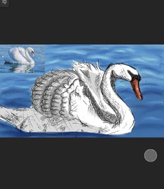
No. 208504
>>208489From your post alone I can see that you have but a lot of thought and effort into drawing Kirby and co, especially since you have clearly done research about perspective as that is really important when drawing simple blobs that doesn't have a wide range of movements and the fact you still continued on drawing despite disliking the placement of Meta Knights feet as I like to think that every piece of work that I dislike is just practise that I should finish so that I can learn from my mistakes and try better next time. You could also look up Disney hand that are gloved like Mickey mouse as there is a ton of tutorial about that for sure otherwise purchasing gloves are a good idea too since you can always pose them yourself for reference. I posted a bunch of Kirby wallpapers here
>>>/m/208400 I think you would like them, although they are mostly just Kirby himself
No. 208632
File: 1653334263511.jpeg (18.22 KB, 299x168, D84740D9-6723-4514-9F68-5BDCDC…)
>>208511Thank you anon, I don’t usually draw animals or anything like that I am trying to expand on what I do I like the look of early 2000s sketchy anime picrel ( breaking the habit -linkin park music video)
>>208509I’ll be dambed. I did this drawing really fast and I have a tendency to jumble things and rush.
No. 208635
File: 1653335344514.png (Spoiler Image,1.4 MB, 2764x3686, law.png)

lawrence my beloved
(spoilered for some blood/implied dismemberment)
No. 208696
>>208444I don’t understand how you guys are able to draw this shit my mind is incapable of this kek, this is good nonna
Everything in this thread is good! <3
(<3) No. 208698
>>208664>>208672dang, and i used a poser for reference too ;; the arm length is an easy fix, i might fix the eyes if i can get them to look aesthetically better lmao
also, please elaborate on what you mean by lineart around the eye so i can have a better understanding on how to fix it. do i make the lineart for eyelashes thicker? the irises? or the whole thing?
No. 208876
File: 1653430436669.jpeg (661.29 KB, 2045x2048, 3C08CDAD-DA5D-469F-9AD9-08F57C…)
I’ve tried different color palette on this portrait. I usually do realistic or black and white only because I’m scared of fucking up the values. Not really sure if it’s any good, but I think I need to leave my comfort zone.
Any critique is welcomed!
I love all the original artwork here btw, I rarely draw without reference, so to the nonnas posting here - you have my deepest admiration!
No. 208931
>>208911Thank you!
>>208913I probably described my painting badly but I never do the shades of grey to color technique, because I kinda don’t know how to make it work lol. I either do real skin tone or b&w. But you’re right that this one looks like I did just that and I don’t know why. On my iPad the picture looks way more saturated. I did this one like an oil painting - started with the orange background and adding the blues on one layer.
And thanks for the mention of hard and soft edges, it’s something I struggle to do properly, unless the source picture is in very contrasting lighting. I need to practice more!
No. 209851
File: 1653846323221.png (293.07 KB, 700x703, MagicalDraw.png)

Posting some stuff again! This is something I did in a Magical Draw session that I cleaned up in CSP.
No. 209852
File: 1653846389256.png (125.46 KB, 642x971, daraoch.png)
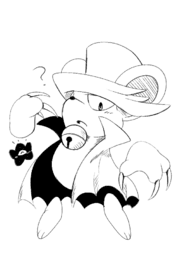
>>209851Daroach! Posting the black and white version since I like it a lot more than the colored version.
No. 209854
File: 1653846588232.png (196.59 KB, 564x537, cafededede.png)

>>209852I know I fucked up on the hands, but I still liked how this came out. I was testing out a new set of brushes.
No. 216314
File: 1655941325955.png (2.13 MB, 2943x2195, styles.png)
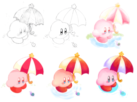
Back again with some more Kirby right back at ya.
No. 216315
File: 1655941382721.png (1.28 MB, 1389x2048, IDK.png)
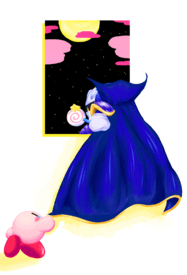
>>216314I don't feel proud of this one, I'm probably gonna re-do the composition but keep the colors.
No. 216316
File: 1655941623314.png (332.87 KB, 1118x1277, tripled.png)

>>216315Quickie Dedede sketch
No. 216335
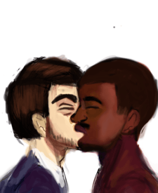
File: 1655948897279.png (204.29 KB, 900x881, trainkiss.png)
>>216318>>216321Thank you nonnies, I am glad you like my art of varying quality!
No. 217038
File: 1656214911143.png (667.25 KB, 1551x870, ekichouu.png)

Another one! I did this to relax before bed, while drawing this I primarily wanted to test if I can do a more 'lazier' but cohesive painterly style. I need to practice the method a bit more
No. 217374
File: 1656326537077.png (219.76 KB, 726x648, bt.png)
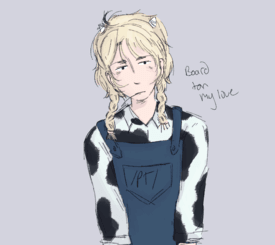
this was going to be a full body but i got lazy hehe
No. 219992
File: 1657238737409.jpg (3.27 MB, 4032x3024, image.jpg)

This was supposed to be a hair study
No. 219993
File: 1657238795672.png (4.85 MB, 960x2079, C2A87CA2-8102-4B3A-B105-C43E49…)
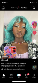
>>219992This was the image I was recreating
No. 220002
File: 1657241601561.jpg (159.88 KB, 1280x720, maxresdefault.jpg)

>>219992It's fine for a hair study! Not sure what exactly was your focus, but if color then it's definitely missing a strong highlight, and if structure, then a good practice would be simplifying the shapes even more and applying more geometric approach to understand a 3d form better, kinda like picrel
No. 221879
File: 1657828191678.jpeg (758.27 KB, 1606x2047, FFADF5A6-3C88-467D-A5D2-5D7580…)

HRG. Not sure if it’s finished. I have this problem with my artwork, whenever I try to polish it,I overdo it and it ends up looking worse. It somehow looses its "charm" or whatever it is. My sketches looks better than the finished thing. I guess it’s because I start to focus on details and I can’t see the big picture anymore. Anyone knows how to avoid this thing? I
No. 221915
File: 1657833382579.jpg (3.94 MB, 3544x2547, IMG_20220313_000553.jpg)
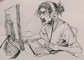
just a doodle of a seething gamer Eren
No. 222930
>>221879in my experience you just have to stop touching it and move on to your next illustration
that looks finished except maybe the hair
No. 222986
>>222948damn I'm a million years old. I swear it used to be harder to steal lmao
that's cool though
No. 223741
File: 1658445877393.png (8.72 MB, 3000x3000, bjheeh.png)

feel free to critique the shit out of me, i need it. havent drawn a background in months so maybe go easy on that part
No. 225632
File: 1659177828357.jpg (30.17 KB, 727x582, mkkksssss.jpg)
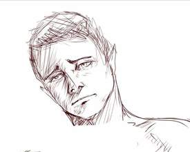
I like sad faces
No. 225649
>>222567That's a cute stickfigure though
>>223741So good
No. 227010
File: 1659637240054.png (55.43 KB, 399x459, Screenshot_2022-08-03_233852.p…)
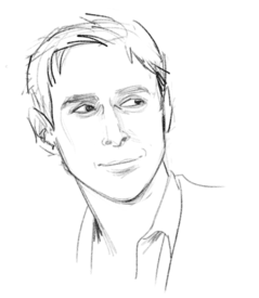
I haven't drawn in a loooong while, decided to get back to it recently. Thoughts on this? Can you tell who this is?
No. 227903
>>225633thank you
>>225636Thank you a lot for this review!!!!!! youre definitely right about the shading part because i have no idea what i'm doing to be honest.
>>225649thank you
>>225670i will keep that in mind thank you
>>225713thank you for this, my esl ass is definitely going to have to google for atmospheric perspective but afaik perspective is always a pain so im going to have to work hard lmao. youre right about the design being autism central but believe me or not this is an actual character haha
No. 228339
>>228305nonni im about to engage in some light bullying so that you don't don't become a pariah after getting the mistaken impression from anons here that this is something normal enough to share with regular people
>>228328ikr i guess i assumed that she didnt actually want to FUCK kirby characters and just liked them in a weird asexual autistic special interest way kek
No. 228396
File: 1660016312875.png (319.48 KB, 915x957, Capture.PNG)

hello nonitas…any and all criticism accepted i do not mind
No. 228400
File: 1660017185732.jpeg (89.65 KB, 720x1280, D1B6F864-8FF9-4529-92B7-1C01A8…)
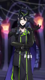
>>228396Give him a big ass and make it so his bulge can be seen from behind. Otherwise he looks great, he reminds me a bit of Malleus Draconia from twisted wonderland, which is nice.
No. 228402
>>228398no, no
nonny. Don't discourage her. I want to see the porn. This is a once in a lifetime opportunity
No. 228405
>>228400he was actually a big inspo for the process !! so that makes me happy
damm yall nonnies…really wanna see an ass version huh.. gimme some minutes
No. 228416
>>228402Can't you just Google Kirby x DeDeDe porn?
Anyways… Ok Kirby anon, do it. Drop the porn.
No. 230595
File: 1660436775539.jpg (619.5 KB, 1000x1000, Untitled_Artwork 18.jpg)
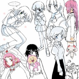
i wish i had more time to draw
No. 230619
File: 1660443579771.png (1.89 MB, 1500x2000, stars.png)
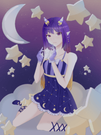
looking for things to improve with this oc piece nonnas, i havent drawn for years and this was my first attempt
No. 230632
>>230619Sorry for not giving you actual advice, but I think you could benefit a lot by watching Naoki Saito's videos, especially the correction ones and ones about shadows. Correction videos 95, 81 and 97 touch on a lot of the points that I think will help your drawing really pop! While I do think you could fix up the anatomy, and finding a ref of that pose would probably help (mostly her legs, and (our right, her left) forearm is too long); lighting, background, and composition will honestly improve your drawing most. Those things seem a bit intimidating at first, but I think you'll be able to do it! Naoki's videos of him painting over the art submissions is way more useful (for me) than having someone try to explain it in words. He kinda turned into an nftbro but idgaf, his videos are super helpful. Your oc is really cute
nonny!
No. 231128
File: 1660614046050.jpeg (924.29 KB, 1170x1805, C8C6872D-93D6-430F-989C-77BE10…)

She’s in a classroom
No. 231794
>>231572im just a hobbyist i feel like its not that serious
>>231583i didn't even post my own @. someone else did
No. 231925
File: 1660844987918.jpg (192.85 KB, 504x1044, featurecreep.jpg)
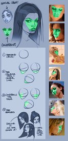
>>231128Great perspective and use of 3D space
nonnie! I also really like the shading on her shirt, there's such good value contrast and you can see where the material bunches under her arms and indicates directional movement.
Her facial features are a little spread out, like picrel. But if that was an intentional style choice, feel free to ignore that. There's also some lines that don't match up in the background. The floor line appears to be going two different directions, and is not parallel with the board. The photographs are a bit distracting because the photographs have more value contrast and pull the eye away from the rest of the picture, making everything look washed out by comparison.
No. 233688
File: 1661467986433.png (497.55 KB, 591x890, gorumefes.png)

Posting once more. Kirby's Dream Buffet was released recently so I had to draw something.
No. 233689
File: 1661468020381.png (651.48 KB, 1672x1248, darorodo.png)
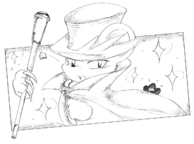
>>233688Daroach, he's fun to draw though his hat is confusing at first.
No. 233691
File: 1661468073698.png (1015.75 KB, 1683x2421, sketch.png)

>>233689A sketch I'm still debating on coloring.
No. 233692
File: 1661468124622.png (259.89 KB, 674x839, annifest.png)

>>233691This was made in relation to the 30th Anniversary Music Fest. King Dedede Fest and The Knights' Revenge Medley were my favorites.
No. 233693
File: 1661468170837.png (174.09 KB, 720x360, banner2.png)

>>233692Finally a banner I made for my blog.
No. 233700
File: 1661472491728.gif (1.11 MB, 498x282, tears-of-joy-anime[1].gif)
>>233693Kirby anon I love you… This banner looks so soft and cute like a manga cover ♥
No. 234008
File: 1661585870431.png (Spoiler Image,2.54 MB, 2744x1169, kakaya.png)

I'll never post this anywhere else so here it is. Unfinished spicy drawing of Kaeya from Genshin Impact. I think it's incredibly cringe but I do like how I drew the body/anatomy. I am confused with the composition though, something doesn't look right to me.
No. 234166
File: 1661634944068.jpg (380.63 KB, 1080x1225, Screenshot_20220827-161447_Ins…)

Rena pic i drew cuz i love rena
No. 234443
File: 1661729727604.jpeg (109.77 KB, 658x313, 8A41D346-7A5A-47D0-A775-7923EF…)

I make silly collages off of thrifted materials
No. 234446
File: 1661729874613.jpeg (44.96 KB, 470x312, 4A10493C-B296-4551-9EEF-F1F9A2…)

>>234444Aww thank you nonna
No. 234492
>>234128Yeah he was supposed to be laying down. I didn't notice how odd the neck/head/shoulder area looked until you mentioned it. Thank you
nonnie! I really struggle with poses sometimes
>>234455Got it! Thank you too nona.
No. 235454
File: 1662046550312.jpeg (228.88 KB, 1222x640, DDBD61CB-5144-47BF-BB56-A6400F…)

>>234547>>234909Thank you all for the support! I love collecting materials and making them. Ill keep posting here more often. Wish we could all hang out and make art together. Heres another! All the love
No. 235476
>>235454You're welcome! I love your style so much and I look forward to seeing any new pieces you do. I've actually been trying collaging myself lately as my wrist is fucked from a decade of tattooing (early onset arthritis, fml) so collaging has allowed me to sketch a very rough idea for a picture and build on it without the pain. I
might post what I'm working on if I'm feeling brave. I would love to hang out to! I miss collaborating with other artists and mixing styles so much.
No. 237238
File: 1662619217362.jpeg (338.21 KB, 1536x2048, 9B29FC83-BF22-4EE9-8634-248293…)

Something is horrible with this drawing and idk what pls help
No. 238023
File: 1662861060816.jpeg (84.93 KB, 709x1000, 1665AAD9-CD43-408C-9746-24F28F…)
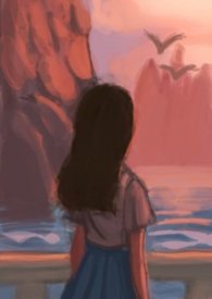
No. 238067
File: 1662880241983.png (726.12 KB, 1900x1600, cool cool cool so cool.png)

I didn't mean to make her look so coomerish, sorry nonnas. Any and all criticism/critique is accepted
No. 238308
File: 1662942893577.png (263.18 KB, 566x708, wadodon.png)

I drew a Waddle Bowl, mostly as a test of drawing with only pencil brushes along with using a smaller canvas instead of my usual 2000 x 1000 canvases.
No. 238413
>>238347I suppose so! I love him a whole lots even if others may not and find him cringe.
Though I now have the awareness to never mention him ever anymore. Thank you, I want to get better at drawing food but I had to add a Waddle Dee, I can't help myself. I'm glad it looks yummy, rendering the fluffy rice was my favorite part!
>>238358Oh, I draw on huge canvases too. It feels like the image is sharper to me when it's on a huge canvas. Usually I start with a huge canvas and by the time I'm ready to ink I'll scale the canvas down.
No. 238473
>>238439Nah, it shouldn't.
To be honest, it kind of really hurt to learn the truth of the matter is that he isn't a desirable husbando to others as he is to me. Others will never see him in the way I do. Talking about and posting him was making others annoyed, uncomfortable, or laugh. Not all husbandos are equal and I'm fine with that. I'd rather not make others uncomfortable by posting him or have my husbando, or my love for him, reduced to some shitty punchline or joke. Thank you though, it means a lot to know others may like him!
No. 239423
File: 1663218761348.png (361.83 KB, 481x934, babumeta.png)

Doodle to compensate for the postings below, it's Meta Knight but babey.
>>239087>>238826>>238786Dedede is my one of two everythings, and I love him very much. I could talk about him, Meta Knight or Kirby for hours, enough to fill a three hour and thirty minute youtube if I had to give an estimate. My passion is unending to be honest and I can get a little carried away with it, so I could never lose any love or passion for him. Probably one of my biggest reasons for drawing things in general!
>>238989>>238780Thanks Anon, my passion is the one thing that keeps me driving and living each morning.
If you're the Anon from /g/ who I snapped at, I'm truly truly sorry for how rude and aggressive I sounded, I really am. The way you acted, especially the wking, kind of scared me since it was eerily similar to a moid with a tsim fetish who stalked me on twitter and shitcord for a while and I just ended up freaking out a bit.>>239007Thank you very much! If you're wondering how I did it, the trick is to use a low density or opacity analog pencil style brushes at a large size and build everything up from the dark color first and the lighter color next. Changing the direction in which you do your brush strokes helps as well as it adds different directions in texture. Three overlapping colors of a varying saturation and shade for each color to blend rather than an actual blending tool helps as well. I used three colors, yellow, pale yellow and pale brown to do the rice funnily enough!
No. 240007
File: 1663558131529.png (116.17 KB, 438x340, whereamisupposedtolaughatidiot…)
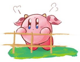
WE'RE BACK!!!
Here's a cowe Kirby I drew back on CC.
No. 240236
File: 1663600444693.jpeg (764.77 KB, 2334x3028, AD2C9204-D424-46D5-9BB8-B688AB…)
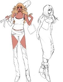
I feel embarrassed posting my art because I feel like this is bad art but I have trouble rendering and fleshing out my compositions and have problems finishing my drawings because none of them are perfect. do any of you have any good tips/videos for improving color theory and perspective?
No. 240267
>>240236Practice perspective by studying references. It's essential that you start seeing things in 3D (or in shapes) instead of just lines on a canvas. I know it's boring but it'll help a lot.
As for color theory there are plenty of videos/tutorials, but you can also study professional artists you like and look at how it's applied. Lots of great artists also post speedpaints on YouTube so you can see the process.
No. 241221
File: 1663846284800.png (3.59 MB, 3024x4032, 614DDE01-B465-46CA-A231-9D7B02…)
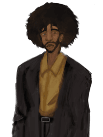
I like this but something feels off lmao it’s probably multiple things
No. 241249
File: 1663856499582.jpg (154.05 KB, 1173x1600, plans de la face sous éclairag…)

>>241221Edges need to be cleaner
Colors are muddy : need more contrast and values shift (look up black skin color palettes refs)
No light source, which brings us to the next point :
Feels too flat : look faces and body planes refs such as the one attached
And mroe importantly, keep drawing !
God luck nonna
No. 241378
File: 1663881348599.jpeg (1.06 MB, 3211x2048, FC68D99E-A228-429B-A164-338ABA…)

>>241300thank you nonna,
here’s side by side. now when I’m looking at it, I can see the values are off. Maybe I shouldn’t try to get the proportions so right and concentrate on shapes instead. I have a visual impairment (everything I see is kind of skewed and crooked) so digital has been a great help to me. I dont trace, but I make an outline of the source and than I can easily compare it to my drawing. but it obviously limits me too. I have some sketch portraits and although they are not that accurate,they look better than those where I try to be really accurate with proportion.
No. 241379
>>217038Kirb-dedede anon, if you're still around, can you let us know about other inspirations and resources you used to learn how to draw?
I really like the movement, forms, and life in your art and I want to stea–borrow some!!
No. 241434
File: 1663898503938.jpeg (96.04 KB, 1400x788, 7FA7B72C-D84F-4E02-B987-D73D06…)
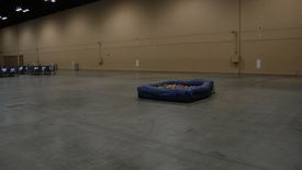
the one and only ball pit. never 4get
No. 241445
File: 1663903694725.png (2.09 MB, 2175x1433, dontworryyouwillgetthere.png)

>>241379Don't know if I'm the best one to give advice, I mean my only strong suits is coloring and that's about it. I can't even draw humans
granted, I don't want to. but for you, nona, I'll give it a shot.
I'll just go over the basis for my art. To be clear, I use a pirated copy of Clipstudio Paint EX.
My biggest inspiration is Kirby, in general. The colors, the aesthetics, everything. So usually I'll play Kirby and take screenshots to use as references, look at other Kirby art, read some of the novels, etc. The Kirby Art & Style Collection book is also one of my biggest references as it covers so many different art and concepts from the entire series up to Robobobot. As for other inspirations, it can be other things like songs I listen to, manga covers, things I see about my day, etc. Really it's anything and everything, though usually it's something cute and adorable.
I generally like soft palettes so I tend to stick to those, but in general I usually use a basic color palette. I used to use a copic marker color palette I got from the ClipStudioPaint Asset Store, but that was removed so I just use a regular color palette called "和色カラーパレット" from
https://assets.clip-studio.com/en-us/detail?id=1631368, it covers all the basic colors you'd need and then some. Color choice really depends on what you're going for with your individual art peice, though I try to be creative with my color choices nowadays using purples to shade reds, cyans to highlight navy blues, blues to shade pink, etc. So it's always good to try playing around with colors, some books I would suggest that I used when I was still shit at color theory would be 色の教科書, コピックかんたん上達色ぬりレッスン, コピックで描く基本 可愛いキャラと身の回りの小物たち, though the last two lean towards marker like illustrations but they help all the same. You can find them on places like e-/ex-hentai as horrid as that sounds. Another thing that helps with coloring is playing around with gradation and hues, they can brighten up, make colors more contrast, make certain areas pop, etc. I would suggest taking an illustration that you used LOTS of different colors and just taking a moment to put different filters and different hues, it gives you a better understanding of what colors might look interesting together when shifted.
As for resources, I admit, I'm a bit of a brush hoarder. In reality, outside of my tablet I can't draw or even write well. My hands shake too much so I'm thankful for technology that has things like stabilizers. As such, I'm able to try out all sorts of different types of drawings and I tend to go a bit hog-wild. I would have to say I use about three different groups of brushes on a daily basis. Manga-type ink brushes, I use them for all sorts of things like hatching, line art, etc. Marker and Watercolor-type brushes, which I use for making "softer" looking pieces. Rough Paint and Pencil-type brushes, which I use for making pieces that are more painterly and have texture to them, along with textured line art or hatching. I'm going to drop my favorite from each category.
Manga-type Ink Brush
>1本で線画&描き文字ペン (https://assets.clip-studio.com/en-us/detail?id=1811648)I love this pen a lot, I use it for almost everything. It's not too texturized but
just enough that there's a little dash of analog to it. The pen pressure is really good, allows for a lot of control. I used it for my past doujinshi as it's perfect for doing the general inks, small hatching, details, and small SFX.
Marker and Watercolor-type Pen
>Tマーカー風ブラシセット (https://assets.clip-studio.com/en-us/detail?id=1692034)I love, love, LOVE this marker set. I looks almost like the real thing if I had to say. The blending tool is wonderful and I use it more than the base blending tool It's perfect for soft water color art that relies on the white background, and more colorful watercolor art. I tend to call these pens the "
Digital Copics" because they behave the same way in buildability and bendability. They're best used with pencil brushes and a just barely yellow-tan background.
Rough Paint and Pencil Brushes
>しげ絵筆令式 (https://assets.clip-studio.com/en-us/detail?id=1871677)These are my absolute go-to when it comes to making rendered painterly art. It's wonderfully textured, with different brushes that have varying level "scratchiness" to them, so you can layer different colors over with the lower color showing through. They look nice, work nicely and are always reliable from the get-go so you don't need to do much finicking with them.
Those are my main resources for drawing and coloring.
As for process. Usually when I come up with something, I'll write it down and sketch it. Usually I'll use one or two colors depending on what I'm sketching like blue for the background and red for the character. It's better to clean your sketches rather than leaving them messy. Messy sketches won't be as defined and easy to follow as clean sketches, and can lead to slight trouble when you begin inking them. This is just me though, I find I ink faster on a clean sketch than a messy one. I use a huge canvas so I can copy and paste various references I may need around the area I'm drawing because CSP's subview is absolute shit and I don't like opening a new tab for each thing I need to remember. Such things could be screenshots, flowers, color palettes, photos, official renders, etc.
After I check the sketch looks good after flipping, and tweaking and such, I'll save it and close CSP and go ahead and ink tomorrow. Usually the period from sketching and beginning inking allows me to think of things I might not have thought of in the moment like slight additions or changes. I feel taking some times allows you to better stew on what you'll want to do later on. Unless I'm doing a painterly picture, I'll move on to inking after the sketch.
Once I'm ready to ink, I'll do it all in one swoop. I'll have different layers for different things. For example, Layer 1 will be the main body, Layer 2 for small details, Layer 3 will be facial expressions, and Layer 4 will be the background and so on. I feel this allows me to better edit and change things without accidentally erasing something.
Once all is done, I'll go ahead and color. Now, how I color really depends on how I plan to color like if I plan to use water colors or cell-shade or soft rendering. I feel that's too much to type so I'll just put it plain and simple. I layer on the base colors, then shade/blend on a different layer in a completely different folder, and repeat the same with highlights and detail. The reason being so that I can change colors easily if something seems off or I want to play around. (I don't do this for watercolor though, I just do the colors on one single layer for that.)
I also feel the airbrush tool tends to look bad unless done to add a gradient over a large area before applying the shadows and light over it or done as a "non-textured" water color brush against a white background. This is just a personal preference.
After coloring I just do tweaks. I'll maybe add a gradation, shift hues, modify the canvas, add a frame, white highlights, text, etc. It's just the general tweaks before I post it online.
And done, that's how I do illustrations and such. I also used to use this book, Let's Make ★ Character CGイラストテクニック, for a basic workflow of how illustrations are done, it's very helpful!
Some other books I've used… (Note. Some of these are one-offs after I used them for their worth, some of these I come to occasionally, and some of them I refer to constantly.)
着物の描き方 基本からそれっぽく描くポイントまで, マンガで使える! 食の描き方, 動きとシワがよくわかる 衣服の描き方図鑑 服の仕組みから角度別の描き方まで, 完全実用版 おんなのこの服の脱がせ方 (I mostly use this a reference when I'm drawing pin-ups, it's porny though.), Sketching Manga-Style Vol. 4 - All About Perspective, デジタルイラストの「表情」描き方事典:想いが伝わる感情表現, ちょっぴりHなコスチュームの描き方 (Porny, so be warned. Mostly used this when I was sketching up a personal lewd calendar of my husbandos but I still occasionally go to it even now), 軍服・制服の描き方 アメリカ軍・自衛隊の制服から戦闘服まで (For any of you who has a thing military or uniforms, this is PERFECT, even outside of a reference I love it)
As for other small things I keep in mind…
0. Draw what you love, and only what you love. Never let drawing become a chore.
1. When it comes to forms, I just go for what would look cool and interesting and or cute and simple. Though I always try to make sure my compositions look somewhat symmetrical or have an interesting contrast. As for movements, I just try to make sure nothing looks too shift, there should be curves and such with arms, details that imply there's movement going on, etc. The facial expressions help too, I'm horrible when it comes to reading (and drawing) facial expressions so I actually have a folder of them that I've screenshotted from manga and such. As for life, I just try to draw the characters as if they're living as weird as that sounds.
2. This is biased but I feel Kirby characters are perfect for practicing colors. As each character has a general core color theme you can use to test for certain colors. Meta Knight is perfect if you want to get used to experimenting with blues, purples and yellows. Dedede has the primary colors, yellow, red and blue built directly into his design, and so on.
3. There will always be a bigger fish so feeling insecure is stupid. By that I mean, if you feel insecure or upset that your art isn't good enough or isn't good, don't
because it's true. Someone will
always be better than you at art, someone will always draw better, someone will always draw more interesting and creative pieces, someone younger than you will draw better than you, someone older will draw better than you. This is a universal constant you will and should learn to accept, so there's no use in being sore or jealous of other artists and their skill. Instead, be inspired and use those inadequate feelings you develop to push yourself harder to improve and become the best artist you yourself want to be. Even more so if you're drawing for fun. I guarantee, if you think something like "God, I wish I was like this artist!!! It's not fair!!!" someone is thinking the same about you.
4. Everyone's art has always started piss-poor before they began to improve, pic very very much related (2019-2023). No one is born picasso, and if someone is, become better. Just continue working and improving at what you like and what interests you and you will get there.
5. Try everything and go for it. If you want to try something, absolutely go for it! The best way to improve is to try different things, experiment with different things. Use a painterly brush and textured watercolor brush in one art peice. Even if it sucks, all that matters is that you tried and went for something different and that in itself is a form of improvement, moving out of your comfort zone. If you want to draw something in a lineless painterly style, go for it! If you want to make a doujinshi, go for it! If you want to draw with nothing but pencils, even for coloring, go for it! Just try all sorts of different things, it'll be worth it since you might just pick something up on the way. It's great to incorporate some sort of practice of fundamentals into your drawing
6. Don't use too many artbooks, it will overwhelm you and you'll never read them, same goes for brushes.
7. Drawing porn is only fun if you personally and actually enjoy what you are drawing. Never draw porn if you don't like it, especially if you're drawing porn for others.
8. And most importantly, have fun.
9. Perspective is an absolute pain in the ass but you should definitely learn it. Fundamentals are cool.
Hope this helps.
Shit, I sound like a shitty art channel don't I?>>240290Super Star Ultra, absolute 10/10 and perfect for entering the series.
No. 241456
File: 1663905737616.png (914.34 KB, 775x1100, spaceydoodle.png)
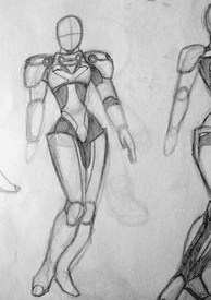
Should probably get off my ass and design shit for real.
No. 241470
>>241445You went above and beyond the stars!! Reading through this made me realizes a lot of areas I was succumbing to chaos too and not really in a fun way either. Like, doodling things I didn't even like just because I was better at certain things and was afraid of exploring, or being disorganized in an oddly unspontaneous way–in contrast to your conscientious approach. And it's really silly cuz when I drew something I really liked, it made me happy. Also, I asked you because there's something I like about your drawings that I prefer over, say, what I see when I look up Kirby and similar art of nonhuman characters. Take that as you may.
Anywaaay, I ramble. I'll check out some of the links and references you gave. I'm pretty shy but maybe I'll talk about my progress sometime here.
No. 241471
>>241468From 2018 to 2023, so six years as of now.
>>241469>>241470Thanks, I'm glad I could help.
I get what you mean. I feel like every artist has that moment when they fear trying something new. For example, despite my uncomfortable lust for Dedede, I only
just started drawing him maybe a few months ago because I was afraid to branch out into something so alien and new. Sometimes you just got to force yourself even if it's scary and even if you know it's going to look bad at first. A comfort zone is a double edged sword in a way.
I'm happy to hear that, it's amazing when you're able to draw something you really do enjoy and love, something that actually makes you proud.
>I asked you because there's something I like about your drawings that I prefer over, say, what I see when I look up Kirby and similar art of nonhuman characters. Take that as you may.I genuinely don't know how to take this but I will assume it's supposed to be a compliment so thank you very much, it means a whole lot.
I'd love to see your progress and I'm honored that my advice was of some use!
No. 241475
>>241471Oh, it was meant to be a compliment. I love your art. The expressions, style, liveliness–I worded it like I did because I love these characters, but never really found art I really loved of them until now.
Your Dede-delay is painfully relatable and describes most of my early art attempts. Can't believe I spent so long dawdling on things that were so much less fun to me. Oh well. Here I am, on the right path now.
No. 241520
>>241445Can you post more examples of the brushes you use in your art? example
>Rough Paint and Pencil BrushesI want to see a drawing using these
No. 241593
>>241520Here's this
>>196512 and
>>196511. For the Waddle Dee picture, I only used different colored pencils to color, shade and add lighting. For the second picture, I used a mix of Rough-paint to do the coloring and pencil brushes at different sizes to do add textures and details.
No. 241771
File: 1663980763035.png (3.84 MB, 3024x4032, 0CCC5EB7-B556-41B3-81BC-2BAFB6…)
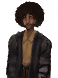
>>241513Here, I’m still working on the clothing folds and I never expected to work this long on a face lmao. But he looks more lively than the last image.
No. 242429
File: 1664159569134.jpeg (28.68 KB, 623x567, 9FB614CB-67C8-429F-A008-3EC57B…)

>>242375Tysm these tips are really helping me out
No. 243103
File: 1664332057510.png (Spoiler Image,6.83 MB, 2803x2968, mstrgl3.png)

No. 243793
File: 1664577658161.png (314.65 KB, 1453x1893, uhh.png)
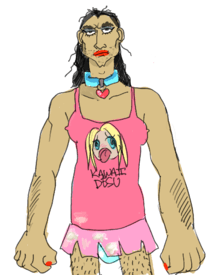
my magnum opus
No. 244009
>>243131>>243448Thank you anons you have warmed my heart
>>243935Yes! It was done on lined paper (at work lol). I finally found a setting of the line extraction tool on clip studio EX that eliminates only the lines from the paper. I’m really happy because I really only can draw on lined paper due to mental issues so this really opens up a new world for me. I think for it to work the drawing has to be in black pen so there is enough difference between it and the lined paper. If anyone has EX and wants to try, I used the “posterize before extracting” option and played with the ratio.
No. 244058
File: 1664659102892.png (59.73 KB, 564x1002, nonnabella.png)
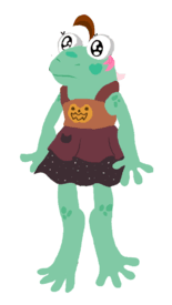
frog
No. 244062
File: 1664659898476.png (9.45 KB, 272x312, thx.png)

>>244060im glad you liked it anon!
No. 245821
File: 1665293312728.png (600.95 KB, 1756x1054, Screen Shot 2022-10-09 at 4.25…)
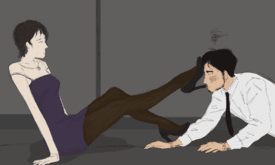
was just doing fun trace overs of movie screen grabs with my friends and ill never post it anywhere so i thought id post it here..very rough but i liked it
No. 251613
File: 1667147792687.jpg (346.2 KB, 700x628, ribombee.jpg)

Very early sketch, but how are the colors looking like so far? (aside from most likely terrible on mobile).
I usually draw with 3 colors (2 main + 1 accent) because I'm kinda bad at picking them, but I wanted to give her some colourful flowers and I don't know if they clash too much.
No. 251614
>>251613Adorable
nonnie!! They don't clash at all, I would play around with the blue flower a little, reflect that yellow off the other two flowers like how you did with the pink, it's very pretty & makes it a bit more cohesive. You definitely have an eye for colour, be more confident and play around, there's endless opportunity! Good luck
No. 253831
File: 1667839066167.jpg (6.21 MB, 4032x3024, 20221105_235728.jpg)
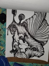
I am drawing a weird snail my hands are tired and idk if I have it in me to finish
No. 257186
File: 1669168544176.png (223.7 KB, 1181x945, cat1.png)
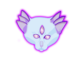
first time in digital, i dont know what im doing
No. 257390
File: 1669233734282.jpg (1009.81 KB, 1700x1597, new ocs - Copy.jpg)

I mostly draw women and girls because of malegaze, how do I embrace the thirst and master the art of cute men, nonnies?
No. 257423
>>257390Complete unironically, find a good husbando
You'll want to portray him justly, so you'll force yourself to draw the male figure better and break the male gaze dominant pretty girl art
The husbando hornyposting thread is a good research field for new husbando prospects btw
No. 257513
File: 1669282886289.jpg (540.66 KB, 1700x1387, TAKERU.jpg)
>>257423thank you
nonnie, I'll try
I'm mostly an oc artist, but I will channel thirst to my husbandos as well.
>>257454you're powerful.
I really hate ic but I discovered the husbando thread, and it looks really comfy so far.
No. 259152
File: 1669747313690.jpg (848.54 KB, 2241x2029, 20221129_193740.jpg)
No. 259153
File: 1669747370027.jpg (541.58 KB, 1580x1599, 20221129_193546.jpg)
No. 259154
File: 1669747457996.jpg (750 KB, 1705x2303, 20221129_193718.jpg)
No. 259155
File: 1669747479118.jpg (1.53 MB, 3264x2448, 20221129_193237.jpg)
No. 259156
File: 1669747543917.jpg (527.4 KB, 1517x1656, 20221129_193623.jpg)

No. 259157
File: 1669747603665.jpg (947.06 KB, 3145x2327, 20221129_194622.jpg)
No. 259162
File: 1669748238612.jpeg (152.13 KB, 878x700, Vincent-Van-Gogh-The-Street-th…)
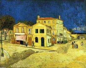
>>259157Reminds me of The Yellow House by Vincent Van Gogh, except - Van Gogh could only hope to be this talented.
No. 259175
>>259164>>259158This
>>259153 is Paul and this
>>259154 is Adam imho
No. 259176
>>259175I think
>>259154 is supposed to be Robert Pattinson? "sparkle sparkle" meaning Edward Cullen?
No. 259198
File: 1669758726413.png (Spoiler Image,989.29 KB, 2745x2650, yoshiwithegg.png)

Egg
No. 259324
File: 1669778645988.png (Spoiler Image,692.77 KB, 1412x1222, cursed-delete.png)

we posting cursed art now?
No. 259534
File: 1669834820425.png (Spoiler Image,85.34 KB, 1322x538, july 2018 the illustration to …)

I've kept a (digital) diary for a few years now, but when I first started it I used to include a few MS Paint illustrations in the folder for each month. Looking back on them they are completely incomprehensible and I have no idea what I was referring to even after reading the accompanying diary entries.
No. 259556
>>259534This is so cute
nonnie! I hope you continue to illustrate little parts of it
No. 260053
File: 1670005353219.jpeg (580.48 KB, 2108x2048, CDF54E27-B072-4E75-A3A6-88EF6D…)
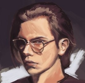
WIP. I’m trying to step out of my comfort zone and learn mixer brushes in Infinite painter instead of using procreate as I usually do.
No. 260856
File: 1670210326255.jpeg (336.49 KB, 750x945, A33C6601-B0D8-4F96-920D-092D1A…)
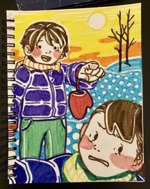
I don’t need a rating I just wanted to share a happy winter picture with my nonnies
No. 260946
File: 1670252152552.jpeg (494.89 KB, 1440x1800, B8DFC83F-6387-4478-BA16-086DB3…)
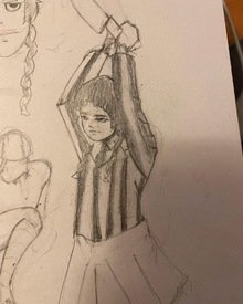
Some fan art for the show wensday
No. 261349
File: 1670356202735.gif (321.34 KB, 500x500, picmix.gif)

rate my pixmix
No. 261350
File: 1670356248419.gif (1.46 MB, 500x500, picmix 2.gif)

>>261349just an average
nonny, always on the search
No. 261911
File: 1670515868272.jpg (921.47 KB, 1600x1507, quinn.jpg)
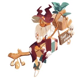
This character's a cringe they/them gendie but he's a cute man to me.
I can fix him…>>260140Thank you!
No. 261914
File: 1670515927801.jpg (1.67 MB, 1137x1386, quinn2.jpg)
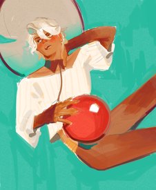
>>261911Had to draw him again because I don't think the first one is thirsty enough.
No. 261924
File: 1670517286401.jpg (2.1 MB, 3456x3024, 20221006_145334.jpg)

I draw weird things I guess. Rip it apart
No. 262529
File: 1670685144852.png (1.65 MB, 1527x1863, Untitled7_20221210101122.png)
Nick fuentes x ye
No. 263839
File: 1671138075915.png (103.52 KB, 383x744, starfiree.png)
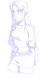
god i want art friends but the discord link doesn't work for me so i can't join and meet nonnies
picrel sketch of starfire i'm procrastinating on because it feels too coomer-y but i like the pose. probably gonna redo anyways
>>238067reminds me of those zombie girls on the msi cover art!
No. 263843
File: 1671139145647.jpeg (444.95 KB, 1607x2048, 0C8D36BF-C956-4BC9-817D-3E112B…)

wip of tommy shelby. i’m stuck doing boring portraits, but that’s what I enjoy the most. I deeply admire artists who draw things from imagination.
No. 268386
File: 1673418401494.png (1.08 MB, 1920x1080, comparacion.png)
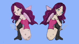
it all started as a tracing (right) but i didnt like the lineart so I did it again, used different brushes and it ended like left. I know its silly and edgy but i like it as it is
No. 268520
File: 1673472901206.png (1.82 MB, 1200x1703, Capture.PNG)

got this bad boy shown in an exhibition in december
No. 268551
>>268520i like the shape of the fire and the empty stare
congrats on the exhibition!
planning on posting a collage of my elsie drawings
No. 268558
File: 1673489956247.png (192.37 KB, 718x635, redline.PNG)
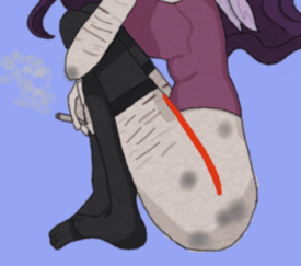
>>268386Hey the thin lineart looks good and there's a visible improvement. I'd advise against tracing though even if its just practice cause it can be difficult to understand what the original artist was stylizing (for example the area around the leg should fold more like picrel, I'm guessing the original had clothes covering it). Instead I suggest looking at real photo poses for reference, or the mirror. Cute design though.
No. 270893
File: 1674267953782.png (266.66 KB, 724x872, Screenshot_20230120_212515.png)
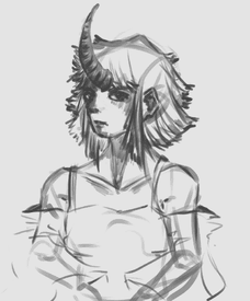
this has to be the first time I drew something in a style like this. I think it looks rough… but I like some parts of it. What can I improve on?
No. 271407
File: 1674523231031.png (331.45 KB, 686x1000, Untitled_Artwork 2.png)
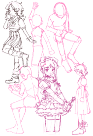
sketching
No. 272974
File: 1675373458758.jpeg (693.96 KB, 1471x1665, E217C01C-87B9-4071-89A2-29D6DE…)
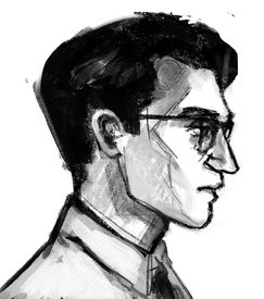
I don’t want to see this thread to die, there’re so many talented nonnas here and I love to see your work. I like to draw men with glasess, so here’s one I just made up.
No. 273315
File: 1675504231370.png (859.69 KB, 1114x1127, twoex_1.png)
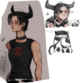
I have had art block for almost half a year
No. 273454
>>272974Lovely angle and a beautiful nose. I'm a bit envious with how you manage to draw glasses on correctly without making it look out of place. 10/10 One question, is this a digital piece?
>>273315Astonishing! I love that you made 2X have visible biceps and feminine outline, love that her shirt looks like it frowning to onlookers and yet from 2X it looks like a smiling face, cow print baggy trousers is something that I hope catches on as it matches with Elsie's tacky shirt which I love! Also love that Elsie is creeping in the background and the height diffrence. 10/10
No. 274081
File: 1675791018969.jpeg (543.66 KB, 1204x1216, CEBEFF0C-5480-43D4-A399-3E7453…)

>>273454Thank you! I have a lot of practice drawing glasses heh. Profile is actually the easiest portrait angle, only one eye to draw and a clear line to get the proportions right.
To answer your question - yes, it’s a digital drawing, I mainly use procreate. I used to only do traditional, I love traditional, but doing it all on ipad is much more convenient. I sometimes try to mimic the traditional feel in digital, in drawings it’s quite easy, paintings are harder.
Here’s a portrait where I tried to make it look like a pencil drawing.
No. 277985
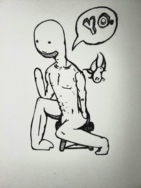
File: 1677206794412.jpg (2.9 MB, 3024x4032, 20230223_204139.jpg)
No. 278020
File: 1677214753819.png (362.25 KB, 864x909, cheebs.png)
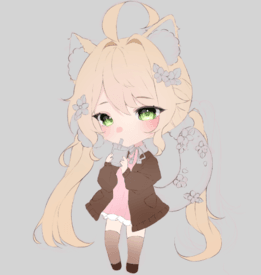
littl chibi im working on
No. 278027
>>277999Kek. I love it
nonnie.
No. 278028
>>277985I remember you, are you
>>261924 ? I loved that one, I saw it a long time after you posted it so I never said anything but I should've, your creature is cool. I like your style, I mostly do pen and ink too so it feels like I have a friend itt.
>>277999 kek
No. 278680
File: 1677441859249.png (579.38 KB, 1322x1051, valhard.png)

I drew this for Valentines Day
No. 278683
File: 1677442066002.png (354.56 KB, 1069x1207, shesflustered.png)

this as well, it's one of my favorite ships.
No. 279083
File: 1677574290199.jpg (367.54 KB, 1345x1477, 1677559737731272.jpg)

Be honest, I'm looking for ways to improve
No. 279085
>>2786809/10 clean, competent
>>278020Looks well done. I'm not a big fan of the style but I dont like chibi anime so that's on me
>>268386The textured brush on the right helped give it that messy early internet look. I don't really like the execution or subject matter
>>261911I like this a lot 9/10 or 10/10
No. 279556
>>279085>>279107Thanks, metakirby is one of my top fives.
>>279083First off, I love the linework here it looks solid and confident. The style is nice here, I love how blocky and round everything looks without coming off as the style being used as a crutch. Everything looks fun and pleasing to the eyes. It looks like you have a pretty solid grasp on shapes and perspective already. I'd say you could work on keeping certain things like the little details consistent within the designs, for example the height of the rectangular design of the character on the right's shoes don't match up. One being shorter than the other. Other than that, it all looks really really good!
No. 279633
File: 1677756930839.jpg (259.58 KB, 1377x1477, IMG_5091.jpg)

>>279556Thanky, I appreciate the feedback. Didn't see this till I had already colored, so I'm gonna watch out for inconsistencies like that in the future. Arigato
No. 280066
File: 1677959260894.jpg (Spoiler Image,845.47 KB, 1130x1130, Tumblr_l_24554498014770.jpg)

(Spoilered because creepy crawlers)
Gonta Gokuhara fanart. I'd appreciate tips because something feels like it's missing
No. 280095
File: 1677969480439.jpg (128.31 KB, 1078x878, Tumblr_l_3603524595353929.jpg)
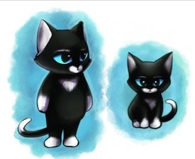
>>280094Thanks for the advice, here is something more painterly I drew recently, so I hope that's better
>>280087Maybe I'm dumb but I figured it didn't matter since you can reverse-search images anyway - either way, censored the watermark here ^^
(^^) No. 284406
File: 1679355293890.png (2.71 MB, 1875x1729, magodatefinalfinal.png)

This was more so a refresher in doing my usual cell-shading style and a way to warm up for other drawings such as a card for Meta Knight's birthday.
>>280095Very cute cat, I like the shading a whole lot a and it reminds me of old picture books.
No. 284412
>>284408Thank you very much! Now that you mention that, I
really should have. The funny thing is, you can sort of tell I had originally went/was going with a textured fluffy coloring with the floor and cotton candy but when I got to coloring Meta Knight and Kirby I changed my mind. Reason being I hadn't done cell shading in a while and wanted to 'brush up' on that however in doing so, while it does bring your attention to Meta Knight and Kirby, it strongly clashes with everything else so I kind of regret that stylistic choice. Thanks, I definitely need to get better with lighting though, I think I tend to make the characters a little too flat with the lighting or not make the changes in lighting such as shadows visible enough.
No. 286924
File: 1680328437146.png (83.08 KB, 709x1000, 162E8E37-8559-47EF-B9E1-A84F8E…)

>>241771 A couple of months later and I got gud
>>259154Better than Picasso 10000/10
No. 287241
File: 1680535902671.png (571.55 KB, 1074x1558, めたかrd1.png)
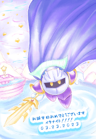
New art, this was for Meta Knight's birthday. I took another nonnies advice and went for a full watercolor style with textured brushes though you can kind of tell I got a little lazy coloring things such as the background and Meta Knight's cape. Kirby and Dedede's are on the 26th so I want to draw something special for them next.
>>286924She's very cute, I like what you have so far and I can't wait to see the final product! I would suggest giving more textured definition to the edges of her hair but that's about all.
>>285384As do I, they're an adorable couple and you have can a lot of interesting dynamics to pull off with them. What do you like about mtkb?
No. 288145
File: 1680892839212.jpeg (527.47 KB, 2053x2731, 46A8A336-91D2-44DC-91B1-733B8C…)
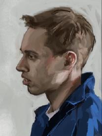
I just like to draw portraits so here’s another one I did few weeks ago. Any criticism is welcomed!
No. 289091
File: 1681299900879.jpeg (97.14 KB, 1620x1620, A206E9CA-52DF-4E9B-8D7A-0DAF41…)
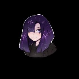
not an artist or anything, i'll maybe draw once every 5 months so keep that in mind
had the sudden motivation for this last night
No. 289135
>>289122heh, yeah.. i guess my personal style tends to lean towards the super shiny vinyl/glass look
once my apple pencil recharges i'll try a more traditional and soft highlight type.
do u have any more reccs?
No. 289141
File: 1681317529159.jpeg (74.33 KB, 1620x1620, FE6FFD03-D53D-4497-9990-DC0551…)

>>289122i feel like i just made her depressed
No. 289163
File: 1681325536249.jpeg (81.33 KB, 1620x1620, 48E429FE-5CD8-4FB1-9F44-E9C775…)
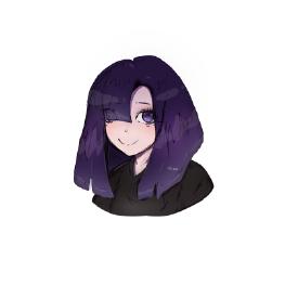
>>289148i feel like its still missing something, i can't pinpoint what
maybe more color?
No. 289345
>>289163I’m not an expert in anime art, but when I look at your picture, I see a discrepancy between the very detailed eyes and the sketch mouth. The eyes stand out and are very nicely rendered and the mouth looks like it belongs to someone else. But otherwise your work is great! I love the emotion of it all. The expression is like she’s guilty of something, or smiling through sadness. It’s very good. Especially when you say you draw once in a 5 months… like girl, you are very talented, draw more! If you can of course. I know the struggle. I have art as a hobby, I gotta work, so there’s not much time to draw. And then there’s the awful thing called artist block… I got that too. I once haven’t draw anything at all for 4 years. But keep going
nonny!
No. 290426
>>289345 first of all, thank u!!!
and yes her expression is sort of a "smiling thru to the pain", i guess i just decided to draw how i felt at the time? lol
and yessssss i had so much struggle with the mouth AAAAAA, i tried rendering it more and using different styles first, but nothing felt right. So i settled for a painful smile ww
but in the end i guess it not
too bad considering most older anime art also follows this pattern a lot, to the point it linda turned into a meme, the overly detailed eyes and hair, but extremely simple eyebrows nose and mouth
ps: if any of you want to tweak it to what you think would look better, please feel free to do so and share it! id love to see everyone's ideas and takes on this piece~
(learn2integrate) No. 290878
File: 1681950335435.png (146.14 KB, 670x576, GOOEY.PNG)

I drew Gooey, he's pretty cute and I like to imagine he's the equivalent of Kirby's roomate/house cat
>>289163Very cute character! Like the other anon said, playing around with light and setting up a light source can really make your art pop.
No. 290879
File: 1681950411539.png (44.29 KB, 608x770, metacool.png)
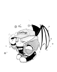
>>290878samefag but I also drew Meta Knight and casual clothes.
My brother said he looks like the famous Korean idol, Jimin. I'm still shaking and crying thinking about it. No. 291110
>>289163May be personal opinion but I think your hair highlights are too dark.
Objectively speaking tho your lines are too messy and those random squiggles on the hair make it look dirty in an amateurish way. Clean that up a bit. I see you removed all such lines that you were using as highlights except the black ones, good job, but the black lines also have to go.
You can improve the hair highlights if you give them either a more natural zig-zaggy shape, or a more defined straight/curved shape (like in some simplified anime styles) that doesn't look like you just drew one lazy stroke of the pen brush with default settings.
No. 292838
File: 1682724486310.jpg (643.36 KB, 3000x4000, IMG_20230428_013132.jpg)
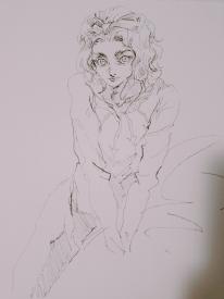
doodling cute boys
No. 292854
File: 1682729462969.png (2.16 MB, 1211x1598, B-DAYCARDfinal.png)

It was my main two's birthday yesterday so I wanted to draw something. I don't like how this came out, you can seriously tell I was pressed for time from the sloppy blending of the icing and the lax and simple rendering of the fruit. Not to mention, it's a direct rip from my card of last year but less painterly and more "soft". I'll do better next year.
>>292838He's beautiful, like really really beautiful. I really love this, the way the lines are scratchy yet still provide such a detailed face that draws you in reminds me of those old European inspired mangas or something. Really really good. His face is just mesmerizing, it's truly hard to describe.
No. 292971
File: 1682779338758.jpg (2.02 MB, 3000x4000, IMG_20230429_163929.jpg)
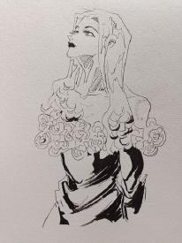
>>292854>>292877Thank you nonas! I like drawing feminine men and masculine women, they're not trannies though. Many of my characters aren't even gay
No. 293641
File: 1683015671160.jpg (146.57 KB, 1231x1935, IMG_5269~2.jpg)

Ignore the weird crop
Was meant to be a zombie girl but I'm not sure if that reads, there was a guy next to her but he looked weird
I appreciate any tips or ways I can improve
No. 294064
File: 1683162665552.jpg (79.69 KB, 697x1118, photo_2023-05-03_21-11-09.jpg)
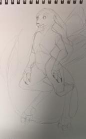
I tried to aim for cleaner lines and better 3D shapes. any tips? I struggle a lot with proportion and keeping stuff clean tbh
No. 294399
File: 1683315156482.png (77.41 KB, 526x815, SPOILER_image-1.png)
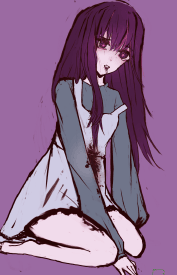
I'm aware the arms are too long in comparison to the legs, but what do you nonnas think?
No. 294798
File: 1683504266030.jpg (270.91 KB, 1551x1700, Makoto guapa.jpg)
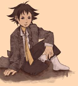
>>294065Thanks, but honestly, I think it's because animals are my strong suit. picrel, it's a human drawing I finished today and I suffered a lot when it came to drawing it.
>>294399This is pretty cute, I think the clothes should be a bit more detailed though, like adding a few lines to make the sleeves seem puffy.
No. 294804
File: 1683508192678.jpg (246.37 KB, 1275x1651, Imaginative Realism_ How to Pa…)
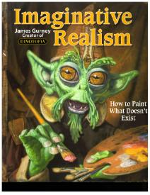
>>294064Study more animal anatomy, specifically écorchés if you can find them. In this case, you'll want to look at references of odd-toed ungulates for the hind legs. Picrel is also a good read for what you're trying to do. The body is serviceable ( a little oversimplified, maybe) but the head doesn't make much sense; the jaw is really small compared to the cranium, and unusually placed structurally.
>>294065Don't lie to her. This thread is too much of a hugbox.
No. 295219
File: 1683652197565.jpg (173.03 KB, 1520x1730, IMG_5378.jpg)
I want to draw more like @tealidium bur I'm having a tough time with matching his colors and rendering
Is there anything I can try to get better at
No. 295363
File: 1683707599829.jpg (372.55 KB, 1554x2307, FpyzeZfX0AAjfN0.jpg)
>>295219i think you should start with the lineart, checked that guy's art(thanks for the rec, love it) and he has a very seamless lineart. Have you tried asking him about his process? they seem very small and will most likely see your comment.
No. 296057
File: 1683998173012.png (358.73 KB, 508x670, Illustration.png)

>>295219Hi nonita! First off that artist's work is really awesome, thank you for linking them.
I think your art style is very fun already! But if you're looking to emulate this specific style I think right now your art is too soft compared to tealidium's work. I'd recommend either removing the transparent white border around your lineart or committing to making it fully white for a bold effect! With rendering it looks like this artist works with the contrast of cool and warm tones and does it really well. From a cursory scroll they vary their colouring style a bit, but in general it looks like warm colors with a cooler but more desaturated darker tone for shading. Similar with cold colors, with a warmer but more desaturated shading color. See picrel for an example!
Another feature is the different use of blurred and hard lines which your art is lacking, the artist looks like they're using a spray paint or crayon textured brush when blurring lines so if you have a program like CSP see if you can find any brushes like that on the asset store. All this plus the more crisp lineart (which I think comes more from experience than anything else) makes up the style you're aiming for.
Sorry for the reddit spacing I didn't want a massive text wall, hope this helps
nonnie!
No. 297652
File: 1684626341519.png (45.19 KB, 818x546, taranzadonut.png)

I was finally able to get a moment to draw, I ended up sketching Taranza. Halfway through drawing this I came to sudden realization of how does one spill something with six hands? Tarazna is clumsy enough to make the impossible, possible.
No. 297653
File: 1684626436218.png (278.4 KB, 1241x1048, eastercard1color.png)

>>297652I also drew this for Easter but I really don't like how Dedede's face came out. I think I made his face too square.
No. 297689
File: 1684640055115.png (Spoiler Image,2.54 MB, 1668x2288, books.png)

>>297686check /ic/ video course thread. Honestly the art of 99% of art teachers sucks, you should take what they teach and apply it on your way. After all, the fundamentals are all the same and the bones and muscles and how light and color interacts with an image are pretty objective subjects. I say make your own curriculum. pic rel is mine.
No. 298254
File: 1684902548280.png (24.82 KB, 956x786, factores.png)
I haven't finished or even started a drawing in such a long time and it feels bad
but making this felt really nice even if it's kinda ugly
I love gumi ♥
No. 298542
File: 1684990487088.png (10.3 KB, 726x918, elsie sign.png)

>>298264Thanks anon!
wip and i don't want to finish it because i have no idea what to put in the sign
No. 298975
File: 1685191682252.png (35.62 KB, 1121x1101, regersdcadb gfrewdcw.png)
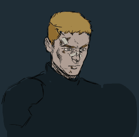
I really want some advice on… everything basically. I wanted to ask about rendering at first, cause I get lost after applying flat colors, but come to thing of it, my digital art looks extremely messy and ugly. Is there like an easy fix to unfuck it? I kinda going for that comic book-y messy lines vibe, if that makes sense.
No. 299108
File: 1685215556325.png (211.5 KB, 1843x1008, paintover.png)
>>298975i actually really like your sketchy lineart it looks like it belongs in a dark comic! i tried redrawing it in a cleaner artstyle and a bit of rendering (sorry i usually draw only women). i really love how you draw noses!
No. 299123
>>298975I think this is really far from ugly lol.
Not an expert on messy comic book style but maybe try doing the outline/main lines of your character and only then add details to make it look messy on the surface? Also, idk what drawing app you use but csp's shop has some bangers for different textured inking brush, especially for comic books/manga
No. 299133
>>299108That's a lovely paintover, nona! TY for the effort you put into it, cause when you applied your skills, something in my brain clicked and I got a better feeling on how I want my art to look. I especially like the textures on the left, cause I realized that I can make some sort of celshading stuff but with textures applied to shadows, which I think would look interesting. Thanks again!
>>299123Kek thanks. I just feel that my art lacks the polish of more smooth line art, but on other hand it doesn't have this chaotically pretty feel that you all over the place.
I use photoshop and use different brushes, but my problem is that I can only use basic untextured brushes with a good control of pressure. Unfortunately, I would really love to use textured brushes for ink, but I don't feel them if it makes sense. My brush of choice that I used for this sketch has this very artificial feel.
I tried using other programs, mainly SAI, but I always come crawling back to PS, cause I just like the huge array of functions and tools and how easier they can be used than CSP and SAI.
Anyway, thanks for your feedback, it gave me inspiration to try more and I would probably post more art after I process the info!
No. 299187
>>298975>>299108sage for completely ot but this is my husbando type so thank you for the oc
nonnie (looks great just so you know!)
No. 300518
File: 1685924035606.jpg (919.53 KB, 2485x3095, IMG_20230605_021249.jpg)

almost every time I draw something and I think it looks cute, I flip it and it looks bad grrrr. How do I avoid that and make faces more symmetric? Is it just practice and training your eye? I think I don't practice enough anyway
No. 300573
>>300518in traditional art lean is common i had it myself,i recommend buying a transparent grid or making one your self at home with a transparent sheet and the other trick is to use a mirror like this nonna said
>>300530 good luck
No. 300593
File: 1685956678863.png (25.7 KB, 797x796, regersdcadb gfrewdc__.png)
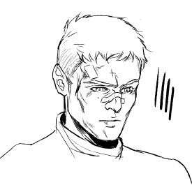
>>298975I love this nonna, I'll just leave a suggestion that you plan for the line's directions and weight when you are drawing shadows or stronger features. The angle of the hatching really changes the end result. You may like Kotteri's work, he's great at giving the messy line vibe.
No. 300648
File: 1685985395027.png (89.49 KB, 499x1051, FT_B-LeaIAAIrwh.png)
>>300645Oh I didn't know that, I probably got her twitter posts confused with another artist then. Good to know!
I can't find her tweet but I'll leave this image where she pointed how she was trying out to shade the jacket by drawing in the same direction of the outside line, rather than the top left. Thought it was interesting and illustrates the difference the direction of the line can make.
No. 300661
>>300593Thank you for a rec, kotteri is a great artists and her artstyle is something that I want to achieve!
I'm still trying to produce a piece that I can post itt, since I learnt a thing or two about coloring and rendering… but rn I can't force myself to finish anything except some doodles… sigh
No. 300986
File: 1686138145854.png (196.94 KB, 842x1311, example.png)
i want to shift to a more grittier 90s anime artstyle with some modern styles mixed in.. which i thought i had? i usually draw monsters and grim noir and sometimes emo stuff but the thing is my artstyle keeps getting called cute and im so confused about it like what exactly is cute in it? i feel like i might be not hitting the dark gritty feel i want? i also want to improve my shading as well! i personally feel it is very bland. any feedback is appreciated! picrel is my oc in a cute fit to see if my artstyle is cute?(sorry im esl i dunno how to explain it )
No. 301026
File: 1686157783500.png (389.83 KB, 1464x1094, example.png)
>>301012something like this, i get told my men look cute? im very used to drawing women. ive tried switching my artstyle here and there but it doesn't seem to work?
No. 303051
>>300986A lot of anime styles get called cute but i notice these things
>soft expression, shiny eyes>catgirl>cute outfit as you said>>301026this one idk
>detailed outfit>it's an attractive dude igi'm pretty sure people call your style because of the first piece type drawings
the ambience in the second one isn't exactly missing the dark feel but the pose of the guy licking his hand may not be really the feel you're going for, perhaps some people call your art cute because they like the type of character you draw?
A lot of artist i've seen considered dark and gritty use dark themes (not emo, more like idk death and disturbing imagery, try to use stuff you personally find scary perhaps), muted colors maybe? violence (not just blood, actions too) and characters with not necessarily detailed outfits/style but more details on what makes them gritty.
Maybe you don't like these things and that's ok, people don't always know how to define/compliment art and that doesn't mean your art isn't working the way you intended
No. 303063
File: 1687146976565.png (65.6 KB, 1200x641, gestures-6-18-23.png)
hi nonnies. are these okay gesture drawings? i'm working through steve huston's book and have told myself i'll do about ~30-40 gestures a day. i had a lot more but i fucked around and deleted them (i was using autodesk sketchbook which apparently doesn't export the entire layer when you save it as a psd)
No. 303065
>>301026>>300986I mean… Yeah they look more cute than gritty and dark. Or to be more precise, it looks like what edgy teenagers think it's dark.
I think you could lean more into the "creepy-cute" art style. Your art style would work in that niche
No. 303089
File: 1687169247828.jpg (52.32 KB, 399x600, lowbroaw.jpg)
>>303051thank you for your feedback! this makes more sense now that you point it out, i felt like my art being called cute was being being called immature and missing the point i was trying to potray but i see that i have been wrong to assume that.
>>303065kek it really does i dont really want to draw gore to make it come across as dark but i see how it could work. do you mean art like picrel?
No. 303117
>>303063I think you are doing good,keep going and make sure to post your studies when you finish practicing.
I would recommend you looking closer into anatomy and how muscles work, cause you art is more tubes and blocks that represent ribcages/pelvises, while with gesture drawing its more useful to pay more attention to muscles and bone structure. Research more anatomy and try to apply how certain muscles contract and how you can covey movement through that.
Keep grinding,
nonnie!
No. 303148
File: 1687192054374.png (110.34 KB, 1400x884, gestures-6-18-2.png)
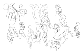
did 14 more that night. it's starting to become "fun" which is good.
>>303117>post your studieshere?
>anatomy and how muscles workyou're completely right…i noticed while drawing that i couldn't understand
what i was drawing, so i wasn't sure of how it would actually move. thanks for the tip
nonnie.
No. 304122
File: 1687469402240.png (306.06 KB, 1146x975, Illustration3.png)
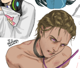
if the anon who drew this is miracously itt please tell me how to get this good at drawing please
No. 304344
File: 1687557181020.png (304.35 KB, 1722x1436, colonized afrikkan catboy.png)

my leoruggie sexo i mean sex i mean leona and ruggie from twisted wonderland doodles so far! maybe i finish later
No. 304377
>>297653I love it
nonnie, it looks professional. I love the dynamism, natural sense of movement, delicate linework and pleasing colors that feel like watercolor!
No. 305080
File: 1687881346675.png (80.24 KB, 1092x686, 223423132.png)
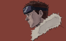
Thoughts and all sorts of criticism is very welcome. I still have trouble rendering and adding light/shadows.
No. 305099
>>305080WAAAH
nonnie this is beautiful! youve gotten so well at lineart! im so glad to see you posted again! i was waiting for you
No. 305236
>>305099Awww, thanks
nonnie. I feel bad about posing my stuff anywhere on the internet but the lack of people trashing me here (I hope you all are being honest kek) makes me feel better.
No. 305288
File: 1687965646398.png (40.96 KB, 479x455, hairaggie.png)

>>304122kek I don't think I am that good but ty
nonnie ♥. I mean I can try helping what do you struggle while drawing? What exactly did you like in this drawing that you would like to replicate? I can try giving out advice, but I am pretty bad at explaining. I wished I saw your post sooner.
>>304130Tysm! I will try my best helping, but I am pretty shit at explaining. I make the lines, fill the base color in a layer under the lines. I pick a highlight and a shadow that are not too distant to the base color and lower the opacity of the brush to 60% and give it the first shading, sometimes color picking to blend some areas. Lastly I pick a very bright highlight and dark shadow and place only in a few areas. to give it more dimension, also with 60% opacity. In the heimdall drawing I used the highlight on top of the initial base line layer to give him loose hair strands. I hope this made any sense? I left the colors I used for each step.
>>305080I love it, the way you drew the nose is so good.
No. 305294
>>305288From now on I will be known as the nose anon.
If you don't mind, can you explain how this coloring applies to shorter hair? I think i figured it out when drawing longer locks but otherwise hair gives a headache. Love your stuff
nonnie btw. Your addition to the doodle board was just so mwah perfect.
No. 305305
File: 1687971831026.png (106.02 KB, 627x771, shorthairchris.png)
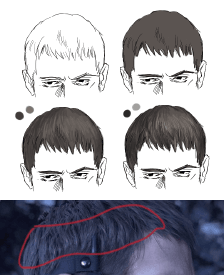
>>305294Color wise it's same principle, but sort hair doesn't do that distinct band of light longer straight hair does. You can still see it (red area) but the different directions of the sort hair tend the break the line. I find where I would put the light and break it into smaller strokes. Also if it's really short I would just follow the lighting of the skull.
I love the drawings you posted here nose
nonnie! You got a great style.
No. 305369
File: 1688000660680.png (Spoiler Image,676.41 KB, 1655x2667, asdadadawad.png)

>>305288>what do you struggle while drawing? What exactly did you like in this drawing that you would like to replicate? i love your faces!! do you have any tips on how to improve in this regard? this week i started practicing, pic rel. I feel like i struggle the most with the eyes, but everything is pretty wonky.
No. 305377
>>305288I'm the other AYRT, my problem is that my hair always looks flat because giving it "dimension" is confusing to me. The way you shaded Heimdall's hair here
>>304122 gives the feeling that it's actually made of complex shapes, it makes his braids look really good and convincing. I also just don't know how to achieve the right "flow" when shading hair.
I like what you did here too
>>305305 it looks like Chris's hair is actually made of layers despite being so short.
No. 305580
File: 1688095610176.png (245.03 KB, 1200x1530, whatamievensaying.png)

>>305369I only got better with faces after I understood how to break the overall structure of the head, I hate suggesting this but Loomis does have a good method of structure for heads, proko has a bunch of videos on that. After you get that I swear it gets easier.
I think you are already on your way because I can see the guiding lines in some of your sketches. After that you just start stylizing and playing around with different types of faces. I sketched heimdall in the hope it would serve as an example but I realized I it turned out almost useless kek.
Anyway on A that's when I decided the face direction and expression, that little cross on top is the skull direction and eyebrow level, inspired by Loomis head structure. From there I sketch the features, trying to put the character's actual characteristics, like his eye shape, jawline, nose shape and all that. This is where I actually suck, when I try cleaning that up to D I tend to mess things up and I end up making the character too different from the original. I would continue cleaning and refining the drawing until I am happy with it
which is never.
I included my past heimdalls to show how inconsistent I am when it comes to features, but honestly after drawing my husbando countless times I also found out you become better at this the more you draw them. I don't exercise as much as I should so I definitely suck when it comes to that, Heimdall 1 has a dorito chin and the wrong eyebrows. 2 has a small nose and I the wrong angle on his brows and eyes. In 3 I gave him fat cheeks.
You said you were struggling with eyes, when I struggled with specific things I would see videos and tutorials explaining the anatomy of it. Being quite honest with you I don't draw that much, I am a lazy bitch, I just try observing and seeing videos until something clicks in my head and I can see the form of the object in a way I understand it. Even looking at myself in a mirror helped me sometimes. After I get some grasp at the form I sketch variations of it, like the eyes on the left of the heimdalls.
>>305377I guess it's more about seeing the overall shape of it? You could try making simple cell shaded shadows without color to help you practice giving the hair volume and dimension. I made an example for chris.
The little short hairs he got on top of his head, they are like the tips of a long hair, little triangles, but they warp around his skull if that makes sense. So little triangles warping around a skull on the top of his head.
In II. Since his hair is so short most of the volume comes from his skull so I would follow the shadow of a sphere.
On III. I added some shadow to his pointy top hair, but I didn't go too far away from the original sphere shape shadow.
Adding midtones and highlights help to give it volume, like on IV., but try to keep the overall shape of the hair/head.
Heimdall's hair is hard to explain, he has 3 big braids plus some smaller ones to the side and some weird twist thing. I just try to keep the overall shape of things, like braids are big ropes entwined that wrap around the skull. They are weird and you can tell I didn't give it too much care in heimdall 1 and 2 kek. His hair is very tricky to be honest.
I am so sorry if none of this helps, I tried my best explaining but it's harder than I thought. I hope it helps somehow. I hope other nonnas can join and explain things better than me.
No. 305591
File: 1688106554276.png (Spoiler Image,511.77 KB, 2667x2667, 300623.png)

>>305580thanks! actually just started with loomis, thats why all the faces have construction lines, but i feel like something goes missing between construction and the clean up at the end. I guess its all practice from there. It makes me feel more relieved that even the pros struggle with how their stuff looks at the end, i guess one is never trully satisfied with their work. I am going to follow your eye practice method!! i feel like its the thing i struggle the most with atm. Screw hands, eyes are my mortal enemy.
Also, where is this heimdall dude from? your art peaked my interest in the character, seriously your art is so good.
Also, today's practice. I am trying to do at least a lil practice everyday.
No. 305720
File: 1688157891290.jpg (234.59 KB, 3250x1790, IMG_5646-1.jpg)
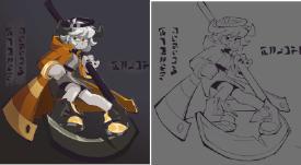
I feel like my drawings look worse colored in and I can't tell if it's because:
1. Contrast is bad between lineart and color
2. I am imagining them cooler when they're uncolored
3. I'm bad at color coordination or shading. I don't color stuff in often so it usually is hard when I try
No. 305920
File: 1688214174781.png (48.34 KB, 885x437, Illustration.png)
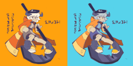
>>305918Got stupid and didn't attach.
No. 306018
>>305580Holy fuck, thanks for the examples and explanation. Now I understand Chris's hair so much better. And yes, after looking at some in-game pics of Heimdall his hair is more complex than I thought! Thanks for the tips,
nonny.
Is the drawing at the top new?>honestly after drawing my husbando countless times I also found out you become better at this the more you draw them.Not the other anon but this is so relieving kek. I always get so ashamed of my first attempts to draw characters but you're right, it's good to get a reminder that this is normal and takes practice.
No. 306427
File: 1688404111763.png (395.43 KB, 516x860, roro.png)

>>304352appreciate it anon! my anatomy and ability to convey perspective is not so good, I'll try to learn how to do things properly in the future.
very quick christfag!white rabbit fest rollo, hamburger helper mascot, and botw dragon malleus. the details are pretty busted
(lets pretend the bell thing isnt clipping through his shoulder) but I wanted to get the concepts on a page.
No. 307189
File: 1688761102716.png (Spoiler Image,2.41 MB, 2122x2976, IMG_1437.png)

This is something I’m working on for art fight. The legs and feet look weird to me and I know I have to move the hand up. Also the abs and belly button area needs a bit more work done. Do you guys have any suggestions that could improve the way this looks so far???
No. 307196
>>307193> why are you scared of his cock, the pelvis is nonexistent.Kek
nonnie I don’t draw muscular men all that often.
No. 307492
File: 1688881345917.jpg (141.56 KB, 2123x1419, IMG_57033.jpg)

>>306432Thanku!!
I usually ref @nikingply or sometimes @tonkatsu184 but not as much
No. 307658
File: 1688975272865.png (Spoiler Image,2.52 MB, 2122x2976, Untitled135_20230710032502.png)

>>307500>>307193Tried to give him more pelvis and make the pose more like the original sketch. I give up on this. Was good practice though. tried giving him a cock and it did make it a little porny.
No. 307708
>>307199>>307658Nudity isn't inherently porny. About picrel, it looks better
nonny!
No. 307738
>>307492Holy shit your style is so nice
nonnie, I'm obsessed!!
No. 307762
File: 1689019087658.jpeg (165.63 KB, 1080x1096, Screenshot_20230710-214727~2.j…)
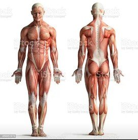
>>307658Do you use references anon? His pelvis is still missing, there's like a whole muscle section that's missing near his crotch. There should be a visibile narrow triangle-like shape that goes from his belly-button to where his thighs start in the middle of his legs (and where his penis would be). You can see it in most anatomy references like picrel.
His pecs look nice but his sides are very confusing. The armpit area is very difficult to get right imo so be sure to look up a lot of references because the muscles there get fucky. In any case there should be a clear oval-ish shape where his armpit would be, and several muscle lines going diagonally from under his armpit to the front muscles under his pecs, following his ribs. His thigh looks good but his calf anatomy is wrong.
I would advise you to start with normal linework for practice and not go straight to painting which can be more time-consuming and practice at your level should be frequent and quick-ish.
No. 307787
File: 1689024781371.png (Spoiler Image,1.37 MB, 2222x2222, 307658.png)

>> 307658 Atempted to fix the non-exsistent pelvis and short legs, + redlining.
Nonna could really benefit from using a reference and sketching prior to actually starting to paint and render.
No. 307815
>>307787>>307762>>307755Thanks for the feedback. I do use references it's just hard for me to find a reference at the angle I want. I did do a sketch before rendering though.
>>307787Tysm to the
nonnie here especially.
No. 307852
>>305080If you're struggling with rendering light and shadow, I'd recommend making a smaller copy of your lineart/sketch and doing a thumbnail of the colors there. Start with flats and then build structure with shadows (don't be afraid of tools like multiply layers) and then light ti make things pop.
Sounds basic, and probably things you've heard before, but doing a thumbnail of the painting will both help you get a rough sense of what you're rendering and reduce how much you need to think while rendering by giving you somthing to color pick off of.
No. 307879
>>307787Nta but isn't the pelvis kinda wide? Not trying to be an asshole, just trying to understand if male hips can look like that. He looks kinda stocky too to me.
>thighs should be the lenghts of ribsIs this an actual rule? I feel like thighs are definitely a bit longer that the ribcage… unless you mean like, the whole torso. And feet should be about the lenght of the forearm, so one of them is definitely bigger now (or the forearm is too short).
No. 308758
File: 1689534167141.png (1.27 MB, 2536x2254, ergdd.png)

I like doodling monsters/robots (I have very autistic lore about my OCs, they are basically monsters who are also cyborgs who wear exosceleton suits everywhere).
So here is a monstergirl I made.
No. 308759
File: 1689534347720.png (255.63 KB, 309x405, de8a468f-de4e-48bb-a129-d23ad8…)
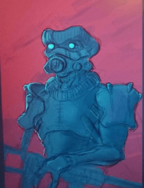
>>308758And here's her boyfriend. Sadly, I deleted a sketch before I can finish it, but I have a pic of it on my phone kek.
No. 308865
>>308758I like her face piece (especially the jaw) quite a bit,
Nonny.
No. 315441
File: 1692226125173.jpeg (919.54 KB, 3040x2292, IMG_5936.jpeg)

I’m trying to get better at coloring, any suggestions appreciated
>>189187Weird to see my early art still here
No. 315448
>>315441looks like you're pretty good at picking out values. id say that the blue hair highlight sticks out unnecessarily, and since the only other blue or cool toned colour in her design is her eyes you might want to try to tie the blue in somewhere else, just so it's slightly more cohesive. the fur collar could do with some more contrast too, either making the whole thing darker or the shadows darker.
these are minor things, overall looks good to me!!
No. 316986
File: 1692797401124.png (Spoiler Image,4.34 MB, 2111x1243, 1692795460958.png)

anons, which pose for the smaller boy's arms looks better? I'll gladly take suggestions for other poses and expressions if anyone has any, but not feeling anything with his arms behind his back.
No. 318828
File: 1693524652678.png (1.32 MB, 1042x1093, Furromierda.png)
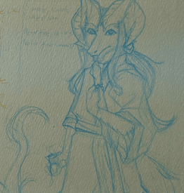
Currently sketching my OC, anything I should fix before I go to the final lining?
No. 318839
>>316986What I'm noticing is the boy in front's outstretched arm is too short. I like the boy in the back's pose on the right because it just seems to fit the expression you gave him, I dunno. Maybe have his head leaning a little towards his folded hands? Make the arms a bit longer, use yourself as reference, you'd probably find your folded hands coming closer to level with just where your chin ends.
>>318828Ye I wanna see more
No. 318842
File: 1693529641972.png (563.22 KB, 776x1003, Captura de pantalla de 2023-08…)

>>318839lmao if you insist, here's a crop of one I did about two months ago. Honestly I haven't been drawing much because I have been insanely busy (and stressed).
No. 318845
File: 1693530639147.jpg (193.2 KB, 774x1326, zombie.jpg)

>>317004late but thank you, anon! I did go with that pose
>>318839mm, I was going for the weirdly long legs you see in some shojo but I might've just given them weirdly short arms. I'm a
phone artist and the app I use to draw doesn't have a canvas resize function so I actually ran out of space for vil's arm, it was an add-on to the original drawing… I'll make some more adjustments to it. all my art has issues with short arms and weird poses.
No. 319049
File: 1693616543143.png (1.06 MB, 1700x1074, this is an anteater i swear.pn…)
I'm trying to practice more natural subjects for my digital painting. (Things like plants and animals). Anyways, I'm not sure it's going well. How do you guys do fur? I feel lost.
No. 319084
>>319049That's cute kek I would add more contrast to the fur, along with highlights. Don't try to draw every single hair, be mindful of the fur direction, and draw in layers (I prefer to start with the darkest color and build the lighter on top). Maybe drawing in black/white helps as well, to give it color when you finish simply put a layer on top in the blending mode "Color" and put the bases here.
There are tons of videos of people drawing realistic animals in YT, their process may be helpful to you.
No. 321885
File: 1694907001167.jpg (500.8 KB, 1995x2259, IMG_6029.jpg)
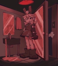
Trying to do full scenes, perspective is fucking me up
>>319097No lmao
No. 324376
File: 1696021772896.jpg (Spoiler Image,682.28 KB, 3840x2160, 20230930_011934.jpg)

>>307787The shoulder on the left is too far away from the neck. The top of the shoulder touches the neck when you raise your arm
>>318828The ogee curve should be more towards the right relative to the maxilla (excuse my autism). The forehead and the arms could be made longer
>>316986I prefer the one on the left. It's more in-line with his expression
>>321885I dont see anything wrong with the perspective
Please criticise my anatomy, anons. Ignore the messiness
No. 324437
>>324376These look like you drew them under a microscope, drawing them bigger to start like each filling a quarter of a page is going to help you out
Idk what to say about the anatomy, is there a particular style of anatomy you're trying to do?
No. 324440
>>324409I wouldnt mind if you seem "mean." Can you tell me some specifics to focus on? I know the hands need work and the legs need to be a bit shorter
>>324437Thanks. Will do.
No. 324469
File: 1696076441812.jpg (702.05 KB, 2160x3840, 20230930_171918.jpg)

>>324409>>324437Nvm anons I get it. To elaborate I was going for a style similar to picrel
No. 325103
File: 1696341640564.png (8.52 MB, 4240x2610, dddddd.png)
>>300986im this
nonnie i changed my style!! does this look cute creepy?
No. 325137
File: 1696354150957.jpg (5.32 KB, 276x183, download (1).jpg)
>>325109i was really struggling with the light in this its supposed to be light from above from like a broken roof? i tried multiply but it darkened the image fully and i couldnt paint it like picrel ,would noise work as texture or a more paper like texture?
No. 325851
File: 1696716173550.jpeg (3.46 MB, 3264x2448, F9047715-457D-4AE5-8D9B-945D9C…)
Drew this after 10 million years of artblock. Theres a crinkle because I erased too fast.
I love drawing ugly faces.
No. 327644
File: 1697501775873.png (543.71 KB, 641x954, Untitled_Artwork 46.png)
trying to also get out of my artblock and just draw more thru the end of the year. i want to focus on improving my colors
No. 327909
File: 1697579594764.png (677.27 KB, 860x1000, Untitled_Artwork 47.png)
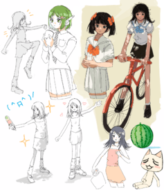
>>327694thank you! i use procreate
-added some more, changed some things also
No. 327926
>>327909>>327644So cute!! Are you the same
nonnie who posted this too>>230595 ? I love your artstyle
nonnie!! Can you tell how do you get those crisp lines?
No. 327961
>>327924it got terminated smh
>>327926ya. im finding that my lines look better when i draw quicker. i always tend to draw with brushes that dont use pen pressure either, so maybe that's an element
No. 328461
File: 1697749305167.png (917.04 KB, 743x868, IMG_9997.png)
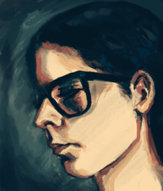
Nonna who can only draw portraits reporting here with my attempt at an auto portrait. Remaining at awe of all the original artwork here. I can’t draw without reference at all , I think I have a some kind of a block. I used to draw from imagination all the time as a child but I can’t seem to do it now and I kinda miss it, the freedom of not giving a shit. I guess I’m just afraid of mistakes or whatever .
No. 328473
>>328461>I can’t draw without referenceTry drawing with only eyes and eyebrows as an reference, with that draw features you think fit that person with those eyes and eyebrows.
To add in more difficulty, have references to old, young or expressive eyes and eyebrows.
No. 330288
File: 1698292117334.jpg (64.9 KB, 528x528, pixelart.jpg)

I've been trying to get used to pixel art. This was my attempt at something ancient Egyptian inspired, I wanted it to look like a statue. I feel like I could have added more for the background, but a lot is above my skill level.
No. 330592
File: 1698431127659.png (2.01 MB, 2832x2478, Untitled.png)

hey this is a character im working on! He's one of those really smart kids that's special interest is robotics
No. 331618
File: 1698736482332.jpg (4.5 MB, 3120x4160, IMG20231031150024.jpg)
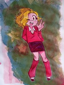
>sees favorite artist using gouache
>"wooaah traditional art is so cool"
>looks old acrylics
>picrel is my piss poor attempt
i mostly color stuff digitally so im not very familiar with painting irl,,, are there any Nonna's here skilled with acrylics? or maybe some helpful tutorials
No. 331619
File: 1698736945990.jpg (1.39 MB, 1536x1740, IMG_20231031_151906.jpg)
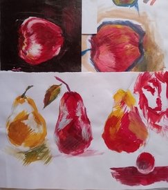
>>331618samefag, these were some older small test. i have a vision of what i want but it feels so uncomfortable to do? idk i just feel like i have lack of control and i don't know how to go about it
No. 331909
>>331618Get to know your paints. Acrylics tend to be shit if they're cheap, they go muddy really quickly if they're mixed because of the pigments used. If your acrylics are cheap, layer them when dry instead of blending or mixing the paints. Some paints are translucent, some are opaque. You can use the translucent ones for glazing, but it's hard to use opaque paint for glazing because even if you dilute the shit out of it it looks muddy (ofc if you're going for that effect, like if you're painting mist, it works great).
Did you gesso the surface before painting? If you want more control over your painting I really recommend that, it helps so much. It looks like you painted on paper, which isn't the best idea as it can't take a lot of water so it warps. You can get acrylic paper that's got more of a canvas texture and will be able to handle the paint better.
Do some studies with your brushes, ideally copy the same painting with the same paints and use a single different brush for each study, so you know what kind of look each brush will give you. You'll be able to get the look you want much more easily then.
Do you have any mediums? I have matte and gloss mediums which I also mix with metallic, glitter and glow in the dark pigments for paints that aren't shit. I also have a bunch of mediums to add textures. They're not expensive and you only need a tiny amount. If you want to continue working with acrylics get at least a matte and gloss medium and experiment with them, they can make a huge difference to a painting.
Lastly, paint like you painted your studies. A limited palette, bold lighting and lots of texture will give you a better result than over-blending and using every paint you own (I know you probably know this but it's tempting to keep adding more paints to your palette when it's not looking the way you wanted it to, and that normally makes it worse).
No. 332412
File: 1698985823777.png (1.16 MB, 1078x1616, Sketchbook24.png)
Israel-san trying to eat Hamas-tan wip
>tfw ai won't give me the picture i see in my head but my art skill level isnt high enough to make it either
Pain
No. 332465
File: 1699009756095.png (63.32 KB, 360x400, it's blurry, i know.png)

>>330592Looks good but what is that above his mouth? Is it a scar? Looks okay when you zoom in, doesn't look like a scar when you zoom out. It looks like a cigarette or something. Side profile is a bit weird looking imo, I see you're trying to make it realistic but it doesn't work well with the south park art style, I'd suggest you remove the nose or make the glasses on the nose like this
No. 332466
>>332412Don’t listen to
>>332444, this is great
nonnie No. 332467
>>332465NTA but that's a cleft lip.
>>330592With regards to the cringy speshul south park oc you have way to much going on which makes it out of place with south park simplistic art style.
No. 332545
File: 1699040239983.png (346.52 KB, 1080x1268, circulationrip.png)

>>332526Me cant into anatomy
No. 332570
Anyone has any tips on how to make the drawing not look fucked up when you flip it? Most of my drawings have that issue even if i flip it to the other side while drawing to fix stuff i just keep fucking it up more and more and it ends up looking deformed.
>>332412>>332520Kekk wtf
No. 332590
>>332412based
nonnie i really like your designs
No. 332741
File: 1699105902984.png (830.2 KB, 1176x1576, test.png)
>>332602>When I used to to flip it all the times I realized my poses looked more stiff and my composition got boringThis is exactly what happens to me every time i try to fix stuff on my drawings when i flip it, i'll try this too
>>332689I feel dumb for never thinking about trying this thanks for the tip
Art tax for not posting it before, i used the symmetry tool for this bust and it did help.
No. 332766
File: 1699114435396.png (352.02 KB, 1475x1780, 1699067437254.png)

No. 332768
File: 1699114625319.png (273.53 KB, 1051x924, Sketchbook31.png)
drawing nui political cartoons is fun
No. 332818
>>332743Wow that was fast hi
>>332744None i just made him up on the spot lol
No. 332824
File: 1699140166312.jpg (Spoiler Image,234.68 KB, 1110x1080, Hamas chan.jpg)

kind of edgy, but I wanted to draw hamas kun as a sad animu girl
No. 332838
File: 1699144072348.png (509.75 KB, 1040x1351, fumo_.png)

>>332824Bless anon, shes so cute! And your art reminds me of fear and hunger
No. 332859
File: 1699147519855.png (707 KB, 1080x1440, Sketchbook32.png)
>>332849Yes! Its based on that old cirno fumo in a bottle pic, someone suggested it earlier but i think she deleted her post
>>332841Ill try to draw some more full sized ones once I figure out what I want to do with Israel-sans hair
I do want to give him fucked up happy merchant teeth to bite Hamas-kun with
(/pol/ bait) No. 332882
>>332838>>332859>>332768>>332766I love your designs!!!
Please make more!!!
No. 332910
File: 1699166951178.jpg (947.73 KB, 1418x1738, cowmas-kun.jpg)
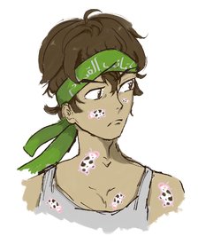
i haven't done digital in 300 years but nonas inspired me with their hamas-kun autism. doodled him with some cow stickers
No. 333141
File: 1699221722383.jpg (42.47 KB, 563x373, f630caf9c5e5ae470933209f755588…)

Hi nonas. Idk if this is the place to ask for help, but can anyone point me to a tutorial on how to achieve a 90s polaroid look with digital art?
Something like picrel, not necessarily the grainy look but the strong flash and shadows and stuff
No. 333161
>>333155Not very helpful
>>333158I dont mean the graininess, i mean more the light and shadows and the colors
No. 333253
File: 1699243249143.png (523.03 KB, 1078x858, Sketchbook35.png)
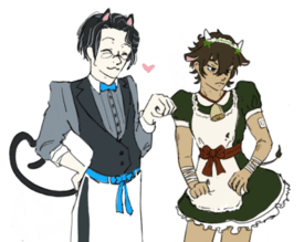
>>332910Cowaii>>333012you should make one with the bing AI creator! I mostly based mine on the affluent American jew stereotypes I'm familiar with partially to represent the ties Israel has to America
No. 333265
File: 1699243964460.jpg (531.88 KB, 1447x2047, [23-09-25] 1706279129593881045…)
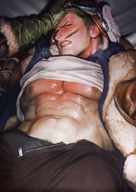
>>333141i know this artist who has a similar style, maybe try asking them?
No. 333452
File: 1699297868598.jpg (676.11 KB, 1786x2048, [23-04-08] 1644669201892933632…)

>>333305yeah this artist has extreme shit taste, but her(his?) art is godly
>>333323>>333377sowwy
No. 333537
>>333376Thanks!
>>333452Yeah, it's spot on what I'm trying to do, looks very cool. I hate the weird little mustaches though,
No. 333541
File: 1699325007168.png (459.59 KB, 531x849, shura from one piece.png)

>>333489The character is Shura from One Piece
No. 333583
File: 1699339748885.jpg (391.33 KB, 982x907, newagehetalia.jpg)
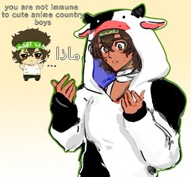
>>332545im going to burn in jahanam for this but hamas kun is worth it
not really No. 333584
>>333583Cute
nonnie…I love him
No. 333634
File: 1699363708367.png (397.52 KB, 1196x798, Namnlöst 2.png)
>>330592Jesus christ, what are you even doing here? Does your genderspecial friends know you post on a
terf forum?
No. 335271
File: 1699845425137.jpg (321.75 KB, 2129x2329, IMG_6243.jpg)

Was for an art prompt guillotine
Tfw no psycho moids to hunt me down
No. 335662
File: 1700012806457.jpeg (141.59 KB, 670x885, IMG_1590.jpeg)
>>335271Sorry for the autism but the guillotine should be much taller for that blade to cut anything, also small nitpick but the bottom part of the guillotine wotv the hole should have two halves. the upper half is mobile, that's how you get the head in
No. 336497
File: 1700271153911.png (1.96 MB, 1600x3805, Illustration4.png)
>>333253Don't stop drawing your gijinkas!
No. 336594
File: 1700286766136.png (802.5 KB, 944x1194, fd.png)
>>336497cute!! I'll draw some more of them one day, lately all I feel like is edgy linkcest and moblink
No. 336668
File: 1700329944989.jpg (266.67 KB, 940x1419, o6G3co0dj3M.jpg)
nonnasnonnas i love cringe so there's my cringe OC
No. 336674
>>336671>>336672I didnt have any real intention or idea, just playing with procreate and looking for any pose that won't make me struggle. I need to learn to pose a character but i struggle with good references so it ends up weird/static.
If anyone had good ref source (maybe 3d models to look from all angles?) or art tut would be appreciated.
No. 336726
File: 1700343186253.jpeg (61.82 KB, 736x552, IMG_6006.jpeg)
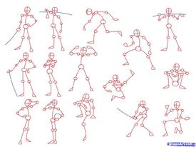
>>336674I just draw a stick figure and go from there without changing the basic lines(pic not mine, just an example) I find it gives more life to the final pose
No. 340596
File: 1702006944222.jpg (356.86 KB, 1877x1470, IMG_3144.jpg)

The latest episode has me by the collar
No. 340631
File: 1702024136701.jpg (833.32 KB, 2640x2510, luckytowa.jpg)

twins having lunch
No. 340694
>>340637How can I even call myself a fan at this point..
>>340657thank so much nonita! I just painted with light colors then used an overlay of blue and purple
No. 345089
File: 1703658676301.png (372.09 KB, 1344x706, itdontlok..likeher.png)

based on the dumbass shit thread, couldn't get her likeness but whatevs
>>298254should've drawn her like this
No. 345090
File: 1703658751643.png (160.5 KB, 1344x706, kagura.png)
pee n gee
No. 345118
File: 1703674251533.jpg (Spoiler Image,569.68 KB, 1080x1973, wip_haru.jpg)

>>340640>>345104ty anons. been on a tortured yaoi boy bender for a while now.
No. 345156
File: 1703698991525.png (Spoiler Image,504.56 KB, 679x768, waifu.png)

>>345121appreciate it! haru and nty!!! are all-time favs. still to this day it and 1917 are the only bl where I had to take a nap from crying so much.
No. 348237
File: 1705116556270.png (273.15 KB, 839x970, Captura de pantalla de 2024-01…)
here's a painting I have a hard time trying to finish zzzzz
Really want to pull through and improve my digital painting skills more this year
No. 348627
File: 1705260085628.png (1.14 MB, 616x905, claire.png)
i'm trying to get used to my tablet
it's Claire from that shitty tranny comic whathappensnext
she deserved better.
No. 348644
>>348627Based. She looks so pretty
nonnie! Truly the best
terf wife.
No. 349985
File: 1705733521886.png (180.64 KB, 847x840, Screenshot_53.png)
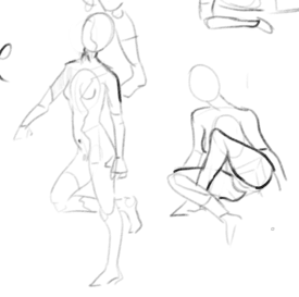
this is probably nothing to experienced art nonnies (and i'm also experiencing a bit of dunning whatever) but i got the sense that i really could improve if i just kept practicing today…and i also think this is the first time in years i've just sat down and made myself draw on a consistent basis.
hope i can keep it up! i would've done more here – these are a few 2 minute poses – but i have to sleep kek, started too late today…
No. 351770
File: 1706432275595.jpeg (1.86 MB, 2240x2986, IMG_1422.jpeg)

No. 351858
File: 1706478108708.png (316.21 KB, 914x1668, gnc.png)
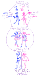
wanted to make a comic on why being gnc and trans is a fallacy but i couldn't figure out how to phrase it kek. i will post it here regardless
No. 352065
File: 1706564597921.jpg (Spoiler Image,654.57 KB, 1547x2449, mimori_56.jpg)

edgy rkgk, spoiler for amputee stump and lots of blood
No. 352067
File: 1706564939088.png (Spoiler Image,900.23 KB, 1020x1624, israel-kun.png)

>>352065and debatably less edgy, very quick doodle I did whenever this happened kek
No. 352078
>>352065I dig this so much, really amazing
nonnie>>352067Also kek
No. 352210
>>351770I like it
>>352065Moar
>>352067Return of the Queen (saved) also please post moar for my folder
No. 352557
File: 1706757242666.jpg (486.16 KB, 1510x2209, maid towa.jpg)
Towa sketch I forgot about and then finished with some spooky elemtents ooooo
No. 353060
File: 1706907406087.jpg (371.25 KB, 1535x991, 1000005693.jpg)
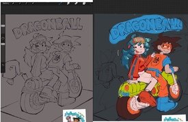
I'm not sure how to pick colors or render, I can get by alright until I get to that point and then I'm not sure what to do. I also don't know if the style I draw in is ugly or not, I might try to change to something else
No. 353067
File: 1706909058735.png (238.96 KB, 1182x778, image.png)
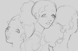
fun sketch based off a cute girl i keep seeing at work. i wish i was a bit better at drawing bodies
No. 353069
>>353060I really like the drawings of yours I've seen, I think it's a neat style but if you're feeling unsatisfied you should change it up. And I suck at picking colors and rendering too so no advice sorry
>>353067How flattering to inspire a nona to make art,these are very cute
No. 353107
>>352557Your shading is fine but you REALLY need to work on your anatomy.
>>353060That's so cute! I love your style, it's got a retro charm to it. I think that simple cel shading and not much rendering would work best with your style so it doesn't overshadow the lineart.
No. 353112
File: 1706924685017.jpg (87.11 KB, 792x792, GCweYMAWEAEGGxx.jpg)
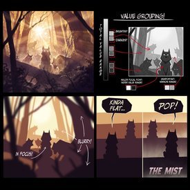
>>353060Your values are weak in most of your pieces so I think thats where youre struggling. I no you use more desat colors but I'm also a fan of desat and had the same issues with colors you seem to have. You can check the values of your drawings by completely desatuating your drawing. Our brains read the values first even if we aren't aware of it. Your rendering always looks fine to me but if you want alittle more I might suggest some bounce light.
No. 353133
File: 1706937994167.jpg (213.88 KB, 1080x1488, 6216648.jpg)

>>353060you should study gashi-gashi, he has a very colorful saturated rendering style and is more caroon leaning like you
No. 353246
>>353112I turned it black and white and you're right, I think I make the values too flat. This info graphic is great too, going to incorporate this next time
>>353133Thanks for the recommendation, I think I'm gonna practice redrawing some of his images
>>353135Lmao
No. 353249
>>353060I've seen your other stuff and I like your style. It's satisfying to look at, it must be the thick lines, though you could vary your line weight somewhat. You don't have to stick with this style if you don't want to, but people like it. If you think it's ugly that might honestly mean you're improving past the style (hopefully). Yeah I am not a color expert. I think it might be that some of the colors you used, like the green on the bike and the blue on Goku are very bright, but you used other more murky colors too (I don't know though). The girl's shorts are also pretty much the same color as her skin and as parts of the bike, which is a little weird. Dunno if it's a real piece of advice, but I think different materials should be a different enough shade/hue to differentiate each other. So the bike doesn't seem made of skin or her skin made of bike.
>>353067These are good, you should try drawing bodies anyway
No. 353287
File: 1707011323074.jpeg (1.63 MB, 3464x3464, CF00345E-1383-4667-9D5E-B59783…)
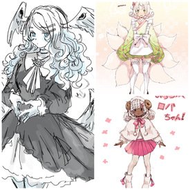
I want to buy an OC design from this artist, but people I know are saying the designs aren’t that good. I think they’re really pretty, so I’m getting lolcows opinion
No. 353428
>>353287They're cute but surely you can come up with these type of designs yourself? There's nothing particularly creative or original about them.
>>353301Nta but if you can't justify a purchase for the quality of the design by itself and nothing sentimental around it, then that's a completely reasonable consideration.
No. 353498
File: 1707072826064.jpeg (952.46 KB, 2048x2048, EZM20j9UEAAP_Y1.jpeg)
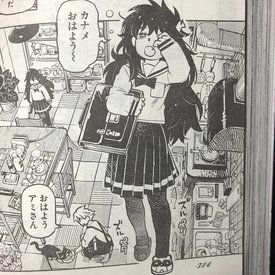
>>353060i still think you should try a more even lineart style rather than it being all messy and randomly thicker. Your style kind reminds me of pic rel.
No. 353588
>>353249Thank you, I just got paranoid I was making bad stylistic choices and not realizing it. I get what you're saying about the material, I should probably also put some shine on the metal or something or some texture for the clothes to separate stuff
>>353498This is so cute what's this from
No. 357348
>>357078why was this marked as "derailing"?
>>357085yes so do i, that's why i asked for "good" art servers. or communities in general. this thread is slow and dead, artist salt is full of crabs and bitter whiners, and /ic/ is definitely far worse than it used to be. so much ugly, hateful art
No. 357965
File: 1708684234359.jpeg (3.66 MB, 4032x3024, FDC681EC-4D2A-43F4-84DC-CDD0E0…)
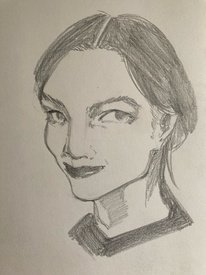
What do you think?
No. 358118
File: 1708738891844.png (13.03 MB, 3024x4032, liquify.png)

>>357965pencil texture looks really nice. I love the texture in her eyes and on her neck, im usually not a fan of how you did the hair texture but it matches the way you did the eyes in a nice way giving everything a kind of soft shaded photo look. If you want to improve i suggest if you mainly draw with pencil on paper, get a hand mirror to check the proportions of your drawing as you go. When you draw your brain gets used to what you are looking at and causes distortions which make it hard to see errors. This is why digital artists "flip the canvas". You can simulate flipping the canvas with a mirror to check your art. Liquified some corrections on your drawing to show some of the distortions. I made the proportions a bit more realistic but if you were going for a kind of fish eye look on the face thats also fine, but the eyes are still a bit distorted to each other. Also the ear could use some work but i just suggest looking at a reference the next time you draw the ear.
No. 358725
File: 1709006187238.png (2.29 MB, 3411x2470, studies examples.png)
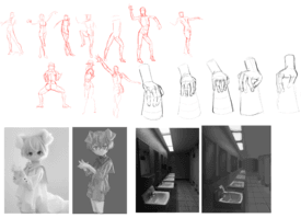
Reposting because I didnt know this thread existed.
I wanna keep doing value studies, but I feel like I am doing them wrong. I understand the concepts, but I don't know how to apply them, if that makes sense. I also don't know where to find good photos to study from, all of the ones I think look good have very similar values that mesh all together when I convert them to greyscale. I am just tired of sucking at painting because it's my favourite thing about art and it halts me from fully enjoying art and making more interesting pieces.
No. 358738
File: 1709019384153.png (589.93 KB, 1414x2664, 3toneposterization.png)

>>358725yeah unfortunately you appear to be doing the studies incorrectly. I recommend trying the simpler form of this study, using only three values(white, grey, black). Values control the composition and guide the eye to the parts of the picture that are the most important. I also recommend this video
https://www.youtube.com/watch?v=-ZNZ7ln1Z90 despite being about environments, it explains common value study mistakes.
No. 358742
File: 1709021387674.png (1.03 MB, 2677x1448, beforeandafter.PNG)
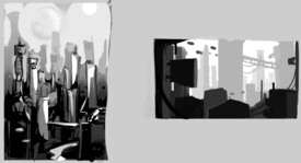
>>358741i draw more people but i ended up using environments to study values and i found it helpful. because i was used to drawing people it was hard not to want to use value to express form. example of my first environment attempt and then after watching a bunch of value and composition videos. values where further away means lighter and closer is darker can also be used with pieces where the subject is a person but its easier to conceptualize with environments sometimes. or it was for me.
No. 358756
>>358744the youtuber i recommended here
>>358738 hes not insufferable like most male youtuber guys and explains things well.
No. 358950
File: 1709103904470.png (1.67 MB, 1743x2637, february 28 2024.png)

How can I get better at colors?
No. 358963
File: 1709109869252.png (6.46 MB, 5217x5268, valuesvaluesvalues.png)
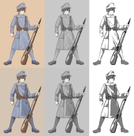
>>358950I'm going to sound like a broken record in this thread but i struggled for years with colors and couldn't figure it out no matter how much i studied colors but it was because my values were shit. 1. study values 2. try and avoid same colors touching, i broke up ur guys clothes with some darker blues to break up value groups to make it more visually appealing. 3. remember that colors are visually affected by colors next to each other. ur figures desaturated with a slightly more saturated background made him appear more washed out. by desating the background he appeared a bit brighter despite me not adjusting his saturation. heres another helpful value tutorial i liked
https://tips.clip-studio.com/en-us/articles/2893 No. 358976
File: 1709112684387.jpg (416.3 KB, 2894x4093, garoppui-1682721904854200320-2…)
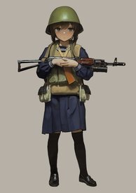
>>358967thanks
nonny!! my goal is to render like this guy, so i got a long way to go.
No. 359728
File: 1709411440265.jpg (833.83 KB, 1488x2021, sailorgirl.jpg)

tried some new methods after watching some Chinese tutorials on color, which would you say looks better?(as in colors) and for the character as well since shes supposed to based in the 1990s so maybe a more pop artish style?
No. 359851
>>359774thanks
nonny i really need to pick up james gurney's book, also are those acrylics?
No. 359855
File: 1709466495474.jpg (87.49 KB, 426x574, Screenshot_20240303_144933.jpg)
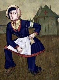
I think the poses I draw are very flat. I posted on the art salt thread that I couldn't draw from references, what should I do? (background isn't by me)
No. 359863
>>359855well, you should start drawing from references!
there's a lot for you to work on but for the flat poses you go try gesture drawing. it's a timed exercise of drawing models, so the drawing itself isn't supposed to be perfect, what matters is the essence of the pose. from that you learn how to see things in more abstract forms which then help you with construction. you balance the dynamism of your pose with your knowledge of anatomy and that requires its separate study too. focus on figure drawing, you can pick up a course like proko's for example
No. 359866
>>359864>constructionusing boxes and cilinders to build your drawings
>perspectiveall drawings have perspective. The left foot should be further away.
No. 359867
File: 1709470925941.jpg (82.89 KB, 1280x720, maxresdefault.jpg)

>>359865i don't understand what you mean by you can't draw what you see then. are you ashamed your drawing from reference looks crappy? the point of drawing is to learn understand 3D forms, you can't do that without exercise
does this example look 3D to you?
No. 359868
>>359866I use shapes like stick boxes etc in my sketches first. I didn't know this was called construction.
>>359867 it's not shame, I'm both bad at copying and seeing things in 3D.
No. 359872
File: 1709472779983.jpg (159.34 KB, 1260x1260, 4548076538523_1260.jpg)

>>359868nah cmon
nonnie, i know you see the edges of this box and can draw a shape like that. reference is only there for you to adjust the angle
No. 359876
File: 1709474873247.png (1.52 MB, 838x1200, image_2024-03-04_005702015.png)
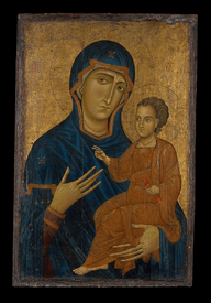
>>359855Yor rendering is also making it flat, it looks almost like medieval art. There's no sense of depth because you've done the painterly equivalent of pillow shading. Where is the light coming from? Because looking at the background image you've chosen her face and front should be in partial shadow at least. The clothing also suffers from this, the collars of the undershirt and dress have zero interaction with the light or form- making it look like one of those printed tuxedo shirts. You could remedy this issue with your "eyes" by tracing over reference images (and breaking it down into simple 3D shapes) and then redrawing the trace freehand.
Speaking of the background, your paint over sticks out like a sore thumb because of the colours you've chosen- try adjusting them so they actually fit into the palette of the background- going more muted and greeny- brownish with the character's colours would have fit much better. Your anatomy is also poor, especially around the upper torso and head.
I'm suspecting a bucket of crabs from some of the more unhelpful anon's responses though.
No. 359880
File: 1709476063093.jpeg (24.15 KB, 320x431, images (81).jpeg)
>>359876I said that I did not make the background, there's no paintover, no "sore thumb". There's also no issue with the upper torso, you're not going to believe this but it's a 1860s style bodice. 1860s dresses have weird low shoulders (see picrel)
No. 359884
>>359882>>359876>>359872LOL nonnas poster is not the og artist.
>>359855 is 100% a troll.
No. 359887
File: 1709477547942.png (3.19 MB, 1400x1050, image_2024-03-04_015108409.png)

>>359880It's not your background (which I implied by saying "you've chosen") but you didn't paint over it? Not even going to bother commenting on that. Sure, I'm not the most knowledgeable about 1860s dress but in your example the woman has shoulders and her collar curves around her neck.
>>359878Let balding 35 year old baby Jesus and his scary mother be
>>359884I tried to google search the image and every match is linked to a deleted account. Interesting.
No. 359899
File: 1709480153086.png (910.82 KB, 1096x1544, hmm.png)

>>359886aand of course an amateur would rely on AI slop
you may be right with the troll attempt but I remember some
nonny defending AI on the general art salt thread, complaining bout the "inability" to draw from reference wouldn't be too far off this mentality
No. 359957
File: 1709503246504.png (988.35 KB, 1299x2211, 03 03 2024.png)
My brain just completly shut downs when i try to paint. I just realized the values suck and the lighting is coming from two places. Oh well, it's practice.
No. 359959
>>359957Keep at it! this certainly looks much better than the old one but there are some critiques i have.
>applying some cloth texture over the clothes with overlay >photobashing can work for the helmet if you blend it in well>gesture seems OK but could be better it feels way too stiff as if he's alert but his gun is handled very idly so it conflicts with the mood, making him lean to the back can work but only the torso>perspective is a bit wonky especially on the feet placement maybe instead them facing downward make them in the front perspective >use 3d models of guns and paint over them instead of tediously drawing them(up to you if you like drawing them)Hope it helps a bit
nonnie! Good luck! Hope to keep seeing you in this thread!
No. 359960
>>359959thank you
nonny! i would rather not photobash or use 3D models as i enjoy getting better and i draw as a hobby so i am not in a clutch to get better fast or pump out drawings.
No. 359962
>>359899The artist of this pic has a thread on Onionfarms and a shitty KF thread as well as
>>>/snow/1498807Troll or selfpost?
No. 360282
File: 1709629203346.png (635.89 KB, 887x635, image_2024-03-05_192706193.png)
This is a random collage of work from the past few months. I don't draw very often and I'm very lazy. I've been wanting to gitgud for the past 3-4 years now but alas, I am still very lazy. I have very poor habits when it comes to art as I tend to draw everything in an hour or two and then hibernate for the next month. I'm looking for strong criticism on aspects of my art that look ugly, lazy to a detriment, or even just trying advice on how to draw for longer without getting burnt out. yes I have shit taste, that will not be necessary to point out as I am aware, thank you.
No. 360296
>>360282You seem very good
nonny, maybe it will benefit you to get out of your comfort zone more.
No. 360297
File: 1709635288438.png (942.22 KB, 1080x1412, _yl.png)

yael and friend. having to think about how folds in clothing like this cape would work make me lose motivation to finish.
No. 360312
File: 1709648310919.jpg (1.89 MB, 2802x1068, mqps.jpg)

>>360282I would give the colors some variety instead of doing shadows/lights in a darker/lighter tone of the base color, but the mute palette works for the gritty feeling these drawings have as well. Other than that I think they're very good, I have the same problem as you (I draw a bit 1-2 days and then I don't pick up a pencil in weeks) so unfortunately I can't give you advice on that.
Not fully directed at you but since some nonas here had some problems with colors, have you tried gradient maps? I'm not good with colors and they usually help me lots. Once I got the drawing around 80% done, I merge all the color layers, duplicate it, apply a gradient map and play with its layer modes; then I merge again and finish polishing the drawing with its new colors. Sometimes they completely change the piece's colors, while other times they can give you small accent colors here and there, it's pretty fun.
In picrel, the Kirby at the left is the original drawing, middle is original + gradient map 1 & the right one is original + g.map 1 + g.map 2. I think these examples are a bit extreme (mostly a hue shift / complete different colors), but it gives an idea on what they can do, gradient maps with layer modes can give interesting results.
No. 360318
File: 1709655513336.png (282.97 KB, 960x850, d00dle.png)
>>360317You could start one and post on friend finder.
No. 360323
>>360320What about hand verification as well?
troons can use voice modulators and where will you be posting the server link?
No. 360412
File: 1709676420693.jpg (20.13 KB, 625x469, 1000003612.jpg)
I mean, I do want it, but I think I can speak for many of us when I say I just don't want it enough to bear the responsibility of admin, management, and potential schizo/troid filtering. It's ironic because usually you'd want someone normal to do such a task but in a catch-22 no normal person wants to do it. I've witnessed a fair number of times where the founder of some niche community especially on discord eventually reveals themselves to either be some deranged terminally online e-clown or tragically lost too much sanity from having to be terminally online to wrangle tards. Wish there was a good way to go about it but it's tough toeing the line between keeping out unwanteds and unproductive autistic gatekeeping, and anonymous mongolian kiteflying forum adjacency and fostering community don't exactly go hand in hand.
No. 360413
File: 1709676613975.jpg (23.3 KB, 400x299, 1614303272309.jpg)
I'm going to be completely honest with you ladies, needing this many hoops just to post work on discord demonstrates exactly why /lc/ shouldn't have a server to begin with. What happens when the owner or mods doesn't like someone in server? Do they just pull a creepshow OP and dox/expose them in the threads? How are you guaranteeing that artist in the server won't leak things on the board for sake of having their own personal artcows or dumb vendetta's? Who's confirming that the owner/mods isn't schizo collecting this information themselves? The bottom line is that you need to have trust to run a successful art server and all of these hoops demonstrate, hell /lc/'s culture of being drama-focused in general, does none of that.
Not to shamless plug the /cgsg/ discord but you can get into a tried and true server right now for less and you don't have to worry about facedoxxing yourself to strangers, being outed as some evil terf, or being harassed by moids because they are all just gay men.
No. 360428
File: 1709678935691.jpg (2.67 MB, 1984x2239, 20240226_231109.jpg)

>>360413Simple
>pull a creepshow and dox usThe farmhands never doxxed creepshow only revealed her identity when she was caught self posting and so have many cows if you have forgotten is against the rules.if you don't want to be doxxed don't put in searchable information use a throwaway email account and post art to be critiqued not posted on your public accounts to be backtracked from
>won't leak things onto the boardsDon't act like a cow then.if you do then dont expect nonnas not to laugh at you.Many nonas have posted artcows from the servers they're in its not new.
>Who's confirming that the server mod isn't collecting information on you?Same could be said for cgsg.dont share personal traceable information
>plugging cgsg ironicallyConsidering what a fagtard the enstarfag was,I would rather be outed as a
terf than to share a server with someone who draws chicken scratchs and spergs on anyone who has a differing taste. Not to mention all the moids,you plugging it here either means you're a troon who's hand will out him out or you want to force nonas to join a server with coomer moids when they don't want to
No. 360432
>>360323I am not passing that hand verification (has skelly hand)
>>360412Are any based NEETs willing to take the fall?
>>360413Man I gotta post work to a /cgsg/ thread before I can join? I don't even remember if I've posted something there before. Annoying… I'm responding to you only because I'm assuming you are the /ic/ liaison. Also what about pencil and paper fagolis, are they allowed? Asking for myself.
No. 360438
>>360433>>360428The enstargfag got kicked for trying to infiltrate the server and had a public meltdown on 4chan yesterday, so /cgsg/ does turn people away and kick people who cause problems. I have been a member for a while, so I can say that gatekeeping is going on there. The slime guy Choob that keeps getting brought up is harmless though. He just talks about drawing and shares artists that he likes. I didn't even know he was MAGA until was mentioned here. Judging by how much it's being mentioned, it genuinely feels like a scare tactic by some vendettafag against the server.
>>360432I'm just someone whose been in there for a while, mods mentioned they changed the rule temporality so /lc/ doesn't have to post on 4chan, but they made entering the server require even more art because the enstarschizo posted nonshota to get in before revealing themselves to be the shota schizo that's been vendettafaging in the thread for nearly a year now.
No. 360440
>>360438NTA but are you a newfag, why are you defending a scrote so hard? the whole discord conversation started because anons were complaining about the lack of female-only spaces and how 4chan scrotes ruin everything with their coom, so it's normal they dont want to share a space with a scrote. I hope
nonny makes a discord server eventually, because every time that /ic/ server gets brought up its related to gay drama.
No. 360443
>>360440What do you mean defending a scrote, I'm telling you what I have seen firsthand lmao I wish he was the big bad sperg in a pick-me cord so I could at least laugh about it, but it's just empty fear-mongering from spergs who I guarantee spends their times whining about being unable to find any good art communities while being too autistic to properly function in one. I wish there was an all female server too, but until then this cord is as good as it gets considering they only have 4 men at the moment.
>>360441Unless your traditional art is really good you might have to go elsewhere since they are looking for fully done digital artwork now. Blame the shotafag if you can't get in.
No. 360452
File: 1709690413037.png (34.23 KB, 1523x215, filtered.PNG)

>>360446It's hard enough to convince people to post their goddamn work to join an art discord as it is, pic-related is from their thread. Making people get burner emails and face dox to strangers and all this extra shit is insanity. It's not fear-mongering when it's the truth.
>scrote infested serverWe get it "boys icky yucky yuck", do you have another personality trait or is this the only one built into your algorithm? The last post btw, you're becoming a broken record now and this is clearly your only gotcha about the cord.
No. 360459
File: 1709692113238.png (215.97 KB, 792x638, drawboxestonotsucksomuch.PNG)

https://drawabox.com/ posting for anyone else that complains about their drawings being too flat, drawabox has tons of exercises for helping your brain conceptualize and draw objects in 3 dimensional space
No. 361289
File: 1710063865419.jpg (692.01 KB, 1206x1698, lc.jpg)
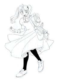
Here's some art.
No. 361475
>>361289that's adorable
nonnie, i love the artstyle.
No. 363043
File: 1710606945999.png (961.56 KB, 2354x1200, withcloak.png)
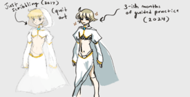
redrew something old again (and was once again told by /ic/ that the old drawing was better…). today i'm just going through proko's anatomy videos (currently done with his overview on pecs), i'll try to do a leyendecker study too. can anyone attest to the marco way of master studies though? e.g. picking out shapes in a painting, just blocking out colors before moving into edge work, etc.
No. 363044
File: 1710607042631.png (190.35 KB, 874x876, Screenshot_165.png)
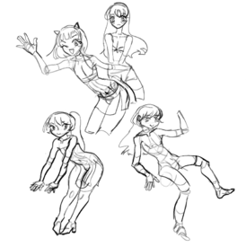
>>363043and here are some miscellaneous scribbles from a week or so ago
No. 363050
>>363043Your figures are kind of stiff. I'd give advice but I have the same problem.
>>363044These poses just don't really make sense. They look awkward. Where is their center of gravity? What are they doing?
No. 363104
>>363043nonnie if i may ask what kind of art style do you want to achieve in particular?
since itll help me redraw according to it and give better tips seems like youve changed it quite a bit, more bolder lines and character design aswell.
>>363044did you referenced these poses or did you draw them from imagination? because it seems the anatomy is quite broken in some places and alot of same face is going on, always remember taking references is NOT cheating and can help you alot!
No. 363124
>>363043sorry
nonny, this does look like a downgrade. It's good you seem to be doing more confident, less scratchy lines, but that's about the only positive development. Not sure what's up with the huge thick line on the stomach, internal details should generally not be thicker than important/silhouette-defining lines. I'm also not really sure what you're going for with they eyes, they looks kind of bug-eyed and scary in a way your old drawing did not (and again, why are the lines of the face thicker than anything else? it makes the face hard to parse). Also, if this is male, I don't know why his belly button is so incredibly low on his torso– one of the things that makes a torso look "male" is a higher belly button, try drawing it more as a bent line, too, that's what I do since it also gives the illusion of 3d form. And his waistline is absurdly high up, right under his ribs. You say you've been doing studies for 3 months but it doesn't seem like you're absorbing anything from it. Learn landmarks of the body and how they relate to each other, don't just blindly copy without analyzing spatial relationships between features.
No. 363187
File: 1710645827335.png (1.45 MB, 3405x2019, ana-tomy.png)
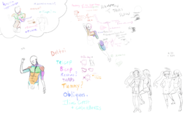
>>363104they are from imagination; i don't consider using references cheating, i just get tired of drawing figures. i'm not aiming for any one style in particular either, i just want to get a better grasp of the human body by year's end. my goals wrt that are like, iniro and lacryboy. maybe notapil
>>363124>Learn landmarks of the body and how they relate to each other, i've been studying this (or attempting to)…i guess i need to try harder to put it into practice? picrel's something from last month, i also copied some stuff from xiao's sketchbook the other…week?
No. 363196
File: 1710647463715.png (Spoiler Image,222.99 KB, 572x899, Screenshot_178.png)

>>363187also: is this any better anatomy wise? i switched up the face too
No. 363201
I'm not the anon you're replying to, but
>>363196No, the space between the legs is crazy. A pelvic bone doesn't jut out that far, even when knowing that the ass curves between the legs.
>>363187Imo, as long as it's not old school yaoi looking proportions, I think learning all this muscle work might be making it worse for you. You are doing very cartoony looks, so you need to be more fluid. Don't worry about certain aspects, get a decent style down first. Then if you do more realistic art, this will come in handy. Otherwise, you're focusing too much on the extra bits for very cartoony movements and designs.
No. 363237
>>363196One of his hands looks backwards, the pose is very stiff and his little “o” mouth is just weird. Your anatomy has improved, but i’d recommend focusing on realism when doing studies- i get a strong feeling that your studies involve redrawing a pose in your style, which is a common mistake that limits the speed at which you’ll improve your craft and risks leaving you with gaps that affect your art later on (such as anime faces on more realistic bodies due to a lack of practice with real faces)
My advice would be to mix realistic studies of both faces and bodies with your own original pictures so you don’t get burnt out and develop both technical skill and your creative muscles at the same time.
No. 363249
>>363237Samefag, i realized it might have come across as too harsh, so I’d like to balance it out with some compliments. You definitely have an eye for stylization and understanding three-dimensionality (it’s particularly evident in the shape breakdown studies you posted here
>>363187 and details such as the way you drew the back and belly curvature of one of the girls in the corner of the drawing, as well as the leg and groin area of
>>363196 there is also a clear improvement in the aspects of line steadiness and movement. Adding some realistic studies to what you’re already doing will speed up your progress.
No. 363300
>>363267Anon doesn't even understand that. They could use a model or even pose themselves to create a proper moving model. Even using references. I don't know why nonnas spend extra time doing this when technology has gotten better. If you're not doing absolute realism, there's no reason the anon needs to do fill body muscle exercises to get a form or shape or even an action. Call it bad advice, idc, but it seems like all this work and it's not even sticking still. Anon should use models and actual references, not try to come up with it on their own when they don't even have a general grasp fully on how anatomy like
>>363187 can help them. It's not making them a better artist and instead it's holding them back from the looks of it.
>>363043 Nothing had changed.
No. 363307
>>363304I'm not saying she can't do anatomy studies, but it's very, very clear the emphasis on muscles and everything is ruining this nonna's art. They have massively stiff models with still absolutely inaccurate anatomy for the work they are highlighting with muscles. The issue is that she is trying to do all this from imagination. No amount of anatomy study will help you make bodies look good when you can't even properly come up with a real movement. Anon needs real models. Not just learning about anatomy and how far a muscle could stretch.
I swear, some of you read "don't do anatomy ever" when I've suggested using models first would be more helpful because it's actively ruining their art. No one said anatomy is bad. Anon won't even understand it though because they can't even come up with a proper body movement because they aren't using references or even looking at how people can actually move. Comparing your art to the skills of other stylized artists isn't how you're going to improve real-life anatomy.
No. 363311
File: 1710693047426.png (4.76 MB, 8929x7086, huge.png)

>>363307i mean, i'm focusing on anatomy right now so i can get a better grasp of what i'm drawing. currently, when i go to study figures, i don't get what's there exactly; i break it down into boxes and i can't go past that without it looking…"off". it's also not like i'm never doing figure studies haha, i just get tired of doing them.
picrel are more studies from earlier this month/those xiao copies i brought up earlier
>>363283hmmm maybe i will try googling 'how to add weight to a figure'. someone on /ic/ said the same thing
>>363211>>363252tbh i don't really want stylized anatomy right off the bat, i do want to have a proper grasp of how it all actually works before i branch out. if the heads look cartoony that's simply because i haven't studied heads yet, trying to figure out the body first
>>363307are muscles not anatomy?
No. 363344
File: 1710700469115.png (187.24 KB, 1169x923, poses.png)

>>363327Pose Maniacs will help with their 3D modeling, but finding natural poses will help too. One thing I find fun to do just finding a random photo online of an action and then scribble copy it. Don't worry about it looking clean and trying to fit in a skeletal structure into a practice. If anything the joint balls are enough, but even then you go over it with skin that will form different on top of the layers due to folds. Practice external first with what you can see, then work your way in.
No. 363437
File: 1710720591224.png (272.15 KB, 1044x931, Screenshot_187.png)
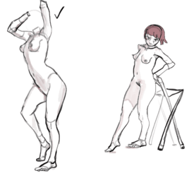
not done figure studying for the day, but do these two figures right here have good "weight"? they look alright to me but i dunno
No. 363461
>>363444i did use human refs yeah
i have a lot of packs thanks to /ic/
No. 363725
File: 1710810689022.png (333.5 KB, 1000x1000, Untitled917_20240318210459.png)
i started doing art again after almost a year of inactivity & i’m struggling a lot, specifically with eyes & eyelashes. HOW do i draw eyelashes onto these without them looking… clunky & out of place?
No. 363823
>>363725Draw the lashes but don’t fill them. If you get what I mean. Like…just draw the triangular shape. So it’s like this: /\ /\ /\
Sorry I’m using my phone and I’m a retard.
No. 364041
File: 1710885727199.gif (668.92 KB, 540x362, fruitegg_eyelashes.gif)

>>363725This one crazy cunt, fruitegg, draws eyelashes in the wildest way. Maybe this would help? (Probably not)
No. 364272
File: 1710965729615.jpg (1.24 MB, 2189x3059, a2b91630-333d-40e2-99ec-e9aa4e…)
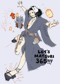
the anatomy/pose is supposed to be a little exaggerated and cartoony, but is it too far off? and should I give the cat a different type of food like takoyaki or candy apple? ikayaki looks phallic but that's fitting and it suits the color palette.
No. 364274
File: 1710967267221.png (14.12 MB, 10000x10000, um unfinsh joka.png)
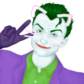
i still struggle a lot with digital and i literally just guess with shading and colors. tell me what i can work on ples (((ignore the kawaii retarded filters i thought it was really funny)))
No. 364282
File: 1710968024274.png (137 KB, 1000x478, chonklashes.png)

>>363725honestly with the very stylized design and how thick your lineart is, i think you should embrace the 'clunky' lashes. maybe on the bottom instead of the top, though, keep it simple to match with the rest of the drawing. i think the top example you posted could do without the finer-stroke lashes, even. there's a very doll-like look to your current style and you could definitely embrace that look.
No. 364285
File: 1710968583768.png (1.39 MB, 1442x842, no-scifi.PNG)
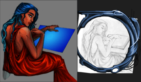
this was something i was working on a real long time ago and i never finished, but it's probably the most recent thing i can show for WIP stuff.
for some reason i always like my linart so much better than after it's scanned and colored.
i need to start on something new but i've been attention-deficit recently. what do you guys do to encourage yourself to put in some hours on a piece? i worry i'm just getting lazy.
No. 364290
File: 1710972169559.png (512.13 KB, 1000x1152, fruitegg.png)

>>364041GOD I love fregg. I've followed her for years, I'm so envious of her art. She's worth a follow if you don't mind that all she draws is Homestuck.
No. 364450
File: 1711043238517.jpeg (904.94 KB, 1656x1996, 935480C8-DFB5-4590-B73E-D34BDC…)

I feel like my understanding of light and anatomy is far ahead of my understanding of cartoon faces. For some reason I can draw realistic faces easily but when I try to do cartoon/anime/etc, it looks like garbage. Particularly I feel like my eyes are too simple and the mouths frequently look off. Please excuse the ancient weeb fanart, I haven’t been drawing much since then.
No. 364480
File: 1711051445887.jpg (1.37 MB, 2202x3083, sketch1711049116787 (1).jpg)
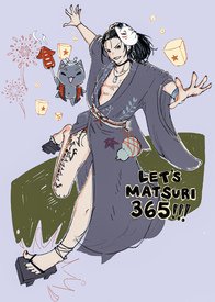
>>364430i'm not as concerned with having the pose look comfortable as i am with the overall image composition, so i don't want to change the pose itself that much as long as i can keep it properly proportioned, but i did try bringing the left leg up a bit. i think i'll bring the right leg closer in and reposition the knee.
No. 364641
>>364461Stylization is its own skill. You need to know what parts to exaggerate to make a piece cohesive. I think the main problem of pic rel
>>364450 is proportions. Study how anime changes these up without ruining the flow and rhythm of anatomy and see if it works for your stuff? I've drawn realism on and off as well, but I really needed to learn stylization first in order to liven up my art. It might sound crazy, but what matters most is perspective, colors, and composition. Anatomy, correct anatomy at that, should only account for 10%. Just make it believable and you'll do fine. I believe in you, nonna. What you have here is generally good, so maybe in a few years, it would look as good as the greats.
No. 364682
>>364641> I think the main problem of pic rel >>364450 is proportionsIn what way? You mean like
>>364656 said?
>his head is way too big for his bodyI’m trying to see it but I just can’t, it looks correct to me. I’m not saying it
is correct, just that it appears that way to me so I struggle to fix it. I feel like if I was succeeding in the cartoon/manga look I was trying to do, the head maybe wouldn’t seem so big because cartoons generally do have big heads (plus the drawing is of a character who is ~15 with stunted physical development), but because I’m failing at stylizing, it just reads as disproportionate realism…?
No. 364688
>>364682I have issues with proportions too and what helps is literally just editing the image so I'm able to see how bad it was before. I think proportion is that thing that just requires a wide visual library to get. Also, anime people are generally taller and slimmer that real people.
In your picture the head is big, the torso is short and I'd say the calves could also be a tiny bit longer. Doing some figure studies can also help to get rid of the bulky/stiff pose overall.
No. 364697
File: 1711133674272.png (4.58 MB, 3312x1996, edward.png)
>>364682Other anons are right, it's more of a proportion issue. A smaller head would help, the feet looked small to me as well. As for having a grasp on proportions, just rotate and mirror the image, that usually helps to see it. Use a real mirror if you are drawing on traditional or flip the canvas upside down.
No. 364799
File: 1711151154876.png (252.09 KB, 1105x896, Screenshot_4.png)
going from sketch to lines is tough. i've watched a video on it and the guy recommended cleaning up the initial sketch as much as possible and being more confident with lines but kek it's still pretty hard
No. 364808
File: 1711152219250.png (Spoiler Image,967.54 KB, 1867x2151, lldm.png)

>>364799oh and more scribbles while i'm here
No. 366057
File: 1711612043082.gif (35.53 KB, 256x192, 1000032797.gif)

I've been getting (back) into pixel art lately.
No. 366075
File: 1711621520144.png (1.39 MB, 1598x1574, Beelzebabe-nia.png)
>>366065Thank you, Nona.
Here's something of mine that isn't pixel art
No. 366492
File: 1711781104925.png (99.33 KB, 935x923, SELF-SLAYER.png)
>>366323Thanks, here's a big monochrome one
No. 366722
>>366624that's not me, but i'm curious to see the art. could you give me their @?
and thanks for the compliment kek made me smile
No. 367004
File: 1711998430818.png (1.74 MB, 2083x759, studies.png)
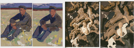
any tips on improving how you do master studies? is it better to do them on traditional or digital?
No. 368179
>>366897I don't go on /ic/ much, partly because I don't have time and partly because a
lot of the threads are repetitive and boring and I don't aim to be an artist in any capacity, I simply like drawing for myself. Even then, I don't think she posts there often. She's probably living her best life
No. 368831
File: 1712544581481.png (Spoiler Image,1.08 MB, 1502x1623, kandv.png)

maybe i'll be able to draw my coveted trap/bishonen slop after all…i feel like i am making progress even if it's at a snail's pace
No. 369148
File: 1712623567319.png (Spoiler Image,663.09 KB, 1311x910, Screenshot_78.png)

>>368831i fear turd polishing so i won't finish this kek
need to get into coloring/rendering/whatever this month though
No. 369240
>>369198what do you mean? 3d models or figure models
if it’s the former i’d rather not trace over things kek
No. 369365
>>369240If your characters were stylized and not meant to look human, I'd get it, but you don't have a grasp of anatomy at all and I'm usually someone who says anatomy doesn't really matter. The problem is you are actively trying to be proportional, not even mildly stylized. Doing so means you can't exaggerate anything and it needs to look right. The perspective is completely off and yes, models whether 3D or figure models, will help with this. Especially posed ones. I don't know if you've ever taken digital classes at all, but you an even find different random people and a couch and mesh it all together and used that as a model for yourself too.
But you can't have unstylized, unexaggerated characters and expect this to make sense.
No. 370638
File: 1713108831813.gif (6.8 MB, 399x500, E07E80CA-8DF6-441B-8877-3CD381…)
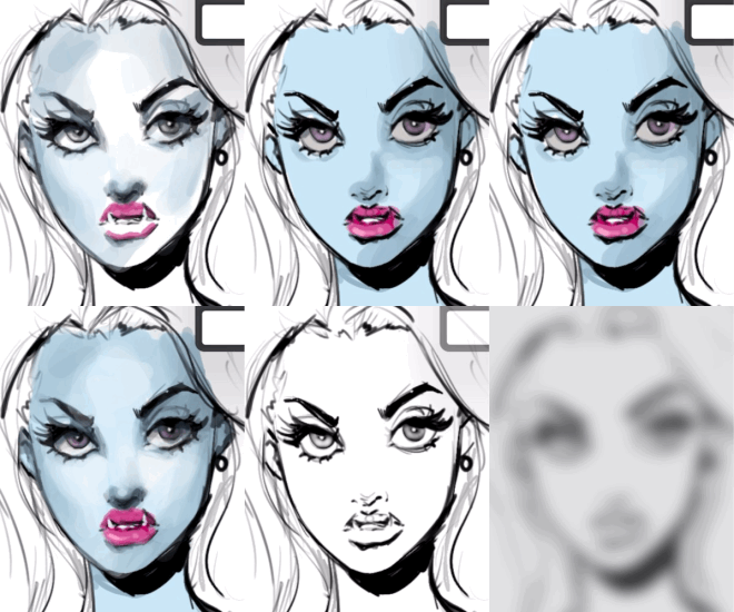
not an avid drawer anymore but why does the rendering always ruin the original lineart?
No. 370672
File: 1713115023104.png (Spoiler Image,1.66 MB, 2151x1791, CF053A05-06C5-4665-8775-1CC86E…)

this piece is giving me dunning kruger whatever so i’m here to be humbled. it’s mildly coomery so it’s spoilered. thanks
No. 370806
>>370672>>369148>>364808Why do you keep posting when you aren't using models after anons keep telling you to use models? You need to improve your art, not just keep posting the same type of work and expecting an different reply from users. I don't know what else you want anons to say. Sort of seems less like you want to improve and more like you need a space to share your work.
>>370766I hope anons don't. You need to reflect on everything people have been telling you and actually
try to incorporate it into your work. You aren't listening to anyone, but you want critique. It makes no sense. At this point you should know how to redline and edit your own art. Anons want to help you, but you just don't want to improve.
No. 370813
>>370806>>370806i used a model for
>>370672 though kek
and tbh most of the advice itt is bad, or just "durr do [what everyone who is trying to learn does]" or nonsensical babble from probable /beg/'s like
>>369365. i ask for critique because i'd prefer specific comments like
>>370704 or the nonas who mentioned weight. that was actually helpful.
>>370811he's nude
No. 370814
>>370813Can you post the models you used underlaid with your finished piece then? Also don't know why you're infighting. Multiple anons have pointing out that the same advice is just going to be given to you again.
>>370749 >>370704
Also if you're going to nitpick what advice you do and don't like, but at the same time say
>>369403 thank you to that same advice you're suddenly now complaining about, then I don't know what to tell you. If all you want is advice on an outfit and how a character looks rather than anons immediately noticing your anatomy skill are the worst, then you need to say that when you are posting.
Then censor the model or spoiler it. You seem to know how to use the spoiler function before. Also it's
underlaid meaning your top layer is going to be overtop of it anyway. It's art, not porn.
No. 370830
>>370672There are many, many things that can be improved here. Is the succubus supposed to be that much smaller? His waist is very small, his hips are weird, his hand is deformed. His expression is kinda dumb-looking too, were you going for something like a grin or something? Also work on cleaning up the lines, right now it looks very doodle-y and unfinished, one of the hooves is even missing. The other guy also looks weirdly flabby and too thin (his torso and waist area especially), his legs are awful, what's happening to his right foot? And where are the muscles and details on the left one? Where's his nose? Why are his eyes so far apart?
Learn to color inside the lines, choose better ones according to color theory, learn to properly shade so the muscles and bodies can have volume. Work on composition too because right now it's literally just two characters standing next to each other looking kinda confused and dumb.
No. 370847
File: 1713168028121.jpeg (124.73 KB, 875x999, IMG_3425.jpeg)
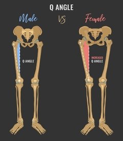
>>370672the furry looks female, especially the tiny waist and rounded hips/tights. even skinny moids dinnt have waists that cinched, their shape is pretty rectangular. and the thigh is too curved. moids' legs are pretty straight, their pelvis is narrow and their femur is angled differently.
No. 370854
File: 1713176601338.png (748.49 KB, 2151x924, redline.png)
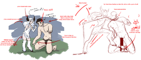
>>370672hope this helps!!
No. 370880
File: 1713186396964.jpg (742.66 KB, 1920x1536, leslie-tran-boysmall.jpg)

>>370638Art is all about designing, and design is intentional. You have to design a rendering style that looks good with the line art if that's your intention, or you have to sketch a line art you can easily paint over.
No. 370895
>>370854I’m dying cause
nonnie really outdid you and that’s straight up embarrassing kek
No. 370914
File: 1713196107506.png (183.64 KB, 1078x893, succubusdoodle.PNG)

I did it too kek, critique me nonnies (I hope the original anon doesn't mind that I made a doodle of the succubus and knight too, they belong to her so she can take this as bad fanart I guess). Excuse the chicken scratches I did it with a mouse. Tbh those poses are kinda difficult to get, I had to change is up a bit.
No. 370916
>>370815 (me)
and how the hell was this infighting
farmhands are unfair sometimes
(take it to meta) No. 370922
>>370920kek i’m just fooling anyway
twinks are good too
No. 370927
>>370914im the anon who drew
>>370854 and i have to say i like your goatman pose way better than what i did with it! it has a nice quality of being weak yet domineering
also reminds me of griffith kekkk femboys do seem hard to draw when you're not used to them
No. 370933
File: 1713198851533.png (175.24 KB, 624x785, image_2024-04-16_023355120.png)

Fuck it, fanart time. I know it looks fucked as all hell so forgive me, I draw buildings and foilate heads I have no clue how human anatomy works
No. 370936
File: 1713200786318.png (180.52 KB, 624x785, horns_anon.png)
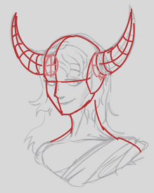
>>370933A small suggestion would be that the horn on the left be directed to the back. Since the head is tilted to the left, it would also tilt the horn's direction.
No. 370939
>>370933It looks good nona. A couple of things: the eye on the right is much bigger than the left one. Flip your picture and you will see. The horn on the right stops around eye level, but the one on the left doesn't. It also looks like it's at the wrong angle. Looks like it's coming forward instead of sideways.
>>370936This is good but the base of the horn on the left needs to be wider so it meets the eyeline like on the other side
No. 370964
File: 1713204001797.jpg (648.92 KB, 1490x3376, hips.jpg)
Please give me some tips on male hips position
No. 370977
File: 1713204655435.png (Spoiler Image,161.99 KB, 590x845, 2B67C334-52ED-4204-A9FA-E3568B…)

>>370672didn't mean to give him big 80s hair, but it is my first time drawing digitally since a few years ago… he is so cute! i had to try to draw him, too.
No. 370982
File: 1713204787506.png (781.21 KB, 1080x1976, goat-tan.png)

mobilefag reporting in for goat-tan bandwagon
No. 371004
File: 1713206048435.png (629.2 KB, 1176x1265, goatman.png)
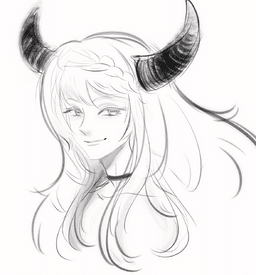
something nice to end the thread on! a quick goatman
No. 371060
>>371004>>370982>>370977>>370933i like all of these. it’s cool to see things in other peoples styles
>>371014he’s a prince who bullies holy knights. lore autism doesn’t go any deeper than that x
No. 371072
File: 1713216002696.png (532.83 KB, 1080x1571, append.png)
>>370983thanks, here's a cleaner version
No. 371077
File: 1713216420069.png (Spoiler Image,488.19 KB, 1036x805, ukem@ster.png)

>>371072now back to my autism crossover…
No. 371091
File: 1713219154978.jpg (Spoiler Image,4.36 MB, 3024x4032, draw.jpg)

Spoiling cuz Im embarrassed and don't want to be seen from the front page, but I draw… yes they are not each finished, sorry
>>371072Post moar of your stuff
No. 371103
File: 1713221910908.png (Spoiler Image,1.83 MB, 2944x1994, mon doodles.png)

while i'm here posting things, i redrew something else. i think i'm improving, and a few people on /ic/ said i was, but another guy was like "it's just a style change" so i'm not sure
No. 371106
>>371091you're getting there! a lot of this just comes down to practice. i'd recommend practicing referenced poses as well as checking your proportions in relation to other parts of the anatomy. for example, the right forearm in that standing pose you got there is too long, and the thighs are quite short in comparison to the shins- this means that if i measured the length of the arms in that piece, it'd go down to about the knees, which i'm sure is not the look you're going for.
one more thing is to maybe play around with angling the shoulders a bit more. it'll make poses feel a little more dynamic.
>>371103to say that there is no improvement is wrong, as i can absolutely see improvements in the way the fur is drawn and the front foot is angled. where i think the issue lies is again (if youre the same op) the shoulders and the weighting of the pose. try sitting like exactly how've you got your character sat and you'll see what i mean. the torso is straight up- this character's got to have some crazy core strength because the shoulders dont show any signs of the arms supporting the body's weight.
hope this helps.
No. 371120
File: 1713224681358.png (Spoiler Image,394.98 KB, 1291x852, asdasdasd.png)

>>371103I gave it a try myself. I feel like mine ended up way more stiff so don't take it as a critique, just more like fanart lol. I really like the way you draw faces.
No. 371129
File: 1713226423975.png (333.8 KB, 1036x758, Sketchbook.png)
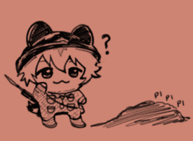
>>371091is that your oc?? i love his nekojiru eyes and spoopy vibe, the one where he has long hair is especially cute. am shit at giving advice and it's been ages since i drew traditionally, but i always found using feather light pressure and as few strokes as possible or in other words keeping your pencil to the paper for as long as you can when sketching made my work turn out cleaner.
No. 371141
File: 1713229929633.png (1.02 MB, 1080x1350, IMG_0650.png)
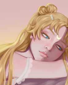
Can’t find myself wanting to finish pieces lately; like I know my compositions aren’t exactly interesting but when I try to work on those parts and backgrounds it makes drawing soo boring that I’d rather abandon the piece entirely
No. 371147
>>371138What did you draw today,
nonnie? Show her how it's done!
(infighting) No. 371225
>>371103I think there's definitely some improvement. I think you'd benefit a lot from studying and copying pictures of male torsos. His neck is also a little thin imo but maybe that's how you like it. The hooves are better but I would make the calves slightly longer.
Also please try to stay away from /ic/ because everyone there sucks ass.
No. 371226
File: 1713256983198.png (134.76 KB, 627x609, 7867786786786.png)
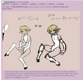
>>371103If you're serious about improving, you have to know that it's still too early to see any significant changes. In all these pics you still visibly use the same technique. I think you're only getting better with copying symbols that's why it feels like shallow improvement. No hate, nona, I used to redraw/repaint my own doodles to get dopamine before too, I get it. Just go eat your veggies, it'll be better on the long run.
No. 371253
tbh I don’t know why femboy anon gets so many (you)‘s when there’s no real technical difference between her art and something like
>>364450>>306427>>364272>>371176i think it’s fair. If you’re being rude and nitpicky then ofc anons will want to see how well your rude ass actually draws
(defending yourself in third person) No. 371293
>>371253>use a VPN >get accused of samefagging Why are modern farmhands so retarded
>>371288Watch out anon, you might catch a ban…
(ban evasion) No. 371314
>>371077>NTY!!! boysThis is amazing and based. Please post the finished pic here for us. Great taste my
nonnie.
No. 371331
File: 1713291805364.jpeg (1.21 MB, 3264x2448, 13A085A5-09E8-4207-A748-32C378…)
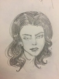
Does the hair look nice like this?
No. 371370
File: 1713300678695.png (Spoiler Image,134.36 KB, 321x873, E3872CA9-6606-4007-92F7-B250AF…)

>inadvertently got nonas banned
kek i’m sorry. here’s another doodle as recompense(ban evasion)
No. 371389
File: 1713303343899.jpg (83.53 KB, 736x490, 1000018801.jpg)
>>371370Wait, if he's a goat, shouldn't he have goat eyes? I think that would look neat.
No. 371401
>>371288it's genuinely silly tbh. there's nothing in the (2 year old) op
or site rules that states asking people to post their work after they give crit is bannable here..it just seems arbitrary on the farmhand's part. maybe put something in the op like "proof of skill is not required to rate" or some shit
(ban evasion) No. 371407
File: 1713312402100.jpeg (1.71 MB, 1290x1695, IMG_0762.jpeg)
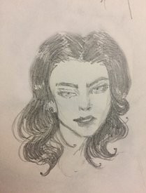
>>371331The hair looks nice, though Imo it’d be better to reduce or clarify what’s happening at the back. Her right eye is tweaked.
No. 371418
File: 1713317291906.png (142.12 KB, 607x802, test.png.png)
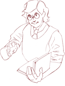
Drawing clothes, body (specially arms) was always a pain in the ass for me because I've spent a really long time only drawing faces. I'm proud of my evolution, but would also enjoy some criticism to get better.
No. 371420
>>371418study the collar on the shirt more, it looks like you phoned it in and just sort of drew something that could pass as a collar but it doesn't actually have any of the qualities of a collar and the tie is clipping through it somehow instead of being tied around it. I know it seems like a strange piece of fabric but it's actually fun to draw once you grasp it in your mind's eye in 3d.
also work on connecting the head to the body. study the neck area. important for clothes. you have kind of a floaty head/tiny neck thing going here
No. 371536
File: 1713365565595.jpg (168.01 KB, 840x1200, 310119cad672281e1dc1e1db780be4…)

>>371494We did it because we wanted to draw her own character better than her. Isn't that what being an artist is all about?
No. 371616
File: 1713391912688.png (915.3 KB, 1724x802, 1713317291906_redlines.png)
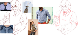
>>371418Just addressing your note about clothes - are you pulling reference? I'm not sure if you wanted the collar opened at the top or not, and what sort of tie knot you were going for but clothing has to follow the same perspective and form as the rest of the body to support everything turning in space. Likewise knowing what sort of material you're aiming for helps with fabric thickness, stiffness, and wrinkle structure.
Apologies for the shitty redlines but the references I pulled cover the rest of it.
No. 371617
File: 1713392413761.png (582.38 KB, 966x994, meo.png)

>>371314ty nona! I'll work on it some more, for now here's a little ren in an im@s 'I want' inspided outfit
No. 372103
File: 1713553019651.jpg (729.43 KB, 3060x4080, wip 1million.jpg)
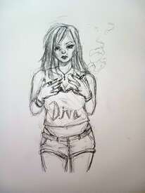
this is the average quality for anything i draw lately. i feel kinda defeated after every drawing turning out like shitty amateur garbage. at a bit of a loss as to where to go with art at all atm. id like to gear towards a more realistic style and get better at shading, but i just feel so unmotivated and have been getting frustrated super easily. any advice is appreciated.
No. 372153
File: 1713572282105.png (488.54 KB, 2056x1606, Screenshot 2024-04-19 at 20.09…)
>>372103I've seen Love Life Drawing recommended a lot. I joined their free site but I haven't tried it yet. Another nona on here said if you do the practices it will improve your drawing significantly just by teaching you the basics and drilling on them to the point you can, like, impress friends and family with your figure drawing skills lol. Have to actually do the drawing practice of course (that's the part I'm stalling on) it's not a magic bullet just a beginner-friendly helpful site with clear instruction. Maybe we can do the 10 day fresh eyes challenge together (picrel, screencapped part of the plan)
https://www.lovelifedrawing.com/they have a youtube channel too but I'm not sure where to start with it, too many videos. some of them are clearly labelled for beginners and some of them are just tips or the guy talking about mindset
https://www.youtube.com/@lovelifedrawing No. 372713
File: 1713762246658.png (461.82 KB, 1184x1812, drawing.png)
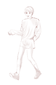
I decided to get back to drawing after a year of focusing on other stuff. This time i want to take it seriously and improve, but i really don't know what to do. I drew this based on a ref.
No. 372714
File: 1713762376280.jpg (27.32 KB, 563x755, 804910e1419886b4d6107a0620a166…)
>>372713here is the ref, i deleted it off the canvas before i decided to lazily paint it so i understand the light makes no sense
No. 372733
File: 1713768848098.jpg (43.82 KB, 563x490, d0f406bc80083da1f76b2a176305e9…)

>>372713That's pretty good for a return! Your lines look nice, not shaky at all and it looks like you don't have trouble drawing faces in this style (which I think is the most important because it's usually the main thing people look at and a bad one could completely ruin an otherwise good drawing).
Maybe work on values next by doing studies with greyscale versions of your references. Your shading is very light and when you squint you lose everything. Besides that it looks like you drew this without paying attention to detail. Clothing folds and the pose itself are different from your ref and I can't tell if you wanted to go for that (since you said it's only based off it) or if it happened because you didn't compare distances (like the space around the elbow on the right is bigger and the legs are further apart in your drawing). If you wanted to draw a skinnier/less muscular version you should've pulled up additional references for skinny legs, if anything the knees should be more defined then.
If you don't know how to continue, I'd recommend doing more photo studies and some specific ones where you only focus on shoes or clothing or anything else you've noticed yourself struggling with to help build your visual library and get the shapes down. Like drawing a foot from different angles and then a shoe over it so you'll be able to visualize it better in the future. Try studying Morpho to improve anatomy in general, I used to simply copy the drawings during times when I felt artblocked and it ended up helping me a lot (or go through another anatomy book, this one is just pretty easy to follow since it has so little text). Good luck!
No. 372735
>>372733>you don't have trouble drawing faces in this styleyou dont know how many times i re drew the face to make it look ''ok'' lol. I feel like it doesnt look animu yet, but it makes me glad it doesn't look as bad as i thought. I struggle a lot with faces.
> Try studying Morpho to improve anatomy in generalThanks
nonny! I already studied Morpho once, but i am a slow learner so maybe it didnt stick with me, I will give it another read!
No. 372765
>>372713Nice job anon, I love the softness and the face. There are a few things off with the pose. The ref image guy is leaning back, whereas your guy is not. Not sure if this is a stylistic choice but it's a common mistake: necks don't go straight down into shoulders. Even in this ref with the angle and his sweater, you can see his neck curves and his shoulders drop slightly down instead of sticking straight out. The shoulder on the left looks weird, it should slope downwards then the arm comes out at more of an angle. His front leg is extended and not bent. The sock on the front leg is practically a straight line, not curved upwards. I think his leg will look less flat just changing that.
This is a strange pose though. I tried doing it to get an idea of where his weight would be, but I couldn't actually do it. It seems his weight is distributed between his back toes and front heel. Your guy looks weightless, like he's floating and it makes sense with how weird the ref pose is. I'd just put his back foot flat on the ground, much more natural (and possible. I was about to fall straight over)
Keep in mind the camera angle of any ref as well. This camera angle looks low. You can see the inside of his shorts, under his chin, up his nose, not much of his hair. I think it's around waist high but I'm not perfect at this yet. With your guy, it looks like you wanted a ref with a higher camera angle, so you can see the top of his head and his neckline would be a downwards curve. Look for refs that show the top of their heads if you want to draw that.
Keep it up, drawing with refs is so helpful
No. 372928
File: 1713815863490.jpg (87.12 KB, 726x1280, lmao.jpg)

trying to get better at drawing after starting college killed any hobbies kek
No. 372934
File: 1713819265438.jpg (1.99 MB, 4010x2949, sketch1713818390698.jpg)
if the nona who wanted to see this when I finished is lurking, I got it like 80% finished over the weekend. still scuffed but maybe posting it somewhere will motivate me to fix it later.
No. 373011
File: 1713834187652.jpg (32.83 KB, 500x281, 5bc83b5dc41e652462f0a06a066b80…)
>>373001thank you for the compliment and for asking a question that gives me an excuse to sperg lol. ren's is a mix of a few different I WANT/edgy outfits, hiroshi's is the main platinum stars outfit just because I thought it'd suit him, haru's is an unfinished mix of things hibiki and ami would wear, ryu's is leon's acceleration outfit, and maki's is the ai like hamburger outfit lol.
No. 373020
File: 1713837987398.jpeg (490.68 KB, 978x1968, 3554BDF6-3B45-407E-8C5B-41CBA6…)
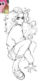
how to make this not look weird? thanks
No. 373061
File: 1713853023779.png (820.12 KB, 978x1968, image.png)
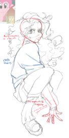
>>373020dont forget to use references, flip your canvas often. great confident lines and fun poses keep it up
No. 373062
>>372984ok maybe i should browse the ideal bodies thread a lil less kek>>373002it's ok
nonnie, that's actually a common complaint i've had from friends since the beginning, whenever i'd try drawing a man my friends would think it's a girl kek
No. 373064
>>371370>fujo whos drawing flat chested women and calling them femboys turns out to be unhinged ban evading samefaggerI don't get why you guys gave this retard free fanart of her fugly ocs. I'm glad farmhand finally banned them.
>>371354>like she has downsGo back to ic and post your gay porn there, it's obvious that anon has a better understanding of fundies than you based on your own art.
No. 373073
>>371474proof that femboyfags are mentally ill (this explains their shit taste)
>>373020your style is so cute!
No. 373075
File: 1713859120046.png (892.38 KB, 2330x1490, figure drawing example.png)
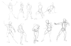
can i get some tips on how to properly do figure drawing studies? i struggle a lot finding the line of action in stiff poses. It feels like all of the information from proko/hampton's videos arent really useful in the vast majority of poses.