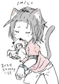
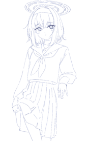
File: 1713873475744.jpeg (25.56 KB, 320x216, IMG_0131.jpeg)

No. 373122
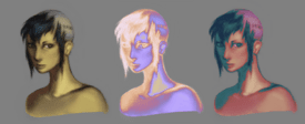
post art for anons to rate, critique, give advice, etc.
previous
>>>/m/187240 No. 373123
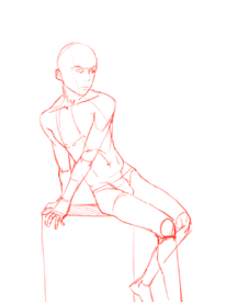
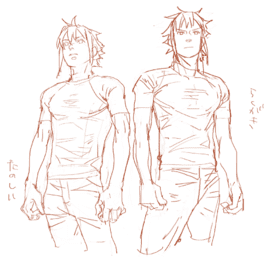
>>373034oh my god that’s such a good idea and my retarded ass didn’t think of that. thanks nonnersss having a hard time visualizing lately
>>373061thanks
nonnie for the advice and redline
>>373048>>373073thanks
No. 373693
File: 1714037846608.png (2.01 MB, 2160x1620, IMG_0599.PNG)
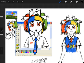
wanted to practice designing cute and simple characters so here's my version of xp-chan. outfit suggestions are welcome, i'm still figuring out the bottom part
i know i used the wrong cursor for her bows
No. 373723
File: 1714045554511.jpg (130.97 KB, 1500x1500, il_fullxfull.388896228_98td-29…)
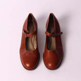
>>373693oh my this is really cute, the glasses suit her well!
hmm for the bottom you can do a skirt with striped pantyhose and classic Mary Jane flats, something like picrel, but you can colour them however you want, maybe a dark blue shade
No. 373724
File: 1714045628020.jpg (82.35 KB, 800x800, Women-Girls-Autumn-Spring-Pant…)
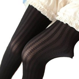
>>373723picrel something like this for the pantyhose
No. 373770
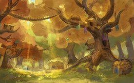
File: 1714062429784.jpeg (435.24 KB, 1725x1075, IMG_2056.jpeg)
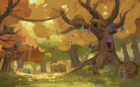
Gaaaawd someone give advice/tear this up/help me with this please. I’m a character artist not an environ artist but I always end up doing stuff like this for my dayjob. I spend hours on this and can’t get colors right. It’s just so yellow no matter what colors I mess with and looks like the foliage isn’t attached to the tree branches, the branches break up eye flow but feel hopeless to fix them since they’re supposed to be going over the viewer some. I also feel so bad knowing AI could do this instantly.
What can I do to make this better?
No. 373782
File: 1714064433434.png (3.95 MB, 1725x2150, contrast.png)
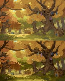
>>373770It seems to me like you will want to push the contrast (maybe even harder than I did in this edit). I'm not a professional so there may be more to it but this is something I always struggled with too until a pro explained it to me.
I think the colors are very nice!
No. 373783
File: 1714064604786.jpg (130.75 KB, 564x564, 9-uSaca93bmzA.jpg)
>>373770This looks amazing! But there are ways to improve it a bit, the foliage is a bit flat for a foliage. I suggest you add some variation in tone, darker and lighter chunks of leaves, look at picrel and similar images. As for branches, dont be afraid of hiding some parts with foliage. I'd also added more contrast to the image overall and played around with bouncing light from the grass on the right tree, to make it look nicer and to enhance it as a point of interest. Just throwing some ideas at the wall, because i'm myself not a environment expert, kek.
Also, yep, exactly like
>>373782 said, more contrast could improve the image lots
No. 373799
>>373782Contrast solves so many issues but since the thing is for a little kids musical, I’m worried it makes it too dark and scary for them. I should have mentioned that in my post. Thank you though, I’ll see if coworkers on the project think it’s scary.
>>373783I’ll try to add more detail to the leaves like this without going out of kinda simple storybook style. Thanks.
No. 373830
>>373693I loooove her bows. I think you should stick with the white xp shirt and blue tie. I think it would be better to make her outfit design simplistic so you can focus more on her overly designed head.
Since she has a blue tie give her a blue skirt, white socks and white shoes. I think white shoes would put the design all together since it would match her cursor bows, it would 'ground' her design together if that makes sense.
No. 373878
File: 1714090337176.gif (740.18 KB, 1035x645, ezgif-7-392388e008.gif)
>>373770I'm not an environmental artist so I have no suggestion for the composition (that aspect looks okay to me), but I felt like I could immediately see how to improve your colors and contrast, gif related.
You want the sunlight to look golden and bright, meaning you have to push back the gold/yellow/green hues (& the brightness) in the places not touched by light. I chose to push them into darker purple because it would lend the pic a sense of warmth. My laptop screen has fucked color calibration though, so this might look clownish on other screens
No. 373917
>>373770This is awesome! i would love to get into painting bgs but i dont know where to start, do yuo have any tips
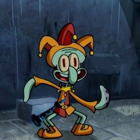
nonny?
No. 373930
>>373878Oooh I love the reds and purples on the right side especially, and the contrast the red makes with the trees on the left. It might be a little strong (and going too much into brown territory which is the main color of another area in the story…sorry I feel like I keep making excuses but it’s that there are so many limitations with this project) but I’ll throw some of it in there.
>>373917Im still relatively new to taking it seriously and am entirely self taught, so I’m no pro and it’s boring advice but I’d say just save tons of photos of real life and imaginative places you like as you come across them…I always have “I can use that for art sometime” on my mind. Especially if the bg I have to do has manmade buildings and stuff where perspective is more obvious, I will use one a photo as my structural “base” regardless of color or architecture in it and think of the floor of it as a 3D plane I’m placing stuff on.
Oh also I’ve found that throwing colors down on one layer with a messy brush and zooming really far out to make thumbnails is best for me. Then can move in and detail and “build” it (still all on that same layer, not being afraid of just coloring over stuff I don’t like)
No. 373969
File: 1714140140337.jpg (5.96 MB, 4032x2268, 20240426_105015.jpg)
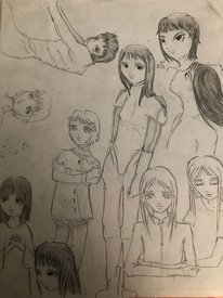
Was bored during class and drew this on paint, I was thinking of doing a proper version at home, thoughts?
No. 373976
>>373878>>373782I agree it needs more contrast. Instantly made the sunlight pop.
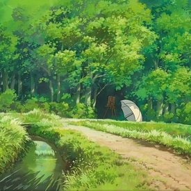
>>373799 The yellow/autumnal tone is what's making it scary with more contrast, especially with purple tones added. Yellow/orange leaves on trees = fall = halloween. Just make the leaves green, or even something whimsical like pink.
No. 373996
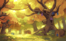
File: 1714148729066.jpg (1.04 MB, 1725x1075, paintover.jpg)
>>373770personally i only think your piece just needs finishing touches, the composition is good as is the rendering just needs a bit of filtering and a bit of making the light reflective with the surroundings although i'll admit making landscapes isnt my strong point but ive have to say you did a amazing job
nonnie! i loved seeing all the textures zoomed in
No. 374163
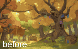
>>373996Oh that looks great! The glowing light in the shadow to break up the darkness! 100% going to add that, thanks. I should be able to finish this thing today and will incorporate all the nonna’s advice.
>>374132Not really, I work at a small youth theatre company doing all art related stuff they need (in this case, backgrounds to use as a projection instead of a physical set)
No. 375173
File: 1714522221182.png (2.7 MB, 1725x1075, Layer 7.png)
>>373770>>374163tbh if thats the work you are doing then this is more than fine, as long as you are hitting the brief and the director is happy with it (i doubt they are paying you enouhg to spend more time on this)
but if you do want to practice you skills, it might be worth spending your own time on this. Looks to me it needs a bit of a detail pass over everything. The ghibli example someone posted is a good place to start for foliage detail and shapes. No need to go crazy and paint every single leaf, but see if you can get some more detail in the shadows (as thats what your scene is exposing for) and closer to focal points where you want the eyes to be drawn.
I agree with other nonnies that it needs more constrast cuz the scene overall looks underexposed (but idk what the production needs, maybe you purposely underexposed for the brief) And a bit more exaggeration of the cool tones in the shadows you are already doing to help break up the yellowness of the scene.
Overall great job with the colours and the mood. Needs to pushed a little further and the intention needs defining ala, a focal point, to help you go in the right direction.
No. 375182
File: 1714526348927.jpeg (427.6 KB, 2160x1620, 1E1252A8-A492-4CC1-A9B8-1AB1D6…)
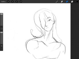
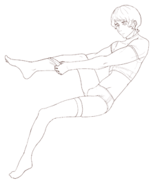
i know i'm drawing the neck too long, i kind of like it stylistically. does it look retarded?
No. 375341
File: 1714578344306.jpeg (384.06 KB, 2048x1536, 32BCF467-80C7-4045-AEB0-841AA2…)
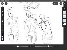
some practice. i think i’ll try coping morpho/bridgeman for the next few months and see where that gets me
No. 384207
File: 1716164026709.png (165.73 KB, 444x463, Captura de tela 2024-05-19 211…)
I'm really upset about the colors. My tablet screen has way more vivid and red colors. I tried to adjust bout couldnt. So whenever I finish something I have to try to correct color balance.
I'm using a reference.
No. 384595
File: 1716230176871.jpg (1.6 MB, 1400x1191, crossover episode.jpg)
made a quick sketch, pls tear it down now before I continue
No. 384701
File: 1716248159378.jpeg (114.03 KB, 1400x700, IMG_3209.jpeg)

>>373770Nona…your art is so beautiful I could just cry
No. 385508
File: 1716401257702.jpg (763.6 KB, 1400x1191, lbesbiab.jpg)
>>373969So I finally started working on it, it's still not finished but getting to it
No. 385510
File: 1716401594821.png (206.83 KB, 425x485, Captura_de_tela_2024-05-19_214…)
>>384207Worked some more on it the other day, ear and neck mostly. No clue what to do with the hair, I'll probably need a different brush.
No. 385536
>>385520> getting memed into coming out as the orientation/gender identity that's trending with the terminally online losers you idolize Nice fanfic but that's not the case you chronically online loser, I came out when I was 12 and I've never had any issues with my own orientation since. The idea of the drawing just came to me when I was bored and the character isn't made to represent myself.
I don't care if the anime art style is considered a tranny thing now, I find the idea of changing your entire art so the ~aesthetic~ isn't too close to the one of a group you politically disagree with to be quite pathetic, frankly.
No. 385660
>>385508Your previous draft made more sense as to how the blade of the axe was positioned, now you've just got the top blunt end buried in her skull which makes it look like she's just wearing the axe as a hat.
And the triangle in the back is crooked.
No. 385686
File: 1716451666281.png (489.54 KB, 580x850, sumika.png)

any muv luvers
No. 385694
>>385692ooh yeah haven't posted on lc in a while i forgot they get you for that kek. also ikr, i expected it to be a basic and boring eroge until i got into it, really great stuff.
>>385693i 100% recommend mogoon's course, it provides great information and content for artists of all skill levels, i also really liked chyan's course! and yeah playing the first game before alternative is basically required to get the full experience of muv luv. thanks so much btw nonna, i'll be posting my works every now and then!
No. 387251
File: 1716916125292.png (Spoiler Image,1.43 MB, 1000x1595, hrhr.png)

happy with how this one is turning out so far(spoiler this)
No. 387258
File: 1716917049301.png (13.35 KB, 100x133, ham.png)

>>387253my bad, i'll let the jannies do it
No. 387288
File: 1716922532131.png (194.25 KB, 450x638, kittysheep.png)
>>387266yes, i been slowly working on it the last few days based on the school au haruhiro in the ai thread. now i'm satisfied enough with it that i'll stop reposting haha. thank you!
No. 387292
>>385686suprised another nonner likes muv-luv, is cute fanart. this and that painting of a tree
nonny made are the only pieces of art posted ITT that aren't embarrassing to look at kek
No. 387554
File: 1717007546232.jpeg (2.65 MB, 4032x3024, IMG_5725.jpeg)
Tried to draw Roger from memory, he’s a farmer now.
No. 387647
>>387292haha thank you
nonnie ily, i'll be drawing my wife meiya next!
No. 387712
File: 1717063652878.png (952.69 KB, 1720x913, Untitled-2.png)
i don't know why my art looks the same quality whether i use reference or not is this a result of not using it often? prefer just brute forcing construction from imagination until it looks mildly acceptable usually. how often do people itt use refs? also any general opinions/preferences
No. 387727
>>387712I'm guessing it's because you don't actually look at and analyze the picture. You made no effort to draw the clothing folds or surroundings properly and in that short timespan you couldn't have since you don't seem to have the necessary muscle memory. If you don't want a reference to influence your result it's fine to use it loosely like that, but if you want to add more specific detail to your art you need to start looking at everything more carefully and take your time with it. I like your style though, that first one looks really appealing to me despite some flaws and it's cool that you can draw so quickly.
I used to also brute force everything, but at the time I wasn't even doing proper anatomy studies so everything ended up looking very wrong without me noticing kek it's difficult to rely on skill alone when you haven't actually built up any. I think references are useful but they're oftentimes not exactly what I need or overused pinterest ones so I've been trying to get better at construction myself
No. 387785
>>387712I use reference as a way to check my assumptions after I've made a relatively clean pass at the drawing, with the understanding that it won't be 1:1 but good enough to see whether or not the construction is in the correct perspective and proportions.
In regards to your art quality, the shoulder construction is much stronger in the image where you used reference vs. the no ref image where half the deltoid has gone missing on the screen-left side. So I'm not sure if that's what you mean, or if you're talking about confidence of line or what.
No. 388294
File: 1717262854520.png (393.5 KB, 1418x977, sketch1717262638236.png)
>>387558appreciate it, nona! i got addicted to drawing these retards
No. 388297
File: 1717263429071.png (714.42 KB, 1068x1671, Sketchbook66.png)
>>388294more crossover autism
No. 388449
File: 1717329218380.jpeg (159.69 KB, 933x1024, image0.jpeg)
How the fuck do I paint hair? Apologies for shite anatomy, first time drawing in a couple years
No. 388885
File: 1717473114031.png (1.02 MB, 2130x3221, figure drawing.png)
how do i stop chicken scratching and develop confident lines?
No. 388958
>>388885Some of your lines honestly look fine, it seems to me like you only chickenscratch if you're trying to define an area more. Get used to erasing lines that you'd otherwise continue scribbling over. If you do it because you want a thicker line for more contrast you should change your brush settings so you don't have to press as hard to make it happen. Or make it more difficult to get a thicker line, whatever you prefer. But
>>388954 is right, the easiest way is to learn it with a pencil. Maybe do your warm-ups traditionally for a while. It also helps to use a very big sketchbook (at least bigger than A4 if possible) for single 30-60 second figures. You won't have time to worry much when there's such a big surface to fill up and it'll force you to use your shoulder which will naturally make it flow better
No. 389121
File: 1717571147504.png (826.97 KB, 1189x1091, practice.png)
Sorry for posting on the wrong thread, I just realized this thread exists. How can I study anatomy? I recently dowloaded Anatomy for Sculptors but I have no idea how to properly study it. I just want to draw sexy husbandos.
No. 389489
File: 1717653585470.jpeg (2.82 MB, 2480x3508, IMG_1390.jpeg)
How do I fix them? Please be brutally honest I really want to improve.
I started drawing about a year ago, I try to practice for an hour or so daily but my digital art never looks clean or polished. I use procreate but I’m thinking of switching to clip studio, though the art program won’t make a difference until I can figure out the underlying issues.
No. 389492
>>389121What's the red box supposed to be? Preferably, it's best to study nudes. Clothing can hide and trick out minds to see longer or shorter torsos. I wouldn't waste time learning the muscles' full names. The studies you're doing on the left seem fine to me. It's a way of understanding the muscles. As for drawings on the right, I would say you got some angles wrong. One thing my teacher from figure drawing taught me was to try to draw what you see and not what you think you're seeing. Spend more time looking than drawing. See how the right arm on the bottom reference is going down straight while yours is going outwards? Getting these things right is a boring and repetitive exercise, but they made my figures way more consistent and cohesive over time.
>>389489By adding these realistic textures, you'll make the rest look even flatter unless that was your goal. For this style to work, I think the lines need to be clean and the shapes well defined. The blonde one eye's looking into different directions. The number one thing every artist should look into is composition. Right know yours is a bit boring and this type or art really benefits from the shape of the figures being more interesting.
No. 389493
>>389492>What's the red box supposed to be?pelvis
>Preferably, it's best to study nudes. Clothing can hide and trick out minds to see longer or shorter torsos. thanks, i will try to. I used those pics because its hard to find male nude models that arent grandpas or fat, sadly. I was also trying to study the chest muscles only, then slowly moving onto the arms/legs/back.
No. 389494
>>389492That makes sense, I wanted to experiment with a lineless style but the textures idea came in halfway through and I wasn’t sure if they fit together. Regarding the composition, do you mean the poses should be more dynamic?
Appreciate your feedback
nonny No. 389511
>>389493Oh, I thought it could be the pelvis, but that is a bit too high and small for that. That's why clothing hiding the body makes it more tricky. Kek I know it sucks to see ugly man as reference, I'm not even joking when I say my nude figure drawing class hired homeless guys to pose for us, but at the end of the day the models are just a way to understand the figure. I think your studies on the chest muscles look good. I know it seems weird to do them, but they'll help with your drawings in the long run. It's a way of training your eye to understand the muscles shapes and how they interact.
>>389494The poses are fine it's more about the shape they form, their silhouettes. If you look up silhouette drawing, you'll find some concept art videos on the matter. If you can ignore some of the cringe in them, they'll explain the figure in the form of shapes. Like fashion designers drawing, use that to their advantage to make simple poses like walking and standing seem more dynamic as you said. But I liked your drawing, it's really cute.l and ilI liked the chunky boots kek. They remind me of the drawings I loved when I wa growing up.
No. 389512
File: 1717663145991.png (545.17 KB, 869x489, 101010.png)
>>389511>but that is a bit too high and small for thatoh i didnt realize, care to readline it if you dont mind? i though that part was the illiac crest
No. 389517
>>389511Oh I get it now, it’s like how the different elements and shapes of the drawing comes together as a whole. I’ll check out those silhouette drawing videos and then try reworking the drawing, remove the textures and fiddle with the overall shapes and see how I can improve it.
You’re the best nonna I appreciate your perspective. Need to get better so I can draw more cute girls
No. 389829
File: 1717709095500.png (Spoiler Image,524.44 KB, 2048x1536, 89A3D0D8-0ABA-40C2-AF15-BEAE94…)
drew another guy with hooves(USER HAS BEEN PUT OUT TO PASTURE)
No. 389885
>>389830nta but no, it wouldn't.
>>389880agreed. also there is something really off with his left (closer to the camera) leg. It's really broken.
No. 390006
>>389489They're really cute nona. I think one of the things that gives you those beginner vibes is that they're a little stiff and their proportions are slightly off, and they're flat in a way that shows inexperience and not deliberate stylisation. As someone who also taught herself to draw the best advice I can give you is to learn the fundamentals and especially focus on anatomy and form in 3d space. It's something I didnt even know early on when I was drawing and now years later I have bad habits that are harder to unlearn than if I started learning properly.
Basically once you learn human proportions, shapes and form better, your stylised children's drawings will look much better too because you'll know how to abstract them in a more appealing way.
Also pinterest has been very nice to find inspiration for children's book style drawings and different styles. Good luck with your journey.
No. 390131
>>390006>>389887Thank you anons ilysm
after a few days I looked closer and I could really tell I got bogged down in details and experimenting with cutesy effects and neglected the harmony of the picture as a whole. I’ll start with a more comprehensive sketch and then try again
No. 390163
File: 1717783356129.jpeg (557.41 KB, 1640x2360, Untitled_Artwork.jpeg)
>>389829They don’t understand you like I do
nonny No. 390457
File: 1717849837535.jpg (13.4 KB, 236x236, 36d72b34ec061307bcc577688e1d59…)

>>390266Please post your work or just a sketch for the sole purpose of that im NTA and I want to see what you make PLEASE even just something small and original for this thread only
No. 390494
>>390482Maybe for some things like what you mentioned but I don't think anyone needs to be an artist to critique that something like
>>389829 looks off
No. 390573
File: 1717873139847.jpg (201.09 KB, 1252x972, lc moving.jpg)
Haven't posted since last thread
>>384595So cute actually, keep us posted!
>>385686It really looks like you captured the style you really wanna do.
No. 391335
File: 1718083539326.jpg (417.23 KB, 758x851, 2bros.jpg)
ikebokuro, brazil rkgk
don't mind the badly edited in pistol i'll draw one later
No. 391712
File: 1718199549956.png (271.15 KB, 956x1088, sukeban deka.png)
I only draw once in a while as a hobby, but i have been following an artist called kona ming that makes me want to take art seriously and improve. I don't know where to start though, what anatomy resources would you recommend for a begginer?
No. 392724
File: 1718501889327.png (1.54 MB, 2479x2752, 1000008702.png)
I'm feeling kinda stuck at mid what are some things I can do to improve
No. 392748
>>392727Thank you, I didn't realize they were samey so that helps. I'll try to make them have better contrast + the bounce light is a good idea. I thought of doing that and just didn't for some reason
>>392729Backgrounds and comp are probably my weakest point. I keep not doing them cause I'm bad at them, which is not helping lol. I should try to push myself
>>392739I don't have one, but thank you nonna!
>>392742 I haven't done this much but I'll try it out, thanks
>>392741I really should tbh… hard to figure out how even
No. 392754
File: 1718513977435.png (4.36 MB, 4000x1600, examples.png)
>>392724you can try experimenting with styles and colors heres some examples i made quickly (some needed just gradient maps) or even changing the inking style a bit if its getting stale to draw, its always recommended to take breaks from your usual style and do master studies to keep your creative mind fresh
>>392739do not ask for socials on a anonymous imageboard you retard
No. 392979
>>392894besides, would u
really want your socials associated with lolcor of all places? in the sense that anyone can reverse search ur name and find that you browse
terf central
No. 393105
File: 1718633395153.jpg (1.89 MB, 2665x3123, nonnie nonnie.JPG)
Haven't drawn in ages but I used to do watercolour self portraits in my notebooks. Recently I bought the shittiest cheapest markers on a whim, then sat down, did a quick sketch (sitting awkwardly on the floor, leaning into a chair I'm using as a table) and just filled in the colors pretty randomly. This was surprisingly fun, could do more.
No. 393159
File: 1718651156274.png (1.29 MB, 1592x1656, test test.png)
I want to start drawing finished pieces with background, but i have no idea how to tackle color. I feel like i shoot myself in the foot by only sketching since i started drawing. My friend told me to start with greyscale, but where do i go from here?
No. 393324
>>393159Do some more value exercises with thumbnails because the lighting has no impact there, you should focus on blocking broad zones with no details and no blending unless it's intentional (soft, hard, lost edges).
Pick the base colors that looks good together then their respective shadow/light colors depending on whether you chose a cold or warm light. You can play with whatever color, like bouncing on the shadow, if it respects the value scale it will look good so do what you like.
Follow the thumbnail as reference but don't use layers mode on greyscale like overlay/multiply because it's a waste of time, for practice and finding new colors is good but not for a full finished piece.
No. 393327
File: 1718693685843.jpg (445 KB, 1200x2000, 1000000962.jpg)
>>393324>>393159Well, I couldn't sleep so I did it for you nona so you can have fun picking colors.
Colours don't have to be the exact same value but it's important to maintain the overall contrast and vibes. Remember that the background out of focus should not have much contrast or details.
Hopefully this has been useful
No. 393371
>>393357That's why I said to just use thumbnails as a guide, and start from scratch with base colors.
The maths used for layers mode like overlay have ugly results depending on brighter colors like yellow, and darker one like blues. Good pieces don't even have that harsh of a contrast as greyscales anyway.
You would need to start with an all around midtone greyscale, then use multiply for shadow and add for lights (that's how overlay works actually)
I think you could put a base color with hue/color layer mode and start from there. Or like watercolors, make the greyscale brighter/fainter then put base colors with the opacity lowered.
No. 394163
File: 1718949156075.jpeg (1.59 MB, 2851x3886, IMG_1183.jpeg)
This is the first time I’ve ever used the Loomis method for drawing faces. I am not very good at drawing ears or hair, I feel that my problem is that I am not good at drawing ears at different angles, also I tend to scale them in odd ways. I tried to take a good photo without the camera warping the proportions. I’ll know if I did good if someone can recognize who this is. This wasn’t supposed to be 3/4th view but the reference photo was.
No. 394300
File: 1718996126517.jpg (144.4 KB, 1047x769, 1000000988.jpg)
>>394247I don't know the reference so I can't say for sure, and the beauty of art is that everything is right if you meant it to be.
At first impact it looks pretty nice!
Following basic anatomy it is just slightly all over the place: the forehead line has one direction, the nose and lower half another one and faced 3/4view while the eyes position are frontal, plus the left eye is even bigger when it should be the opposite or same size. Again, I don't know the reference so maybe the left one was closer to the nose instead of the right eye being too near. I took the forehead as landmark point and did tiny fixes all around.
For the hair I think it looks better if you have chunks with no details! Simplify everything in basic pleasant forms since it's also definitely harder to fix traditionally, and keep in mind the parallel/converging lines for the face and another for the side view!
No. 394302
File: 1718996551692.jpeg (178.76 KB, 1070x1383, IMG_1185.jpeg)

>>394300Thanks for your tips. This was the reference photo btw, I noticed I drew the lips more front facing than 3/4ths.
Reposted because I dropped the pic
No. 394307
>>394303>kpopfied Yeah correct basic guidelines doesn't mean it's going to look like what you want, fixating too much on the Loomis method is useless. You think about the eyedrop falling in line with the nose but if you make the nose thinner than what he has, and the face a perfect oval divided in three when it's more squarish with a shorter looking chin-mouth, everything it's going to fall apart
>>394302Draw him again nona
No. 394310
File: 1718998212734.png (10.35 MB, 2851x3886, Untitled325_20240621122130.png)
>>394302I overlayed the drawing onto the reference, the main issue is the play end of the eyes and the eyes, I think the jaw might be warped from my camera lens.
No. 394311
>>394308Naw I meant it in a encouraging way like, fuck corrections let's draw again like you always do
Just pay attention to the direction of the lines and where the middle one goes, straight lines and no details, draw and check everything at once
I've never tried the Loomis method but I'll post something that is still useful to me if I find it again
No. 394314
File: 1718999777222.jpg (294.55 KB, 1083x1165, 1000000997.jpg)
>>394311Kato_anatomy. Doesn't it make more sense?
No. 398182
>>392724Moar, I like your stuff, everyone's critiques are extremely
valid nothing more for me to say except 100% on the learning animal anatomy
>>393159Draw him sluttier
>>394163Sluttier
No. 398188
File: 1720229729100.jpg (195.78 KB, 816x527, sketch1719885714173 (1).jpg)
fatty my friend requested
No. 398189
File: 1720229801778.jpg (104.61 KB, 538x654, hirowoki.jpg)

>>398188and unfinished neopet the tism requested
No. 398197
File: 1720231656029.jpg (579.61 KB, 1169x1012, sketch1719724191658.jpg)
>>398191oh, yes! here's a better organized version of the cats one
>>398192thank you nona
No. 398240
File: 1720243198039.jpg (3.28 MB, 1343x2474, 1677425354797263.jpg)
>>398239just keep drawing
nonny, everyone starts sucking ass.
No. 398243
>>398240That pic…unreal.
Thanks for the inspo
>>398241I don't really draw right now, I sort of gave up. The main problem is I have no confidence at all to draw, so I get too sad when I try because again, worried over when will I get good at it or if I can or if it might not be for me.
I "doodle" daily but that doesn't really count
No. 400566
File: 1720740957326.png (3.12 MB, 1242x2208, F57975E1-907D-403E-BCA3-B70DE3…)
I don't usually color my drawings, just linearted characters I draw look okayish but as soon as I color them their eyes look wonky af. any advice to improve? I can't put the finger on what is wrong with it.
No. 400578
>>400576KEK
bri’ish phenotype
No. 400604
File: 1720748366881.jpeg (4.04 MB, 3024x4032, 1DDB1AF3-14CB-46A0-A667-A8BFBB…)
Samefag here, an example of what the character I draw on paper look like, I think it looks pretty good here but when I try to color it it gradually gets more and more retarded as much as I insist on details especially around the eyes.
No. 400610
File: 1720749899152.png (172.06 KB, 907x1210, sfdsfdggagdfdasfdafd.png)
>>400604i am not good at anatomy so dont take this as a critique, i just tried to redline it to my best abilities
No. 400624
>>400604The head is too large as
>>400605 said
No. 400643
File: 1720755493539.jpeg (160.44 KB, 1075x1179, FC0AFF79-74E1-4FB1-8353-7B9223…)
>>400605Thanks I love drawing floating hair ! Shit, I tought his body was ok but now that you said it I can see his wonkiness too lmao, arms and shoulders are the worst to draw for me, I’ve used this Japanese male poses book however. I need to observe my model better I think, I’m gonna redraw it tomorrow, this
>>400610 is helpful too actually ! Also that’s
wonderful
nonny, I love the sharpness of your « pencil stroke » (I don’t know if this is the right word for what I try to say sorry my english level is a bit weak)
>>400624I always make the head too big because I have the bad habit of drawing on ants scale textbook so it’s hard to add details whiteout enlarging the head, I readjusts the size of it when I switch on drawing tablet btw but your right thanks
No. 400738
>>400604>>400610I think the wonkiness also comes from the orientation of the pelvic/chest. The video shows how it twists no more than 40 degree (timestamp 7:40) I thought it was really interesting when I learned it. Her earlier videos are also useful especially the neck and shoulder movement and the chest one.
The second one is stiffier because it has a really front view of the chest with the straight collarbones when they're actually rounded if you think about the ribcage.
Overall the arms are just a byproduct of the collarbones, chest pose in correlation to the pelvic.
The thighs can move a lot so that's where you can have more moviments.
No. 400997
File: 1720832365988.png (376.17 KB, 1810x2238, 130724.png)
What are some tips to get proportions right? I always fuck them up. I would also like to learn how to play with them to make more interesting characters with varied body types without them looking like tumblr gender blobs. Pic unrelated its just a male whore i drew, its been one of those weeks.
No. 401023
>>400997Tip one
>don’t draw ugly faggots Tip two
>practice gestures so your lines don’t look boring and stiff Tip three
>don’t be an overgrown child still interested in japshit and porn and expand your interests for better sources of inspiration (infight bait) No. 401161
>>401051thanks
nonny i will keep this in mind
>>401034but i want to draw sexy bishies not fridge 3dpd
No. 401180
File: 1720900156178.jpg (2.85 MB, 3024x4032, doodles1.jpg)
Some lil doodles (but all I do is doodle)
No. 401192
File: 1720901897006.jpg (3.4 MB, 3024x4032, doodles2.jpg)
>>401182Thank you! I have more, I doodle everyday at work, been drawing this OC lately
No. 401208
File: 1720903099446.jpg (63.81 KB, 800x576, 6FE2C957-9D56-4AD7-92AA-A4DEB6…)
>>401161Me too but unfortunately you must study reality so you can train your eye and hand to draw sexy bishies correctly. Gotta know what you're portraying before you stylize it. Try an anatomy art book and just copy the drawings over and over, you will internalize the way the body looks. Picrel is morpho
No. 401239
>>401231thanks
nonny. Actually what i am struggling with is turning the morpho fridges into hot bishies. I feel like my women look better because i actually draw them realistically, whereas my male characters end up very himbofied kek
No. 401248
>>401207I suppose partly because I really do like his work
>>401212Thank you!!
>>401241No but what could I do to improve?
No. 401618
File: 1720997939726.png (18.05 KB, 756x646, fucky legs.PNG)
for the life of me, i cannot figure out how to get these legs anatomically fixed. TBH to me they look fine, but something is off and I can't tell what. nonnies please help
No. 401649
>>401620That's what I did initially, and then I think the problem was that it was a larger body, so I shrunk the upper body while keeping the legs the same. I've adjusted it since, thanks
nonny!
No. 402183
File: 1721153442591.jpeg (2.88 MB, 3024x4032, 5A78A8D5-3973-442A-97ED-EAE569…)
is he recognizable? Do the proportions look good? Also thank you to the nonna who made me aware of my problem with proportions, especially around the shoulders in particular, it's not yet perfect but I think I understand a little better what often goes wrong with my drawings.
No. 402825
File: 1721268708300.jpeg (280.07 KB, 1000x913, B9076E47-E95C-4E21-81D3-48F398…)

>>402796 Yes it's his kek leg, here is the photo I used as a reference.
>>402808 Damn, why are my eyes lying to me? Yeah, I really need to practice more, I feel a bit doomed, it's going to be 17 hours straight that I spend trying to correct his face and body, it's better but worse at the same time wtf . What do you say by line by line ?
No. 403338
File: 1721383634949.png (897.76 KB, 2108x3400, Illustration42.png)
No. 403363
>>403356Probably a crab who can't/won't draw
>>403338Moar
No. 403380
File: 1721394909628.png (15.22 MB, 2304x3400, ilynonnie.png)
>>403363ask and you shall receive!
No. 403392
>>403380are you the same anon as
>>385686 ? because you are so talented and your art is so pretty.
No. 403422
>>403406thank you
nonnie!! also ikr? i remember having artist friends during old deviantart days but now they're all gone, it's nice to be able to draw with others
No. 403713
>>403380Mooaaaaar; do you have OCs? Huehuehue
>>403406Same x2
(integrate) No. 404256
File: 1721677770421.png (2.11 MB, 1097x1153, bjork-poppy.png)
Rate my Bjönk
No. 404501
File: 1721742888004.png (Spoiler Image,2.15 MB, 1097x1153, bjork-poppy2.png)
>>404278>>404283>>404286>>404356>>404371Thank you ♥ I did a second pass over but I'm probably not going to spend any more time on this now
No. 404942
File: 1721874455268.png (Spoiler Image,98.71 KB, 412x791, Captura de tela 2024-07-24 232…)
Image is SFW, I just didn't want it to show up on the front page. I don't know how I feel about the face. Any suggestions?
No. 404948
File: 1721878871661.png (Spoiler Image,101.66 KB, 412x791, nonniedraws.png)
>>404942hes long in a way that looked more warped and stylized, ur lines and style are interesting but there is a bit of warping. Staring at a drawing for too long will cause your brain to ignore errors and make it hard to see when warpage occurs. remember to flip your canvas often, try to take breaks, if you are zooming in to draw specific parts remember to zoom out and check. I also like to have a second window of my canvas open to see the drawing in full if i need to zoom in for details. this can be challenging depending on screen/tablet youre using. The proportions were off in that even tho the style he looks long with big eyes, his head seemed too big, his torso just a bit too long, and his wrists and shoulders didnt match each other. Gesture studies can help with proportion. great line confidence and interesting line weight. You could probably also play with line weight more if you want to spice up this style, but thats my opinion.
No. 404970
>>404944>>404945Thanks! I like defined upper lips but yeah you calling it a Kim possible lip ruined it for me lol.
>>404948Awesome thank you!!!
No. 405042
File: 1721928262004.jpeg (157.27 KB, 736x1126, IMG_1912.jpeg)
>>404942>me when I copy jeluto’s art stylekekkk
No. 405050
File: 1721930074133.jpg (320.8 KB, 1313x1688, FCqkqx1XEAA58k3.jpg)
>>405042I don't get why you're making comparisons when Jeluto seems to be pretty unoriginal herself, her art style screams early 2000's cartoon.
No. 405073
File: 1721933594976.png (Spoiler Image,2.36 MB, 979x1341, study.png)
spoiler because of blood, not real gore! the reference was from a horror movie how do i improve textures? more specifically how do i maintain a steady balance of when to use textures and when not to? i always find myself overtexturising and also…where the fuck do i find actual good moid reference to paint? i hate drawing them but its necessary for my game
No. 405075
>>405073looks cool but I kinda get the impression that you draw with texture brushes, in my experience its better to use a plain brush and then put texture over that. usually i apply textures mostly to the shaded areas on a person, and also to places like brick, dirt, stone etc
for finding ref pics I just use pinterest.. theres also a billion threads on /g/ about irl men so you could peruse there too
No. 405085
File: 1721937096494.jpeg (203.48 KB, 736x1138, IMG_1915.jpeg)
>>405084I love this art style so much
No. 405098
>>405095Post it nona, I wanna see.
>>405097Vidrel
No. 405142
File: 1721970321574.png (103.02 KB, 550x925, face.png)
does anyone have tips on how to get better at faces? critique everything else too if you want.
No. 405206
File: 1722011431430.jpg (142.36 KB, 1718x1978, [24-02-03] 1753907230775410829…)
>>405147thanks
nonny this is very helpful!
>>405154something like pic rel, i like how soft a round the face is, yet it still looks masculine
>>405181i am actually doing drawabox right now lol
No. 405240
File: 1722027444280.jpg (129.54 KB, 900x1200, GTWAljwawAAFNVr.jpg)
>>405142Try anatomy studies, including anatomy of the face and different structures on it, draw a box is helpful cause every structure of the body can be broken down like picrel. Improving anatomy or studying from real life is helpful even if you want to draw anime style. Better understanding of how things actually look translate to being able to stylize them more naturally (like to obtain the round yet masculine effect). I can redline this drawing in a moment as well but specifically everythings alittle flat and his wrists wonky, like his hands are just
fused into his arm. if you study hands and arms it helps to avoid anatomy things like that where you accidentally draw joints kind of melded together making them look unnatural. Your line confidence is nice so just some anatomy studies should improve the wonky bits. Also looks like his dong is missing with how you drew the pants
No. 405250
File: 1722029364823.mp4 (12.12 MB, 720x720, redlinfornonnie.mp4)
>>405142and heres the redline
No. 405258
File: 1722029866006.jpg (748.08 KB, 3508x2480, [24-07-02] 1807922839930167579…)
>>405250thanks
nonny looks great. How would you study anatomy? i really want to draw muscles like pic rel but i have no idea where to start.
No. 405271
File: 1722031506209.jpg (342.26 KB, 1200x2000, 1000001167.jpg)

>>405258Start with the skeleton, it shows where the muscles are wrapped
No. 405278
File: 1722033412351.jpg (121.83 KB, 690x892, 0105e6583a508da8012060c89f4809…)

>>405258finding pictures that show the muscle groupings, using references and practicing identifying muscle groupings on reference photos like picrel, what other nona said about studying the bones but basically looking for break downs of particular parts or groups at a time to practice(try studying like heads, necks, arms, torso, shoulders, legs, something specific at first). find muscle groups and breakdowns, copy it, identify it on a reference, look up how the muscles wrap, pull, or rest on the bones underneath. you can also do gestures studies to get general natural looking poses and anatomy which can then can make it easier to break down anatomy to construct your own poses as gesture will give you the more natural shapes of muscles engaged or at rest or squished or what have you.
No. 405341
>>405314Oh wow, thank you, that's really nice to hear!
assuming you're not making fun of me lol Anyway I want to take art more seriously so maybe I will at some point.
No. 405417
File: 1722094542016.jpg (54.81 KB, 1456x509, dumbsariohead.jpg)
any nonnas do 3d
making these asario heads is harder than I thought
No. 406053
File: 1722295719678.jpg (47.03 KB, 1149x605, brothers.jpg)
Fixed up the asario head
>>405631kek
I made a squidward just for you
No. 407169
File: 1722742892456.jpg (481.01 KB, 1061x1561, sketch1722741857683.jpg)
otp in a quirked up ChiRus au
I kind of feel this expression is too fox-like for haru, and I don't know what to make him hold in the other hand. a baozi?
No. 407228
File: 1722756238031.jpeg (99.01 KB, 736x736, IMG_6390.jpeg)
>>406053Thank you nona he's beautiful
No. 407250
File: 1722763501397.png (Spoiler Image,584.88 KB, 608x472, 20240804115626.png)
tuxpaint fun
i didn't use a reference so she's probably all fucked up, feel free to redline this(spoiler nsfw)
No. 407252
>>407250samefag
oof seeing this as a thumbnail makes her dislocated shoulder so obvious
No. 407390
File: 1722808957922.png (987.2 KB, 1062x1495, hagged uke.png)

>>407371maki-chan from bl game No, thank you!!!
No. 407406
File: 1722814019116.jpg (Spoiler Image,834.99 KB, 1200x2000, 1000001187.jpg)
>>407250Cute crazy background nona. Redlines
No. 407547
File: 1722871594122.png (34.76 KB, 529x797, bababaybyby.png)
I just started drawing again for the first time in years 4 days ago don't laugh too hard kek. Any suggestions on how to make my anatomy less wonky or what I can do to improve in general? Obvious WIP
No. 407559
File: 1722879506050.png (6.55 MB, 2613x1807, IMG_4668.png)

how to render different types of trees/shrubbery so that they dont all blend together and look shit?
No. 407561
File: 1722879964196.jpg (16.36 KB, 308x400, 45047413.jpg)
>>407547Draw from life, and don't hide hands. You're not going to get any better at drawing hands by avoiding them entirely. My favorite anatomy book is the Vilppu Drawing Manual, which you can find a free pdf of easily. It had advice that artists of all skill levels can benefit from. Glen Vilppu also has videos describing his methods if you're a more audio-oriented person, or if you prefer to watch demonstrations.
No. 407562
File: 1722880409854.webp (586.55 KB, 1525x1200, thomas-cole-obelisk-art-histor…)
>>407559Shape and density. Some trees are domes, some are spire-like, and others are broad and flat. Trees vary widely in terms of density, where some types allow more light through and have more visible branches. You may also benefit from darkening the cast-shadows and dark canopies of trees, which helps distinguish them from the grass below. Perspective is also a good option; if you have trees closer up in the foreground, it will make it more clear that the simplified green blobs further away are also trees, especially if they're similarly shaped and shaded. (Picrel is a painting by Thomas Cole.)
No. 407564
File: 1722880663018.jpg (254.89 KB, 1600x1434, tree tutorial.jpg)
>>407559make the forms of the trees first, then create the shadows out of the form, then add your different values to the tree and then the lighting and then adjust with blending modes you want to use. ripped this off google, painting and rendering can be slightly different when doing it digitally
No. 407568
File: 1722882607363.jpg (288.35 KB, 1562x744, 1719321178781.jpg)
>>407414all I got is some unfinished neopets
No. 407694
File: 1722948934125.gif (8.34 KB, 150x150, 1_blue_sad.gif)

>>407609ty nonapie, i was thinking about refining them and making them into keychains for myself hue. the new art does suck, i used dress to impress as a ref and the retarded fist poses made me seethe the whole time. the rare cute concepts get cucked by them and they're here to stay because they're still desperate to sell those uggo nc clothes. don't even wanna talk about all the lgbtbbq+ slop they shoehorn in.
No. 407697
File: 1722952679468.png (2.43 MB, 2756x1722, facess.png)
How do i get better at drawing faces? I use the loomis method and all, but they always end up looking real wonky and unappealing. I also only realize the mistakes after i am done.
No. 407700
>>407698>se the grid methodwhats the grid method
>You are not drawing what you see.sorry but what do you mean by this?
No. 407704
File: 1722953301125.jpg (101.44 KB, 770x1100, 8 (2).jpg)
>>407701I guess so. My goal is a more realistic anime like pic rel i guess.
No. 407708
File: 1722954203958.jpg (320.04 KB, 1114x1600, otonari_037.jpg)
>>407707>if you there's an artist who draws a certain facial feature or body part in a way you really like, you can try drawing it like that toosadly there isnt an artist that draws faces exactly how i want, closest is
>>407704 or yoh yoshinari. But kishi doesnt have much diversity and yoshinari only has a few sketches before he defaulted to moeblob anime face.
No. 407711
File: 1722954921054.jpeg (107.23 KB, 1219x746, 5552E294-7C3B-47DC-93F0-4B185D…)
>>407708there are a lot of artists that draw similarly, have you tried studying from eune ryu? or shin'ichi morioka? there are definitely artists out there.
No. 407712
>>407711>shin'ichi moriokathanks shes really good!
>>407710Thanks
nonny! thats kinda what i want to go for. A middle ground between anime and old disney stylization. I really want the viewer to be able to tell if the character is pretty/average/ugly and old/young just from seeing their faces.
No. 407765
File: 1722969748373.jpg (135.13 KB, 1280x720, maxresdefault-2.jpg)
>>407700Ntayrt but the grid method means putting a grid over your reference and copying it exactly. It's easier than freehanding because you only focus on one square at a time. Would not recommend, it won't help you reach your goals.
And not drawing what you're seeing means literally that. For example, in the third one you drew an ear in the vague way you memorized it instead of looking closely at the reference and figuring out its actual shapes. That's what symbol drawing is. Maybe try overlaying the ref once you're done drawing to better see the parts you misjudged and then try fixing it. Go through the Morpho chapter on heads too. It doesn't matter that those are realistic, basic proportions stay largely the same in anime styles.
No. 408432
File: 1723174480193.png (323.43 KB, 2571x784, faces2.png)
More attempts at faces. Still dont know how to properly stylize wrinkles. My old ladies look creepy.
>>407997Gonna try this next time, thanks.
No. 408495
>>408432My advice is to try looking at the negative space (ie; the space between forms) as well as try to see the face as less of a collection of features like eyes, noses and mouths that are slotted into the head shape but as a whole form. I think people when drawing from reference can struggle with over-correcting their drawings where instead of drawing the forms and shapes they see they try to draw 'an eye' or 'a mouth' and then try to make it look good in isolation of the whole head.
If i were to be more specific with something like
>>407697 I'd say the ears probably an example of overcorrection, they look fine on your drawings, but in reference with the reference you can see that the angles and sizes are completely wrong because you're trying to draw 'an ear' rather than a form that has perspective and dimension. If i were to point out where negative space would help you with drawing I'd say look at the shape of the space under the chin areas in pictures 2 and 3, ref #2 has a sharper right angle where the chin meets the neck and #3 is also at a higher angle because the chin + jawline is more defined in the photo than your reference. Another spot to check is the space between the fingers in #4. The shape the space between the ring fingers and the pinky fingers make is a lot rounder in the ref, and the fingers don't extend high enough past the face so he looks like he has tiny hands.
I hate to sound super nitpicky because your art is great but I reckon you could see a lot of improvement by learning 'how to see' as an artist.
No. 408517
>>408495Thanks. I do try to draw shapes instead of symbols, but its hard to translate it into the canvas. I will apply your advice on negative space.
>>408513I get it, but i want to work on lineart for now.
No. 408537
File: 1723213563785.jpeg (111.71 KB, 900x1000, IMG_7399.jpeg)
thoughts on this kot
No. 408561
>>408553I don't think this is just a matter of anons disliking the subject matter. I think there are ways to depict a woman with a gun that don't give off moid vibes, or like you're trying to cater to a male audience. Here are some ways to make it less moid-y:
>Give the woman more realistic body proportions (aside from the head, since you're working in an anime style)>Give her an outfit that gels stylistically with the gun, like camouflage or a vest>Change her expression to something more "badass">Get rid of the bow and bead hairbands>Pose her in a way that is more dynamicJust spitballing.
>>408557You posted your art in a critique thread. Idk what you expected. I posted my art in a different thread years ago, and I actually learned a lot from the harsh criticism I got.
No. 408566
File: 1723222866716.png (763.03 KB, 832x729, 1723183241908.png)

No. 408581
File: 1723226930421.png (44.91 KB, 370x370, 1723226917028.png)

>>408572>pic>>408569shitsrael has to be a little uggo. I'll think about dj when my art improves, there are also haruhiro and haruinu dj I want to make.
No. 408584
>>408579Pretty sure they're talking about male gaze not style. But idk if I see anything indicating male gaze here.
It's overall kinda boring to look at. Like it'd be different if the girl was in an environment/costume/pose more aggressive and fitting with the gun, but otherwise it's just a model in a void holding a prop.
No. 408596
File: 1723230760138.jpg (335.27 KB, 2048x2048, example.jpg)

>>408595Thats not what anons are criticizing though. They are pearl clutching about how ''moid gazey'' it is. Fun fact, if anon drew her cat girl as an angry geared up woman like
>>408561 said, men would STILL sexualize her. I really like military anime art and men mostly draw girls that look like pic rel. Its just stupid to let men dictate what you can or cannot draw, as long as its a woman men will coom to it regardless of how she looks.
No. 408598
>>408589Ofcourse she's a a handmaiden kek
>>408596Personally I like picrel way better than whatever this creature is>>408537 it does look like what 4chan larper animecore tards make
No. 408611
>>408596Honestly anon that drawing is kind of cute lol. I'm not one of the anons who are into the whole military uniform thing and I dislike gun culture, but I don't think the drawing you posted is sexualized at all. The pose is still a little boring, but I like the detail they put into the outfit and the weapon.
I had kind of a genderbent Rambo in mind. Or maybe you can go hard in the other direction and make it comedic, where some girl in elaborate ita fashion is cocking a gun.
No. 408628
>>408617The only thing women are allowed to like is sanrio and romantic movies according to some anons.
>>408611The anons in lc need to be studied. They shitted on anon's drawing for being ''moidgazey'' and ''coomery'' just for being an anime girl with cat ears, but when i post an actual moid gazey piece by a moid they all love it and defend the moid's honor. Truly amazing speciments we have in our dear lolcor.
No. 408644
>>408562pretty sure there's a difference between criticism and blatant belittling but maybe it does work, now I actually want to better than the people who try putting me down
>>408586nah its just my oc.
>>408579>>408591TSMT. i wasn't even trying to appeal to scrotes at all like she's just a neko wearing a shitty outfit holding an AR15… shits not that deep..
>>408611thanks so much, your last point was what exactly what I was trying to do instead of this weird coomer shit everyone keeps pulling out of their fucking ass
No. 408653
>>408638as one of those anons i do not denounce the cow boards, take your meds
>>408640true
(USER HAS BEEN PUT OUT TO PASTURE) No. 408723
File: 1723278665331.png (200.46 KB, 1556x1359, anons try not to be cunts chal…)

>>408537Sorry anons were being retarded, I think your character is super cute! My only real critiques for your level is to learn form a bit better and use a reference while drawing guns (although my gun in picrel is pretty shitty too, guns are hard to draw). Anons can rate this if they like but it's not really indicative of my skill because its a 10 minute doodle, and I don't really want to post my actual art because if anons are sperg out over a neko holding a gun, I can't imagine the reaction to my typical realistic gore filled art.
No. 408822
File: 1723327607410.png (486.14 KB, 808x950, Untitled-2.png)
Downloaded some brushes, screwing around with them, whaddya think?
No. 408835
>>408736Alright, I will after I finish what I'm doing because you asked so nicely nonna. I'll also post some older art so you guys can gauge my progress better.
>>408744Where did I say it was good, how many times do I have to say it's a diarrhea of a ms paint doodle? Why would I be considering posting drawings here if it were good? My ego is sollipistic enough to not need my arsehole eaten, I hope you guys actually do rip my actual stuff to shreds because then I know how people actually see my drawings instead of trying to coddle me
>>408733>>408743Your parents must be very proud to have such imaginative novelists! I do hope you're considering publishing your magnus opus soon anons.
No. 408852
File: 1723332893894.jpg (66.38 KB, 541x768, a456c2f5400315fed7f3ba0c17eafe…)
>>408822I like how the brushes almost look like dithering, it's a fun effect, though I'd use it for value rather than blocking in local color. My main feedback is that you should pay closer attention to facial proportions. It's really common for people to make the midface too long when they're trying to un-learn anime proportions.
No. 408855
>>408822Shading is too dark imo,, and everything is quite blurry, but not necessarily in a bad way. Keep experimenting.
>>408848NTA your banter sucks
No. 408882
File: 1723336860736.gif (159.55 KB, 220x220, my-sweet-summer-child-sweet-su…)
>>408875>if they were good they would brag by posting redlines to flex on the begletsYou've never seen the old redline thread, have you
No. 408898
File: 1723338156340.jpg (6.7 KB, 275x270, 1648229473335.jpg)
>>408875>>408878I shouldn't expect it at this point, but is no art thread safe from the mgonganon? Never even heard of that artist before and I now never want to hear it again.
>>408883True true. It's fucking stupid and your defeating the purpose of a critique thread. Take the critique or ignore it, but don't post your cringe cope ITT.
No. 408920
File: 1723344706703.png (732.84 KB, 1038x1215, Untitled-3.png)
Me again, still screwing around with these brushes. I like 'em. Trying to figure out how I could work them into my style for concept art.
No. 408986
>>408920You could reduce the scattering and have one more brush with the jagged contours for defined parts like the eyes, so there's a nice contrast.
It's like you're drawing with the flat side of the charcoal the whole time instead of giving clear point of interest with the angle of the charcoal.
No. 409009
>>408920Looks good on the gold part, but maybe a different brush for the face to separate the different textures (skin versus metal)
>>409006Are you the anon who made the art? Have you ever used charcoal; you know how if you use the side, it spreads out the coal and sort of creates bigger, blurried shapes? Try reducing that effect. Imagine you're now using the sharpened part of the charcoal for more defined, straight, darker lines.
No. 409109
File: 1723407522327.png (829.85 KB, 1500x613, bunchaweirdos.png)
I feel like this is the kind of crap that would've gotten me popular on Tumblr 10 years ago.
No. 409120
File: 1723411671679.jpeg (907.06 KB, 1105x795, IMG_1432.jpeg)
I drew two different drawings of the same reference using different techniques. Which one is better? Any tips and critiques are appreciated
No. 409176
File: 1723423226055.mp4 (6.89 MB, 720x720, fornonnie.mp4)
>>408822interesting style and texture and love the mood, you can help push this soft style with just adding a little bit of harder lines to break up the texture and direct the flow of the piece. Also make sure to study values. remember in order to check the values convert image to black and white and check how readable it is. our eyes are drawn to the sections with more white or black. even just adjusting contrast can help this.
No. 409286
File: 1723455099878.jpg (31.49 KB, 290x161, kek.jpg)
>>409212>it's super chill and the artist are solid.>super chillkek
No. 409363
Late response but anyway
>>407551Kek how'd you know I was a fujo?
>>407561Thank you, this seems super helpful! The hands not being there was unintentional actually but I have been practicing hands.
No. 409374
File: 1723482495987.png (254.19 KB, 598x495, exabieb.png)
i always feel like my faces miss something, how can i render this to make the eyes pop out more? (not literally)
No. 409424
File: 1723491036383.jpg (17.54 KB, 640x209, idk-if-my-eyes-are-amber-brown…)
>>409374Well, the eyes are a little uneven. Then it depends on what style you're going for. Super rendered like many korean and japanese artists? Or something simpler with more lines? Many artists add a bit of a darker color near the lashes (either towards the center or the outer corner) and make the iris blurried with small highlights. You can also play with how the light hits the eyes at an angle which is always cool.
No. 409429
File: 1723491829254.jpg (107.56 KB, 736x736, 186747fb65c3e96eea93e80ed00fdb…)

>>409424>Well, the eyes are a little uneven.nice catch! i didnt even notice.. i would say eyes like picrel is my goal, i really like the ref image you gave maybe ill experiment with it a bit. thank you nona!
No. 409436
File: 1723494055050.png (250.22 KB, 598x495, birbbbbb.png)

>>409374samefag tried the tips anons suggested (sorry the blue green contrast was going against the red theme!) do the eyes look better now? also fixed some mistakes
No. 409462
File: 1723498921852.jpg (587.59 KB, 1200x2000, 1000001199.jpg)
>>409436But nona…blue/green are complentary to red/orange it would make it pop on both ways. I color picked and it's around the skin tone hue but more grayish, if you don't want a wildly different contrast you could try with a violet (blu with white)
No. 409540
File: 1723525142344.png (1009.21 KB, 2534x903, 1000010468.png)
Ok but we are forgetting the fucking matter at hand, how can I fucking learn to draw? Hakobe, tell me or else. How can I FUCKING DRAW?
No. 409556
File: 1723528664371.gif (1.08 MB, 474x266, jake-the-dog-sucking-is-the-fi…)
>>409540It seems like you're too eager to call things failures and get angry at yourself. It's self-fulfilling prophecy; if you're too defeatist, you won't feel inspired to continue. You're going to make some bad drawings sometimes. I'm a published illustrator with a BFA and I still sometimes make stuff that sucks. Mistakes and experiments are how you learn. If you're not happy with a drawing, set it aside and start a different drawing instead of throwing a tantrum and scribbling all over everything.
No. 409561
File: 1723530158722.png (2.07 MB, 2132x1174, birrrrrrrrrrrrrrrb.png)
>>409438>>409450>>409462>>409497samefag as before! tried some more tips anons suggested i was nicely surprised how well the violet looks with the red! and the proportions are supposed to be uncanny lol! since this isnt a human anyways i was going for the thing birds do with their neck i also corrected the mouth and stretched it a bit but im a bit unsure if i should make him snarl more or less without ruining the prettyness? you know?, the work is still in progress but the head was bothering me alot, thank you to all anons who helped! ily
No. 409603
File: 1723537026778.png (742.72 KB, 902x729, saedawd.PNG)
>>409561>>409588Samefag, don't be afraid to play with expressions and face features for the sake of prettyness. I'm not an expert at all but if you're going for some uncanny feeling then some "ugly" (but not really) things have to be added. I made a quick lazy example to show what I mean, I addded darker shadows to define the face shape, tweaked the jawline (it looked a bit too horizontal to me), made her nose slightly bigger so it could cast a cool shadow on the right side of her face (nlg it did look way too small before but a lot of anime styles are like that I guess), made her mouth a bit bigger, tweaked the eyebrows, added some minimal expression lines under her eyes and played with light reflections on her eyes. It's still not very expressive because I didn't add too much but even than makes a bit of a difference.
No. 409662
File: 1723559633257.jpg (107.15 KB, 736x644, a6d437de10e23b895e2f884958556e…)
>>409561The part where the shoulders connect to the wings looks wrong (not uncanny more like they aren't connected). Something about the angle of the wing coming towards the viewer looks like it's connecting at the back. I'd study a bit about where wings connect to the body on birds or some artists make tutorials like picrel
No. 409725
File: 1723573181111.png (2.48 MB, 2113x1182, Nona art.png)
Far from perfect, take my advice with a grain of salt. Mostly I think you should move where the eye on the left is, adding angry eyebrows helps with the snarl. Other nona is right though, you do have to sacrafice a bit of the pretty if you really want to commit to the snarl. And def check out that wing ref posted (i didn't follow it, clearly, kek) Also changing the jaw/ chin/ shoulders slightly will help him look more like a guy.
No. 409737
File: 1723574479435.png (Spoiler Image,243.12 KB, 946x1018, 12345835441215.png)
Not NSFW, spoilering so it won't show up on the front page. A bunch of sketches of guys. The limbs are a bit long but I kinda like it. Does it look nice or should I go for normal proportions? Also what's wrong with the side profile? I can tell it looks weird but idk why.
No. 409744
>>409742I posted here before, quite a while ago. I don't have any social media though, so if you saw something similar lmk I'd like to see!
>>409739Not in a charming way I assume
No. 409749
Anon from
>>409725 just realized I forgot to
>>409561 you. My bad
No. 409916
File: 1723617882647.png (Spoiler Image,126.23 KB, 459x1082, legss.png)
>>409737tried to make his legs work
No. 409984
File: 1723643037861.jpg (Spoiler Image,265.59 KB, 1200x2000, 1000001205.jpg)
>>409916Still too long. Good long legs illusions come from the shorter chest-to-pelvic and the thigh will be longer to compensate, but it should all maintain the 2 head proportion each for thighs and calves. I tried lowering the knees with a shorter leg overall. Still looks kind of weird tho kek
No. 411333
File: 1724064176790.png (1.18 MB, 2651x2060, 190824.png)
Drawing faces hard.
No. 411344
>>411343Thanks
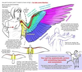
nonny, you are right. He kinda looking a bit like Britanny Venti.
No. 411348
File: 1724068606585.jpg (712.41 KB, 2581x1811, faces.jpg)
>>411333guide lines help alot! and flipping the canvas to see if the faces are slanted or not. (didnt change anything on the anatomy since it wasn't asked)
No. 411350
>>411333The semi-realistic body versus anime face, like one anon said also something about the boy on the right's face makes him look nervous. The upturned eyebrows maybe. I don't know,
>>411348 these fixes are pretty good, esp. the boy on the right's face I guess it's just a proportional thing, keep practicing
No. 411358
>>411348thanks
nonny these are great!
No. 411391
File: 1724082155870.jpeg (293.6 KB, 1435x2048, GNz5uBqbQAAWDap.jpeg)
>>411359This artist just has better skills over all which is why it generally looks nicer but it's just as jarring
No. 411562
File: 1724119899244.png (289.98 KB, 1970x1844, [23-03-08] 1633573459354849281…)
>>411561As long as it doesnt look like a bara or guts from berserk i dont mind.
No. 411572
>>411569>you should find your own style instead of just drawing repetitive anime slopbut i want to draw anime slop.
>just practice drawing realistic people and then stylize as you go i do this already
>>407697 >>408432
No. 411575
File: 1724122999704.jpg (229.53 KB, 1920x1080, 904501-iwatobi-swim-club-wallp…)

>>411569Implying style is something one has to find and not something that just comes naturally. I don't particularly care if the nona wants an anime style, but maybe tone down the realism in the bodies then? Maybe do studies of shonen artists since they tend to blend muscled bodies with simplistic faces. But if you're really hell bent on pretty boys maybe something like picrel would be better reference material?
No. 411577
File: 1724123226700.jpeg (269.55 KB, 1348x1622, EydVaeRUcAE5VR1.jpeg)

>>411560Work on stylizing bodies too (if you don't want the disconnect, of course you should keep doing what you're doing if that's something you like). Imo rinotuna is an artist that does this well, his pieces rarely look like the body doesn't match the head. That happens when it's too closely referenced off of a photo while the head is completely made up and not even shaded correctly or too little in comparison. The uncolored drawings you posted look fine, but in
>>411391 the skintone of the face doesn't even seem to match the rest
No. 411580
>>411577I really dislike rinotuna, sorry. His bodies look too hard, flat and plastic and i hate the bara faces. I would like to go for a softer look on both the bodies and faces.
>>411575>But if you're really hell bent on pretty boys maybe something like picrel would be better reference material?what do you mean by using free as reference? like how? dont they also have simplistic faces on top of realistic bodies? or is the realism critique related more to the shading? one of my inspirations is hajime no ippo, which also has pretty goofy faces on top of realistic bodies. Maybe thats why i am kinda used to it and i dont see it as weird.
No. 411584
File: 1724127267217.jpg (66.79 KB, 600x375, Hajime.no.Ippo.full.1017242.jp…)
>>411580I'd say it has more to the balance of the image. The head looks like it belongs to a seperate being than the body. Not a fan so I only did a cursory glance at Hajime no Ippo and it seems like the creator balances the difference by giving his character's faces sharp features to match the sharp line work in the body definition. You kinda made these bishounen character faces that's why my brain jumped on Free! because it does balance (not perfectly but still) the muscle body with a boyish face. But if you're going the Ippo route I would give them sharper stylized features that's more inline with what you're going for. Things like their eye shape, brows, hair outline and jawlines are all very round. That might be why it's not exactly acquiring the look Ippo has.
>reference? Like how?I meant like doing a master study of the concept/cell art. That was what I thought you were aiming for going by what you made, but that's not the case so maybe do a master study on Ippo's creator? Basically, pick some panels/art by the creator you really like the pieces that make you wanna draw and try and break it down and understand their process and why the pieces look the way they do. If you can find some behind the scenes documentary of them creating the manga all the better.
Good luck to you,
Nonnie! You've got some great skills, it's just about polishing them.
No. 411586
File: 1724127711826.jpg (976.8 KB, 1451x2048, [23-09-04] 1698738206194438634…)
>>411584Thanks
nonny!
> that's why my brain jumped on Free! because it does balance (not perfectly but still) the muscle body with a boyish faceSo the problem is how the body is drawn, not rendered? sorry if i sound dense i am heavily ESL.
>but that's not the case so maybe do a master study on Ippo's creator?oh no, his original art is nasty. I like how the fanartists draw the characters.
No. 411689
File: 1724157836567.png (782.23 KB, 1950x2662, 200824.png)
My apologies for posting another thot, but i have been staring at its face and despite knowing its wrong but, i cannot find out how. Also, is the face and body less uncanny or is it still mismatching?
No. 411694
>>411391Looks like they're trying to draw similar to Yusuke Murata but the head is still too simplified
>>411689Yeah it still looks like a anime head asset or some manga reference on top of a different reference for the body. The shirt folding around the arm doesn't make sense either because it looks like it's rolled up on one side while the other is a short sleeve
No. 411695
File: 1724158145495.jpg (135.49 KB, 1080x1080, 1664908765902.jpg)
>>411691I already do, but i want to draw fun stuff too between my studies.
No. 411698
File: 1724159066046.jpeg (314.77 KB, 1058x1500, IMG_6343.jpeg)
>>411696If that's how you want to draw it will always look weird. You need to find a balance between it being detailed or simplified. I'd suggest looking at artists like Akihiro Yamada or Shinkiro that draw realistic proportions but have to do it for anime-esque designs, so they know where details should be kept or reduced. Seriously just look at shirtless anime guy concept art or some shit, the posters bringing up Free earlier were right
No. 411701
File: 1724159357698.jpg (284.06 KB, 1613x2048, EsF_5lcVoAIRbqn.jpg)
>>411698I see. I was using mgongs old art as reference. Does hers also look weird?
>Seriously just look at shirtless anime guy concept art or some shit, the posters bringing up Free earlier were rightBut those arent shaded, so i feel like i would fuck it up with the shading later on.
No. 411705
File: 1724159838367.jpg (84.04 KB, 736x836, 1716602773767.jpg)

>>411704They are all referenced from photos, actually.
No. 411723
>>411720kek sorry my bad i just posted some drawings a while ago
>>389121 and i wasnt told the faces didnt match the bodies so i thought it had more to do with the shading that the way i draw bodies itself
No. 411741
>>411689The arms, hands and legs definitely need work because they're not detailed or properly shaded. Then for the face, take a look at your mgong reference and observe it closely. First of all you can see that the shading technique is different, chinese artists like her often use strong desaturated shading that's bordered by lighter and more saturaded "strip" of shading (in
>>411701 see how she uses a dark brown for most of the shading but then she uses a light more saturated red for the mid-shading?) while it looks like you're doing the opposite.
Then look at the features, mgong's drawing is stylized but she does use some more realistic features so the head doesn't look too odd on the realistic body, some good elements your drawing lacks is shading on the forehead, defined eye creases, under eye creases, shading under the nose, cheek curves (these are important to make the face slightly less animu) and jaw definition with that diagonal like that indicates the character is nervous/angry, and overall the features aren't as simple as in your drawing. Please get rid of that side mouth anime thing because it's ugly and doesn't fit the style, your guy is looking sideways so his mouth should also be sideways. Nostril is also a bit too high up and his nose is shark-like.
No. 411745
>>411741Thanks
nonny, very helpful. I gave up halfway through it so i didnt even bother with the legs and hands.
No. 411747
File: 1724164922301.png (1.05 MB, 1396x1118, bunny from tab.png)
>>411689did a repaint but with reference to af_cf style(left the face as is and just readjusted the face from guidelines)the pose reference did piss me off alot kek (i wouldn't choose a ref with the face cut off as it messes up how the head would be positioned) i think the most uncanny thing about your art is the face (youre quite decent at the body but the face needs more rendering) i think you should try to study from realistic anime like carol and Tuesday or even hellsing like mgong does but practicing with real people can help you alot with face muscles and body. im not that great at drawing men so i hope this helps a tiny bit
also is this bunny from tiger and bunny? kek No. 411751
>>411747damn
nonny thats amazing, thanks a lot! thats my dream artstyle right there
>also is this bunny from tiger and bunny? no i dont even know who that is, sorry
>i think you should try to study from realistic anime like carol and Tuesday or even hellsing I will, although i dont like how the men are usually drawn in those anime, but i can steal the female faces
No. 411759
>>411757are you the
nonny that drew buff emo x-tan and emo elsie? if so, i love you.
No. 411762
>>411761oh im not the artist for that lol that
nonnie is super talented
and i miss her come back pls i was just saying you can always put in a request in the art request thread kekkk
No. 411927
File: 1724200077866.jpg (574.19 KB, 2282x1774, SAVE_20240820_212735.jpg)
>>411333You are kinda pillow shading.
Did a quick fix on one of the dudes for a better visualization, it's not perfect but I hope it helps
No. 411939
>>411689Side mouths give me nightmares. Also midget hands. Also the quality of the pants versus the shirt (though the folds are weird) is funny- keep practicing though.
>>411696If you're so into animu faces, try different styles of anime.
>>411705The reference is at a different angle and the holds are different, I'd say use this referenced photo again but draw closer to what it is in the image, such as the angle, folds, hand size, etc and as another anon said definitely use references with faces included! Draw the faces as close as you can, but simplify it as needed (call it stylization whatever) to match with whatever simplifications you're doing for the body, but you'd want the quality to be consistent throughout the whole drawing
No. 411976
>>411927thanks
nonny! i was trying to follow the ref but the shading was pretty shitty and i am terrible at shading
>>411939>If you're so into animu faces, try different styles of anime. i will, thanks
No. 412145
File: 1724274805201.jpg (103.81 KB, 736x981, d111fea16dc771249a6a09e4fad0d4…)
>>412143Thanks! It's all SFW, just super edgelord and cringy and stuff I made when I was a teenager. Kickstarting this with a Bleach Espada outfit and Junji Ito inspired design.
No. 412146
File: 1724274992470.jpg (166.37 KB, 736x981, 7a20def062025fa60142c98b567290…)
>>412145This was inspired by occult stuff, specially satanism but like the unserious atheist one forgot what it's called, Thelema, and black metal shit. The weird lion lizard is some fictional creature I was obsessed with the design and idea of when I was younger, I used references for the lion snake thingy, the clothes, the face, the flames etc. I remember showing it for my high school at the time art club booth and the principal was so weirded out by it but tried to be nice kek.
No. 412150
File: 1724275202295.jpg (189.77 KB, 736x981, 03531e4abfde78affafd19ec347ade…)
>>412146This was inspired by a metal song lyrics, it just illustrated vivid imagery and scenery in my mind, so I had to draw it. It's about being Pisces and a woman, but I never cared about astrology despite liking this concept and being Pisces myself. The evil butcher is inspired by Little Nightmares chefs iirc because I was really into the game back then. Had to sketch the lizard lion along side it for no reason at all lol. Showed this to an artist friend once and they told me it looks like medieval tapestry art. I always wondered why did those people draw so horribly back then, but I guess now I know the answer, they got people like me drawing these back then kek.
No. 412152
File: 1724275438988.jpeg (342 KB, 552x1472, download-4.jpeg)
>>412150This was also inspired by a metal song lyrics about some girl trapped in an endless nightmare of some creature hunting her. Because I suck at drawing humans, I went with a stick figure and called it a day. This reeks of mental illness for some reason. I was also learning Japanese at the time and trying to memorize the lyrics to sing the song, hence writing it in kanji. Excuse my shit handwriting. The images are quite old as well from an old phone, I threw all of these drawings in the trash out of frustration of never improving, so all I have left of them is these poor quality images.
No. 412158
File: 1724275690625.jpg (2.31 MB, 2880x2880, 20240822_002455.jpg)
>>412152Lastly, this is a more recent one from 2 years ago iirc, I got into jojo and drew this guy on the left on a whim, I'm dying at the gigachad ass phenotype. Right is just some eye because I enjoy drawing eyes the most and still sketch them sometimes on my notebooks or on my phone. I remember at school a teacher saw me doing that and was like "this is a sign of something about you but I won't tell you what", to this day, I wonder what did she mean by this? I later discovered that schizophrenic artists tend to draw tons of eyes to symbolize feeling watched, was she insinuating that I'm schizophrenic? Kek. That's all I have, thanks for bearing the cringe.
No. 412279
File: 1724303639739.png (1.09 MB, 1024x1447, sketch.png)
haru!
No. 412555
File: 1724364800593.jpg (477.43 KB, 902x1252, sketch1724360750911.jpg)
>>412476more specific? here, a more recent version
>>412386thanks
No. 412575
>>412555NTA but I can agree there's
some stiffness, but I definitely also sense movement. The little drawings are good, the big one on top I am a little confused about, is he mid-motion or reclining and still? The big one on the bottom just needs better anatomy. Would like to see more from you
No. 412838
File: 1724439609036.png (1.05 MB, 1502x1622, 5C6002E2-9804-43B2-A53D-B801C8…)
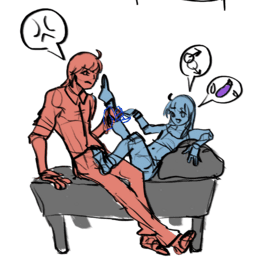
an old sketch(ban evasion)
No. 412913
File: 1724452763091.png (Spoiler Image,263.56 KB, 935x586, 7MHu1BPtsD.png)
As soon as I try to clean up the lines or I dare to put some colors, I feel my drawings look like shit. I don't understand values and colors no matter how much I study, I'll be stuck at being ok at sketches forever. I don't have any recent drawings with colors to show, the last ones I painted were part of the doodle board. Sometimes I feel inspired by some art god and the colors work magically, but most of the time they look so weird, like a DeviantArt drawing colored in 2008. I'm starting to think my problem is value, I'll look up my past value studies to share, but I would love a recc for a book/video for people like me who struggle with it.
No. 412930
>>412913Your art is really pretty
nonny.
No. 412966
File: 1724460548269.jpeg (220.6 KB, 1077x1854, Fy_zvmAWwAEnOJT.jpeg)
>>412913Your art is beautiful!
I think my best tip to study value (and then study color) is to grab a pic or piece of art you like, preferably with color you like and turn it b&w. Then copy it; study it purposefully, why are the greys darker in certain areas and lighters in others. Is it readability? Is it to make certain parts pop more? Is it to creat interesting shadows or form?
Then do it the same thing, but now with the same piece with it's original colors. Why is this color here, even if the value is a shadow, darker? How saturation affects the values? How to properly color light, when some colors are naturally darker and translate bad as a value?
You can kinda play it from thereafter. I think you got the harder part down (the actual drawings) anyway! Good luck nona!
pic mostly unrel No. 413003
File: 1724473830558.png (27.07 KB, 524x796, dhjghfk.png)
I'm
>>407547, posting again since I've been trying to fix this (ik very little progress, i took a 1 week break kek) and there's something very off but I can't sense what it is, specifically with the face area and the right shoulder, and it's driving me insane. Advice appreciated!
No. 413062
>>413003Why would you fix that? Draw on paper and fill pages of drawing mannequins
>>412913Don't give up on your studies nona, something will click someday. Also nothing wrong with getting inspired, then you'll pick some fav colors and grow your personal palette.
You have to think about what you actually would like for your art, realism/cell shading are thought as the pinnacle of fanart but maybe you prefer something else so it would always look like shit to you when there's a disconnect between what you think you should be doing and what you like. This also matters for values and lighting choices.
No. 413125
File: 1724527357610.jpg (44.5 KB, 564x846, 0eadb9e69aa4f8dc8f02f79bc30386…)
Anon, to properly give you advices, first I need to understand where you are coming from.
Did you use a reference to draw this, or was this from imagination? Either way, you clearly need to better your understanding of 3D and construction, cause every looks flat and weightless - this makes the drawing looks like just a bunch of lines instead on giving the illusion of form. To properly convey form, you need to think in 3D instead of just thinking of an idea of something (like for example, drawing an arm vaguely tube shaped because that's our "idea" of an arm, when in actuality an arm can bend an twist in a multitude of shapes depending on angles, perspective, etc.)
No. 413154
File: 1724530825740.jpg (79.27 KB, 679x967, 5e581ea200fc279453ea7a9ec112eb…)
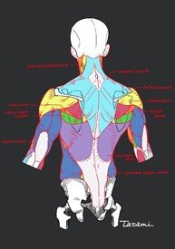
>>413127Fuck, I'm dumb. I did forgor
I was replying to this
nonnie >>413003Another anatomical break down for good measure
No. 413239
Thank you nonnies who complimented the art I posted
>>412932>>412943I am very inconsistent, I wouldn't even say I have a style to be quite honest.
>>412953>>413065>>413128Tysm nonnas, I'll look into it all and get back to you with some studies.
>>412966I love the artist from your pic, I would be happy if I could render like her. I'll try to be mindful of my studies and keep your observations in mind, thanks.
No. 413412
File: 1724625822049.png (182.3 KB, 604x908, hkjdfgkhdf.png)
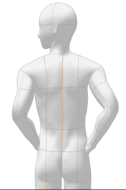
>>413068Thank you for telling me about this, I will for sure.
>>413125>>413154>Did you use a reference to draw this, or was this from imaginationReference, picrel. I imagine (or at least) I hope it'll look less flat when I shade it if I get what you mean. I don't think I understand what you're saying just yet but thank you nonetheless.
No. 413422
File: 1724627716854.jpg (190.88 KB, 1190x850, IMG-20240825-WA0005.jpg)
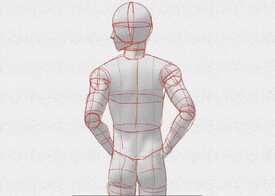
>>413412Ayrt and I'm gonna be honest nona, the reference itself is pretty shitty so it's not a good base for a beginner. It can create really bad vices. Usually using 3D models like that is for when you're a bit more advanced and you need a very specific pose to reference but also have enough knowledge to not use it entirely as a crutch.
But for the sake of explanation, I'll use that reference to better explain what I meant in the first place.
Excuse the chicken scratch, for I traced it really fast - you should be more mindful on your exercise than me. I'd suggest you to first trace the reference and break it down to shapes to understand its 3 dimensionality. Like the lines that make a grid in your model are meant to simulate the volume of something 3D, like a striped shirt that bend according to the contours of the wearer's body. Try to see what pieces of the body are balls, which are cylinders, which are triangular, which are boxes. Trace it within the body like I did there to create a mannequin, that hopefully you can rotate mentally after you're done.
Trace the shadows to understand better what it is doing there, what is its place to create a less flat image, and the illusion of form. Then, try to draw it again without tracing, using your mannequin as a side help. Compare how each exercise feels next to the original model, overlap them and look what can be done to improve.
It's a bit laborious, but hopefully you can listen to music or a podcast to make it less tedious.
No. 413476
File: 1724648241806.jpg (418.34 KB, 768x1062, sketch1724646956420.jpg)
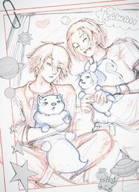
>tiny alien aisha mogging the rest of the drawing
reeee
No. 413954
File: 1724776694695.jpg (56.9 KB, 1000x692, issue21ostrich5_xl.jpg)
>>413952
Anon, a human leg only bends that way if they've had their kneecap broken with a baseball bat.
No. 413961
File: 1724778087929.jpg (7.82 MB, 4096x4096, 1000040179.jpg)
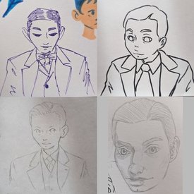
These are all quite a few years old, the nonna who loves brah inspired me to find my old doodles. I love drawing suits.
No. 413969
>>413942>>413954>>413943Damn, I wanted to see it
>>413961Lower left is super cute!
No. 414666
File: 1726059135035.png (1.98 MB, 3620x2196, facessssssssss.png)
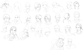
I drew a shit ton of faces while lolcow was down. Faces hard, i will keep practicing.
No. 414705
File: 1726065457684.png (212.12 KB, 441x455, sketch1725835471274.png)

it's back! here is an lc kau i drew
No. 414747
File: 1726082117496.png (2.95 MB, 936x1280, image-2.png)
Some old art of my OC, I'm still quite proud of it.
No. 414748
>>414705absolutely adorable and i love the soft colors
>>414747gorgeous hatching and i love the bright yellows, the lines in the face are so clean and nice
No. 414800
>>414666Some of them are kind of derpy or autistic but keep going
>>414708Imagine…
>>414747Love this post more
>>414750Kek it's Neopets
No. 414966
File: 1726148671487.png (530.1 KB, 2114x1338, 110924.png)
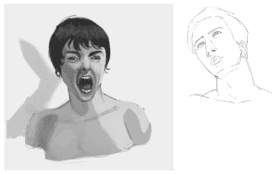
>>414800>Some of them are kind of derpy or autisticwhat part of it?
>>414836thank you i will keep practicing. Its really hard to draw eyes.
No. 414997
File: 1726159834029.png (71.46 KB, 503x682, Captura de tela 2024-09-12 134…)
Trying to get back to daily drawing for the 100th time this year
No. 415104
>>414966>What part of it?Those
Aka they are just uncanny as of now, you'll know what I mean when you look back at them in a few months
No. 415199
File: 1726206511932.png (Spoiler Image,1.12 MB, 1112x685, AAAARGH.png)
is it worth it to continue making art in the style on the left or do i just need to accept that its bad and move on to doing serious facial anatomy studies? i like making furries uncanny and retarded looking but still kind of beautiful, but i don't know if this actually translates to others and just ends up coming off as creepy and unintentionally shitty. i edited it a bit in mspaint with more realistic proportions (on the right), but i feel like it doesn't give off the same 'alien-ish' vibe i want. i guess i'm wondering if i can keep this same vibe but also improve the anatomy at the same time to make it better than it could be? i was planning on making this into a painting since i feel like messy paint strokes and weird colors would lend well to it
No. 415240
>>415104i mean what part of it, the eyes the mouth the stylization, etc
>>415117those arent anime faces
No. 415328
File: 1726259062765.png (198.47 KB, 948x898, aaaaaaaaa.png)
>>415256Thank you <3 I drew another benson but it doesn't look as clean…
No. 415353
>>415117That isn't anime
>>415240The harmony, or lack thereof. Also the proportions. Nothing in particular. Some of them are good, others just need work. Keep practicing.
No. 415482
File: 1726337770504.jpeg (320.86 KB, 1104x1527, 2E164068-C9CA-4DCA-A3CD-9BF30F…)
Here are some guys from the week I attempted pixel art.
No. 415494
File: 1726340076607.jpeg (250.08 KB, 1280x1263, B68F3EF2-0296-4606-AB32-A738A2…)
>>415491No, I’m not a big oc person but here’s some other old shit.
No. 415505
>>415482Sexy… more
>>415494… Less
No. 415635
File: 1726394814547.jpg (65.7 KB, 529x529, 1000044349.jpg)
I still don't really understand why that one was so offensive. Is this better?
>>414997I could tell it was Kyle Gallner before you even said, it looks great nonna
No. 415675
>>415199"You need to know the rules to break them" Once you have a better understanding of faces and anatomy you can get a better understanding of how to go about making faces uncanny. If you want to keep an uncanny style keep it, but don't give up on studying
Nonny!
No. 415717
File: 1726427605409.jpeg (293.93 KB, 1037x749, EA07E1E1-7419-41EF-9EDD-DFA902…)
I don’t have any art stamina. I draw one small thing and then am too mentally worn out to draw anything for the next 6 months. Does anyone else have this problem? I think I have the skills to draw, but not the stamina to actually do it. I don’t know what’s wrong with me.
No. 416336
File: 1726676956402.jpeg (23.93 KB, 480x360, WEDcRwT.jpeg)
>>416285No, this is Patrick
No. 416611
File: 1726762416351.png (Spoiler Image,193.31 KB, 818x663, Captura de tela 2024-09-19 131…)
SFW image. I can feel something's very wrong here but I can't tell what. It looks weird when I flip it.
No. 417276
the last doodle board admin said she's quitting because the doodle board is inactive. pls consider adding some doodles to the board so this lolcor tradition doesn't die:
>>>/ot/2163139here's the doodleanons post trying to get mods to unpin the board:
>>>/meta/84178I'll even take drawings from that retard who wont stop drawing femboy goats
No. 417548
File: 1727036295289.png (566.23 KB, 1141x1284, study1.png)
I've been so lazy with anatomy for the past year that I somehow convinced myself it wasn't that important to refresh with real photos. Hence why doing this study really humbled me. Here's a reminder to all my artist nonas that you can never use enough references…
No. 417580
File: 1727043888681.jpg (100.86 KB, 390x572, sketch1727042429523.jpg)
way too girly and i think i need to add another goldfish
No. 417768
>>417548Now add a sexy face
>>417580Needs way more goldfishies
No. 417770
File: 1727095614495.gif (3.23 MB, 803x907, whos...there.gif)

im slowly learning animation but i cant really pin point the timing at all its always too fast or too slow
No. 417779
>>417548I love it, beautiful strokes! My main issue is the hand though, some of the anatomy is a bit off, but I think it still works overall. I understand it's just a quick study, and it looks good for what it is.
>>417580So cute, like the colors and the composition, I'm just not sure about his right arm looking so straight. To me, it creates this harsh diagonal in the middle of the drawing that doesn't leads our eyes to a interesting space in the drawing like his face or the goldfish.
>>417770That's adorable, wished I could help with the animation, but I might make things worse with my suggestion. I would test different times for each frame. Make some faster or slower than others.
No. 417879
>>417770Soooo good, more
>>417818Wait, so he is not getting fucked…?
No. 417911
>>417770I think for the first blink adding an extra frame of eye closed lower (Crowne Prince mentions it in her eye blink video, I think that would be technically either the "easing-out" or "overshooting" technique) would make it feel a bit more alive. The wink feels a bit slow to me, but this still looks very pretty.
Good luck with animation
nonny ♥
No. 419332
>>417892But he is turned on? Or is he meant to be annoyed? Maybe his eyes should be open?
>>417911Im not an animation expert I think the winking looks fine, god i want to see more of her stuff
No. 419748
File: 1727741645855.png (Spoiler Image,1.41 MB, 1926x1025, uhhh uhmmmmmm.png)
i'd love to hear some critiques nonnas. i'm a noob when it comes to human anatomy and rendering so i already know i've fucked up several parts of this kek. i feel like the lineart looks 10x better than the coloured piece, idk exactly why though. spoiler for moid and little bit of blood
No. 419754
File: 1727744407884.png (Spoiler Image,2.56 MB, 1926x1025, image.png)
>>419748cute style, for the line art only one, line weight and line confidence could be used to enhance the sketchy style to bring more focus to the subject. The colors are stronger than the lines so the colors could either be toned down or the lines should be cleaned up for this sketch color style. the colors could also use more cohesion. I recommend studying values, line weight, anatomy, and color relativity. Basically don't forget to work on the fundamentals when you feel stuck, fundamentals are important when trying to stylize not just for realism art. Our unfinished works tend to look better to our brains because the errors are harder to see. Don't shy away from colors, just strengthen your understanding of them so that you can use them to enhance your lines instead of clashing with them. attached is how i personally would try and improve the image. The character has red hair so i tried to improve the yellow and red throughout the image instead of having strong red with dull skin tones and grey shirt. The anatomy in the neck looks worse in color because your lack of understanding is made more clear when you tried to color it versus with the vague lines we can make it up in our brains. Your flattened face looks better in lines because again the color shows your lack of understanding of how the face is actually shaped, this is how anatomy studies can help.
No. 421063
File: 1728166494413.jpg (1.6 MB, 2590x3729, dwaringg.jpg)
Some things I drew/doodled
No. 421064
File: 1728166520337.jpg (779.68 KB, 3024x1565, dwaringa.jpg)
No. 421065
File: 1728166714506.jpg (1.29 MB, 2322x3598, dwaring0.jpg)
I hate how bad it looks now that I am uploading them versus how they looked on paper, this is the last I will post for now, I don't think anyone wants to see more but I am curious about any suggestions? I also practiced some stuff with perspective I might post, I didn't use references though (none handy at the time) so maybe not
No. 421231
>>421065The last is pretty good in terms of body construction.
>>421063You seemed to struggle here drawing the body folding up. Try drawing 3d shapes when creating the pose like two squares for the torso (1 for the ribcage and another for the waist and hips) and cylinders for sections of the limbs with balls to represent joints like elbows and knees. I'd also recommend doing a few studies with realistic faces (even if you're just interested in drawing anime) stylized simplistic faces benefit a lot from understanding structure and depth of real faces.
No. 421254
File: 1728237776259.jpeg (21.67 KB, 328x299, Illustration.jpeg)
This looks like shit, how do you draw a body? Am I, as the zoomers say, cooked? I only know how to draw girls kek
No. 421296
>>421231Thank you, I have been studying real faces I've definitely improved in the face area, so I am looking to improve more. I've never drew bodies as separate shapes like squares and stuff, it confuses me but I will practice more and prob try deconstructing, especially when learning how torsos and hips interact, kek. I'll prob draw that pose again sometime and post. I draw a lot at work where I have no access to references, so I use my own body as reference by projecting it into a 3d image in my head, but I did not do so for the sitting one. Maybe I'll try that and looking at references?
>>421254Post example of body!
No. 421354
File: 1728263325969.png (399.43 KB, 587x730, help.png)
Never been so upset attempting a study
No. 421357
File: 1728263615974.jpg (523.93 KB, 997x1432, Screenshot_20241006-184834_Gal…)

>>421354This is what I'm attempting to replicate for reference
There's a image that shows all the steps the original artist took but I can't be assed to find it in my files
No. 421362
>>421355Kek, probably not but I'd like to try.
>>421359Thank you! It's been incredibly painful but it's somehow satisfying.
No. 421407
File: 1728272201274.png (1.92 MB, 510x1800, to_where_the_days_take_us__wip…)
>>421373AYRT, I tend to do everything on a single layer and painting it in blocks like that just helps speed up the process especially as this stage will be covered up by airbrushing later, (I'm only on step 3.5 of picrel.) Although I do understand where you're coming from and I might try out that method on another study, I'm not that great with airbrushing in the first place so it might be fun.
No. 421408
File: 1728272821894.jpg (36.82 KB, 796x575, christalmightyitsterrifying.JP…)
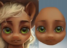
>>421397oh stop it, it's what I do and ignoring the fact that i did this with my damn track pad in 20 minutes so it's lumpy as fuck and I can't draw in the details, i think it's enough to be proof of concept. After this stage you go in with a harder edge brush and define the edges only where needed.
No. 421448
File: 1728277321607.png (450.9 KB, 616x806, myshading.png)
>>421412reading comprehension below sea level, did you see where I said
>After this stage you go in with a harder edge brush and define the edges only where needed.i'm not gonna redraw the entire fucking horse, anon (kek). i was just showing the "base" stage.
picrel, i don't do art anymore but here are parts of some (years… rip) old pieces to show the technique, i used 90% just airbrush and eraser for these and not really any other tools.
No. 421469
>>421460>>421468You guys have got to be baiting me or something. I never claimed to be a master or an expert but my picrel was not THAT bad.
At the time of those drawings I’d been doing digital art for 10 years, I used to use painterly brushes but switched to airbrushes because after years of hearing “NEVER TOUCH AIRBRUSH” I touched them and realized they work great for me.
No. 421476
File: 1728283014717.jpg (12.35 KB, 275x264, 1648006695808.jpg)

>>421460>>421468OP, I really don't understand why you're dunking on that anon, she might be a bit abrasive but she's not totally incorrect. Plus her art is closer to what I'm aiming for so I can take bits and pieces of what she's saying to help.
>>421408 This particularly is really helpful and made me realise that my brush strokes are way too harsh for what I was aiming for and I most likely have a sort of render blindness because I tend to render with the default pen and watercolour brushes and I'd have to watch that. I don't know why but it's slightly upsetting the way you guys are digging into her, maybe it's because I've had a long break from lolcow until today but it's a bit much.
No. 421478
File: 1728283180585.png (81.12 KB, 224x225, image.png)
>>421460>>421468why are you guys so angry at her
No. 421569
File: 1728308036128.jpg (104.86 KB, 587x300, eye guide.jpg)
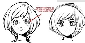
>>421254the only critique i have for you that your eyes seem a bit unfocussed when looking in front your eyes ever so slightly become cross eyed (the difference is more hard to notice in realistic styles) since im assuming you wanted a more animeesque style i inked it a bit too. besides the eyes your art is great! you arent cooked youre "cooking" kekk
No. 421572
>>421476I’m airbrush anon, I’m glad you found it helpful. Tbh I’m also a bit taken aback by receiving such harsh put-downs, I was really not expecting to get dog piled. An yeah I’m biased but I still don’t think the works I posted are so bad to warrant the reaction they received. What I get for trying to be helpful I guess kek
>>421504Sure I love coloring and shading. But it could wind up looking uncanny depending on your style kek, since my coloring looks like
>>421448 . But I think it would be fun regardless
No. 421577
>>421314>>421332Idk if this is the same anon but thank you for the feedback! Kekkk no it’s not AI I haven’t drawn on a drawing tablet and still don’t know how which is stupid because I should really learn but I don’t really have the time and that’s why it looks so busted and crooked. I actually don’t draw that often like I used to years ago but I was curious on what feedback I would get, thank you guys! ♥ I will try flipping. Do you have any recs or videos for Clip Studio Art?
>>421569Ty for this anon, I think I have to brush over the fundamentals again tbh kek but for some reason by brain has a lot of trouble learning them, especially perspective shots they are just extremely hard I almost feel mentally disabled trying to learn art but I tend to skip important steps because I just want to draw for fun even though I know that’s not how it works. Do you have any tips for that?
No. 421578
>>421448anon pls just use hard brush, then use soft brush for rendering and blending
>>421354this isn’t actually that bad because you have to start somewhere but you need some hardness to this painting, maybe you would benefit more from like form shading in your sketch and then adding the shading and lighting
No. 421589
File: 1728316207408.jpg (66.46 KB, 600x869, oxx_by_cbedford-d80vkuy.jpg)
>>421582>the technique you speak of gives really shitty resultsNta, but this isn't really true. If you know what you're doing you can definitely start off with the airbrush, but of course you have to go in with hard brushes afterwards for definition and details (a drawing with only the airbrush would be really blurry…). C.Bedford uses this method and I think her art is very very good (warning for gendie shit if you look her up).
No. 421594
>>421589Ok but
>>421448 is no Bedford and she clearly doesn’t know how to do it, so the point stands.
No. 421599
>>421595I am airbrush anon and the person you’re replying to is not me. I get it though, apparently everyone thinks I suck balls, so whatever, like I said I don’t do art anymore anyway so I’ll stay out of these threads since apparently I’m not qualified to give advice.
I would just say though I’m very curious what the art of the people calling mine “beginner” and “shitty” looks like because although I never claimed to be an expert, I know my work is more advanced than beginner level. No one has offered any actual criticism other than “airbrush bad so you bad.” And frankly, what I posted (although not perfect!) is objectively more advanced than a lot of the rest of the painting work posted ITT, yet I’m the only one getting shat upon and told I know nothing. Ok. Way to teach people how fun it is to try to participate earnestly in this thread.
No. 421614
>>421607Nta but there are good reasons not to post your art here or on 4c. Unless you want to out yourself as a user of le evil
terf website, you have to draw something specifically to post it here. Seems like a waste of time to draw something for free just to appease a bunch of assholes who are going to attack the work regardless of how good it is because they want to "win" an argument. PYW in my opinion really isn't that different from demanding that people post hand pics. Literally every single time someone's posted a hand pic, they've been ridiculed for it and called a moid anyway.
No. 421631
>>421594>>421595I agree that she's not at that level but the point is that you can use the airbrushing method and it can work. The issue here is skill, not method.
>>421448It's true you're not a beginner, but you're also not great (not that you care apparently but I still want to critique). The upper face is the best one rendering-wise, but it's still boring because it's just a piece of a face on a yellowish background and with what looks like simple black shading. The bottom face has the most issues, the scratchy lines don't blend in well with the rest, the bouncing light is a good attempt but the colors appear muddy and it's not defined enough, in a way it reminds me of sakimichan's overly blurry and rubber-looking skin. The eyes hardly have depth (remember, the white sclera would be rounded like you would expect and nor super reflective, while the iris is a flat-ish tissue that slightly caves inward where the pupil starts and it's much more reflective, and the pupil is a hole, but also remember that over the flat iris you have a rounded "glass-like" cornea that can cast a shadow on the iris) and a hard defined eye-shine would make it a lot better. In the drawing it's all very blurry and muddy and this doesn't come accross. Your shading almost looks like pillow shading which tends to be boring.
No. 421640
>>421637No anon, it’s actually worse than that, airbrushchan was dumb enough to post
>>421448 as a critique of someone else and then had a meltdown when people laughed at her for being delusional about her own bad art kek
No. 421643
>>421635Anon is not me, your crusade against me is bizarre.
>>421640>meltdownWhat. Literally where. I swear to god I am never posting ITT again because you all are unhinged.
No. 421649
>>421635Ayart. I'm a separate-ass person, you schizo. This is one of my replies:
>>421400 . I didn't say that her art was perfect or astounding, just that it was fine. The colors are a little muddy, but they're decent drawings. I reiterate: you're going after that anon because you're overly invested in a petty argument about brush hardness, of all things. I think she came across too harsh in
>>421373 and
>>421382, and I honestly think that the hardness of your brush is damn near irrelevant that early in the process, when you're just blocking in big shapes. I personally use a hard-edge flat brush for that step of the process, because I was taught how to paint traditionally and I just replicate that process when working digitally. But her process probably makes sense for someone who learned traditional airbrushing before moving to digital, idk. It seems like the strategy she uses works for her.
No. 421654
Forget the study, I think this is the most upset I've been at ever posting on lolcow. Even if they're baiters or newfags who think being mean is somehow integrating, between this and anons posting anon art in the bad art thread, sperging at anons for drawing redesigns for fun etc. wow lolcow has become really hostile to (esp more amateur) drawfags for some reason this year and it's tiring. I cannot fathom getting angry by proxy because someone who does a different method offered advice, and it was good even if I personally didn't agree with every point. That's how you know a critique is good because if it makes you realise a flaw or puts something into a different perspective, you can take from that and use it. Why are you so butthurt over a critique not directed to you, did airbrushing anon kill your dog or something? If anon's advice is so shit why don't you share your wisdom? Forget PYW, how about you PYC?
Also airbrushing anon has said multiple times that she doesn't draw anymore, do you guys expect her to fire up the drawing tablet to start studying the rendering of form, something she probably doesn't want to do or have the time for just so she can comment on a autistic my little pony study.
And the "muh bad art so bad critique" point is stupid, people who don't do art or are begs or slightly intermediate can critique art you know, if they're egocentric or too normie obviously they'll do it poorly, and amazing artists can be god awful and even detrimental giving critiques because it's a skill separate from art making. Some people are great at pointing things out in art but lack degrees of self awareness for their own work, it's just a thing that happens pretty often and most artists have in varying severities.
You guys suck any sort of fun out of getting criticism, this isn't a St Petersburg art university you don't need to go around hitting people with a stick.
No. 421658
File: 1728335851858.png (7.08 KB, 224x225, images (15).png)
No. 421697
File: 1728340224817.jpg (34.67 KB, 563x421, e927c77c8e2600b010bf838b60f9e2…)
POST PRETTY PRETTY PICTURES NOW
No. 421705
File: 1728341382609.png (915.06 KB, 994x2016, IMG_1831.png)
>>421697Rate my gigabutch
No. 421710
>>421705looks like someone’s father
>>421706it’s a joke
No. 421772
File: 1728356404862.jpg (Spoiler Image,507.49 KB, 720x1600, 20241007_215344_Gallery.jpg)
>>421504>>421448Do you think you could paint over this, or is the linework too muddy? I tend to draw small which fucks up the penciling when I erase a bunch. If you think it's too coomery then I also understand if you don't want to paint over it bc of that. I'm absolute shit at coloring and I've always wondered what my stuff would look like colored.
No. 421803
File: 1728366756416.png (815.82 KB, 720x1600, 20241008_005130.png)
>>421783I edited it a bit, would you say this is easier to paint over? Honestly it took me so long just to draw this one unfinished drawing, I'm not going to do another one. I'm too lazy.
No. 421881
File: 1728381545728.png (689.01 KB, 483x757, cdsef.PNG)
Shittiest sketch ever, should I continue?
No. 421890
>>421883Oh cool thank you! Yeah brush is the standard round one but I really just scratched around very badly. I'm glad you like the colors!
>>421884>design is so prettyKEK this is Broly from DBZ I just made him into a buff bishie (and lowered the waist cloth), but yeah I like his clothes and jewelry too! For the proportions I know his head is too tiny but he is built like a fridge so it's intentional, not sure how I can make it look more appealing though.
No. 421896
File: 1728387821827.jpg (216.71 KB, 483x757, KARROTTTTTT.jpg)
>>421881the colours are great! but the proportions seem a bit too elongated even for dbz characters so i only edited that and nothing else!. i know this is a wip so i hope you post the finished version too!
No. 421903
>>421889Me too
>>421891Yes, this is basically a thumbnail. It'll be remade completely once I nail down the proportions and concept as much as possible. Then I will be define it as I render it.
>>421896Thank you anon, that looks a lot better. For some reason every time I draw a body it always starts off way too elongated. The hand and shoulders are also much better.
No. 421904
File: 1728390735335.jpg (1.23 MB, 1671x4032, dwar.jpg)
>>421903Is it possible to color over something like this? Or no because I already filled it in with pencil? Maybe
>>421065 the middle figure?
If not that's okay. Also take your time
No. 422062
File: 1728457698655.png (Spoiler Image,690.99 KB, 1408x3175, bleh.png)
Still can't draw faces and it pissed me off. Ignore the ugly legs and feet i can't even bother at this point.
No. 422083
File: 1728466908314.png (Spoiler Image,232.3 KB, 648x1489, bleh2.png)
>>422077Thanks
nonny tried to fix it up a bit, the neck is really fucking me up.
No. 422125
>>422062Face too cartoony and simple for such a realistic body and something about the neck is off. Arms are too short as well. Also like other anon said, the ear is too low, ears are level with eyes. Eyes above ear, something to fear!
>>422074I'd say find a ref doing something similar, draw, and compare to find mistakes.
No. 422128
File: 1728475298455.jpeg (Spoiler Image,149.45 KB, 750x1042, IMG_4977.jpeg)
>>422083I would suggest moving the ear a little higher, (the ear is pretty much in the centre of the head when looking at the head on profile so you have to account for perspective)and usually aligns with the top of the brow bone and the bottom of the nose. The calves are a little short too, the knees should be more or less halfway up the leg, if you measure the distance between the ankle and the knee it should be around the distance between the knee and the middle of the hip bone. The head looks a lot better though!
No. 422129
>>422128thanks
nonny. The head was supposed to be angled upwards thats why the ear is low but i realized its too low now.
No. 422133
File: 1728476906436.jpg (274.58 KB, 850x1243, sample_be9aae90b0ba6ad45cede7b…)

>>422130I dont like yoshitaka amano's faces, sorry. I mostly take inspiration from af_cf and yuusuke murata
No. 422135
File: 1728477917463.png (91.49 KB, 400x300, miyata.png)
>>422134thanks
nonny that would be highly appreciated. I really like chubby cute male faces that still look manly, like murata's or miyata from hajime no ippo. I don't like super manly rough faces.
No. 422151
File: 1728482588656.jpeg (123.59 KB, 788x484, 5AF0E567-E8B0-4EAB-A5A9-521744…)
>>422083Absolutely everyone ITT struggling with heads and faces needs to stop wasting their time trying to blindly feel their way to understanding and take 30 minutes to learn the loomis method. I had the same problems and struggled for years desperately analyzing and redrawing and analyzing and redrawing trying to figure out what was off about my heads and faces making very little improvement, then I took 30 minutes, learned loomis, and I’ve never struggled (as much) again. It’s basically a life hack. Picrel were drawn in the same week a few years ago, right one is after learning loomis. Basically I’m saying don’t write off classic drawing tools, they are taught for a reason.
No. 422160
File: 1728485677046.png (151.21 KB, 554x497, asdafasdfasfdf.png)
>>422154i fucked up the ear because i probably moved the head up to fix the neck or some shit and i forgot
No. 422174
>>422168???? What. The right is objectively better, left’s eyes are totally wonky and the face has no structure.
>>422161I was really proud of my progress at that time and I still think it’s decent, I don’t understand why every time I post here all I get is insults when absolute beginners also post here (no offense to beginners ilu) and never receive this sort of vitriol. What is going on? This is a serious question. I’m starting to think I’m going crazy and it’s seriously making me depressed.
No. 422176
>>422151This has to be a joke kek, you can’t be serious. Both the before and after are ass, but at least before had potential to be cute.
>>422174Kek you must be airbrush-chan. Everyone clowns on you because your art sucks but despite that you go around giving people advice, it’s literally that simple. Like a kindergartener trying to instruct other kindergartners while acting like da’Vinci. And then throwing tantrums like this when people don’t like your bad art. If you keep doing this, you’re going to become a thread cow.
No. 422179
>>422178I really don’t think it’s “chimping out” to react negatively to anons just insulting me
without critique every time I offer advice with picture examples. It’s not lost on me that I have been the only one posting examples with my advice and I’m the only one getting essentially bullied off the thread. “I would hate for my art to look like yours” and “your art is ass” are not “critiques” and I don’t think I have to just lay down and take that behavior, especially when all I came to do in the first place was try my best to help other anons out.
>>422177>>422163Thanks anons
No. 422185
>>422183I wasn't talking about the anon who posted the loomis example but the previous personalityfags we've had who chimp out DESPITE asking for advice or criticism
goatfag the op should've had more rules regarding this because these types of posters always derail the thread
No. 422187
>>422184Everyone knows about the loomis method, it's not a super obscure art technique
nonny kek. Even if you know construction methods like that you are still prone to making mistakes because it's human.
>>422185If you are talking about the person she gave a critique to(me) i didn't say anything about her after
>>422160 but it did sound condescending to me, i didn't say anything but it seems some anons picked up on it too.
No. 422194
>>422128This is an underrated reply. Anons got distracted by the Loomis thing, but the photos anon posted do an excellent job of illustrating the main problem with the drawing, which is that it's impossible to see the head at a three-quarter angle with a posterior view of the body. In order to keep the head three-quarter, you either have to have a twist, like the guys in the top row and seventh pictures, or the guy has to be standing at more of an angle, like the guy in the fifth photo. Another option is drawing the face in profile if you want to keep the body entirely in posterior view, which is often what I choose to do with the looking-over-the-shoulder pose.
There's no shame in using reference photos, so long as you don't literally trace them. Hell, if you take a photos yourself, you can trace it as much as you'd like, because the photos you take are your own artwork. I often take photos of my hands when I'm struggling with a specific hand pose.
No. 422207
All of you shut tf up oh my god why is this thread always fighting. And YOU
>>422205you don’t have to respond to every little post and defend yourself just close the thread, you’re shitting it up too.
No. 422227
>>422151your art is good don’t let them get to you
nonnie, no point in giving the lazy malding barafag advice.
i like the left drawing better No. 422242
File: 1728498643343.jpeg (17.37 KB, 250x395, 1722378918355.jpeg)

>im not the goatfucker guiz! she would never troll or be a personalityfag!>the same goatfag samefagged and shat on anons who critiqued her art which was caught by a farmhand >>>/m/371474>"inb4 you call me the goatfag!!"youre really not even trying anymore kekkk
No. 422255
File: 1728499528338.png (Spoiler Image,203.47 KB, 625x1342, image.png)
>>422083i know youre already being helped but i did a redline because i thought the pose was fun, my recommendations is whenever you get stuck on a particular part or cant seem to get it right(like the neck or feet) go and do just a study of that body part (gesture, trace references, do breakdowns, look for breakdown tutorials) and practice drawing it in multiple positions to better understand the body part in 3d, it can help with your body construction.
No. 422268
>>422242You're the furryfag that's been posting on the fujo thread as well.
>>422255Nta but this is so good anon! Love the legs and back, do you have any advice for drawing muscles that look so smooth and soft? When I use references I can never get them right because every picture looks so different and most irl males look too roided or wonky.
No. 422277
File: 1728502085563.jpeg (29.62 KB, 720x376, IMG_2759.jpeg)
>>422255You know what I always wondered, why do you people always draw disgusting porn when you can draw something soulful, beautiful and pleasing to the eye? There’s something that makes my face grimace whenever I see contrived art like this. Drawing male faggot aesthetics and pretending it’s some epic femdom thing for da gurlz when it really just only appeals to gay men is embarrassing. Anon please get better taste, this is the first time I would suggest someone to draw something
else pretty please, pretty please with a cherry on top?
(infight bait) No. 422281
File: 1728502364583.png (474.03 KB, 1545x1250, image.png)
>>422268i do what i outlined for anon while having a fetish for chubby thick guys LMAO. I like thick and muscular guys but like you said hate the roided out decorative muscle look. I save any reference photo where the muscles look nice and soft while also finding artstyles i like that stylize the muscles in such a way. studies i suggest is if you look up gesture studies, this is to learn how to break down shapes of the body in a more natural way(giving everything distinct body like shapes instead of breaking down in squares in cylinders). and line confidence studies for smooth lines.
No. 422294
This isn’t directed at anyone in particular but stop drawing digitally if you lack the skills to draw well traditionally. You can immediately tell that someone like
>>422281 who is one of the more skilled artists itt would not be able to draw using paper and a pencil. Not to mention ever getting to the point of making real art.
No. 422345
File: 1728510913352.png (58.26 KB, 500x500, 227c6efc-569a-402f-8ce8-341173…)
>>422329tl;dr from backreading
>spergs criticize art>anons sperg about their art being criticized>anons sperg about spergs>anons start accusing eachother of being a personalityfag to discredit their posts>actual personalityfags get involved for the opp to skitzopost about other personalityfags???>pyw sperging>whenever someone actually posts their work it gets dogpiled (because WHAT if that was the anon criticizing ME?)this thread is normally dead, i'm not sure why it's full of tardrage all the sudden. you'd think the art salt thread closed.
>>422332yes, tiktokcensor-chan. half the anons who sperg about personalityfags are unintegrated faggots who have no idea how to deal with them but feel like they fit in better when they namedrop them; you can't expect those people to have the lore right.
No. 422360
File: 1728514578911.png (296.99 KB, 1030x1403, edit.png)
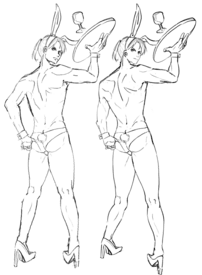
>>422135I had a go using a 3d model to help with some of the perspective, its not perfect ofc but hopefully this helps somewhat, i also tried to make the face look a little more proportionate while still being cutesy but idk if i've messed it up because i am terrible at cute things.
No. 422361
>>422360Right arm still too short. It kind of looks longer in the right drawing. I kind of like the lean on the right drawing though. As in the figure itself leaning, can you see it? It adds more motion, especially since he's meant to be flipping the glass, or teetering on his heels (?), maybe the next step is to work towards conveying that sense of motion in the legs, maybe in the arm pulling out his wedgie, maybe his expression can reflect the events happening (or not I dont care)
Also I know you'd hate to hear it, but the way the head is on the left drawing… it seems turned a little too much, if you can see it. With the way his body is turned, his neck wouldn't be able to turn that much. It's not too noticeable I don't think
No. 422440
>>422227i dont know why you are getting mad at me i said nothing rude to that anon, i am not the anons seething at her.
>>422255thanks this is very helpful
No. 422443
>>422360thanks
nonny, also saved to the critiques folder.
>>422425i tried to convey him looking ashamed of having to wear something to shameful i guess. At first the focus of the picture was going to be the ass but i such at perspective and i got lazy.
No. 422491
>>422486Dont worry
nonny it looks great otherwise. It's also a bit calming to know even the pros make mistakes kek. Thank you for the help.
No. 422493
File: 1728537535777.png (Spoiler Image,236.42 KB, 648x1436, rabbit man2.png)
>>422491i'm not a pro, but thanks. also the legs mistake was driving me insane, so i fixed it. it probably happened because i spent too long zoomed in. i don't normally work on canvases that are so tall and narrow like this.
No. 422500
>>422496nta
[Kaneda Koubou] Otoko no Kinniku Kakiwake Pose-Shuu - Slim Kara Macho Made
[カネダ工房] 男の筋肉描きわけポーズ集 スリムからマッチョまで
It's on e-hentai No. 422555
File: 1728553497991.png (Spoiler Image,121.43 KB, 400x744, homosexual bartender.png)
spent break doing my own version since he is a slut who works at a bar
No. 422587
File: 1728561822820.png (301.99 KB, 648x1489, bunnyyyyyyyyy.png)
>>422083heres a shitty quick paintover
and keep in mind i dont draw moids so please excuse any anatomical mistakes i had to look at alot of fags for this i did but i have to say i was really confused with what kind of perspective you were going for from the upper body it seems like the camera is in front and a bit below but from the lower body it seems its viewing from the top, were you going for a fisheye lens? but i have to say its so nice to see you slowly improve! its always recommended to use references when drawing from imagination because even if you think you know how a muscle looks its always best to have something to base it off of actual real muscles (idk how to explain it just use refs) good luck!
No. 422590
>>422587Thanks
nonny, i like what you did with the head and the expression.
No. 422614
>>422471i know this is a redline to another anons request but if you dont mind but can i ask how do you draw your hands? or what brush do you use? i really love the inking on it
>>422612>>422608im the anon who made that one and i also noticed that only after posting kekk and the calves arent short but more like theyre bending in so they appear short as for the feminine legs i did say i wasnt well versed in drawing moids kekk
No. 422615
File: 1728570881629.png (143.95 KB, 622x1207, lolcorguy.png)
I gotta try it too! I used a mouse so excuse the chicken scratches
No. 422616
>>422589>lineweightit's a sketch done on my phone during a 20 minute break, i didn't put much effort into it. this thread isn't an intense progress competition, it's somewhere for amateurs to post art for other amateurs. if we were great at art or we wanted serious advice on how to improve we'd be posting somewhere else. you can post art just for fun instead of to bait asspats from other mid to bad imageboard artists for your miraculous improvement.
and in the likely case that one of these crabs is loomischan, i don't like your art either, sorry. it looks like the art of every other genereic ghibli-inspired western artist and it doesn't look any more professional than anyone else itt. i'd rather refine my current method of drawing and seek new methods from artists i actually look up to than take what you say to heart. most of your advice isn't any more helpful than the usual nitpickers who i also don't take seriously
especially since in my case half of them are usually rancefag samefagging. it's good that you feel like you've progressed, but you also act insecure, crabby, and entitled to praise
>>422174 which no one is. none of this is that deep.
No. 422636
File: 1728573266209.jpg (96.01 KB, 560x441, sketch1719042854002.jpg)
>>422621i haven't been sperging, i normally don't give advice or criticism either unless asked directly. i've had plenty of positive reception to my art and some genuine fans of my ocs that made me really happy. it's more because of the subject matter than my own skills which i'm fine with. i draw to put my thoughts down on paper, not to become a great artist. i share them for the same reason. of course i'd
like to improve but i don't have much freetime these days so it's not a priority.
i could probably bait praise all day long by drawing nothing but neopets and pokemon again if i was really desperate for that ego stroke, that's my one real area of expertise.
No. 422666
>>422658Oh I see kek well usually I like to draw slightly muscular guys, not skinny but also not roidpigs. I used minimal lines because I didn't want it to look too messy but I guess I removed too much
>>422662It's the first time I actually draw this waiter guy
No. 422673
>>422670Shhh don’t even try to get through to them, treat them like a resident personalityfag you just laugh at. It’s also as clear as day that femboy goat personalityfag is still posting in this thread, exhibit A
>>422555 and the mods haven’t banned them yet
No. 422685
File: 1728578931159.jpg (21.98 KB, 400x333, worlds-tiniest-violin_400x333.…)
>>422684Poor you
(infighting) No. 422696
File: 1728582285824.jpg (19.95 KB, 480x360, hqdefault.jpg)
Jfc what happened in this thread. You guys need to chill the hell out and stop being so aggro in general. I appreciate blunt critique, but I do think you're being a little too harsh.
No. 422699
File: 1728582664655.gif (104.3 KB, 220x164, popcorn-michael-jackson.gif)

No. 422704
File: 1728583190190.jpeg (129.61 KB, 750x1008, 43AB9783-F5CF-40B5-8DFE-F5E1A2…)
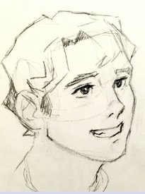
>>422702>I think calling my art “okay for a beginner” is a bit harsh but whatever.Meanwhile, the art in question. Kek. The delusion.
No. 422705
File: 1728583339926.png (Spoiler Image,345.04 KB, 1178x611, drummerdddd.png)
What do you think would be the best way to save this background? I forgot to thumbnail the background as I was too focused on the electronic drumset. I tried drawing some lines to give the impression of a room however it seems doesn't feel like a solid setting and more of the illusion of space which I don't like. Maybe I should try spacing it out, making the lines of the wall farther away from the camera and add some props? Sorry about the poor resolution, I didn't start off my canvas with a 144-300dpi and instead tried using 1200dpi thinking it would give a higher quality.
No. 422713
File: 1728583828751.jpg (218.09 KB, 967x794, ignore and report.jpg)
No. 422714
>>422709>>422704You guys are just nitpicking her art because you're having an argument with her. Is she good enough to be giving advice to other people? I don't think so. But it's not horrible by any means. This is such a retarded infight, just let it go already and stop dog-piling this person.
>>422706I've been here since 2017. The culture of the cow boards is different from /ot/ and /m/. It's not unreasonable to expect that anons be a little more civil with other anons than they are towards cows. There wouldn't be rules against infighting otherwise.
No. 422718
File: 1728584037274.png (298.64 KB, 1178x611, image.png)
>>422705i think it would look cool with a bunch of posters in the back, either of his band or other fake bands. and something small in the corner thats not too detailed.
No. 422720
>>422714I mean I appreciate that but my question is how much of a master level expert to you have to be before you can offer advice to other people? Like I know I’m not perfect but if drawing like that doesn’t meet the standard for qualifying to be offering advice then we need to throw the whole thread out because
I don’t think I’m worse than anyone else in this thread and the whole concept is about anons ITT helping each other. Right? I just don’t get it. If we follow your rule then almost no one can offer any advice.
No. 422728
>>422718Thank you
nonnie! Do you mind if I use your image as a reference? Looking at your image, I think I've realized why my background looks so off. I was forcing a weird perspective when it would look better with just a solid wall that's closer to the camera.
>>422721That's the plan. I was going to make parodies of albums I like such as Chubb Rock's The One, April March's Gainsbourgsion, or Mexican Institute of Sound's Suave Patria.
No. 422743
>>422705I love the juxtaposition between a simplistic character within a detailed environment (e.g the drumset!) my advice is the same as
>>422718 some posters and miscellaneous objects scattered throughout the environment will help it look more dynamic; I would say the corner object could be a box crate with something like a bookbag and books on top to match the garage band theme
No. 422768
File: 1728590058696.png (79.95 KB, 640x480, v7to2nlj3ag11.png)
>anons itt
No. 422876
File: 1728615972461.png (866.2 KB, 1854x2413, aaaaaaaaasssss.png)
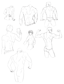
>>422681Worst part is that i study anatomy lol i just suck at it. I cope by telling myself i have only been drawing for 3 years kek but i bet someone more intelligent would be miles ahead of me now.
No. 422938
>>422925They are studies of real people. I did ecorche then i applied what i learnt onto a copy.
>>422887thanks
nonny No. 422993
File: 1728646699447.png (Spoiler Image,352.27 KB, 533x930, sketch1728645890806.png)
redraw, now I think he looks just cute enough for my abandon pile
No. 422999
File: 1728649739421.jpg (Spoiler Image,137.85 KB, 711x1287, 1722644185417.jpg)
>>422977kek its from a ref. I didnt like how it turn out
No. 423006
File: 1728650992308.jpg (89.44 KB, 564x671, aa0955c97385c727dda85c133170fa…)
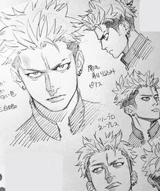
I can paint noses just fine, but whenever I try to draw them, especially stylized noses that are not a single line, it always look like shit. Even more so if the nose is at an angle.
Does anyone have any tutorials that could help with that?
No. 423013
>>423012That's not her art anon kek its by yuto__sano on twitter.
>>423006Do studies of asaro heads, they help with understanding the forms.
No. 423147
File: 1728696356033.jpg (46.22 KB, 735x576, 4dde39402cd2f12f84100c11456090…)
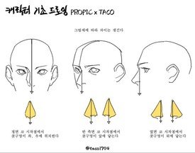
>>423013I don't think I have a problem with its forms, that's why I think I can paint them fine (I like to paint using the "feeling the form" method, as it's clay), but when I try to stylize it in a semi realistic manner, it just looks bad. Maybe I just need to copy the artists with the type of stylization I like, but it's really frustrating, especially when I try to draw from imagination and I want to do an specific look and the guy ends up looking like a camel or plain incomplete.
No. 423258
File: 1728742359975.jpg (Spoiler Image,587.96 KB, 2245x4026, sheisse.jpg)
I am sorry… who hired this guy anyway?
No. 423260
>>423206i first started drawing not even 2 full years ago (january 2023), i
am a beginner drawing on a smart phone. when i look back at my early attempts at art, i can't complain at all about the progress i've made.
>>423245it is glued (or taped) there kek. the shading is actually part of the sketch repurposed into basic shading so that's most likely why it makes no sense. i didn't think about how the light would work, i randomly added and erased extra lines to my sketch where i thought it would look better.
No. 423334
File: 1728749555649.jpeg (127.8 KB, 735x891, IMG_2777.jpeg)
>>423258if I posted this in the bad art thread people would be ripping it apart but if it’s farmers we get to be biased. more proof a bunch of sensitive newfags who want a safe space so nobody is mean to them, too fucking bad you’re shit, the new userbase is shit, the original bunnyfag’s drawing is shit, the farmhands is shit, your nigel you keep bpd texting is shit, your autism is shit, your parents is shit, your existence is shit, your scribbles is shit, your face is shit, the admin is shit, 4chan is shit, twitter is shit, tiktok is shit, newfags are shit, summerfags who don’t understand schools in session is shit, everything is just shit and this looks elementary as fuck. you were waiting for me to say “jk” because no, your whole entire life is a lie, the words you speak are meaningless this is simply shit!
(calm down) No. 423359
>>423345that is literally so me!!!!!!
>>423346>larping larping as what? the art is shit you don’t have to be a critic to know the obvious
(ban evasion) No. 423392
File: 1728755648495.png (388.68 KB, 1080x887, 1695612150063-2.png)
>>423378She used to be a shotafag, maybe she prefers loli these days
(derailing) No. 423403
>>423280>>423286>>423288The title of the thread is "post art for anons to rate," not "lolcow art hugbox." How is it that anons swam up Loomisfag's ass, but turned around and caped for
>>423258, who is clearly in dire need of useful feedback? This person basically has to start at square one. I'm not even sure what resources to recommend her, outside of an in-person beginner's drawing class.
No. 423421
>>423409It's funny to me that nobody is happy with their moderation techniques, not the people getting banned or the people reporting.
>>423420>Post art>Get shit on by bitter spergsNo thanks. This thread is garbage.
(concern trolling ban evader) No. 423445
File: 1728763121664.png (2.61 MB, 3508x2420, bbekekSJLJL.png)
Literally look at the last thread for comparison, yeah it's not supposed to be a hugbox but it's also not the sperg out for days over anon art thread. "But lolcow is supposed to mean!" To cows and if anons started talking about cows the way you guys are, it would get banned. If you looked at any /ot/ or /m/ thread before 2020, 2019, 2018 etc. anons… are talking to other anons nicely and not trying to be so mean but also really funny like you think you are. Scary! I'm a post 2020 permanewfag and even I know that.
Half finished MS Paint and trackpad study for thread tax.
No. 423447
File: 1728763264721.png (323.94 KB, 710x720, sketch1728762504800.png)
>>423378i've been called a barafag, furfag, lolifag, scatfag, and everything else you can imagine by rancidfag. she makes shit up and runs with whatever sounds the most incriminating and/or projects her own traits onto me (see her old ao3 account full of jjba poopy daiper fetish fics). no need to dispute the schizobabble of a mentally ill teenager who sexts incels and plays actual loli rape eroge on discord in between shitposting on lolcow and 4chan all day. she's going to keep doing it until she finally kills herself so i'll just have to wait that out.
(USER HAS BEEN PUT OUT TO PASTURE) No. 423465
File: 1728765583775.png (46.36 KB, 2443x213, lel.png)

>>423458What's the point if she's going to cry ''waaah rancefag is bullying meeee'' everytime you give her a critique, no matter how constructive? This is also a board centered around drama so anons are going to follow a cow around, especially one as milky as ntyfag.
>>423454Nonnies on the bunker were talking about how rancefag and ntyfag should kiss, they have so much in common they might as well be the same person. I am kekking at her sperging about how shotafags are pedophiles on the bunker and now it turns out she's a shotafag herself. She's also admitted to playing a loli rape game but it's fine because she totes played it for the deep plot and prose kek.
>>423464Anna would be the Tachi and NTYfag would be the tsundere neko. The romance ends abruptly when Anna stabs Ntyfag to death with her buttchin in a fit of rage after disagreeing over some petty anime bullshit.
(derailing) No. 423477
>>423455Thank you! I wasn't sure about the colour of the water so I'm glad it looks pleasing.
>>423476Farmhand did.