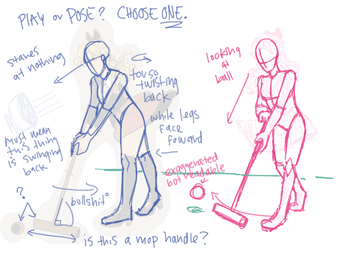
File: 1524192122624.png (298.19 KB, 800x600, 1493346319784.png)
No. 243983
File: 1524209887299.jpg (239.68 KB, 821x1200, alsoitsfullbright.jpg)
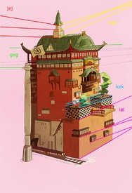
>>243951yes! finally this thread! I mean I like to see these rather than I want to do them, but I did amuse myself making this before. I'm not sure what to do about the horizon. Btw holly brown posted with the comment "yes i fucked up the perspective, here's an edit" (i think implying the perspective was supposed to be fixed)
No. 244018
File: 1524240522991.png (1.4 MB, 1280x1280, B9CA61E2-73BD-475D-A948-02AF91…)
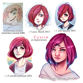
Does anyone else get a kick out of art improvement pictures?
No. 244019
File: 1524240685587.jpeg (166.52 KB, 784x784, 2BCC0B36-3F6E-4191-ABD6-62E410…)
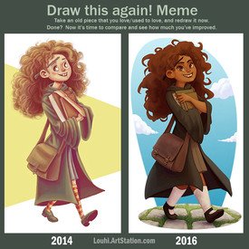
It makes me sad when there’s barely any improvement, though.
No. 244056
File: 1524252040320.png (123.73 KB, 556x572, 2A55E913-8FAA-4F9C-B787-D1A455…)
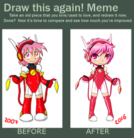
Nine years… damn.
No. 244077
>>243951lol i was shook seeing my redline as an OP image
ppl got so mad at it that i stopped posting in those threads
HB's stuff is so nonsensical that its v hard for artists to resist manually showing whats wrong w it instead of typing it out bullet by bullet point, glad u made a thread
No. 244096
File: 1524266580762.jpeg (26.01 KB, 275x248, 08B4E6A5-C514-477E-9AA3-EE5BBA…)
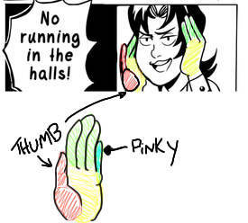
>>244077>>244077Yeah! I really appreciated that pic when I saw it because I’m not an artist so I don’t know why an art piece looks wrong, I just know it does.
This is another fav of mine from the Holly threads. If you put your hands to your face, your thumb is near your ear. Idk why she doesn’t just try these things before she draws them.
No. 244102
File: 1524267562481.png (757.18 KB, 1000x1000, spechie redraw half.png)
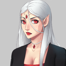
hey i drew something
No. 244106
File: 1524268168107.jpeg (391.05 KB, 1936x1452, F39F6619-18A3-430A-B0BD-27D027…)
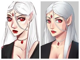
>>244102Holy shit anon. That’s miles better. Made a quick side by side of Spechie’s original and yours.
No. 244263
File: 1524370096375.png (1.15 MB, 2000x1000, honestly why did I.png)
No. 244681
File: 1524502648806.jpg (178.67 KB, 737x1080, 1524499848723_.jpg)
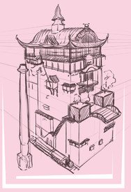
>>244673I think by the time you're looking that far down, you have to start hinting at a third vanishing point at the bottom
No. 250236
File: 1526508205551.png (331.08 KB, 740x700, E7D9A120-F8AF-4319-8DB7-8A46F6…)
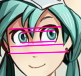
Redline spotted in the Holly thread
No. 250273
File: 1526522905233.png (757.64 KB, 1500x894, mercy_commission_by_spechie-dc…)
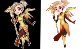
just tried to fix anatomy and use more vibrant colours etc, i didn't try to keep any of the details. still not worth $30 imo
No. 250286
File: 1526526616157.gif (466.8 KB, 982x1200, not_even_better_tbh.gif)
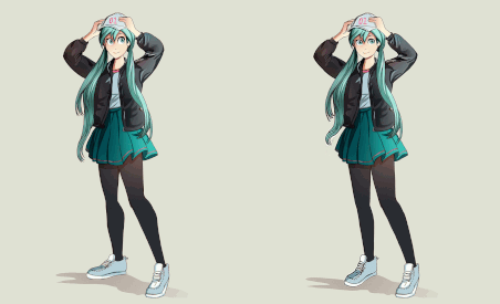
>>250236I messed with it in a beauty app just for laughs but it's still such garbage. Does Holly actually know what humans look like?
No. 250307
File: 1526532937189.png (235.46 KB, 1000x1250, 39.png)
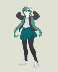
No shading.
Critiques welcome.
No. 250325
>>250314… How is the shading wonky if there is no shading, though?
I do think the eyes are too big (even for animu, kinda like kanon or air) and the head is too small, though.
No. 250575
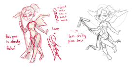
File: 1526614654146.png (930.57 KB, 2000x1000, mercy on us.png)
No. 250576
File: 1526614805688.jpg (2.06 MB, 4088x2348, redrawpt2.jpg)
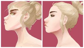
how's this? the forehead just irked me.
No. 250595
File: 1526619389309.jpeg (1.47 MB, 2048x1024, 0C10B398-E1D6-4C95-9799-A6963B…)
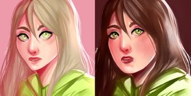
Spechie’s art Facetuned.
No. 250604
File: 1526620774007.jpg (85.49 KB, 715x1117, chillin_by_spechie-daxe7x1.jpg)
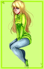
>>250596I'm the facetune anon (which was just for fun), but I didn't do any of the others.
You can't stylize until you know the basics. Spechie has absolutely awful technical and stylistic skills. She doesn't understand basic anatomy, line work, lighting, coloring, ect. You can't go "oh but style" for any of that. Her work is shit. That's pretty much a universally agreed with opinion on this site (check the general art thread and her thread on snow). If you wanna disagree, you can, but just know most people are going to think your opinion is shit- because she's shit. If you honestly look at
>>250576 and think the left looks better than the right, then yikes. Idk what to say to that.
She can't draw a normal face, the alien bug-eyed with no chin look isn't an intentional style choice, its a lack of skill. The shitty line quality, unrefined edges, poorly rendered and detailed features, etc aren't a choice. They're cause she's baaaad. I never thought I'd see someone defend Spechie's "style" on here, its like defending Holly's. I'm kinda like just shocked.
But, regardless, this is a thread for fun. Contribute your own redraws, redlines, or revised work. Its fun.
(And kek at calling Spechie a "cartoonist." She's a shitty youtube "artist" who is just famous for her spergy rants and edgelord attitude.)
No. 250625
>>250604I dont care about or know of any of these artists. in my field it just grinds my gears when laymen try to criticize modern work when you have absolutely no tools to do that.
she doodles story cartoons. shes not studying from roberto ferri's atelier as a neo-baroque painter, or designing for a functional use, these people are delusional at worst or just doing casual digital outsider works on her non monetized channel, which you'd specifically need go out of your way to see any mention of. shes telling personal stories with doodles because she likes to.
every "fix" in this thread is objectively and equally "bad", with no potential for improvement. you'd need to construct an entirely new original foundation using hundreds of 3-dimensional geometric shapes from the perspective point(s). you cant just warp or blend over it and say its better on those arbitrarily chosen points because you made it look smooth and flat or put things into "place". you're not "correcting" it. you're doing things you personally like which look just as bad.
No. 250627
File: 1526628388588.jpeg (641.02 KB, 1080x566, 6C654574-D635-4F7A-94F4-918EF8…)
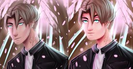
>>250625This isn’t the vent or unpopular opinion thread. People are having fun. And there’s no way you can look at these side by sides and say they’re “objectively” just as bad.
>>244106>>244263>>244106>>250307>>250576>>250595Sorry the thread struck a nerve with you cause of your job, but that doesn’t mean anons’ works are bad.
>laymen try to criticize modern work>modern workKek. So far it’s been fucking Holly and Spechie. You projecting?
>shes telling personal stories with doodles because she likes to. That’s nice. Good for her. She’s still a whiney cow with no talent.
>you'd need to construct an entirely new original foundation using hundreds of 3-dimensional geometric shapes from the perspective point(s).Kek what?
>say its better on those arbitrarily chosen points because you made it look smooth and flat or put things into "place". Anatomy don’t real. Only geometric shapes and “style”
Why so
triggered, anon? You’re the only cringey one here. Everyone else is just having fun and fucking about with art. What “field” are you even in where you think Spechie/Holly’s work is “objectively” just as good as the edits? And even if everyone’s work is just based on what they personally like, who fucking cares? Why does it bother you that they’re playing around with art and what they like? It’s not that serious.
I played around in Facetune again for like five minutes. Hope it doesn’t
trigger you again.
No. 250735
File: 1526672968408.jpeg (3.22 MB, 1536x2048, 439298F3-782C-4822-AF3B-51FAF8…)
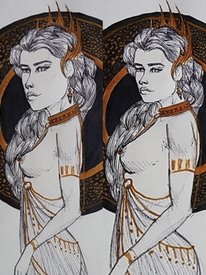
This Facetune bullshit is so fun and quick. I can see why Istebrak has built a career on fucking about with other people’s work. It’s pretty satisfying, even if the end result is still shit. Found this pic on ugly art thread.
No. 250809
>>250808why are you so
triggered by someone calling you istebrak? tbh her facial anatomy is way better than yours
No. 250810
>>250809Hopefully she’s much much better. I’m not an artist, and that’s her job. How am I
triggered? I’m just baffled that you’re so mad I fucked around in a free beauty app. Why does it bother you so much? I’m not mad or hurt that some anon is sperging out over my five minute facetunes. It was for fun. I encourage you to try it yourself, as mine are so shit and you know much better, and cause it’s actually really satisfying and fun (like I’ve said over and over).
No. 252809
File: 1527161825790.png (87.06 KB, 261x142, 33075246_266086930601418_73151…)
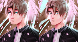
>>250810Are you MAD im not MAD are you really
TRIGGERED trollface No. 256061
File: 1528078644099.png (343.75 KB, 590x684, 53DCE3B5-3548-4B96-A3A1-41AF2B…)
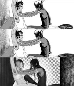
Ik it’s still jacked but you know what they say about polishing a turd lmao
>first is “hc BRowns
>second is trying to warp
>impossible, decide to paint over and fix mood and poses
Tfw your art is so bad not even photoshop can fix it
No. 256064
>>252809this isn't much of an improvement, it looks just as bad but in a different way.
>>2560612nd one definitely looks better than the other two, but why did you give them tits?
No. 256078
File: 1528084786901.png (504.69 KB, 573x587, E4747E93-E71F-4FCF-8474-397A66…)
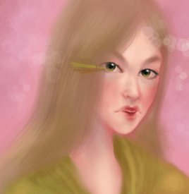
Last one
>first is spechie>second is warping it>third is paint overSpechie reminds me of half the weeb art kids I went to school with, awful
>>256064Lmao they’re meant to be pecs, but it’s such a shit angle that it makes the whole thing look off, idk I hate when men’s chests are draw super flat it just bugs me
No. 256079
File: 1528084825470.png (1.21 MB, 573x1761, C90B9D84-24CC-4CA4-8CCD-A0F262…)

>>256078Whoops, wrong image
No. 256083
File: 1528085638364.jpg (101.8 KB, 1080x1096, 2eb53343-d896-41bd-a27c-155008…)
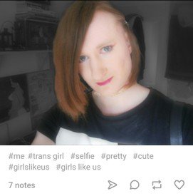
>>256079>>256078It looks way worse lmao, reminds me of something you'd find in the "girls like us" tag on tunglr
No. 256084
File: 1528085642215.jpg (25.88 KB, 600x450, snapshot_1a39aeb4_3abd79f0.jpg)

>>256079>>256078congratulations it's somehow worse
reminds me of pic related
No. 256086
>>256081Thanks, Mind telling me why exactly you think so?
>>256083It is spechie after all, she already looks like one, but I guess I like them caterpillar eyebrows so there’s that
>>256084Haha sims is a big inspiration of mine, how’d ya know?
No. 256091
File: 1528088145411.png (82.72 KB, 545x581, lensEmoter.png)
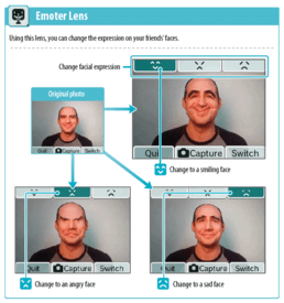
>>256086It's more than just the eyebrows, gorl… The only thing that looks okay is the nose, literally everything else is giving me awkward, uncanny valley wikihow troon selfie that was taken with the DSi camera and edited in the emoter lens + meitu
No. 256092
>>256061The hair in the last one is so satisfying compared to her clusterfuck hair styles.
>>256079Hey yeah so you need to work on your edges. The hair doesn’t have any weight or structure. And you also need to work on facial anatomy. The issues from the first are still there (strange eyes, awkward chin, etc) but then you added some like the strange lip expression and tiny teeth. I do like how you’ve colored the cheeks. Work on refining your edges, like making them more concrete and not so blurry and vague.
No. 256132
File: 1528104529438.png (1.34 MB, 573x2428, lmao.png)

>>256096i done one
pls let this become a meme
No. 256134
>>256132sorry about how unfinished/messy everything is. This is all I had time to do, but i'm petty af and will jump at any chance to overdraw for the keks
>mfw her neck is still not connected to her head correctly just like spechies version a true homage
No. 256135
File: 1528106226519.jpg (44.91 KB, 500x500, artworks-000156558639-65ebfh-t…)
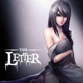
>>256132Damn your a great artist but you basically destroyed that dumpster fire of original artwork and created your own that bares a vague resemblance to the original trash and replicated trash.
Your art kind of reminds me of a mix between steins gate and the letter visual novels.
No. 256139
>>256135thank you anon!
I'm new to artfagging on this site but i'll try do some more things in threads like these
No. 256152
File: 1528111641820.png (1.99 MB, 573x2998, xYBhg6F.png)

>>256132i deleted my post to add to this lmao sorry it's scribbly garbage
No. 256154
>>256152yay i like your style frien
>>256148i find photoshop is all i need, if i'm doing linework then clip studio. I actually don't use this style much, I'm more a fan on textured brushes and ps handles them really well
No. 256240
File: 1528141904144.jpg (1000.16 KB, 2000x2000, ohwell.jpg)
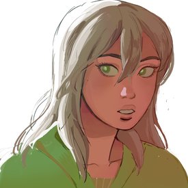
i didnt bother putting it into the row, but i tried my hand at redrawing the spechie pic. white bg bcuz lazy.
No. 256255
File: 1528146785007.jpg (1.86 MB, 573x4173, 1528111641820.jpg)

>>256240Added yours. I like the expression.
>>256152>>256132These are pretty sweet too.
No. 256646
File: 1528260719619.jpeg (694.58 KB, 1772x1772, 0E3F5365-AC63-46D6-A6C1-5E587F…)
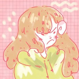
A different flavour of Spechie.
Does this even count as a redraw at this point
No. 256676
File: 1528269512856.png (2.6 MB, 573x4795, updated.png)

>>256255This seemed fun so I did one too, it was an awesome practice sketch before work, so thanks.
No. 256678
>>256676Um you missed the best one
>>256646Include it and it’s perf.
>>256655Cause is funny. And interesting. And shows how awful her “style” is. Shhh. Don’t question brilliance
No. 256679
File: 1528270526074.png (3.06 MB, 573x5356, wwww.png)

>>256678Ah sorry I wasn't the person who started to collect these so I hadn't thought about adding the others
Here fixed it!
No. 256689
>>256680thanks I’m glad you like it!
And I do but I’m really unsure about sharing it on lolcow of all places
No. 260638
File: 1529297052140.jpg (1014.15 KB, 2000x1000, redraw3.jpg)
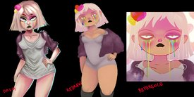
redrew her cherry because it sucked ass :) critiques welcome, just tried to stay on model.
No. 260668
File: 1529309779614.png (164.72 KB, 640x356, 6A7A8406-64F5-4A6C-B4B1-8EFE0C…)
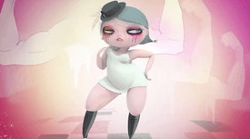
>>260667I think it’d help if you pushed her thighs further apart and also made it more stylized like attached pic
No. 261475
File: 1529611601013.jpg (177.24 KB, 560x306, Capture22.jpg)
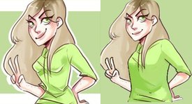
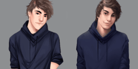
redraw on the right. sorry that its so messy my pen pressure was not working at all last night. made the hoodie not airtight and tried to fix the hands best i could
No. 261513
>>261475tbh Im also always
triggered in animes when any kind of shirt is airtight on the breasts and chest. Like thats not how clothing works ffs. not even latex clothing.
No. 261550
>>261475Style wise I think the airtight clothing looks better. It's not logical, but gives her otherwise very lacking body structure some flow. The one on the right looks very shapeless.
I would suggest you try to redraw the whole thing with your own underlines and builds rather than drawing and trying to correct over hers.
No. 261920
File: 1529693974769.png (220.43 KB, 585x306, oml.png)
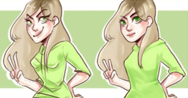
>>261475I tried to tune up this piece too and yeah, its almost not worth saving, the most I was able to fix was the fingers, the chin, and the hoodie, but anatomically this drawing is so fucked up, im not an expert but that hand placement is so weird anyone with eyes can see that, not to mention but so many of the colors clash together, there's no contrast or value, I understand it was probably a simple sketch but there's no excuse for the drawing to look so messed up.
No. 261924
>>261920Yeah, the eyes especially are so wonky I would have probably constructed the whole face from the beginning instead of trying to save what was there.
But I think you did a good job on giving the body shape without the sweater looking like it's plastered on. It looks more natural now while still keeping a little curve that leads the eye through the drawing.
No. 277012
File: 1533610270671.png (1.1 MB, 1339x844, 32435.png)
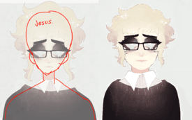
it's not perfect, but i gave it a shot. i hate the alien heads that tearzah draws. i think they could be a really good artist if they didn't rely so heavily on stylization. i recall them answering an tumblr ask with something along the lines of "if it's personal, you don't have to improve your art" and… i guess? but she does commissions, so she should really care more about the quality of her art.
No. 277202
>>277012I’m surprised that I haven’t seen many art rant videos on this girl yet (since you know that’s a thing right now)
Like, not only is she distasteful as a person but her art seems like the same plastered piece over and over again, only coloured differently
No. 279298
File: 1534053697153.png (4.8 MB, 3588x2542, 1534052295841.png)
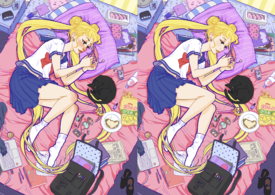
>>278591Just wanted to edit out the blush everywhere from the op
No. 279311
>>279298It's astonishing how removing the blush makes it look so much better. The extreme tumblr blushing looks always so tacky and gross.
>>279301What are you talking about? If your face was red like that you'd have a severe skin condition.
No. 279315
File: 1534066206314.png (503.34 KB, 1280x720, Upclosepollen.png)
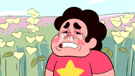
>>279298The original reminds me of this
No. 279587
>>279298I can understand why people like either or, but to me the girl looks sick on the left but lifeless on the right.
(Totally laughed at the Steven comparison)
No. 279748
>>279299agreed. Not sure why the brows were changed.
Also removing blush also removed freckles.
I've seen the blush placements in manga art long before tumblr style. The only thing I hate of the blush concept is red noses, especially when in most tumblr art it's the only red part of the skin. The red nose in the original is a little OTT but I agree with the anon who said the blush removal makes the piece look much more lifeless by comparison.
No. 279753
>>279748I changed the brows because I thought her original expression didn't look all that happy
But yeah, that backfired and she does look lifeless in the edit
She's still kinda blushing but it's really faint because I lowered the opacity
No. 279951
File: 1534203115846.png (4.82 MB, 3588x2542, Illustration.png)
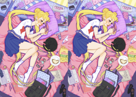
>>279298i wanted to remove the blush from her nose, and tone it down on her cheeks so it looks more natural. i removed almost all the blush from the rest of her, leaving only a tiny bit of color since some people do have slightly darker elbows/knees. though i don't think it's actually noticeable
No. 279954
>>279951That's still way too much blush for a normal face and Usagi doesn't have freckles.
Why it looks a bit better with super blush is because this artist has no idea how to make a face without that.
No. 279967
>>279954really? i thought it looked pretty natural. was probably the comparison between the original that made me think so. i don't think adding freckles is a big deal so i didn't bother removing them.
>>279956i didn't even notice that at first, but now i can't stop looking at her pigtail and how it lays completely flat when it should be falling off the pillow
No. 283843
File: 1534892314618.jpg (67.45 KB, 486x538, topbeforebottomafter.jpg)
sorry for crossposting but here's my fix from the bad art thread
No. 283944
I’d like to give a heads up to all art anons we have made a official art thread in /meta/!
If you are interested in making some OC
>>>/meta/6362 No. 284757
>>284089I was so convinced that the top was edited just so someone could try and say they edited something
But checked her Twitter and look and behold she really put that sketch out there looking like that fuckin lol
No. 286376
>>286248I think
>>282896 would be okay for that sort of stuff
No. 296889
File: 1537227422683.jpg (267.6 KB, 737x559, fuck.jpg)
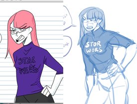
when im bored, i redraw spechie for a nice no-effort ego boost (sans pants)
No. 296925
File: 1537237477035.png (908.24 KB, 2200x1100, A1F5CC0F-5DD6-4785-AACE-B798DA…)
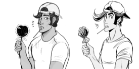
I was bored
No. 296966
File: 1537245356590.png (1.16 MB, 2200x1100, holly redraw reese.png)
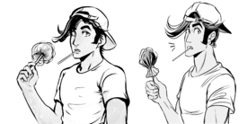
>>296925bandwagoning. hope holly appreciates all the free fanart
No. 297025
File: 1537260273142.png (2.03 MB, 2000x1954, another holly reese redraw.png)
idk a sketchy beef boi idk
No. 297239
>>297025This one Is actually good! You could use some work on the stifness of the arm pose tho. But it is looking lovely overall
Is actually a blessing to see, since 99% of the remakes on thir thread look like shit, even worse than the original.
Love urselves and stop trying to showcase a skill you don't have anons. We don't need 2 shitty remakes to see
No. 297263
>>297259I guess is a matter of taste and being used to art then.
Because a lot of anons show to be amateurs trying to fix other people mistakes.
No. 299875
File: 1537852776555.png (498.35 KB, 911x510, lazy redraw.png)
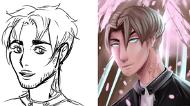
>>250627I don't really draw dudes much, but I figured I'd give this a go for some practice.
No. 300682
>>300550ha ha
The one on the left. It was like 5am here gimme a break lmao
No. 300690
>>300550It's late here and I can't tell if you're joking because
1) It was really obvious to me which one was the redraw- It's not great, but it's still an improvement over the vacuum-suctioned tits and the weird face
2) the original literally has spechie's name (faded) at the bottom from where the tweet banner thing was.
No. 304817
File: 1538623355287.png (1.12 MB, 1843x2000, chair guy.png)
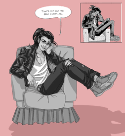
Drew this a while ago, but forgot to post it.
No. 304954
>>304817Loads better than the original, only complaint is the chair seemed like an afterthought.
Also you negative anons need to chill tf out like this is something that is supposed to be fun and maybe pick up a trick or two.
No. 304965
>>304963eh, the main point of the thread is to one-up annoying artcows.
it's not really that out of step for anons to be snarky about people who can't really deliver.
No. 305154
File: 1538694707013.png (328.86 KB, 1000x775, holly redraw reese chair.png)
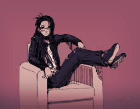
Happy Hoctober?
No. 305272
>>304817 is better than
>>305154 yall
No. 305290
>>305272I like both of them! They are pretty great in their own right even if you can't tell the gender in the first one lol
They are nice break from farmers postingtheir half-assed doodles looking for undeserved asspats.
No. 305299
File: 1538744097833.png (2.1 MB, 1843x2000, holly brown reese critique.png)
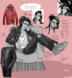
>>304817You over-corrected Holly's mistakes. You show good understanding of volume in a 3D space, it just isn't appealing.
No. 306430
>>305154This is an interesting style, and I like it because he does appear male without looking like a completely different character.
Also the pose doesn't look super stiff like some other redraws.
>>305299Oooh anon you nailed it. The jacket I didn't mind too much but I didn't like the face and couldn't figure out why.
And yeah I guess it also makes it look like Reese put on like 20 pounds.
No. 307820
I'm the person who drew
>>304817None of the other posts in this thread are mine; I literally dropped the picture here and forgot about it until now.
I think all the criticism here is legitimate, especially the ones
>>305299 outlines. My only disagreement is that I don't like how animu your revised face is. I'm not a manga artist- if you're going to critique me, do it based on normal human anatomy.
I agree that I drew his face a little too feminine and his legs too thick, as several anons observed. The mouth is a bit too wide, and the shading needs more contrast.
Thanks to everybody who gave actual critique, instead of just vaguely calling it "fuggly" (nice spelling, retard).
>>305154This one looks way more like a chick than mine. No human male over ten years old has proportions like this. Also, the lineart is sloppy and feathery as hell. Am I supposed to be impressed by this?
Having a preference for manga styles =/= observing an objective difference in skill. Yes, this one is cuter than mine, but it's less anatomically correct.
>>305249People mostly weren't "shitting on me", anon. I agree with the sentiment as it pertains to the site in general, though.
>>306430Might repost with a fixed face. I'm thinking I overworked the face.
No. 307857
>>307824nta but i think anons who try to defend themselves when they could just quietly slip away are fucking stupid.
plus
>>307820 is all over the place trying to act like she agrees with the critiques while still trying to defend her shit drawing and also being passive aggressive.
just a bad mix all around.
No. 307861
>>304817It's a good effort pose-wise and looks a lot more appealing, but it simply looks like a completely different character from the original and the jacket of that length should be spilling out a lot more from under him.
>>305299 Anon here nailed the face a lot better while explaining why, in the original redraw it honestly looks like jeff goldblum from jurassic park.
No. 307864
>>307857This.
>>307820Salty drawanon, just shut up and don't make yourself look more of a dumbass. Especially when you start throwing a tantrum about your work being ~more anatomically correct because it's "not manga"~ like a pretentious asshole. The source material is trying to imitate the manga bishie style so it's only justified to have the redraw fix that aspect too by making an actually attractive manga-styled hottie male. And still, the original character clearly has an angular face with slim features, your redraw has a gnome face.
No. 307876
>>307871Yeah, shit's getting way too infight-y- it just seems like everyone here has a chip on their shoulder.
To give you a gauge of how much of a shit thread this is, compare it to the cow redraw thread on Kiwifarms. There's a lot more art and a lot less bickering.
No. 308497
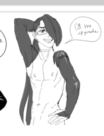
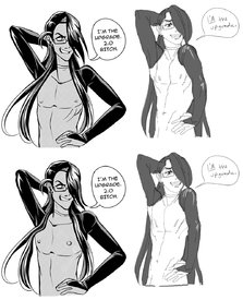
File: 1539342577428.png (421.59 KB, 1250x600, reese redraw upgrade 2.0.png)
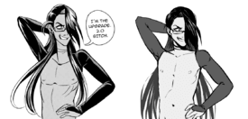
Critiques welcome.
Didn't draw the hair covering his chest.
No. 308521
>>308509Now THIS is the content I want to see itt.
10/10 anon-chan
No. 309374
File: 1539487769140.png (277.95 KB, 1037x690, 98ff5ab08b9ae293c846f8d0bf1b73…)
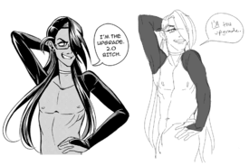
wanted to change the pose to something less bad
No. 309380
File: 1539491883575.png (277.43 KB, 1026x639, a675ed8b07998ce36877887f041d2b…)
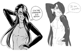
>>309378i saw so many mistakes after posting it so i had to fix it
goddammit holly just use a reference for pecs they change when you lift your arms up reeee
No. 309390
>>309386not that anon but for example, where is the clavicle?
neither holly nor any anons has figured out nipple is on pec so arm up pec up nipple up.
It's funny because reese is such a disgusting subject in the first place, making him look good is probably beyond the abilities of a professional so good luck amateur anons lol
No. 309634
>>309374>>309380What I like about this redraw is how gestural it is. The twist really gives it life. You guys are being way too harsh to this person, as usual.
>>309390The clavicle is right where it should be? Look at the lines coming down from the deltoids, dumbass.
Also, are you implying that YOU'RE a professional?
I bet the most critical anons here are actually weebs who think they know more than they actually do and just want to trash artists better than them lmao
No. 309744
>>309634>Also, are you implying that YOU'RE a professional?No? so fuck off
there isn't room for a clavicle because the shoulder is attached to the neck. I know it's supposed to be posed forward, but it's too far in.
No. 309782
File: 1539566836957.png (84.71 KB, 514x670, ddd.png)
>>309769a harsh anon here. so i'm not an artist but all i mean is, shouldn't the arm be more like here? maybe i'm wrong
No. 309919
>>309782Theoretically it could be either, it looks more natural but less dynamic the way you have it.
However, you forgot to fix the clavicle in accordance with your editing. By which I mean you erased a chunk of the other artists and didn't draw in a new one.
Also if you're not an artist, please get out of this thread.
No. 310284
>>310259It's not bait. I was being serious.
Unless a piece a art is bad in a really obvious way, how the hell is someone with no art background going to know what to say? Is this not common sense?
Sure, on some level a non-artist can sense a problem with the piece, but with no knowledge of the discipline, they can't articulate the problem. I think this is why a few anons are just saying "this sucks," while other anons are able to talk about things like proportion, gesture, value, etc.
It's all well and good if you think a piece sucks, but it's not helpful. The most relevant information is the stuff that follows, "this sucks
because".
No. 310313
>>310303That's subjective, but for our intents and purposes, it's someone with at least a little bit of formal art education.
This is kind of the problem with art critiques on an anonymous board, because someone who couldn't draw a stick person could be blindly lecturing you about anatomy and you would never know.
No. 310318
>>310313so someone who's technically competent but self-taught isn't allowed to comment on this thread?
you do know this is an image board for gossip right?
No. 310452
>>310318Nah anon, it's just the uppity drawfags being salty because anons aren't head over heels praising their sugoi redraws so they MUST be people with no "formal art education". I swear the Holly thread has the worst influx of "I can do that better!!" anons who are just as amateurish and delusional as her.
Here's a protip - use redrawing as a way to point out flaws (such as by redlining the original or doing what anon here did
>>305299 ), not to shill your own shitty drawings.
No. 313250
File: 1540003363181.png (46.89 KB, 566x297, stillgay.png)
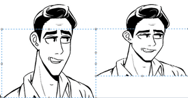
now i'm not saying this looks good. but vaguely human? in like two clicks. holly y u no
No. 313457
File: 1540046214460.png (264.06 KB, 452x709, Nick.png)
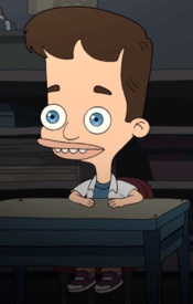
>>313422stylization isn't always good, anon
No. 316104
File: 1540453850357.png (172.29 KB, 600x639, uhh.png)
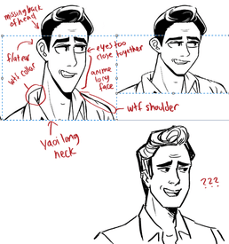
>>313250quick attempt to fix this…tried to keep holly's expression and general face shape so it's still butt ugly lmao
No. 316106
>>316104end result: cute
but i just really have a pet peeve when ppl try to "QUICK" fix holly's heart and just totally redraw it in their own style
holly's current style is more anime than anything, so stick to anime proportions ya know? geez
No. 316109
>>316106People can redraw in whatever style they want to so long as it looks good, you fucking weeb.
Anon's redraw was good. Sorry it wasn't kawaii sugoi animu enough for you.
No. 316112
File: 1540457571053.jpg (429.52 KB, 1026x1264, liquify.jpg)
>>309380good job, nice pose! but always keep practicing, you'll be way better than holly
liquified in photoshop a little
No. 316114
>>313250meh to me, the face length dosent stand out as a problem to me? squashing it just makes it look more foreshortened/ younger
its the long neck/clavicle and the weird, not in perspective/sticking straight out from the cheek, plug ears AND maybe she could add more of the back part cranium cause it looks strangely flat back there
No. 316117
>>316116i was just saying that a "fix" should stick to the same area of stylization of the original for good context on how to improve og
its a cute redraw thoo
No. 316119
File: 1540459606218.jpg (91.94 KB, 566x297, liquify2.jpg)
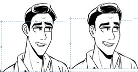
>>313250ive adjusted to holly's art style so much that looking at the way she styles the face doesn't jar me as much as her bodies.
No. 316126
File: 1540461955674.gif (1.69 MB, 330x280, anigif_enhanced-buzz-19058-134…)
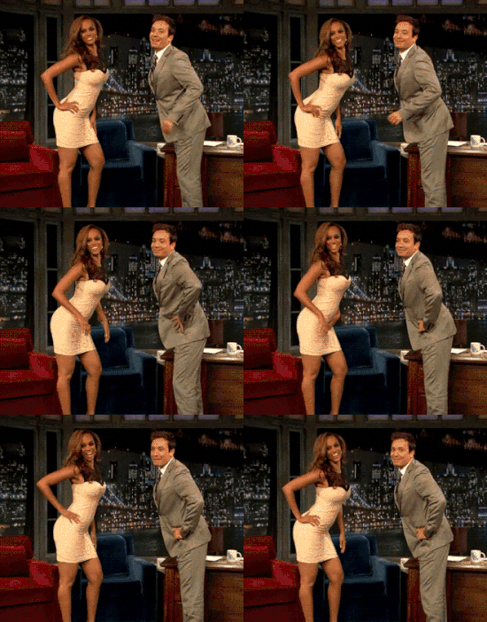
>>309386liquify anon ere'
technically not much wrong but you could of used more of a gesture line cause it feels kinda like a unbalanced jenga tower. I just made him lil more straightened but i could've pushed the gesture more by: having him lean backwards OR having him arch back and push his tooch out
also just felt you made him a lil too buff, but that aint wrong its just character design.
No. 316481
>>316106>but i just really have a pet peeve when ppl try to "QUICK" fix holly's heart and just totally redraw it in their own stylethis, anon here
>>316104 just made a completely new character or aged the original for like 20 years. It's obvious the original character is pretty youthful looking with slicked, head-hugging hair with a very slight pompadour, why did anon just draw a 48-year old sitcom actor with a poofed daddy hair?
I'm also sick of people wahhing about "weebs" when they're being told that Holly is trying to imitate the anime bishie style (and failing horribly) and they probably should utilize that in their redlines/redraws but instead go for their own generic style, completely ignoring the source context because m-m-m-muh realism. Would you redraw a Simpsons fanart with flesh-colored skin too?
No. 316505
File: 1540547013845.jpg (45.22 KB, 960x540, south-park-s10e04c06-bad-bart-…)
>>316481>Would you redraw a Simpsons fanart with flesh-colored skin too?People have literally done this countless times before, Anon. It's called artistic license.
Holly's style is garbage. There's no point in trying to adhere to it.
No. 316509
>>316505>holly art=garbage, no point adhering to itthis makes me frustrated, we're simply advocating for people to take into account the stylization when they fix art
redrawing in another style is just fan art and dosent help people learn what was wrong/what to fix with the original
redraws are fine and dandy here, i just dont like it when people are like "here! fixed!" because redraws are an entirely different piece just referencing the og
capsice?
its like if i asked you to fix the leg of a desk and then you went and made me a brand new desk of a different design
thats cool! …but wheres my desk?
No. 316516
>>316509agree. this redraw thread is "her's how holly/whoever could fix her piece" not "here's my piece which is better."
If you like drawing her characters in your style, that's fanart and you should post it on instagram and tag her with the other fans doing that. (I note that if you look on her tagged tab on insta there are about 20 reese chair fanarts and only about two of them aren't better than the ones here)
No. 320180
File: 1541326178372.png (1.06 MB, 2000x1200, mansette.png)
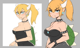
did a pretty true to definition redraw/trace over spechies bowestte piece that was obviously shit out judging by how lazy it is.
even though i did draw this in a pretty animu style i did try to make the general anatomy and style more appealing vs hers which looks very stiff and heavily referenced.
considering i directly traced over her art and managed to give somewhat better fluidity to the piece just means that spechie just really needs to focus on laying out better basic shapes (those spiky bands and shell lmao) and also pay attention to female anatomy more because how she does her females and males is the same to be honest.
its like she learned how to draw basic male body shape and head and just uses that for all her base art and it just gives all the females she draws an unfortunate aesthetic. her art would benefit a lot more if she stopped with the fucking useless painting studies and actually learned basic form and anatomy first because the way shes trying to get better at art will always leave her shit looking stiff and askew when she does any art that isnt heavily referenced and traced
No. 324254
File: 1542107799045.png (1.05 MB, 2640x852, Screenshot (17).png)

Redraw of Spechie's recent post. I think the demon was meant to be lit by neon lights? I drew one using the same colors and shading and one with more "realistic" neon lighting. (I'm also not happy with how the more complicated one turned out so please don't be too mean about it)
No. 324306
File: 1542118109509.jpg (1.02 MB, 1740x1080, Untitled271.jpg)
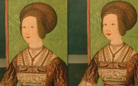
attempted to fix a weird painting from the renaissance
No. 324319
File: 1542121408975.jpg (126.67 KB, 1024x576, Untitled272.jpg)
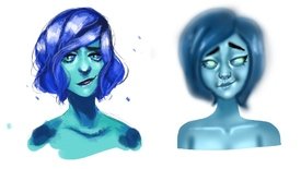
redrew spechie art. feel free to critique.
No. 324323
>>324319Not familiar with Spechie's art. Which one is hers?
Either way the right one is worse. It's a blurry mess, like someone went crazy with the Smudge tool.
No. 324343
>>324319>feel free to critiqueI'll give some.
So the two most glaring issues of Spechie's piece on the left are her color selection and the hair. Her colors are too bright, it's painful to look at. Some bright colors are fine else all art would just be grey and lifeless, but every color she's selected is bright, and as a result they are not in harmony with each other. The other issue is the hair, which features too high a shine when compared to the rest of the piece. You would need very bright, harsh lighting to achieve such a high shine on the hair, and that lighting would give the face a similarly high-contrast look. Instead, the face has a more subtle contrast between its light and shade, and it makes it look like it has no connection to the hair.
Your piece fixes the color issues somewhat. The colors you've chosen don't hurt my eyes nearly as much, but because they are all similar values it also means that there's no point of color interest. I'd have made the eyes brigher to try and counteract this.
And as someone else pointed out, you really overdid it with the blending. The nose has a good level of definition, but the rest of the face and especially the hair is overblended to hell, making it feel like I'm looking at the image through glasses someone rubbed butter all over. I would allow more brush strokes and harder lines to exist within the piece to give definition, particularly to the darkest and lightest areas.
No. 324356
File: 1542126519488.png (551.5 KB, 1482x758, spechie's shit demon.png)
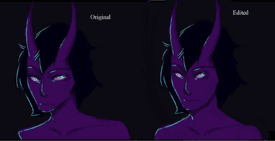
>>324254Anon please post your fan art somewhere else. And I don't think it's supposed to be a girl.
The lean is so bad he's basically falling over. I widened the jaw, made the eyes smaller, moved the mouth higher, moved the shoulders a bit, and centered the neck and head.
No. 324387
>>324385ah, the classic "if u don't do art, u have no rite 2 criticize mine!"
you guys really are embarrassing. you aren't much better than the cows you shit on, especially not in the skill department.
No. 324390
>>324387Of course you can criticize art if you don't do art, anon. Don't be silly.
What's dumb is acting like using the lasso tool and moving bits of a drawing someone else did in Photoshop is superior to actually being able to redraw something.
No. 324516
>>320180Yeah this is much closer to a redraw than most stuff in this thread.
>Similar style>Similar color scheme>Same expression>Same pose>Similar proportions but more realistic and appealing>More depth and detail but only to highlight the flaws of the original piece such as the angle of the spikes and the shape of the shellThis is also a pretty good example of a nice redraw that serves its purpose.
>>324356>>324319Anon I seriously had to wonder if this was a troll post and actually gotten from that godawful kiwifarms redraw thread. It's not even remotely similar to the original character or drawing.
>Completely different expression>Completely different color scheme>Original one has way harsher shadows and lighting>The redraw has inferior anatomy and dynamic with the setting>The eye shape is droopy and sleepy-like in the original, completely different cat eye style in the redraw>Why am I even writing this list, it's a waste of my time No. 324563
File: 1542146488515.png (571.24 KB, 1024x576, spechie redraw blue.png)
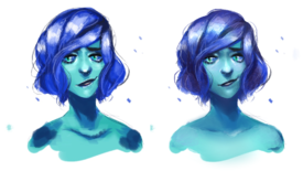
No. 324702
File: 1542179275039.png (663.35 KB, 3000x758, spechie redraw purple.png)

Can't tell what it's supposed to be.
No. 324747
File: 1542200643417.jpg (110.48 KB, 576x1024, Untitled274.jpg)
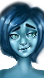
I tried to fix anon's drawing, still looks like shit though.
No. 324753
Every time I see anons bitch about artist cows' skill level I think of this thread and how 4/5 redraws are just as bad as the original, just with different stylization choices. Paintovers like
>>324563 or red lines are more than enough to point out flaws.
No. 324982
>>324964nta but do you know what fucking website you're on? if you wanted a borderline hugbox, you should've posted your shit art on another site.
how much you wanna bet all of the shitty artists itt who are crying about le meanies turn around and do the exact same shit to holly, spechie, etc.?
No. 325048
File: 1542238898106.png (5.02 MB, 2273x1702, ''mostly artist''.png)
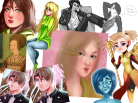
>>324999>mostly artist who know what they're doinganon pls
and this is /ot/ not /snow/. we're allowed to make 'huehue yer art sux kys!!!!!1!1!111' comments all we want.
No. 325614
>>325548We all agree that a lot of cows' art sucks, but then if you're going to "fix" it after mocking it relentlessly, but it's not technically any better, you're just asking to get what you just dished out.
If it was just a "post your art!" thread and people were being really mean i would agree that it's too much, but it's literally supposed to be a thread where you post better art than the original.
It's like if you claimed you were thinner than some cow, then posted a pic, turns out you're just as fat or fatter, but then when called out you went "wtf i'm not trying to be a spoop or a supermodel!! you guys are mean!"
Like this is not the thread for respecting subjective taste. If it was, we wouldn't be mocking spechie or holly in the first place.
No. 326062
>>326060Nah /ic/ is still worse lmao
At least most anons here actually draw
No. 326147
>>326144i disagree
>>325655>>324743>>324421maybe not sperging but people are taking everything too seriously
No. 326369
File: 1542455048848.png (493.69 KB, 940x708, holly.png)
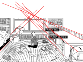
is posting holly's art cheating at this point?
No. 327376
File: 1542657474457.png (184.88 KB, 446x394, 1542623004474.png)
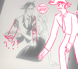
found in the holly thread
No. 329108
>>327376I wanted to edit or redraw this but Holly's art is so jacked are can't figure out how to fix it without drastically changing the poses. Ash isn't looking at Hershel?? And is he bending down because it looks like he's standing straight? Ash is sitting down so is Hershel really short?
Holly's art melts my brain trying to figure out what's happening
No. 331493
File: 1543514202663.jpg (213.94 KB, 815x459, sp.thumb.jpg.af7efb5273554b72b…)
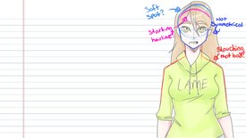
Found this on spechie's newest sprite
No. 331560
File: 1543524907487.jpg (234.18 KB, 815x459, lamegreen.jpg)
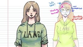
I tried to redo it
No. 331567
>>331563I don't understand, please speak a clear language.
thanks,xx
No. 331576
>>331574>>331574I didn't know that, that wasn't my name but the title of the image but, is there a way I can remove my e-mail?
thanks.
T
No. 331977
>>331560You could improve by shrinking the neck and moving the face up a bit on the head. The eyes seems a bit too far apart. I think your doing the "fit 1 eye in between the eyes" thing which works for some things but you're should be a bit closer together.
It's obvious you know more than spechie art wise though.
No. 332022
>>243951>>331977Thanks, I appreciate it a lot.
Actually I didn't do the one eye thing but I will try and make eyes closer next time (although I used to make them way further apart, It is kinda a thing I'm into TBH).
Also correct, I have studied art to some extent.
>>332016I would like to defend myself and say that you got it the other way round, the original is closer to wikiHow, but if what you're saying is the case then you got some good wikiHow art, please share some.
No. 332026
File: 1543609145192.png (647.86 KB, 900x675, 2HxG3HN.png)
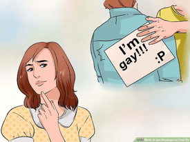
>>332022are you really gonna argue with someone's subjective take on your art? Accept that the asspats aren't coming and move on instead of making butthurt comments.
While I am NTA, I can see what they mean when they compare your drawing to wikihow art…
Also stop with the namefagging.
No. 332035
File: 1543610518863.png (438.59 KB, 892x492, reedit.png)
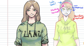
>>331560The body and coloring is good and shows a better understanding of how clothes and bodies work than Spechie's, especially for what looks like a rough sketch, but the face could use some work. The neck is too long, eyes and mouth too low (she has no chin). I've attached a quick edit of the face to try and show what I mean.
No. 335752
File: 1544209963608.png (228.96 KB, 634x952, what.png)
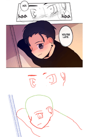
While looking at stuff on tapas to see how holly's stuff ranked I found this terrible series called "Where's My BL Story"
It's a gold mine of terrible
No. 343469
File: 1545607392386.png (349.32 KB, 600x400, shego.png)
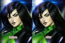
This was on the front page of dA. The face bothered me so I tried a 5 minute edit. Made the nose 10% bigger, resized the far eye by 5% and moved eyebrow closer to the bridge.
No. 346871
File: 1546277519028.png (249.54 KB, 638x675, fix.png)
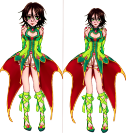
Tried fixing last version of
>>346661 They would be pretty cute, if their heads weren't that big tbh + lips too low
No. 371542
>>371451Why did you use the skin brush in the hair?
Pretty good besides that.
No. 375347
File: 1550437633180.png (1.41 MB, 2228x1466, zelda fixed.png)
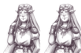
sloppy editing but I wanted to try and fix
>>375164 because I felt like it was… almost good?
No. 375359
>>371584I'm assuming they mean the texture/bits in the hair when hair should be smooth looking
Good fix though I agree
No. 375543
File: 1550463544837.png (1000.56 KB, 1331x1024, 2017.08.20.png)
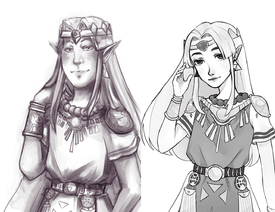
I wanted to redraw the same picture because the whole picture for me was so awkward
im not a true zelda fan so its not all that accurate
No. 375546
File: 1550463922588.png (1.67 MB, 2228x1466, yikes.png)
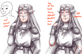
>>375347idk if I should go ahead and paint over this… didn't realize it was Zelda until I read the file name
>>371542I thought it looked fine, I could have used a hair brush instead.
>>375360Thanks
No. 398165
File: 1555133764426.png (70.78 KB, 584x272, lazee edit.png)

a quick edit of bj's new icon
No. 398226
>>398165The hate boner for Bj and a bunch of stupid artist is so strong, that they think they can do better, lmao
BJ's design is better than yours, fuck off anon.
No. 402334
File: 1556155322727.png (1.11 MB, 1158x1212, Holly Brown Art edit.png)
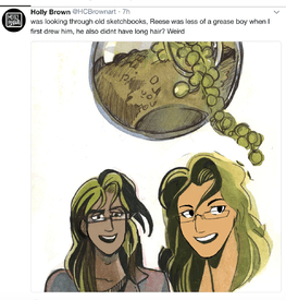
not sure if anyone's posted this specific Holly Brown edit yet but I just felt like fixing the faces
No. 404068
File: 1556479263208.png (104.23 KB, 263x275, holly.png)
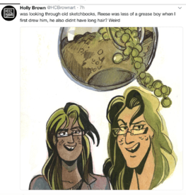
>>402538sorry I guess I forgot
No. 404071
File: 1556479684036.png (135.97 KB, 400x405, 400px-Ogre_image.png)
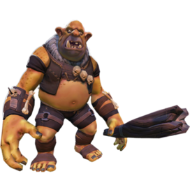
>>398421Nigga those are some peak ogre proportions there's no arguing otherwise.
No. 404097
File: 1556482534354.png (289.37 KB, 330x525, rz.png)
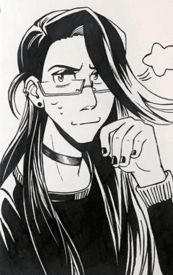
>>404068
>that old ReeseoofI mean, I dislike Holly's antics as much as the next anon, but to say she didn't get better at all is a big lie
Is just that she's still stiff as all fuck and don't understand anatomy beyond like two poses
No. 404382
>>402334>>404178Gave him girl eyebrows and removed his low brow. Changed his eye and nose shape… looks like an attempt at genderbending kek
>>375543You destroyed the feeling of the original pic and ruined everything that was good about it
No. 406890
File: 1557082812864.png (460.17 KB, 500x560, old reese redraw face.png)
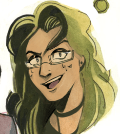
>>402334Tried redrawing his face based on her newer style.
No. 408449
File: 1557426002787.png (2.02 MB, 2200x1467, redraw elf.png)
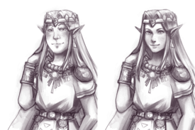
>>375347Quick animu redraw
No. 408657
>>408449Now
this is a proper redraw. You kept the same shading and feel of the original piece but fixed that ogre face. Love it.
No. 408906
File: 1557592937992.png (848.59 KB, 1950x1024, redraw zelda alttp.png)
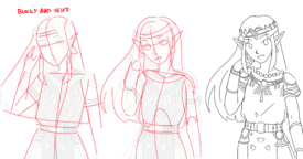
>>375543Hope this helps. Didn't know what to do with the hand.
No. 409393
>>408449Nice redraw!
It was literally just the face. I notice that some artists are only good at one thing.
Like some artists are great with faces, but bad with bodies and vice versa.
No. 440466
File: 1564278122235.png (387.15 KB, 839x697, aps redline.png)
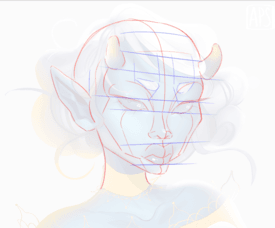
From the discussion in the General Artist Salt thread.
I traced over the face to show the construction.
Also by the way, she's holding a "draw it in your style" contest with this drawing. It ends tomorrow.
No. 487256
File: 1574720528022.jpg (106.13 KB, 768x768, Untitled322.jpg)
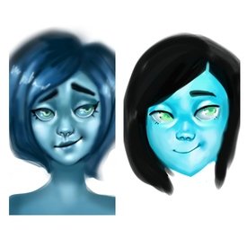
im back bitches
No. 487297
>>487268its not finished all the way
give honest critique, i will not freak out my emotional intelligence has improved over the last year…
No. 487327
>>487297okey you
the color of the sink is to bright, you can't really see the face , the eyes are much better , i will say that for now it looks better, at last better than the original
No. 487407
File: 1574771229510.png (386.26 KB, 446x330, C4B53750-0007-4A60-A19B-A8C081…)
this thread was a FUNNY ass ride
No. 487458
File: 1574782748698.png (3.46 MB, 2273x1702, hurrrrrpredraw.png)
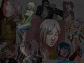
>>325048ok fun thread so far,
but the many fundamental issues within most of the redraws
triggered me.
such like hinting a light source which wasn't fully executed throughout the drawing,
anatomical/perspective issues etc.
heres my shitty attempt at fixing this mess,
toned down for reduced eyecancer.
No. 487597
File: 1574814203537.jpg (97.92 KB, 576x1024, Untitled319-2.jpg)
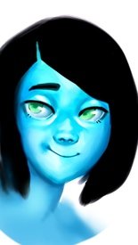
No. 487975
File: 1574902750234.png (285.96 KB, 432x768, uwu blue alien uwu.png)
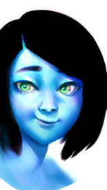
>>487597>>487789Let's redraw something that isn't blue.
Also this looks so much better upside down.
No. 488089
>>487975This actually hurts my eyes. It looks like a 3d movie when you're not wearing 3d glasses.
The anatomy is improved but jfc you need to fix the saturation on your computer screen or something.
No. 488322
File: 1574979386138.png (191.06 KB, 324x576, toned down.png)
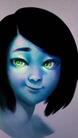
>>488089White backgrounds tend to have that effect. I added a lot of glow dodge at the end.
Here, more layer effects.
No. 488646
File: 1575056402760.png (3.76 MB, 2035x2533, 06DBC173-16A0-4EFE-B35A-4865B4…)
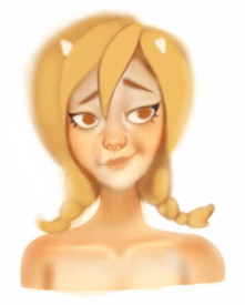
It was difficult making this as shitty as the original tbh
No. 488765
File: 1575074762288.png (53.16 KB, 300x300, 354356576.png)
No. 491675
File: 1575705561337.png (3.59 MB, 4093x2894, Rosheruu.png)
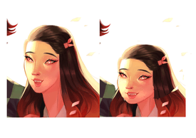
Edited some of rosheruu's art,(original on the left edit on the right) its not a perfect edit but its still better than the long faced mess the original was
No. 491817
File: 1575745385720.jpeg (866.02 KB, 1920x2560, DF43E6CF-F987-4DC7-B72F-17C7BA…)
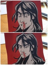
While i wouldnt say the new one is a good drawing i feel like its an improvement and what holly is probably striving for aka shit anime boy aesthetic
No. 493179
File: 1576055617405.png (716.09 KB, 1000x1408, ad.png)
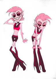
I know it's profoundly arrogant and shitty to redesign other peoples' characters, which is why I'm posting it here, anonymously. The only reason I'm not posting it to /co/ is because I hate /co/.
So rip into me anons! Literally some of the most valuable critique I've read is some of the stuff I've read here.
Autism on the changes:
A lot of the decisions I made were to make it more obvious what time period he's from. His name seems to imply that he's from the seventies or eighties, and I went with eighties simply because hot pink was more common then, and I tried to keep the palette of the original design as much as possible. I was looking at the guys in bands like Hanoi Rocks, Judas Priest, and Cinderella. So what I came up with was a bright pink, cropped leather vest instead of a suit jacket, and a choker instead of a bowtie. The vest exposes his flank more so his arms have somewhere to grow from. I also wanted to make him look more pointy overall.
So in terms of things I removed, I made him look less like a furry, which I concede might be more boring (?) So now he's got a mohawk instead of random fur sticking off of his head, and the bizarre fur-boobs are gone. The problem with giving him actual hair though is that he looked really weird without ears, so I added pointed ears. Removed all the things I felt were unnecessary or scene-kid-ish (heterochromia, stripes everywhere, freckles.) I wanted to keep the gold tooth but it just… didn't look right no matter what I tried.
I also wanted to make him look more spider-like, but that didn't really work out either. All of the drawings I tried where he had eight eyes or mandibles made the character unrecognizable. Like if what Vivienne was going for was "promiscuous spider", than the design needs a total overhaul, which I didn't want to do.
No. 493292
>>493263I posted about this at length in the art salt thread, but nothing about him makes sense for the forties:
1) Porn was underground and illegal, so there were no porn "stars." 2) PCP (Angel Dust) wasn't even used by hospitals yet, let alone recreationally at that time. 3) No one was wearing hot pants and thigh high boots– not even hookers. 4) His color palette is very neon, which makes more sense for the 80s than the 40s.
Having him be from the eighties makes more sense. Viv would even be able to keep the part about him being in the mob, since not only was it around in the eighties, but it had a hand in porn production.
No. 493293
>>493263I posted about this at length in the art salt thread, but nothing about him makes sense for the forties:
1) Porn was underground and illegal, so there were no porn "stars." 2) PCP (Angel Dust) wasn't even used by hospitals yet, let alone recreationally at that time. 3) No one was wearing hot pants and thigh high boots– not even hookers. 4) His color palette is very neon, which makes more sense for the 80s than the 40s.
Having him be from the eighties makes more sense. Viv would even be able to keep the part about him being in the mob, since not only was it around in the eighties, but it had a hand in porn production.
No. 493429
>>493179My only gripes are:
1) Hate the mohawk. It just doesn't fit with the character and reads more as a biker than a pornstar.
2) He's not a spider. His species is literally a spider demon and this just looks like a boring, normal demon when he's SUPPOSED to stand out with him being a main character and all. He just looks like another background biker chick with some masculine-ish features.
3) The ears? Confusing. Hate them. He's not an elf and it again, doesn't read spider just generic demon or nymph.
4)This also doesn't read as eighties. At all. If you didn't point out that he was from the eighties, I wouldn't have known. It's one thing to research the clothes they wore, but it's another to take the basic most recognizable to the time period features and using them. This is for animation, the audience needs to be able to know everything about the character in their first appearence with an equally as readable silhouette. You knocked the nail right on the head with saying beforehand that it's boring.
A for effort anon, but this looks like another generic background demon rather than a spider demon main character.
No. 493442
>>493432He was. And I believe he was actually paired with Vaggie.
But Vivziepop wanted to be a pandering little shit and said "NO!! HE GAY!!!"
No. 494699
File: 1576446062210.png (1.36 MB, 2080x720, edit edit edit.png)

Just some more polishing.
No. 494749
File: 1576452615614.jpg (111.96 KB, 520x720, 1576446062210.jpg)
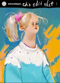
>>494699The neck needs to be wider.
No. 498133
File: 1577277374097.png (3.09 MB, 1064x1758, becca.png)
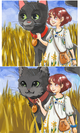
No. 499235
File: 1577643693777.png (1.04 MB, 1300x781, hb.png)
got lazy toward the end
No. 499325
>>499305You’re joking right..? The difference is night and day between the redraw
good job anon taking a holly turd and making it nice to look at
No. 499326
File: 1577665871487.jpg (376.09 KB, 2228x1466, 1550437633180.jpg)
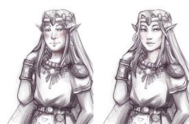
took a whack at zelda's face
this one is super weird in particular because when i started re-drawing from forehead-down i felt like i ended up at a completely different angle from when i was drawing chin-up and had to redo it. tried to keep the eyeline and general face shape consistent, at least. i think the cheek area is what drives the original into ogre-territory like that other anon said.
No. 499632
File: 1577762946979.png (114.51 KB, 600x550, attack helicopter.png)
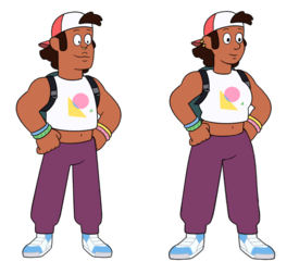
Tried to fix this trainwreck.
In the fixed version, she's just a lesbian, like she should have been in the first place.
No. 499641
>>499632Wtf is non binary?
I know you can be lesbian or gay
But what the hell is non binary??
No they're getting rubbish out of their asses
No. 499664
I could understand Stevonnie being a "they" because Stevonnie was a fusion of two people of the opposite sex, making "they appropriate on both counts- it's plurality and it's neutrality.
But "Shep" is just the show-runners desperately trying to bring back their old Tumbrlina fans. She even looks like a Tumblrina with her stupid septum piercing.
>>499651No, Sadie is apparently Rebecca's self-insert. I don't remember where she said it, but in one of her shit-zillion interviews she said Sadie was a character she made in college and is based off of what she was like as a teenager.
>>499662With a retarded name like Indya I can only assume it's a troon. Why do they pick such stupid names for themselves?
No. 500831
File: 1578083715530.jpg (78.79 KB, 494x598, viperman.jpg)
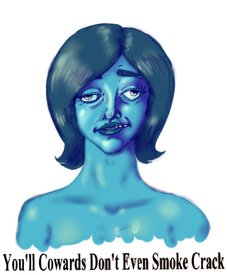
No. 500929
File: 1578100145015.gif (1.22 MB, 375x250, EasyGranularDuckbillcat-small.…)
>>500831Amazing job, anon.
No. 504065
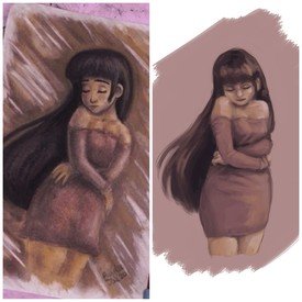
File: 1579057692683.jpg (378.21 KB, 2289x2289, 01-14-10.01.37.jpg)
Took a shot at making sense of the form in Baylee Jae's recent charcoal thing
No. 512549
File: 1581096938516.jpeg (420.87 KB, 2048x2048, 3A572832-4B7E-4F85-A52A-F193F2…)
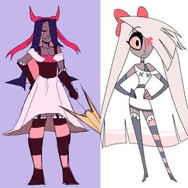
I don’t want this thread to die, so I thought I’d throw in a month old re draw of Vaggie from hazbin hotel. I felt that her design was really close to being decent, but the stupid scene hair, and ugly colors threw me off. Plus the unsymmetrical design is hell to animate. My drawing still isn’t particularly animation friendly, but imo it’s a step up. I also added in her spear, since Vaggies original spear changes it’s design twice in the 30 minute pilot. Btw sorry it’s kinda unfinished but I’m way too lazy to go back and finish this.
No. 512591
>>512549I like your outfit better, the devil horn bow was absolutely a missed opportunity.
But I agree with anon that it looks like a completely different character. Not to say that the original wasn't totally uninspired because damn it's boring.
No. 512592
>>512587Samefag to clarify by hairstyle I meant the general shape and size. I find the scene hair annoying too, but it would be better if in yours you kept the relative size/shape.
>>512591 Agreed I think anons character is 1000% better designed and cuter.
No. 512714
File: 1581116160884.jpeg (26.17 KB, 300x300, D6386478-BCE6-483C-AB0B-57812C…)
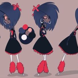
>>512587>>512591>>512592Same anon who did the redesign, I see what y’all mean, and I agree! I did make it look a little too different. incorporating more X’s into the design, and changing the hair to fit the original design would be more fitting. I wanted to incorporate some of the colors from earlier designs of vaggie (the dark blue hair and somewhat similar dress, the image attached is what I’m referring to) but I think the blue makes her look too different, and almost blends in with her skin tone. Also I might redraw this since it’s been a minute, and I’ll try my best to mimic the style of hazbin hotel! My style is kinda anime, and I did watch avatar as a kid so I see the avatar comparison lmao. Thanks for the advice anons!!
No. 515102
File: 1581790527504.png (1.86 MB, 1262x853, becc.png)
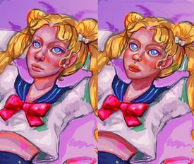
Tried to clean up Becca's strange lighting/shadows. I'd change the colors entirely because the entire thing is so saturated but I wanted to see it with as little of my own style injected as possible. Maybe it's an unfair comparison because I edited it digitally, but white highlights everywhere does not improve anything.
No. 515118
>>515102She no longer looks like the
victim of domestic violence. Nice fix-up.
No. 518369
File: 1582715545109.jpg (611.83 KB, 998x842, redraw.jpg)
I saw this on the Bad art thread and I thought I'd give it a go
Majority is just using the liquify tool and changing some colours
No. 518446
>>518369It looks kinda better. She no longer looks like an asphyxiation
victim, but those cold,dead eyes are beyond saving.
No. 518574
File: 1582757007644.png (950.04 KB, 998x842, op.png)
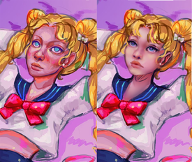
>>518369I gave a shot too, mostly face there are still lots of things wrong, but it's tho am and I have lectures in morning. Little piece I noticed is that nose, lips and chin doesn't really add up, and lips are pretty detailed by themselves, so I would say it might be traced/heavily referenced.
No. 519952
File: 1583091902345.png (1.76 MB, 1233x1113, E707D61C-F6A6-49AA-BCCB-5204EC…)
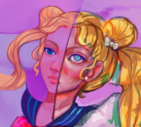
I wanted to fix the values rather than redraw it cause I don't know how to draw anime. I think the original artist intended sailor moon to be high so I tried adding to that vibe.
No. 521017
File: 1583353116548.jpg (78.62 KB, 532x275, holly's_ugly_fuck_face_before-…)
Edited Holly Brown's new icon. Just as I suspected, if she just moved the mouth up and added a nose, it would look a lot less creepy.
No. 521594
File: 1583504065461.jpg (209.57 KB, 981x622, 20200306_151202.jpg)
I was scrolling through art redraw thread on Kiwi Farms earlier and I'm schocked but half of the redraws are soo ugly. Sometimes even worse than tumblr-art they trying to "fix"
No. 521600
File: 1583505268411.png (487.66 KB, 1041x827, orginals on the left.PNG)
>>521594The original is better. More dynamic, better colors, and the style meshes well (The hair and ears fit better than on the re draws). The only mistake is the low nose, which can be excused because it's a sketch, and oddly places ears, which is most likely style. The funniest part is how what looks like a 5 minute sketch somehow GTFO what looks like a final sketch.
And oh god the Kiwi farm delusions. /IC/ isn't as delusional. People were praising this
No. 521602
File: 1583505777500.png (479.83 KB, 1219x929, 3456.PNG)
>>521600The delusion holly shit. Left is the "crappy" original and right is the superior kiwi farms verison
No. 521990
File: 1583583163655.png (1.46 MB, 2000x2000, sketch2.png)
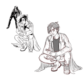
>>518574I tried redrawing again, this time Holly's character.
No. 522084
>>521990Honest critique anon?
Folds are pretty bad and most of them are not in the right places, the arms and legs look like limp noodles. (Holly's looking slightly better in comparison)
Hands are just as bad if not slightly worse, and the anatomy is a step better than Holly's but that's not saying much considering just how low a bar she holds.
My consensus?
More anatomy and fold studies anon, gain that confidence in your lines before trying to redraw someone's art.
If Holly's art was an F- this would just barely be a D-.
No. 522354
File: 1583641578555.png (1.2 MB, 2000x2000, holly redraw.png)
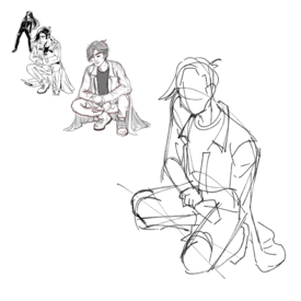
>>521990Not really a redraw but I was thinking something like this would be a cooler pose/angle.
Too lazy to redraw it properly sorry.
No. 522772
File: 1583729455419.png (762.81 KB, 1235x1026, redrawh.png)
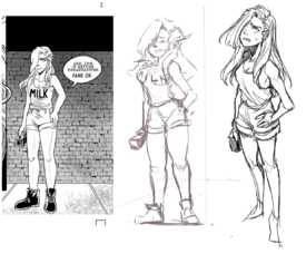
God I just saw this on the artist salt/discussion thread and I wanted to redraw this, I tried to make it not so stiff like the other 2
No. 523237
>>522772Holy shit, this is pretty impressive. You actually kept it somewhat in her style, which is a huge step up from most redraws I see of her art, and its dynamic and stylish. I love the shirt especially.
Its not perfect, it gets weird the lower down you get, but def my favorite redraw of her art that I've seen lately
No. 523495
File: 1583880310784.png (723.13 KB, 1358x899, 3DDD5348-67E3-4025-BE05-F9D1A9…)
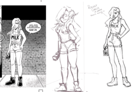
Guess another anon had the same idea. I didn’t want to replicate holly’s style, just show that shifting weight even slightly can improve the pose marginally.
No. 533884
>>533797Here's a file (1/2 resolution) with the layers if you want to look at it. Drawn in Clip Studio Paint.
https://cdn.discordapp.com/attachments/325478537329115136/693935521667350558/spechie_redraw.psdNot sure exactly what you want to know.
No. 539972
File: 1586654057716.png (3.53 MB, 3400x1418, cyarine_redline.png)
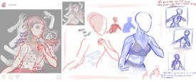
the neck in this cyarine post was really bothering me when I saw
>>539846 because the head looks like it's floating. I tried to fix it but it looks slightly mannish and def not perfect. If anyone else wants to give it a shot please do.
No. 540298
File: 1586738323911.png (1.81 MB, 2236x1106, idk cyarine.png)
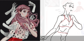
>>539972I think she might have been going for this sort of pose with the arm? Sorry I'm not good at drawing bodies. Didn't try to do the neck
No. 540804
>>540298You did a lot better job than the anon you replied to. lol.
>>309374 late reply but the Anatomy on this redraw is very correct? What the hell is wrong with anons here.
No. 546138
>>521990Love that there is much more movement in your figure Anon,
As
>>522084 said, just work on clothes folds to further that movement!
The face, I love, but maybe try more emotion? I can’t really understand what his face is trying to describe, apathy or worry.
But overall, really like the direction of your sketch :)
No. 548403
File: 1588378491546.png (5.1 MB, 3461x2018, AB62003D-D6C9-47DD-91D9-C3FA13…)
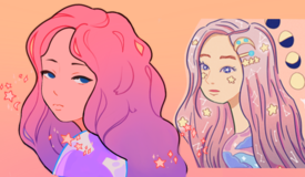
Followed the tutorial in the salty artist thread
No. 548523
File: 1588393917112.jpg (2.89 MB, 1500x1500, meyoco copy w noise.jpg)
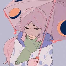
Drew my own one hour knock off, based off that salty tutorial. This was pretty fun. I shouldn't have put the umbrella over the face. It's more random looking than her stuff, I just put elements I saw in a few drawings.
No. 548588
File: 1588406497812.png (1.12 MB, 2048x2048, image-1.png)
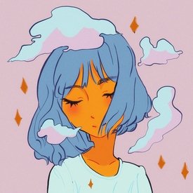
I'm gonna hop on this bandwagon. This might be the most obnoxious thing I've ever done but I think I got it down kind of.
No. 548633
File: 1588416580386.png (2.44 MB, 2048x2048, Untitled_Artwork-2.png)
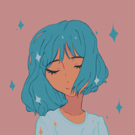
>>548588Samefag (obviously) but just wanted to see how far I could take it, I actually like Meyoco's line art a lot.
I like that her stuff is very uniform, I can't replicate it but it's fun to try.
No. 548737
>>548523everything looks good cept for the water, it looks like jello
>>548633those shoulders tho
No. 548768
File: 1588437906161.jpg (280.71 KB, 1024x1024, redline meyoco.jpg)
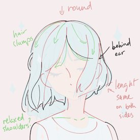
>>548633You need to think of the skull that's underneath (round) and then put big clumps/ribbons that originate mostly from the top of the head. I changed the hairstyle a bit.
>>548736My stabilizer is at 0. I admit my lineart (more like a sketch) doesn't quite look like hers because of the brush I used. High stabilizer makes it even harder to control your pen pressure though.
>>548539 >>548556
>>548570 >>548595
>>548602 >>548620
>>548737Thanks. I'm too lazy to make a rip off IG account. How would you even monetize that?
The jello water makes more sense in the image I took it from which had a watermelon umbrella.
No. 548823
>>548768your art is a lot better than some of the other overrated meyoco copycats on instagram tbh.
if you posted more art like that you could easily grow a following??
or if you already have an insta you could get popular thru that
No. 549033
File: 1588476481173.png (6.84 MB, 20000x20000, and_thats_why_i_quit_art_jfk_s…)
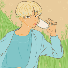
I was also trying to follow that Meyoco tutorial but got tired mid drawing.
I'm trying to pick art again as a hobby, but holly shit I have a new found respect toward Meyoco and her copycats, this shit is hard to do.
Feel free to red line this if you want anons.
No. 549046
File: 1588478424318.png (584.53 KB, 2000x2000, 90s.png)
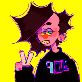
I saw some art improvement stuff from earlier so I thought I'd post mine although I'm gonna get eaten alive for my face blushing lol.
So this is from 2 years ago.
No. 549049
File: 1588478478411.png (4.26 MB, 5666x5808, acnl.png)
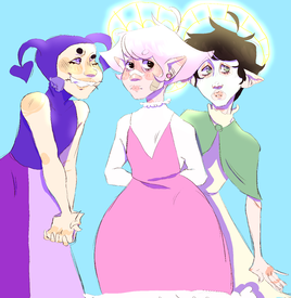
and this is from a week ago.(namefag)
No. 549067
>>549049I really think you should work on anatomy and general skill development before you do any stylization. If you do different studies on anatomy, shading, colour, practice drawing proportional faces and hands etc. your art will improve much quicker than with just regular doodle practice alone. It will make it easier to draw art in your own style that is executed well. To work on your line art skills, try practicing drawing a line in one go instead of sketching back and forth because it makes it look nicer and is easier to colour.
Also don't namefag pls
No. 549079
>>549049I think you’ve lost a lot of fun in your work. If I saw these both side by side my eye would be drawn to the first one. I personally find that piece to be a lot more whimsical and weird, where as the second one appears to be a little more lifeless. Now, I don’t think that you can necessarily choose exactly what your style comes out to be, and I definitely don’t want to discourage you by any means because god knows people on anon forums can say and do anything they want which in turn can leave little brain bugs that nestle in your head for years— but I think
>>549067 had it spot on. Work on those fundamentals, but don’t forget what makes you want to draw, your roots, your core self. Sage for the shitty ramble, I see a lot of potential in you
No. 549269
>>549046>>549049Jesus Christ anon lurk moar. Also your art is the kind style people here usually dislike, so you didn't pick an easy crowd.
Anyway, learn anatomy before you try to stylize things. The faces on these characters are terrifying.
No. 549333
>>549033Did you draw this with a mouse?
>>549282unrelated but I swear i've seen another post refer to an asexual flag animal crossing profile pic before. Do you just reuse the same insults over and over?
No. 549367
File: 1588519110907.png (1.61 MB, 720x2127, 1568847680634.png)

>>549046>>549049well I think you should learn the basics first, the artist salt thread (older ones) had this image and I can only recommend these books
The colours in the first one are cool but it just seems without 'purpose'
Maybe get on Facebook and join the level up! group to get further feedback because lc isn't the place
No. 552866
>>552726>>552852Ok, here then
https://discord.gg/7F5MqeI'll try to help anyone with their art.
No. 553265
File: 1589309179978.png (320.87 KB, 1176x444, horror.png)
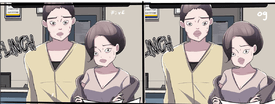
this webtoon is a study on odd faces, it might because its mostly google sketch up? it ruins the mood when the characters have snap turtle-like faces.
No. 555301
File: 1589832142232.png (1.4 MB, 1580x2224, tracing is easy.png)
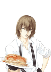
>>>/ot/555104Traced the body from hers and then changed the head and pancakes. Didn't bother doing clean lineart or coloring.
No. 555384
File: 1589845149253.png (285.71 KB, 907x2046, kasumi redraw.png)
>>>/ot/555231Another one. Didn't shade.
No. 555679
File: 1589918821325.png (1.17 MB, 1814x903, redraw.png)
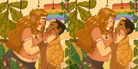
>>243951Sometimes I wonder what the western art scene on the internet would have looked like if tumblr never existed…
No. 555705
>>555695anything thats ugly has
charm nowadays huh
No. 555729
>>555716Haha, well I only lurk on the artist salt thread, I don't actually post.
>>555722Sure,
https://discord.gg/Ks58HF No. 556986
File: 1590191756467.jpg (65.9 KB, 622x172, ripmoon.jpg)

watch holly turn sailormoon into a sheep
left =just stuck a normal nose for comparison
No. 557007
>>555301I really like the way you did the hair!
any tips/tutorials on how to paint that way? Not so much the colors used, but where the lights/shadows are
I hope that makes sense, english is not my first language
No. 557085
File: 1590204711167.jpg (35.15 KB, 320x320, 2933950-3223192599-goro-.jpg)
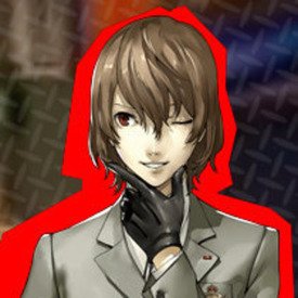
>>557007Umm I used another pic as ref and I took some of the shading from it. The top is darker and the bottom gets darker in a gradient. A bit like a sphere. There's shadows where the hair is turned away from the light. I made the hair turn lighter at the tips in the middle of the face to make it look more transparent/the face looks brighter. My example isn't super well done.
No. 557095
File: 1590207087239.jpeg (1.13 MB, 1920x2560, 9F34E233-1D89-4F0E-B368-9EABD3…)
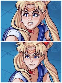
Tried using one of those chinese beauty apps to move her around
Tbh its really stiff but what can you do when you have that as a base
No. 557098
File: 1590207306801.png (11.23 MB, 2562x1532, island.png)
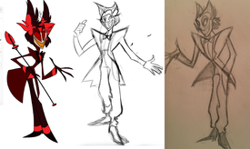
my attempt from a while ago to fix this wretched design
No. 557110
File: 1590209659742.jpg (752.78 KB, 1280x922, lock-406-5993-1__42939.1521078…)
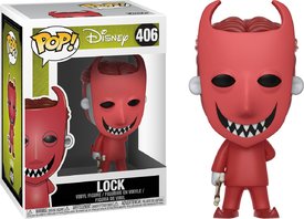
>>557098Not sure which one is the final design between the middle and the right, but I like him! I prefer the middle one though, I think he looks better with eyebrows. It makes him look less like one of the kids from Nightmare Before Christmas
No. 557771
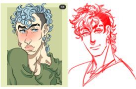
File: 1590311128234.png (98.44 KB, 390x255, redrawLLC.png)
No. 557798
>>557771i love this so much, you've got a really nice JJBA kinda style going on
who's the original artist? i'm cringing at the botched botox face
No. 559856
>>557098I actually like this one anon, there’s much more of a figure/sharp angles, making him look much more like an antagonist .
And I also agree with
>>557110 lol
No. 564108
File: 1591136551953.jpeg (322.04 KB, 2048x1536, 9FE4EA8D-D0A0-4F16-AC93-74CB00…)
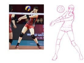
Repost from the artist salt thread, but basically I want to figure out how to make the pose more fluid
No. 564127
File: 1591139765532.jpg (559.08 KB, 2048x1536, volleyball anon.jpg)
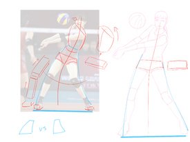
>>564108Here's what I think. The pelvis is angled differently. the original has her pelvis angled as it it's tilted back and you can tell she's putting her weight more on one leg. Your shapes aren't showing the same orientation in space. To show that she's putting more weight on the leg that's drawn on the right, you need there to be more mass above that leg. The different body parts also need to follow curves (motion/action lines) for the pose to look good as another anon said. Hope this helps.
No. 564714
File: 1591191959315.jpg (30.48 KB, 368x446, crispy.jpg)
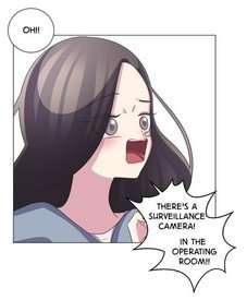
>>553265how could anyone have left out this gem that was the panel right before the fixed one
No. 564915
File: 1591220853628.png (65.25 KB, 227x275, webtoon.png)
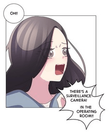
>>564714How hard is it to just move the features…
No. 570115
>>567491Nah, at max like 70% probably? Still, hasn't figured out completely how to pressure sensitivity.
Also found myself a makeshift treatment, shitton thermacare/icy hot and bandage.
No. 572092
File: 1592526011001.png (627.67 KB, 1924x886, idk.png)
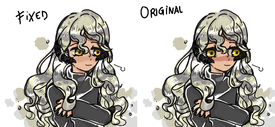
tried my best with ms paint lol. the blush still looks a bit weird but oh well.
No. 575749
File: 1593241697514.jpg (493.7 KB, 1000x707, 2020-06-27_02.57.00.jpg)
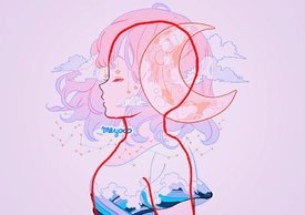
not a redraw, just a super shitty redline done on my phone, but I felt it was necessary to truely visualise what meyoco's hydrocephalus skulls look like. I think the combination of the thick neck and bobblehead with a tiny face is really something.
I kind of want to Photoshop a normal human face to meyoco proportions using this as a base, but I don't know if that's allowed in this thread.
No. 576738
File: 1593446155458.jpg (2.85 MB, 2132x3647, 20200629_115340.jpg)
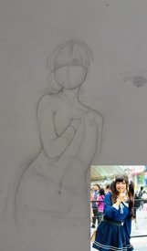
I saw someone else post something like this and thought I would to something about this pose still feels a bit stiff is their anyway to make it more fluid
No. 577104
File: 1593472208743.png (4.36 MB, 1800x2763, rl.png)
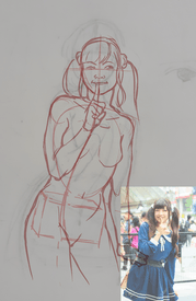
>>576738If you want your work to have a better sense of movement, you should do 30 or 60 second gestures on a large piece of paper, preferably from a live model, but there are online resources you can use for gesture drawing, too.
Your biggest mistake early on is that you didn't draw a line for the spine. The line of the spine is important because it tells you where to place the neck, ribcage, and pelvis relative to each other. As a result the neck doesn't line up with the rest of the body. In general, you need to do more anatomy studies. I would recommend looking at some Burne Hogarth books for that. Like
>>576746 said, this isn't a very good reference photo if you're trying to improve your gestures, because she's wearing baggy clothing that obscures her body and is doing a stiff pose for the camera. You need to use nude models for this sort of practice so you can see their anatomy and musculature.
No. 577485
>>577104Thanks so much for the advise lol definitely keep that on mind for anatomy and figure practice I've mostly been trying to reference
Micheal Hampton's book honestly
No. 578551
File: 1593727470469.jpg (282.88 KB, 800x349, kinda fix.jpg)
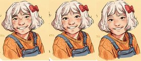
>>97952I don't know if it's any better but I felt like adding more to her top skull.
No. 578671
File: 1593746150070.png (723.84 KB, 1052x349, unknownrrwewer.png)

here is mine
No. 587434
File: 1595326349425.png (259.47 KB, 844x421, lovesickcharacter.png)

It's a shame this thread is kind of dead, so let me bump it.
The new Yandere Simulator clone, Love Sick, has a pretty incompetent artist, so I redrew some of the face proportions. Ideally, they would just find a new artist, lol.
Sry about the jagged lines, I don't really do much digital art.
No. 587603
File: 1595347442664.png (224.96 KB, 839x416, LoveLetter.png)

tbh I like the original but meh, here's mine anyway
No. 593101
File: 1596106504986.png (281.4 KB, 786x413, lovesick_protag.png)
anon posting their redraw made me want to post mine
No. 593164
>>593101Everyone is being so nice so I feel bad for this but
She looks like a pin head in your version. Heads are fuller than that, and her face is massive compared to the rest of her head.
No. 593998
File: 1596217269330.png (139.89 KB, 786x413, edit lovesick.png)
>>593101Tried seeing what it would look like with the mouth shrunk a bit.
No. 594284
File: 1596246706985.png (284.09 KB, 972x575, lovesick_senpai.png)
No. 594304
>>594302It just looks like a big glob of… Whatever
>>594302I'm equally disgusted by the hair.
No. 594313
>>594305thanks
cake set the bar pretty low so it was pretty easy to fix
No. 596316
File: 1596530052940.jpg (234.32 KB, 540x837, 20200804_032456.jpg)
Someone fix this
No. 596824
File: 1596581676697.jpg (590.6 KB, 1678x1748, lol.jpg)
>>596316Okay but I followed the original framing and posing
No. 597057
File: 1596595454191.jpeg (Spoiler Image,174.13 KB, 672x1720, 5BE95788-3B5C-44AA-893B-43C768…)

>>596316I chicken scratched how I would lay it out, but looking it over two panels would probably be fine instead of three.
No. 597176
File: 1596602739978.jpg (191.31 KB, 540x859, 20200804_234411.jpg)
>>597057He kind of looks like a woman, I agree that the panels are badly paced, though.
No. 597239
>>596847I tried to stick to the style of the original panel. My normal art looks nothing like this, so none taken, kek.
>>596896Who? From what? (No, lol.)
No. 597627
>>597248Oh well that's the fault of the artists and me not telling you, sorry
>>597346Holy shit he does! Hes apparently black and native American, too
No. 600222
File: 1596969153710.png (2.81 MB, 3406x2041, lazy redraw.png)
I did a paintover of a piece from the raedizzle thread bc everything about it made my brain feel like it was melting.
why does this bitch use only high saturated colors and shade with black. why.
redraw is on the left bc im a dumbass who didnt unflip my view of the canvas.
No. 600250
>>600222Yours looks so much more natural pose wise and colour wise! I love the changes you made to the neck/collar area. The bottom portion of the legs look a little long tho.
I cant get over the weird colour choices of the original. That skin tone?
No. 600252
File: 1596974849793.png (539.36 KB, 962x1151, 1596969153710(1).png)

>>600222I changed the colors a bit, hope you don't mind
No. 600278
>>600252Thanks! I noticed the leg proportions on mine a little too late. It initially started as a quick little tweak then I realized I couldn’t fix it with tweaks bc the entire thing was fucked up and I got carried away.
>>600250This looks so much nicer! I don’t know why I didn’t futz with the colors more, but this looks much nicer lol
No. 629688
File: 1600028823039.png (1.12 MB, 1081x725, D05C8947-8B3B-4CE1-8F11-6D4BA8…)
My redraw
No. 632513
File: 1600370078038.png (81.68 KB, 384x402, paint2.png)
>>593998just make her full on anime already lol
No. 633221
File: 1600453913990.jpg (75.34 KB, 632x754, Op_satsuki.jpg)
>>555679ya'll hate any kind of face that isn't anime so bad. damn can't even have a bigger nose. wait no even anime girls can have big eyebrows. this is pathetic lol
No. 633240
>>555679It was a decent attempt. Hard to save that one though.
It's just too fucking hideous
No. 633359
File: 1600463434584.png (953.34 KB, 1814x903, redraw_.png)
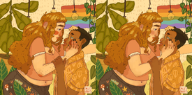
>>555679I gave up on the body tho
No. 633400
File: 1600466323947.jpg (538.44 KB, 1944x896, fixed art .jpg)
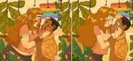
fixed!!!
No. 633491
>>633362I don't have my tablet atm, I edited with the mouse. Guess if the body hair was her hair color and less thick and spread out it could work, but idk.
>>633389Body hair is very tricky to draw tbh, since most of it is not visible from a distance it's just easier to not draw it. It's tricky to no make it look like some weird misplaced shadow or the thick sparse hair from the original art.
No. 633846
File: 1600520448285.jpeg (228.11 KB, 987x856, 78557C16-C234-4F0A-A962-B79D44…)
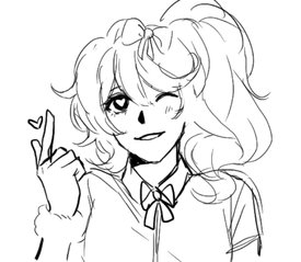
>>587434Shitty sketch over I’m sorry for those who recognize my art LOL
No. 634509
File: 1600611999659.jpeg (105 KB, 1124x599, DD6750C6-F35F-4456-A910-CCF6B2…)
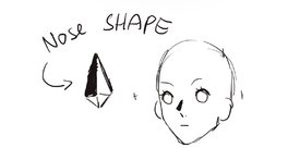
>>634461Tbh I have a preference for more neutral expressions
And here’s an explanation for the “black blob”
No. 634514
File: 1600613010146.jpeg (386.49 KB, 1584x781, 08674877-6155-41D1-923B-547B30…)
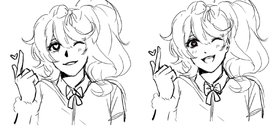
>>634461and a touched up version just for u
No. 634516
File: 1600613405399.jpg (221.33 KB, 1200x1526, 1598256013808.jpg)
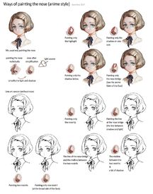
>>634509nta, but here's other explanation. also off topic, i think it's interesting how japanese creators know what they're doing, and every part of anime character body is anatomically correct - but a lot westerners just put dot in the midlle of the face and think it's ok
No. 634517
>>634515kek
nonny I thought it was a weird humblebrag too
No. 635163
>>634509That's not what you did. You drew a black blob and thought it looked good. At least the original had a nose. See
>>634516 on how to do minimalist features correctly.
>>634515It looks like every other generic low quality art on twitter at the moment. Wouldn't be surprised if they also slam "do not repost" disclaimers everywhere because these subpar weebs seem to think they're distinctive or good enough for people to recognise/steal their art
No. 635748
>>633389There's a million Tumblr artists who draw women to look like the wolfman, I think we've met the quota for cartoon ladies with body hair for a while.
>>635728I agree with
>>635163 honestly. It IS better than the original but, it's not much different from any other weeb anime art you'd find on Twitter or Pixiv. Unless you're deep into that kind of art, you won't be able to single out the artists who do this kinda stuff.
But this is starting to become derailing.
No. 638109
File: 1600995246531.png (379.99 KB, 900x509, jfk_redraw.png)
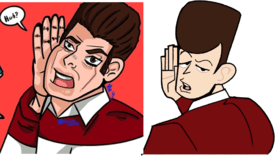
>>635836no that was me lol
new one from the /m/ thread
No. 638130
File: 1600998258717.png (353.37 KB, 900x512, jfk_redraw2.png)
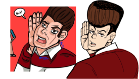
No. 645751
File: 1601790726379.png (385.69 KB, 1192x554, redraw lolcow.png)
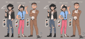
>>>/ot/109877Here you go, edited their features to be smaller (mostly the eyes).
No. 645811
File: 1601804553786.jpg (78.44 KB, 240x554, eye.jpg)
>>645751this guy's eye was making me go nuts looking like that.
No. 646749
File: 1601920796811.png (1.75 MB, 1423x2191, long torsos lolcow.png)
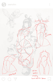
>>>/m/110043Here's why I think the anatomy is strange.
No. 654498
File: 1602606877876.png (1.83 MB, 2820x2000, recolor.png)
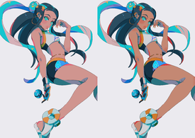
I just felt like making her less pink, idk.
No. 660084
File: 1603246290285.jpg (792.31 KB, 2246x1392, ec2c66d6985fe66301fc9e6ca7993d…)

Can any art fag tell me what's wrong with her feet? The vanishing points and background seem fine, but her feet look fucking weird. I've been trying to improve my art with perspective, and this shot is bothering me…any explanation would be appreciated.
No. 660087
File: 1603250466679.jpg (770.99 KB, 2246x1392, lolcow foot.jpg)
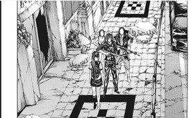
>>660084I tried to edit it to look more foot shaped but I don't know if it makes a different. It's just her feet, I don't think anyone really cares. Maybe it looks weird because there are no shadows below the characters.
No. 661844
File: 1603912425658.jpg (700.52 KB, 2246x1392, perspective fix.jpg)
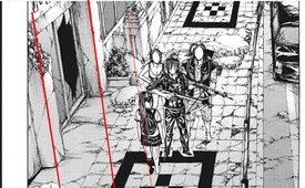
>>660084I think the issue is that the characters aren't drawn in quite the same perspective as the characters. I tried to align it roughly with perspective warp, using the girl as a guide. It seems to fix her feet issue. But the guy in front has hilariously short legs now and should probably be moved back a bit.
No. 661865
>>654498eh… it ruins the color palette
if you are going to change her skin then change other colors. The original had a better color harmony and looks more consistent. if you make one color different then you would need to tone the other colors to match. Idea is there the attempt isn't good
No. 662123
File: 1603936267079.jpg (787.19 KB, 2246x1392, Illustration.jpg)
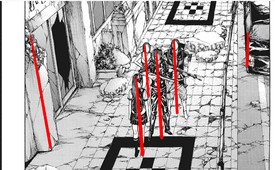
>>661844I see what you mean by the perspective, but I think that if you consider the side of the car to be vertical and then make perspective lines based off that, the girl should only be a bit more tilted to be in perspective. The vanishing point would be at the bottom of the image.
No. 665585
File: 1604372487770.png (132.42 KB, 500x466, redraw.png)
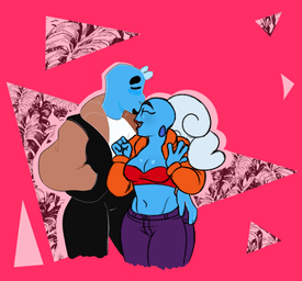
came across this and the balloon hips and hair skeeved me out, so i took a swing at redrawing it
No. 665586
File: 1604372761074.png (191.32 KB, 997x466, redraw 2.png)
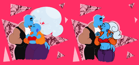
>>665585whoops, my autism slipped out, here's the side by side comparison
No. 665830
File: 1604410030746.png (5.81 MB, 2000x1630, cable.png)
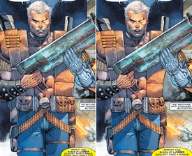
I know Rob Liefeld is an easy target (there's even a dialogue bubble in this panel making fun of him) but it's fun to edit his art, if only to see what his style would look like without all the tangents and anatomical issues. Obviously I couldn't fix everything– Cable's pose here is really stiff and that can't really be helped without redrawing it entirely, which I didn't want to do. I wanted to edit this one because it was so close to being passable were it not for how misaligned his torso, head, and legs are with each other.
No. 667724
File: 1604622724334.jpg (131.76 KB, 1306x1216, design.jpg)
I saw this piece in the Bad/Hideous Art Thread but I thought the design was really cute and fundamentally good but damn there's too much thicc.
If anyone knows can they link me the artist?
No. 710810
>>683154Not the same artist, do you think every talented artist is fucking the same person? lmao
stop derailing the thread
No. 712717
File: 1610438487966.jpg (Spoiler Image,708.16 KB, 1564x1564, IMG_20210112_025505.jpg)

Deleted because forgot to spoiler so reposting:
The minute I saw this, I had to drop everything to fix this. Would you all day mine is more anatomically correct? The only thing I edited was the hips/pubis.
To answer your question,
>>712710, mine is on the right.
No. 712767
File: 1610445390563.jpeg (202.87 KB, 907x903, 343AA4C3-B13E-4480-904F-65E612…)
>>683154I’ve never drawn for a game before but thanks for indirectly thinking my art is good enough for one teehee
No. 713103
>>712767anime artists are so boring especially ones who draw in this style, no one cares
>>638109>>638130awesome work anon
No. 713572
>>667724I know i'm replying to an old post so I'm not sure it's worth it but you slimmed her down too much and removed the appeal and I hate fat bitches.
>>712773>>712787>>713103>>683154Seething like this over a drawing…
No. 786757
File: 1618813756144.png (610.59 KB, 640x512, Untitled67_20210419022635.png)
Tried to fix the face from
>>138175 from the bad art thread. Just a lazy paint over to try to make her look like a kid rather than a midget
No. 800648
File: 1620337311141.png (Spoiler Image,1.51 MB, 2029x1239, Tired.png)

I give up
No. 1023623
File: 1641927503945.png (3.29 MB, 2540x1141, Picsart_22-01-12_01-49-09-171.…)
No. 1023743
>>1023692Its
very obvious the artist drew these characters ugly on purpose
No. 1023747
File: 1641932664802.png (505.97 KB, 631x564, ah.png)
>>1023623>>1023664contributing to the attempt
No. 1031977
File: 1642541125154.png (1.14 MB, 1008x914, lel.png)
>>1023623Late but i tried, used reference and shit
i thought Camilo was darker but he's actually lighter than i remember